Rose Pink
The pale dusty rose Sherwin-Williams keeps putting on its own pink shortlist, reviewed honestly: the grown-up rooms it flatters, the light that flattens it, and what to pick instead.

Jessica has spec'd whites and neutrals for more than 300 rooms and keeps a sample wall of painted drawdowns in her studio. Every color review is checked against real reader rooms in the comments and re-tested when a formula changes. About the testing process →
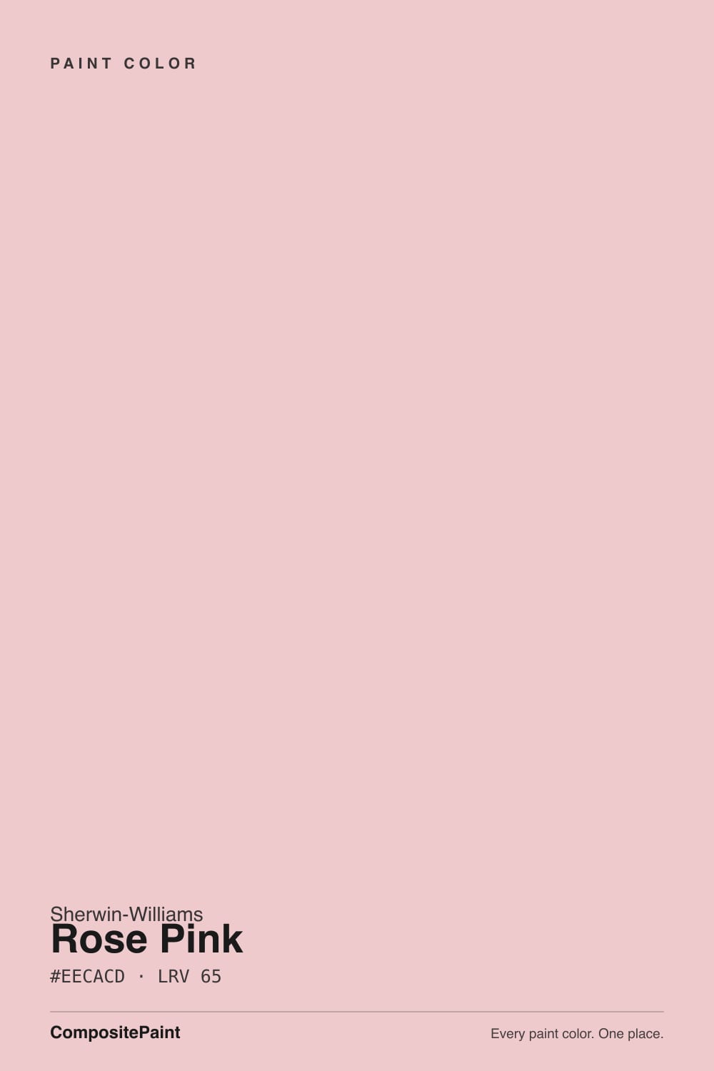
- 1Vintage Tea Rose47
- 2Abalone Shell60
- 3Rose Pink65
- 4First Light76
- 5Pink Bliss82
The Fast Verdict
Rose Pink is a pale, warm dusty rose — soft enough to read almost like a blush off-white in strong daylight, clearly pink the moment the light turns even. Sherwin-Williams files it under Red, not Pink, which is a tell: the undertone leans peachy-rose, never bubblegum and never cool mauve. It is a quiet, grown-up pastel that behaves best in bounded rooms with warm light — not a color that wants to run across an open floor plan.
Nurseries and little-kid bedrooms that need to grow up with the kid · guest rooms and reading nooks · powder rooms wanting a hint of warmth · anyone who wants pink without it reading sugary
You want a true, saturated pink · your room is north-facing and dim · you're painting a big open-plan space · your trim and floors already run cool
- A pale pink that reads grown-up, not sugary
- Warm enough to feel finished; light enough to keep small rooms bright
- Flatters brass and warm wood tones
- Works as a genuinely gender-neutral-adjacent nursery color with white trim
- Quiet enough to grow up with a kid instead of getting repainted
- Reads close to a washed-out blush in very strong daylight
- Goes dull and chalky in cold, north-facing light
- Looks dingy next to a stark, cool white trim
- Too quiet a color to carry a large open-plan room
What Color Is Rose Pink, Really?
A pale, warm dusty rose with a peachy-beige lean. Sherwin-Williams files Rose Pink in its Red family, not its Pink family, and its listed complementary partners are blue-green shades — both point the same direction: this is a warm pink, built to sit opposite blue-green rather than beside a cool mauve. Third-party color guides describe it in almost identical language — "soft," "romantic," a "pinky beige" with a "light, airy feel" — which lines up with a color built to be worn in, not stared at.
At LRV 65 it reflects most of the light that hits it, and that is the whole double-edged story of this color. In strong, even daylight it can read close to a warm blush off-white — some readers will swear it looks almost neutral. In softer or cooler light the pink comes forward and is unmistakable. Neither read is wrong; it is the same paint responding honestly to the room, the same way every pale pastel does. Sample it on the actual wall, at the actual time of day you use the room, before you commit.
Undertone in one line: warm dusty rose with a peachy-beige lean — never a cool mauve, never a bubblegum pink. If your sample looks flat or slightly gray, that is cold daylight talking, not the paint.
Where It Shines
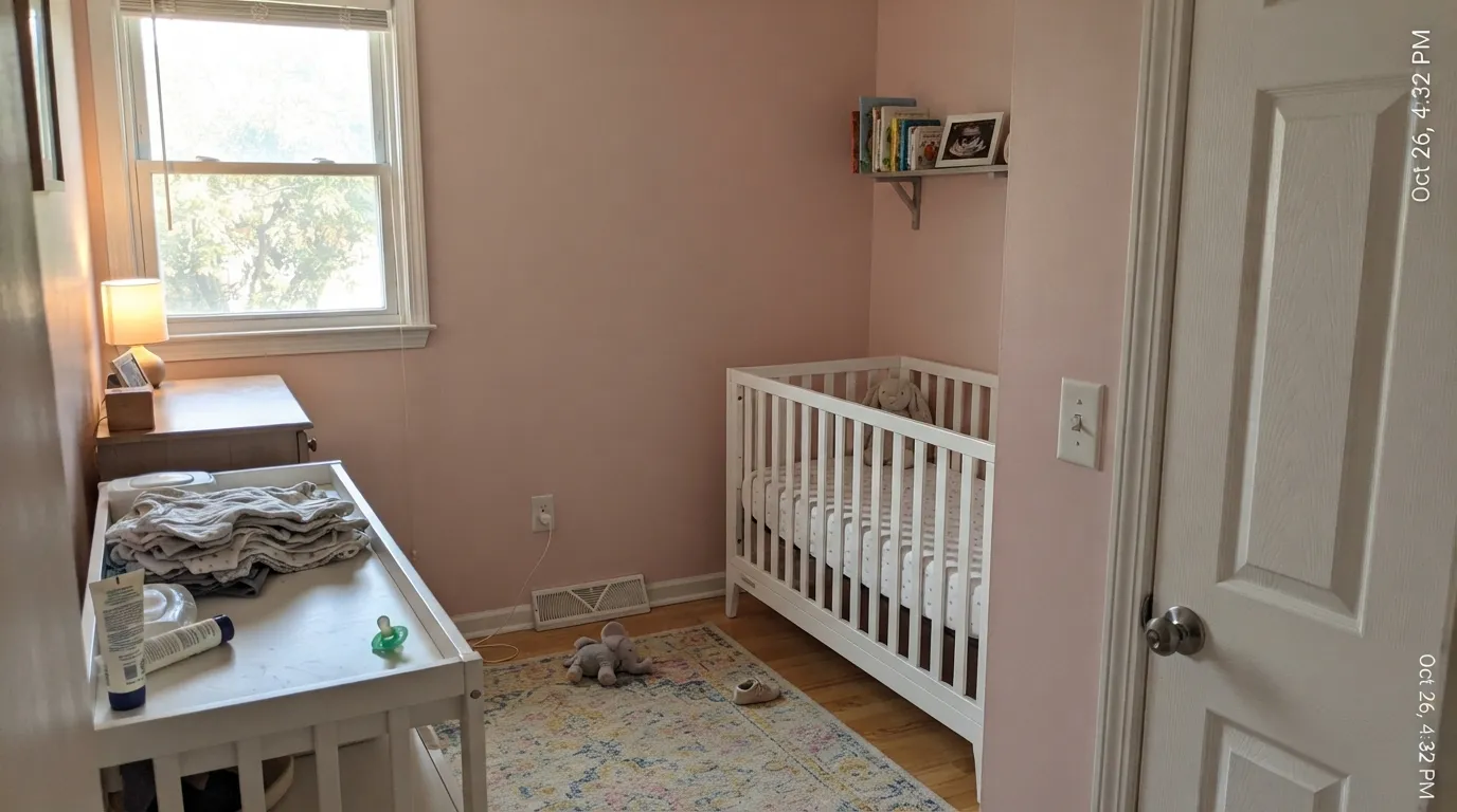
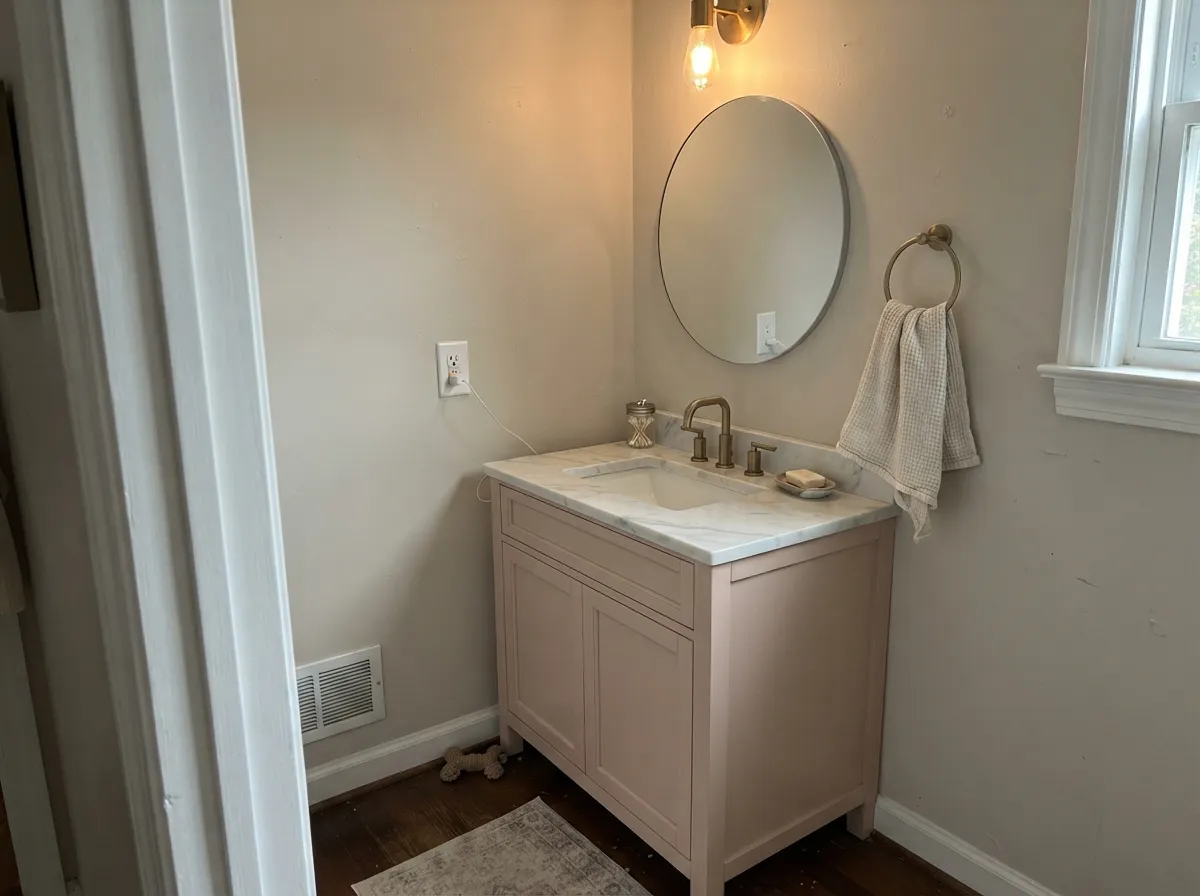
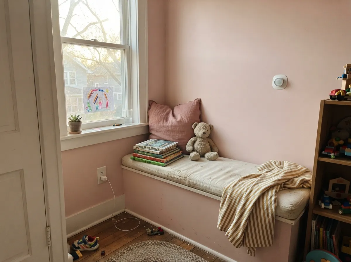
Give it a bounded room with decent warm daylight — a nursery, a guest room, a reading nook, a powder room — and it earns its keep as the pastel that reads finished, not childish. It is at its best paired with warm wood, brass, and a crisp-but-not-stark white trim, where the color sits back as a quiet backdrop instead of shouting for attention. Small, enclosed rooms let it hold its color; it is far more convincing in a nursery than it will ever be across an open-plan living room.
Where It Fails
Almost every disappointed story about Rose Pink comes down to one of three predictable mismatches. None of them are the paint's fault — but if your room matches one, this is not your color, and a bigger sample will only confirm it.
North light is grey and directionless — it strips the warmth straight out of a pale pastel like this one and leaves it looking dull, chalky, almost dirty. The color did not fail; the light did. Either add warm lamps and accept the shift, or pick a color that does not depend on daylight to look good.
The most common regret is a pairing mistake, not a paint mistake: Rose Pink walls beside a bright, cool builder white make the walls look washed-out and slightly dirty by comparison. Warm it up — Pure White or a similar soft white keeps the contrast gentle instead of harsh.
At this light and this quiet a color, a huge wall of it can go flat and lose definition — it needs a bounded space to hold its own. Save it for a nursery, a guest room, or a powder room, and use a deeper, more saturated color if the open floor plan needs to carry real presence.
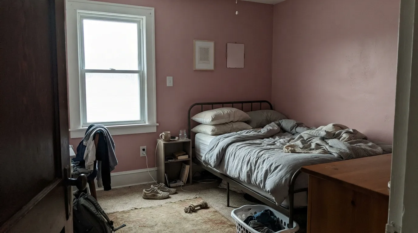
Room by Room
Soft enough to read gender-neutral-adjacent with the right trim, warm enough to feel finished instead of sugary. Eggshell on the walls, semi-gloss on the door and trim, and it will still look grown-up when the crib becomes a toddler bed.
Under morning or afternoon daylight it reads calm and pretty without tipping into a full pink theme. In a north-facing kid's room it can go flat and dull — check the light before committing.
A gentle, welcoming color for a room that is not lived in every day. Pairs easily with cream or white bedding and warm wood furniture.
A little room takes a pale pastel well, and brass hardware or a darker vanity gives it enough contrast to feel deliberate rather than accidental.
It can work as an accent wall or nook, but a full open floor plan in this quiet a pink tends to go flat and undefined. A bounded room is a safer bet.
Sherwin-Williams' own visualizer supports Rose Pink on siding, shutters and doors, and it can work on a full-sun facade in a warm climate. In shade or overcast light it dulls toward gray — this is not a color for a north-facing porch.
Your Light Is the Risk
The rose reads soft and clear without going pale-blush or dull. This is the light to sample it in.
Cold, even daylight flattens the warmth and can leave it looking dull or slightly grey. Test before committing to a north-facing room.
Rosier and warmer during the sun hours, quieter and closer to a blush neutral the rest of the day. Most people are pleasantly surprised by the range.
2700K warm bulbs deepen the rose and make it cozier at night. Cool white LEDs flatten it toward beige — swap the bulbs before you blame the paint.
Most complaints about Rose Pink are a light mismatch. Upload a photo of your actual room and see it on your walls — then ask for the same wall in north light or evening lamps before you buy a single sample.
Need It From Another Brand?
Any paint counter can custom-tint Sherwin-Williams SW 9693 directly. If you would rather stay in one brand's own deck, these are the closest stock matches, measured as ΔE2000. Under 2 is a difference you will not see on the wall.
| Brand | Closest color | ΔE | LRV | |
|---|---|---|---|---|
| Behr | Funny FaceM140-2 · Behr | 1.3 | 64 | Color page → |
| Benjamin Moore | Unspoken Love1269 · Benjamin Moore | 0.8 | 66 | Color page → |
| Valspar | Cat Nose8001-9B · Valspar | 0.6 | 65 | Color page → |
| PPG / Glidden | Wright Shell PinkFLLW943 · PPG / Glidden | 0.9 | 64 | Color page → |
| Glidden | Pink CardoonPPG1051-2 · Glidden | 0.9 | 64 | Color page → |
| Dutch Boy | Tea Party102-3DB · Dutch Boy | 2.5 | 64 | Color page → |
Similar Sherwin-Williams Colors
The nearest shades to Rose Pink within Sherwin-Williams's own range, ranked by perceptual color distance — useful when you want the same look a touch lighter, darker, or warmer.
WCAG 2.1: AA is 4.5 : 1 for normal text, 3 : 1 for large text, AAA is 7 : 1.
Rose Pink vs the Colors You're Also Considering
Every Rose Pink sample board has the same rivals on it. The numbers show the real lightness gap — then it comes down to which risk you would rather live with.
Pick this for the quieter, paler version that can pass for a warm off-white in strong daylight.
Sherwin-Williams SW 6323 · LRV 66RomancePick this if you want the pink to fully commit — Romance is warmer and more clearly, confidently pink, with no waffling toward neutral.
Pick this for a color that stays visibly, unmistakably pink in normal daylight instead of hiding as a neutral.
Benjamin Moore 2102-70 · LRV 76First LightPick this for an even softer, more neutral read — First Light behaves like a warm off-white until the light turns it pink.
Rose Pink Coordinating Colors
The rule for coordinating with Rose Pink: stay warm, and either go softer or go deeper — it doesn't have much middle ground to work with. A blue-green accent plays off its complement chart directly, a soft warm white keeps the edges gentle, and a deeper rose or a grounding charcoal-greige gives it the contrast a pale color needs to read as a deliberate choice rather than an accident.
Where Rose Pink Sits in Sherwin-Williams' Pink Lineup
Sherwin-Williams quietly files Rose Pink under its Red color family rather than Pink, which is a small but useful clue: this is the palest tint of a warmer, redder pink lineage, not a diluted version of a cooler mauve. The deck lists a handful of deeper cousins in the same strip for anyone who wants to go bolder without leaving the family — useful to know if you like this undertone but want more saturation somewhere in the room, like a door or an accent wall.
It's also more flexible on surface than its soft, bedroom-leaning reputation suggests. Sherwin-Williams' own visualizer lists it for walls, cabinets, doors, shutters, siding and even brick — though we'd only push it outdoors in a genuinely sunny climate, where the warmth has enough light to work with. In shade it reads more like a dulled beige than the pink you picked it for.
Rose Pink With Wood Tones and Metals
Warm wood is this color's easiest friend — oak, walnut and butcher block all sit comfortably against it because the warmth on both sides is already speaking the same language. Cool, gray-washed floors are the pairing that needs a sample first: they can pull the pink toward looking slightly washed-out or make the floor read colder by contrast.
Brass and warm gold hardware are the classic match and the reason this color keeps showing up in nurseries and powder rooms with brass fixtures. Matte black and aged bronze also work fine for a more grounded look; polished chrome is the one metal that argues with it, reading noticeably cooler next to the warm pink.
Three Ready Palettes Built on Rose Pink
A color is never alone on the wall. These are complete combinations in the 60-30-10 pattern, with the reason each one holds together. Every one opens in the visualizer.
Sea Salt is the blue-green Rose Pink's own complement chart points to, so the pairing is more than a guess — it keeps the room from reading as one-note pink. Pure White trim keeps the edges soft instead of stark.
Try this palette in your roomA charcoal-greige vanity grounds the pale pink so a small room reads deliberate and jewel-box, not childish. Brass hardware and a marble top finish the look.
Try this palette in your roomLayering two pale tints from the same warm-pink family gives the room depth without introducing a second color family — the slightly berrier Teaberry keeps a nook or accent wall from going flat next to the paler Rose Pink.
Try this palette in your roomRose Pink FAQ
Is rose pink warm or cool?
Warm — a dusty rose with a peachy-beige lean. Sherwin-Williams files it in its Red family rather than Pink, and its listed complementary partners are blue-green shades, both of which point the same direction. It never reads as a cool mauve or a bubblegum pink.
Will it look pink or beige on my wall?
Both, depending on the light. In strong, even daylight it can read close to a warm blush off-white; in softer or cooler light the pink comes forward and is unmistakable. Sample it on the actual wall at the time of day you'll use the room before you decide.
Is it a good nursery color?
Yes — it's one of the calmer, more grown-up pale pinks, and it reads gender-neutral-adjacent when paired with a soft white trim rather than a full pink theme. It's quiet enough to still look good once the nursery becomes a kid's room.
What trim white goes with rose pink?
A soft, warm white like Pure White. A very stark, cool white trim can make the walls look washed-out and slightly dingy by comparison — the same trap most pale pastels fall into next to a bright white.
Does it work on an exterior?
Sherwin-Williams' own visualizer supports it on siding, shutters and doors, and it can work on a full-sun facade in a warm climate. In shade or overcast light it dulls toward gray, so this is not a color for a north-facing exterior.
How many coats does it take?
Two coats over a similar light color is usually enough. Because it's a pale tint, going over a deep or saturated existing color needs a tinted primer first, or the pink will look patchy and uneven.
Have you painted with Rose Pink?
Rate it — one tap helps the next reader decide.
Ask a Question