Cheery
The bubblegum pink Sherwin-Williams files under red, reviewed honestly: the rooms it makes happy, the ones it overwhelms, and how many coats it really takes.

Jessica has spec'd whites and neutrals for more than 300 rooms and keeps a sample wall of painted drawdowns in her studio. Every color review is checked against real reader rooms in the comments and re-tested when a formula changes. About the testing process →
- 1Razzle Dazzle20
- 2Coming up Roses30
- 3Cheery41
- 4Pale Cherry Blossom61
- 5Romance66
The Fast Verdict
Cheery is pink with no apologies and no dust in it — a clean rosy bubblegum that reads exactly as pink under every light, which is both the reason to buy it and the reason to ration it. In a powder room, a closet, a laundry room or on one wall of a teen's bedroom it is delightful. On four walls of a big sunny bedroom it stops being a wall color and becomes the room's personality. Buy it for a small commitment, prime it gray, and plan on three coats.
Teen bedrooms and kids' rooms — one wall, not four · powder rooms and vanities · laundry rooms, closets and interior doors · anyone who wants a genuinely happy pink instead of a dusty one
You want a soft, grown-up blush · you plan to paint all four walls of a big south-facing room · the bedding, rug and art are already chosen and cannot change · you want a nursery color that will still work at age ten
- An honestly happy pink — clean and rosy, never dusty, coral or mauve
- Small rooms take it beautifully: powder rooms, closets, laundry rooms
- Deep enough at LRV 41 to still read pink at night, not fade to white
- Easy contrast math — sage and green-gray are its built-in partners
- The pink bounce is flattering in a bathroom mirror, not clinical
- Four walls at this saturation overwhelm a normal-sized room
- Semi-transparent pigment — expect a gray-tinted primer and three coats
- Throws pink onto the ceiling, white trim and everything nearby in sun
- Commits the whole room's bedding, rug and art to agreeing with it
What Color Is Cheery, Really?
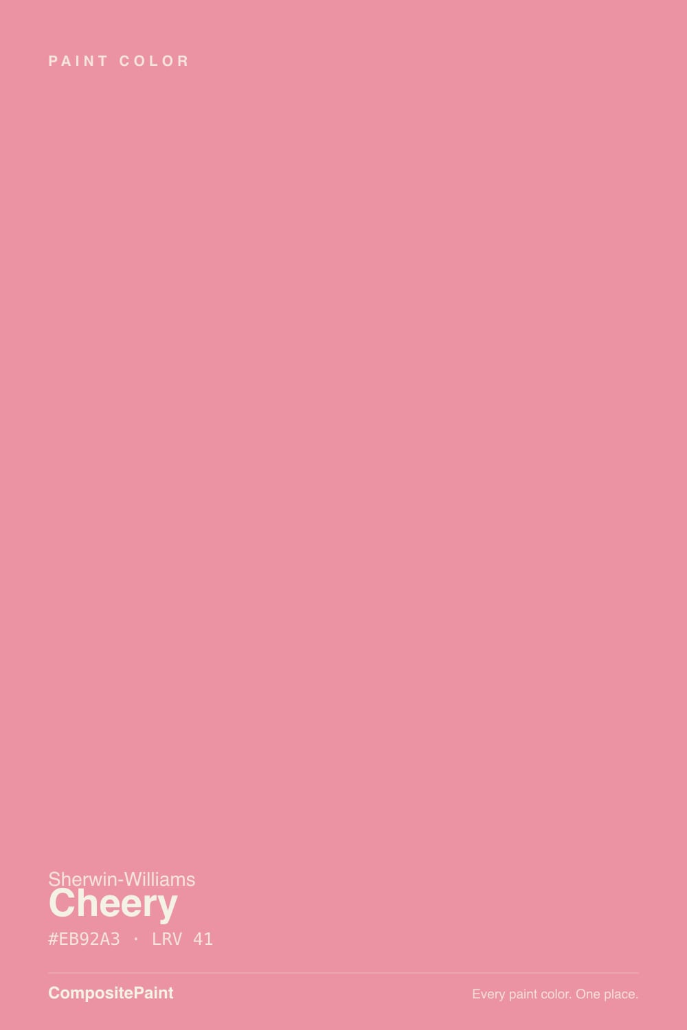
A clean, bright rosy pink — bubblegum is the fair description, and Sherwin-Williams uses it themselves. On the color wheel it sits a hair to the cool side of true red, so it lands as an honest pink rather than a coral or a salmon, and there is no gray and no brown mixed into it. That matters because most of the pinks people end up buying are muted: dusty rose, blush, greige-with-a-pink-tell. Cheery is not one of those. It is the pink a kid picks from the fan deck when nobody is steering them, and Sherwin-Williams files it in the red family, which tells you how much color is actually in the can.
At LRV 41 it is a mid-tone, and this is where buyers get surprised. LRV measures how much light a color bounces, not how much color it carries. A greige at LRV 41 gives you a quiet room; Cheery at LRV 41 gives you a room that hums, because the saturation is doing work the number never mentions. Sherwin-Williams' own styling advice for it leans toward furniture, doors and accent moments rather than four full walls — that is a fair reading of the color, not a dodge. Plan for the wall to read noticeably stronger and warmer than the chip in your hand.
Undertone in one line: clean rosy pink with the faintest blue-red lean — never orange, never brown, never gray. If your sample looks coral, that is west sun or a warm bulb pushing it; if it looks chalky and cold, that is a 4000K LED. Both are the same paint being honest about your light.
Where It Shines
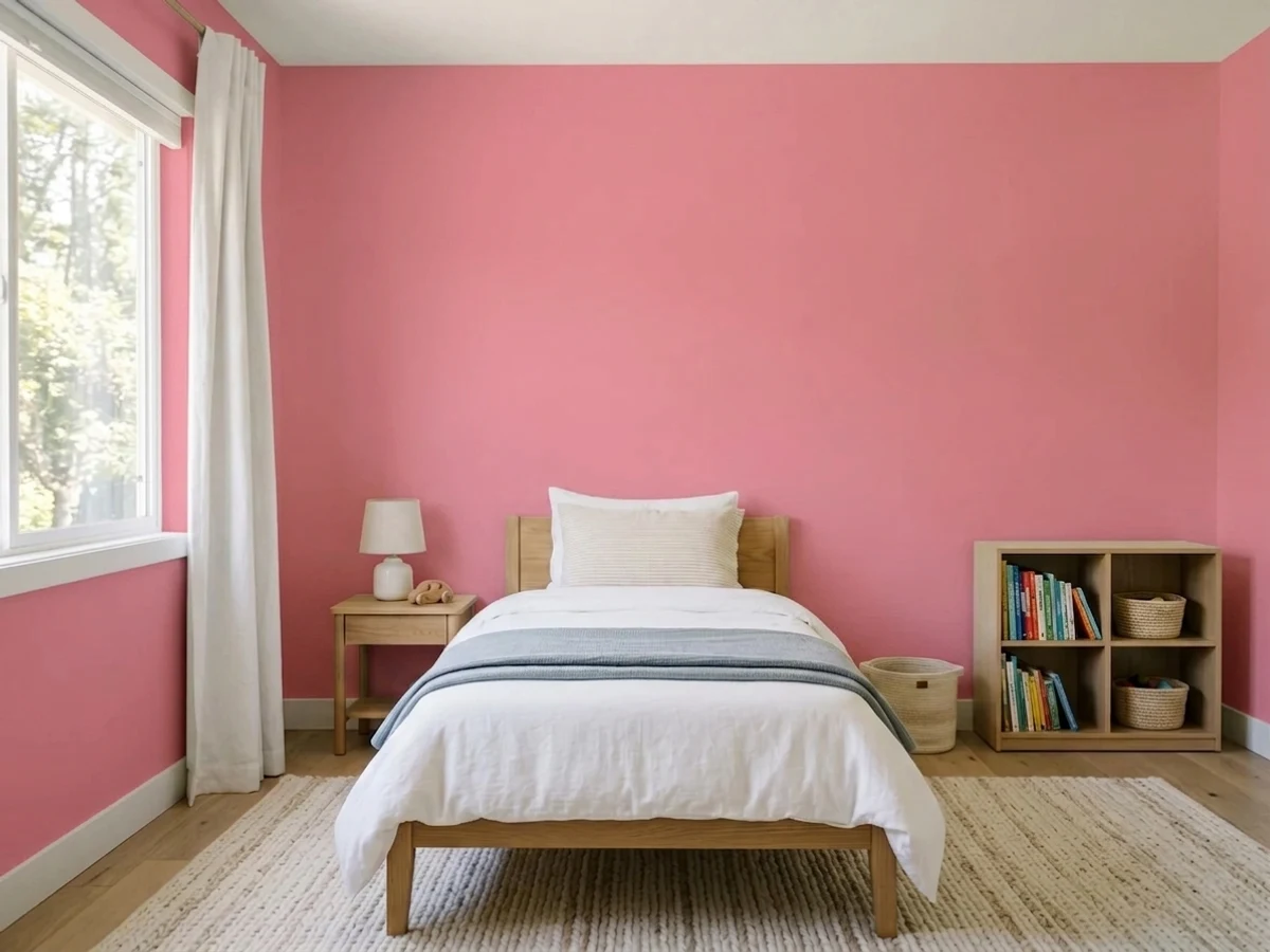
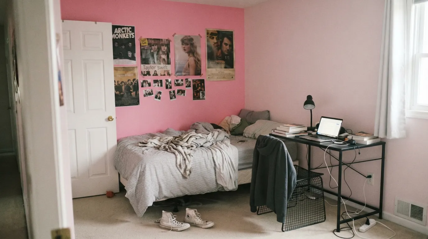
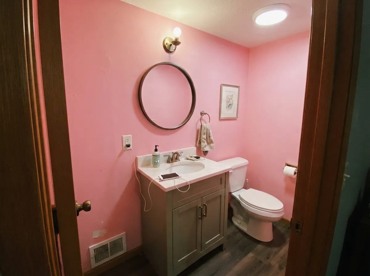
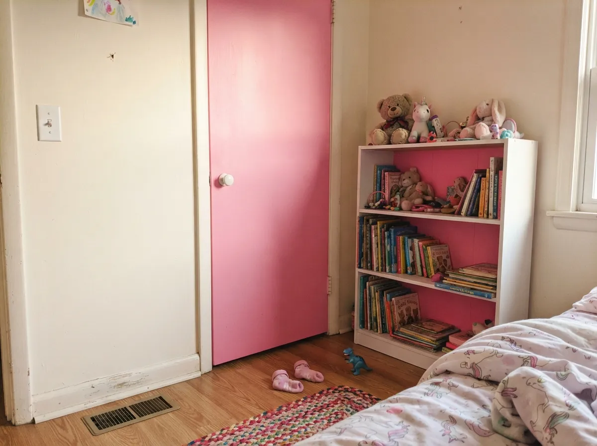
This color is at its best when the room is small enough to take a joke. Powder rooms, laundry rooms, the inside of a closet or a dressing room, the back of a built-in bookcase, an interior door painted while the walls stay white — every one of those is a place where a bright pink reads confident instead of overwhelming, and where the whole job is one gallon and one afternoon. Its other real home is a kid's or teen's room on a single wall, behind the bed, with a near-black desk and white trim doing the grown-up work. Give it a warm white, pale wood, brass and one sage-green note and it stops looking like a candy aisle and starts looking deliberate.
Where It Fails
The complaints about a color like this are boringly predictable, and every one of them is decided before you open the can. None of them are the paint's fault. But if your plan matches one of the three below, you will be repainting.
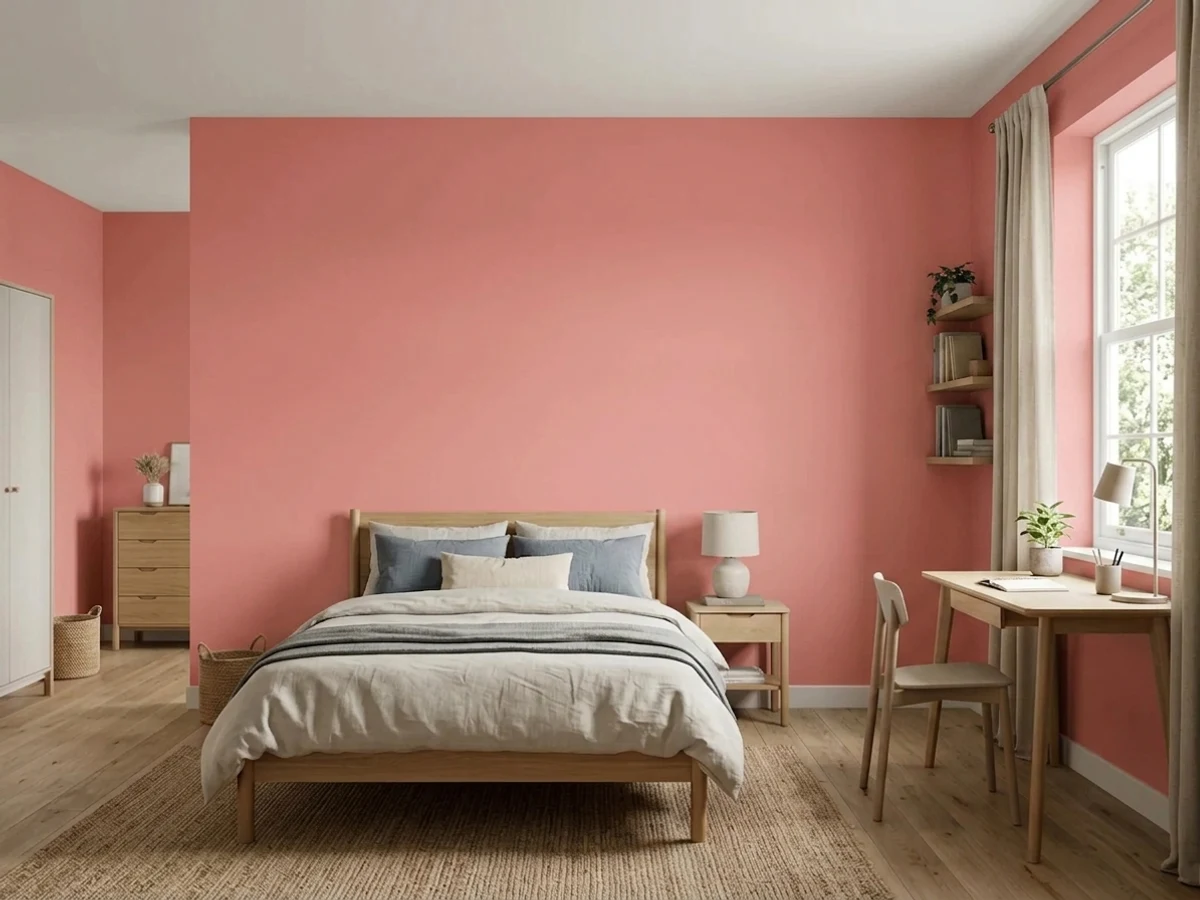
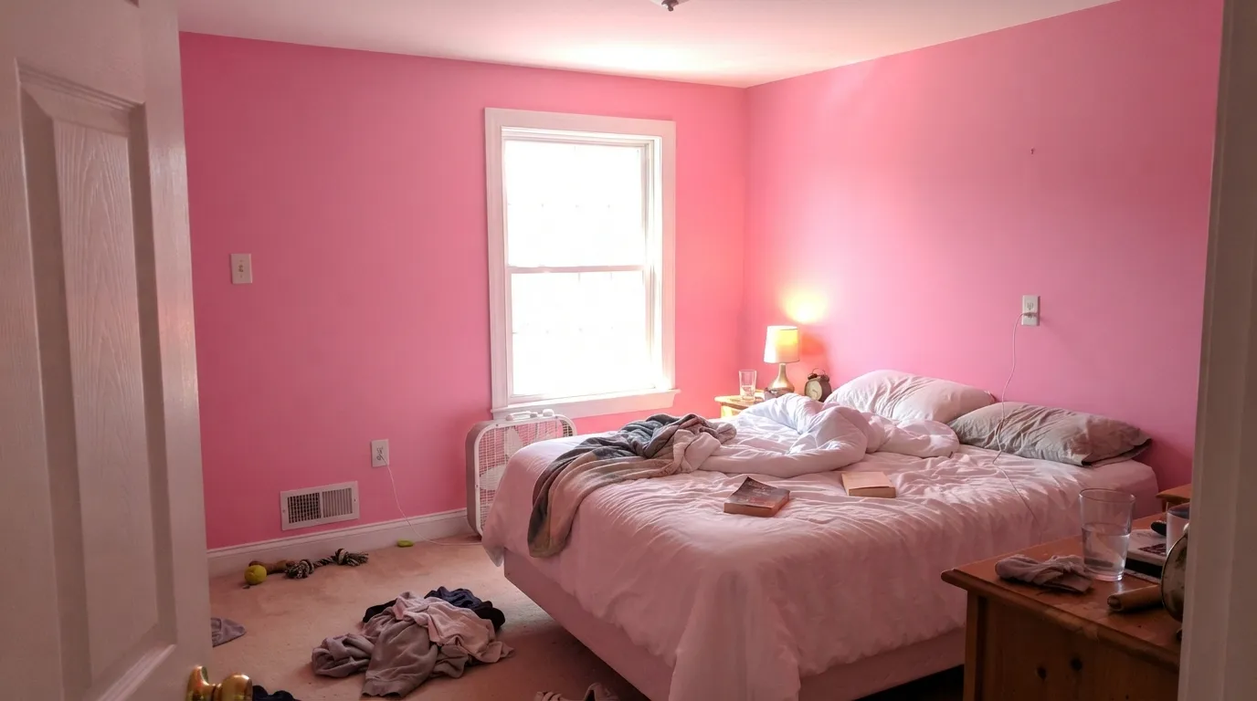
A saturated pink at LRV 41 does not just cover the walls, it fills the room: the color bounces onto the ceiling, tints white trim, and puts a pink cast on bedding, faces and every photo taken in there. In a small windowless powder room that is the whole charm. In a normal bedroom with real daylight it becomes exhausting by week two. One wall, or a small room — that is the honest brief.
The red and magenta pigments that make this color are semi-transparent by nature, so a bright pink rolled straight over white drywall goes on streaky and patchy and stays that way. Ask for it in the deep base and start with a gray-tinted primer — that one step is the difference between three coats and five. Budget for the extra gallon before you fall in love with the chip.
This is the complaint designers hear most about high-chroma walls: once the pink is up, the rug, the bedding, the curtains and the art all have to agree with it, and half of what you already own suddenly clashes. In a teen's room add the other clock — tastes move faster than paint. If you cannot say yes to repainting in three years, keep the pink to one wall, a door, or something you can change cheaply.
Room by Room
Behind the bed, with the other three walls in a soft warm white and a near-black desk and shelf, this is the color doing exactly what it should: loud where you look, calm everywhere else. Eggshell on the pink wall, or matte if the drywall has seen some abuse. Skip the matching pink ceiling — the bounce already handles that.
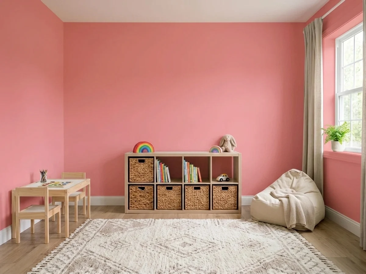
Playrooms are the one place where a full room of it can work, because nobody is trying to relax in there and the space is usually small. A bookcase back panel, a reading nook, a half-wall under a chair rail all give you the color without the whole box. Scrubbable eggshell, and keep a labeled quart for the crayon repairs.
The classic small-room bet, and Sherwin-Williams suggests it themselves. Four walls of Cheery in a windowless powder room with a warm white ceiling, brass fixtures and a dark mirror frame reads confident and expensive, and the pink light it throws is genuinely kind in the mirror. Satin on the vanity if you paint that too.
This is stronger than a nursery wants. It is fine for a few years and then it is a very pink room a seven-year-old has opinions about. Pink Bliss (LRV 82) or First Light (LRV 76) give the same warmth at a fraction of the volume and never need repainting; save Cheery for the closet door or a stripe.
Small, enclosed, low-stakes: the best places to be brave. A laundry room in full Cheery makes an unloved room fun for the price of one gallon, and a pink interior door or closet interior behind white walls is the cheapest bit of personality in the house. Satin on doors so it wipes clean.
Open main floors are the wrong shape for it: the color has to negotiate with every adjoining room and it will not lose quietly. Kitchens the same — pink cabinets are a very specific taste and a very specific resale conversation. Outside, saturated organic reds and pinks are the pigments that fade fastest in full sun, so if you must, keep it to a shaded front door and expect to refresh it sooner than a neutral.
Your Light Is the Risk
Cool, even daylight takes the heat out of it and leaves a clean, calm rosy pink. The one light where a full room of this reads gentle rather than loud.
A south window at midday or a hot west beam pushes it toward neon and throws pink light across the ceiling and trim. Bright rooms want this on one wall only.
Freshest in cool morning light, warmer and more coral through the afternoon, then dropping to a soft dusty rose after sunset. Sample it at 8am and again at 6pm.
2700K warm bulbs turn it slightly salmon and cozy; 4000K cool LEDs make it colder, flatter and more chalky bubblegum. Stay at 2700–3000K unless you want the sharper version.
Most complaints about Cheery are a light mismatch. Upload a photo of your actual room and see it on your walls — then ask for the same wall in north light or evening lamps before you buy a single sample.
Need It From Another Brand?
Any paint counter can custom-tint Sherwin-Williams SW 6584 directly. If you would rather stay in one brand's own deck, these are the closest stock matches, measured as ΔE2000. Under 2 is a difference you will not see on the wall.
| Brand | Closest color | ΔE | LRV | |
|---|---|---|---|---|
| Behr | All Dressed UpP160-3 · Behr | 4.3 | 42 | Color page → |
| Benjamin Moore | Pretty in Pink1334 · Benjamin Moore | 2.9 | 42 | Color page → |
| Valspar | Petal Power8001-8D · Valspar | 1.8 | 43 | Color page → |
| PPG / Glidden | Pink PunchPPG1184-4 · PPG / Glidden | 2.2 | 42 | Color page → |
| Glidden | Pink PunchPPG1184-4 · Glidden | 2.0 | 42 | Color page → |
| Dutch Boy | Berrylicious102-4DB · Dutch Boy | 1.4 | 40 | Color page → |
Similar Sherwin-Williams Colors
The nearest shades to Cheery within Sherwin-Williams's own range, ranked by perceptual color distance — useful when you want the same look a touch lighter, darker, or warmer.
WCAG 2.1: AA is 4.5 : 1 for normal text, 3 : 1 for large text, AAA is 7 : 1.
Cheery vs the Colors You're Also Considering
Every Cheery sample board has the same rivals on it. The numbers show the real lightness gap — then it comes down to which risk you would rather live with.
Pick this when you want the brighter, fresher pink that still bounces light around a small room.
Sherwin-Williams SW 6585 · LRV 30Coming up RosesPick this for the deeper, slightly dustier version — at LRV 30 it has more weight and reads a little more grown-up on four walls.
Pick this for the version a kid can actually sleep in; Razzle Dazzle at LRV 20 is a jewel tone, not a bedroom color.
Benjamin Moore 1348 · LRV 20Razzle DazzlePick this if Cheery is not loud enough — this is a deep magenta-rose for a powder room you want people to talk about.
Cheery Coordinating Colors
The rule for coordinating with a bright pink is that everything else stays quiet or goes opposite. Warm whites keep the edges soft, a muted sage supplies the complement that stops it reading candy-aisle, a near-black gives the scheme an adult spine, and a paler pink lets you use the color across a whole room without a whole room of it. These are the partners that keep working:
Why the Chip Lies: LRV 41 With This Much Color In It
LRV is the number people reach for when they want to know how a color will feel, and on neutrals it works: a greige at LRV 41 is a mid-tone room, calm and easy. Cheery is also LRV 41, and the room it produces is nothing like that. The reason is that light reflectance only describes brightness — it says nothing about saturation, and saturation is what makes a room feel loud. Two colors can bounce identical amounts of light and still deliver completely different rooms.
The practical consequence is bounce. A high-chroma wall does not just sit there; it reflects its own color onto every surface facing it. On four walls of Cheery, the ceiling picks up a pink cast, white trim warms, bedding shifts, and everyone in the room is lit slightly pink. In a powder room that is the effect you are paying for — it is why the color is genuinely flattering in a mirror. In a bedroom with a big window it is the thing people describe as overwhelming, and it is not something more coats or a different sheen can fix.
So test it the way the color actually behaves. A 12-inch peel-and-stick sample tells you the hue; it does not tell you what the room will feel like. Paint two large boards, stand them in a corner facing each other, and look at the light between them — that is the closest preview of a full pink room you can get before committing.
Painting Cheery — Primer, Coats, and Undoing It Later
This is the part nobody mentions until the second coat looks patchy. The pigments that make a bright pink are red and magenta organics, and they are semi-transparent by nature — light passes through the paint film and bounces off whatever is underneath, which is why a bright pink rolled straight over white drywall reads streaky and thin. The fix is standard trade practice: have the store mix it in a deep base, and put down a gray-tinted primer first. Gray kills the show-through from below and lets the color reach full depth in fewer finish coats. Skip that step and you can be on coat four still seeing roller lines.
Sheen is a small decision here but not a free one. Eggshell is right for most walls; matte hides bad drywall and softens the intensity slightly, which is a real argument for it on a big accent wall. Satin belongs on doors, vanities and built-ins where hands go. What you should not do is put this color on the trim — pink trim against pink walls removes the one place the eye gets to rest.
Plan the exit while you are still at the store. The same transparency that makes pink hard to apply makes it hard to cover: a white rolled over Cheery will need a gray-tinted primer of its own plus two finish coats. Keep a labeled quart for touch-ups, and if the room belongs to a child, keep the pink on surfaces you can repaint in an afternoon — one wall, a door, a bookcase back — rather than everything at once.
Three Ready Palettes Built on Cheery
A color is never alone on the wall. These are complete combinations in the 60-30-10 pattern, with the reason each one holds together. Every one opens in the visualizer.
Tonal pink is what keeps the room from reading like one loud box: Pink Bliss carries the warmth quietly on three walls so the Cheery wall behind the bed can be the only thing shouting. Iron Ore on the desk and window frames is the part people skip and the part that makes it look designed rather than juvenile — a near-black note tells the eye the pink was a choice.
Try this palette in your roomGreen sits opposite pink on the wheel, so a muted sage is the contrast this color was built for — and Evergreen Fog at LRV 30 is dark enough to anchor the little room without turning it into a Christmas scheme. Greek Villa keeps the ceiling warm so the pink bounce reads glow instead of stain; brass fixtures and a dark mirror frame finish it.
Try this palette in your roomThe shared-room solve: two playful colors that are honest about being playful, kept apart by a soft warm white so neither has to win. Painting the color onto the bookcase back and the closet door instead of the walls means the whole scheme changes later for the price of a quart.
Try this palette in your roomCheery FAQ
Is Cheery too bright for a bedroom?
For all four walls of an average bedroom, usually yes — at LRV 41 with this much saturation the color fills the room and tints the ceiling and bedding. On one wall behind the bed, with the rest in a soft warm white, it is genuinely good. If you want a full pink bedroom, drop to something much lighter like Romance (LRV 66) and use Cheery on the closet door.
What white goes with Cheery?
A soft warm white, not a bright one. Alabaster (LRV 82) or Greek Villa (LRV 84) sit comfortably beside it because they share its warmth; a stark blue-leaning white makes the pink look sharper and more artificial where the two meet. Trim in semi-gloss, and keep the ceiling white rather than pink so the room has somewhere to rest.
How many coats does Cheery take?
Plan on three, and start with a gray-tinted primer. Bright pinks are built on red and magenta pigments that are semi-transparent, so rolled straight over white drywall the first two coats look streaky and uneven. Buy it in the deep base rather than a neutral one, and do not judge the color until the last coat is dry.
Is Cheery a good nursery color?
It is stronger than most nurseries want. It photographs beautifully for the first year and then it is a very pink room that a school-age child may not have chosen. Pink Bliss (LRV 82) or First Light (LRV 76) give the same soft warmth and never date; use Cheery for a door, a crib wall or the inside of the closet instead.
What color goes with Cheery besides white?
Green — that is the complement, and it is the pairing that makes the pink look intentional. A muted sage such as Evergreen Fog (LRV 30) on a vanity or Clary Sage (LRV 41) on adjoining walls both work; Clary Sage sits at exactly the same LRV, so the two read as equal partners rather than one dominating. Add a near-black like Iron Ore for furniture and brass for hardware.
Will Cheery look dated in a few years?
Bright bubblegum pink is not a neutral and never pretends to be, so treat it as a color you will repaint rather than one you will live with for twenty years. The good news is that this is a cheap risk when you keep it where it belongs — a powder room, a laundry room, one wall, a door. It is only an expensive mistake when it goes on a whole floor.
Have you painted with Cheery?
Rate it — one tap helps the next reader decide.
Ask a Question