Coming up Roses
The full-strength rose Sherwin-Williams files under red, reviewed honestly: the rooms it makes, the ceiling it tints pink, and how many coats it really takes.

Jessica has spec'd whites and neutrals for more than 300 rooms and keeps a sample wall of painted drawdowns in her studio. Every color review is checked against real reader rooms in the comments and re-tested when a formula changes. About the testing process →
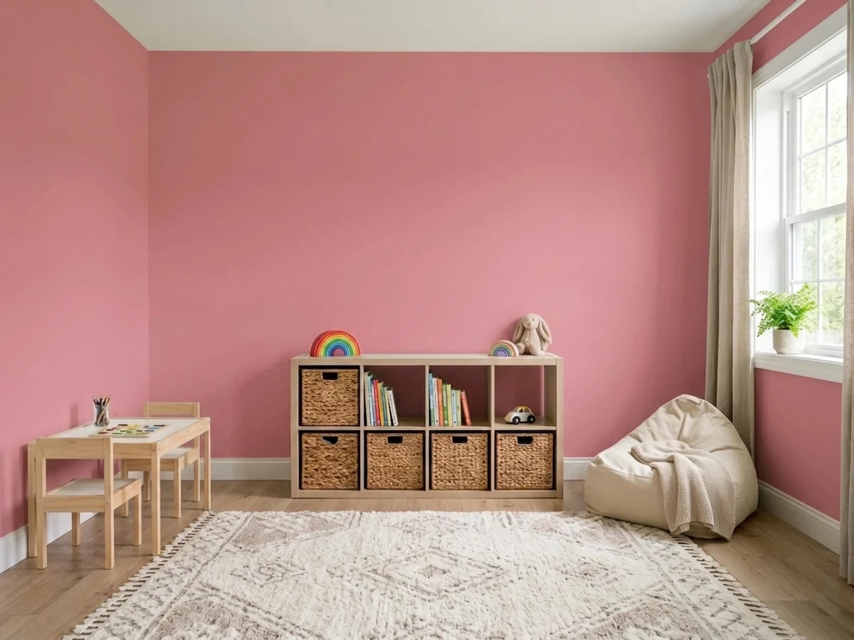
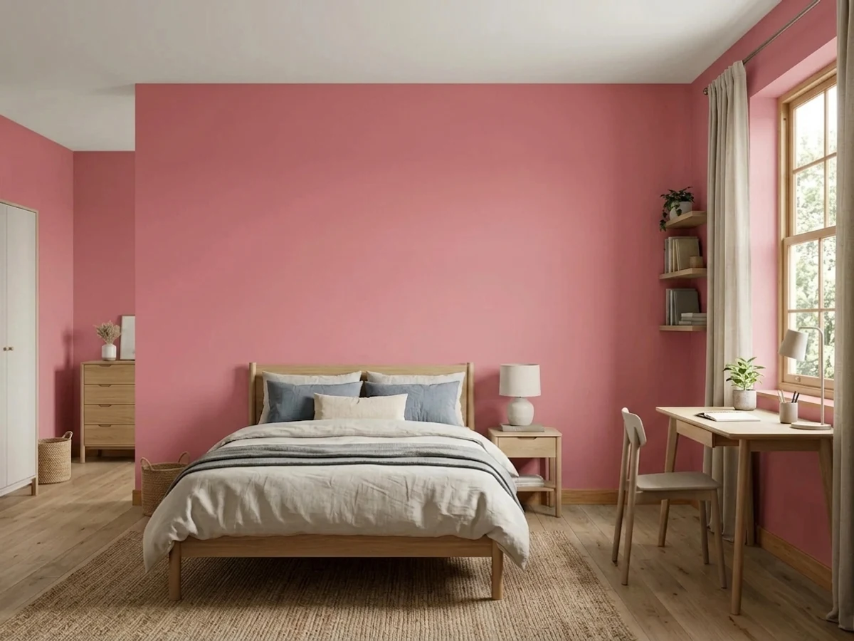
- 1Berry Bush14
- 2Razzle Dazzle20
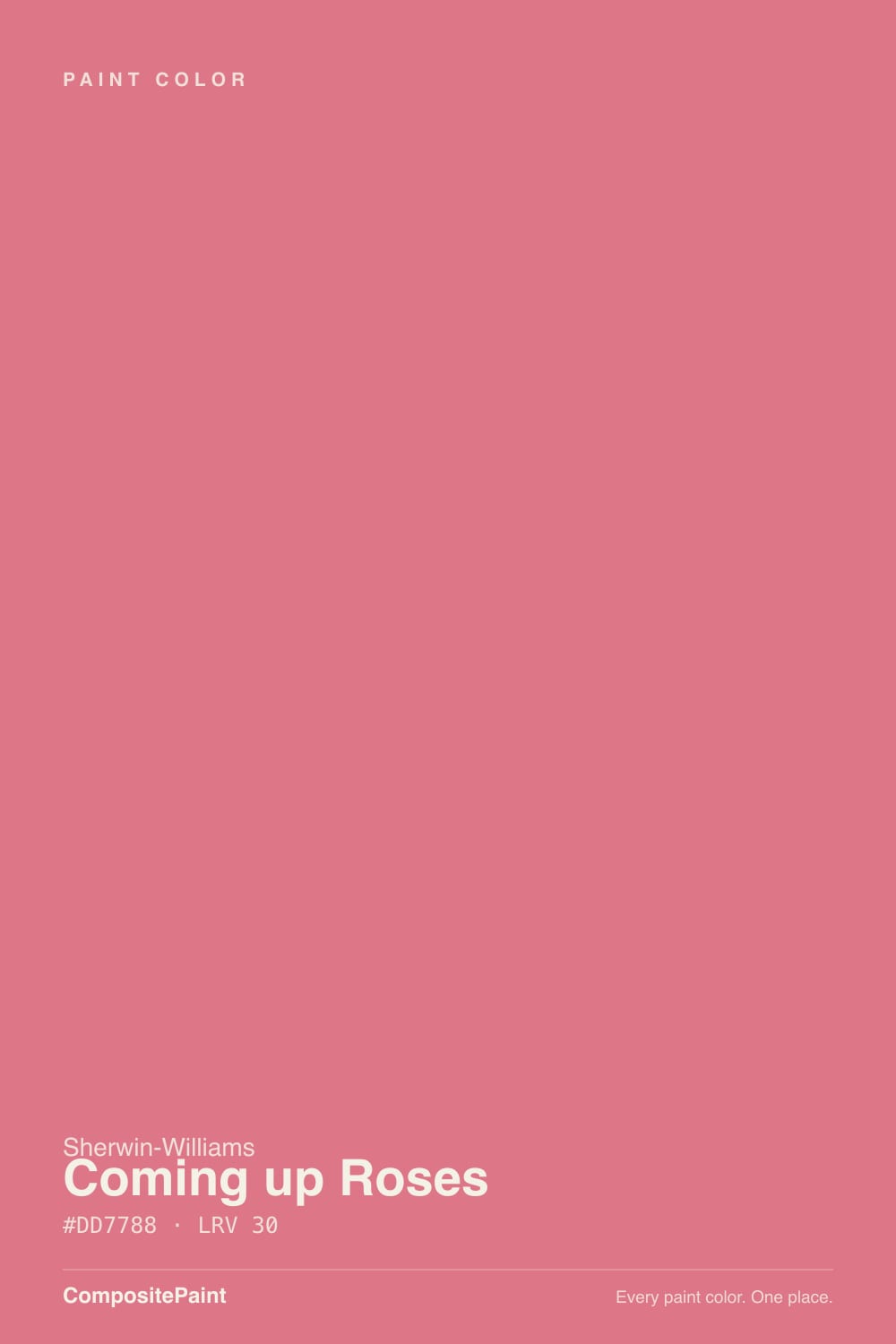
- 3Coming up Roses30
- 4Vintage Tea Rose47
- 5Abalone Shell60
The Fast Verdict
Coming up Roses is a real, saturated rose-pink at mid depth — the pink you pick when blush has already bored you. Sherwin-Williams files it in the red family, not the pinks, and that is the honest read: there is enough red in it to stay warm and coral under lamps instead of going cold bubblegum. It is superb on one wall, a powder room, a door or a painted dresser. On four walls of a big adult room it stops being a color and becomes a decision everyone in the house has to live with.
Teen bedrooms and kids' rooms · one bold wall behind a bed or desk · powder rooms and laundry rooms drenched on purpose · doors, dressers and built-ins that need a jolt
You wanted a soft blush · you have honey oak floors or orange brick nearby · the room runs on cool 4000K LEDs · you repaint rarely, or you may sell soon
- A real pink at real depth — it never washes out to nothing
- Warm red base keeps it rosy and coral, never cold bubblegum
- Its maker's own teen-room pick, and it earns the listing
- Powder rooms, doors and furniture look designed for a quart of paint
- Genuinely flattering under warm lamps — rose light is kind to faces
- Too saturated for four walls in most adult rooms
- Throws a pink cast onto ceilings, trim and everything nearby
- Transparent pigment: gray primer and often a third coat
- Expensive to undo — repainting over it means priming again
What Color Is Coming up Roses, Really?
A saturated, warm-leaning rose — pink with real red in it, which is why Sherwin-Williams catalogs SW 6585 under red paint colors rather than under its pinks. That filing is the most useful thing on the chip. Colors on the blue side of pink go cold and chalky on a wall; this one has enough red to hold a warm, slightly coral character in lamplight, so it reads like a rose petal rather than like bubblegum. It sits one step deeper than Cheery (SW 6584) on the same strip, and it is one of the colors Sherwin-Williams itself puts in front of people shopping for a teen bedroom.
At LRV 30 it is a genuine mid-tone, not a tint — the same light reflectance as Evergreen Fog, a color nobody calls pale. That matters more than usual here, because saturation compounds with area. A 2-inch chip looks cheerful; a 12-foot wall of it looks loud, and four walls of it look like a decision. Every reader photo of this color shows the same thing: on the wall it is a full step stronger and a shade more coral than the fan deck promised.
Undertone in one line: warm red-coral pink — never mauve, never lilac, never dusty. If your sample looks coral, that is west sun or warm bulbs doing it. If it looks cool and candy-bright, that is north light or a 4000K bulb. Both are the same paint being honest about the room.
Where It Shines
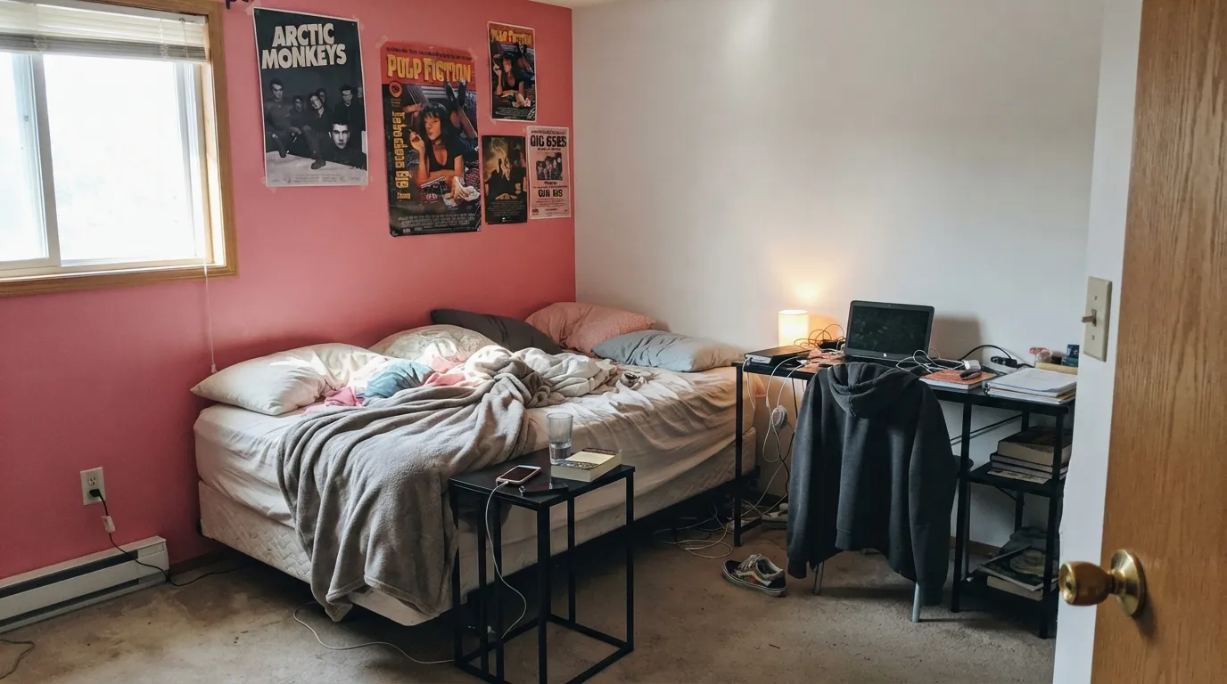
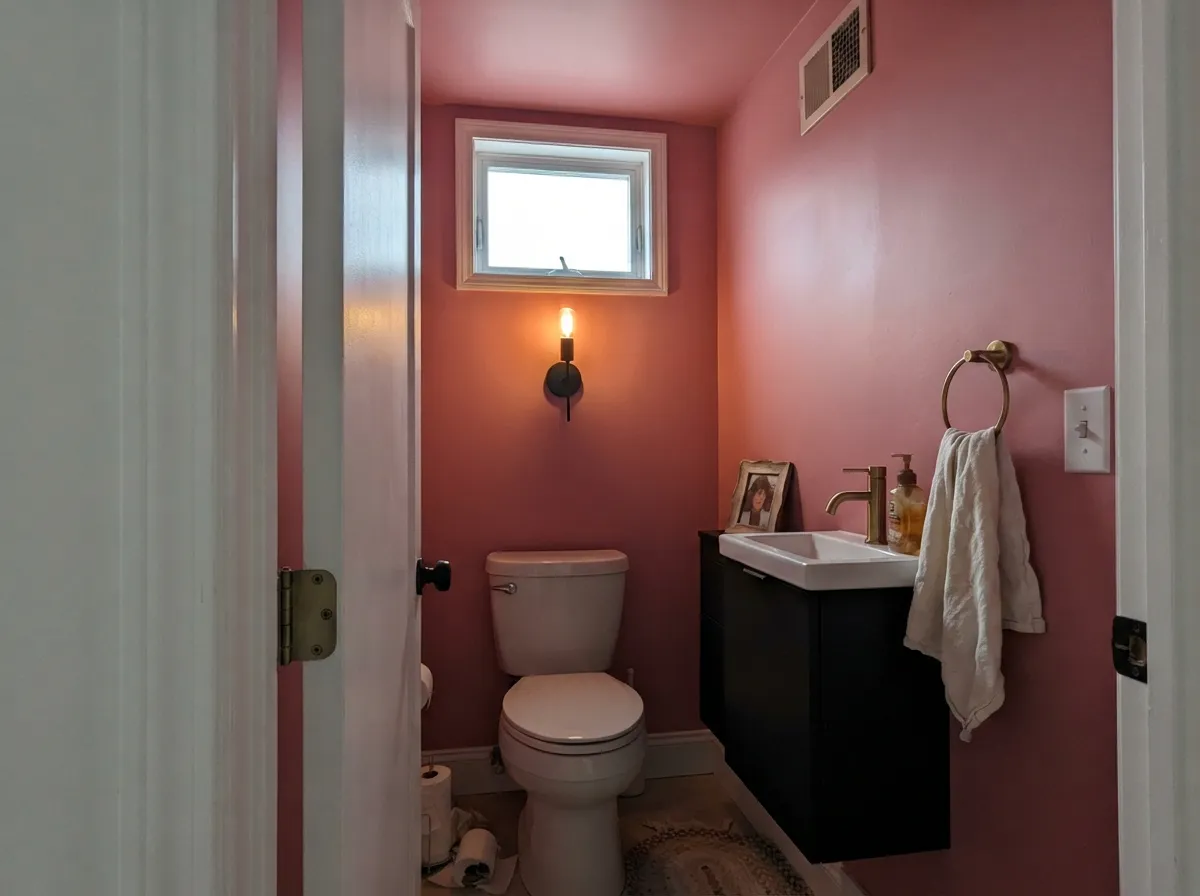
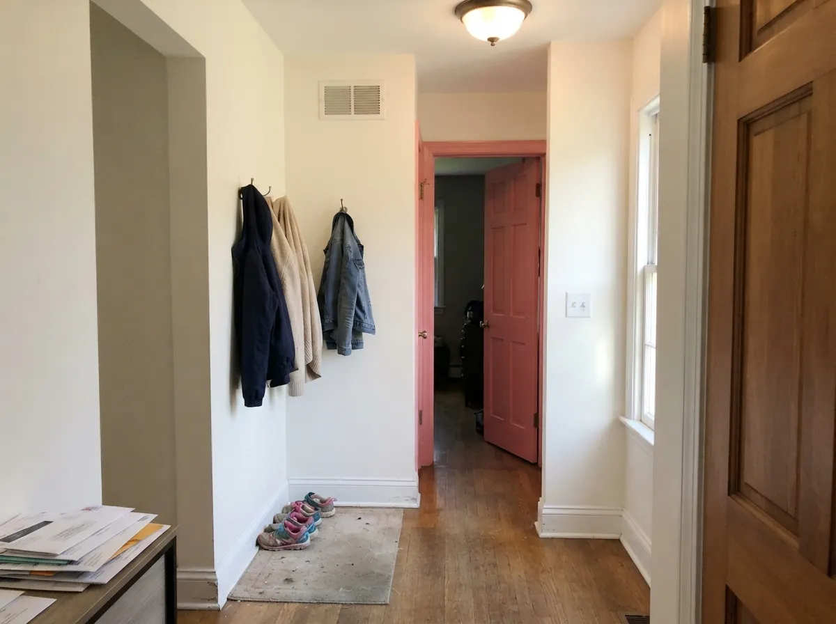
This color is built for rooms that are allowed to be loud. Its best home is a teen or kid's bedroom, where the whole point is a room that looks nothing like the rest of the house — and Sherwin-Williams' own teen-room picks agree. Its second home is the small commitment: a powder room drenched to the ceiling, a laundry room nobody expected to be cheerful, a door or a dresser painted in satin against soft white walls. Give it crisp white trim, warm wood, black metal and warm bulbs, and it reads designed instead of girly.
Where It Fails
Nearly every regret story about a saturated pink follows one of three scripts, and all three are predictable before the first coat. None of them are the paint's fault — but if your room matches one, sampling bigger will only confirm it.
This is the number-one mismatch. Coming up Roses is not a whisper of pink; at LRV 30 it is a mid-tone color that announces itself from the doorway, and rolled out over a whole room it gains strength the chip never showed. If what you actually pictured was barely-there pink, look at SW Romance or BM First Light and keep this one for a single wall.
Saturated warm colors reflect their own light. On four walls, this one throws a rose cast onto a white ceiling, onto white trim, onto the carpet and onto faces — people repaint the ceiling before they figure out the walls were doing it. In a small room that glow is the charm; in a bright open room with big white planes it just looks like the trim was painted wrong.
Clean, bright pinks are built on transparent red and magenta pigments with weak hide — this is the same family of colors painters warn you about, not a mistake you made. Plan on a gray-tinted primer plus two finish coats, three over anything white or patched. Budget the same way going back: painting over this later takes primer and a full day, not a coat of white.
Room by Room
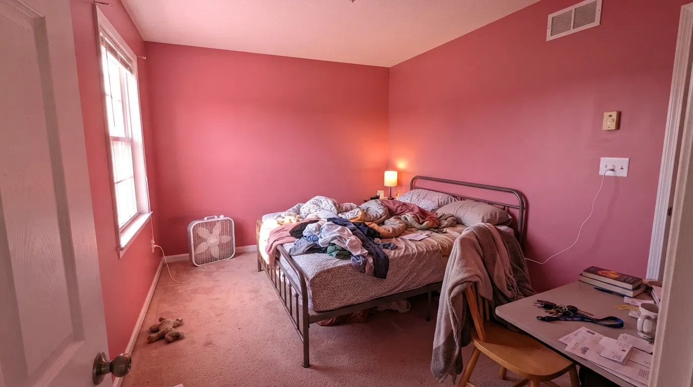
The room where full-strength rose is the right answer. Sherwin-Williams puts it in its own teen-room lineup, and it does the job: bold enough to feel like the room belongs to the person living there, warm enough to stay flattering at night. Eggshell, not flat — teen walls take a beating and saturated flat paint burnishes shiny where a backpack rubs it.
Great on one wall, a closet interior, a bunk-bed wall or painted shelving; a lot for four walls in a room that already has bright toys, bright bedding and a bright rug. If the room is small and north-facing, one wall plus white everywhere else keeps it cheerful instead of cave-like.
Small rooms are where bold color is cheapest to be wrong about, and this one goes jewel-box fast: all four walls plus the ceiling, satin on the vanity, black or brass hardware, one big mirror. In a laundry room it does the same trick for the price of a quart. This is the highest reward-to-risk use of the color.
Sherwin-Williams' own designer channel has shown it on doors against Alabaster walls, and that is the move for adults who like the color but not the commitment: soft white walls, rose doors in satin. A painted dresser, a bookcase back or an inside-the-closet surprise gets you the same lift for a quart and an afternoon.
A saturated warm pink is stimulating, and both rooms are asking for the opposite. It is also the color adjacent rooms have to negotiate with, so in an open plan it drags every neighboring wall into the conversation. If you want rose in a grown-up bedroom, go muted — Redend Point at LRV 27 gives you the same warmth with the volume turned down.
It is rated for exterior use and a rose front door on a white or pale-gray house looks deliberate and charming. The caution is real, though: saturated reds and pinks are the pigments most likely to fade on a full-sun southern or western elevation. Shaded entries hold much better, and any exterior use wants a fresh coat sooner than a neutral would.
Your Light Is the Risk
Full daylight is where it reads cleanest — a clear, lively rose with no mud in it. Bright rooms also absorb the intensity better than dim ones. Sample here first.
Cool, weak light drains the warmth and the depth takes over: the rose goes chalky and slightly cold, and LRV 30 starts to feel heavy in a room with nothing to reflect.
Morning east light keeps it sharp and clear; late west sun pushes it toward coral and floods the room with pink bounce for an hour. Look at it at 6pm before you commit.
2700K bulbs bring the coral forward and make the room glow — this is its best evening. Cool 4000K LEDs strip the warmth and push it toward a flat, candy-bright pink.
Most complaints about Coming up Roses are a light mismatch. Upload a photo of your actual room and see it on your walls — then ask for the same wall in north light or evening lamps before you buy a single sample.
Need It From Another Brand?
Any paint counter can custom-tint Sherwin-Williams SW 6585 directly. If you would rather stay in one brand's own deck, these are the closest stock matches, measured as ΔE2000. Under 2 is a difference you will not see on the wall.
| Brand | Closest color | ΔE | LRV | |
|---|---|---|---|---|
| Behr | Hot GossipP150-4 · Behr | 1.7 | 32 | Color page → |
| Benjamin Moore | Secret Rendezvous1341 · Benjamin Moore | 2.0 | 29 | Color page → |
| Valspar | Reflecting Rose1007-3B · Valspar | 2.2 | 29.9 | Color page → |
| PPG / Glidden | RazzberriesPPG1183-5 · PPG / Glidden | 3.4 | 29 | Color page → |
| Glidden | Cheery Cherry90RR 31/403 · Glidden | 2.7 | 31 | Color page → |
| Dutch Boy | Watermelon Core103-5DB · Dutch Boy | 2.6 | 29 | Color page → |
Similar Sherwin-Williams Colors
The nearest shades to Coming up Roses within Sherwin-Williams's own range, ranked by perceptual color distance — useful when you want the same look a touch lighter, darker, or warmer.
WCAG 2.1: AA is 4.5 : 1 for normal text, 3 : 1 for large text, AAA is 7 : 1.
Coming up Roses vs the Colors You're Also Considering
Every Coming up Roses sample board has the same rivals on it. The numbers show the real lightness gap — then it comes down to which risk you would rather live with.
Pick this when you want the color to hold its own against white trim and bright bedding instead of going sweet.
Sherwin-Williams SW 6584 · LRV 41CheeryPick this for the same pink one step lighter — LRV 41 keeps a small or dim room from closing in.
Pick this when the room is supposed to be loud and a muted clay-pink would read like a compromise.
Sherwin-Williams SW 9081 · LRV 27Redend PointPick this for a grown-up bedroom or living room — nearly the same depth, with the saturation muted down into clay.
Coming up Roses Coordinating Colors
The rule for coordinating with a saturated rose: give it soft whites, one near-black, and nothing else trying to be loud. It wants a quiet room around it, not a second opinion. These are the partners that keep showing up in rooms that work:
The Pink Sherwin-Williams Files Under Red
Look up SW 6585 on Sherwin-Williams' own site and it appears under red paint colors, alongside brick reds and barn reds, not with the blush pinks. That is not a filing error — it tells you which half of the pink family this is. Pinks built on the blue side turn cool and chalky as the light drops; this one has enough red in it to keep a warm, faintly coral character under lamps, which is exactly why it survives evening light better than most bright pinks and why it looks flattering on skin in a small room.
It is also a color the brand markets rather than hides. Sherwin-Williams lists it among the colors it puts in front of people shopping for a teen bedroom, and its designer channel has shown it on doors against Alabaster walls — a much more adult use than the name suggests. Between those two, you have the color's honest range: a room for someone who wants a room, or a dose of nerve in a house that is otherwise white.
One trend note, told straight. Pale millennial pink is being declared finished heading into 2026, while saturated joy-colors keep their own audience — IKEA named a bold pink its 2026 color of the year. That does not make this a safe long-term neutral. It makes it a color worth using where repainting is cheap and expected: a kid's room, a powder room, a door, a piece of furniture.
Coming up Roses With Wood Tones, Floors and Fabrics
The floor decides more than the paint chip does. Pale white oak, natural maple and light LVP are the easiest company — they stay out of the way and let the wall be the event. Walnut and espresso work too, in the opposite way: dark warm wood gives the rose something serious to lean on, which is what keeps a painted dresser or a bookcase from reading like a doll's house.
The genuine clash is orange. Honey oak floors, orange-stained trim, red brick and terracotta tile all sit close enough to this color's red base to fight it — the two warm tones argue over which is redder, and the wall usually loses and looks synthetic. Golden builder-beige carpet does the same thing more quietly. If the orange floor is staying, put a large light rug between it and the wall, or keep this color off the walls entirely and use it on a door instead.
For fabrics and metals: white, cream and true black bedding all work; try to avoid mid-tone warm beige, which turns muddy against it. Brass and black metal both look right; polished chrome and cool nickel read slightly clinical next to that much warmth.
Three Ready Palettes Built on Coming up Roses
A color is never alone on the wall. These are complete combinations in the 60-30-10 pattern, with the reason each one holds together. Every one opens in the visualizer.
The near-black is what keeps this out of nursery territory: rose reads graphic next to Iron Ore and merely sweet next to more pink. Alabaster carries the other three walls so the color stays a feature, and the whole scheme survives the teenager becoming a college student.
Try this palette in your roomDrenching a small room — walls and ceiling in one color — is the only way this saturation reads intentional instead of accidental. Snowbound is a quieter, slightly grayer white than Alabaster, so the trim stays crisp without going glaring, and a black vanity gives the eye a place to rest. Brass hardware, one oversized mirror, done.
Try this palette in your roomThe doors-on-white-walls version is the adult way to own this color, and Sherwin-Williams' own designers have published exactly that pairing. Evergreen Fog is the green opposite of rose at the identical LRV 30 — put them on the same wall and they buzz, put them a room apart and the house reads deliberate and a little bit brave.
Try this palette in your roomComing up Roses FAQ
Is Coming up Roses pink or red?
Pink to look at, red underneath — Sherwin-Williams files SW 6585 in its red paint colors, not its pinks, and that red base is why it stays warm and slightly coral instead of turning cold bubblegum. On a wall almost everyone will call it rose or pink; the red only shows up in how it behaves under warm light.
Is it too bright for a bedroom?
For a teen or kid's bedroom, no — that is its best room. For a main bedroom, usually yes: at LRV 30 and this saturation it is stimulating in a room whose whole job is winding down. If you want rose in a grown-up bedroom, use it on one wall behind the headboard, or step over to a muted clay-pink like Redend Point.
How many coats does Coming up Roses need?
Plan on a gray-tinted primer plus two finish coats, and be ready for a third. Clean bright pinks are made with transparent red and magenta pigments that hide poorly on their own — this is a known property of the pigment family, not a sign of cheap paint. Skipping the primer is how people end up rolling four coats.
What white goes with Coming up Roses?
A soft white, not a blue-white. Alabaster is the natural partner for Sherwin-Williams jobs and the one SW's own designers have paired with it; Snowbound is the slightly grayer, crisper option. Avoid a stark bright white next to it — the contrast turns the pink into a poster. Semi-gloss on trim, eggshell on walls.
Will it work in a north-facing room?
It works, but it changes. Cool north light takes the warmth out and leaves a chalkier, cooler rose, and the depth reads heavier in weak light. If the room is north-facing and dim, keep the color to one wall, put warm 2700K bulbs in every fixture, and look at a large sample after dark before you buy gallons.
Is a saturated pink going to date?
Honestly, yes — faster than a neutral. Pale millennial pink is already being written off, and the current bold-pink moment is a trend cycle, not a constant. That is an argument for where you use it, not whether: a teen room gets repainted anyway, a powder room is a quart and a Saturday. Painting a whole main floor this color is the version you would regret.
Have you painted with Coming up Roses?
Rate it — one tap helps the next reader decide.
Ask a Question