Razzle Dazzle
The hot pink Benjamin Moore describes as a red, reviewed honestly: the rooms it makes, the three coats it costs, and when a softer pink is the smarter buy.

Jessica has spec'd whites and neutrals for more than 300 rooms and keeps a sample wall of painted drawdowns in her studio. Every color review is checked against real reader rooms in the comments and re-tested when a formula changes. About the testing process →

- 1Juneberry9
- 2Berry Bush14
- 3Razzle Dazzle20
- 4Retro Pink38
- 5Vintage Tea Rose47
The Fast Verdict
Razzle Dazzle is a real hot pink — saturated, slightly blue-violet, and completely uninterested in being a background. Used the way it wants to be used (one playroom wall, a set of built-in cubbies, a small powder room drenched top to bottom) it looks designed and expensive. Used across four bright walls it takes over the room, throws pink light onto everything, and costs three coats to get there. Buy it as an event, not as a wall color.
One playroom or kid's-bedroom wall, not four · powder rooms drenched floor to ceiling · built-in cubbies, closet doors and craft-room cabinets · anyone who genuinely wants the color to be the thing you notice
You wanted a soft blush or a background pink · the room is big, bright, and meant for winding down · you plan to repaint in two years and hate priming · your budget assumed two coats
- A real, unapologetic hot pink with no dusty compromise in it
- The blue-violet lean keeps it from turning bubblegum or coral
- Small rooms drenched in it read designed rather than childish
- Deep enough at LRV 20 to hold its color at night and against white trim
- A Classic Collection color, not a 2023 trend invention
- Low-hide saturated base — budget a tinted primer plus three coats
- Bounces pink light onto ceilings, trim, carpet and faces
- Too stimulating for any room meant for winding down
- Painting it out later costs a primer coat plus two more of white
What Color Is Razzle Dazzle, Really?
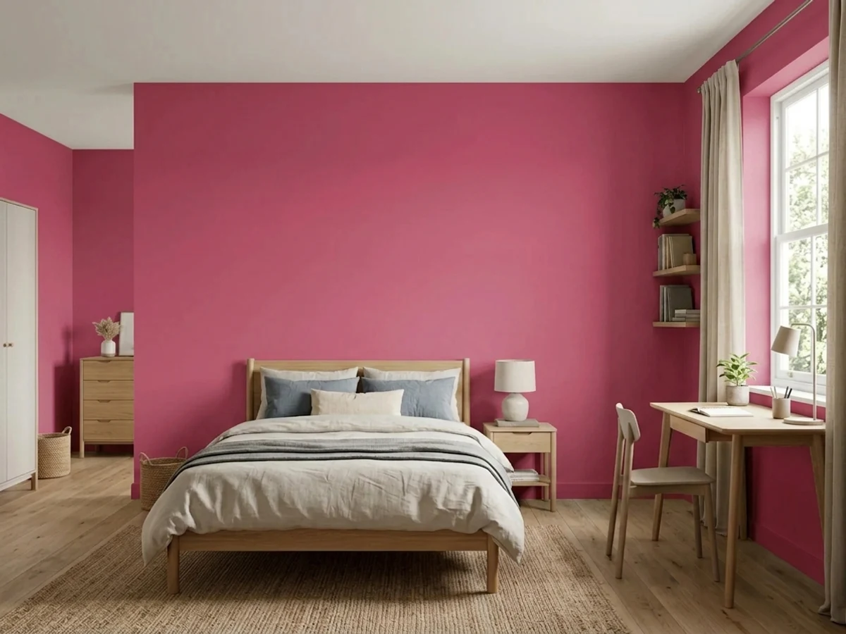
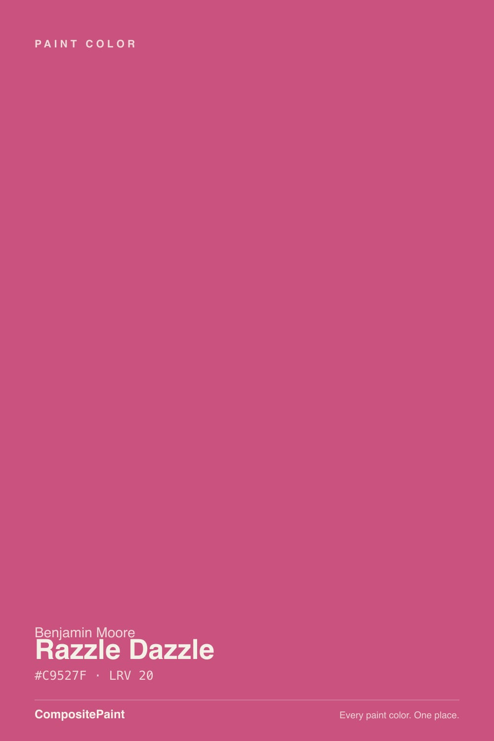
A fully saturated magenta-fuchsia with a cool, blue-violet lean. Benjamin Moore's own description reads it as a red with violet in it rather than a pink, and that is a useful warning: this is not the pastel end of the pink aisle. On a wall most people call it hot pink or fuchsia, and the blue in it is what keeps it from going bubblegum or coral. It sits in BM's Classic Collection, so it has been in the deck for decades — it is not something the Barbie summer invented.
At LRV 20 it is a deep color, roughly as dark as a mid-charcoal, which surprises people who assume bright means light. That matters twice. It means the color holds its punch at night and against white trim instead of fading out, and it means a room painted entirely in it gets noticeably darker, not brighter. Saturation also multiplies with area: the chip is charming, the sample card is fun, and four walls of it is a decision the whole household will have an opinion about.
Undertone in one line: blue-violet pink — never coral, never dusty. If your sample reads closer to raspberry-red, that is warm afternoon sun or 2700K bulbs pulling the red forward. If it reads faintly purple, that is cool dim light. Both are the same paint being honest about the room.
Where It Shines
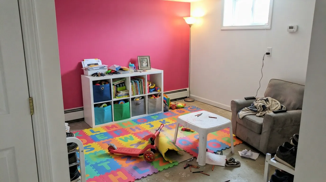
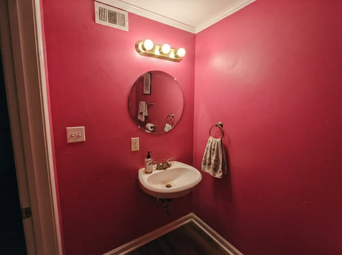
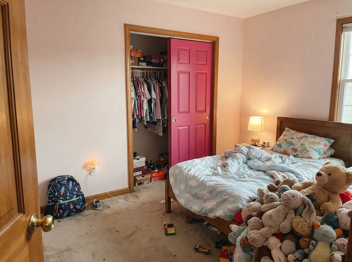
This color is built for small, deliberate commitments. A playroom wall behind the toy storage, a run of built-in cubbies, a closet door, a craft-room cabinet — places where you want energy and where the pink is bounded by white on all sides. Its other home is the tiny room nobody spends an hour in: a powder room painted floor to ceiling in Razzle Dazzle, with a white ceiling line and brass hardware, reads like a decision somebody made on purpose. Give it crisp white rather than cream, one near-black or navy note, and it stops looking like a theme and starts looking like design.
Where It Fails
The bad Razzle Dazzle stories are almost never about the paint quality. They are about three specific mismatches, and every one of them is predictable before you open the can. If your project matches one of these, sampling bigger will only confirm it.
This is the number-one mismatch. Parents shopping for a sweet pink bedroom see a cheerful chip and get a saturated LRV 20 fuchsia on the wall — pretty in a photo, loud at 7am. If what you pictured was a quiet pink room, this is the wrong end of the deck entirely: Pink Bliss or First Light give you a pink room you can live in, and you can still use Razzle Dazzle on the closet doors.
Bright saturated colors are mixed in a clear or deep base with very little of the white pigment that does the hiding, so the paint goes on translucent and streaky. Plan on a gray or pink-tinted primer plus three finish coats, and roll each coat in one session so the sheen matches. Painters trade horror stories about magenta needing five coats over white — assume three, be glad if it is two.
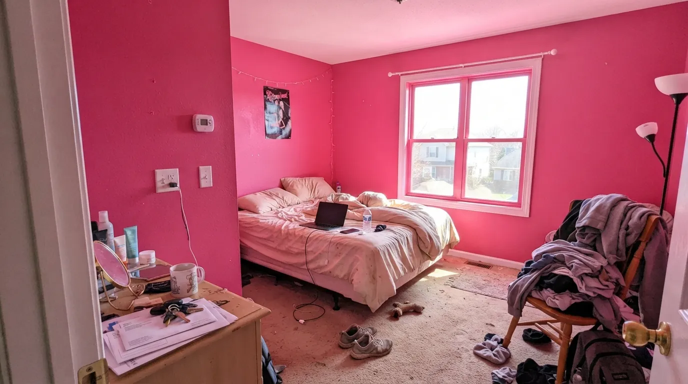
Saturated pink bounces. In a sunny room it throws a pink cast onto the ceiling, the white trim, the carpet and everyone's face, and the effect that reads playful for ten minutes reads relentless by hour three. Bright pink is genuinely stimulating, which is fine for a playroom wall and wrong for anywhere you want people to settle down. Keep it to one wall, to joinery, or to a small windowless room.
Room by Room
One wall, usually the one with the storage against it, in scrubbable eggshell. The energy is the point here, and the surrounding white keeps it from swallowing the room. Painting the cubby interiors or a low bench in it works even better: color where kids look, white where the light needs to bounce.
It absolutely can be a kid's-room color, but treat it as the headboard wall or the closet doors with pale walls around it. Four walls of it in a bedroom is too much stimulation in the room that is supposed to end the day, and a teen who loves it at eleven may not at fifteen — the one-wall version is much cheaper to undo.
This is where drenching works. A small room with no natural light and five minutes of occupancy is exactly where a saturated pink reads as confidence. Walls, and ceiling if you are brave, in satin or eggshell; crisp white trim; brass or matte black fixtures; a big mirror to give the eye somewhere to rest.
Utility rooms are the best-value place to be bold: nobody relaxes in them and everybody wants them cheerful. Cabinet fronts, a shelving wall, or the whole small room. Satin cabinet enamel over a tinted primer, same three-coat rule.
The exception is a small, formal, maximalist dining room where the color is deliberately theatrical and everything else in the room is white, black or brass. In an ordinary open-plan living room it fights every adjacent color, bounces onto the kitchen cabinets, and gives you nowhere to look.
On a white or pale-gray house, a Razzle Dazzle front door is a legitimately good idea: bounded, deliberate, and cheerful from the street. Anything larger than a door is a statement about the whole neighborhood. Use an exterior door and trim enamel and expect the color to fade faster than a muted one in full southern sun — organic pink and red pigments are the least UV-stable in any deck.
Your Light Is the Risk
Cool, steady light keeps the blue-violet edge intact, so the wall reads clean jewel-box fuchsia instead of neon. It is also the light that stops the color from getting shouty.
Direct sun turns it up rather than washing it out: the wall glows, the ceiling picks up a pink cast, and white trim beside it goes faintly pink too. One wall survives this; four do not.
Morning east light keeps it crisp and slightly cool. By late afternoon, warm west sun pulls the red forward and it moves toward raspberry — closer to the red Benjamin Moore's own description suggests. Sample at 8am and again at 6pm.
2700K bulbs warm it toward red and take a little of the shrillness off, which is the friendlier version at night. Cool 4000K LEDs keep it electric magenta and make a small room feel like a nightclub. Pick the bulb on purpose — it changes this color more than it changes a neutral.
Most complaints about Razzle Dazzle are a light mismatch. Upload a photo of your actual room and see it on your walls — then ask for the same wall in north light or evening lamps before you buy a single sample.
Need It From Another Brand?
Any paint counter can custom-tint Benjamin Moore 1348 directly. If you would rather stay in one brand's own deck, these are the closest stock matches, measured as ΔE2000. Under 2 is a difference you will not see on the wall.
| Brand | Closest color | ΔE | LRV | |
|---|---|---|---|---|
| Behr | Deep Bloom150D-5 · Behr | 3.0 | 21 | Color page → |
| Valspar | Rose Dust1002-1B · Valspar | 4.5 | 22.9 | Color page → |
| PPG / Glidden | Panama RosePPG1181-7 · PPG / Glidden | 1.2 | 20 | Color page → |
| Glidden | Azalea Pink43RR 19/444 · Glidden | 0.7 | 19 | Color page → |
| Dutch Boy | Glitterberry147-6DB · Dutch Boy | 4.5 | 20 | Color page → |
| Dunn-Edwards | LipstickDE5040 · Dunn-Edwards | 2.0 | 20 | Color page → |
Similar Benjamin Moore Colors
The nearest shades to Razzle Dazzle within Benjamin Moore's own range, ranked by perceptual color distance — useful when you want the same look a touch lighter, darker, or warmer.
WCAG 2.1: AA is 4.5 : 1 for normal text, 3 : 1 for large text, AAA is 7 : 1.
Razzle Dazzle vs the Colors You're Also Considering
Every Razzle Dazzle sample board has the same rivals on it. The numbers show the real lightness gap — then it comes down to which risk you would rather live with.
Pick this when you want the color to be the statement rather than the backdrop.
Sherwin-Williams SW 6585 · LRV 30Coming up RosesPick this for the same happy pink with the volume turned down — warmer, lighter, and survivable on all four walls.
Pick this if Cheery looks like a sample-card pink to you and you want real saturation.
Sherwin-Williams SW 6584 · LRV 41CheeryPick this for a kid's room you want cheerful but restful — at LRV 41 it stays a pink room, not a pink event.
Razzle Dazzle Coordinating Colors
The rule with a color this loud is that everything around it should be quiet, crisp, or deliberately jewel-toned — nothing in between. Crisp whites keep it looking expensive, cream whites make it look dated, and a single dark or teal note is what separates a designed room from a themed one. These are the partners that keep working:
The Barbiecore Moment And What Came After
Razzle Dazzle had a strange few years. It sat in the Benjamin Moore Classic Collection for decades as a color mostly ordered for accent walls and stage sets, then the Barbie film landed in July 2023 and every design outlet started publishing hot-pink paint round-ups. Color-matching tools put Razzle Dazzle among the closest paint equivalents to the toy-box Barbie pink, and it turned up on designer shortlists alongside BM Peony and Hot Lips as the shade to use in an entry, a powder room or an alcove.
The useful part is what happened next. Trend pinks that were invented for the moment have mostly gone quiet; Razzle Dazzle went back to being what it always was, a deck staple that certain rooms genuinely want. That is the honest case for it in 2026: not that hot pink is in, but that this particular hot pink was never a trend color to begin with. It will look like a choice in ten years, not like a timestamp — as long as you used it on a wall, a door or a cabinet run, and not across a whole floor plan.
Getting It Covered: Base, Primer And Coats
This is the part people underestimate, so here it is plainly. Bright saturated colors like this one are mixed into a clear or deep tint base, which contains almost none of the white pigment that makes ordinary paint hide what is underneath. All the punch comes from colorant, and colorant does not cover. That is why the first coat over white drywall looks translucent and blotchy and makes people think they picked wrong.
The fix is a primer coat tinted toward the color — gray for a mid-tone read, or a pink-tinted primer if your store offers it. With that underneath, two to three finish coats get you there; without it, three is the floor and painters will tell you about magenta jobs that took five. Roll a full coat in one session so the sheen dries even, keep a wet edge, and do not judge the color until the last coat has cured a couple of days. Cheap paint compounds every one of these problems — this is a color where the better line of paint genuinely saves you a coat.
One more practical note: buy enough at once. Saturated colors show batch-to-batch variation more than neutrals do, and a second gallon mixed a week later can land visibly off on the same wall.
Three Ready Palettes Built on Razzle Dazzle
A color is never alone on the wall. These are complete combinations in the 60-30-10 pattern, with the reason each one holds together. Every one opens in the visualizer.
Three quarters of the room stays a clean bright white so the light keeps bouncing and the pink stays a feature instead of a fog. Peacock Blue is the second jewel tone that stops the scheme reading as a pink theme — a teal note next to a magenta note is the oldest trick there is for making bold look intentional.
Try this palette in your roomNavy is the classic counterweight to hot pink: it is dark enough to hold the room down and cool enough to agree with the blue already in this pink. Chantilly Lace overhead keeps a crisp edge — a cream white would make the walls look dusty by comparison. Brass fixtures and a big mirror finish it.
Try this palette in your roomThis is the 60-30-10 answer to the most common Razzle Dazzle mistake. Pink Bliss carries the room at a level anyone can sleep in, the hot pink lands on one bounded surface, and White Dove trim softens the join between them. When the child outgrows the fuchsia you repaint two doors, not a bedroom.
Try this palette in your roomRazzle Dazzle FAQ
Is Razzle Dazzle pink or red?
On a wall, pink — a saturated blue-leaning fuchsia. Benjamin Moore's own description leans on the red side with violet in it, which tells you the formula is red-based, and you will see that in warm afternoon light when it shifts toward raspberry. But nobody walking into the room is going to call it red.
How many coats does Razzle Dazzle need?
Budget three, over a tinted primer. Bright saturated colors are mixed in a clear or deep base that carries very little white hiding pigment, so the first coat looks alarming and the second still looks patchy. A gray or pink-tinted primer does more for coverage than a fourth finish coat, and it is cheaper.
Is it too much for a kid's bedroom?
For all four walls, usually yes — bright pink is stimulating, and bedrooms are the one room where that works against you. As one wall, a headboard wall or a set of closet doors, it is genuinely great in a kid's room. Keep the rest pale and let the pink be the fun part.
What white goes with Razzle Dazzle?
A clean, crisp one. Chantilly Lace is the sharpest match and keeps the pink looking like a jewel; Pure White is the Sherwin-Williams equivalent if that is what your painter carries. Cream and yellow-leaning whites are the mistake — they turn dingy next to this much saturation.
What colors go with it besides white?
Navy and near-black are the safe grounding notes — Hale Navy on a vanity or Tricorn Black on a door frame. Teal is the interesting one: Peacock Blue next to it reads deliberate rather than sweet. If you want a whole pink scheme, layer a pale pink like Pink Bliss underneath rather than a second bright pink.
How hard is it to paint over later?
Harder than a neutral, which is worth knowing before you commit a big wall. Saturated pink bleeds through white — plan on a stain-blocking primer plus two coats of your new color, and expect to inspect it in raking light for pink haze. This is the practical argument for keeping it to one wall or to joinery.
Have you painted with Razzle Dazzle?
Rate it — one tap helps the next reader decide.
Ask a Question