Pale Cherry Blossom
The blush nobody markets, reviewed honestly: the light that makes it glow warm, the light that makes it look dirty, and what to pick instead.

Jessica has spec'd whites and neutrals for more than 300 rooms and keeps a sample wall of painted drawdowns in her studio. Every color review is checked against real reader rooms in the comments and re-tested when a formula changes. About the testing process →
- 1Vintage Tea Rose47
- 2Pink Quartz53
- 3Pale Cherry Blossom61
- 4Romance66
- 5First Light76
The Fast Verdict
Pale Cherry Blossom is what happens when a pink gets dialed down until almost nobody notices it is one. Benjamin Moore's own file calls it "a gently faded beauty" with a "sentimental mood," and that is exactly right — this is a rosy, warm beige that only announces itself as pink up close or next to a true white. It has sat quietly in the Color Preview collection for years with no Color of the Year moment and no viral room, which makes it a genuinely good, undersung pick for anyone who wants warmth without committing to a pink wall.
Nurseries and kids' rooms that want warmth, not candy · guest rooms and reading nooks · anyone who wants "pink" that reads as a warm off-white from across the room · rooms with oak, walnut or brass already in them
You want a color that reads clearly pink from across the room · your room is north-facing or lit by cool LEDs · you're chasing a trend color, not a quiet one · your trim and floors are already cool gray
- Reads as a warm off-white to most people, not "a pink wall"
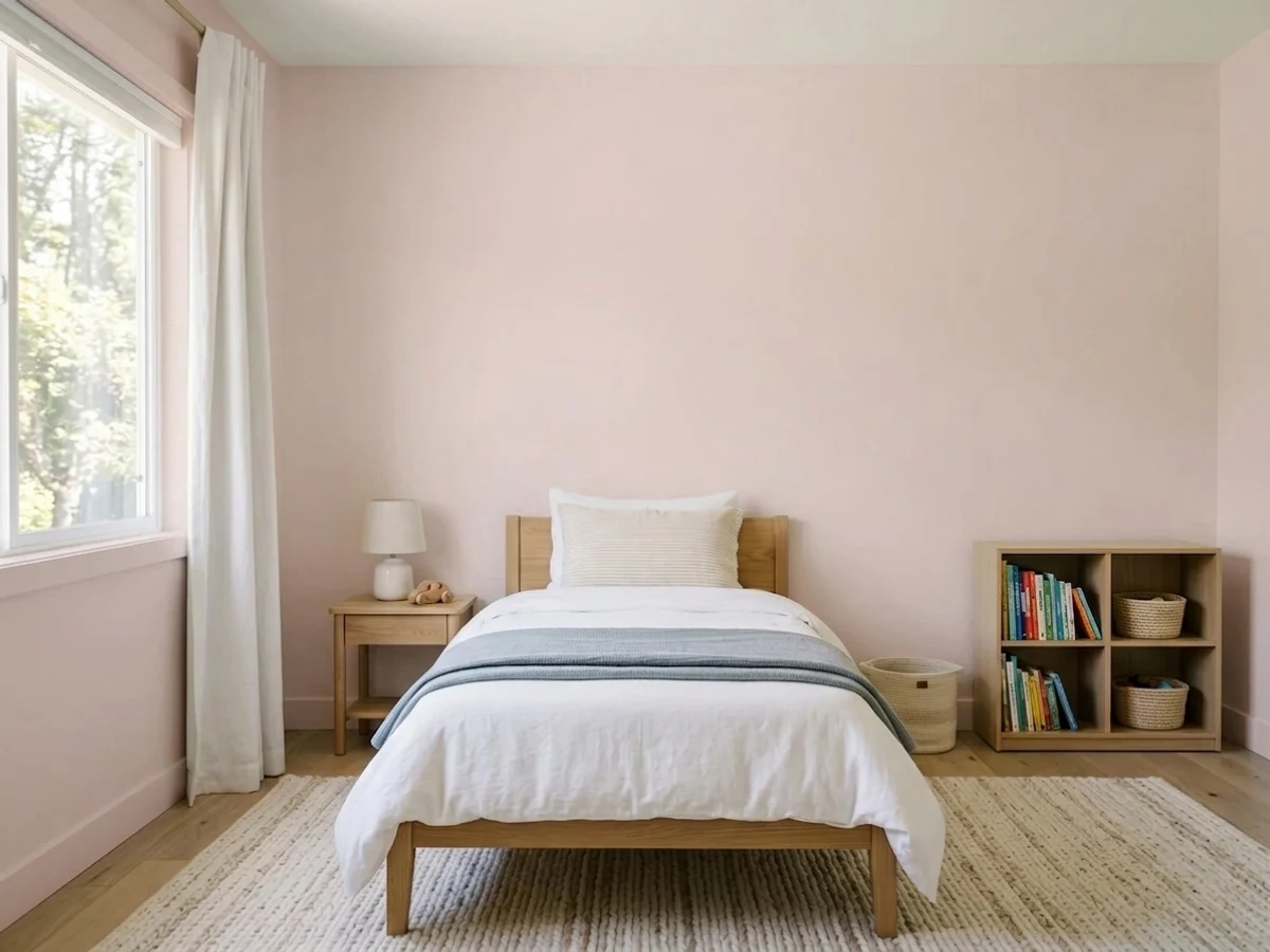
- Genuinely nursery-to-grown-up flexible — it does not age out in three years
- Flatters oak, walnut, brass and other warm wood tones
- LRV 61 holds its color without going pale-washed-out in daylight
- Quiet enough to outlast trend cycles that saturated pinks don't survive
- Goes muddy and dingy under cool LEDs or in a dim north room
- Can flash a dated "dusty rose" look next to a cool bright white
- Fights cool gray floors, stone and steel-toned fixtures
- Too subtle for anyone who actually wants a wall that reads pink
What Color Is Pale Cherry Blossom, Really?
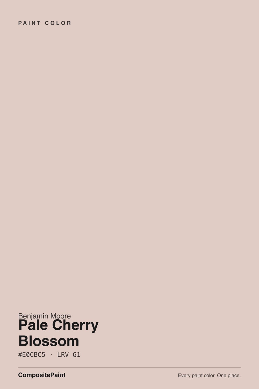
A warm, heavily grayed-down pink — the kind of color that behaves less like "pink" and more like a rosy beige with a pink memory. Pulled apart, the numbers tell the story: the hue sits at a warm red-orange around 13 degrees, but the saturation is only about 30 percent, which is low. That is the whole trick of the Color Preview collection strip this comes from — a family of soft pinks and apricots built to read as "warm neutral" first and "pink" second. Benjamin Moore's own copy calls it "a gently faded beauty" that "provokes a sentimental mood," which is corporate-speak for exactly what it is: nostalgic, soft, not loud.
At LRV 61 it sits in an interesting middle spot. It is noticeably deeper and more colored than a barely-there blush like First Light (LRV 76), which reads almost as an off-white — but it is much paler and quieter than a true dusty rose like Vintage Tea Rose (LRV 47), which announces itself as pink the moment you walk in. Pale Cherry Blossom is the compromise: present enough to warm a room, faint enough that most guests will call it "a nice warm white" and never guess the paint can says pink.
Undertone in one line: warm rose-beige, never cool, never true peach-orange. If your sample looks tan or greige, that is warm light pulling the pink back toward its beige floor; if it looks visibly rosy or dusty-pink, that is cooler light letting the underlying hue show through — both are the same paint being honest about the room it is in.
Where It Shines
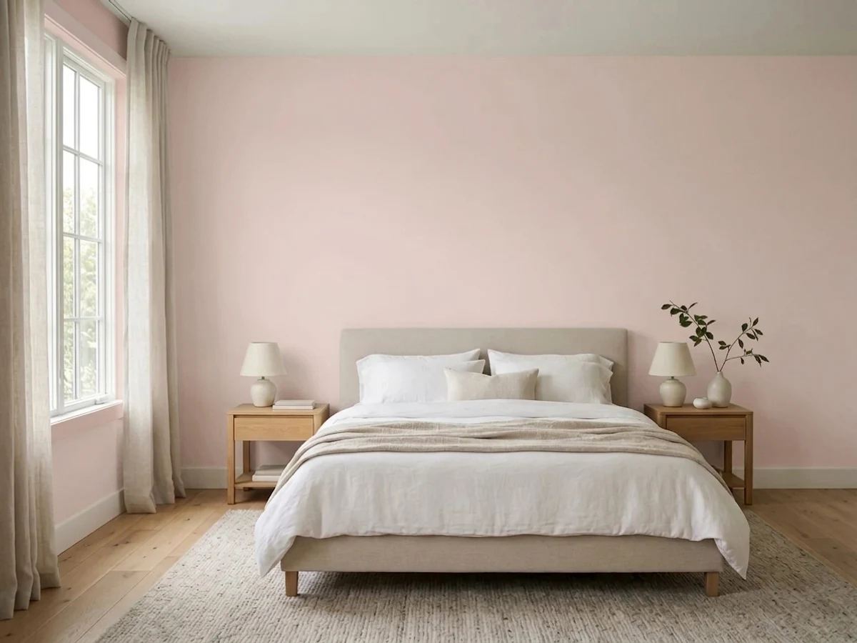
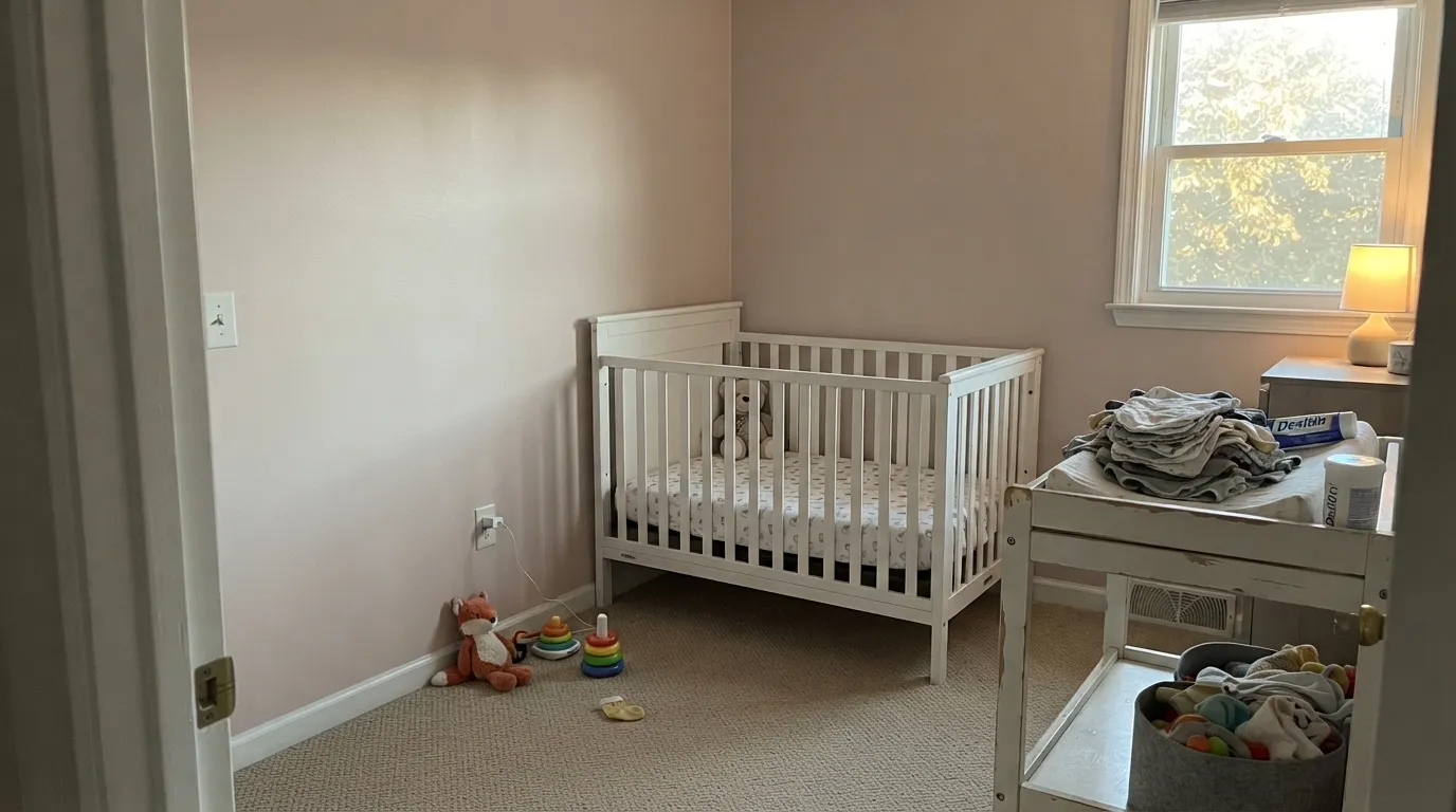
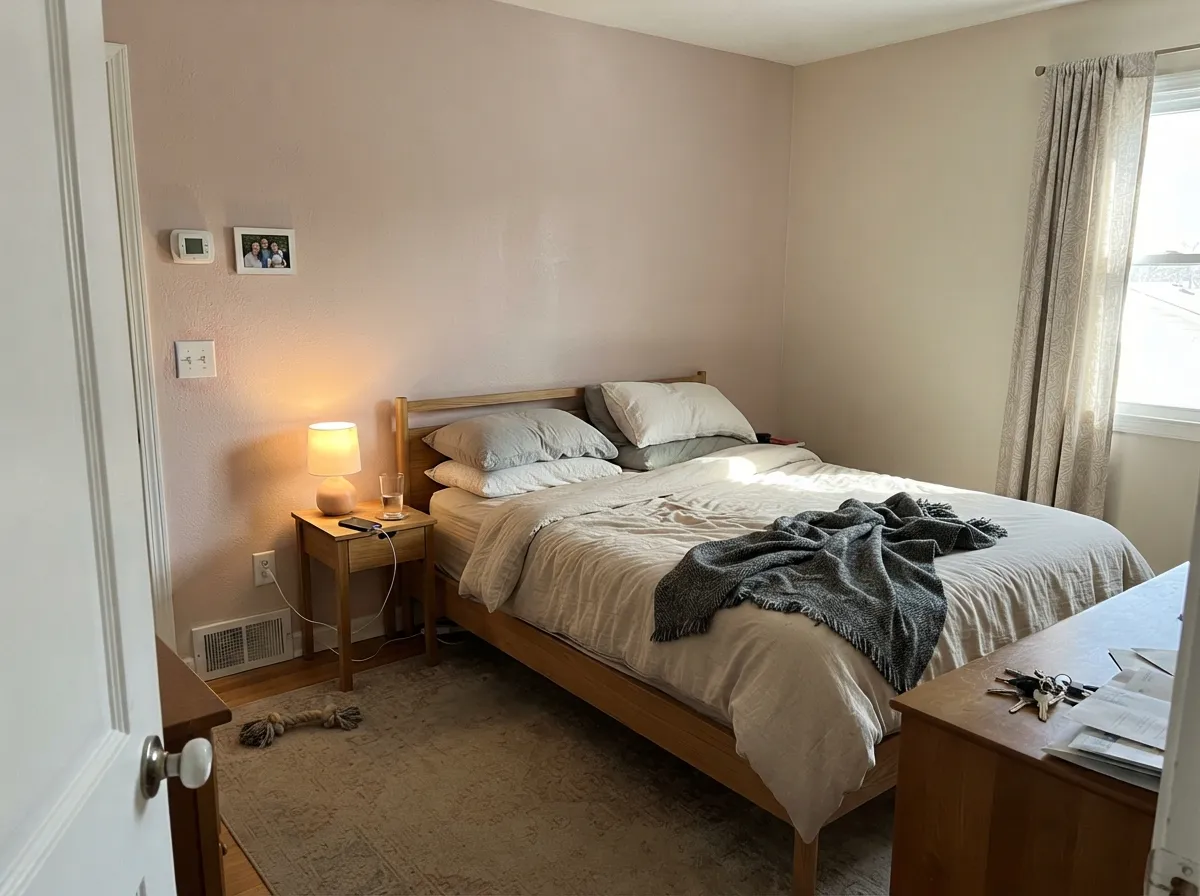
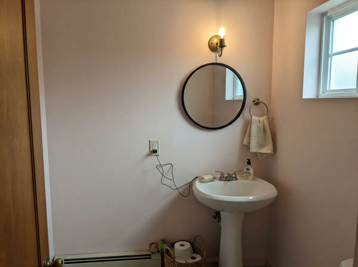
Give it warm daylight and wood and it does exactly what its name promises: a soft, faded rose warmth that never tips into nursery-candy or dated mauve. It is at its best doing a job most "real" pinks can't — standing in for a warm off-white in a room that wants a little more coziness than beige gives, without anyone clocking it as a color decision. Layer in oak, walnut, brass or aged wood, and it looks intentional and calm rather than themed.
Where It Fails
Almost every disappointed story about this color comes down to one of three predictable mismatches. None of them are the paint's fault — but if your room fits one, sample big before you commit a whole nursery to it.
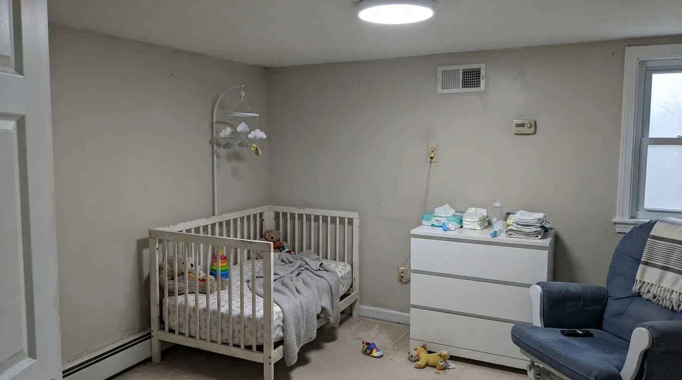
Take the warmth out of the light and this color loses its reason for being — the rose fades and what's left reads like a slightly dirty, muddy beige. It is not a color built for a north-facing room lit by 5000K bulbs. Fix it with 2700K warm bulbs before you blame the paint.
Because the color is so muted, most of the time it hides in plain sight — until a brighter, cooler white sits right beside it. Then the pink and the beige both come forward at once, and some readers describe an unwanted "90s dusty rose" flashback. Use a warm trim white (not a cool bright one) to keep the color reading current and quiet.
Gray LVP, cool-toned stone and steel-gray tile sit at the opposite temperature and expose the pink instead of absorbing it — the wall goes pinker, the floor goes colder, and the two argue instead of agreeing. This color wants warm wood or a warm stone underfoot, not gray.
Room by Room
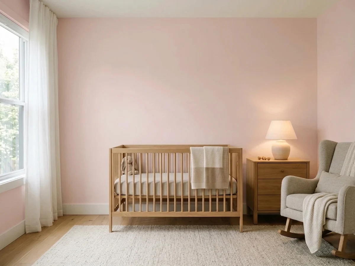
Warm without being sugary, and gentle enough to outlast the crib years into a grown kid's room. Eggshell finish; White Dove trim keeps the edges soft instead of cutting.
A color guests will call "cozy" without being able to name it. Works especially well as the one warm room in an otherwise gray-and-white house.
Small rooms take a full wrap of soft color well, and this one reads custom rather than themed. Benjamin Moore's own coordinating pick, Silver Satin, on the trim keeps it quiet and current.
In a warm, sunny bedroom it is genuinely restful. In a dim, north-facing bedroom lit by cool bulbs, it goes flat and slightly muddy — swap the bulbs before you repaint.
Works best as a single accent wall or reading nook rather than the whole open plan, where it has to negotiate with kitchen tile, floors and whatever the adjacent rooms wear.
Full outdoor sun and changeable weather light are unkind to a color this subtle and this dependent on warm indoor light; it can read as faded or slightly dingy rather than intentional. Save it for interiors.
Your Light Is the Risk
The rose comes forward just enough to feel deliberate, without ever tipping into candy pink. This is the light the color was built for.
Cool light strips the warmth and leaves a flat, slightly muddy beige-pink. Test a sample here before committing a whole room.
Rosier and warmer at the sun hours, quieter and more neutral the rest of the day. The shift is gentle, not a color change.
2700K lamps: warmer, softer, more clearly rose. Cool white LEDs: dull and slightly gray — swap the bulbs, not the paint.
Most complaints about Pale Cherry Blossom are a light mismatch. Upload a photo of your actual room and see it on your walls — then ask for the same wall in north light or evening lamps before you buy a single sample.
Need It From Another Brand?
Any paint counter can custom-tint Benjamin Moore 2101-60 directly. If you would rather stay in one brand's own deck, these are the closest stock matches, measured as ΔE2000. Under 2 is a difference you will not see on the wall.
| Brand | Closest color | ΔE | LRV | |
|---|---|---|---|---|
| Sherwin-Williams | Malted MilkSW 6057 · Sherwin-Williams | 3.6 | 62 | Color page → |
| Behr | Victorian CameoHDC-NT-10 · Behr | 0.9 | 63 | Color page → |
| Valspar | Satin TeddyP004 · Valspar | 1.4 | 63.1 | Color page → |
| PPG / Glidden | Kangaroo PawPPG1060-3 · PPG / Glidden | 1.1 | 61 | Color page → |
| Glidden | Kangaroo PawPPG1060-3 · Glidden | 0.6 | 62 | Color page → |
| Dutch Boy | Birmingham Blush303-1DB · Dutch Boy | 1.2 | 62 | Color page → |
Similar Benjamin Moore Colors
The nearest shades to Pale Cherry Blossom within Benjamin Moore's own range, ranked by perceptual color distance — useful when you want the same look a touch lighter, darker, or warmer.
WCAG 2.1: AA is 4.5 : 1 for normal text, 3 : 1 for large text, AAA is 7 : 1.
Pale Cherry Blossom vs the Colors You're Also Considering
Every Pale Cherry Blossom sample board has the same rivals on it. The numbers show the real lightness gap — then it comes down to which risk you would rather live with.
Pick this when you want the warmth to actually register as color, not disappear into the walls.
Benjamin Moore 2102-70 · LRV 76First LightPick this for a paler take that reads almost entirely as a warm off-white, with barely a whisper of pink.
Pick this if you want a color that reads pink up close, not just a name that implies it.
Benjamin Moore 876 · LRV 85AlabasterPick this for the palest possible hint of blush with almost none of the commitment.
Within Benjamin Moore the neighbors are extremely close. Bermuda Sands 2100-60 at #E0CBC3 and LRV 62 is a hair sandier, Honey Hut 2102-60 at #E1CBC7 and LRV 63 is a touch lighter and pinker, and Misty Blush 2097-60 at #DDCBC3 and LRV 61 is very slightly grayer. At this range you are choosing between samples on a wall, not between chips.
Across brands the matches are unusually tight. Glidden Kangaroo Paw PPG1060-3 at deltaE 0.59, Dunn-Edwards Pale Berries DE6051 at deltaE 0.76, and Behr Victorian Cameo HDC-NT-10 at deltaE 0.92 are all effectively the same color. Farrow and Ball Calamine No. 230 at LRV 66 and deltaE 1.57 is visually identical in normal room light but noticeably lighter on a big wall.
Further out, Sherwin-Williams Malted Milk SW 6057 at #DECABD and deltaE 3.6 is close but visibly different side by side, reading yellower and less pink. Note that Benjamin Moore has its own Malted Milk 2099-60, and the two are not the same color.
Pale Cherry Blossom Coordinating Colors
The rule for coordinating with this color: stay warm, keep whites soft rather than stark, and let one dark or neutral note ground the room. Benjamin Moore's own coordinating pick is Silver Satin, a quiet near-white; these are the other partners that keep the blush reading calm rather than sweet:
The Color Preview Collection: Why You've Never Heard of This One
Pale Cherry Blossom has never had a Color of the Year moment, never gone viral on a nursery mood board, and doesn't sit in Benjamin Moore's flashier Classics or Historical collections. It lives in the Color Preview line — a large, older strip system that includes an entire family of related soft pinks and apricots most homeowners have never browsed past the paint-store fan deck. That is not a knock on the color; it is simply an honest account of why it has stayed quiet.
Benjamin Moore's own file describes it as "a gently faded beauty" that "provokes a sentimental mood" — vintage, cottage-adjacent language that fits a color built to feel like it has always been there, not a color built to trend. If you are drawn to it precisely because it isn't the pink everyone else picked this year, that instinct is the point.
Pale Cherry Blossom With Wood Tones and Floors
Warm wood is the easy, reliable partner here. Oak, walnut, cedar and butcher block all sit comfortably against the rose-beige because both are working the same warm side of the color wheel — the wood grounds the color and keeps it from feeling precious.
Cool floors are the genuine risk. Gray LVP, gray-washed wood, and cool-toned stone all pull the room's temperature away from the paint, which exposes the pink instead of absorbing it into a general warmth. If gray floors are staying, lean on a warm rug and warm-toned metals (brass, not chrome) to bridge the gap rather than fighting it with a different wall color.
Three Ready Palettes Built on Pale Cherry Blossom
A color is never alone on the wall. These are complete combinations in the 60-30-10 pattern, with the reason each one holds together. Every one opens in the visualizer.
Warm white trim keeps the blush from tipping dated, and one dark charcoal piece grounds the room so it reads gently sophisticated instead of purely sweet — a palette that survives the move from crib to big-kid bed.
Try this palette in your roomPale Oak and Pale Cherry Blossom share the same warm-neutral floor, so the accent wall reads as a deeper shade of the same room rather than a clashing color — low commitment, high warmth.
Try this palette in your roomSilver Satin is Benjamin Moore's own coordinating pick for this color, and the quiet near-white trim lets the blush walls carry the small room without a fight. One near-black frame keeps the palette from reading too soft.
Try this palette in your roomPale Cherry Blossom FAQ
Is pale cherry blossom actually pink?
Technically yes, but it is a very grayed-down pink — closer to a warm rosy beige than a color you'd point at and call pink. Most people describe it as a "warm off-white" until it sits next to a true white or a true pink and the undertone shows itself.
Is it warm or cool?
Warm. The hue is a warm red-orange at low saturation, never blue-leaning. In cool light it can look muted and slightly gray, but that is the light doing the work, not a cool undertone in the paint.
Is it good for a nursery?
Yes, and it is one of the better choices for parents who want warmth without a committed pink wall — soft enough to feel gender-neutral-adjacent and calm enough to keep working once the nursery becomes a kid's room.
What trim white goes with it?
A warm white — White Dove is the safe default, Silver Satin (Benjamin Moore's own coordinating pick) if you want something a touch cooler and quieter. A stark, cool bright white can make the wall look dated instead of soft.
Does it work with gray floors?
Not its best pairing. Cool gray LVP, gray-washed wood or steel-toned stone pull against the warmth and expose the pink more than most buyers expect. Warm wood — oak, walnut, even a warm-toned rug over gray floors — is the safer bet.
Will it look dated, like 90s dusty rose?
It can, if it is paired the way 90s dusty rose was — matched with brass-heavy florals and a cool white trim. Paired with current warm-white trim, black or walnut accents, and simple modern furniture, it reads current and quietly sophisticated rather than retro.
Have you painted with Pale Cherry Blossom?
Rate it — one tap helps the next reader decide.
Ask a Question