Conch Shell
A dusty, sepia-warm pink reviewed honestly: the light that makes it glow like a sunset, the light that turns it muddy, and the one place Benjamin Moore itself says not to use it.

Jessica has spec'd whites and neutrals for more than 300 rooms and keeps a sample wall of painted drawdowns in her studio. Every color review is checked against real reader rooms in the comments and re-tested when a formula changes. About the testing process →
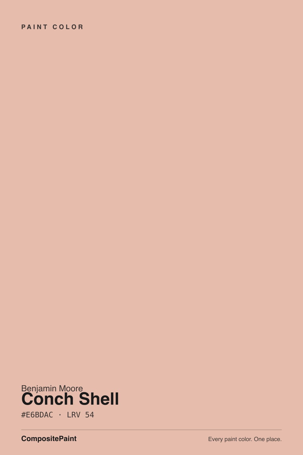
- 1Retro Pink38
- 2Vintage Tea Rose47
- 3Conch Shell54
- 4Pale Cherry Blossom61
- 5First Light76
The Fast Verdict
Conch Shell is what happens when pink gets sanded down until it almost stops looking like pink. Benjamin Moore's own colorists describe it as a sunset shot on a vintage camera, and that is the right read — dusty, sepia, warm without being sweet. In good daylight it sits close enough to a warm neutral that plenty of buyers pick it while searching for greige. Take it into flat, cool light and the pink comes back out, and if you try it outside, it will not stay this color for long.
Bedrooms and primary suites · bathrooms and powder rooms · nurseries that want warmth without candy pink · living rooms with warm wood and real daylight
You want a true neutral, not a color that can read pink · the room is north-facing with no lamps · your counters or trim run cool gray or icy white · you were hoping to use it outside
- A genuinely warm dusty pink that reads sophisticated, not sugary
- Deep enough at LRV 54 to hold its color without washing out
- Flatters warm wood, brass hardware and cream textiles
- Works across bedrooms, baths, nurseries and living rooms without feeling juvenile
- Muted enough that some buyers use it as a stand-in for a warm neutral
- Turns muddy, flat taupe-mauve in cool or overcast north light
- Benjamin Moore itself advises against using it outdoors — it fades in direct sun
- Reads more clearly pink on four walls than the small chip suggests
- Fights cool gray stone, icy white trim and stainless steel
What Color Is Conch Shell, Really?
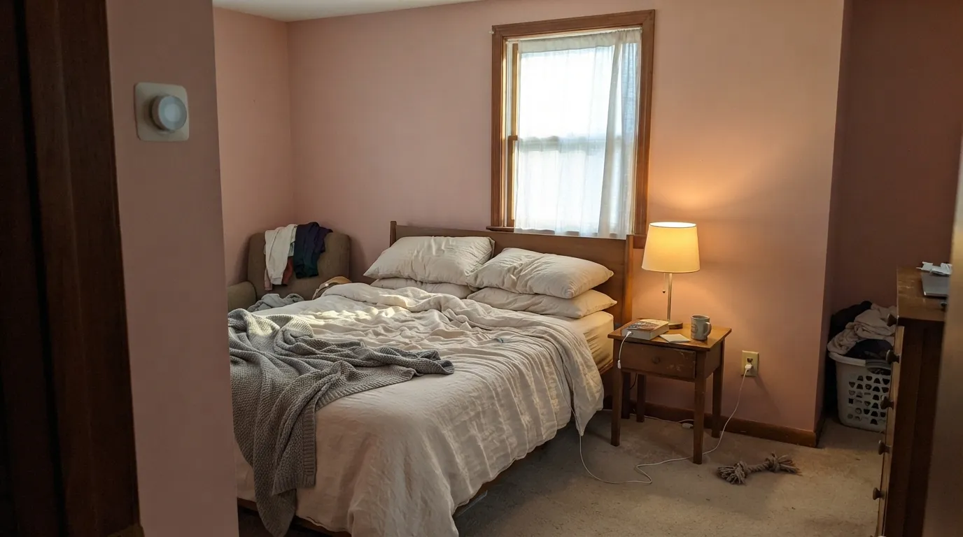
A dusty pink built on a sepia, peachy base rather than a straight rose or blush. Benjamin Moore's own copy calls it a sunset captured by a vintage camera, and the description holds up on the wall: the color is warm and slightly faded-looking, like pink that has been out in the sun, rather than the cooler cotton-candy pinks most people picture. That muted, sun-worn quality is exactly why it reads as a livable neutral to a lot of buyers instead of a "pink room" color.
At LRV 54 it sits squarely in the mid-tone range — not a pale blush that washes out, not a saturated statement color either. That depth is why it can pass for a warm greige in a quick glance: it has enough grey and sepia mixed into the pigment that a north-facing sample chip can genuinely look taupe. Push it across four walls in real daylight, though, and the pink comes forward. Plan for the wall to read warmer and more clearly pink than the small chip suggested.
Undertone in one line: warm sepia-pink with a peachy lean — never cool, never truly mauve. If your sample reads flat taupe-gray, that is cool or overcast light suppressing the warmth, not a different color; if it looks distinctly peach or coral at sunset, that is west light doing exactly what the color is named for.
Where It Shines
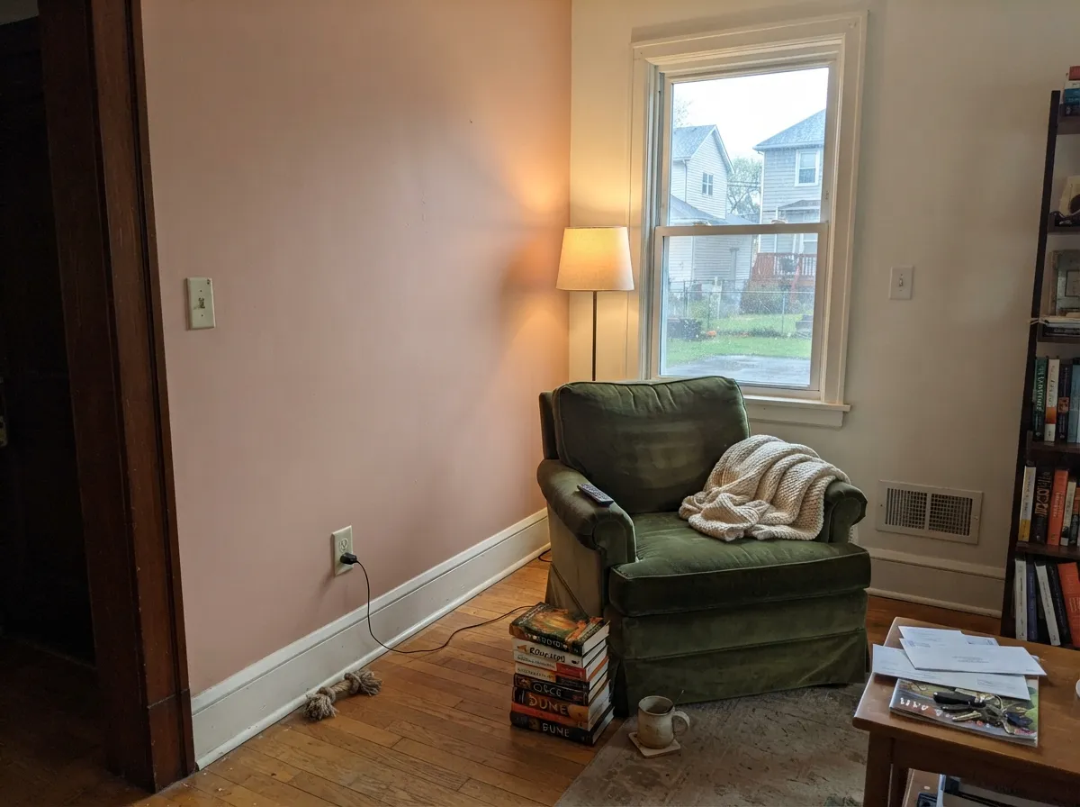
Give it real daylight — south or warm afternoon light — and Conch Shell does the thing its name promises: it glows, soft and sun-faded, without tipping into bubblegum. It is at its best in rooms people actually use at rest: bedrooms, bathrooms, nurseries, a reading corner in a living room. Warm wood, brass hardware, cream linen and white trim all flatter it, and because the color already carries grey in its base, it sits comfortably next to true neutrals instead of fighting them the way a brighter pink would.
Where It Fails
Most of the disappointment with Conch Shell comes from one of three predictable situations, and Benjamin Moore itself has already flagged one of them. None of these are the paint failing — they are the color being tested outside the conditions it needs.
Benjamin Moore's own colorists advise against using Conch Shell on exteriors because direct sunlight fades it faster than the deep, UV-stable pigments used in most exterior colors. If you love the tone for a front door or shutters, sample a swatch outside for a full season before committing, or ask your store about an exterior-rated equivalent.
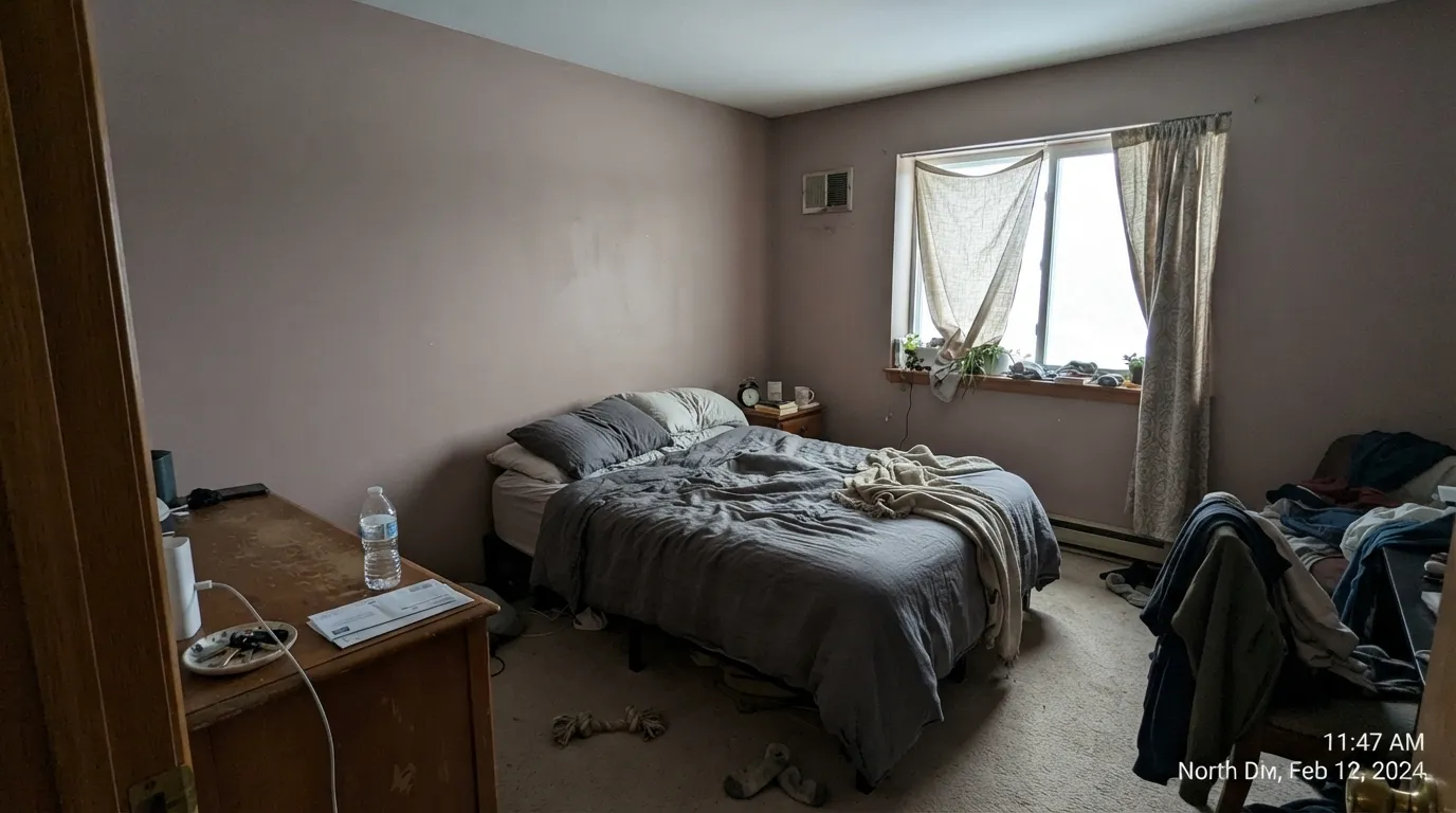
Take the sepia warmth away and what is left is the grey underneath — on an overcast day or in a dim north room, Conch Shell can read as a dull, muddy taupe-mauve instead of a sunset pink. Readers who sampled it in bright afternoon light and then painted a north bedroom are the ones most likely to feel misled. Warm 2700K lamps recover most of the color at night; daylight is the one thing you cannot fix after the fact.
Because the LRV-54 chip can look like a warm greige in a store, some buyers grab it expecting a taupe and end up with a wall that reads unmistakably pink once it covers four walls, especially next to bright white trim or cool gray stone. If "a hint of color" is your ceiling, sample a large board first — this is not a color that behaves like a neutral once it is committed.
Room by Room
Warm and quietly restful with any real daylight, and it turns genuinely soft and rosy under evening lamps. White Dove trim keeps the edges calm; avoid pairing with icy white bedding, which pushes the walls toward tired pink instead of sun-warmed.
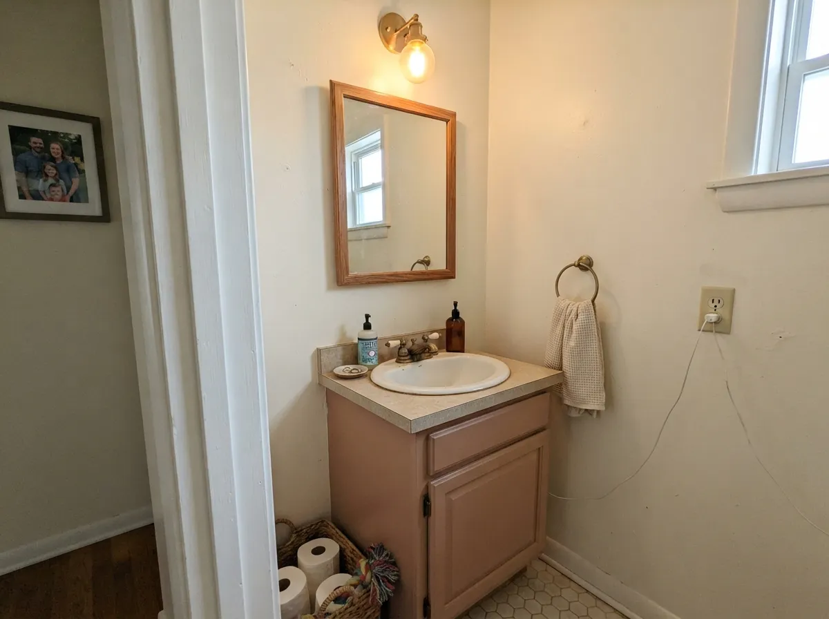
A small, enclosed room takes the depth well and reads custom rather than themed, particularly on a vanity under a marble or wood-tone counter. Skip it next to cool blue-gray tile, which fights the warmth directly.
The sepia base keeps it from reading as a stereotypical baby-pink nursery color, which is the usual complaint with brighter pinks in this role. Pair with warm whites and natural wood furniture rather than cool grays.
Beautiful as a warm backdrop for wood furniture, brass and cream textiles in a sunny room. In a dim or north-facing living room it drifts toward the muddy read described above — add lamps or pick a lighter partner instead.
Works on a single element — an island, a pantry door, a breakfast-nook wall — under warm wood or cream cabinetry. A full kitchen of Conch Shell walls next to cool gray quartz or stainless steel is a harder sell; sample against your actual counter first.
Benjamin Moore's own guidance is to skip this one outdoors: direct sun fades it noticeably faster than colors built for exterior durability. Save it for interior walls, doors and trim instead.
Your Light Is the Risk
The sepia warmth glows the way the sunset-camera description promises — soft, faded, unmistakably pink but never candy-colored.
Cool flat daylight drains the warmth and exposes the grey base underneath — the color can read as dull taupe-mauve instead of sunset pink. Test before committing a whole room.
Warmest and most coral at the sun hours, quieter and more neutral through the middle of the day. Most owners like the shift; sample at both times if you are unsure.
2700K lamps push it rosier and cozier at night. Cool white LEDs flatten it toward gray-taupe — swap the bulbs before you swap the paint.
Most complaints about Conch Shell are a light mismatch. Upload a photo of your actual room and see it on your walls — then ask for the same wall in north light or evening lamps before you buy a single sample.
Need It From Another Brand?
Any paint counter can custom-tint Benjamin Moore 052 directly. If you would rather stay in one brand's own deck, these are the closest stock matches, measured as ΔE2000. Under 2 is a difference you will not see on the wall.
| Brand | Closest color | ΔE | LRV | |
|---|---|---|---|---|
| Sherwin-Williams | Rachel PinkSW 26 · Sherwin-Williams | 3.5 | 55 | Color page → |
| Behr | Pueblo Sand260E-3 · Behr | 2.3 | 58 | Color page → |
| Valspar | Pretty RascalV082-2 · Valspar | 1.5 | 55.8 | Color page → |
| PPG / Glidden | AdorablePPG1066-4 · PPG / Glidden | 1.6 | 56 | Color page → |
| Glidden | AdorablePPG1066-4 · Glidden | 1.4 | 56 | Color page → |
| Dutch Boy | Coral Dreams308-3DB · Dutch Boy | 2.4 | 57 | Color page → |
Similar Benjamin Moore Colors
The nearest shades to Conch Shell within Benjamin Moore's own range, ranked by perceptual color distance — useful when you want the same look a touch lighter, darker, or warmer.
WCAG 2.1: AA is 4.5 : 1 for normal text, 3 : 1 for large text, AAA is 7 : 1.
Conch Shell vs the Colors You're Also Considering
Every Conch Shell sample board has the same rivals on it. The numbers show the real lightness gap — then it comes down to which risk you would rather live with.
Pick this when you want the sepia and grey dialed up so the color reads calmer and more neutral-adjacent.
Benjamin Moore 1296 · LRV 59Sailor's DelightPick this if you want the pink to be the obvious point — a brighter, more coral sunset tone at a slightly higher LRV.
Pick this for real, visible color instead of a near-white with a pink hint.
Benjamin Moore 2102-70 · LRV 76First LightPick this for the palest whisper of pink — it behaves like a warm off-white until the light shifts it.
Conch Shell Coordinating Colors
The rule for coordinating with Conch Shell is the same as most warm, muted colors: lean into warm whites and warm woods, add one grounding dark note if the room needs it, and keep cool grays at a distance. Because the color already carries grey and sepia in its own base, it also plays surprisingly well with a soft coastal blue-green. These are the partners that keep showing up in rooms that work:
The Sunset Story Behind the Name
Benjamin Moore's own description for Conch Shell leans directly into the name: a sunset captured by a vintage camera, the kind of soft, slightly faded pink you get from an old photograph rather than a saturated modern print. That framing explains the color better than the LRV number does — it was built to look sun-worn, not bright, which is exactly why it sits at the quiet end of the pink family instead of the loud one.
That same faded quality is what lets it pass for a warm neutral in the right light, and it is also the reason Benjamin Moore does not recommend it outdoors: a color engineered to look gently sun-faded already will fade for real, and faster, under actual sun. Treat the name as a description of the finished look indoors, not an invitation to put it on a sun-facing exterior wall.
Conch Shell With Wood Tones and Stone
Warm wood is this color's best friend: oak, walnut and butcher block all meet its warmth halfway, and brass hardware reads as intentional rather than dated against it. Cream and off-white countertops are safe; a warm quartz or marble with beige veining will not fight it.
Cool gray stone is the one pairing to test before committing. Grey quartz, cool marble and cool-toned tile pull against the color's warm, peachy base, and more than one report of the color looking "tan" or "dingy" traces back to exactly this combination. If your counters or floor tile already run cool gray, sample a large board against them in person before painting the whole room.
Three Ready Palettes Built on Conch Shell
A color is never alone on the wall. These are complete combinations in the 60-30-10 pattern, with the reason each one holds together. Every one opens in the visualizer.
White Dove keeps the pink glowing instead of competing with a brighter trim white, and Wrought Iron supplies the one grounding dark note that keeps a warm pink room from feeling sweet.
Try this palette in your roomCream walls keep a small room airy while the vanity carries the color; Palladian Blue's coastal spa-green gives the room a second warm-meets-cool note without turning it into a full pink space.
Try this palette in your roomPashmina carries the same warm depth without committing the whole room to pink; Conch Shell adds a single warm blush note in one spot, and White Dove trim ties both back together.
Try this palette in your roomConch Shell FAQ
Is Conch Shell pink or a neutral?
It is genuinely pink, just a sun-faded, sepia-warm version of it. In a quick glance under good light it can pass for a warm greige, which is why some buyers pick it while shopping for a neutral — but on four walls the pink comes forward. If you want zero pink risk, this is not your color.
Can I use Conch Shell outside?
Benjamin Moore itself advises against it. Direct sunlight fades the pigment faster than colors formulated for exterior durability, so a front door or shutters in this color will not hold its tone the way an interior wall does. Keep it indoors, or ask your paint store about an exterior-rated equivalent.
What trim white goes with Conch Shell?
A warm white like White Dove is the safest default — it lets the pink glow without competing. Swiss Coffee works for a creamier, more vintage look. A stark, cool white trim will make the walls look more clearly pink by contrast, which some readers want and others do not — sample both before deciding.
Does it work in a nursery?
Yes, and it tends to avoid the overly sweet look of brighter baby pinks because of its sepia, faded quality. Pair with warm whites and natural wood rather than cool grays, which fight the undertone.
Will it look muddy or brownish in my room?
That risk is real in flat, cool, north-facing light or on overcast days — the grey in the base shows through and the warmth drains out, leaving something closer to dull taupe-mauve. In south or warm afternoon light the same wall reads distinctly pink. Sample a large board and check it at different times of day before committing.
Does Conch Shell work with gray stone counters or cool tile?
Not comfortably. The color is built on a warm, peachy base, and cool gray quartz, marble or tile pull against it — several readers report the wall looking dingy or tan next to cool stone. It is much happier with warm wood, brass and cream textiles.
Have you painted with Conch Shell?
Rate it — one tap helps the next reader decide.
Ask a Question