Love & Happiness
The warm apricot pink Benjamin Moore quietly keeps in its Classics collection, reviewed honestly: the light it needs to glow, the light that turns it muddy, and what to pick instead.

Jessica has spec'd whites and neutrals for more than 300 rooms and keeps a sample wall of painted drawdowns in her studio. Every color review is checked against real reader rooms in the comments and re-tested when a formula changes. About the testing process →
- 1Pale Cherry Blossom61
- 2Romance66
- 3Love & Happiness72
- 4Verbena77
- 5Pink Bliss82
The Fast Verdict
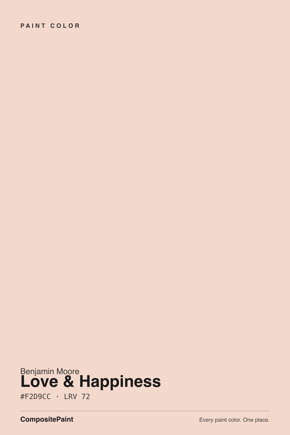
Love & Happiness is a warm, peachy pink built on an apricot base with a yellow-red undertone — soft enough to read as a neutral from across the room, warm enough that you notice the color the moment you step inside. At LRV 72 it holds its glow without going saccharine, which is why Benjamin Moore keeps it quietly in the Classics collection instead of chasing a trend cycle. Give it real daylight and warm company and it is one of the most genuinely happy colors in the deck; take the light away and it collapses into a flat, muddy beige.
Nurseries and kids' rooms that shouldn't look babyish · bedrooms that want warmth without full-on pink · powder rooms and small wellness spaces · dining rooms with brass and warm wood
Your room runs dim or faces north · you want a definite, saturated pink · your stone or floors are cool gray · you're not willing to test it in your room's actual light
- A genuinely warm, cheerful apricot pink that reads sophisticated, not sugary
- Grown-up enough for a nursery that will outlast the crib
- LRV 72 keeps rooms bright while still showing real, visible color
- Flatters brass, warm wood and cream linens
- Part of BM's Classics collection — chosen for lasting appeal, not a trend cycle
- Needs real daylight — dim or north-facing rooms turn it flat, muddy beige
- Direct midday sun bleaches it toward near-white
- Fights cool gray stone, quartz and gray-toned floors
- Too soft a pink for anyone who wants a color that reads as pink in every light
What Color Is Love & Happiness, Really?
A warm, peachy pink built on an apricot base with a yellow-red undertone — the kind of color that reads as a soft neutral in a quick glance and then reveals itself as genuinely pink once you spend a few minutes in the room. Benjamin Moore files it in the Classics collection, the same shelf as White Dove and Revere Pewter: colors chosen for lasting appeal rather than a single trend cycle. That matters here, because the soft-apricot and blush-pink moment happening in paint right now makes Love & Happiness look freshly discovered — it has just been sitting quietly in the deck the whole time.
At LRV 72 it sits in the same bright band as First Light (76) and Pink Bliss (82), but it holds noticeably more color than either. Pink Bliss is the sheerest pink in the deck and nearly disappears in daylight; First Light behaves like a warm off-white until the light shifts. Love & Happiness keeps its apricot cast visible across more lighting conditions — the tradeoff is that it needs a baseline of real daylight to do it. In a genuinely bright room this is one of the most flattering light pinks in the deck; in a dim one, that same visibility works against it.
Undertone in one line: apricot, warmed by yellow-red — never a cool bubblegum pink, never a true orange-peach. If your sample reads beige or muddy on the wall, that's a dim or cool-lit room talking, not the paint; if it looks washed-out and pale, that's strong direct sun bleaching it — both are the same color behaving exactly as its LRV and undertone predict.
Where It Shines
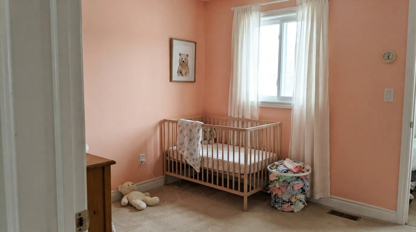
Give it a room with real daylight and this is one of the most likeable colors in the Benjamin Moore Classics line: cheerful without being juvenile, warm without tipping orange, and genuinely happy in the way its name promises. Nurseries are its calling card — soft enough that it won't look like a decision you'll regret in five years, warm enough that it doesn't feel like a leftover paint chip from a different decade. Its second home is the small, well-lit room: a powder room, a dining nook, a hallway that gets real light — anywhere a little sustained color pays off without committing a whole open floor plan to pink.
Where It Fails
Almost every disappointed review of Love & Happiness comes down to one of three predictable situations. None of them are the paint's fault — but if your room matches one, sampling a bigger board will only confirm the problem, not fix it.
This color needs a real baseline of daylight to hold its apricot cast. Take the light away and it doesn't stay pink — it collapses into a flat, muddy beige that readers describe as looking dirty rather than warm. If your room is genuinely dim, this isn't the color; a color built to work as a neutral in low light, like Edgecomb Gray, will serve you better.
The same brightness that makes it glow in soft daylight bleaches it in strong direct sun — the pink washes toward near-white for the hours the sun hits the wall hardest, and the color you picked seems to disappear. Sample it taped up during the room's actual peak-sun hours before you commit.
Gray quartz, cool marble and gray LVP sit at the opposite temperature and make the apricot look like it's fighting the room instead of warming it. Love & Happiness wants warm wood, brass and cream — with cool gray surfaces already in place, pick a true neutral instead.
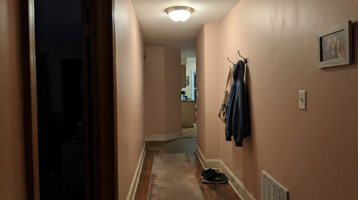
Room by Room
Soft, cheerful, and grown-up enough to repaint into a bigger kid's room later without regret. Eggshell finish wipes clean; pair with a warm white trim (White Dove or Swiss Coffee) and one dark accent piece so the room doesn't read all-pastel.
In a room with genuine morning or afternoon sun it's a gentle, warm backdrop that photographs better than it sounds on paper. In a north-facing or lamp-lit-only bedroom, size up to a color built for low light instead.
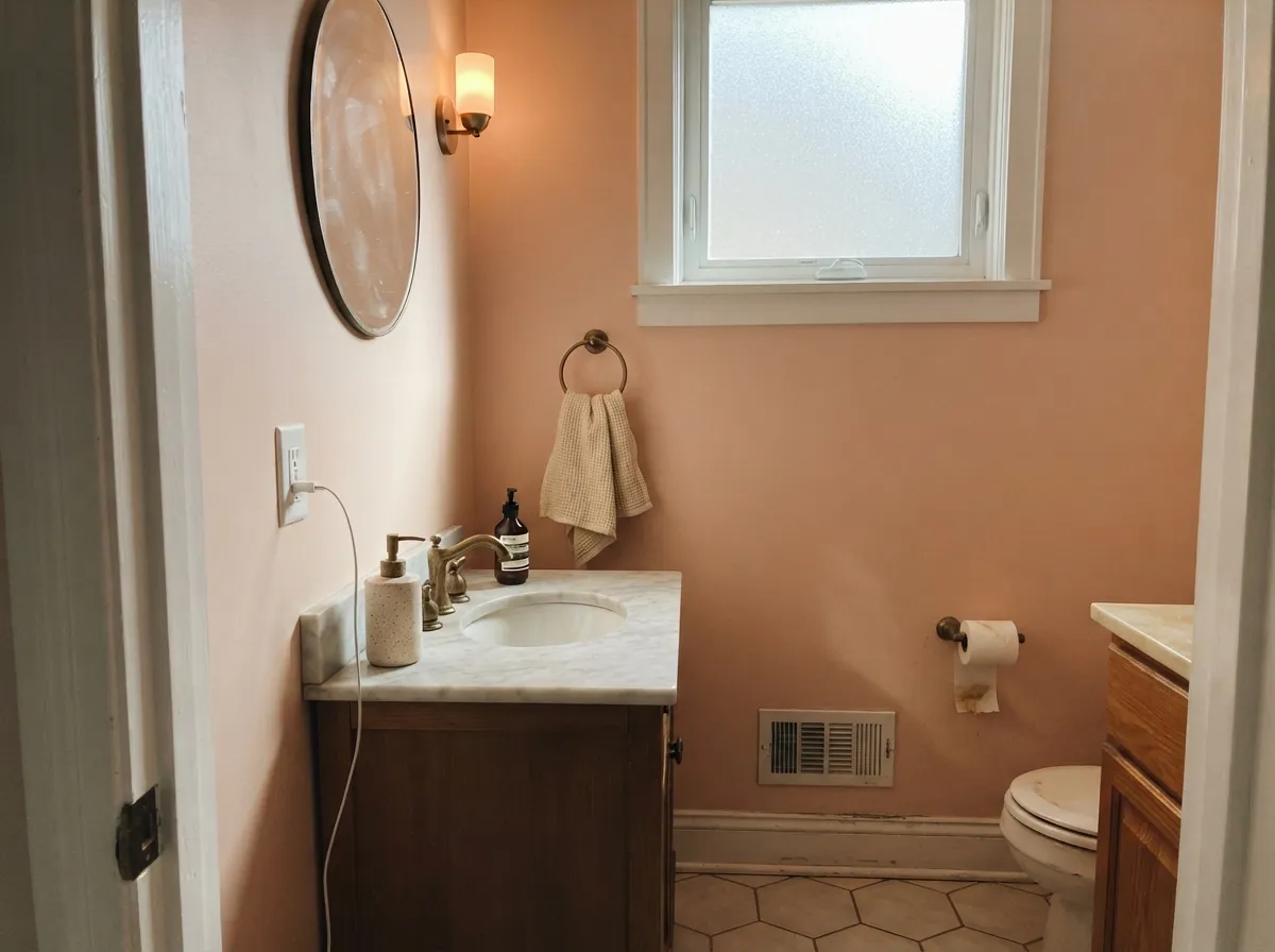
Small, well-lit powder rooms take saturated color well, and this one reads custom rather than sweet against a marble or brass vanity. Satin on the walls if the room sees hand traffic.
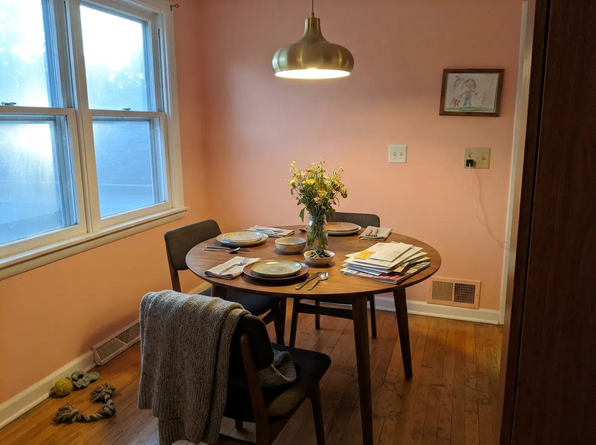
Under a chandelier and around a walnut table, the apricot warms the whole room at dinner-hour light. A crisp white trim (Chantilly Lace) keeps it from feeling like a nursery graduated into the dining room.
A daylit hallway with a window at one end carries the color beautifully room to room. A windowless interior hallway lit only by fixtures is exactly the dim-room failure mode — skip it there.
Kitchens run too much mixed artificial light for this color to stay consistent, and outdoors, full sun bleaches it toward a pale, forgettable off-white with none of the warmth it has indoors. Keep it inside, in a room with real daylight.
Your Light Is the Risk
A well-lit room with soft natural light all day is where this color does its best work — warm, cheerful apricot with no hint of the muddy beige dim rooms bring out.
Cool, weak daylight drains the apricot and leaves a flat, muddy beige. This is the single most common disappointment with this color — test before you commit.
Strong sun bleaches it toward near-white for the hours it hits hardest, then the color returns once the light softens. Expect it to shift more than most pinks its LRV.
2700K warm bulbs deepen the apricot into something cozy and rosy. Cool white LEDs flatten it toward a dull, gray-tinged pink — keep the bulbs warm.
Most complaints about Love & Happiness are a light mismatch. Upload a photo of your actual room and see it on your walls — then ask for the same wall in north light or evening lamps before you buy a single sample.
Need It From Another Brand?
Any paint counter can custom-tint Benjamin Moore 1191 directly. If you would rather stay in one brand's own deck, these are the closest stock matches, measured as ΔE2000. Under 2 is a difference you will not see on the wall.
| Brand | Closest color | ΔE | LRV | |
|---|---|---|---|---|
| Sherwin-Williams | Nearly PeachSW 6336 · Sherwin-Williams | 3.4 | 75 | Color page → |
| Behr | Peach SachetM200-1 · Behr | 1.5 | 73 | Color page → |
| Valspar | Bare NecessityV082-1 · Valspar | 1.1 | 71.7 | Color page → |
| PPG / Glidden | Melon IcePPG1196-2 · PPG / Glidden | 1.3 | 72 | Color page → |
| Glidden | Melon Ice10YY 78/146 · Glidden | 1.6 | 78 | Color page → |
| Dutch Boy | Soft Pink107-2DB · Dutch Boy | 0.9 | 73 | Color page → |
Similar Benjamin Moore Colors
The nearest shades to Love & Happiness within Benjamin Moore's own range, ranked by perceptual color distance — useful when you want the same look a touch lighter, darker, or warmer.
WCAG 2.1: AA is 4.5 : 1 for normal text, 3 : 1 for large text, AAA is 7 : 1.
Love & Happiness vs the Colors You're Also Considering
Every Love & Happiness sample board has the same rivals on it. The numbers show the real lightness gap — then it comes down to which risk you would rather live with.
Pick this when you want visible color, not just a hint — Love & Happiness holds its apricot where First Light nearly disappears.
Benjamin Moore 2102-70 · LRV 76First LightPick this for an even paler, whisper-of-pink version that leans warm off-white more than peach.
Pick this for the lighter, airier version — Pink Shadow needs real light too, but it starts from a darker base.
Sherwin-Williams SW 0070 · LRV 50Pink ShadowPick this for a deeper, more saturated peach-blush that reads as color even in weaker light.
Love & Happiness Coordinating Colors
The rule for coordinating with Love & Happiness is simple: stay warm. It wants warm whites, warm greiges, brass and dark near-neutrals — and it argues with cool grays and true whites pushed toward blue. These are the partners that keep showing up in rooms that work:
A Quiet Member of the Classics Collection
Benjamin Moore files Love & Happiness in its Classics collection — the shelf reserved for colors judged to have lasting appeal rather than a single trend cycle, alongside names like White Dove and Revere Pewter. That's worth knowing right now, because soft apricot and blush pinks are having a real moment in paint again. Love & Happiness isn't a new trend color chasing that wave; it has been sitting in the deck the whole time, which is a reasonable argument for why it should age better than a color launched to catch this exact moment.
There's no dramatic origin story behind the name that we could verify — Benjamin Moore doesn't publish one — but the color itself has quietly done the work: painters and colorists reach for it specifically for nurseries and powder rooms where a client wants real color without a full commitment to pink.
Love & Happiness With Wood Tones and Floors
Warm wood is this color's best friend. Oak, walnut and any wood with red-brown depth make the apricot look intentional and rich rather than pastel; brass hardware and fixtures do the same job in metal. If your floors run warm, this is close to a guaranteed pairing.
Cool gray floors are the one honest no. Gray-washed wood, gray LVP and cool stone pull the apricot toward looking like a mistake rather than a warm accent — the two temperatures visibly disagree. If a cool gray floor is staying put, either bring in a warm rug to bridge the gap, or choose a color built to sit on top of gray, like Abalone Shell or Odessa Pink.
Three Ready Palettes Built on Love & Happiness
A color is never alone on the wall. These are complete combinations in the 60-30-10 pattern, with the reason each one holds together. Every one opens in the visualizer.
Warm white trim keeps the room bright and cohesive with the walls, and one soft near-black piece of furniture grounds the palette so the room reads considered instead of all-pastel.
Try this palette in your roomSwiss Coffee's warm trim keeps a small room from feeling closed in, the apricot walls do the color work, and Kendall Charcoal hardware keeps the whole thing from tipping too sweet.
Try this palette in your roomChantilly Lace's crisp, cool-neutral trim keeps the apricot from reading sugary while brass fixtures and a walnut table do the rest; Edgecomb Gray carries the warmth into the next room without repeating the pink.
Try this palette in your roomLove & Happiness FAQ
is Love & Happiness warm or cool?
Warm. It's built on an apricot base with a yellow-red undertone — never a cool pink, never a true orange-peach. In weak light it can look almost neutral-beige, but it never reads cool.
will it look good in a room with little natural light?
No — this is its one real weakness. Without a baseline of real daylight the apricot drains out and the wall reads flat, muddy beige. If your room is genuinely dim, pick a color built to work as a neutral in low light instead, like Edgecomb Gray.
what trim color goes best with Love & Happiness?
A warm white like White Dove or Swiss Coffee keeps the whole room cohesive and cozy. Chantilly Lace, a crisper cool white, works too if you want the pink to read like a deliberate color choice rather than a soft blur — that's the pairing Benjamin Moore itself suggests.
is it good for a nursery?
Yes — it's one of the better nursery pinks precisely because it doesn't read as candy-sweet. It's soft enough to grow with the room past the nursery years, and warm enough that it doesn't feel clinical.
does it work with gray floors or gray stone?
Not well. Cool gray quartz, marble and gray-toned LVP sit at the opposite temperature, and the pairing looks like the color is fighting the room. It wants warm wood, brass and cream — with cool gray already in place, choose a true neutral instead.
how does it compare to First Light or Pink Shadow?
First Light (LRV 76) is paler and behaves more like a warm off-white that only hints at pink. Pink Shadow (LRV 50) is deeper and holds its peach-blush even in weaker light. Love & Happiness sits between them — more visibly pink than First Light, brighter and airier than Pink Shadow.
Have you painted with Love & Happiness?
Rate it — one tap helps the next reader decide.
Ask a Question