Tissue Pink
A pale peachy blush that hides inside a warm neutral, reviewed honestly: the light where it passes for beige, the light where the pink shows, and what to pick instead.

Jessica has spec'd whites and neutrals for more than 300 rooms and keeps a sample wall of painted drawdowns in her studio. Every color review is checked against real reader rooms in the comments and re-tested when a formula changes. About the testing process →
- 1Agreeable Gray60
- 2Balboa Mist66
- 3Tissue Pink71
- 4Pearly White77
- 5Dover White83
The Fast Verdict
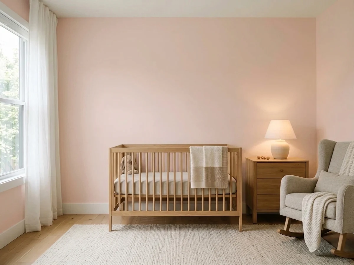
Tissue Pink is the pink for people who insist they don't like pink. At LRV 71 it is pale enough, and grayed-down enough, to read as a warm off-white in a bright room — but the undertone is genuinely orange-pink, not a diluted neutral, and it comes forward the moment the light softens: shade, evening lamps, an interior corner. Treat it as a blush that's learned to whisper, not as a safe neutral with a pink rumor attached.
Nurseries and kids' rooms that shouldn't scream pink · bedrooms that should feel warm at night · powder rooms and vanities · anyone who wants color without committing to "the pink room"
You want a guaranteed zero-pink neutral · your room runs cool gray stone, chrome, or stainless · you want a bold, obvious blush statement · you're painting a north-facing room and expect it to stay pale and quiet
- A genuinely warm blush that never reads like a full "pink room"
- Passes as a warm off-white in bright daylight — low visual commitment
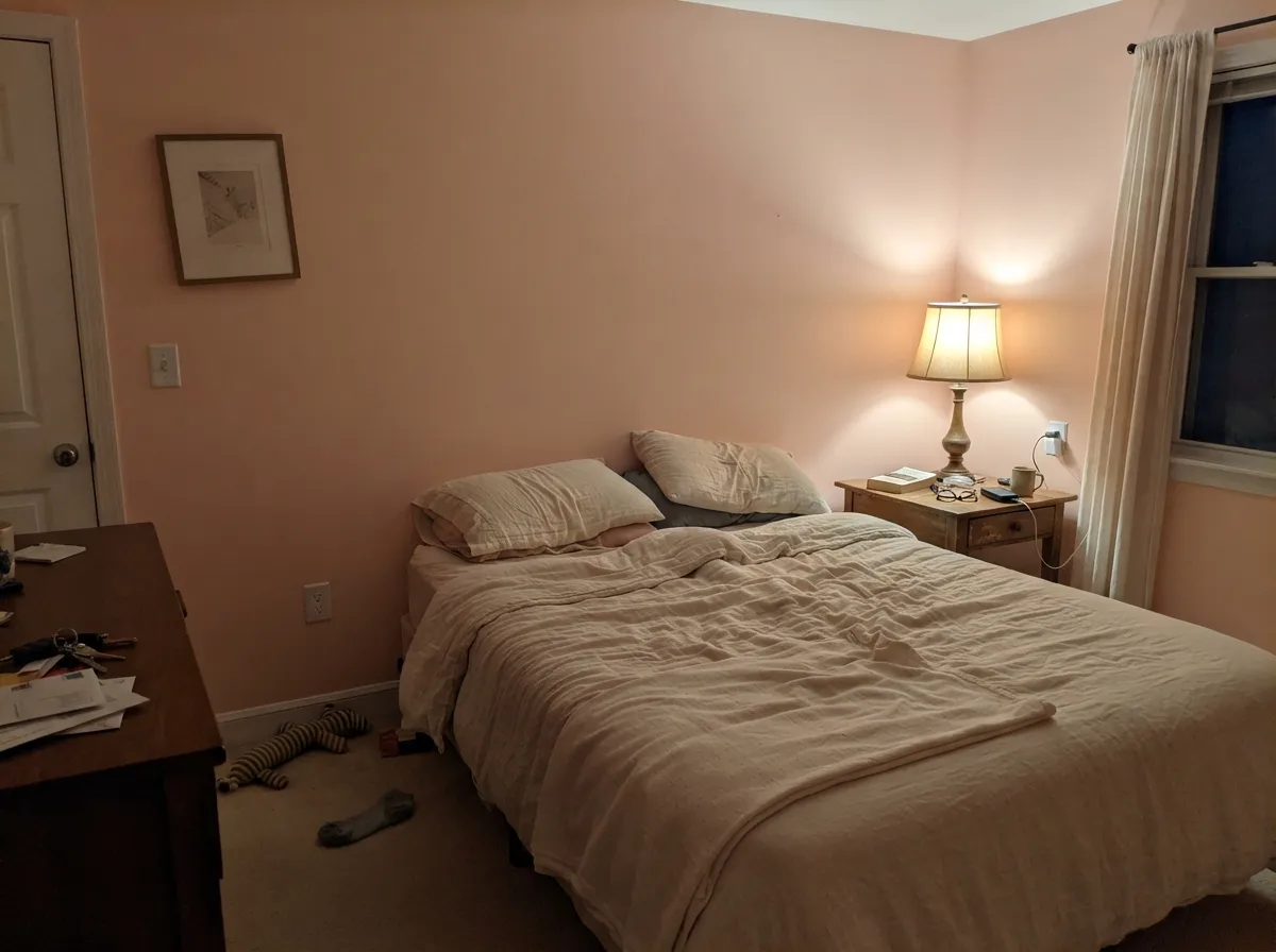
- Turns gently rosy and cozy under evening lamps
- Flatters brass, warm wood and cream — the classic warm-material set
- A quiet Classic-collection color, not a loud trend pink chasing a moment
- Goes flat and slightly dingy in dim, north-facing light
- No light condition makes it a true, guaranteed-neutral beige
- Fights cool gray stone, chrome and stainless
- Almost no real-room photos or forum threads online — you're testing mostly blind
What Color Is Tissue Pink, Really?
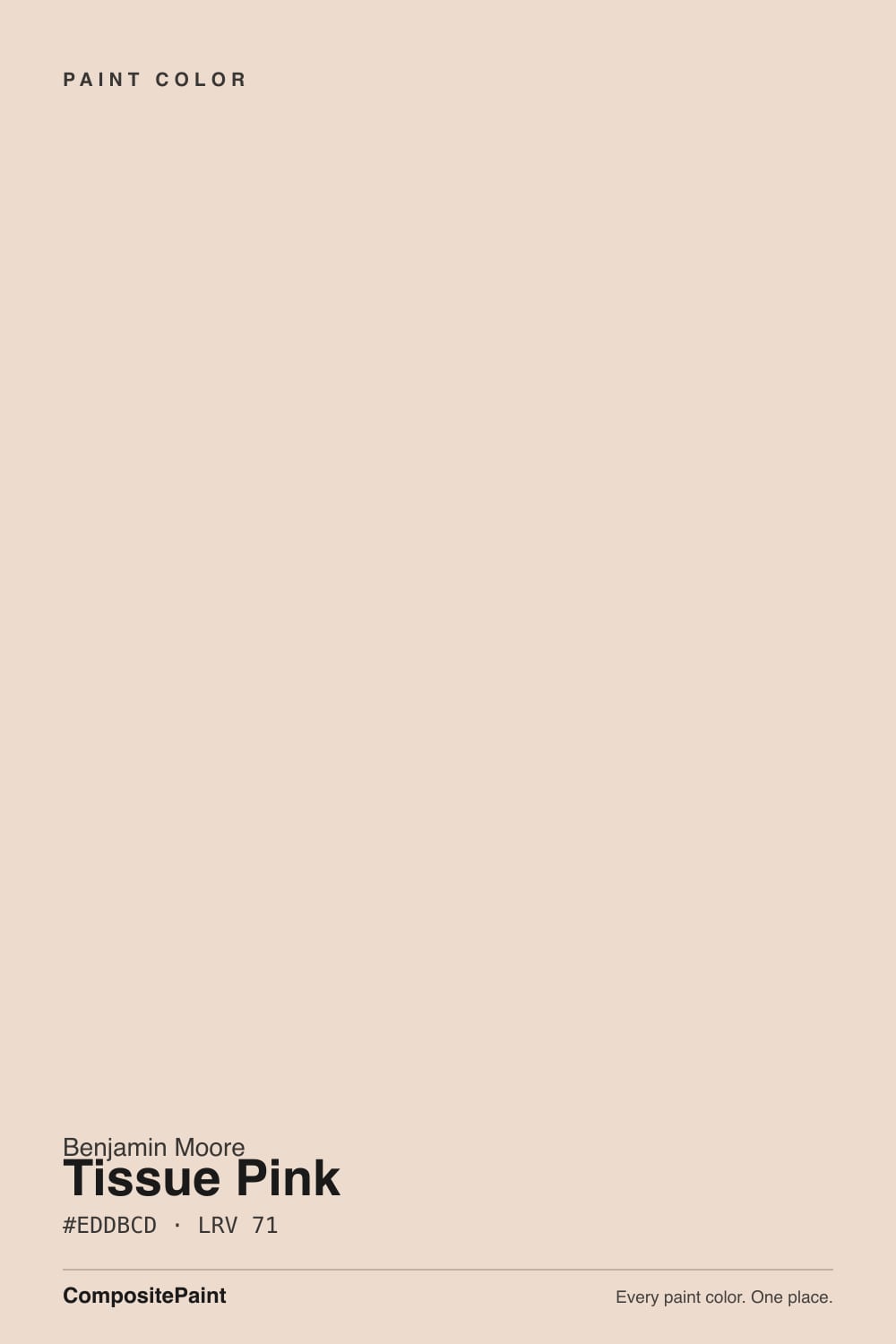
Tissue Pink is a warm, orange-based pink diluted almost to neutral — the opposite build from a cool mauve. Do the math on the deck's own numbers and the lean is obvious: red 237, green 219, blue 205, a steady step-down from red to blue that is textbook peach, not the flatter, cooler spread you'd see in a true gray-pink. It sits in Benjamin Moore's older Classic-era palette, not a Color of the Year release or a design-blog darling — it has simply been quietly available for decades, which is its whole personality: a workhorse, not a headline.
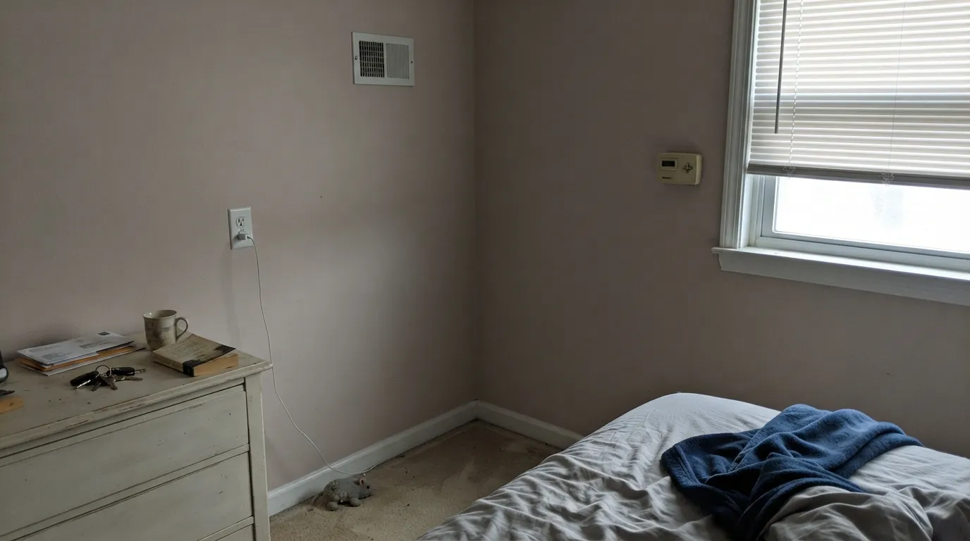
The trick, and the thing every online description of this color glosses over, is that it does not stay one thing. In strong, bright daylight the pale tone dilutes further and the wall reads as a warm off-white or soft greige — genuinely close to neutral. Pull the light down, though — an overcast day, a shaded interior wall, a lamp switched on after dark — and the same paint visibly warms and pinks up, because there's less bright white light in the room to dilute the base hue. Owners who bought it expecting a safe beige are the ones who write it up as "surprisingly pink at night."
Undertone in one line: warm peach-pink, always — never mauve, never cool rose. If your sample looks flat and slightly dingy in a north corner, that's the light being cool and dim, not the paint turning gray; if it looks distinctly rosy under a lamp, that's the color simply being itself once the daylight stops masking it.
Where It Shines
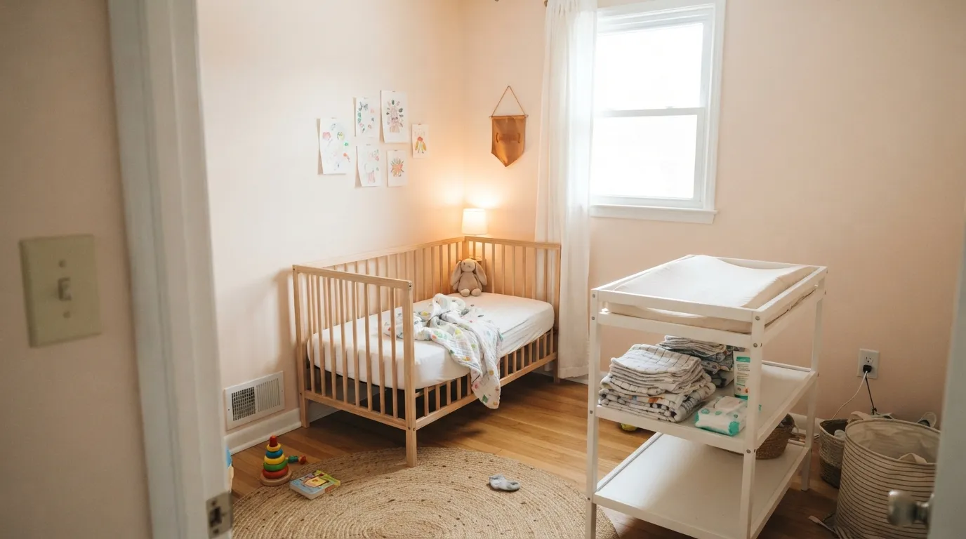
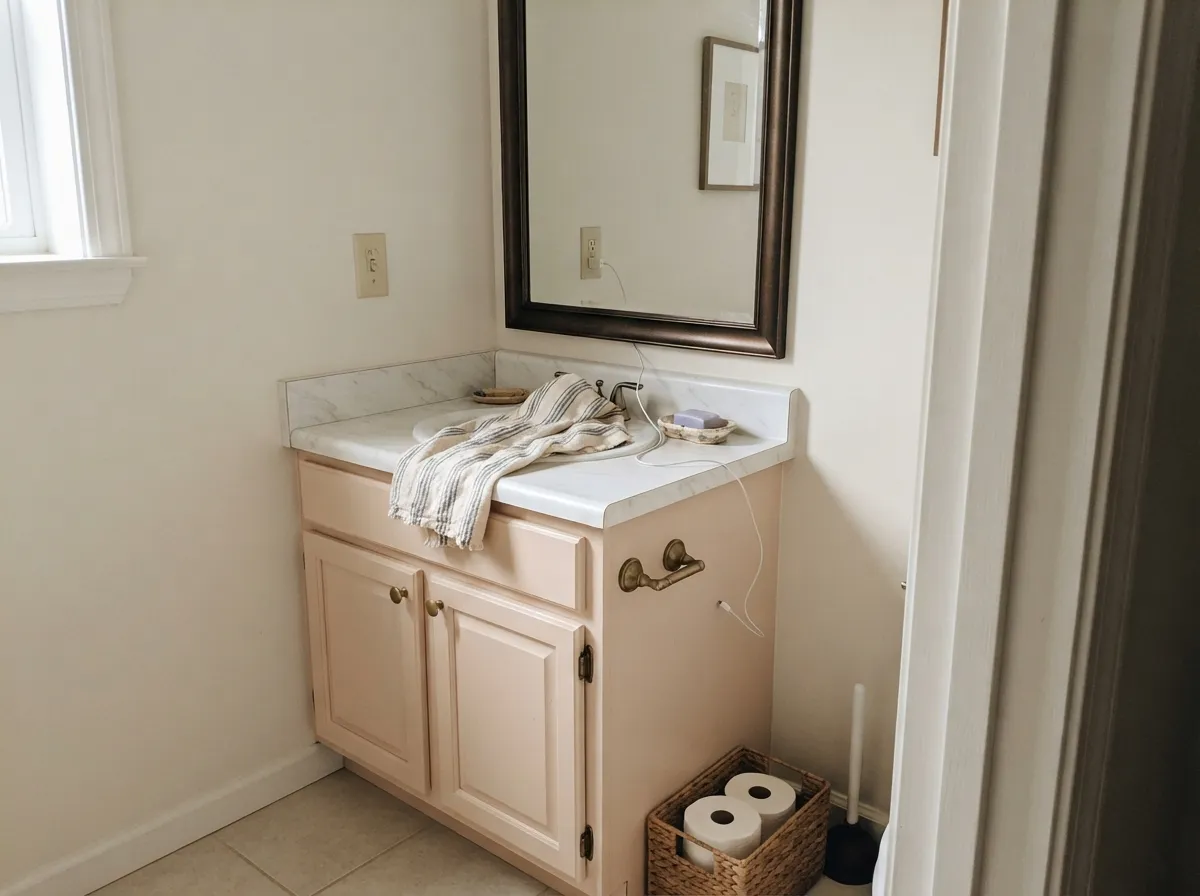
This is a color built for rooms people actually live in after dark. Give it a warm lamp and it turns into a genuine, gentle blush — cozy rather than saccharine, which is exactly the tightrope a nursery or a bedroom needs. Its second home is the small commitment: a powder room or a vanity, where the color reads intentional and a little unexpected without betting a whole open floor plan on pink. Pair it with brass, warm wood and cream, and the peach note stops reading as "pink" and starts reading as warmth.
Where It Fails
The regret stories about Tissue Pink follow one of three scripts, and each one is avoidable if you know the color's real behavior going in — none of them are the paint being defective, they're the color being honestly what it is.
Without direct sun to lift it, Tissue Pink can go flat and slightly dingy — a dull, muted peach-gray rather than the soft glow it shows in better light. It isn't turning a different color, it's simply not getting the light it needs to look finished. If the room stays dim all day, test a large sample there before committing, or add warm lamps as part of the plan, not an afterthought.
In a bright room it can pass for a warm beige for months — then a friend visits at dusk and says "wait, is that pink?" There is no light condition where Tissue Pink is truly undertone-free; it only gets quieter, never neutral. If zero pink risk is the actual requirement, this is the wrong color — go with a real reviewed neutral like Pale Oak instead.
The undertone is warm and orange-leaning, so it fights cool gray quartz, blue-gray tile, and polished chrome the same way any warm pastel fights a cool material — both sides end up looking slightly off. Give it brass, warm wood, or cream stone instead, and the clash disappears.
Room by Room
Soft enough to skip the "pink room" cliché, warm enough to feel finished rather than sterile. Works for any gender the way a true neutral does, but with more personality. Matte or eggshell; White Dove trim keeps the edges soft instead of stark.
Reads calm and neutral by day, quietly rosy once the overhead light is off and the lamps are on. Cream or white bedding keeps it feeling soft rather than sugary; avoid stark white sheets, which push the wall pinker by contrast.
A small, closed room takes the color's full personality well without asking the rest of the house to commit. Satin on a vanity under brass hardware and a marble or cream stone top is a weekend project that reads custom.
Works in a warm, lamplit, closed living room with cream and wood. Riskier in an open plan, where cool kitchen counters or gray flooring nearby will pick the fight described above.
Fine on a hutch, an island, or lower cabinets under a neutral wall — a full kitchen of Tissue Pink cabinets against stainless appliances is the cool-material clash working against you at scale.
Pale warm pastels wash out and read dated in strong outdoor sun, and there is essentially no real-world exterior track record for this color to point to. If you want a peachy exterior neutral, look for a color with actual outdoor history rather than testing this one on a whole house.
Your Light Is the Risk
Strong light dilutes the color toward a soft warm neutral — the most flattering, most "barely-there pink" version of it.
Less light to dilute the base hue leaves a flatter, slightly muted peach-gray rather than a glow. Sample here before committing.
Warms distinctly pink at the sun hours, settles back to quiet neutral in between — a gentle swing, not a color change.
2700K lamps push the pink and peach forward — the color's best moment. Cool LEDs flatten it toward a grayish beige.
Most complaints about Tissue Pink are a light mismatch. Upload a photo of your actual room and see it on your walls — then ask for the same wall in north light or evening lamps before you buy a single sample.
Need It From Another Brand?
Any paint counter can custom-tint Benjamin Moore 1163 directly. If you would rather stay in one brand's own deck, these are the closest stock matches, measured as ΔE2000. Under 2 is a difference you will not see on the wall.
| Brand | Closest color | ΔE | LRV | |
|---|---|---|---|---|
| Sherwin-Williams | BiscuitSW 6112 · Sherwin-Williams | 3.1 | 74 | Color page → |
| Behr | Weathered Sandstone290E-1 · Behr | 2.3 | 73 | Color page → |
| Valspar | Cake Batter2007-8C · Valspar | 1.2 | 72.7 | Color page → |
| PPG / Glidden | NosegayPPG1069-1 · PPG / Glidden | 0.9 | 73 | Color page → |
| Glidden | Beige LlamaPPG18-13 · Glidden | 0.8 | 73 | Color page → |
| Dutch Boy | Beachfront Blush307-1DB · Dutch Boy | 2.6 | 74 | Color page → |
Similar Benjamin Moore Colors
The nearest shades to Tissue Pink within Benjamin Moore's own range, ranked by perceptual color distance — useful when you want the same look a touch lighter, darker, or warmer.
WCAG 2.1: AA is 4.5 : 1 for normal text, 3 : 1 for large text, AAA is 7 : 1.
Tissue Pink vs the Colors You're Also Considering
Every Tissue Pink sample board has the same rivals on it. The numbers show the real lightness gap — then it comes down to which risk you would rather live with.
Pick this for the warmer, peachier lean that reads closer to beige than to rose.
Benjamin Moore 2102-70 · LRV 76First LightPick this for a cooler, pinker version of the same pale-pink-as-neutral trick, one shade lighter.
Pick this for the lighter, quieter, more neutral-passing version at LRV 71.
Sherwin-Williams SW 6057 · LRV 62Malted MilkPick this for more depth and more visible pink day to day — Malted Milk commits further before it hides.
Two cross-brand colors land on it almost exactly. Glidden Beige Llama PPG18-13 at #EEDBCE and LRV 73 is 0.76 away, and PPG Nosegay PPG1069-1 at #EEDACC and LRV 73 is 0.86. At those values you are looking at the same color, just two points lighter.
Valspar Cake Batter 2007-8C at #EDDAC9 and LRV 72.7 at 1.24, Diamond Vogel Flirt 0152 at 1.65, Magnolia Home Dutch Tulip JG-34 at LRV 73 and 1.93, and Dunn-Edwards Cashmere DEC758 at LRV 67 and 1.94 are all visually identical in normal room light, though Cashmere is four points darker, which you would notice on a full wall.
Behr Chiffon HDC-SP16-01 at #EADCCB and LRV 73 at 2.71 and Sherwin-Williams Biscuit SW 6112 at #EBDDCB and LRV 74 at 3.08 are very close but worth sampling first, since both lean a shade more yellow. Clare Baby Soft PNT100-LT-25 at #EFDDD9 and LRV 75 at 4.9 is close but visibly different side by side and reads clearly pinker. Benjamin Moore is sold through independent dealers.
Tissue Pink Coordinating Colors
The rule for coordinating with Tissue Pink: stay warm, stay soft, and keep cool grays and chrome at arm's length. It flatters warm whites, deep warm near-blacks, and one calm blue for contrast — these are the partners that keep the peach undertone working instead of fighting:
Tissue Pink's Story: A Quiet Classic, Not a Trend Color
Unlike the millennial-pink and dusty-blush colors that had a viral design-blog moment and then a backlash, Tissue Pink never had either. It sits in Benjamin Moore's older Classic-era interior palette, the kind of number a painter pulls out because a client asked for "something soft, not really a color" — not the kind a magazine puts on a cover. There is no Color of the Year credential here and no famous room to point to, and that is an honest strength, not a gap: a pale, grayed-down pink this quiet does not need a trend cycle to justify it, and it will not date the way a saturated blush eventually does.
The tradeoff is real, too: because it never went viral, there is very little real-room documentation online to sample against before you commit — most of what turns up is generic paint-database copy, not a Reddit thread of actual owners describing their actual walls. Lean harder on a large in-room sample card than you would for a color with a thousand photographed rooms behind it.
Tissue Pink With Wood Tones and Metals
Warm wood is this color's best friend for the obvious reason: both sit on the same side of the color wheel. Oak, walnut and butcher block all read richer next to Tissue Pink instead of fighting it, and unlacquered brass or warm gold hardware pulls the peach undertone forward in the flattering way rather than the dingy one.
Cool metals are the one clear no. Polished chrome and stainless steel read slightly wrong against a warm pastel — not disastrous, just a little off, the visual equivalent of two people speaking past each other. Matte black splits the difference and works fine in small doses, like a mirror frame or door hardware, without pulling the room cold.
Three Ready Palettes Built on Tissue Pink
A color is never alone on the wall. These are complete combinations in the 60-30-10 pattern, with the reason each one holds together. Every one opens in the visualizer.
White Dove trim keeps the blush soft instead of sugary, and one dose of Van Deusen Blue on a single object gives the room a grown-up, gender-neutral anchor without fighting the warm undertone.
Try this palette in your roomA small room takes the full personality of the blush well, and Wrought Iron's soft near-black keeps the palette from tipping saccharine. Brass hardware and a warm stone top finish the look this color was made for.
Try this palette in your roomPale Oak carries the main floor as a true neutral, so committing one room to Tissue Pink feels like a deliberate accent rather than a mismatch — the same warm White Dove trim ties both rooms back together.
Try this palette in your roomTissue Pink FAQ
Is Tissue Pink actually pink, or does it read neutral?
Both, depending on the light. In a bright room it dilutes toward a warm off-white and most guests won't call it pink. In dimmer light or under a warm lamp, the peach-pink undertone is unmistakable. There is no light where it becomes a truly neutral beige — it only gets quieter.
What trim white goes with Tissue Pink?
A warm white like White Dove is the safe default — it keeps the wall soft instead of making it look dirty by contrast. A stark, cool trim white will fight the peach undertone and make the wall read slightly muddy next to it.
Is it good for a nursery?
It's arguably the best room for it. The color is calm and gender-neutral in daylight and turns gently rosy at night under warm bulbs — exactly the range a nursery needs, without committing to a full "pink room."
Does it work with gray floors or quartz countertops?
Not comfortably. The undertone is warm and orange-based, so it argues with cool gray stone, blue-gray tile and polished chrome. It's much happier with warm wood floors, cream stone, and brass or matte-black fixtures.
How different does it look under LED bulbs versus warm bulbs?
Noticeably different. Warm 2700K bulbs push the pink and peach forward at night — the color's best moment. Cool white LEDs flatten it toward a grayish beige and mute the warmth the color is built on. Bulb choice matters as much as the paint choice here.
Is Tissue Pink an outdated or trendy color?
Neither, really — it has quietly existed in Benjamin Moore's older Classic-era palette for decades without ever having a Color of the Year moment or a viral design-blog run. That's its honest position: a workhorse pale pink, not a trend piece, which also means very little online documentation to lean on before you paint.
Have you painted with Tissue Pink?
Rate it — one tap helps the next reader decide.
Ask a Question