Odessa Pink
A quiet, beige-cast pink from Benjamin Moore's Historical Colors line, reviewed honestly: the light that turns it a soft blush, the light that turns it dingy, and what to pick instead.

Jessica has spec'd whites and neutrals for more than 300 rooms and keeps a sample wall of painted drawdowns in her studio. Every color review is checked against real reader rooms in the comments and re-tested when a formula changes. About the testing process →
- 1Vintage Tea Rose47
- 2Pink Quartz53
- 3Odessa Pink59
- 4Romance66
- 5First Light76
The Fast Verdict
Odessa Pink is what happens when a pink decides to behave like a neutral. Benjamin Moore's own line on it is almost apologetic — "a touch of beige lends versatility to this classic pink" — and that beige is doing real work: in ordinary daylight the wall reads like a warm, softly blushed off-white, not a color you'd call pink from across the room. It has no Color of the Year moment, no viral before-and-after, no Pinterest board named after it. It has just sat in BM's Historical Colors collection for decades, quietly working in bedrooms and powder rooms while louder pinks came and went.
Bedrooms and powder rooms · a living room that wants more presence than an off-white · nurseries that skip the candy-pink cliché · anyone who wants warmth on the walls without committing to an obvious color
You want a true, saturated pink · your room runs on cool LEDs with little daylight · your trim and countertops are chrome-and-cool-gray · you're chasing a specific color you saw online (this one never went viral)
- Reads as a warm neutral first and a pink second — subtle enough for a grown-up room
- Flatters natural oak, linen, and aged brass without any styling effort
- LRV 59 keeps small, light-starved rooms from feeling dark
- Decades in BM's catalog, not a fad — it isn't going to look dated the way a trend pink can
- One of the few pale pinks that sits easily next to a cool accent like teal instead of fighting it
- Cool light and cool LED bulbs flatten it into a dull, slightly dingy beige-gray
- Bright daylight pulls out more visible pink than the "just a touch of beige" reputation suggests
- Next to a bright white trim it can read chalky and dated instead of intentional
- Too quiet for anyone chasing a specific saturated or trendy blush — this color was never built to be a statement
What Color Is Odessa Pink, Really?
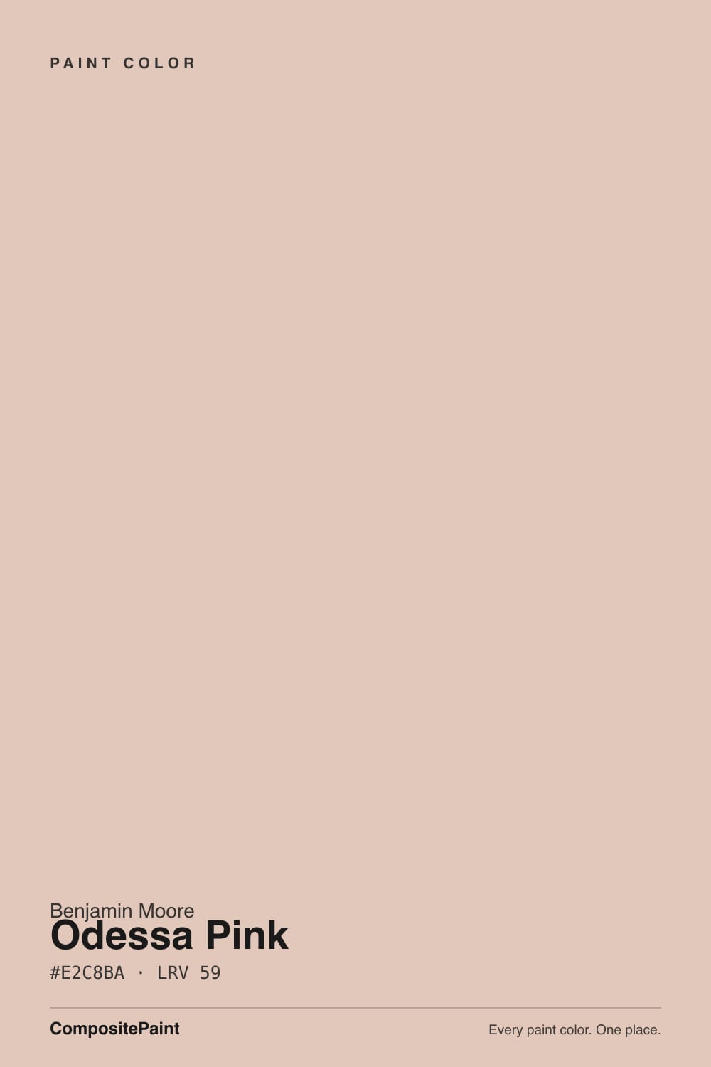
A low-chroma blush built on a beige-and-peach base rather than a true red-pink. Most pinks this pale either go candy-sweet or slip into dusty mauve; Odessa Pink does neither because the undertone leans orange-beige instead of violet. Benjamin Moore files it under Historical Colors — the HC prefix on the SKU is the tell — which is the company's way of saying this shade came from old East Coast interiors, not a current trend report. It has never had a marketing push, a celebrity room, or a design-blog moment. That is not a knock; it is the whole personality: a color you paint because it works, not because you saw it somewhere.
At LRV 59 it reflects a solid majority of the light in a room, but it does not sit still while it does it. In brighter daylight the color pulls forward and reads as a clear, if restrained, blush pink. In lower or warmer light — evening lamps, a shaded room, late afternoon — it settles into a creamier, clay-like warmth that reads closer to a warm off-white than a pink. That range is the whole appeal for people who want a room with more character than beige but less commitment than a real accent color, and it is also the thing first-time buyers most often get surprised by.
Undertone in one line: warm peach-beige, never violet, never true red. If the wall on your sample board looks flat, dull, or grayish, that is cool light draining the peach out of it — not a paint defect. If it looks distinctly pink and you didn't expect that, that is bright daylight doing exactly what the swatch promised; the color is more honest about being a pink than its beige reputation suggests.
Where It Shines
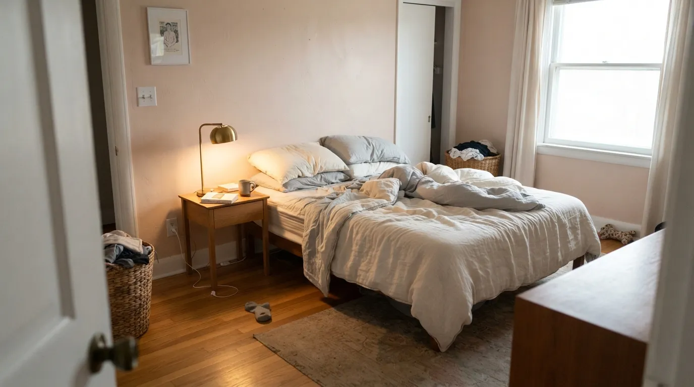
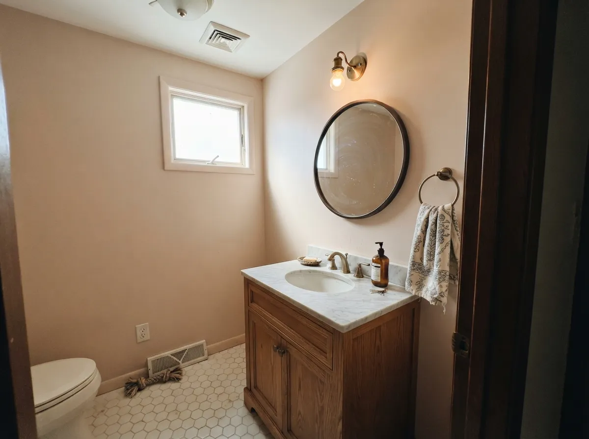
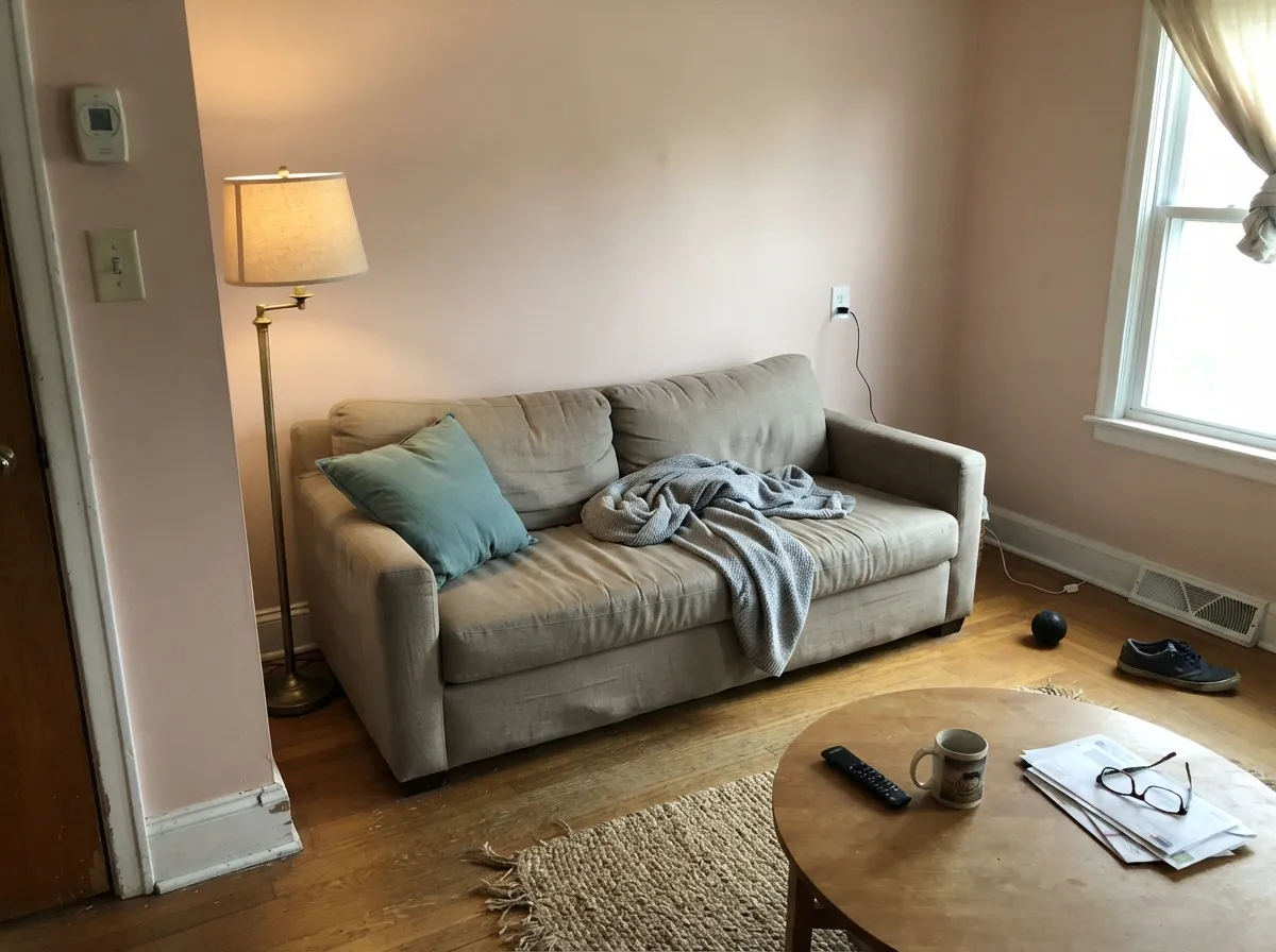
This is a color for rooms that want warmth without a statement. Bedrooms are its strongest case: with natural oak floors, linen bedding, and aged brass hardware, it reads soft and finished rather than themed. Small rooms are its second home — a powder room or a compact bath takes the color's presence well, because four close walls of Odessa Pink read as an intentional, slightly luxe choice instead of an accident. It also does something few pale pinks manage: it sits comfortably next to a cool accent like teal or charcoal instead of fighting it, which makes it easier to use in a room that already has other colors in it.
Where It Fails
Almost every regret story about Odessa Pink traces back to one of three situations, and all three are predictable before the first coat goes on. None of them are the paint's fault — but if your room matches one, this is not your color, and a bigger sample will only confirm the problem.
Buyers who read "a touch of beige" and expected a neutral are sometimes caught off guard in a bright, sunlit room, where the peach comes forward and the wall reads as unmistakably pink. The paint isn't misbehaving — bright light is simply the condition where this color is most honest about what it is. If you truly want a warm neutral with zero pink risk, look at a real off-white instead.
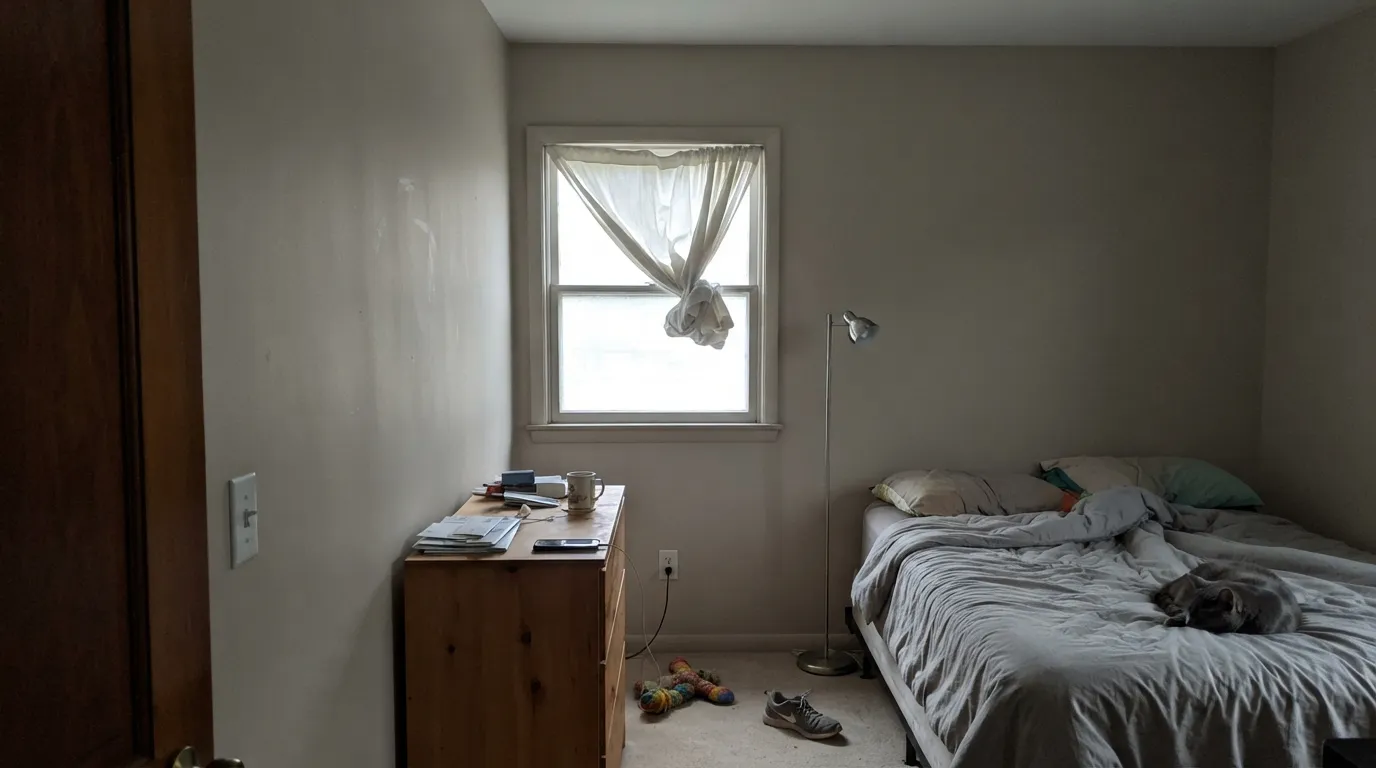
North-facing rooms, cool LED bulbs, and chrome fixtures pull the warmth out and leave the "clay" side of the color with none of the glow that makes it work. Readers describe this version as tired or dirty rather than soft. Warm 2700K bulbs and some direct daylight are part of this paint job, not an accessory.
Pair Odessa Pink with a stark, blue-white trim and the contrast makes the wall look chalky and a little 1990s rather than deliberate. The fix is the same one every warm color needs: trim in a warm white like White Dove or Swiss Coffee, never a cool bright white.
Room by Room
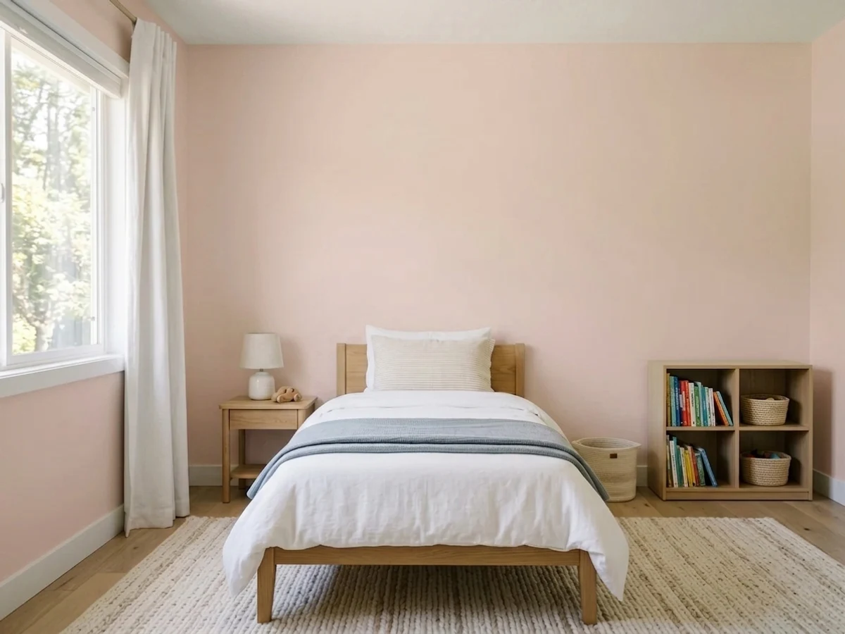
Warm and settled in daylight, cozier under evening lamps. Eggshell on the walls, White Dove trim in semi-gloss, oak furniture and brass hardware are its natural company.
Four close walls in Odessa Pink read as a deliberate, slightly expensive choice rather than an accident — the small-room-deep-color rule works here even though this color isn't especially deep. Satin on the vanity, brass fixtures, a warm-toned mirror frame.
Beautiful with linen upholstery and a cool accent (a teal pillow, a charcoal lamp) to keep it from feeling one-note sweet. Riskier in a north-facing or lamp-only room, where it can dull toward gray-beige.
On an island or a coffee hutch it is warm and unexpected without betting the whole kitchen on pink. A full kitchen of Odessa Pink cabinets against cool quartz or stainless steel is a harder sell — warm wood counters make the case much easier.
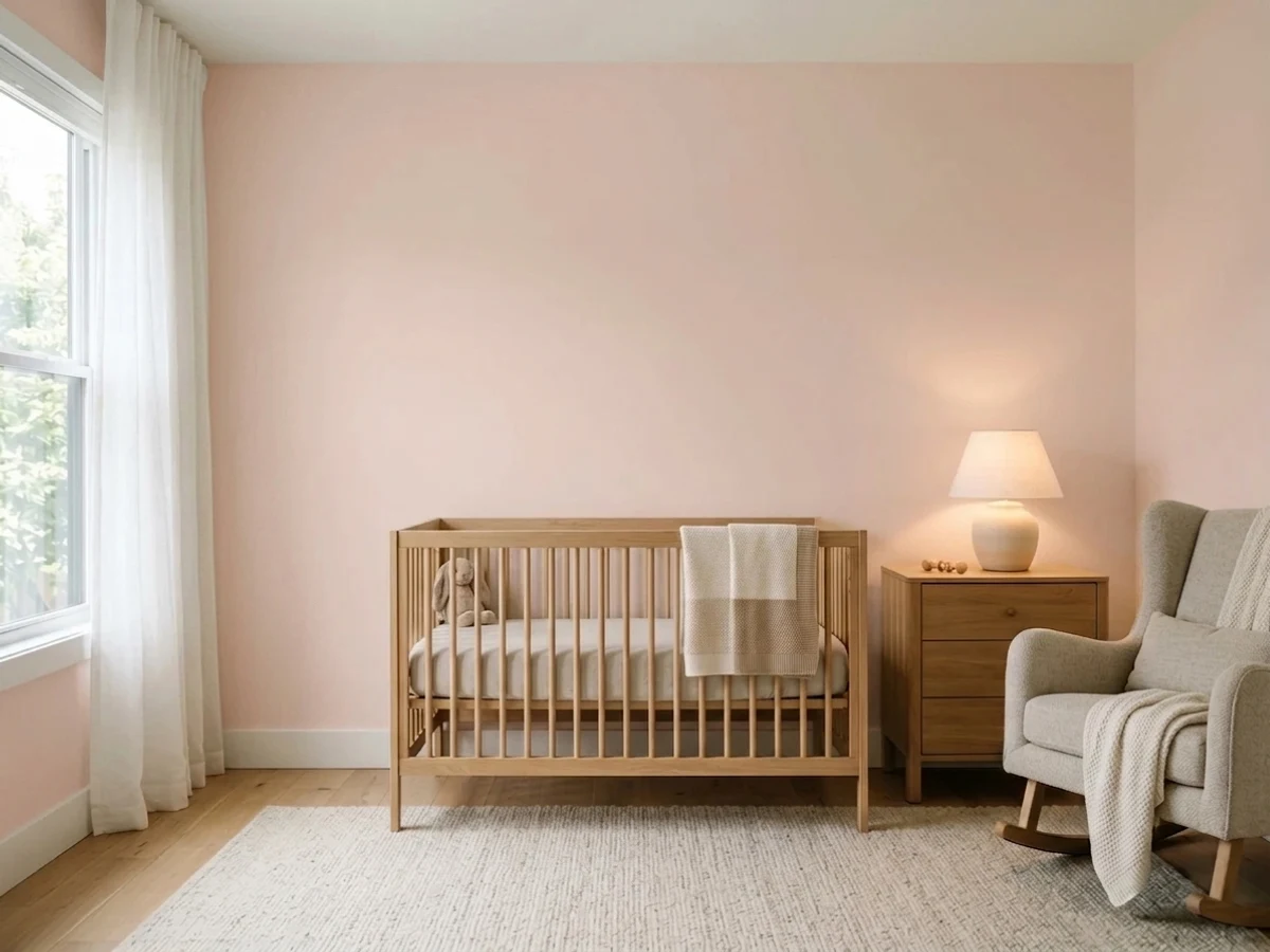
Muted enough to skip the candy-pink cliché and still feel warm and gentle. Works for a gender-neutral room in a way a saturated pink can't. Matte or eggshell for easy touch-ups.
It has been used outside, but full sun washes the peach out toward a flat, salmon-leaning beige, and there isn't a well-established trim pairing the way there is for BM's classic exterior whites and grays. Sample a large board on the actual elevation before committing a whole house to it.
Your Light Is the Risk
Settles into a confident, restrained blush — warm and clearly a color, without tipping candy-sweet or orange.
Cool light drains the peach and leaves a flat, slightly dingy beige-gray — the clay side of the color with none of its warmth.
Quieter and more beige-clay in soft morning light, then warms into a peachier glow as the sun lowers in the afternoon.
2700K lamps deepen it toward a cozy, clay-like pink. Cool white LEDs chalk it out toward gray — swap the bulb before you blame the paint.
Most complaints about Odessa Pink are a light mismatch. Upload a photo of your actual room and see it on your walls — then ask for the same wall in north light or evening lamps before you buy a single sample.
Need It From Another Brand?
Any paint counter can custom-tint Benjamin Moore HC-59 directly. If you would rather stay in one brand's own deck, these are the closest stock matches, measured as ΔE2000. Under 2 is a difference you will not see on the wall.
| Brand | Closest color | ΔE | LRV | |
|---|---|---|---|---|
| Sherwin-Williams | Malted MilkSW 6057 · Sherwin-Williams | 2.2 | 62 | Color page → |
| Behr | Sand DanceS190-2 · Behr | 1.1 | 61 | Color page → |
| Valspar | Misty Loch8003-12C · Valspar | 2.5 | 61 | Color page → |
| PPG / Glidden | Birthday Suit1071-3 · PPG / Glidden | 1.3 | 60 | Color page → |
| Glidden | Sultan SandPPG1068-3 · Glidden | 1.4 | 62 | Color page → |
| Dutch Boy | Sandstone Quarry408-2DB · Dutch Boy | 2.2 | 62 | Color page → |
Similar Benjamin Moore Colors
The nearest shades to Odessa Pink within Benjamin Moore's own range, ranked by perceptual color distance — useful when you want the same look a touch lighter, darker, or warmer.
WCAG 2.1: AA is 4.5 : 1 for normal text, 3 : 1 for large text, AAA is 7 : 1.
Odessa Pink vs the Colors You're Also Considering
Every Odessa Pink sample board has the same rivals on it. The numbers show the real lightness gap — then it comes down to which risk you would rather live with.
Pick this for the more beige, more neutral-reading blush that can still pass for a warm off-white in mixed light.
Benjamin Moore 2101-60 · LRV 61Pale Cherry BlossomPick this if you want the pink to stay visible even in cool light — it holds its rose more evenly across the day than Odessa Pink does.
Pick this if you're already committed to Benjamin Moore's paint line and color system.
Sherwin-Williams SW 6057 · LRV 62Malted MilkPick this if your painter works in Sherwin-Williams — the closest cross-brand match, with the same blushing-beige character.
Pink Beach 1172 shares the same hex, #E2C8BA, and is listed at LRV 61 against 59 for Odessa Pink. On a wall the two are effectively the same color, so pick whichever your dealer has mixed. Basking Ridge Beige 1158, #E0C8B6 at LRV 61, drops a little of the red and reads as beige with a pink memory. Rosetone 1186, #E5C8BF at LRV 62, goes the other way, cooler and clearly rosier. Acapulco Sand 2105-60, #DDC9C1 at LRV 61, is the grayest of the group.
Across brands, PPG and Glidden's Birthday Suit 1071-3 at deltaE 1.26, Clare's Meet Cute PNT100-LT-60 at 1.32, and Backdrop's August BD-AU at 1.32 are all visually identical in normal room light. Sherwin-Williams Malted Milk SW 6057 at deltaE 2.24 and Behr Brazilian Tan N250-2 at 2.54 are very close but worth sampling first. Farrow and Ball Scallop No. 311 at 3.74 is close but visibly different side by side, reading grayer.
Odessa Pink Coordinating Colors
The rule for coordinating with Odessa Pink: warm whites for trim, warm woods and brass for hardware, and one cool accent — a teal, a near-black — to keep the room from feeling all one temperature. It shares its beige base with several BM neutrals, which makes handing off to an adjoining room easy. These are the partners that keep showing up in rooms that work:
A Quiet Historical Color That Never Chased a Trend
Odessa Pink lives in Benjamin Moore's Historical Colors collection — the HC number on the can is the giveaway — a line built from paint archaeology on old American homes, not from a current trend report. It has no Color of the Year moment behind it, no viral before-and-after, no design-blog feature that made it famous. It simply sat in the catalog through decades of gray, then greige, then the loud millennial-pink and Peach-Fuzz cycles that made "pink" a headline color again, without ever getting swept up in any of it.
That absence of a moment is the honest selling point. A color built around a specific trend usually looks like that trend a few years later; Odessa Pink was never built around one, so it doesn't have a decade stamped on it. It's the color you reach for when you want a room with a little more character than beige, and you're not trying to make a statement anyone will date.
Odessa Pink With Wood Tones and Metals
Natural oak, honey-toned floors, and unlacquered or aged brass are this color's best company — the warmth on both sides meets in the middle, and the pairing reads collected rather than themed. Linen upholstery in cream or oatmeal keeps a bedroom or living room soft without adding a second competing color.
The pairing that needs a sample first is anything cool and hard: chrome fixtures, polished nickel, or cool-gray quartz counters. None of these are dealbreakers, but they pull against the color's warmth and can push it toward looking washed-out or slightly off rather than intentional. If your metals and countertops are already cool, lean on a warm-toned mirror frame or light fixture to bridge the gap, or test a large sample under your actual fixtures before committing a whole room.
Three Ready Palettes Built on Odessa Pink
A color is never alone on the wall. These are complete combinations in the 60-30-10 pattern, with the reason each one holds together. Every one opens in the visualizer.
A warm, deep brown accent keeps the pink grounded instead of sugary — the room reads adult and finished rather than like a nursery. White Dove trim, not a brighter white, keeps the handoff soft.
Try this palette in your roomDrenching a small room in one warm color and adding a single soft near-black note (door, mirror frame) is the fastest way to make a powder room read designed. Swiss Coffee overhead keeps the ceiling from going stark.
Try this palette in your roomTeal sits opposite this pink's undertone, so a single teal accent keeps the room from reading one-note sweet without fighting the walls. It's the pairing Odessa Pink handles better than most pale pinks.
Try this palette in your roomOdessa Pink FAQ
Is odessa pink actually pink, or is it more of a beige?
It's a genuine pink built on a beige base, and which side you notice depends on the light. In bright daylight it reads as a clear, restrained blush. In lower or cooler light it settles toward a warm off-white. If you want a color with zero chance of reading pink, this isn't it — but it's about as quiet as a real pink gets.
What's the difference between odessa pink and first light or pale cherry blossom?
First Light (LRV 76) is paler and closer to a warm off-white — the safest of the three if you're nervous about commitment. Pale Cherry Blossom (LRV 61) holds its pink more consistently across different light. Odessa Pink (LRV 59) sits in between: more color than First Light, more willing to fade into beige in dim light than Pale Cherry Blossom.
Does odessa pink work in a kitchen?
On an island, a hutch, or lower cabinets it's a warm, unexpected choice, especially with wood counters and brass hardware. A full kitchen of pink cabinets against cool quartz or stainless is a much bigger commitment and a harder pairing to get right.
What trim white goes with odessa pink walls?
A warm white — White Dove or Swiss Coffee — in semi-gloss. A stark, blue-white trim makes the walls look chalky and dated instead of intentional, which is the single most common styling mistake with this color.
Is it a good nursery or kids' room color?
Yes, and it avoids the candy-pink cliché. It's muted enough to feel calm rather than themed, works for a gender-neutral room, and ages with the child better than a saturated pink would. Matte or eggshell handles crayon marks and handprints reasonably well.
Does odessa pink work on exteriors?
It's been used outside, but honestly it's a niche choice rather than a proven default. Full sun washes the peach out toward a flatter, salmon-leaning beige, and there isn't the established trim playbook that BM's classic exterior colors have. Sample a large board on the actual house before committing.
Have you painted with Odessa Pink?
Rate it — one tap helps the next reader decide.
Ask a Question