Pink Shadow
The dusty peach-blush from Sherwin-Williams' historic deck, reviewed honestly: the nurseries and ceilings it flatters, the light that turns it salmon, and what to pick instead.

Jessica has spec'd whites and neutrals for more than 300 rooms and keeps a sample wall of painted drawdowns in her studio. Every color review is checked against real reader rooms in the comments and re-tested when a formula changes. About the testing process →

- 1Vintage Tea Rose47
- 2Pink Quartz53
- 3Pink Shadow58
- 4Romance66
- 5First Light76
The Fast Verdict
Pink Shadow is a pink with the sugar taken out: a soft peach-blush muted so far down that it reads like aged plaster instead of a color chip. It is the pink you use when you want a room to feel warm and slightly old, not decorated — a nursery that will still look right when the crib becomes a desk, or a ceiling that throws candlelight glow onto white walls. Buy it for the peach. If you are shopping for a cool rose-pink, this is the wrong aisle.
Nurseries and kids' rooms that have to outgrow the theme · ceilings — the fifth-wall glow · bedrooms that live under warm lamps · powder rooms and evening dining rooms
You wanted a cool millennial pink · your floors or trim are orange-toned honey oak · the room runs on cool white LEDs · you have big west-facing walls in afternoon sun
- Pink with the sweetness muted out — reads aged plaster, not nursery décor
- Grows with a kid's room instead of dating in three years
- Casts a warm, flattering glow when used overhead on a ceiling
- At LRV 58 it holds its color instead of washing out to a tint
- A Historic Collection color, so it never looked like this season's pick
- Peach-based — the wrong buy if you wanted a cool dusty rose
- Amplifies honey oak floors and orange-stained trim
- Goes chalky putty-tan under cool LEDs and dim gray light
- Big west-facing walls flush salmon for an hour every afternoon
What Color Is Pink Shadow, Really?
A soft peach-pink with the chroma pulled way down. Technically it sits at the orange end of the pink family — around 18 degrees on the hue wheel, which puts it closer to apricot than to rose — and the gray in it is what the name is describing. That muting is the whole point: straight peach on a wall reads like a bathroom from 1987, while Pink Shadow reads like plaster that has been on the wall a long time. It comes out of Sherwin-Williams' Historic Collection, the preservation-era deck of colors pulled from old houses rather than invented for a season, which is why it feels settled instead of trendy.
At LRV 58 it is a genuine mid-light color, not a tint you can lose. That matters both ways. On four walls it stays visibly pink from across the room — you will not squint at it and call it a warm white — and on a ceiling it is a full step deeper than standard ceiling white, so the plane comes down a little and the whole room gets a warm bounce. Plan for it to read a shade stronger and warmer than the chip, the way every low-chroma warm color does once it covers 400 square feet.
Undertone in one line: peach-orange first, gray second, no blue anywhere. If your sample looks like tan or putty, your light is cold. If it looks like salmon, that is west sun or a 2700K bulb doing it. Both readings are the same paint being honest about your room.
Where It Shines
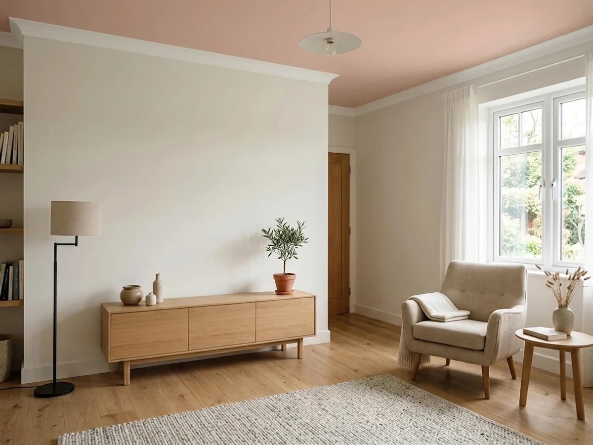
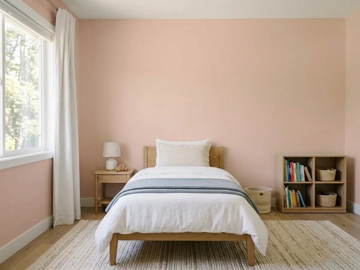
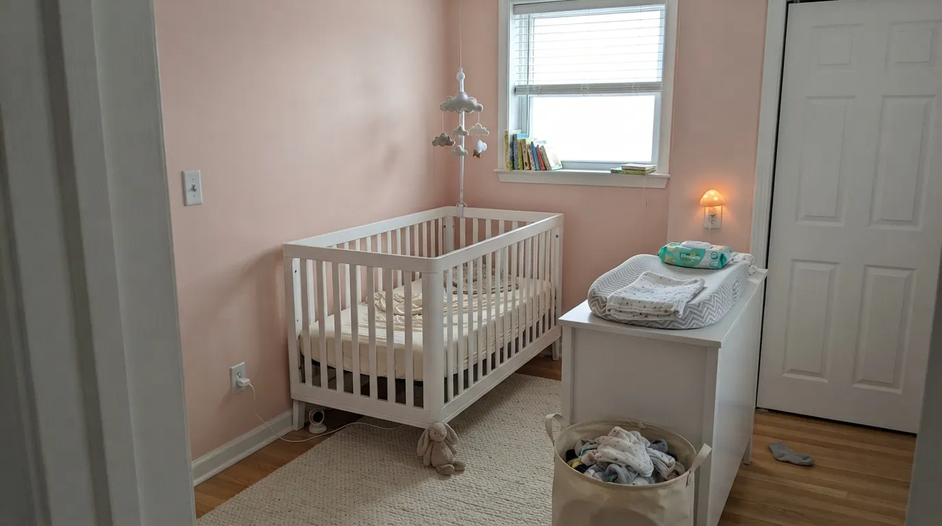
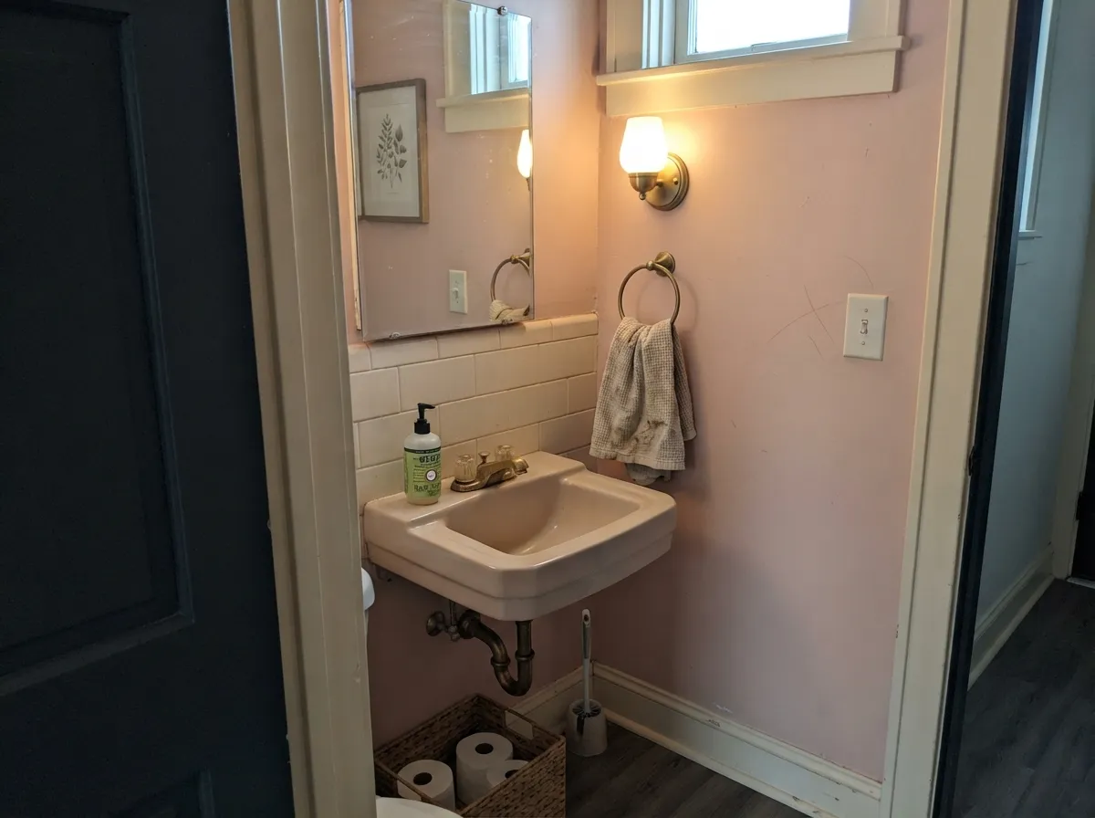
This color earns its keep in rooms that want warmth without a statement. A nursery is the obvious one, and the reason is practical rather than sentimental: the pink is muted enough that it never reads as baby décor, so the room survives a toddler, then a nine-year-old, then a teenager who hates everything. The less obvious win is overhead. Painted on a ceiling above warm white walls it does what decorators have used pink-lined lampshades to do for a century — it bounces a soft flattering light down onto everything and everyone in the room. Give it cream, unlacquered brass, cane, walnut and linen and it looks like it has always been there.
Where It Fails
Nearly every bad Pink Shadow story traces to one of three things, and all three are visible before you open the can. None are the paint's fault — but if your room matches one, no number of coats will argue you out of it.
The name promises shadowy and gray; the pigment delivers peach. Put it next to a blue-based pink and Pink Shadow immediately looks like apricot or bandage-tan. If the rose version is what you pictured, Behr Vintage Tea Rose is the same depth with the warmth pulled out — buy that instead and skip the repaint.
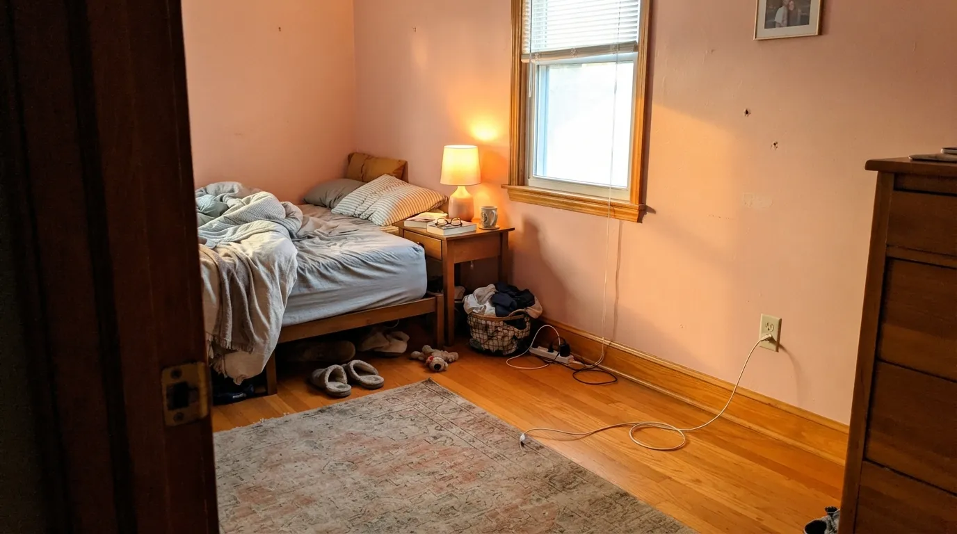
Golden oak sits in the same orange corner of the wheel, so the wall and the floor stop reading as two decisions and start reading as one big peach smear — the floor looks louder, the walls look muddy. Pale white oak, walnut, painted trim or a large cream rug all fix it. Wall-to-wall honey tones do not.
4000K bulbs and flat gray daylight strip out the warmth and leave a chalky putty-tan that readers describe as dirty beige. This paint is a lighting decision as much as a color decision: 2700K bulbs are part of the job. If the room is dim and you refuse lamps, pick something that does not depend on warmth.
Room by Room
Soft enough to be calming, muted enough that nobody labels it a baby room. Eggshell on the walls, warm white trim, and it takes a bed and a desk in ten years without a repaint. The same logic carries it into a young child's room.
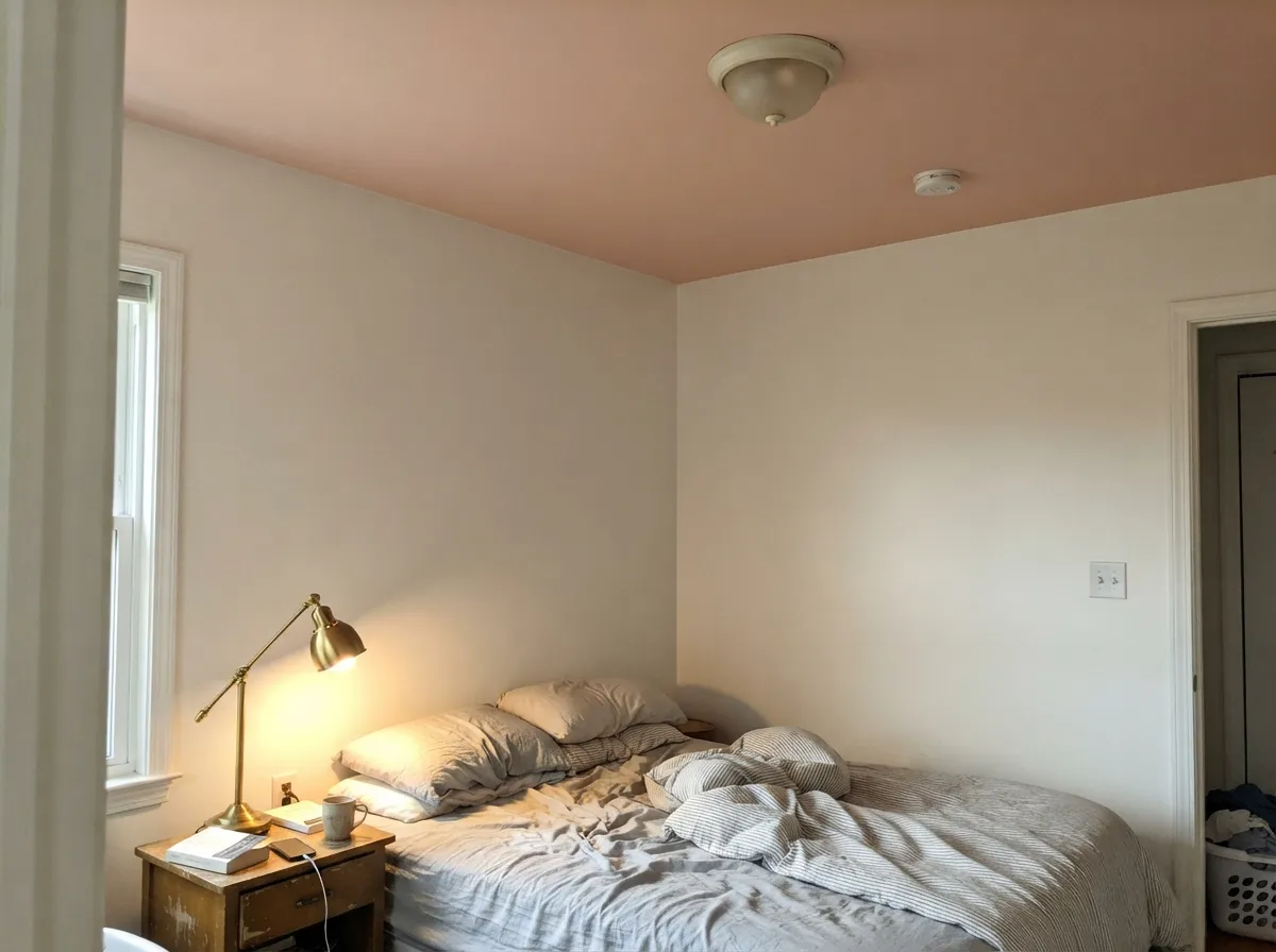
The designer move with this color. Flat sheen overhead, warm white or cream on the walls, and the ceiling throws a soft candlelight cast down over the room. Best in rooms with 9-foot ceilings or higher; in a low room the added depth is felt.
Under 2700K light it turns quietly rosy and the room feels like evening. Matte or eggshell on the walls, cream bedding rather than bright white, and keep the overhead cool LEDs off. In a bright north bedroom it stays dustier and calmer — many people prefer it there.
Warm pink reflects onto faces, which is exactly why old houses used it in dining rooms and why a blush powder room always feels more expensive than it cost. Small rooms take the color well; add a near-black mirror frame or door so the scheme reads deliberate.
In a closed, lamplit sitting room with pale oak or walnut it is lovely. In an open plan it has to negotiate with kitchen wood, cabinet color and every adjacent wall — and with golden floors underneath, it loses. Sample a whole board against the floor before committing the main level.
Full sun bleaches the gray out of it and a whole house reads salmon stucco from the street. It belongs to the historic deck as a detail color: porch trim, brackets and window sash on a Victorian, where a small dose of dusty peach is period-correct and looks intentional.
Your Light Is the Risk
Cool, even daylight tempers the peach and lets the gray show — the dustiest, most sophisticated version of this color.
Low afternoon light pushes it to open salmon on a big wall. Sample at 5pm before you commit a west room.
Warm and peachy at breakfast, calmest and truest at midday, warming again toward evening. It moves — most people like the arc.
2700K lamps make it glow rosy and soft; 4000K LEDs flatten it to putty. Swap bulbs before you blame the paint.
Most complaints about Pink Shadow are a light mismatch. Upload a photo of your actual room and see it on your walls — then ask for the same wall in north light or evening lamps before you buy a single sample.
Need It From Another Brand?
Any paint counter can custom-tint Sherwin-Williams SW 70 directly. If you would rather stay in one brand's own deck, these are the closest stock matches, measured as ΔE2000. Under 2 is a difference you will not see on the wall.
| Brand | Closest color | ΔE | LRV | |
|---|---|---|---|---|
| Behr | Coral StonePPU2-07 · Behr | 0.5 | 57 | Color page → |
| Benjamin Moore | Pale Petal1178 · Benjamin Moore | 0.9 | 59 | Color page → |
| Valspar | Rodeo Dust1008-10B · Valspar | 1.4 | 57 | Color page → |
| PPG / Glidden | Spice BeigePPG18-14 · PPG / Glidden | 0.7 | 59 | Color page → |
| Glidden | Spice BeigePPG18-14 · Glidden | 0.5 | 59 | Color page → |
| Dutch Boy | Mauve Mystery407-1DB · Dutch Boy | 1.4 | 57 | Color page → |
Similar Sherwin-Williams Colors
The nearest shades to Pink Shadow within Sherwin-Williams's own range, ranked by perceptual color distance — useful when you want the same look a touch lighter, darker, or warmer.
WCAG 2.1: AA is 4.5 : 1 for normal text, 3 : 1 for large text, AAA is 7 : 1.
Pink Shadow vs the Colors You're Also Considering
Every Pink Shadow sample board has the same rivals on it. The numbers show the real lightness gap — then it comes down to which risk you would rather live with.
Pick this when you want the pink to actually show up on the wall rather than hover near neutral.
Benjamin Moore HC-59 · LRV 59Odessa PinkPick this if your painter works in Benjamin Moore — it is the same beige-pink idea, a little lighter and a little more beige.
Pick this when you want depth and dust instead of prettiness.
Sherwin-Williams SW 6323 · LRV 66RomancePick this for a lighter, clearer pink that admits it is pink — better in a small dim room that needs the light back.
Pink Shadow Coordinating Colors
The rule with Pink Shadow is to keep the company warm and low-chroma. Warm whites and creams sit beside it without cutting; muted greens sit opposite it and cancel the sweetness; warm darks give it the one grounded note it needs. What to keep away from it: cool blue-grays, bright bluish whites, and anything golden-orange, which collapses into it. These are the partners that keep showing up in rooms that work:
The Pink Ceiling, Explained
Painting a ceiling pink sounds like a dare until you understand the mechanism. Warm pink light is flattering to skin — decorators have lined lampshades with pale pink for a century for exactly that reason — and a ceiling is the largest reflector in the room. Put a muted blush overhead and every lamp and window in the room bounces a faint warm cast down over the walls, the furniture and the people. The room reads as candlelit at 3pm. That is the whole trick, and Pink Shadow is well suited to it because it is muted enough to glow rather than announce itself.
The practical rules are short. Use flat sheen so the plane stays soft and the roller lines vanish. Keep the walls warm — a cream or a blush-leaning white like Ibis White — because the bounce will tint a cool white wall pink anyway, and it looks much better when the wall was already going that direction. Watch your height: at LRV 58 this is far deeper than a 90-plus LRV ceiling white, so an 8-foot ceiling will feel closer. And test with the actual bulbs you own, because a cool LED downlight cancels the effect you are paying for.
Pink Shadow With Wood Tones and Floors
The floor decides this one. Pale white oak is the best partner — it shares the warmth without competing, and the room stays airy. Walnut and other dark red-browns are excellent too: the depth underneath makes the blush look deliberate rather than accidental. Gray-washed floors and cool LVP also work, and they do something useful, pulling the peach back toward dusty pink by contrast.
The one clear no is orange: honey oak, golden-stained trim, orange-red brick, and terracotta tile all sit in the same corner of the wheel as this color, so they exaggerate one another. The wall stops looking like a color choice and starts looking like a continuation of the floor. A large cream or wool rug can rescue a single room. A whole level of golden oak cannot be rescued, and Pink Shadow is the wrong pick there.
For everything else in the room: cane, rattan, unlacquered brass, aged leather and linen all belong to it. Polished chrome and cool nickel are the only finishes that read slightly wrong — they go steely and cold against the warmth, and in a bathroom that contrast is what tips the wall from blush toward flesh tone.
Three Ready Palettes Built on Pink Shadow
A color is never alone on the wall. These are complete combinations in the 60-30-10 pattern, with the reason each one holds together. Every one opens in the visualizer.
Green is pink's opposite, and a muted one keeps the room from tipping sweet — Saybrook Sage needs warm company anyway, so the two prop each other up. Alabaster is the soft warm white that lets the blush stay the warmest thing in the room; a stark white here would make the walls look like a mistake.
Try this palette in your roomIbis White has its own faint blush, so the ceiling bounce lands on a wall that already agrees with it instead of tinting a cool white pink by accident. Urbane Bronze is the warm dark that stops the scheme from floating — one grounded note at the doors and the glow overhead reads intentional.
Try this palette in your roomCream and blush is the old-house pairing this color came from — Dover White's warmth keeps the trim from cutting a cold line through it. Cracked Pepper is a warm near-black, so the dark note stays in the same family instead of going blue on you; brass fixtures finish it.
Try this palette in your roomPink Shadow FAQ
Is Pink Shadow pink or peach?
Peach, honestly — a peach-pink with the color turned down. It sits at the orange end of the pink family, so it will never read as a cool rose. In north light the gray shows and it looks dusty and pink; in warm afternoon light the peach comes forward. If cool rose is the goal, look at Behr Vintage Tea Rose instead.
Will it look babyish in a nursery?
No, and that is the main reason to pick it. The muting keeps it from reading as nursery décor — it looks like a soft warm plaster wall that happens to be pink. Pair it with a warm white trim and natural wood rather than pastel furniture, and the room reads as a bedroom that a child happens to be using.
What trim white goes with Pink Shadow?
A warm one. Alabaster is the easy default, Dover White if you want the creamier old-house version. A bright, cool trim white makes the walls look dirty by comparison — the most common mistake with any muted color this warm. Pure White is the crispest you should go, and only in a room with real daylight.
Can I paint the ceiling Pink Shadow?
Yes — it is one of the best uses for it. Flat sheen, walls in a warm white or cream, and expect the ceiling to throw a soft warm cast down onto the walls and everything under it. Keep it for rooms with 9-foot or taller ceilings; at LRV 58 it is much deeper than ceiling white, so a low room will feel lower.
Does Pink Shadow work with oak floors?
It depends entirely on the oak. Pale white oak, walnut and gray-washed floors are all good. Orange-toned honey oak is the real clash: the floor and the walls sit in the same warm-orange corner, so each makes the other look louder and muddier. A big cream or wool rug helps in one room; a whole house of honey oak means a different color.
Is it too much color for a whole house?
For most houses, yes. It is at its best in one committed room or overhead, with a quieter neutral like Accessible Beige carrying the halls and open areas. Whole-house blush works only when the light is consistent and the floors are pale — otherwise the color changes character every time you walk through a doorway.
Have you painted with Pink Shadow?
Rate it — one tap helps the next reader decide.
Ask a Question