Muted Sage
Behr's gray-leaning sage, reviewed honestly: the cabinets and stucco exteriors it was built for, the flat cloudy light that drains it to taupe, and what to pick instead.

Jessica has spec'd whites and neutrals for more than 300 rooms and keeps a sample wall of painted drawdowns in her studio. Every color review is checked against real reader rooms in the comments and re-tested when a formula changes. About the testing process →
- 1Roycroft Brass15
- 2Anonymous20
- 3Muted Sage28
- 4Light French Gray53
- 5Accessible Beige58
The Fast Verdict
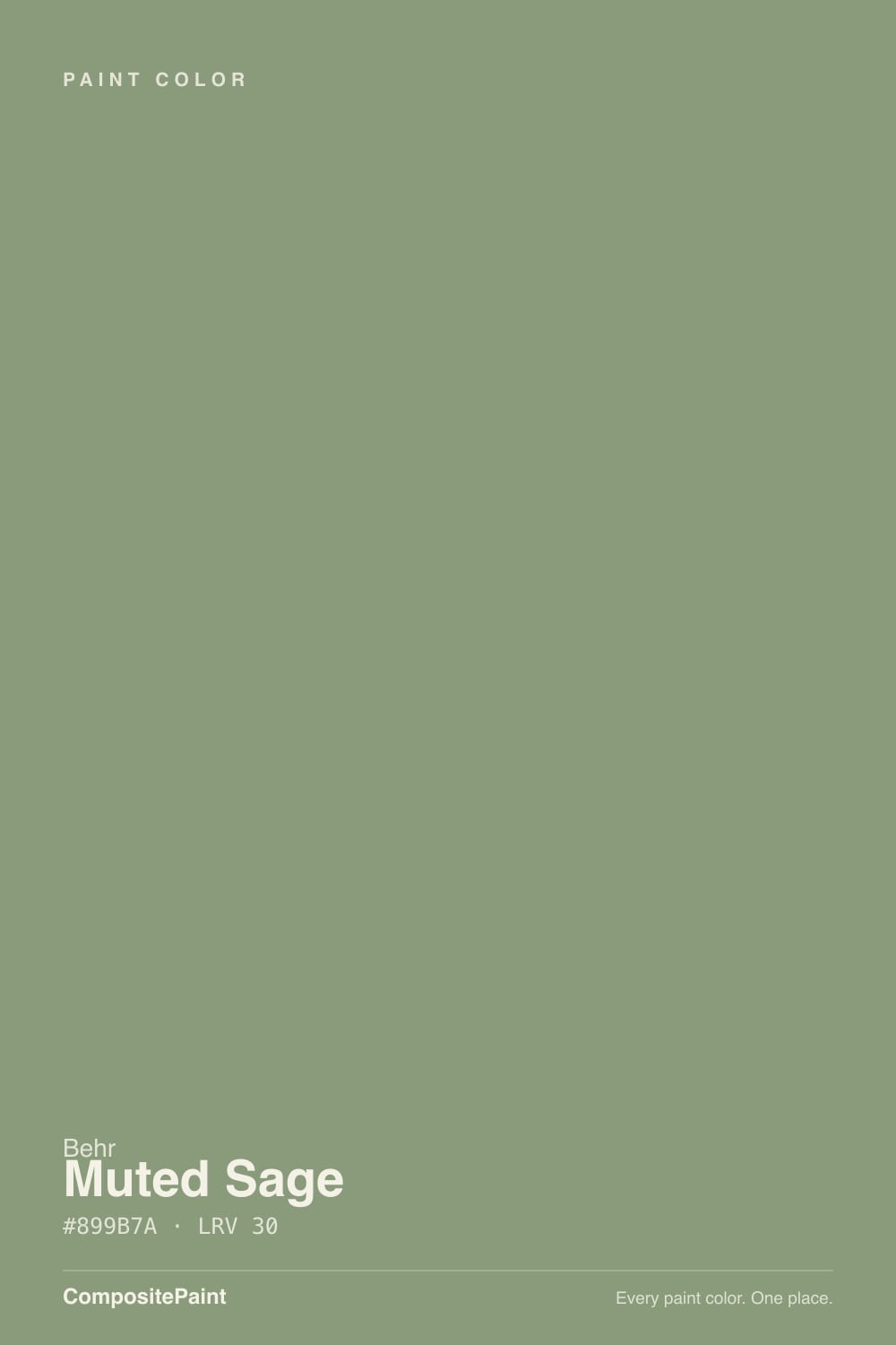
Muted Sage is a sage green with most of the green turned down and a brown-gray cast turned up — closer to a soft olive-taupe than a garden sage. That restraint is the point: it reads as a quiet neutral from across the room and only shows its green up close or under warm light. Behr sells it two ways that tell you exactly what it is good at — a dedicated cabinet-and-trim enamel, and an elastomeric masonry paint for stucco exteriors — and both jobs suit it. It is not the color for anyone who wants an obviously green kitchen.
Kitchen cabinets and islands · mudrooms and entryways · bedroom accent walls · stucco and masonry exteriors, Southwest and craftsman styles
You want an unmistakably green room · your kitchen runs on cool white LEDs with no window light · your floors are heavy honey-orange oak · you need a light, airy sage rather than a deep gray-green
- Grayed-down green that reads as a sophisticated neutral, not a themed color
- Genuinely dual-purpose: a real cabinet/trim enamel and a real exterior masonry paint
- Deep enough (LRV 28) to hide scuffs on cabinets and mudroom walls
- Flatters brass, butcher block, and warm wood without competing with them
- Holds up outdoors in full sun better than a paler, higher-LRV sage
- Too subdued for anyone expecting a clearly green room
- Cool LEDs and no-daylight rooms drain it to a muddy gray-brown
- Looks flat and slightly dirty next to a stark, cool white
- Not the airy, light sage some buyers picture from the name alone
What Color Is Muted Sage, Really?
A low-chroma sage with a brown-gray cast pulled in deep enough that Behr's own deck files it as much a neutral as a green. At hex #93907E the red, green and blue values sit close together — that near-balance is why the color reads calm and grounded instead of like a garden herb. It is closer in spirit to a faded olive or a weathered chaparral hillside than to the bright, saturated sages sold as accent colors.
At LRV 28 it is a genuine mid-depth color, deeper than Sherwin-Williams Evergreen Fog and Clary Sage and lighter than Dried Thyme. That depth is exactly why Behr also sells it as a cabinet-and-trim enamel and as an exterior masonry/stucco paint — it is durable-looking and forgiving of scuffs on cabinets, and substantial enough to read as a real color choice on a stucco facade rather than washing out in full sun.
Undertone in one line: green first, brown-gray second, and the balance between the two moves with the light. Direct warm daylight or a lamp brings the green forward; flat, cool, or overcast light drains it toward a plain gray-taupe. If your sample looks gray on the wall, that is the light doing its job, not a bad can of paint.
Where It Shines
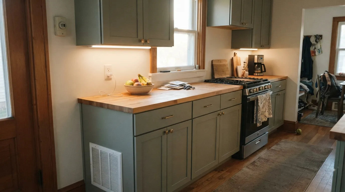
It earns its keep on surfaces that need color without shouting. On cabinets, satin or semi-gloss enamel gives it a durable, easy-clean finish that flatters butcher block and brass without turning the kitchen into a themed "green kitchen." Outdoors, the same restraint makes it a legitimate stucco and masonry color for Southwest and craftsman-style houses, where a bright saturated green would look costume-y and a plain gray would look cold. In a mudroom or entryway it hides scuffs and boot marks the way any mid-depth neutral does, while still reading as a deliberate, considered color rather than builder-basic beige.
Where It Fails
Nearly every disappointed review of a muted, grayed-down green like this one follows the same three scripts, and all three are predictable before the first coat goes on. None of them are a flaw in the paint — but if your room matches one, this is not your color.
This is a grayed sage by design — on the chip it can read almost taupe. If you pictured a saturated, unmistakably green kitchen or accent wall, this color will feel like a compromise. Look at a brighter, higher-chroma green instead and accept the upkeep that comes with it.
Cold artificial light and a room with no real daylight strip the warmth out and leave a flat, muddy gray-brown with barely a hint of green. This is the single most common complaint pattern with muted sage-grays generally. The fix is warm 2700K bulbs and at least one lamp, not more coats.
Set against a bright, cool-leaning white trim or a true cool gray countertop, the muted green-gray can look dull and slightly dirty by comparison. Pair it with a warm off-white — not a stark, blue-leaning white — and the color settles back into looking intentional.
Room by Room
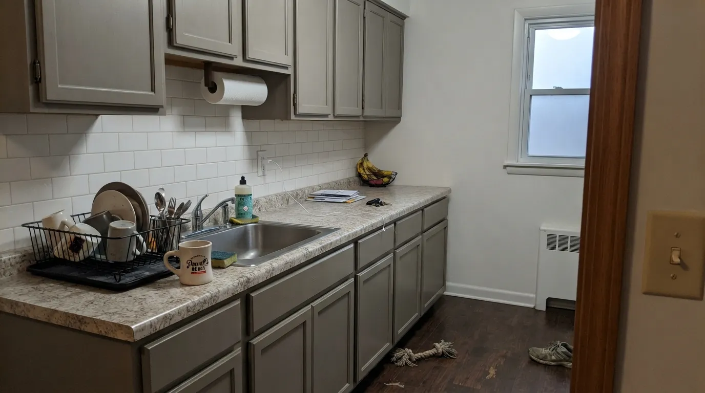
Satin or semi-gloss cabinet enamel over shaker doors reads sophisticated rather than trendy, and it hides fingerprints and pan-drag scuffs better than a brighter green would. Pairs easily with butcher block, unlacquered brass, and matte black hardware.
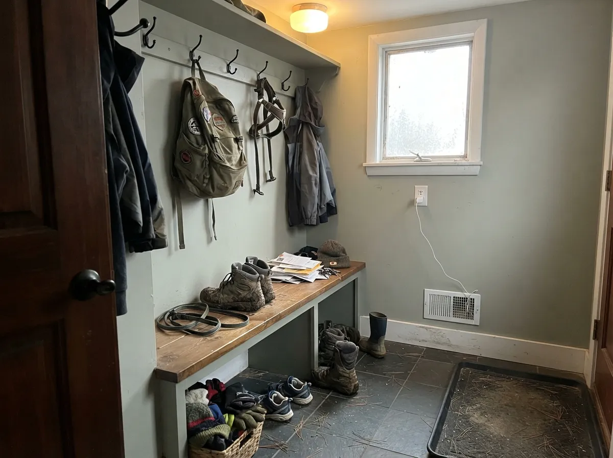
Deep enough to camouflage boot scuffs and backpack drag marks, warm enough not to feel institutional. A common approach is Muted Sage on a lower wainscot or bench with a warm white above.
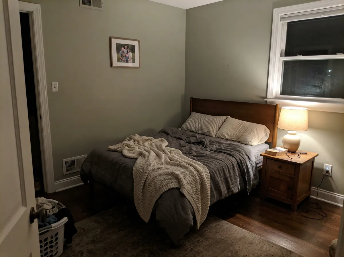
As a single headboard wall under warm lamplight it turns cozy and enveloping without eating all the daylight the way a full room of it would. Keep the other three walls a warm off-white to let it read as a considered accent, not a mistake.
Behr sells a dedicated elastomeric masonry version for exactly this. On stucco it reads earthy and grounded rather than loud, and it does not wash out the way a paler sage can in full sun. Pair with a warm white or dark bronze trim, not a stark cool white.
Works well against warm wood vanities and brass fixtures under a real window or warm-toned vanity light. Skip it in a windowless bath lit only by cool LEDs, where it goes flat fast.
Better as a built-in, a fireplace surround, or a single accent wall than as four full walls, where the color's quiet, gray-leaning nature can start to feel dim rather than restful. A brighter companion white keeps the room from sinking.
Your Light Is the Risk
Direct warm sun or a 2700K lamp pulls the green forward and the color reads as a genuine, grounded sage.
Flat, cool light drains the green and leaves a muddy gray-brown with little color personality left. Test the sample under your actual bulbs.
Greener and warmer at the sun hours, quieter and grayer the rest of the day — a gentle shift most owners read as the color settling in, not misbehaving.
2700K warm bulbs keep it sage and cozy after dark. Cool white LEDs push it toward a flat khaki-gray — swap the bulbs before you swap the paint.
Most complaints about Muted Sage are a light mismatch. Upload a photo of your actual room and see it on your walls — then ask for the same wall in north light or evening lamps before you buy a single sample.
Need It From Another Brand?
Any paint counter can custom-tint Behr N350-5 directly. If you would rather stay in one brand's own deck, these are the closest stock matches, measured as ΔE2000. Under 2 is a difference you will not see on the wall.
| Brand | Closest color | ΔE | LRV | |
|---|---|---|---|---|
| Sherwin-Williams | Bunglehouse GraySW 2845 · Sherwin-Williams | 3.0 | 28 | Color page → |
| Benjamin Moore | Sage Mountain1488 · Benjamin Moore | 0.7 | 28 | Color page → |
| Valspar | Into the WildT689 · Valspar | 0.7 | 27.4 | Color page → |
| PPG / Glidden | MeanderPPG1029-5 · PPG / Glidden | 1.1 | 26 | Color page → |
| Glidden | Winter FeatherPPG14-06 · Glidden | 3.5 | 27 | Color page → |
| Dutch Boy | Stone Cottage421-4DB · Dutch Boy | 3.0 | 28 | Color page → |
Similar Behr Colors
The nearest shades to Muted Sage within Behr's own range, ranked by perceptual color distance — useful when you want the same look a touch lighter, darker, or warmer.
WCAG 2.1: AA is 4.5 : 1 for normal text, 3 : 1 for large text, AAA is 7 : 1.
Muted Sage vs the Colors You're Also Considering
Every Muted Sage sample board has the same rivals on it. The numbers show the real lightness gap — then it comes down to which risk you would rather live with.
Pick this for a slightly deeper, more gray-forward take that reads less "trend color" and more "this house has always looked like this."
Sherwin-Williams SW 9130 · LRV 30Evergreen FogPick this if your painter works in Sherwin-Williams and you want a hair lighter, more universally hyped version of the same cabinet-sage idea.
Pick this when you want more depth and more scuff-hiding power on cabinets or a mudroom.
Sherwin-Williams SW 6178 · LRV 41Clary SagePick this for a noticeably lighter, easier-going sage that works on more full rooms without going dim.
Pick this for a lighter, more flexible depth that still works as a whole-room color, not just cabinets and accents.
Sherwin-Williams SW 6186 · LRV 21Dried ThymePick this if you want the color to read unmistakably deep and herbal, closer to a true dark green-gray.
Pick this for more color payoff in a smaller dose: cabinets, an accent wall, or an exterior where a paler sage would wash out.
Benjamin Moore CC-550 · LRV 47October MistPick this if you want the safest, lightest sage in this comparison — good for a full room with real daylight.
Within Behr, Herbal Scent ICC-76 at LRV 31 and hex #8E9B7C is the nearest neighbor, marginally lighter and grayer. Grassy Savannah N340-5 at LRV 31 and hex #929B73 is clearly more yellow-green and will read as olive faster in warm light. Carriage Door 770D-5 at LRV 28 and hex #8B9574 is a touch darker and duller, better where you want the green to sit back.
Across brands, Glidden Garden Path 30GY 31/202 at LRV 31 has a deltaE of 1.33 and Farrow and Ball Suffield Green No. 77 at LRV 31 is at 1.5, so both are visually identical to Muted Sage in normal room light. Sherwin-Williams Leaflet SW 9674 at LRV 30 is at 2.08 and Benjamin Moore Adirondack Green 453 at LRV 29 is at 2.84, very close but worth sampling. Valspar Scottish Highlands V062-4 at LRV 28.7 is at 4.02, close but visibly greener side by side.
Muted Sage Coordinating Colors
The pairing rule is the same one that governs every grayed-down green: keep the partners warm, and the color settles in; pair it with something cool and it goes flat by comparison. Warm off-whites, brass, butcher block, and one true dark neutral are the combination that keeps showing up in kitchens and mudrooms that work.
Muted Sage on Stucco and Masonry Exteriors
Most sage greens on this site are cabinet and wall colors first, with exterior use as an afterthought. Muted Sage is different: Behr sells it as a dedicated elastomeric masonry, stucco and brick paint alongside the interior cabinet enamel, which is a real signal about how the color behaves outdoors — it is formulated to hold its tone and resist chalking in full sun rather than just being a wall color pressed into exterior service.
On a stucco or masonry facade the muted, gray-leaning cast reads earthy and settled rather than loud, which is why it fits Southwest, craftsman and ranch-style houses especially well. Pair it with a warm white or a dark bronze/black trim rather than a stark cool white, and expect the color to look a touch more gray on a shaded north elevation than on a sun-facing wall — normal behavior for any mid-depth green, and worth walking the whole house with a sample before committing to gallons.
Muted Sage With Wood Tones and Floors
Butcher block, unlacquered brass, and mid-tone or dark wood are this color's natural company — the warmth in the wood meets the color's own warm undertone and the pairing looks deliberate rather than trendy. White oak and walnut cabinetry hardware and open shelving both read well against it.
Very warm, orange-leaning honey oak is the pairing to sample first. Because Muted Sage already carries a brown-gray cast, a strongly orange floor can pull the whole combination toward a muddier, less sage-like olive rather than the clean gray-green the paint shows on its own. A large sample board propped against the actual floor, viewed at different times of day, is worth the ten minutes before a full kitchen repaint.
Three Ready Palettes Built on Muted Sage
A color is never alone on the wall. These are complete combinations in the 60-30-10 pattern, with the reason each one holds together. Every one opens in the visualizer.
White Dove keeps the room bright enough to let a deep, muted color carry the cabinets without going dark; the Chelsea Gray island adds a second grounded neutral so the kitchen reads deliberate, not accidental.
Try this palette in your roomA wainscot split keeps the scuff-prone lower wall in the darker, more forgiving color while the warm white above keeps the room from feeling like a cave; the near-black bench supplies the one true dark note.
Try this palette in your roomSwiss Coffee keeps three walls warm and bright so the fourth can go deep and quiet; Chelsea Gray on furniture ties the room's two neutrals together without adding a third undertone to manage.
Try this palette in your roomMuted Sage FAQ
Is muted sage a green or a gray?
Both, by design. It is a genuinely low-chroma green — the deck files it closer to neutral than to a saturated green family. In warm light it reads sage; in flat, cool, or overcast light it reads gray-taupe. If you want a color that stays obviously green in every light, this is the wrong pick.
Is it good for kitchen cabinets?
Yes — Behr sells it specifically as a cabinet, door and trim enamel, and the depth (LRV 28) hides fingerprints and pan-drag scuffs better than a paler sage would. Use the satin or semi-gloss enamel, not a wall paint, for the durability.
Can I use it on a stucco exterior?
Yes — Behr also makes it as an elastomeric masonry, stucco and brick paint, which tells you it holds its color and doesn't chalk out in full sun the way some interior-only greens do outdoors. It suits Southwest and craftsman-style houses especially well.
How is it different from Sherwin-Williams Evergreen Fog?
They are close cousins. Evergreen Fog is a couple of points lighter (LRV 30 vs. 28) and slightly more hyped as a trend color; Muted Sage sits a shade deeper and reads a little more gray-forward and quiet. Either works on cabinets — pick by brand availability and by which one's undertone you prefer on your own sample.
What trim white goes with Muted Sage walls or cabinets?
A warm off-white, not a stark cool white. A crisp blue-leaning white makes the muted green-gray look dull by comparison; a warm white like Swiss Coffee lets it read as intentional and grounded.
Will it look too dark in a small room?
At LRV 28 it is mid-depth, not dark, but a small room with little daylight will feel its full weight fast. Use it as an accent wall, cabinets, or a wainscot rather than four full walls in a small, dim room; save the whole-room treatment for spaces with real window light.
Have you painted with Muted Sage?
Rate it — one tap helps the next reader decide.
Ask a Question