Noble Blush
The dusty peach-pink that reads grown-up instead of girly, reviewed honestly: the light that makes it glow, the light that flattens it, and what to pick instead.

Jessica has spec'd whites and neutrals for more than 300 rooms and keeps a sample wall of painted drawdowns in her studio. Every color review is checked against real reader rooms in the comments and re-tested when a formula changes. About the testing process →
- 1Retro Pink38
- 2Vintage Tea Rose47
- 3Noble Blush55
- 4Pale Cherry Blossom61
- 5First Light76
The Fast Verdict
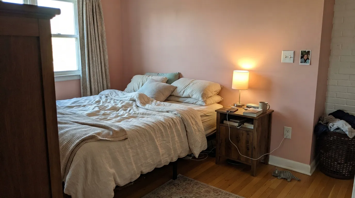
Noble Blush is what pink looks like once it grows up: a dusty peach-rose with just enough grey mixed in that it reads as a considered blush, not a nursery pastel. At LRV 55 it holds real color on the wall — this is not the near-white pink that disappears into a warm off-white — but it never tips into candy or coral. Warm afternoon light and a lamp at night make it glow; a cold north room under LED bulbs flattens it into a dull, slightly chalky mauve. Pick it because you actually want a pink wall people notice, not because you want a hint of color.
Bedrooms and primary suites that want color without going bold · nurseries and kids' rooms that should still look grown-up in ten years · powder rooms and vanities with warm materials · dining rooms under lamp or chandelier light
Your room runs cool white LED bulbs all day · you want a safe, neutral resale color · your floors or trim lean orange-toned honey oak · you are painting a full sun-blasted exterior
- A pink that reads grown-up, not sweet, thanks to the grey underneath
- Holds real, visible color at LRV 55 without darkening a room
- Genuinely flattering under warm lamp light and brass
- Small-room commitment — powder room, vanity, nursery accent — pays off without full-house risk
- Ages better than a true pastel: works in a nursery today and a guest room later
- Goes flat and chalky-mauve under cool LEDs or in a north-facing room
- Blurs into honey-oak or red-toned wood instead of contrasting with it
- Reads chalky next to a stark, cool-white trim
- Full-exterior use is a genuine resale gamble in most markets
What Color Is Noble Blush, Really?
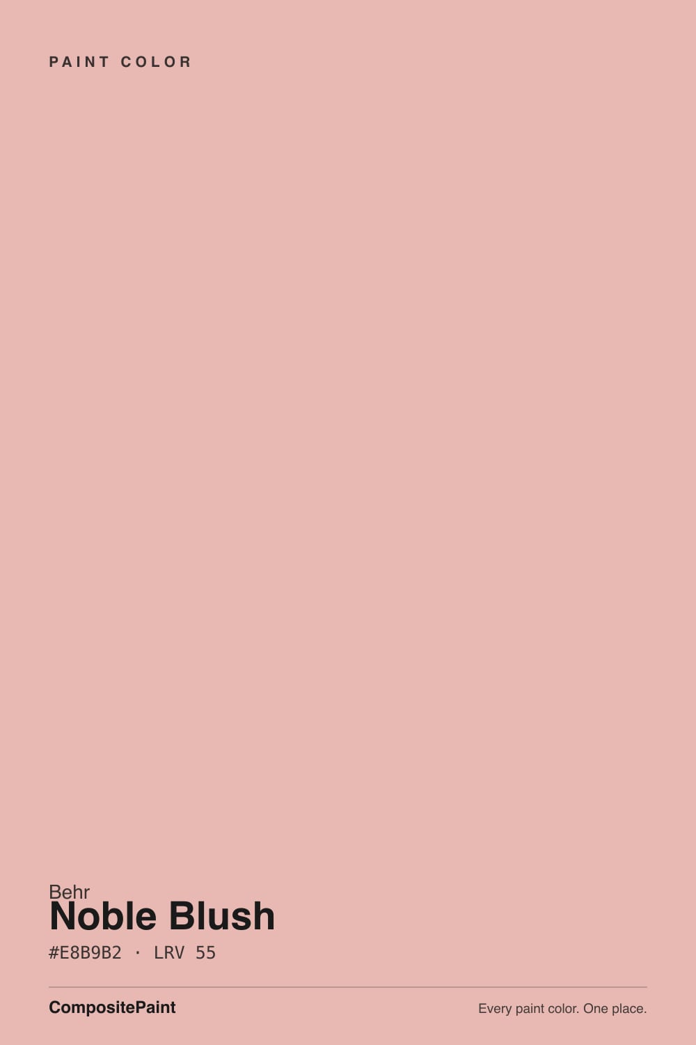
Noble Blush is a dusty, warm pink built on a peach-beige base rather than a true rose or coral — Behr's own material leans on sunrise imagery, and that is the right instinct: it is softer and warmer than a magenta-leaning pink, with enough grey mixed in to keep it from reading as candy or bubblegum. That grey is the whole trick. A straight pastel pink can look juvenile or overly sweet on a wall; the muted, slightly dusty cast in Noble Blush is what lets an adult put it in a primary bedroom or a dining room without it looking like a kid's-room accident.
At LRV 55 it sits solidly in the medium range — not a whisper-pale blush like Behr's own Pink Sea Salt or Benjamin Moore's First Light, both around LRV 74-76 and closer to a warm off-white than a true pink, and not a saturated, room-darkening rose either. That depth is the useful part: on the wall Noble Blush reads unmistakably as pink, holds its color through the day, and still bounces enough light to keep a room from feeling closed in. Compare it to Behr's own Stolen Kiss, LRV 73 — Stolen Kiss behaves like a warm neutral until direct sun catches it; Noble Blush commits to being a color from the first coat.
Undertone in one line: warm peach-pink, never a cool rose and never true coral-orange. If your sample looks flat and dusty-mauve, your light is cold — north exposure or daylight LEDs; if it looks almost salmon, that is warm afternoon sun or a wood floor bouncing color back at it. Both are the same paint reacting honestly to real light — see the light section below before deciding it is wrong.
Where It Shines
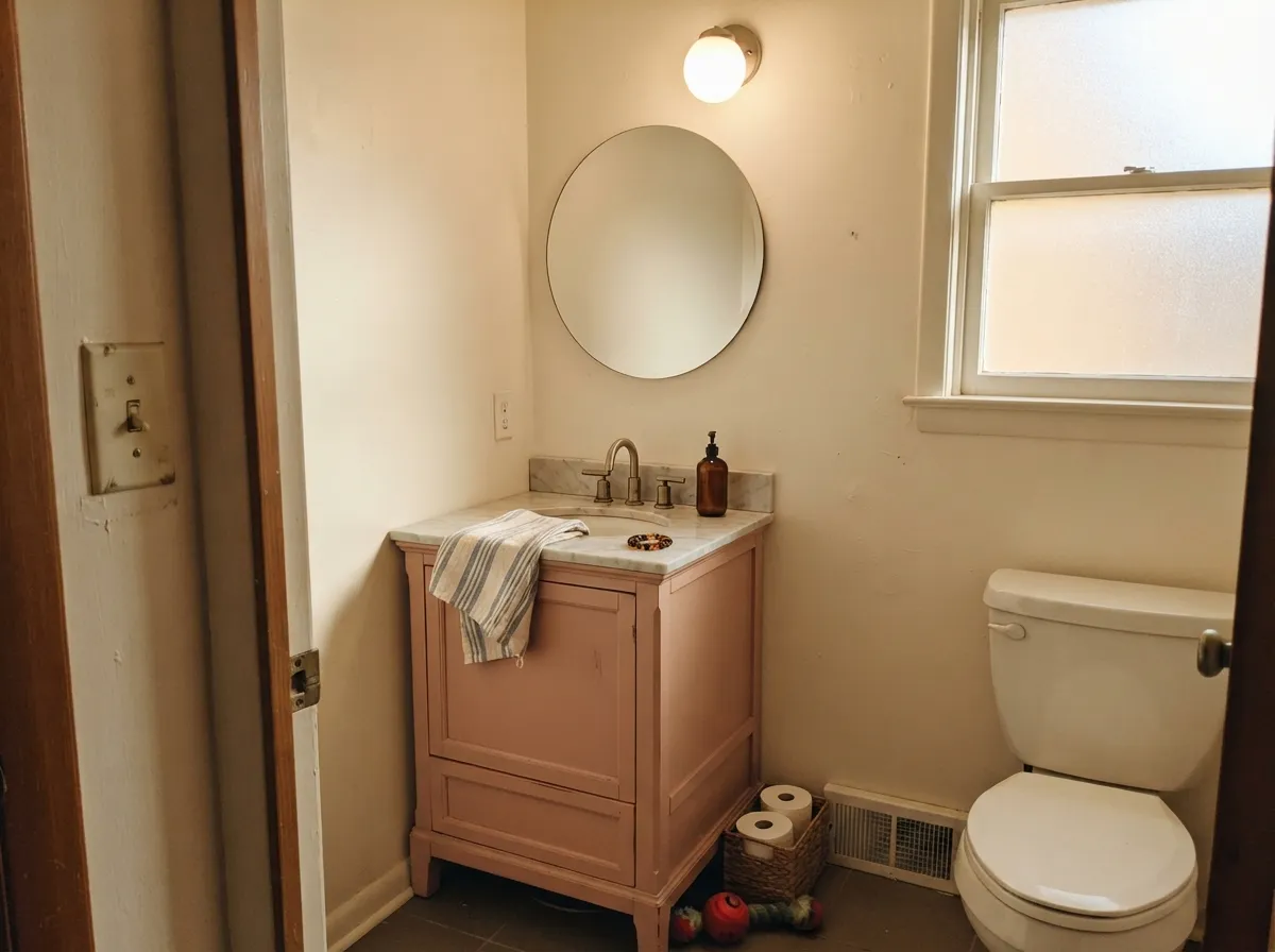
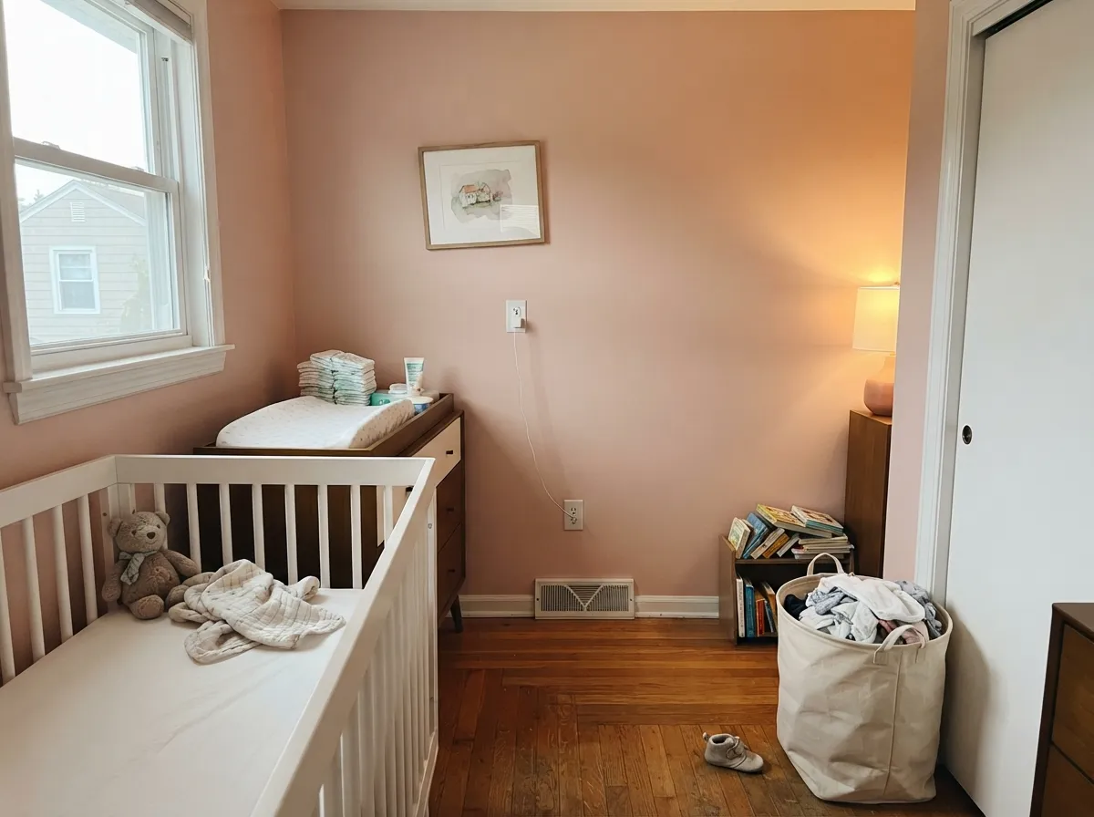
It is built for rooms that get real daylight and end the day under a lamp. Warm afternoon sun and 2700K bulbs bring out the color's soft glow without ever tipping it toward coral; pair it with brass, walnut or cream linens and it looks intentional and grown-up rather than themed. Its second home is the small commitment — a powder room, a vanity, a nursery accent wall — where the color reads custom without betting the whole house on pink.
Where It Fails
Almost every regret story about a color like this follows one of three scripts, and all three are predictable before the first coat. None of them are the paint's fault — but if your room matches one, this is not your color, and a bigger sample will only confirm it.
Take the warmth out of the room and Noble Blush goes flat and slightly chalky — a version that reads dull mauve-gray instead of the warm blush it is in a sunny room. The fix is 2700K bulbs and a warm-toned lamp, not a different paint.
Noble Blush and orange-leaning wood are both warm, and warm-plus-warm does not clash so much as blur — the wall and the floor wash into one undifferentiated peachy tone with no contrast to anchor the room. Walnut, white oak, or a painted floor keep the pink looking deliberate instead of accidental.
A bright, blue-leaning trim white makes Noble Blush look chalky and slightly dirty by contrast. Trim it in a warm white instead — Swiss Coffee or White Dove — and the wall reads considered, not washed out.
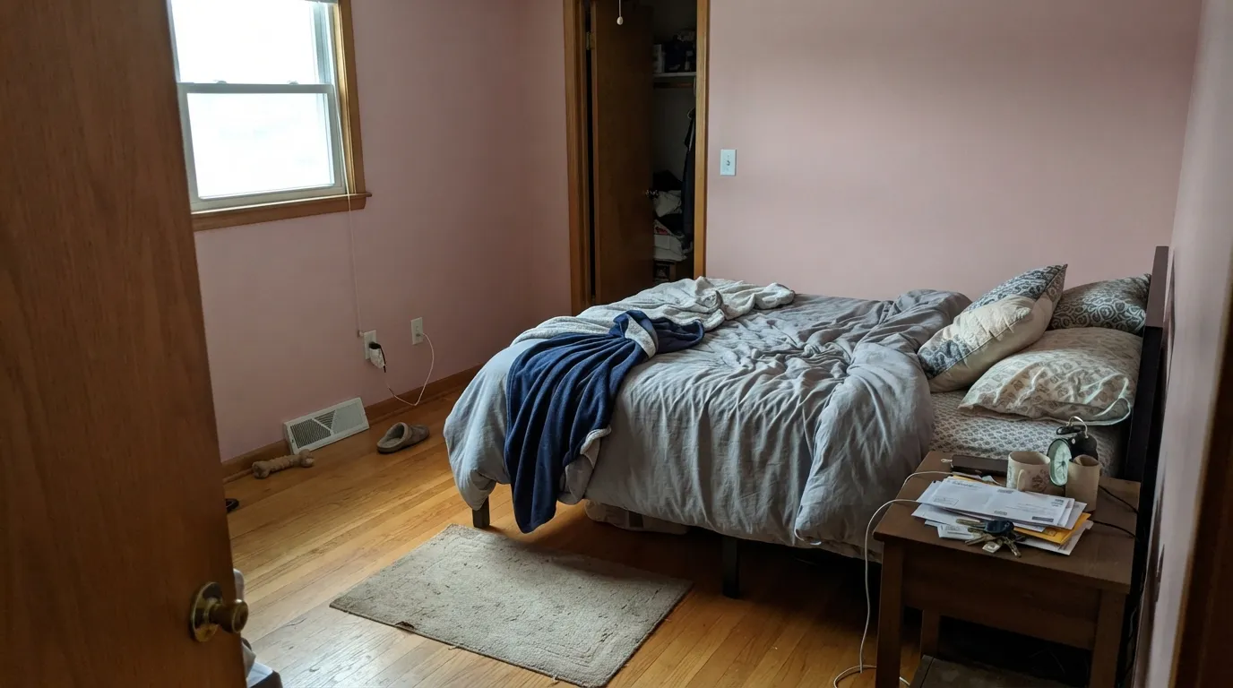
Room by Room
Warm and grown-up under lamp light, calm without going gray. Eggshell on the walls, a warm white trim in semi-gloss, cream or white bedding rather than anything with a cool cast.
Dusty enough to read as a real color choice, not a theme — it still looks intentional once the room becomes a bigger kid's space or a guest room. Skip the glossy, saturated nursery pinks if longevity is the goal.
A small room in a color this confident feels custom, not risky. Satin on the vanity, and a warm-white ceiling so the color does not fight itself overhead. Brass fixtures and a marble top are its best company.
A chandelier or warm pendant plus this wall color is genuinely flattering at the table — one of the few pinks that reads sophisticated instead of sweet at dinner. Skip it if the room only gets cold morning light.
Works in a closed, lamplit room with warm neutrals and wood; in an open floor plan it has to negotiate with the kitchen's undertones and can read inconsistent room to room. A warm neutral like Swiss Coffee is the safer open-plan choice.
Full sun bleaches a medium pastel pink toward chalky over a few seasons, and a pink facade is a genuine resale risk in most markets. If you love it outside, keep it to a shaded porch ceiling or a front door, not the whole house.
Your Light Is the Risk
Late-day sun plus a lamp brings the peach forward and the wall glows without tipping orange. The color's best hour of the day.
Cold light strips the warmth and leaves a flat, slightly chalky mauve. Test a real sample on this wall before committing.
Rosier and brighter at the sun hours, quieter and more neutral the rest of the day — a gentle, honest shift most people like.
2700K lamps: warmer, softer, more blush. Cool white LEDs: flat and slightly gray — swap the bulb before you swap the paint.
Most complaints about Noble Blush are a light mismatch. Upload a photo of your actual room and see it on your walls — then ask for the same wall in north light or evening lamps before you buy a single sample.
Need It From Another Brand?
Any paint counter can custom-tint Behr MQ4-04 directly. If you would rather stay in one brand's own deck, these are the closest stock matches, measured as ΔE2000. Under 2 is a difference you will not see on the wall.
| Brand | Closest color | ΔE | LRV | |
|---|---|---|---|---|
| Sherwin-Williams | Rachel PinkSW 26 · Sherwin-Williams | 1.7 | 55 | Color page → |
| Benjamin Moore | Eraser Pink2174-50 · Benjamin Moore | 0.7 | 54 | Color page → |
| Valspar | Spring Linen2002-6C · Valspar | 1.6 | 55.3 | Color page → |
| PPG / Glidden | Peach BeigePPG1064-4 · PPG / Glidden | 1.4 | 57 | Color page → |
| Glidden | Peach BeigePPG1064-4 · Glidden | 1.4 | 57 | Color page → |
| Dutch Boy | Glowing Rose303-3DB · Dutch Boy | 2.3 | 55 | Color page → |
Similar Behr Colors
The nearest shades to Noble Blush within Behr's own range, ranked by perceptual color distance — useful when you want the same look a touch lighter, darker, or warmer.
WCAG 2.1: AA is 4.5 : 1 for normal text, 3 : 1 for large text, AAA is 7 : 1.
Noble Blush vs the Colors You're Also Considering
Every Noble Blush sample board has the same rivals on it. The numbers show the real lightness gap — then it comes down to which risk you would rather live with.
Pick this when you want a wall that is unmistakably pink from the first coat, not just a warm hint.
Behr MQ3-34 · LRV 73Stolen KissPick this if you want the same idea lighter and closer to a warm neutral — Stolen Kiss barely reads pink except in direct sun.
Pick this for real, visible color — First Light can vanish into just an off-white in flat light; this one will not.
Benjamin Moore 2102-70 · LRV 76First LightPick this for the palest whisper of pink, one that behaves like a warm off-white most of the day.
Noble Blush Coordinating Colors
The rule for coordinating with Noble Blush: warm whites for trim, a near-black or charcoal for grounding, and a cool teal or blue if you want real contrast instead of tone-on-tone softness. It leans warm everywhere except the accent — a cool note is what keeps an all-blush room from feeling flat. These are the partners that keep showing up in rooms that work:
Noble Blush and the Dusty-Pink Revival
Muted, warm pinks have been building momentum for several years now, riding alongside the broader move away from flat cool gray: Sherwin-Williams' clay-toned Redend Point became one of the most talked-about paint colors of the past few years, and Benjamin Moore's Cinnamon Slate — its 2025 Color of the Year — pushed the same warm, grayed-down palette into the mainstream. Noble Blush sits in that same family, but it is the more purely pink member of the group — where Redend Point and Cinnamon Slate lean brown and read as an earthy neutral, Noble Blush stays recognizably a blush pink even with the grey mixed in.
That makes it a different bet than its earthier cousins. A brown-leaning clay color can pass as a neutral in a resale listing; Noble Blush cannot — it commits to being a pink wall. Buy it because you want that commitment, not because you are chasing whichever trend color a neighbor mentioned.
Noble Blush With Wood Tones and Floors
Walnut, white oak, and gray-washed or painted floors are its best partners — the cooler or darker the wood, the more the pink reads as a deliberate color choice instead of an accident. A dark walnut bed frame or vanity against Noble Blush walls looks considered and slightly jewel-toned rather than sweet.
Honey oak and other orange-leaning wood is the one floor that fights it, and not in the usual complementary-color-clash way: both the wall and the floor are warm, so instead of contrasting they blur into a single undifferentiated peachy-orange wash with no visual anchor. A large rug or runner breaks up the expanse if the honey floor is staying; otherwise, keep the pink to a room with different flooring.
Three Ready Palettes Built on Noble Blush
A color is never alone on the wall. These are complete combinations in the 60-30-10 pattern, with the reason each one holds together. Every one opens in the visualizer.
A warm white trim keeps Noble Blush from ever reading chalky, and one charcoal note grounds a soft pink room so it reads considered instead of sugary. The two-depth pairing is the whole trick: color, then one dark anchor.
Try this palette in your roomA cool teal accent is what keeps an all-warm nursery from feeling flat, and the two colors trade the pink-versus-blue cliche for something that actually looks designed. Swiss Coffee trim carries the warmth without adding a second competing color.
Try this palette in your roomA near-black door against blush walls is the classic small-room jewel-box move — it gives the pink a hard edge to play against instead of drifting soft in every direction. Whisper White overhead keeps the little room from feeling closed in.
Try this palette in your roomNoble Blush FAQ
Is Noble Blush pink or peach?
Both, technically — it is built on a peach-beige base, which is exactly what keeps it from reading as a true rose or bubblegum pink. On the wall most people call it a dusty blush; in strong warm light it can look more peachy-salmon, and in cool light it can look more muted mauve. All three are the same paint.
Is it too pink for a nursery that needs to grow up?
No — that is its strength. The grey undertone keeps it from reading as a baby-pink theme color, so it works for a nursery today and a tween or guest room later without repainting. Skip the glossy, saturated nursery pinks if longevity matters to you.
What trim white goes with Noble Blush?
A warm white — Swiss Coffee or White Dove, not a stark cool white. Bright blue-white trim makes the walls look chalky by comparison; a warm trim lets the pink read as a deliberate color choice.
Can I use Noble Blush outside?
Behr sells it in exterior formulas, but a medium pastel pink is a genuine resale risk on a full facade, and full sun bleaches it toward chalky over a few seasons. Keep it to a shaded porch ceiling or a front door if you want it outdoors.
Will it look washed out in a north-facing room?
Yes, more than most colors its depth would suggest. Cold north daylight and cool LED bulbs strip the warmth and leave a flat, slightly gray-mauve version of the paint. Warm 2700K bulbs largely fix it after dark; for the room's daytime look, sample it on the actual wall first.
What wood tones work with it?
Walnut, white oak, and painted or gray-washed floors all give it contrast and let the pink read as intentional. Honey oak or red-toned wood is the one real clash — both are warm, so the wall and floor blur into an undifferentiated peachy wash instead of a considered pairing.
Have you painted with Noble Blush?
Rate it — one tap helps the next reader decide.
Ask a Question