Orchid
The historic dusty rose Sherwin-Williams files as a red, reviewed honestly: the light where it turns rich and velvety, the light where it goes muddy, and what to pick instead.

Jessica has spec'd whites and neutrals for more than 300 rooms and keeps a sample wall of painted drawdowns in her studio. Every color review is checked against real reader rooms in the comments and re-tested when a formula changes. About the testing process →
- 1Razzle Dazzle20
- 2Coming up Roses30
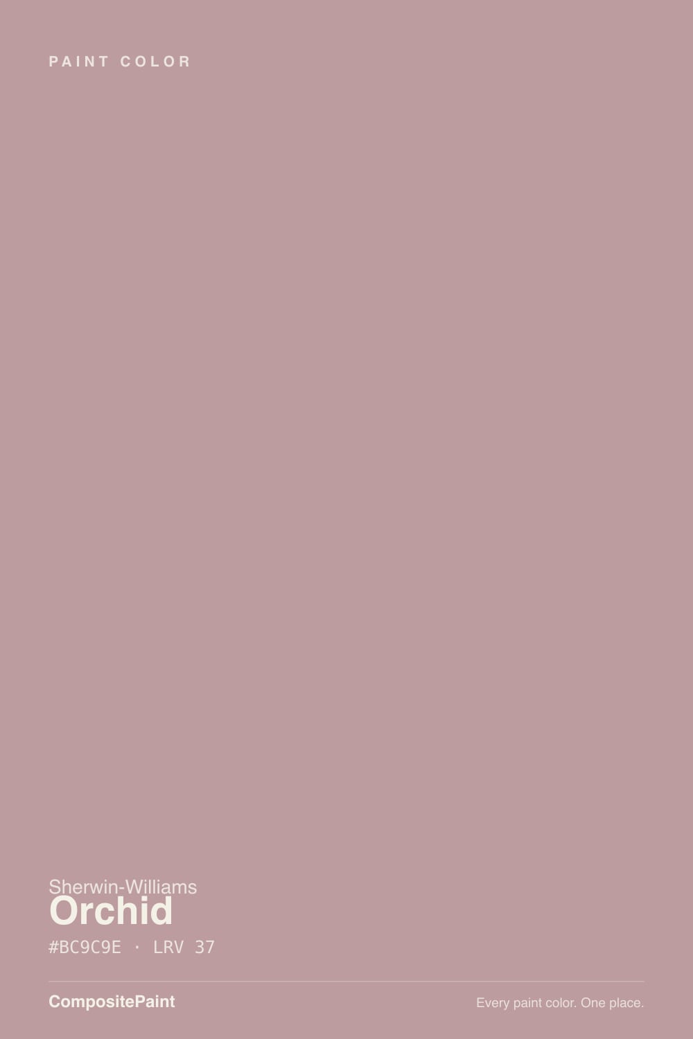
- 3Orchid37
- 4Pale Cherry Blossom61
- 5Romance66
The Fast Verdict
Orchid is Sherwin-Williams' proof that a color can be pink without ever reading as pink. Filed in the company's own Red family and buried in the Historic Colors collection, it's a grayed, dusty rose-mauve with just enough brown in the base to skip the candy-sweet register entirely. At LRV 37 it holds its color rather than fading to a whisper, and under warm lamplight it turns genuinely rich and old-world. It is not a top-20 bestseller — most people have never heard of it — which is exactly why it looks custom instead of trendy.
Bedrooms and powder rooms that want warmth without going full pink · vanities and interior doors as a small, confident commitment · dining rooms lit by candles and brass · anyone who likes Sleepy Hollow's mood but wants rose instead of violet
You want a color nobody will ever call pink · your room is north-facing with cool LED bulbs and no lamps · your other neutrals are cool blue-grays · you need a color your painter can match from memory
- A genuinely wearable, grown-up pink — dusty and grayed, not sweet or girly
- Deep enough (LRV 37) to hold its color without washing out
- Filed as a historic red, but reads as a versatile rose-mauve neutral in the right light
- Flatters brass, walnut, and cream — old-world warmth without looking dated
- Small-room star: vanities, powder rooms, and accent doors punch above their size
- Reads unmistakably pink on four walls, whatever the marketing copy calls it
- Goes flat and muddy mauve-gray in cool north light without warm bulbs
- Argues with cool blue-grays and anything icy
- Not a mainstream bestseller — more repaint risk than a proven top-20 SW color if the mood passes
What Color Is Orchid, Really?
Sherwin-Williams classifies Orchid as a Red, and the swatch tells you why: this is not a violet-based mauve like Sleepy Hollow, it's a warm, grayed rose built on a brick-red core. The gray does the same job it does in every good dusty color — it takes the sweetness out — but here the leftover warmth reads more brownish-pink than purple. It has sat in the Historic Colors collection for years, the kind of color a restoration-minded homeowner finds by searching, not one they stumble on at a paint chip display.
At LRV 37 it's a genuine mid-tone: too deep to read as a blush accent, too light to act like a moody near-black. That depth is why it holds its color in daylight instead of washing out the way a lot of paler 'dusty rose' colors do above LRV 60 — but it also means the wall will look noticeably more saturated and more clearly pink than the tiny chip suggests. Expect the color to arrive a full step bolder than you tested.
Undertone in one line: warm dusty rose with a brownish-red core, never true violet, never a cool blue-pink. If your sample reads flat and grayish, that's cool daylight; if it reads pinker than expected, that's normal — this color is more pink in real life than its 'sophisticated red' marketing suggests.
Where It Shines
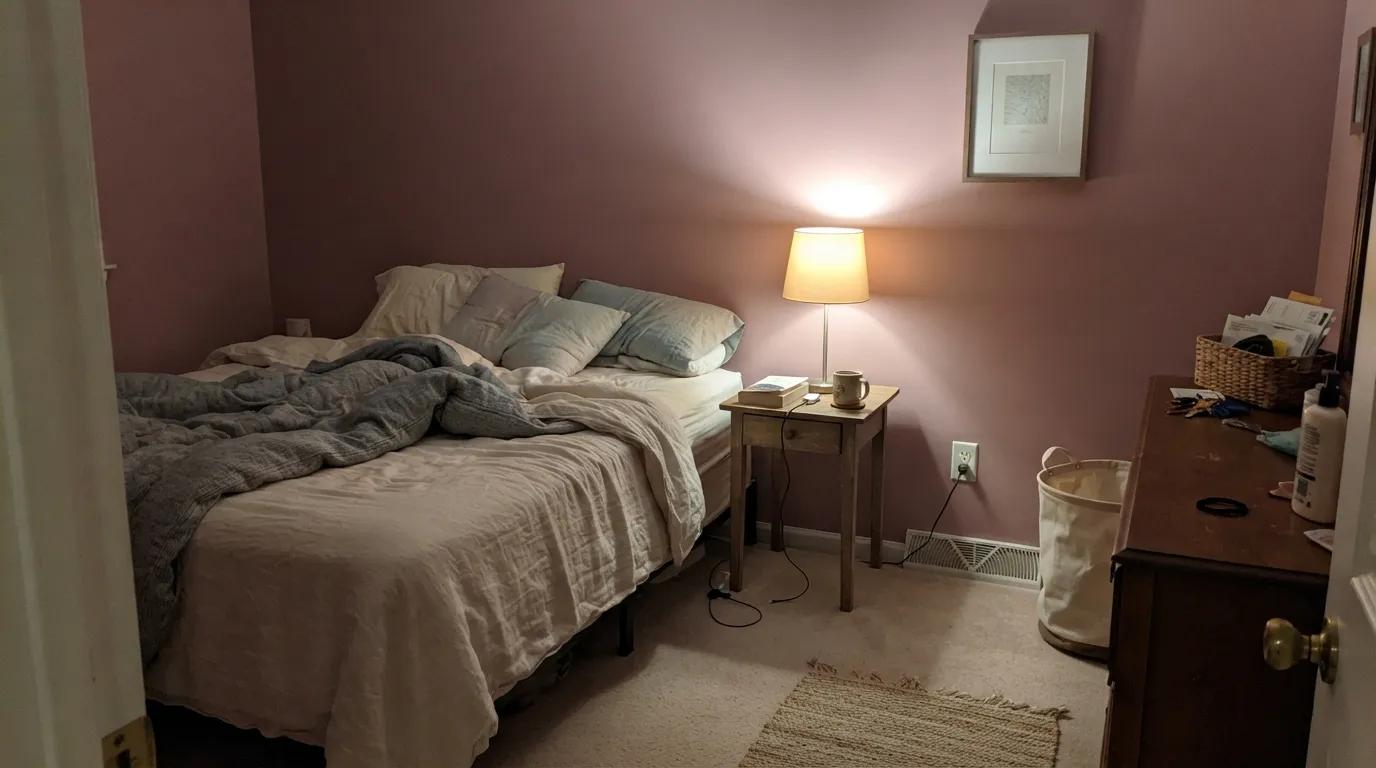
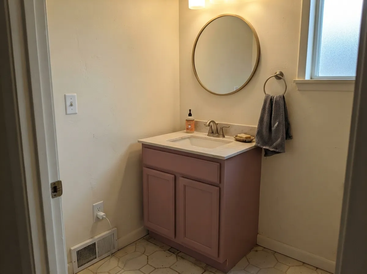
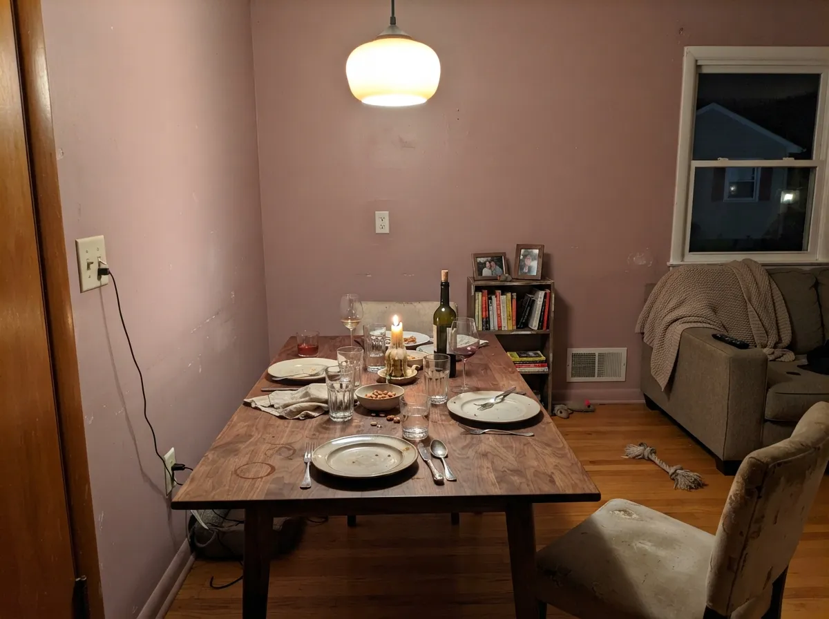
Give it warm lamplight and it turns genuinely luxe — a rich, old-world rose that looks like it was mixed by hand, not picked off a fan deck. Its best jobs are small and confident: a powder room, a vanity, an interior door, a dining room lit by candles and brass, where the color reads custom without betting the whole house on pink. Pair it with cream, walnut, and warm metal and it looks like it belongs in a much older, much more expensive house.
Where It Fails
The complaints about Orchid follow a short, predictable list, and every one of them traces back to expecting a neutral and getting a color. None of them are the paint's fault — but if your room or your expectations match one of these, sample bigger before you commit.
Sherwin-Williams calls this a sophisticated red and design copy leans hard on words like "grounded" and "muted." On four walls in daylight, it reads as an unmistakable dusty rose. If you want a color that merely hints at warmth, this has too much actual pink in it — look at a true greige like Pashmina instead.
Cool north daylight strips the brownish-red warmth out and leaves a flat, slightly muddy mauve-gray that photographs dingy. This color needs either south or west daylight, or warm 2700K bulbs doing real work at night — a dim north room with cool LEDs is the worst-case scenario.
Blue-based grays and icy whites fight Orchid's warm base; next to them the pink can look like a mismatch instead of a decision. Keep its trim and its neighboring rooms on the warm side — cream, warm greige, walnut — the way you would for any dusty rose.
Room by Room
Warm and grown-up rather than sweet, especially under lamp light at night. Eggshell on the walls, a warm white like Alabaster on trim, and it reads restful instead of nursery-pink.
A full four-wall powder room or a single vanity does the same job Sleepy Hollow does for violet: small room, big color, low risk. Satin on the vanity, brass hardware, done.
Evening entertaining is this color's home turf. Under warm light with a walnut table and brass fixtures it turns rich and flattering — a real advantage over a cooler color at dinner.
Works closed-off and lamplit with cream and walnut; gets harder in an open floor plan where it has to negotiate with kitchen tile, counters, and whatever the adjacent rooms wear. Sample against your actual neighbors before committing the whole space.
On a single island or a small run of cabinets under a white or cream wall it's a genuinely interesting, of-the-moment choice. A full kitchen of pink cabinetry is a much bigger bet, and unforgiving over cool countertops.
Full outdoor sun tends to gray a color this muted toward a washed-out, chalky mauve, and it can look like discoloration rather than a decision from the street. The one exception is a shaded front door on a white or warm-neutral house, where the dusty rose reads intentional.
Your Light Is the Risk
Warm 2700K bulbs pull the brick-red base forward and the color turns rich, velvety rose — the look the marketing photos promise.
Cool, flat daylight drains the warmth and leaves a muddy, slightly dingy mauve-gray. Sample here first if this is your only light.
Cooler and grayer in the morning, warmer and pinker as the sun moves west — expect a visible shift across the day, not a static color.
Cool white LEDs flatten it toward gray; warm 2700K bulbs bring the rose back. This is a color where bulb temperature is not optional.
Most complaints about Orchid are a light mismatch. Upload a photo of your actual room and see it on your walls — then ask for the same wall in north light or evening lamps before you buy a single sample.
Need It From Another Brand?
Any paint counter can custom-tint Sherwin-Williams SW 71 directly. If you would rather stay in one brand's own deck, these are the closest stock matches, measured as ΔE2000. Under 2 is a difference you will not see on the wall.
| Brand | Closest color | ΔE | LRV | |
|---|---|---|---|---|
| Behr | Twilight BlushPMD-71 · Behr | 1.9 | 35 | Color page → |
| Benjamin Moore | Mauve Mist1264 · Benjamin Moore | 1.7 | 36 | Color page → |
| Valspar | Bedroom Plum1004-8A · Valspar | 3.0 | 38.1 | Color page → |
| PPG / Glidden | AwakeningPPG18-05 · PPG / Glidden | 2.8 | 38 | Color page → |
| Glidden | AwakeningPPG18-05 · Glidden | 2.6 | 37 | Color page → |
| Dutch Boy | Rosey Glow401-3DB · Dutch Boy | 2.6 | 38 | Color page → |
Similar Sherwin-Williams Colors
The nearest shades to Orchid within Sherwin-Williams's own range, ranked by perceptual color distance — useful when you want the same look a touch lighter, darker, or warmer.
WCAG 2.1: AA is 4.5 : 1 for normal text, 3 : 1 for large text, AAA is 7 : 1.
Orchid vs the Colors You're Also Considering
Every Orchid sample board has the same rivals on it. The numbers show the real lightness gap — then it comes down to which risk you would rather live with.
Pick this for the softer, more classic rose-mauve without the internet drama.
Sherwin-Williams SW 9081 · LRV 30Redend PointPick this if you want the bolder, more orange-clay version of dusty pink that actually went viral.
Pick this for the lighter, more clearly rose-pink read at a friendlier LRV.
Benjamin Moore 2113-40 · LRV 19Cinnamon SlatePick this for a deeper, browner rose that reads more red-brown than pink and needs strong daylight to stay predictable.
Orchid Coordinating Colors
The rule for coordinating with Orchid is the same as any dusty rose: stay warm. It pairs with warm whites and warm grays far better than with anything blue-based, and it likes a grounding near-black more than it likes a matching pink. These are the partners that keep showing up in rooms that work:
A Historic Color, Not a Trend Color
Orchid has none of the internet moment that colors like Redend Point or Cinnamon Slate had. It has sat in Sherwin-Williams' Historic Colors collection quietly for years — the company's own filing puts it under "Red," not pink or purple, which tells you the color was built to sit alongside brick, old wood trim, and brass, the way a lot of pre-1950s houses actually painted their walls.
That history is the practical upside: because it never had a viral moment, it also carries less repaint risk than a color everyone recognizes from a single design-blog era. It reads as a deliberate, slightly unusual choice rather than a trend chasing a color-of-the-year push — closer to how a restoration project picks a color than how a flipper picks one.
Orchid With Wood Tones and Floors
Walnut and other reddish-brown woods are the natural partner — the warm brick-red core in Orchid and the warm red-brown in walnut share a family, so a walnut vanity or dresser against Orchid walls looks coordinated rather than accidental. Pale white oak and cream-toned floors are safe and keep the room from getting too heavy.
Golden honey-oak floors are the one combination to sample first: yellow-orange sits close to the opposite side of the color wheel from a warm red-pink, and the pairing can push the floor toward an odd orange cast while the walls look duller than expected. It isn't a hard no, but a big rug or a shift to cream trim helps bridge the gap.
Three Ready Palettes Built on Orchid
A color is never alone on the wall. These are complete combinations in the 60-30-10 pattern, with the reason each one holds together. Every one opens in the visualizer.
Alabaster's warm white keeps the rose from tipping saccharine, and Iron Ore's soft black-gray gives the room the one grounding dark note that makes the pink read confident instead of sweet.
Try this palette in your roomA warm white keeps the small room airy while the vanity carries all the color; Peppercorn's soft black-brown pulls the same warm-neutral thread through the door and mirror frame.
Try this palette in your roomWorldly Gray shares Orchid's grayed, warm-neutral base, so the doors read like the same house going quieter, not a color swap. Pure White trim keeps the edges crisp without competing with either.
Try this palette in your roomOrchid FAQ
Is Orchid actually pink, or is it more of a mauve or red?
It's pink — Sherwin-Williams files it as a Red and design copy calls it "sophisticated," but on the wall it reads as a clear dusty rose. It's grayed and browned down enough to avoid candy-sweet, but nobody will call it beige.
Is Orchid warm or cool?
Warm. The core is a brick-red, not a blue-violet, so it never drifts toward true purple the way a color like Sleepy Hollow can. In cool north light it goes flat and muddy rather than blue.
Is it good for a bedroom?
Yes — arguably its best room. Under warm lamplight at night it turns rich and velvety instead of girly. Keep the bulbs at 2700K and pair with cream or walnut, not cool gray.
What trim color goes with Orchid?
A warm white — Alabaster or Greek Villa — in semi-gloss. A stark cool white makes the walls look dingy by comparison; a warm white lets the rose read intentional.
Does it work in a small bathroom or powder room?
Very well. A full powder room or a single vanity in Orchid is the classic small-commitment move — enough color to feel custom, small enough that repainting later is a weekend, not a renovation.
Can I use Orchid outside, like on a front door?
Sparingly. Full sun tends to wash a muted color like this toward a chalky, grayed-out version of itself. A shaded front door on a white or warm-neutral house can work; a full exterior is a bigger, riskier bet.
Have you painted with Orchid?
Rate it — one tap helps the next reader decide.
Ask a Question