Pop
Clare's one loud warm color, reviewed honestly: the rooms it makes happy, the light that turns it salmon, and why half the buyers wanted pink and got peach.

Jessica has spec'd whites and neutrals for more than 300 rooms and keeps a sample wall of painted drawdowns in her studio. Every color review is checked against real reader rooms in the comments and re-tested when a formula changes. About the testing process →
- 1Vintage Tea Rose47
- 2Pale Cherry Blossom61
- 3Pop66
- 4First Light76
- 5Pink Bliss82
The Fast Verdict
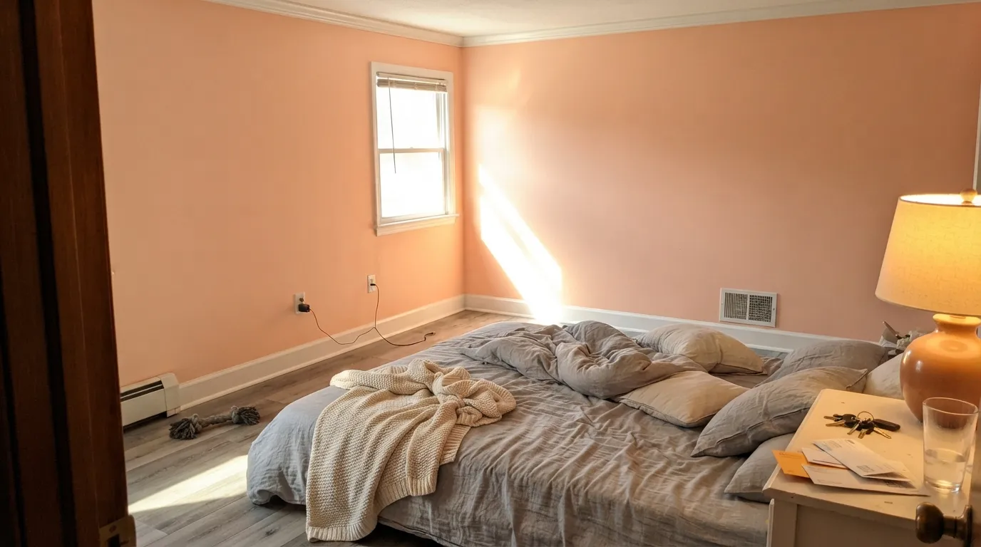
Pop is the warm coral-pink Clare built for rooms that are allowed to be fun — playrooms, nurseries, powder rooms, a breakfast nook. At LRV 66 it is much lighter than the name suggests: on four walls it settles into a soft peach-pink that glows rather than shouts.
The catch is the orange in it. In cool north daylight it reads pink and cheerful; in strong afternoon sun it slides toward salmon and apricot. Buy it for the peach, not for the pink.
Playrooms and kids' rooms · nurseries, especially drenched wall-to-ceiling · powder rooms and small windowless rooms that need warmth · a breakfast nook or one accent wall in an otherwise neutral house
You want a clear rose or bubblegum pink · your floors are honey oak or orange-toned LVP · the room runs on cool white LEDs over gray finishes · you need a color the next buyer will not notice
- A warm, genuinely cheerful color that does not read as a kids' theme
- Light enough (LRV 66) to drench walls, trim and ceiling in a small room
- Excellent in windowless powder rooms and dark small baths where whites go dead
- Warms up cool north light instead of fighting it
- Zero-VOC, GREENGUARD Gold formula with almost no smell — real for nurseries
- Reads peach, not pink — the number-one buyer mismatch
- Goes salmon-apricot in strong south and west afternoon sun
- Clashes with gray floors, gray-toned trim and cool 4000K LEDs
- Direct-to-consumer only, so you cannot walk in and grab a quart
What Color Is Pop, Really?
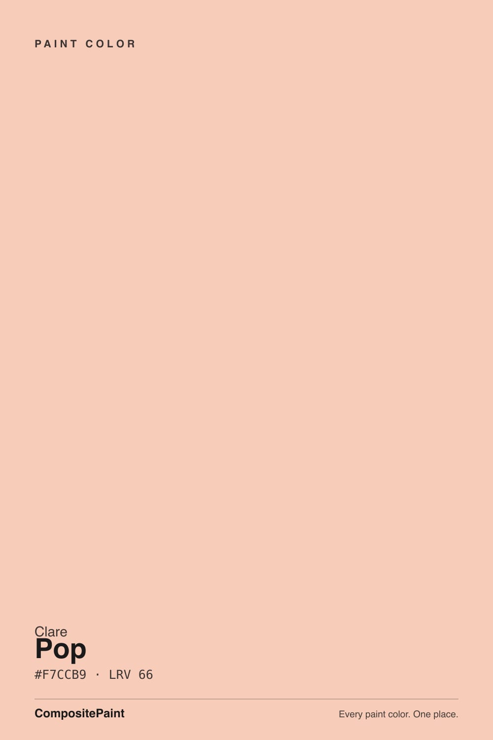
A light peach-coral: warm pink with a real dose of orange sitting under it. The name promises a saturated coral, and the chip on a screen backs that up, but the paint is milder than both — this is closer to the inside of a ripe peach than to a coral reef. Clare keeps a deliberately small, curated deck, and Pop is the one genuinely loud warm color in it, which is why it turns up on the brand's own kids-room and playroom lists rather than in its living-room neutrals.
At LRV 66 it behaves like a light color, not a jewel tone, and that changes how you can use it. Light warm colors take drenching well: walls, trim and ceiling in the same peach reads intentional and makes a small nursery or powder room feel bigger, because there is no ceiling line for the eye to stop at. The flip side is that it is not deep enough to anchor a big open room — spread across a bright open-plan main floor it goes from cheerful to washed-out and vaguely dated.
Undertone in one line: orange first, pink second — never a cool or blue-based pink. If your sample reads salmon, that is warm light or a warm bulb doing exactly what it should. If it reads almost like a warm white, your room is bright enough that the color is being diluted, and you should sample a bigger board before you decide it is 'not enough.'
Where It Shines
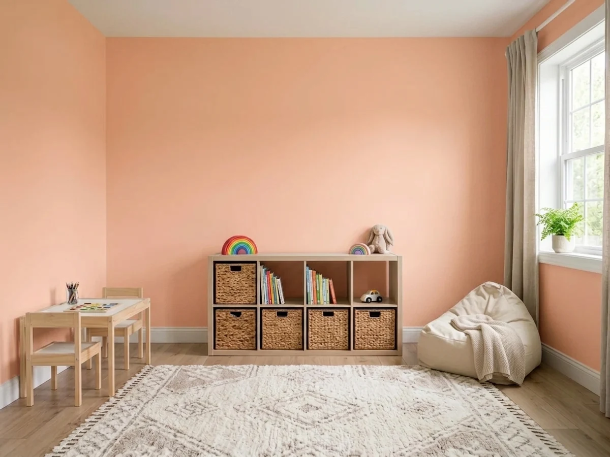
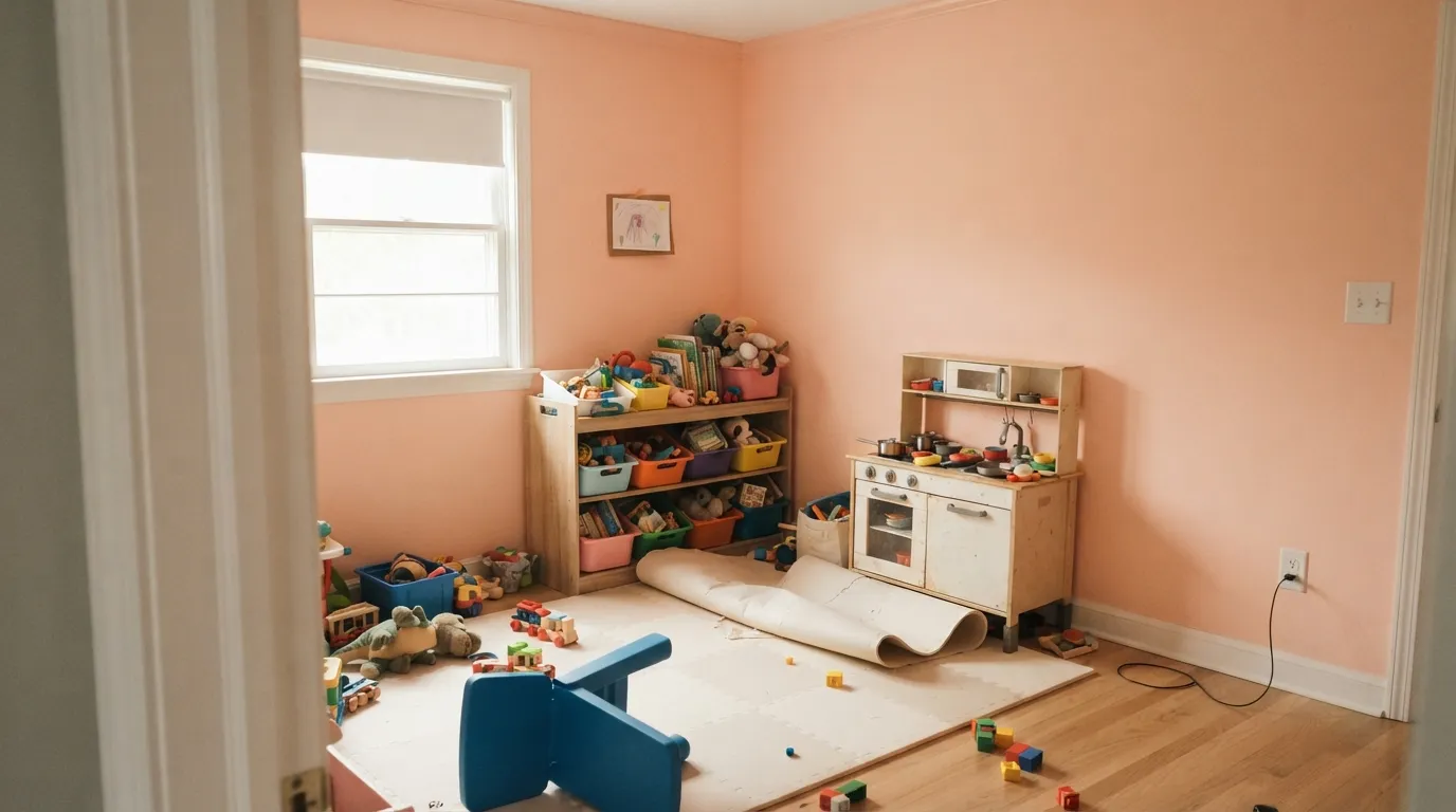
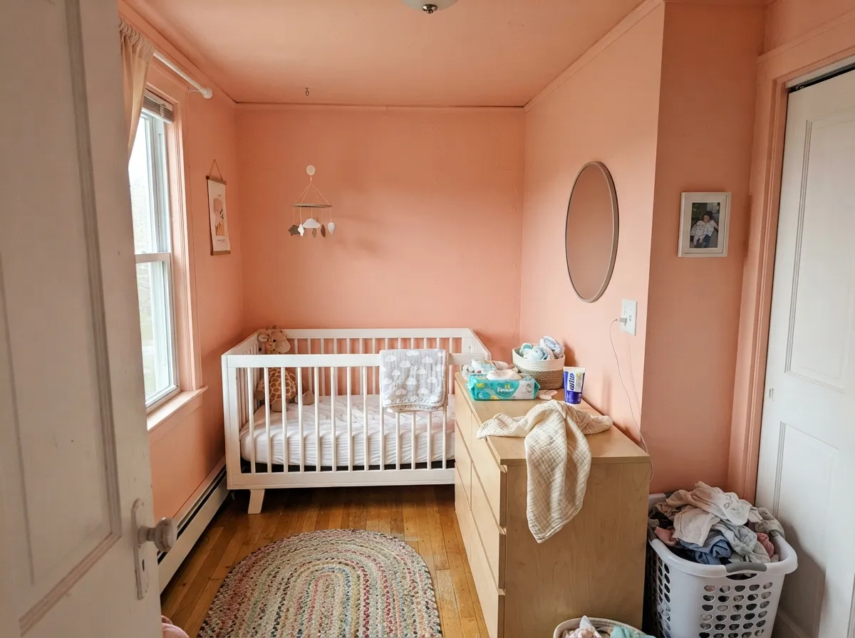
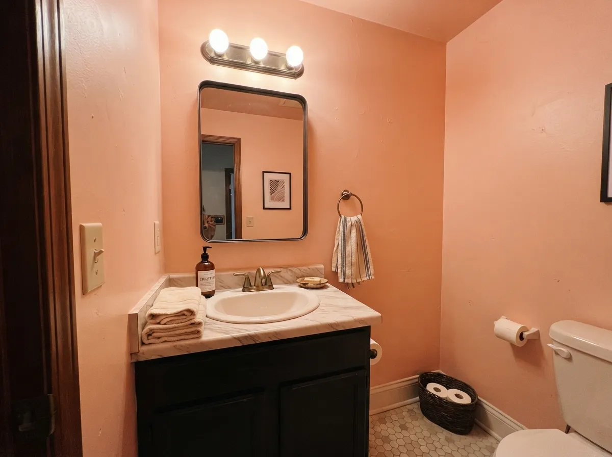
This color earns its keep in rooms with a job to be happy. A playroom drenched in Pop looks deliberate instead of themed — no decals, no primary-color rug, just a warm room that kids read as friendly. It does the same trick in a nursery, where wall-trim-ceiling drenching hides an awkward small footprint, and in a windowless powder room, where a warm mid-light color does more for the mood than any white. Give it white oak, rattan, cream textiles, brass or matte black hardware, and one muted green somewhere in the room, and it stops looking like a kids' color and starts looking like a decision.
Where It Fails
Nearly every disappointed Pop review is one of three stories, and all three are visible in a sample before you open a gallon. None of them mean the paint is bad — they mean the room, the light or the expectation was wrong.
The single most common mismatch. On four walls the orange in Pop comes forward and the pink recedes, so people hoping for a clear rose or a soft bubblegum get apricot instead. If pink is the actual goal, Romance is the color that commits to it at the same LRV 66. Pop is for people who want warmth first and pink second.
A saturated warm color at this lightness bounces hard. In a south or west room, late-day sun pushes it well past the chip into salmon-apricot for an hour or two, and the light reflecting off the walls tints the ceiling, the white trim and everything cream in the room. In a bright sunny room, sample on a large board and look at it at 5pm, not at noon.
Peach over gray-toned LVP, gray carpet or cold 4000K bulbs is the exact combination that reads as a dated bathroom rather than a fresh warm room. Cool light strips the pink out and leaves a chalky salmon; gray finishes underneath make the wall look like an accident. Warm 2700K bulbs and warm wood or cream flooring are not optional decor advice here — they are what keeps the color current.
Room by Room
The rare kids' color that is not childish. Eggshell on all four walls, or drench walls plus trim, and let the toys be the other colors — a peach room absorbs plastic clutter far better than white does. It also photographs warm, which is why it keeps showing up in playroom posts. Pair with white oak shelving and one muted green or sky-blue accent.
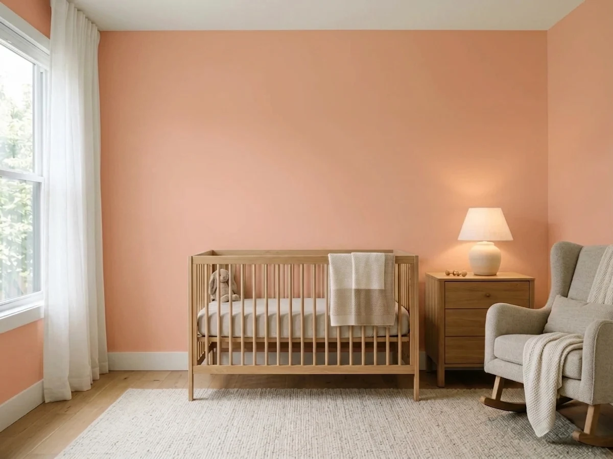
Walls, trim and ceiling in Pop is the move that makes this color look designed rather than sweet, and it is genuinely useful in a small nursery: one continuous color removes the visual ceiling line and the room reads bigger. Flat on the ceiling, eggshell on the walls, semi-gloss on the door. Keep the crib and dresser pale wood or white.
A windowless powder room has no daylight to turn the color salmon, so you get the warm, flattering version all the time — and warm peach light is far kinder to faces in a mirror than a cool gray. Owners report it as a fix for small dark bathrooms specifically. Use eggshell, warm bulbs, and brass or matte black fixtures.
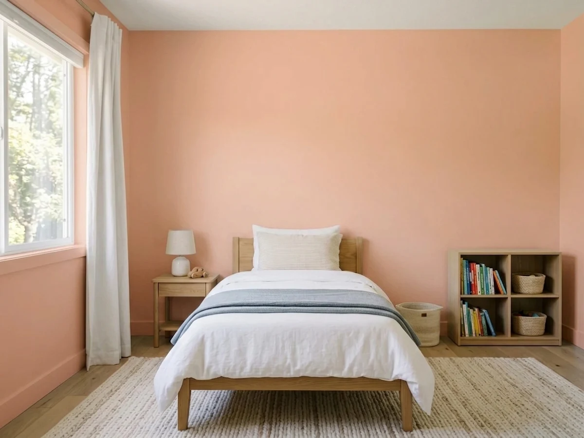
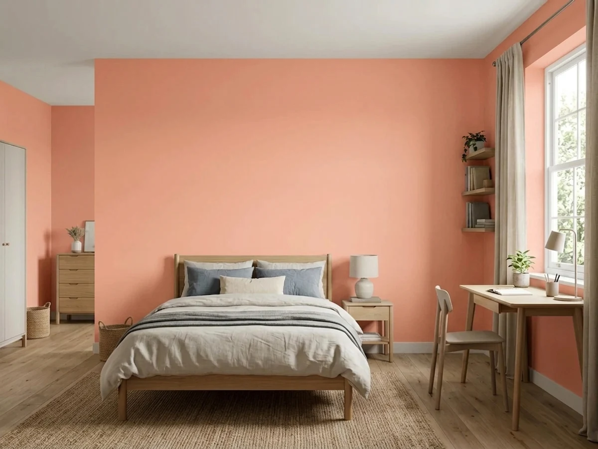
Fine and often lovely, but this is a color kids grow through rather than into. In a bedroom it is calmest with matte-looking eggshell, cream bedding and warm lamps. If the room faces west, expect a strong apricot hour at bedtime — some kids love it, some find it hot.
A single peach wall in a nook, a mudroom, or behind open kitchen shelving gets you the warmth without betting a whole floor on it. It sits well against warm off-whites and badly against cool grays, so check what the adjoining walls are before you tape.
Spread over an open main floor it stops being a statement and starts looking washed out, and it fights almost every gray or greige it meets. Outdoors is a separate problem: Pop belongs to Clare's interior line, so an exterior use means a color match at another brand — and full sun would push it to salmon anyway. Keep it inside, and keep it in one or two rooms.
Your Light Is the Risk
Cool, even north daylight subtracts exactly the orange that gets Pop in trouble elsewhere. The wall stays a clean peach-pink all day and warms a room that would otherwise feel cold — this is the exposure where the color is easiest to love.
Direct afternoon sun drives it past the chip into salmon-apricot and bounces that warmth onto the ceiling and trim. Sunny rooms are where the regret reviews come from; sample large and look at 5pm before you commit.
Brightest and most coral in east morning light, truest around midday, then steadily warmer and deeper through the afternoon until golden hour makes it glow orange. Overcast days give the softest, pinkest read of the whole cycle.
2700K warm bulbs are the right call — they keep the peach glowing and flatter skin in a mirror. Cool 4000K or daylight LEDs pull the warmth out and leave a flat, chalky salmon, which is the version people describe as dated. Pick the bulbs before you judge the paint.
Most complaints about Pop are a light mismatch. Upload a photo of your actual room and see it on your walls — then ask for the same wall in north light or evening lamps before you buy a single sample.
Need It From Another Brand?
Any paint counter can custom-tint Clare PNT100-LT-26 directly. If you would rather stay in one brand's own deck, these are the closest stock matches, measured as ΔE2000. Under 2 is a difference you will not see on the wall.
| Brand | Closest color | ΔE | LRV | |
|---|---|---|---|---|
| Sherwin-Williams | Peach BlossomSW 6624 · Sherwin-Williams | 2.6 | 68 | Color page → |
| Behr | Serene Peach280C-2 · Behr | 1.6 | 69 | Color page → |
| Benjamin Moore | Orange Creamsicle059 · Benjamin Moore | 2.4 | 65 | Color page → |
| Valspar | Pale Satin Peach2003-6C · Valspar | 1.7 | 64.2 | Color page → |
| PPG / Glidden | Sweet AngelPPG1193-4 · PPG / Glidden | 2.7 | 64 | Color page → |
| Glidden | Peach Crayon60YR 65/196 · Glidden | 0.9 | 65 | Color page → |
Similar Clare Colors
The nearest shades to Pop within Clare's own range, ranked by perceptual color distance — useful when you want the same look a touch lighter, darker, or warmer.
WCAG 2.1: AA is 4.5 : 1 for normal text, 3 : 1 for large text, AAA is 7 : 1.
Pop vs the Colors You're Also Considering
Every Pop sample board has the same rivals on it. The numbers show the real lightness gap — then it comes down to which risk you would rather live with.
Pick this when you want the warmth and energy, and peach is a feature rather than a compromise.
Sherwin-Williams SW 6323 · LRV 66RomancePick this if you actually want pink — same LRV 66, but it commits to rose instead of leaning orange.
Pick this when you want the room to be a color, not a neutral with a rumor of one.
Benjamin Moore 2102-70 · LRV 76First LightPick this for a whisper instead of a statement — at LRV 76 it behaves like a warm off-white that happens to be pink.
Pop Coordinating Colors
The rule for coordinating with Pop: warm whites, muted greens, and one clean blue for contrast — and keep gray at arm's length. Cool grays and gray-toned trim are what make a peach room look dated, while cream, white oak and muted sage make the same color look current. These are the partners that keep working in real rooms:
Why Peach Came Back
Peach spent two decades as the punchline of 1980s decorating — peach bathroom tile, peach carpet, peach and seafoam everything. What brought it back was the exhaustion with gray. Pantone named Peach Fuzz its 2024 Color of the Year, warm pink-browns took over the paint brands' color-of-the-year slots, and suddenly the warm end of the wheel was where the interesting colors were.
The difference between the current version and the dated one is almost entirely about company. Eighties peach lived with mauve, brass-and-glass and wall-to-wall carpet in the same family, so the whole room read as one warm haze. Today's peach works because it is set against white oak, cream, muted green and matte black — cool, natural materials that let the color be the only warm thing in the room.
Pop is also a good illustration of what a small, curated deck does to a color. Clare's line is short by design, so instead of eleven near-identical corals to compare, there is one warm punchy pink and a decision to make about it. That is easier for a buyer and riskier for the brand — a curated deck has nowhere to hide a color that does not work.
Pop With Wood Tones, Floors and Trim
This color is decided at the floor. White oak, ash and pale unstained woods are its best partners — cool-leaning grain lets the peach be the warm element without competition. Walnut works too, since dark red-brown reads as a deliberate contrast rather than a match. Cream carpet and natural sisal are both safe.
The two floors to avoid are opposites. Honey oak and orange-stained trim share Pop's undertone, so the walls and the floor blur into one warm orange mass with no edge between them — the room loses its shape. Gray LVP, gray carpet and gray-washed floors do the reverse: the cool floor makes the peach look like an unplanned leftover, which is the fastest route to the dated look. If either floor is staying, this is not the color.
Hardware is easy: brass, matte black and warm nickel all sit well against it. Polished chrome is the one metal that reads cold and slightly clinical next to peach. And plan on two coats — Clare's eggshell is self-priming and covers well, but a warm mid-chroma color over an existing white always needs the second pass to look even.
Three Ready Palettes Built on Pop
A color is never alone on the wall. These are complete combinations in the 60-30-10 pattern, with the reason each one holds together. Every one opens in the visualizer.
Drenching removes the ceiling line so a small playroom reads bigger, and the sky blue is close enough in lightness (62 against 66) that it adds energy without a hard contrast fight. White Dove is the handoff color: a warm white keeps the hallway from looking cold next to all that peach, which a stark bright white would not.
Try this palette in your roomMuted green is the natural counterweight to a warm peach — it sits opposite on the wheel but is grayed down enough that neither side shouts. Alabaster is the right white here because it is soft rather than crisp; a bright cool white would make the walls look flushed by comparison.
Try this palette in your roomA windowless powder room is where Pop is most reliable, because there is no daylight to turn it salmon. Creamy Swiss Coffee trim keeps the whole thing warm, and one near-black note on the vanity stops the room from reading sweet — add brass fixtures and the scheme looks deliberate.
Try this palette in your roomPop FAQ
Is Clare Pop pink or coral?
Practically speaking it is a light peach-coral: pink with a clear orange base. Clare describes it as coral-y, and on a chip it looks it, but at LRV 66 on four walls it settles into peach far more often than into coral. If you are shopping for a true pink, this is the wrong end of the family.
Will Pop be too bright for a whole room?
Less often than people expect. It is a light color, so a full room reads as a warm glow rather than a shout — the bigger risk is the opposite, that in a very bright room it thins out and looks washed. Where it does get loud is direct afternoon sun, when it can jump to salmon for an hour or two.
What trim white goes with Pop?
A warm white. White Dove or Swiss Coffee both sit comfortably beside it. Avoid a crisp cool white like Chantilly Lace at LRV 92 — next to that much clean brightness the walls look flushed and slightly dirty. If you are drenching, the simplest answer is to paint the trim in Pop itself in semi-gloss.
Is Pop a good nursery color?
It is one of the better ones, and the zero-VOC, GREENGUARD Gold formula makes it easy to paint close to a due date. The version that ages best is a full drench — walls, trim and ceiling — which reads as a designed room rather than a baby theme, and makes a small nursery feel larger by removing the ceiling line.
Can I get Pop matched at a regular paint store?
Clare sells direct online only, so there is no store shelf to pull it from. Most paint counters can scan a swatch and mix a close match, but a scan-and-match is an approximation, not the same paint — the base, the sheen and the way it dries will differ. If you want the actual color, order the peel-and-stick swatch and then the gallons from Clare.
Does Pop work in a north-facing room?
It is arguably its best exposure. Cool north light cancels part of the orange, so the wall holds a clean peach-pink instead of drifting salmon, and a warm color is exactly what a cold north room needs. Keep the bulbs at 2700K so the evening version matches the daytime one.
Have you painted with Pop?
Rate it — one tap helps the next reader decide.
Ask a Question