Intimate White
The blush-white almost nobody's heard of, reviewed honestly: the rooms where it glows pink-warm, the light that mutes it to muddy beige, and what to pick instead.

Jessica has spec'd whites and neutrals for more than 300 rooms and keeps a sample wall of painted drawdowns in her studio. Every color review is checked against real reader rooms in the comments and re-tested when a formula changes. About the testing process →
- 1Agreeable Gray60
- 2Pale Oak69
- 3Intimate White77
- 4Dover White83
- 5Moonlit Beach88
The Fast Verdict
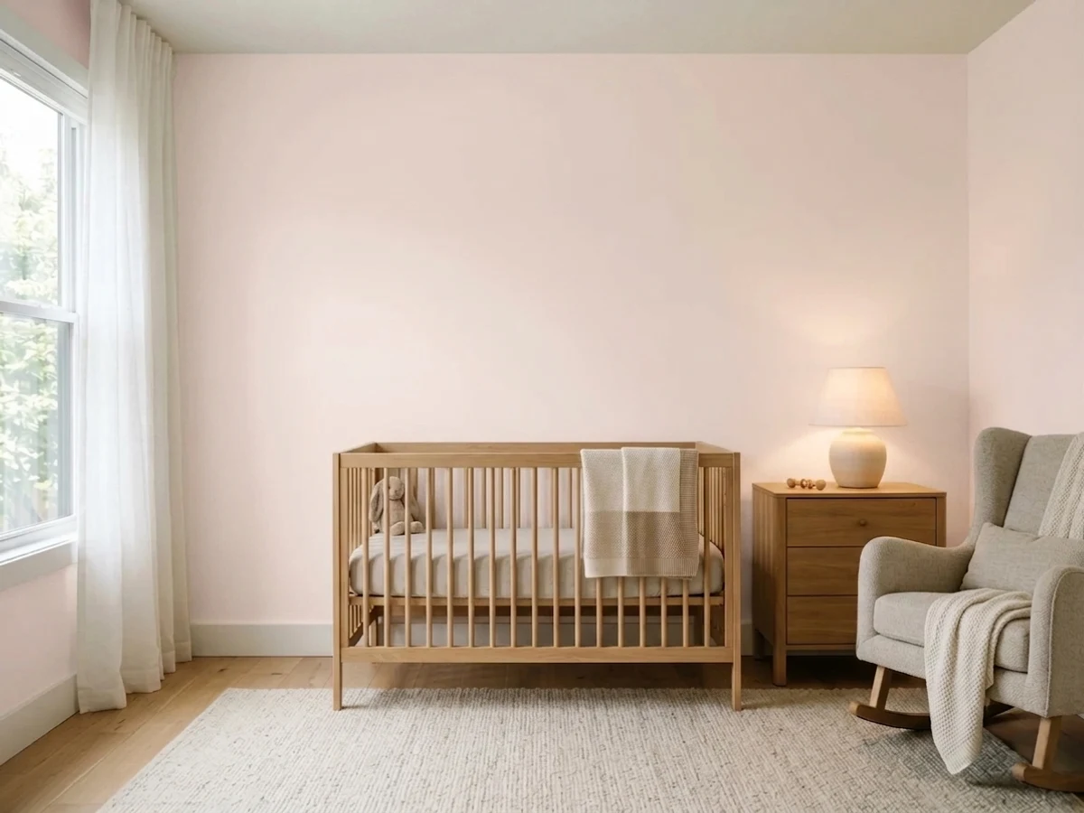
Intimate White is the blush you can almost pass off as a white — a soft peach-pink base with enough brightness (LRV 77) to read as an off-white on the wall rather than a statement pink. It has never chased a trend or won a Color of the Year; it is a quiet, slightly overlooked pick that designers reach for on purpose for one intimate room, not a color most homeowners stumble onto from a mood board. Give it a bedroom, nursery, or powder room with warm evening light and it glows softly pink; put it in a north-facing room with no lamps, or next to anything cool and grey, and the color either flattens into muddy beige or looks like a mistake.
Bedrooms, nurseries, and powder rooms with real daylight · warm 2700K lamps at night · pairing with brass, walnut, and soft sage or clay accents · anyone who wants a whisper of pink, not a stark white
You want a genuinely neutral white, no color at all · your counters or floors are cool grey stone or LVP · your room is north-facing and lamp-free · you're painting a whole open-plan main floor
- Genuine warmth without tipping into beige or yellow — reads as a whisper of pink, not a full blush wall
- LRV 77 keeps rooms bright while still carrying real color
- Gorgeous after dark under warm lamps — the "intimate" glow the name promises
- Pairs effortlessly with brass, walnut, and soft sage or clay accents
- A quieter, far less overexposed alternative to trend-driven blush pinks
- Not a true white — buyers expecting a plain off-white get visible pink or peach
- Flattens into muddy grey-beige in north light with cool bulbs and no lamps
- Clashes with cool grey stone, chrome, and stark-white trim
- Little brand marketing or fame — hard to find real before-and-after photos before committing
What Color Is Intimate White, Really?
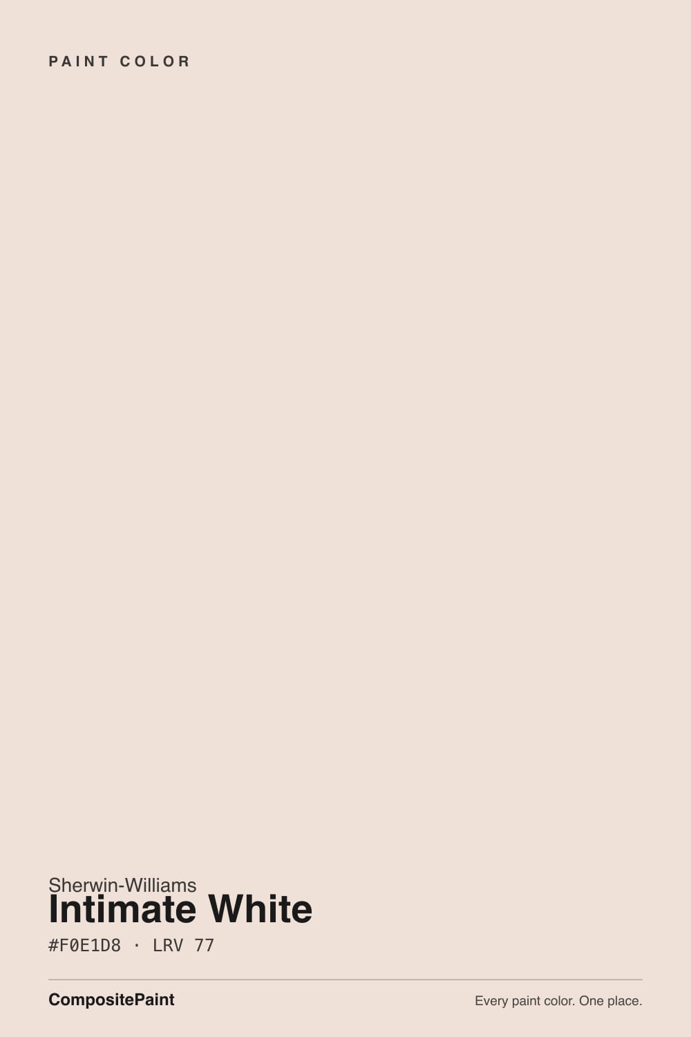
Intimate White belongs to a small, lesser-known cluster of pink-leaning whites in the Sherwin-Williams deck — Romance (SW 6323, more overtly pink) and Faint Coral (SW 6329, more coral) are its closest siblings, with Angelic (SW 6602), the softest of the group, since archived. None of them get the marketing budget or search volume of Alabaster or Pure White, and Intimate White is the quietest of the bunch: a genuine off-white built on a peach-pink undertone rather than a color merely trying to pass as white. It has never been a Color of the Year and rarely turns up in a viral before-and-after — it is the kind of shade a designer specs on purpose for one considered room, not one homeowners back into from a Pinterest board.
At LRV 77 it sits in the same bright bracket as SW's mainstream whites, but hold the chip next to something genuinely neutral — Alabaster (LRV 85) or Pure White (LRV 84) — and the pink is immediately obvious; this is not a white with a hint of warmth, it is a blush with a lot of white mixed in. Its closest cousin outside the SW deck is Benjamin Moore's First Light (LRV 76), which runs the identical playbook: pale pink dressed as an off-white, honest and pretty in warm light, exposed the moment a true white or cool light source sits next to it.
Undertone in one line: pink first, peach second — never yellow, never grey on its own. If your sample looks flat and grayish, that is cool light draining the pigment out, not a different paint; if it looks distinctly coral, that is warm evening light or a 2700K bulb doing exactly what this color was built to do.
Where It Shines
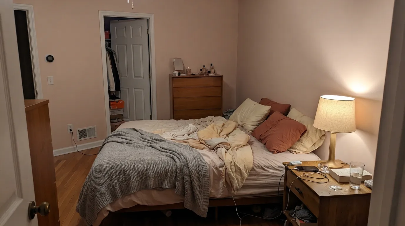
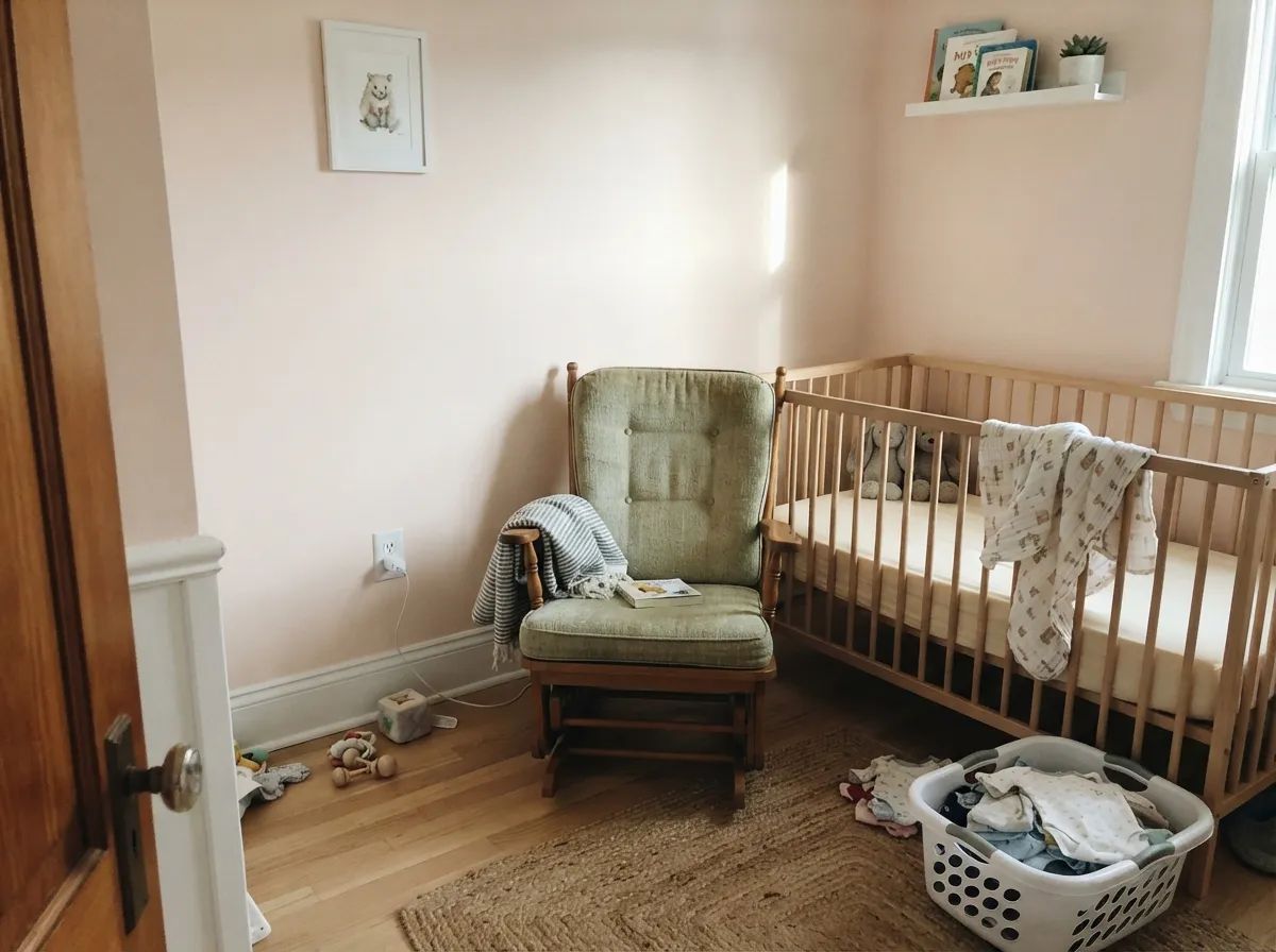
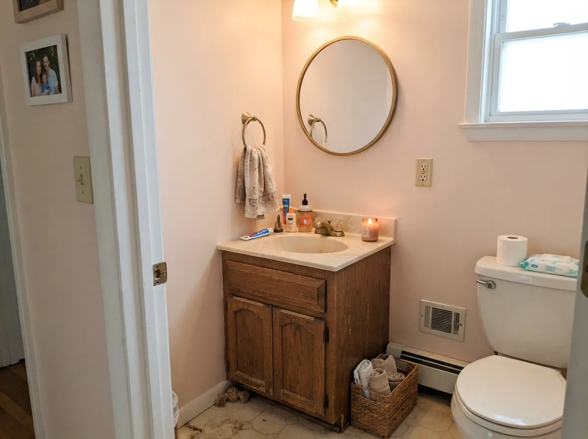
Give it a bedroom, a nursery, or a powder room with warm lamps at night and it does exactly what its name promises: a soft, private glow that reads considered rather than sweet. It is best treated as a small-room, small-commitment color — the kind of white a designer reaches for on one intimate space, not the whole main floor — and it rewards brass, walnut, linen, and blush or clay textiles the way a true white never could.
Where It Fails
Every real complaint about Intimate White traces back to one of three set-ups, and each one is avoidable once you know to look for it. None of them are a flaw in the paint — they are the predictable cost of choosing a white with real pigment in it.
A stark, cool trim white (Extra White territory) upstages the wall and Intimate White reads faintly dirty instead of warm — the same trap that catches every creamy or blush white paired with the wrong partner. Trim it in a warm white like Snowbound or Alabaster instead, never a bright one.
Grey quartz counters, chrome fixtures, and grey-washed floors sit at the opposite temperature and make the pink look accidental rather than intentional — the wall and the material actively argue. Warm wood, brass, and cream stone are the safer match.
Cold light drains the pigment out and leaves a flat, slightly muddy grey-beige — readers who expected a pretty blush end up with dishwater walls. The fix costs less than repainting: swap to 2700K bulbs and add a lamp before you give up on the color.
Room by Room
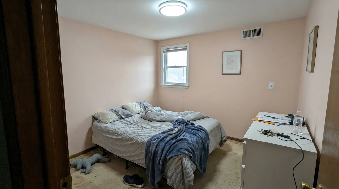
Under a 2700K lamp at night the peach comes forward and the walls turn genuinely cozy — the effect the name is selling. Eggshell hides texture; keep the trim a warm white, not a stark one, or the walls will look dingy by comparison.
Gender-neutral, soft, and calm without tipping into a themed pink. Pair with a muted sage like Clary Sage for an accent wall or crib nook and the room reads considered, not sugary.
With brass, wood vanities, and warm-toned stone it is a genuinely pretty small-room color. With chrome, cool grey quartz, or blue-grey tile it looks off — the pink and the cool material actively argue. Satin on the vanity, eggshell on the walls.
An island, a hutch, or lower cabinets under a neutral wall works well; a full kitchen of Intimate White cabinets bets the whole room on daylight staying warm and consistent, which most kitchens don't get all day.
It needs steady, real daylight to hold its color across a big room with mixed light sources. In an open-plan floor moving between windows, sconces, and overhead LEDs, the wall can read a different color depending on where you stand — which reads as an inconsistent paint job, not a feature.
Full outdoor sun and passing headlights are unkind to a subtle pigment like this one; it tends to look faded or slightly dirty rather than intentional. Save it for indoors and let a true warm white like Snowbound handle the outside of the house.
Your Light Is the Risk
Warm sun brings the peach forward without pushing it into full coral. This is the light that sells the color.
Cool daylight drains the pigment and leaves a flat, slightly muddy grey-beige. Test with a big sample before committing a whole room.
Distinctly pink in morning sun, then cools toward a quieter neutral as the light turns indirect through the afternoon.
2700K lamps: the peach intensifies into the cozy glow the name promises. Cool white LEDs: it washes toward a flat, faintly institutional pink — swap bulbs, not paint.
Most complaints about Intimate White are a light mismatch. Upload a photo of your actual room and see it on your walls — then ask for the same wall in north light or evening lamps before you buy a single sample.
Need It From Another Brand?
Any paint counter can custom-tint Sherwin-Williams SW 6322 directly. If you would rather stay in one brand's own deck, these are the closest stock matches, measured as ΔE2000. Under 2 is a difference you will not see on the wall.
| Brand | Closest color | ΔE | LRV | |
|---|---|---|---|---|
| Behr | Malted Milk700C-2 · Behr | 2.1 | 77 | Color page → |
| Benjamin Moore | Melted Ice Cream2095-70 · Benjamin Moore | 1.3 | 78 | Color page → |
| Valspar | Dance of the GoddessesV169 · Valspar | 2.1 | 78.2 | Color page → |
| PPG / Glidden | Butter IcingPPG1062-1 · PPG / Glidden | 1.6 | 78 | Color page → |
| Glidden | Ginger CreamPPG1052-1 · Glidden | 0.2 | 77 | Color page → |
| Dutch Boy | Pink Floss106-1DB · Dutch Boy | 0.0 | 77 | Color page → |
Similar Sherwin-Williams Colors
The nearest shades to Intimate White within Sherwin-Williams's own range, ranked by perceptual color distance — useful when you want the same look a touch lighter, darker, or warmer.
WCAG 2.1: AA is 4.5 : 1 for normal text, 3 : 1 for large text, AAA is 7 : 1.
Intimate White vs the Colors You're Also Considering
Every Intimate White sample board has the same rivals on it. The numbers show the real lightness gap — then it comes down to which risk you would rather live with.
Pick this if your painter already stocks Sherwin-Williams, or you're comparing brands and want the SW read of the same idea.
Benjamin Moore 2102-70 · LRV 76First LightPick this if you want the identical blush-white idea in Benjamin Moore's line — practically indistinguishable, one LRV point darker.
Pick this when you want the whisper of color Alabaster doesn't have — the whole reason to buy this shade over a true neutral white.
Sherwin-Williams SW 7008 · LRV 82AlabasterPick this if the pink risk feels like too much and you want a warm white with zero blush undertone.
Pick this if pink reads more considered to you than yellow-cream — they solve the same "I want white with warmth" problem two different ways.
Benjamin Moore OC-45 · LRV 84Swiss CoffeePick this for a creamy, yellow-warm off-white instead — the same cozy idea, built on a different and more common undertone.
Touching White SW 6609 at LRV 78 is the nearest neighbor. Its hex #F4E1D7 is a touch lighter and slightly cleaner, so it reads a shade less pink. Teasing Peach SW 6623 at LRV 78 leans more orange, and Feather White SW 6616 at LRV 79 is brighter and a little creamier. Patient White SW 6301 at LRV 77 swaps some of the peach for mauve, which reads cooler and greyer. White Dogwood SW 6315 at LRV 75 is the deepest of the set.
Across brands, Dutch Boy Pink Floss 106-1DB matches at deltaE 0 and Glidden Ginger Cream PPG1052-1 at deltaE 0.22, both the same color in another line. Benjamin Moore Melted Ice Cream 2095-70 at LRV 78 and deltaE 1.31 is visually identical in normal room light. Behr Malted Milk 700C-2 at deltaE 2.14 and Valspar Dance of the Goddesses V169 at deltaE 2.11 are very close but worth sampling first. Farrow and Ball Dimity No. 2008 at deltaE 4.36 is close but visibly different side by side, more beige and less pink.
Intimate White Coordinating Colors
The rule for coordinating with Intimate White is simple: stay warm and stay soft. It flatters warm whites, muted sage, and clay-pink accents — and it argues with cool greys, chrome, and anything stark white. These are the partners that keep it looking intentional:
A Quiet Member of SW's Blush-White Family
Intimate White has never had a marketing moment. It sits in a small pink-leaning cluster in the Sherwin-Williams deck alongside Romance (SW 6323, more overtly pink) and Faint Coral (SW 6329, more coral than pink) — colors close enough that even independent color blogs admit you need bright light and a white trim strip to tell them apart on the wall. Angelic (SW 6602), the softest of the group, has since been archived.
None of the three has ever been a Color of the Year or ridden a viral design trend, and that is a fair, honest thing to say about it: this is not a famous color, it is a genuinely useful one that independent reviewers keep quietly calling a hidden gem. If you want proof it works before committing, look for the handful of designer bedroom and nursery photos online rather than a big before-and-after gallery — there isn't one, because this color has always sold on being a good pick, not a talked-about one.
Intimate White With Wood Tones and Floors
Warm wood is this color's best friend. Walnut, honey oak, and cedar all sit comfortably against the pink-peach base because the temperatures agree — the wood's warmth reads as intentional, not a clash. Cream and ivory linens, rattan, and brass complete the look most reviewers photograph it in.
Cool floors are the one honest no: grey-washed or grey LVP flooring pulls the color's pink into relief and can make the wall look like a mistake rather than a choice. If a grey floor is staying, either sample big before committing or choose a warmer, less pigmented off-white instead — Snowbound or Alabaster carry the same brightness without the undertone risk.
Three Ready Palettes Built on Intimate White
A color is never alone on the wall. These are complete combinations in the 60-30-10 pattern, with the reason each one holds together. Every one opens in the visualizer.
Snowbound keeps the trim warm instead of stark, so the blush walls never look dirty by comparison; Redend Point adds one deeper clay-pink note that turns the tonal pairing intentional instead of accidental.
Try this palette in your roomAlabaster's cooler edge keeps the room from tipping saccharine, and Clary Sage is the classic gender-neutral partner — muted enough not to compete, green enough to read considered rather than themed.
Try this palette in your roomAccessible Beige grounds the vanity in the same warm family as the walls, and Iron Ore supplies the single dark note the small room needs without introducing anything cool to fight the blush.
Try this palette in your roomIntimate White FAQ
Is Intimate White pink or white?
Pink, softly — it is built on a peach-pink base with enough white mixed in to read as an off-white in good light. Independent color reviewers describe it as having a coral tint that gives it a dreamy look rather than a neutral one, and that is the honest read: expect a blush, not a beige.
Is it good for a nursery?
Yes — it is one of its best jobs. It reads gender-neutral rather than a themed girl-pink, stays calm under daytime light, and turns genuinely cozy at night under a warm lamp. Pair it with a soft sage accent or a warm white trim rather than anything stark.
What trim goes with Intimate White walls?
A warm white, not a bright one — Snowbound or Alabaster keep the relationship friendly. A stark, cool trim white will make the walls look faintly dirty by comparison, the same mistake that trips up most creamy or blush whites.
Does it work with grey counters or floors?
Not comfortably. Cool grey quartz, chrome fixtures, and grey-washed floors sit at the opposite temperature and make the pink look accidental rather than intentional. Warm wood, brass, and cream stone are the safer match.
How is it different from Benjamin Moore's First Light?
Very little on paper — First Light sits one LRV point darker (76 vs. 77) and runs the same pale-pink-as-off-white idea. The practical difference is brand and sheen options; pick whichever brand your painter already stocks, and sample both if you're deciding between BM and Sherwin-Williams anyway.
Can I use Intimate White outside?
Not recommended. Full sun and the passing light of a street tend to read the subtle pink as fading or dirt rather than color, and there is little real evidence of it being used successfully on exteriors. Keep it indoors and pick a true warm white like Snowbound for the outside of the house.
Have you painted with Intimate White?
Rate it — one tap helps the next reader decide.
Ask a Question