Frost
The cool white on a million American ceilings, reviewed honestly: the rooms where it looks like a gallery, the rooms where it looks like a clinic, and what to pick instead.

Jessica has spec'd whites and neutrals for more than 300 rooms and keeps a sample wall of painted drawdowns in her studio. Every color review is checked against real reader rooms in the comments and re-tested when a formula changes. About the testing process →

- 1Classic Gray74
- 2Alabaster82
- 3Frost87
- 4Sleek White92
- 5Ultra Pure White97
The Fast Verdict
Frost is Behr's cool white: almost no color left in it, a faint green-gray shadow that only shows up next to cream, and enough brightness to make a room feel like it got a bigger window. On ceilings and trim it is close to flawless, which is why Home Depot stocks it pre-mixed in ceiling paint. On four walls it is a real choice, not a safe one — it needs daylight, and it will not forgive honey oak.
Ceilings, trim and doors · south and west-facing living and family rooms with strong afternoon light · bathrooms, laundry rooms and sunrooms · anyone who wants a gallery-white room, not a cozy one
The room is dim or north-facing · your floors and trim are honey oak · you want cozy, creamy, farmhouse white · your counters and furniture are all warm cream
- Bright enough (LRV 93) to make small and windowless rooms feel bigger
- The best kind of ceiling white — never yellows over a white wall
- Cancels the yellow flash warm whites get in strong afternoon sun
- Agrees with white tile, chrome, glass and cool quartz
- Stocked pre-tinted at Home Depot, so touch-up gallons are always in reach
- Reads clinical against cream furniture and warm-white trim
- Fights honey oak floors and oak trim outright
- Goes flat gray in dim north rooms and under cool LEDs
- Thin bright whites like this need a real two coats — skimping shows
What Color Is Frost, Really?
A near-colorless white with a cool tilt — the pigment left in it reads as a faint green-gray, not as blue. That distinction matters, because the two behave differently on a wall. A blue-tilted white goes icy and sharp; Frost's green-gray shadow keeps it quiet, so it stays flat and clean instead of glaring. You will only ever notice the shadow in company: put a cream white beside it and Frost suddenly looks like the cold one.
At LRV 93 it is at the very top of Behr's deck — there is barely any tinting base in it. That is the entire argument for and against the color. For: it throws light back into the room, which is why it makes small bathrooms and low-ceilinged basements-of-a-family-room feel taller, and why it is the default in Behr's spatter-resistant ceiling paint. Against: a color with this little body has nothing to fall back on when the light fails. In a bright room it reads crisp. In a dim one it just reads gray.
Undertone in one line: cool, faintly green-gray — never warm, never truly blue. If your sample looks blue on the wall, that is a north window, a cool LED, or a gray-blue floor bouncing into it. If it looks dingy, the room is too dark for a color with nothing in it.
Where It Shines
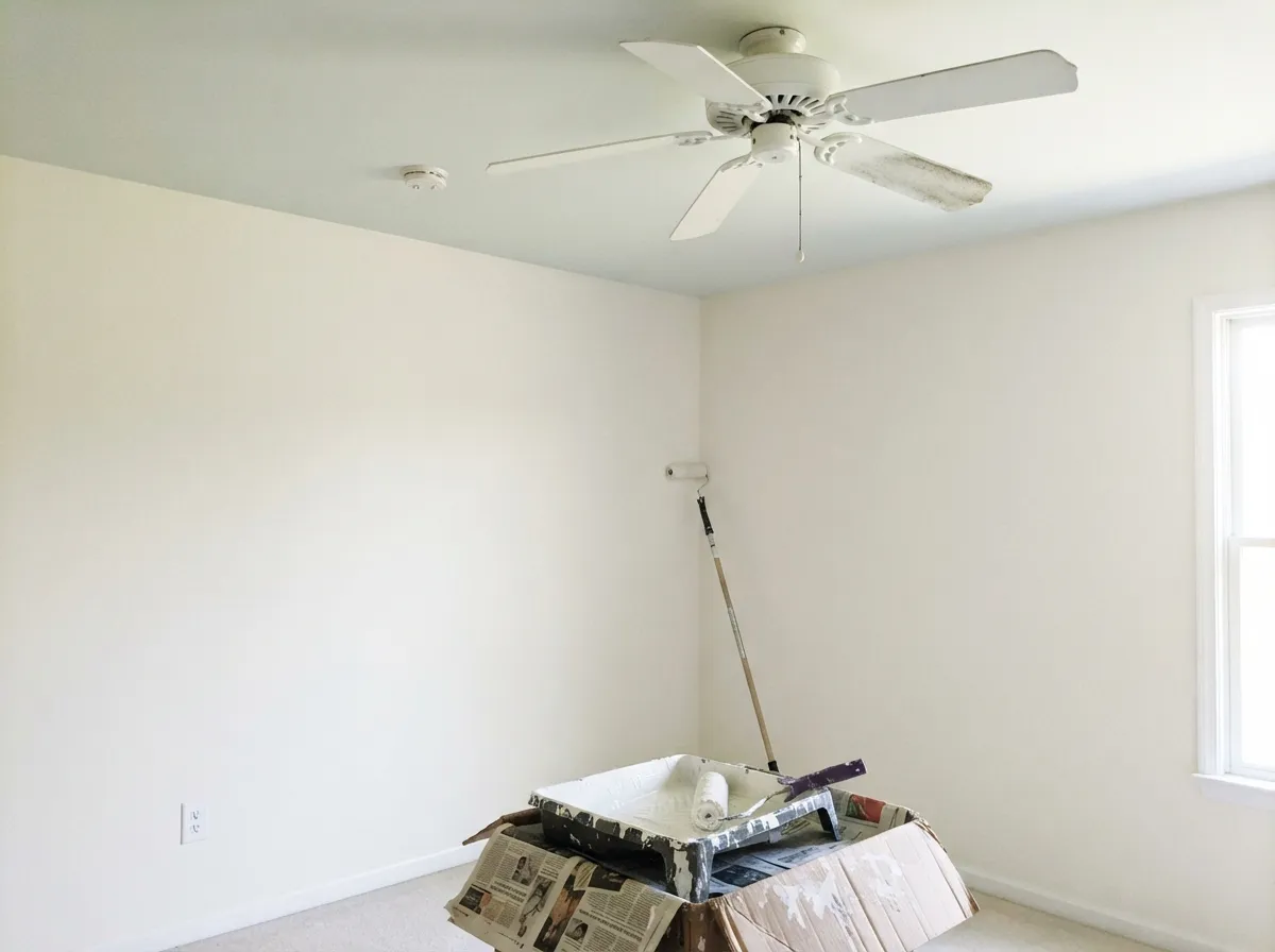
Its real job is overhead and on the woodwork. Behr sells Frost as a stock, pre-tinted ceiling color, which means a very large number of American ceilings are this exact white with nobody in the house knowing its name — and on a ceiling it is genuinely excellent: bright enough to disappear, cool enough to never yellow against a white wall. On trim and doors the alkyd enamel version is the one Home Depot reviewers keep praising for not scratching. On walls it earns its keep in one specific situation: a south or west-facing room with strong afternoon sun, where a warm white would go butter and Frost just goes bright.
Where It Fails
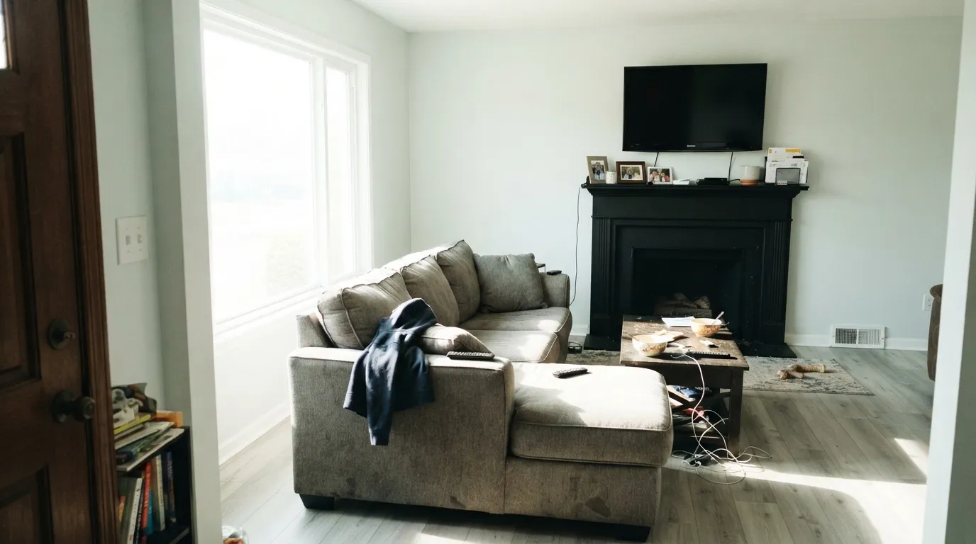
The complaints about Frost are all versions of one thing — people bought a white and got a cool white. It is predictable before the first coat, and none of it is the paint misbehaving. If your room is one of the three below, this is not your white.
On a chip Frost just looks like white. On four walls, next to cream sofas, oatmeal rugs and a warm-white ceiling from the last owner, it reads clinical — the word owners reach for is hospital. There is no warmth in it to find. If cozy is the goal, Behr Swiss Coffee (LRV 80) is the other end of the same shelf, and Polar Bear (LRV 86) is the middle.
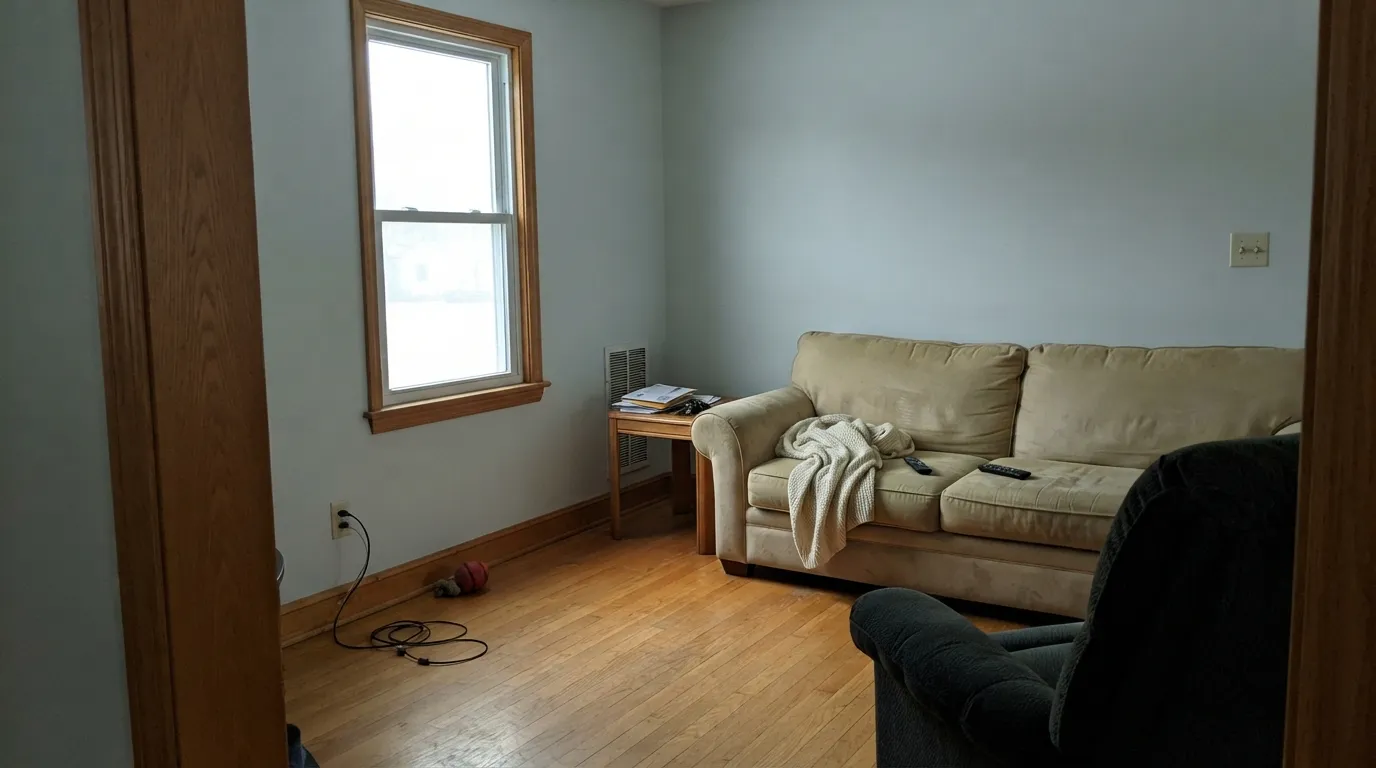
This is the real clash. Orange-gold wood and a cool white are opposites, and each one makes the other louder: the floor goes more orange, the walls go more blue-gray, and the room looks like two houses. A big rug helps a little. Nothing fixes it fully. With honey oak staying, pick a white with body — Polar Bear or Swiss Coffee.
A white this empty has nothing to give back when the light is poor. North light and 4000K bulbs both strip it to flat gray, and rooms with no lamps on look like an office after hours. Warm 2700K bulbs are part of this paint job, not an optional upgrade.
Room by Room
Behr stocks it pre-mixed in ceiling flat for a reason. It stays cool against every wall color, never yellows over a white wall, and at LRV 93 it lifts the plane. Flat sheen, and give it two coats — the ceiling formula is the one Home Depot reviewers most often say did not cover in one.
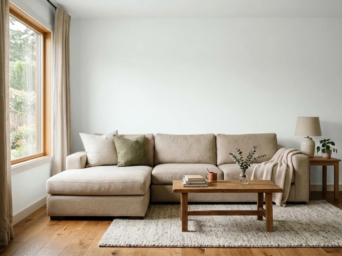
The right room is south or west-facing with real afternoon sun. Frost absorbs the glare that turns warm whites yellow at 4pm and holds a clean gallery look all day. Eggshell on the walls, same color on the trim in semi-gloss. In a dim, north-facing family room, do not.
Semi-gloss Frost against a mid-tone wall gives you a crisp, modern edge rather than a soft creamy one. The urethane alkyd enamel is the version to buy for doors and casings; owners report it stays put on smooth surfaces instead of scratching.
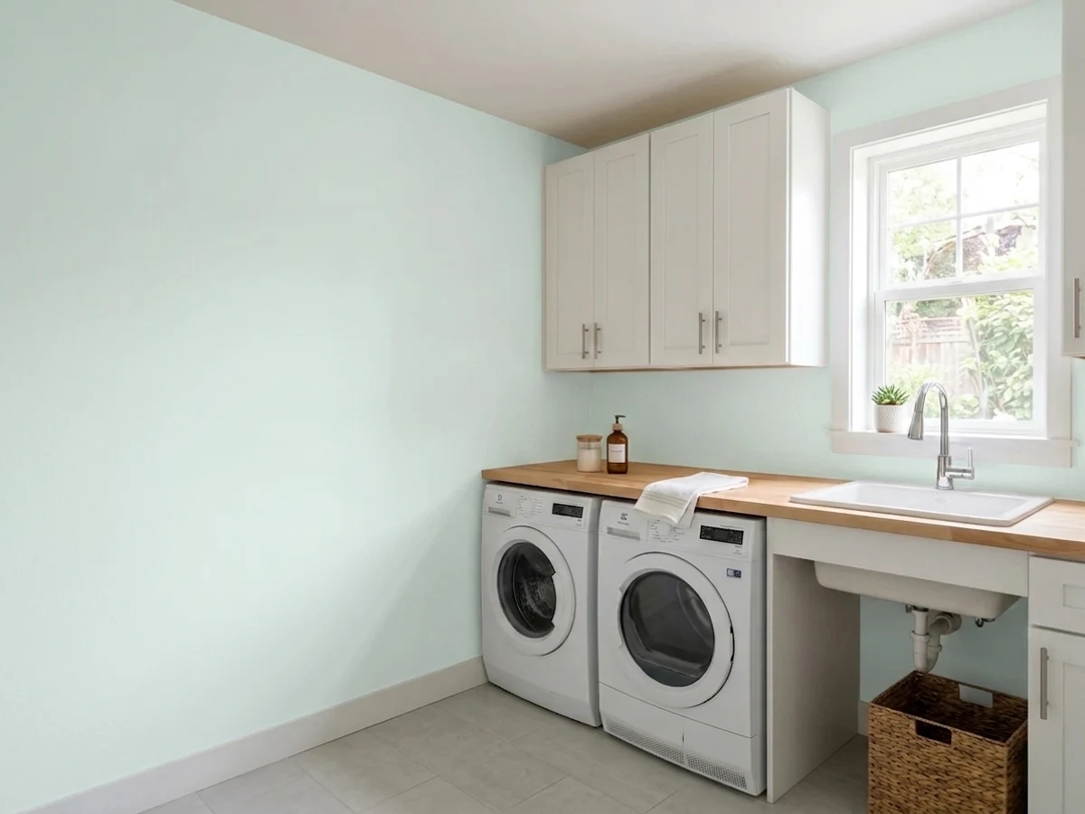
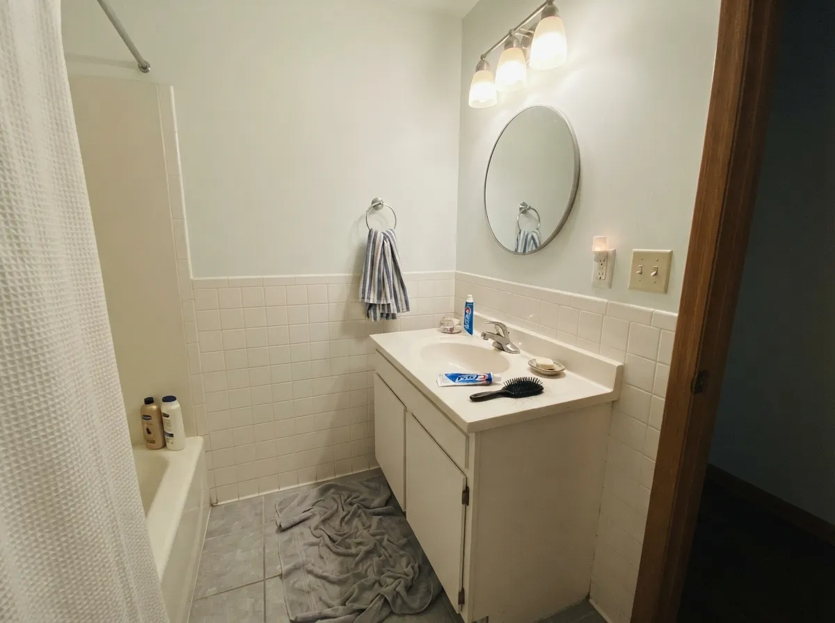
This is where cool white is simply correct: it agrees with white tile, chrome, glass and cool quartz rather than arguing with them, and it makes a windowless bathroom read clean instead of dim. Satin sheen for the moisture.
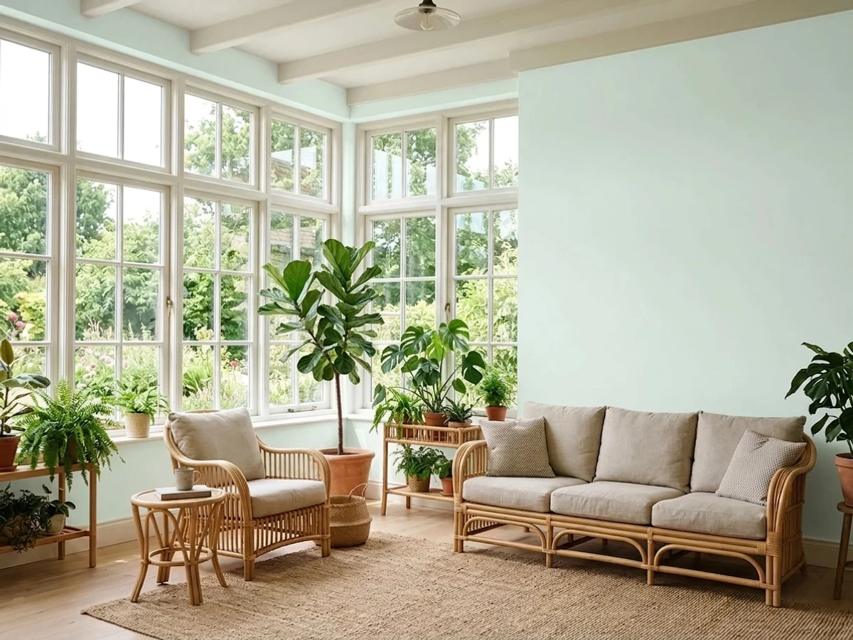
All that glass means all that light, and a warm white in a sunroom goes yellow by mid-afternoon. Frost stays neutral under it and lets the green outside be the color in the room.
It holds up outside — one Home Depot reviewer reports the same color 15 years on at elevation — and with black or charcoal trim it reads sharp and modern. The caution is elevation-by-elevation: the shaded north wall of the house will read distinctly cooler and grayer than the sunny side. Walk a sample board around the whole house before you commit.
Your Light Is the Risk
South and west light is where it wins — it takes the glare and stays clean white instead of flashing yellow.
Cool gray daylight has nothing to warm it with, so the wall reads flat gray-blue. The one light to test before buying.
Bright and slightly warmed at the sun hours, quietly gray after. Golden hour is the friendliest it ever looks.
2700K bulbs soften it to a plain, calm white. 4000K LEDs push it straight to office-gray — change the bulbs, not the paint.
Most complaints about Frost are a light mismatch. Upload a photo of your actual room and see it on your walls — then ask for the same wall in north light or evening lamps before you buy a single sample.
Need It From Another Brand?
Any paint counter can custom-tint Behr 57 directly. If you would rather stay in one brand's own deck, these are the closest stock matches, measured as ΔE2000. Under 2 is a difference you will not see on the wall.
| Brand | Closest color | ΔE | LRV | |
|---|---|---|---|---|
| Sherwin-Williams | SnowbeltSW 9623 · Sherwin-Williams | 1.2 | 87 | Color page → |
| Benjamin Moore | Wedding Veil2125-70 · Benjamin Moore | 1.0 | 87 | Color page → |
| Valspar | Tambourine8007-3B · Valspar | 0.6 | 86 | Color page → |
| PPG / Glidden | Delicate WhitePPG1001-1 · PPG / Glidden | 0.2 | 88 | Color page → |
| Glidden | Shooting StarPPG1154-1 · Glidden | 1.6 | 86 | Color page → |
| Dutch Boy | White003W · Dutch Boy | 0.5 | 86 | Color page → |
Similar Behr Colors
The nearest shades to Frost within Behr's own range, ranked by perceptual color distance — useful when you want the same look a touch lighter, darker, or warmer.
WCAG 2.1: AA is 4.5 : 1 for normal text, 3 : 1 for large text, AAA is 7 : 1.
Frost vs the Colors You're Also Considering
Every Frost sample board has the same rivals on it. The numbers show the real lightness gap — then it comes down to which risk you would rather live with.
Pick this for the brighter, emptier version: on a ceiling or in a small bathroom, Frost gives back more light.
Behr 52 · LRV 88WhitePick this if you want the same cool character with a little more body — it holds up better on walls that do not get much sun.
Pick this when a truly blank white feels harsh and you want the faint green-gray to take the edge off.
Behr 1850 · LRV 92Ultra Pure WhitePick this when you want no undertone to argue about at all — it is the untinted base, and it is the cheapest gallon in the store.
Pick this when Polar Bear looks too soft next to your white tile, chrome or cool quartz.
Behr 75 · LRV 86Polar BearPick this for a softer everyday white that sits on the warm side of neutral — the safer pick for a whole house and for oak floors.
Pick this if you are buying at Home Depot: Frost gets you close for a lot less money, and it comes pre-mixed in ceiling paint.
Benjamin Moore OC-65 · LRV 92Chantilly LacePick this if you are shopping Benjamin Moore — it is the same crisp, cool-neutral gallery look, and the reference point designers name.
Benjamin Moore Chantilly Lace 2121-70 at LRV 91 is the closest famous name, with a deltaE of 1.83, which is visually identical in normal room light and only a shade less reflective. Sherwin-Williams UltraWhite SW 9500 at LRV 94 is deltaE 2.12, very close but worth sampling since it runs a touch brighter and cleaner.
Valspar Ultra White 7006-24 at LRV 93.6 is deltaE 2.49 and Farrow and Ball All White No. 2005 at LRV 92 is 2.36, both very close but not swaps you should make blind. Glidden Delicate White PPG1001-1 sits lower at LRV 88 with a deltaE of 2.21, so it will read slightly softer on a wall.
The clear outliers are Kompozit Sugar Dust 0011 at deltaE 4.13 and Backdrop Tabula Rasa BD-SB at 4.84. Both trade the cool green for a warm cream and are close but visibly different side by side.
Frost Coordinating Colors
The rule with Frost is the mirror image of the warm-white rule: stay on the cool side of the fence. It sits comfortably with cool grays, slate blues and true blacks, and it looks unfinished beside cream, camel and golden beige. These are the Behr partners that keep showing up in rooms that work:
The White You Already Own: Frost as Behr's Stock Ceiling Color
Frost has a strange kind of fame: almost nobody picks it off a fan deck, and an enormous number of people are living under it. Behr sells its Premium Plus ceiling flat pre-tinted in Frost — the one-gallon and five-gallon buckets sitting on the shelf at Home Depot with no tint machine involved — so it is the default overhead white in a very large number of American houses, apartments and rentals. If you have ever bought ceiling paint off a shelf without choosing a color, this was probably it.
That has two practical consequences. First, if you are touching up an existing ceiling in a house you did not paint, Frost is the first thing to test against — it costs one quart to find out. Second, it explains why Frost is a genuinely good ceiling white and only a situational wall white: it was engineered for a plane you never look at directly, where being cool and empty is exactly the point. On four walls, the same emptiness is what makes it demanding.
Frost With Wood Tones and Floors
This decision gets made at the floor, not at the paint counter. Frost is at its best over cool and neutral flooring: gray-toned LVP, pale white oak, gray-washed wood, polished concrete, large-format porcelain tile. Against those it looks deliberate and modern, and the room reads like one idea instead of two.
Dark walnut and espresso also work, for a different reason — the contrast is so wide that temperature stops being the story. What does not work is golden: honey oak floors, orange-stained oak trim, yellow-beige carpet, pine paneling. Cool white and orange wood push each other apart, so the floor looks more orange and the wall looks more gray-blue, and owners describe the result as cold and unfinished. If those floors are staying and you still want white, Polar Bear or Swiss Coffee will meet the wood halfway.
Metals follow the same logic: chrome, polished nickel, matte black and stainless all belong here. Unlacquered brass and antique bronze do not — they read yellow against Frost, and warm brass hardware is the fastest way to make a cool white room look like an accident.
Three Ready Palettes Built on Frost
A color is never alone on the wall. These are complete combinations in the 60-30-10 pattern, with the reason each one holds together. Every one opens in the visualizer.
One white everywhere, separated only by sheen, is what makes a bright room read gallery instead of builder — and it removes the trim-versus-wall mismatch that makes cool whites look dirty. Cracked Pepper supplies the single dark anchor the scheme needs so the room does not float.
Try this palette in your roomFrost sits on the cool side of neutral, so it takes a slate-blue island and cool quartz without any negotiation. Solemn Silence is a quiet cool gray, which makes the handoff to the next room a step down in brightness rather than a change of temperature.
Try this palette in your roomNear-black trim is what stops a bright cool white facade from looking washed out from the street, and the two are both in the Behr deck so the whole job comes off one paint counter. Blueprint gives the door a mid-tone blue that belongs to the same cool family instead of interrupting it.
Try this palette in your roomFrost FAQ
Is Behr Frost warm or cool?
Cool. There is very little pigment in it, and what is there reads as a faint green-gray. Beside a cream white it will always look like the cold one. If you are hoping for a soft, cozy white, this is the wrong end of the shelf — that mismatch is behind almost every bad review of it.
Is Frost a good ceiling color?
It is one of the best. Behr sells it pre-mixed in its spatter-resistant ceiling flat, so you can buy it without a tint machine, and being this cool means it never yellows against a white wall. Plan on two coats — the most common complaint on the ceiling formula is thin coverage on the first pass.
Will Frost look blue on my walls?
It can, and it is usually the room doing it rather than the paint. North windows, 4000K LEDs, gray-blue flooring and a blue roof overhang all push it that way. In a south or west-facing room with warm bulbs it stays a plain bright white. Tape a large sample to the wall and look at it at 9am, 4pm and after dark before committing.
What trim color goes with Frost walls?
Frost itself, in semi-gloss. A cool white this bright has almost nowhere to go — anything brighter does not exist, and anything warmer makes the walls read gray by comparison. One color at two sheens is the safe answer, and it is what makes the gallery look work.
Does Frost work with oak floors?
Depends entirely on the oak. Pale white oak, gray-washed wood and dark walnut are all fine, and cool LVP is excellent. Orange-toned honey oak is the genuine clash: the cool white and the golden floor exaggerate each other, and no number of coats will meet in the middle. With honey oak, look at Polar Bear or Swiss Coffee instead.
How many coats does Frost need?
Two, always — and three if you are going over a mid-tone or dark color, because a white with this little pigment in it hides nothing. Prime first over anything dark or over patched drywall. The thin-coverage reviews on Behr's Frost products are nearly all one-coat attempts.
Have you painted with Frost?
Rate it — one tap helps the next reader decide.
Ask a Question