Blueprint
Behr's actual 2019 Color of the Year, reviewed honestly: the light where it reads confident denim-blue, the light that flattens it to gray, and what to pick instead.

Jessica has spec'd whites and neutrals for more than 300 rooms and keeps a sample wall of painted drawdowns in her studio. Every color review is checked against real reader rooms in the comments and re-tested when a formula changes. About the testing process →
- 1Salamander6
- 2Hidden Gem14
- 3Blueprint20
- 4Van Courtland Blue31
- 5Wythe Blue48
The Fast Verdict
Blueprint is the rare Color of the Year pick that wasn't a marketing stunt — Behr genuinely named this steel blue its 2019 winner, and seven years later it still reads the way it did then: a cool blue-gray with a purple lean, deep enough to feel deliberate, grayed down enough to stay livable. It sits between a casual denim and a formal navy without fully committing to either, which is exactly why it works on a front door, a kitchen island, or a whole home office without ever feeling like a trend purchase.
Front doors and shutters · kitchen islands and cabinetry · home offices and dens that want confidence without going navy-dark · anyone who wants an actual, verifiable Color of the Year instead of a color someone just called that
You want a true, deep navy · your room is small, north-facing and lamp-free · you're matching paint to Behr's on-screen swatch instead of a real sample · you want a color nobody in the house has to be talked into
- A genuinely verified Color of the Year (2019) — not an inflated internet claim
- Sits between denim and navy, so it reads casual or formal depending on the room
- Deep enough (LRV 19) to feel deliberate without swallowing a whole room
- Pairs easily with warm white trim, brass, black hardware and walnut wood
- Confident on a front door without the full commitment of true navy
- Not a true navy — buyers expecting deep navy see a lighter, grayer blue
- Goes flat and gray-lilac in dim, north-facing rooms with no warm light
- Behr's own digital swatch renders slightly green on some screens; the real paint does not
- Saturated exteriors in full south or west sun fade faster and need a fade-resistant formula
What Color Is Blueprint, Really?
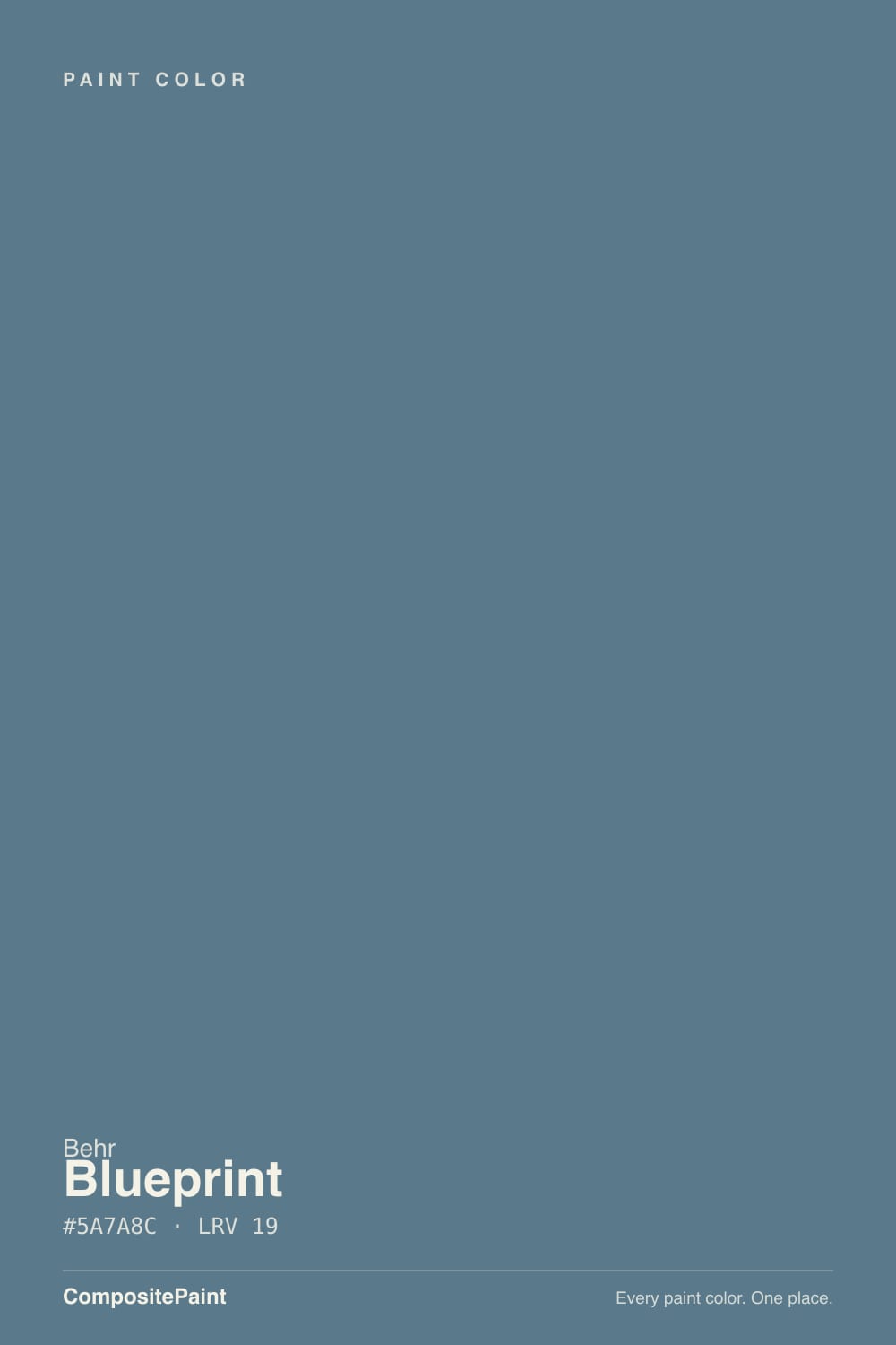
A cool, grayed-down steel blue that sits closer to the blue-purple side of the wheel than to blue-green — Behr's own positioning was warmer than a flat denim, softer than a true navy, and that description holds up in person. The gray in the mix is what keeps it from reading like a costume-department blue; it settles into a room instead of shouting from the wall. On August 23, 2018, Behr named it the 2019 Color of the Year, which makes it one of the few colors on this site with a verifiable, dated claim to fame rather than an inflated one.
At LRV 19 it is a genuinely deep color — noticeably lighter and more forgiving than a true navy like Hale Navy (LRV 6) or SW Naval (LRV 4), but still dark enough that it needs real light to show its blue rather than reading as a near-black shape in a dim room. That middle depth is the whole appeal: light enough to use on an entire home office or a full exterior door without it swallowing the room, dark enough to still register as a real color decision rather than a whisper of blue.
Undertone in one line: cool blue leaning purple, never green — reviewers who complain it looks greenish are almost always looking at Behr's own digital swatch, which several independent colorists have flagged as a poor screen rendering of the actual paint. On the wall, in person, it is unmistakably blue.
Where It Shines
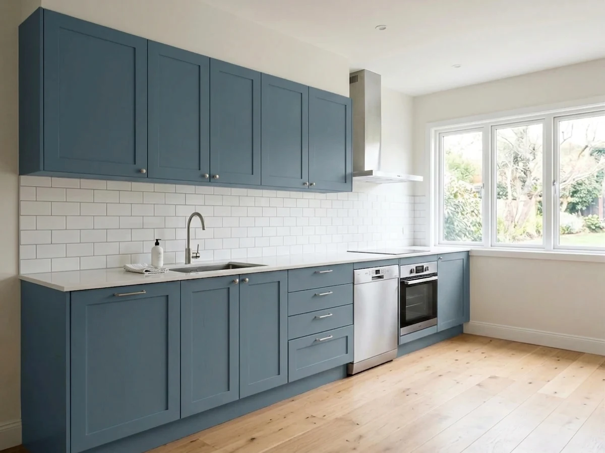
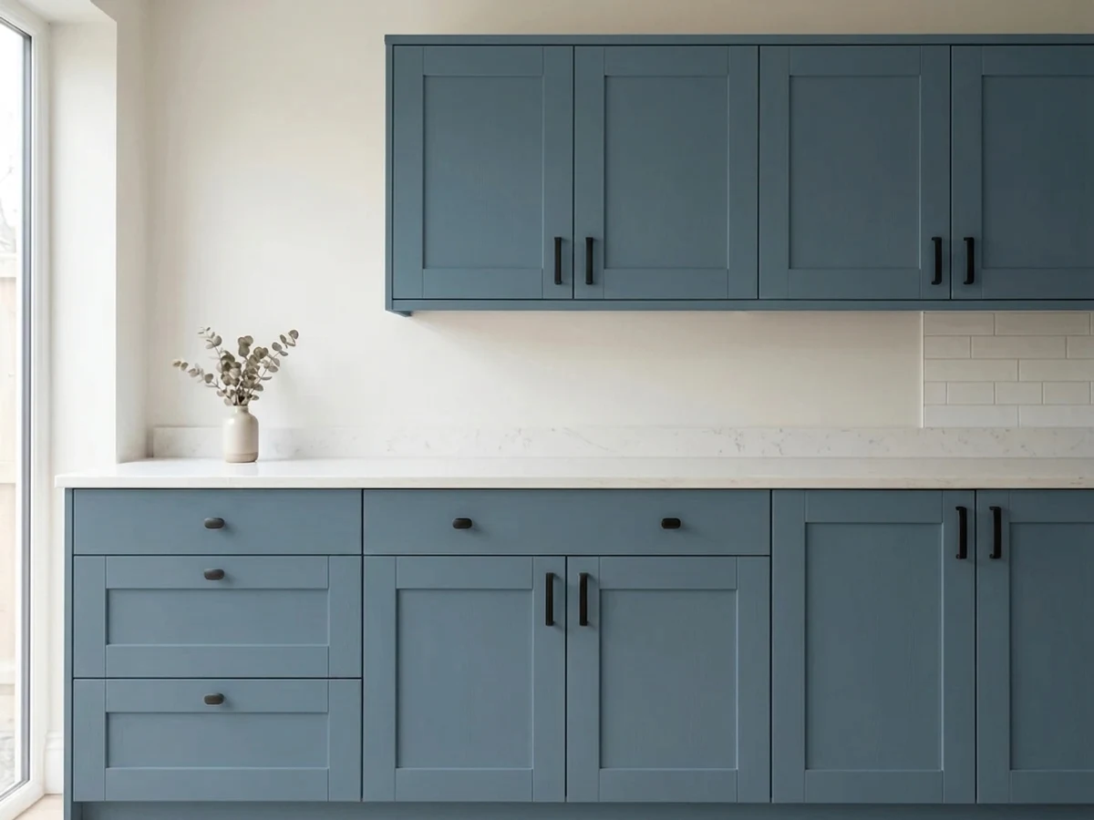
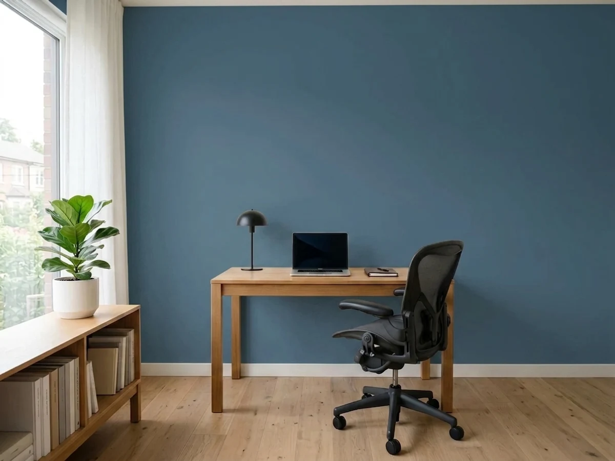
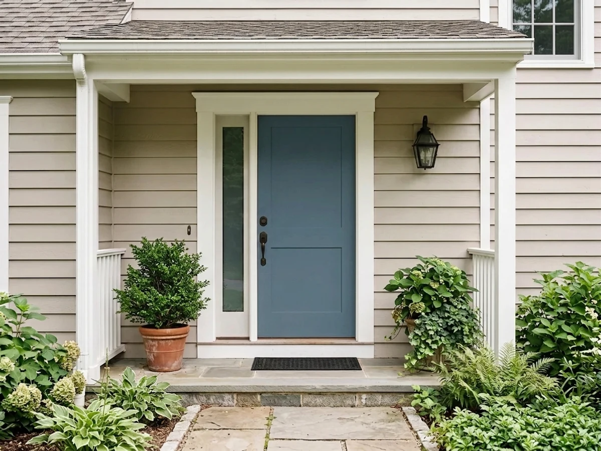
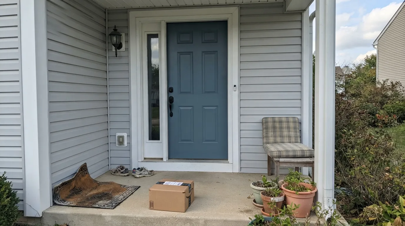
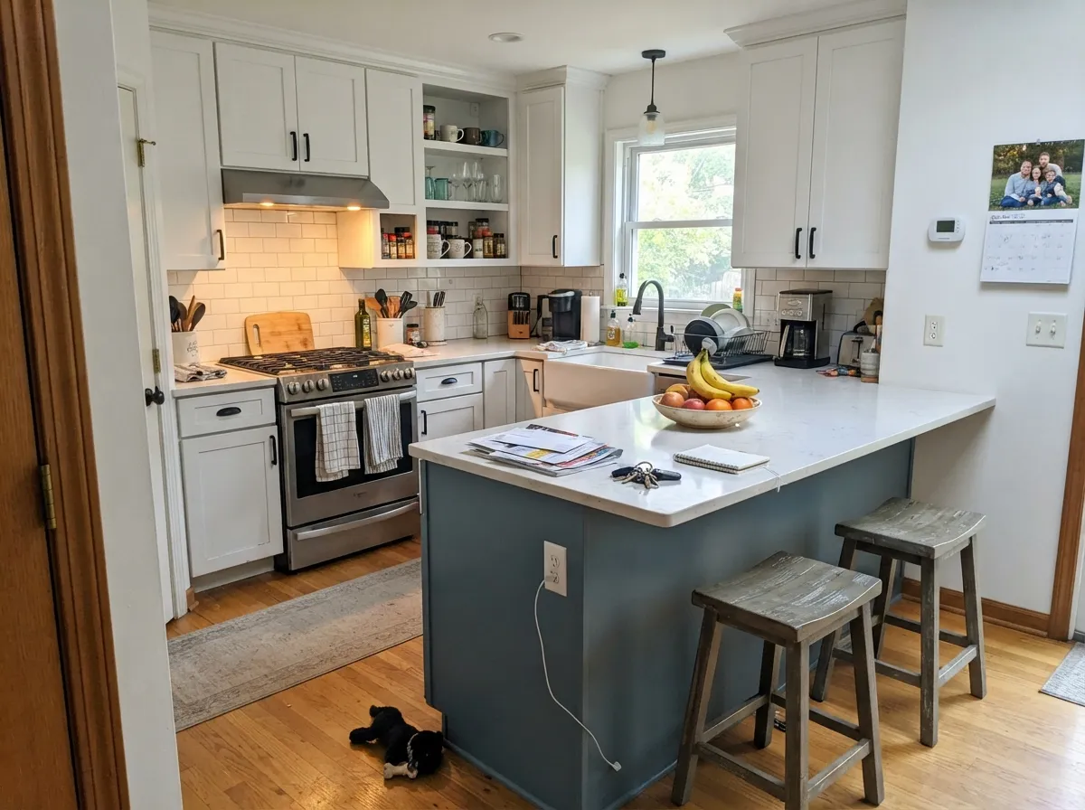
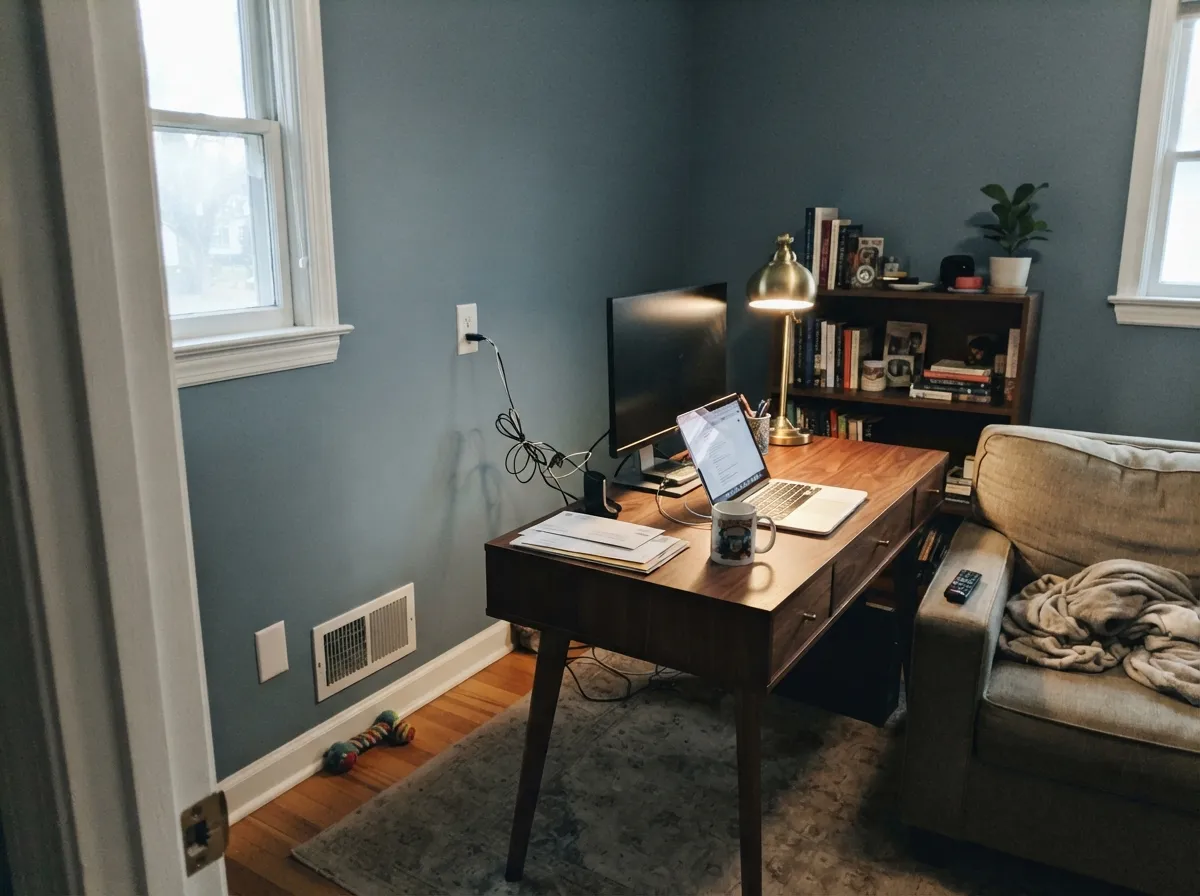
It shines wherever a room wants one confident, grown-up color decision. Front doors are its signature use — Behr built the entire Color of the Year campaign around exteriors and doors, and it still photographs as the classic modern-farmhouse blue door against white or light-gray siding. Indoors, it does the same job on a kitchen island or a home-office accent wall: enough depth to anchor the room, enough gray to keep it from looking like a paint-chip stunt next to warm wood and brass.
Where It Fails
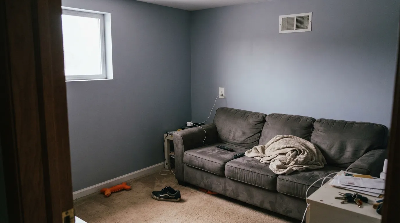
Almost every regret story about Blueprint traces back to one of three predictable situations, and none of them are really the paint's fault — but if your room matches one, this is not your blue, and a bigger sample won't fix it.
Cool north daylight has nothing to give the blue — it flattens toward a dull gray-lilac and loses the depth that makes Blueprint interesting. Readers in dim rooms report it looking closer to a drab gray than the confident blue on the chip. Add warm 2700K lamps or pick a lighter, warmer color instead.
Blueprint is grayer and lighter than a real navy at every turn — put it next to Hale Navy (LRV 6) or SW Naval (LRV 4) and the difference is obvious. If you're picturing a deep, formal navy library or a nautical front door, Blueprint will look washed out by comparison. Go with an actual navy instead.
Any saturated color on a sun-baked south or west exterior wall will fade and chalk faster than a pale neutral, and Blueprint is no exception. It holds up fine on a shaded or partly shaded door and trim; on a full, all-day-sun wall, use a fade-resistant exterior line and expect to recoat sooner than you would a light color.
Room by Room
The use Behr built the launch around, and it still earns it. Semi-gloss on the door reads crisp against white, light-gray or beige siding; black or oil-rubbed-bronze hardware sharpens the contrast. Shaded porches keep it truer to the chip than full sun does.
One blue island under white or greige perimeter cabinets is the single most common way people use this color indoors, and it works: satin cabinet enamel wipes clean, and it flatters brass, black and unlacquered-metal hardware equally well.
Enough depth to feel like a real design decision without going as dark as navy. Pairs well with walnut desks and built-ins; eggshell on the walls, warm task lighting to keep it from reading cool and clinical after sunset.
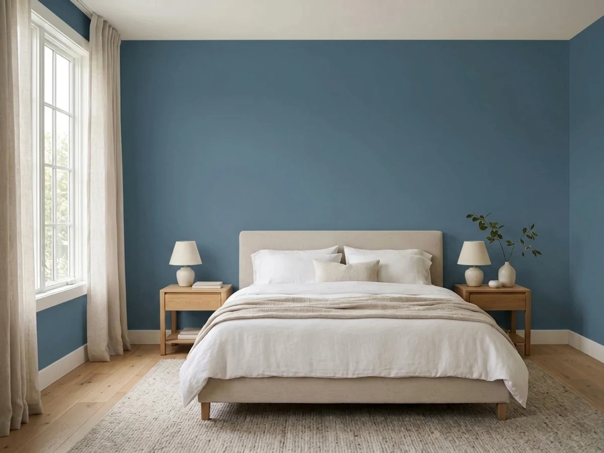
Calming and cool-toned, closer to a dusk blue than a bright color. It wants 2700K bulbs and a north-facing room should be sampled first — this is not a color to trust on a screen or a north wall without testing.
Small rooms carry deep color well, and Blueprint on a vanity or all four powder-room walls under a brass or matte-black mirror reads intentional rather than risky. Satin for the vanity, eggshell or matte for the walls.
Works as a single accent wall behind a sofa or fireplace, especially with warm wood floors and cream upholstery. In a room that leans north or gets little direct sun, expect it to read flatter and grayer than the sunlit rooms in photos.
Your Light Is the Risk
The blue-purple undertone comes forward and the color reads rich, confident denim-to-navy — its most photographed light.
Cool, flat daylight drains the depth and pushes it toward dull gray-lilac. Sample here first if this is your room.
Cooler and grayer in the morning, deeper and more blue as afternoon sun hits it. The shift is real but gentle.
2700K bulbs keep it feeling warm and grounded after dark. Cool white LEDs push it further toward flat gray — swap bulbs before repainting.
Most complaints about Blueprint are a light mismatch. Upload a photo of your actual room and see it on your walls — then ask for the same wall in north light or evening lamps before you buy a single sample.
Need It From Another Brand?
Any paint counter can custom-tint Behr S470-5 directly. If you would rather stay in one brand's own deck, these are the closest stock matches, measured as ΔE2000. Under 2 is a difference you will not see on the wall.
| Brand | Closest color | ΔE | LRV | |
|---|---|---|---|---|
| Sherwin-Williams | RefugeSW 6228 · Sherwin-Williams | 3.0 | 19 | Color page → |
| Benjamin Moore | Alfresco1672 · Benjamin Moore | 2.4 | 22 | Color page → |
| Valspar | Cornflower Blue4008-4B · Valspar | 3.6 | 20.4 | Color page → |
| PPG / Glidden | ArtifactPPG10-16 · PPG / Glidden | 2.8 | 21 | Color page → |
| Glidden | ArtifactPPG10-16 · Glidden | 2.8 | 20 | Color page → |
| Dutch Boy | High Seas Blue337-5DB · Dutch Boy | 3.3 | 21 | Color page → |
Similar Behr Colors
The nearest shades to Blueprint within Behr's own range, ranked by perceptual color distance — useful when you want the same look a touch lighter, darker, or warmer.
WCAG 2.1: AA is 4.5 : 1 for normal text, 3 : 1 for large text, AAA is 7 : 1.
Blueprint vs the Colors You're Also Considering
Every Blueprint sample board has the same rivals on it. The numbers show the real lightness gap — then it comes down to which risk you would rather live with.
Pick this if you want the same family of blue with far more margin for a dimmer room — LRV 19 forgives a lot that LRV 6 will not.
Benjamin Moore HC-154 · LRV 6Hale NavyPick this if you actually want a true, formal navy — it needs real light to avoid going flat, but it commits all the way to navy.
Pick this for more visible blue presence and the verified Color of the Year pedigree.
Sherwin-Williams SW 7604 · LRV 15Smoky BluePick this if you want a quieter, more reserved blue-gray that recedes into the background rather than announcing itself.
Behr's own deck has several near-twins. Cotton Denim (HDC-FL14-11) matches Blueprint's LRV of 19 almost exactly and shifts just a touch grayer and less saturated; on a wall the two are close enough that most people could not tell them apart, so choose whichever is easier to buy in your line.
Ocean Shadow (PMD-65) is a step darker at LRV 17 and drifts slightly toward teal. In a bright south-facing room the difference nearly disappears, but in dim light Ocean Shadow reads noticeably moodier. Pick it when you want a heavier, more enveloping version of the same idea; pick Blueprint when the room needs every bit of reflected light.
Catalina Coast (PPU13-03) also sits at LRV 17 with a similar soft teal lean. It favors coastal schemes with sandy neutrals like Coastal Beige (MQ3-22), while Blueprint stays truer to a classic denim blue that partners just as easily with grays as with beiges.
Blueprint Coordinating Colors
The rule for coordinating with Blueprint: warm whites for softness, crisp whites for contrast, and near-black for hardware and trim rather than as a wall color. It leans purple-blue, not green, so keep true green accents at a distance and let brass or black metal do the accenting instead. These are the partners that keep showing up in rooms and exteriors that work:
Behr's 2019 Color of the Year, Seven Years On
Behr announced Blueprint as its 2019 Color of the Year on August 23, 2018, and unlike some colors that get called famous after the fact, this one has the dated press release to prove it — it is a real, verifiable claim, not an inflated one. The pick leaned into a moment when muted, denim-adjacent blues were replacing the gray-everything decade that came before it, and Behr's own framing was a color that reads warmer than a flat denim and softer than a formal navy.
Seven years later, it is not the color anyone is chasing on social media — it never had a single viral room or celebrity-kitchen moment the way some Colors of the Year do. What it has instead is quiet durability: it is grayed down enough that it reads more like a wardrobe staple than a trend purchase, which is exactly why it still shows up steadily on front doors and kitchen islands without looking like a 2019 time capsule.
Blueprint With Wood Tones and Metals
Walnut, white oak and weathered gray wood all sit comfortably with Blueprint — its cool, grayed undertone doesn't fight any of them the way a warmer navy sometimes can. Honey oak is the one floor or trim tone to test first: it isn't a hard clash the way it is with violet or true-green colors, but the warm orange cast and the cool blue will each make the other look slightly more insistent than they do alone.
Metals are easy: unlacquered brass warms it up and keeps a room from feeling cold, matte black or oil-rubbed bronze sharpens the contrast for a more modern look, and polished chrome is the only common hardware finish that can read a little cold next to it. Either brass or black is the safer default if you're choosing hardware before you've seen the paint on the wall.
Three Ready Palettes Built on Blueprint
A color is never alone on the wall. These are complete combinations in the 60-30-10 pattern, with the reason each one holds together. Every one opens in the visualizer.
White Dove siding keeps the house soft and warm so the door can carry all the color; Wrought Iron shutters give it one near-black note that sharpens the whole facade without turning cold.
Try this palette in your roomAgreeable Gray keeps the walls warm and out of the way; Extra White perimeter cabinets stay crisp so the blue island is the one decision in the room, not a competition.
Try this palette in your roomSwiss Coffee trim keeps the room from feeling cold, and Kendall Charcoal built-ins give the walls something equally deep to talk to instead of standing alone. Add warm lamps at night — this palette is built for evening work.
Try this palette in your roomBlueprint FAQ
Is Behr Blueprint navy or a lighter steel blue?
Steel blue, not navy — it sits between the two on purpose. At LRV 19 it is noticeably lighter and grayer than a true navy like Hale Navy (LRV 6) or SW Naval (LRV 4). If you want deep navy, pick one of those instead; Blueprint is the more casual, more forgiving middle ground.
How dark is Blueprint really?
LRV 19 — genuinely deep, but not near-black. It will read as a clear, confident blue in decent light rather than disappearing into a shape, but it does need real daylight or warm lamps to avoid flattening out in a dim room.
Does it work well on a front door?
Yes — this is the use Behr's own 2019 Color of the Year campaign was built around, and it still holds up. Semi-gloss, paired with white, light-gray or beige siding and black or bronze hardware, is the classic result. A shaded or partly shaded porch keeps the color truer than full, all-day sun.
What white trim pairs best with Blueprint?
Warm whites like White Dove or Swiss Coffee soften the contrast for a traditional look; a crisper white like Extra White sharpens it for a more modern read. Either works — the choice is about how much contrast you want, not a right-or-wrong answer.
Is Blueprint outdated now that it's no longer the current Color of the Year?
No — it was chosen precisely because Behr considered it a durable, wearable blue rather than a flash trend, and the grayed-down undertone has aged more like a good pair of jeans than a fad. It isn't having a viral moment in 2026, but it also isn't dating itself the way a saturated trend color would.
Can I use it on kitchen cabinets or just an island?
Both work, but an island under white or greige perimeter cabinets is the far more common and lower-risk choice — it lets the blue anchor the room without committing the whole kitchen. Use a satin or semi-gloss cabinet-rated enamel either way.
Have you painted with Blueprint?
Rate it — one tap helps the next reader decide.
Ask a Question