Provence
A dusty slate blue-gray Behr has quietly sold for years without ever giving it a marketing moment, reviewed honestly: where it earns its keep, the one room it goes flat in, and what to pick instead.

Jessica has spec'd whites and neutrals for more than 300 rooms and keeps a sample wall of painted drawdowns in her studio. Every color review is checked against real reader rooms in the comments and re-tested when a formula changes. About the testing process →

- 1Hale Navy8
- 2Waterloo13
- 3Provence21
- 4Resolute Blue40
- 5Lost in the 80s51
The Fast Verdict
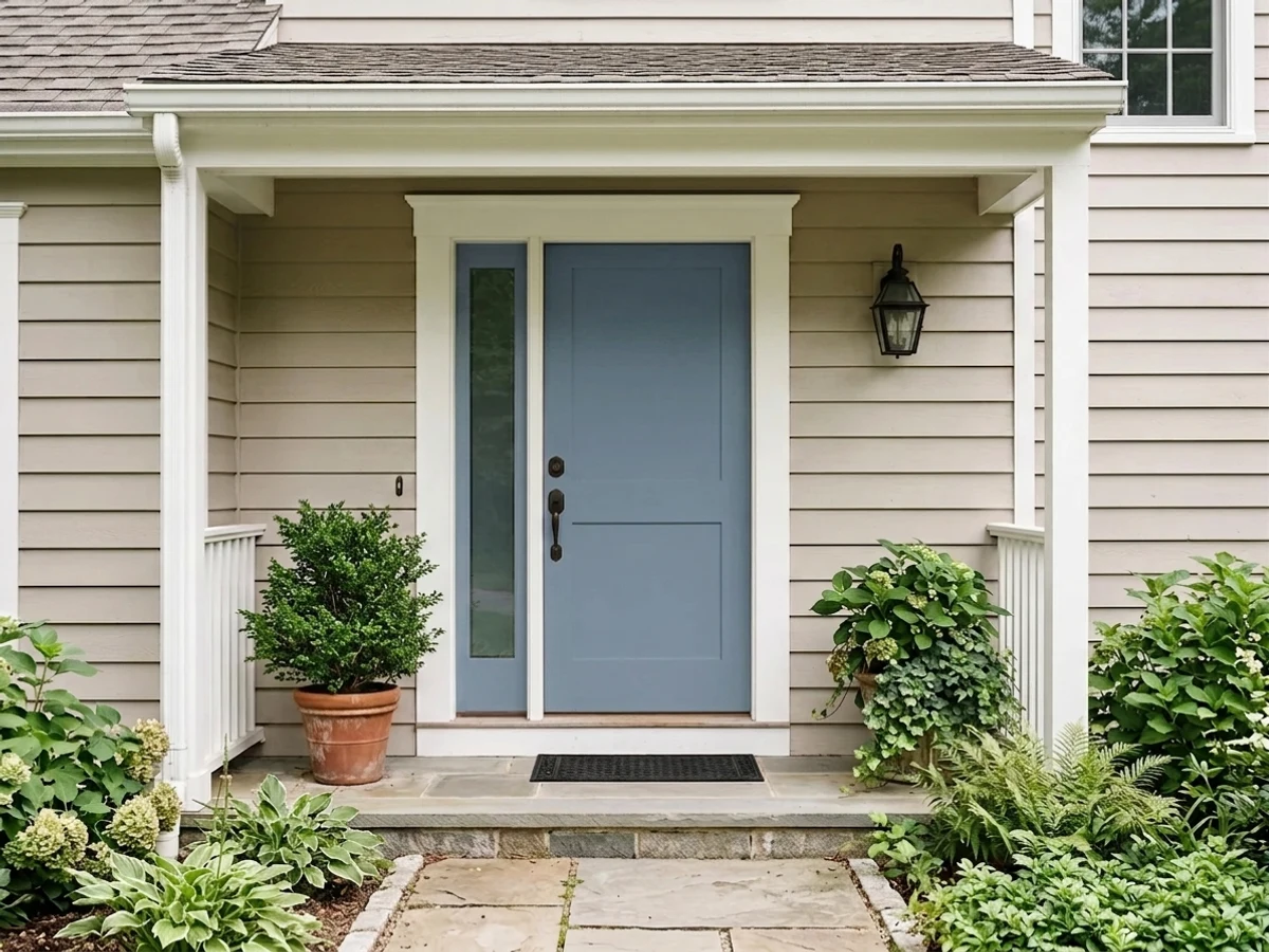
Provence is a dusty, cool-leaning slate blue that Behr has carried for years across half its product lines — Premium Plus, Premium Plus Ultra, Behr Ultra, Dynasty, Marquee — without ever putting it on a trend list or a Color of the Year shortlist. At LRV 21 it is a genuine mid-tone: deep enough to read as real color on a front door or a kitchen island, restrained enough to avoid the coastal-cartoon look that louder blues fall into. Nobody has heard of it. That turns out to be a fair description, not a warning.
Front doors and shutters · kitchen islands · bedrooms and studies with real daylight · anyone who wants a blue that reads calm, not coastal
You want a name people recognize at the paint counter · your room is small, dim, and north-facing · your trim and floors are honey oak · you want true-navy drama instead of a muted slate
- Genuine mid-tone blue — reads as real color, not a tint or a wash
- Sold in Behr's durable exterior lines (Dynasty, Marquee), so it holds up on doors and shutters
- Cool without tipping teal, cyan, or lavender in decent light
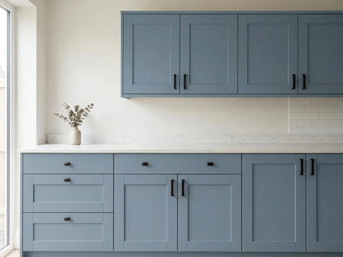
- Excellent on a single kitchen island against a warm white perimeter
- A genuinely quiet, no-hype option if you are tired of the same five trending blue-grays
- Almost no independent reviews or real-room photos online to check before buying
- Goes flat and heavy in a small, dim, north-facing room
- Fights raw honey oak trim and cabinetry
- Not a name most painters or paint-counter staff will recognize — always order by the ICC-74 code, not the name
What Color Is Provence, Really?
A dusty slate blue-gray built on a genuinely blue hue — cool, medium-saturation, sitting closer to steel blue than to teal or lavender. It is not a grayed-out neutral that happens to have a blue name: the blue is the dominant note, and the gray is what keeps it from reading like a nursery or a beach-house accent wall. The ICC prefix on its code is a tell — that numbering belongs to an older Behr naming system, not the newer named trend collections, which lines up with what turns up searching for it: almost no designer-blog coverage, no viral moment, just a color that has sat in the deck getting quietly reordered.
At LRV 21 it sits in genuine mid-tone territory — closer in depth to a color like Chelsea Gray (LRV 22) than to any pastel "spa blue." That depth is the whole personality: on a front door or an island it reads as a confident, grounded color rather than a wash of tint, and it holds that depth in shade the way lighter blues do not. The tradeoff is the same one every mid-depth color makes — a small room with little natural light will feel the weight of that LRV, not the charm of the hue.
Undertone in one line: blue first, warm gray second — never teal, never lavender. If your sample reads greenish, that is almost always reflected light bouncing off grass or trees outside the window, not the paint; if it reads flat and purple-ish gray, that is cool light draining the blue out of it, covered below.
Where It Shines
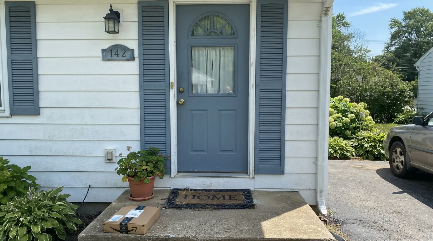
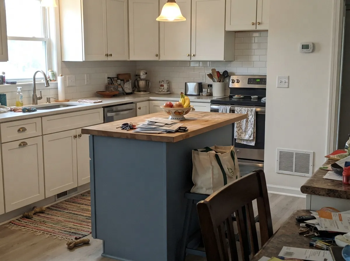
Give it a job with a defined edge — a door, an island, a run of shutters — and it does exactly what a good accent blue should: reads as deliberate color in daylight, settles into a quiet charcoal-blue after dark, and never fights for attention the way a brighter blue would. It is also genuinely weatherproof: Behr sells it in the Dynasty stain-blocking exterior line and in Marquee, which is where contractors put colors they trust to hold up, not colors picked for a moment.
Where It Fails
There is not a large public record of Provence failures to draw on — that is itself part of the story, and the third callout below explains why. But the failure modes a mid-depth cool blue-gray runs into are predictable even without a pile of Reddit threads, and all three are avoidable if you know them going in.
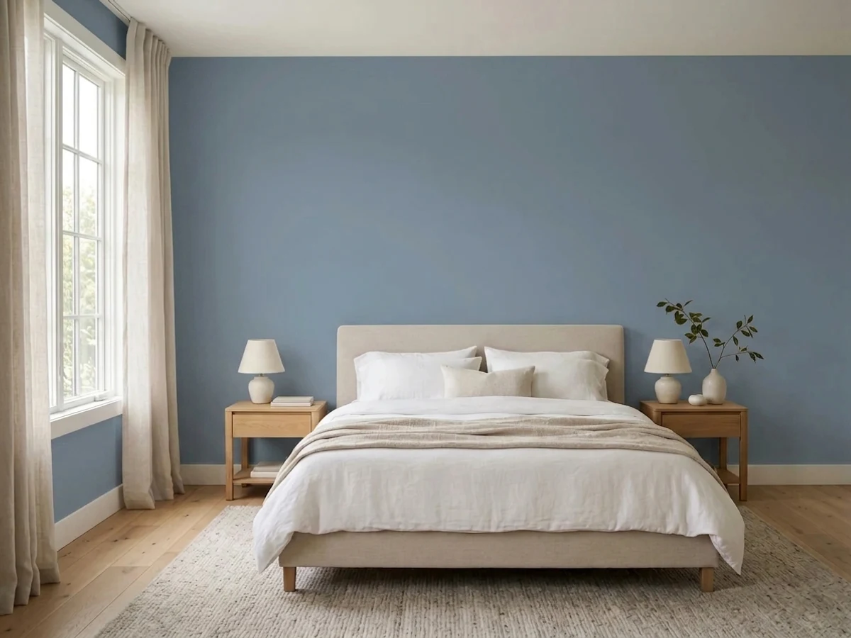
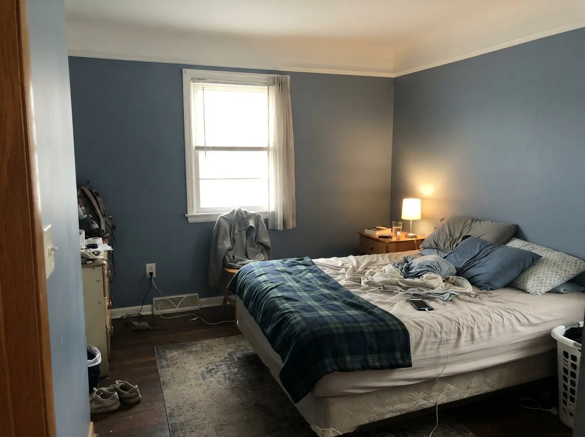
LRV 21 already absorbs more light than it bounces back; put that in a small room with weak northern daylight and no lamps, and the walls go flat, heavy, and a little cave-like rather than moody-in-a-good-way. This is a color that wants either real daylight or a room you are willing to light on purpose.
Blue and orange sit opposite each other on the wheel, and an unpainted honey-oak trim package next to a genuinely blue wall pushes both toward looking dated instead of intentional — the 1990s hunter-green-and-oak problem, just in blue. Walnut, espresso, black-stained, or painted trim all avoid it; raw honey oak does not.
This is the honest, unusual con: because Behr has never marketed Provence, there is very little crowd-sourced photo evidence to check before you commit — no wall of Houzz threads, no Instagram hashtag. Order a real sample and look at it in your own light before painting a whole room; you cannot lean on other people's rooms the way you can with a famous color.
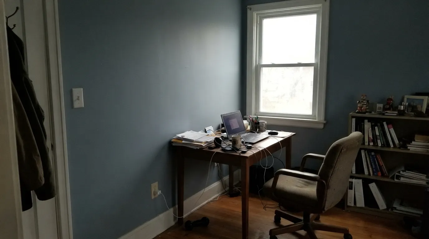
Room by Room
Satin enamel Provence against a light or white body is the color's strongest case: full sun reads it as a confident, grounded blue, and Behr's Dynasty and Marquee exterior lines are built to hold that color through weather. Pairs cleanly with black or charcoal roofline trim.
A single island in Provence against warm white perimeter cabinets is the classic move for a reason: it carries all the color in the room without asking the whole kitchen to commit. Satin cabinet enamel, brass or unlacquered hardware.
In a room with genuine south or east light it settles into a calm, grounded blue that reads restful rather than cold. In a dim north-facing bedroom, step up to something lighter — Van Courtland Blue below — or plan on warm lamps doing real work at night.
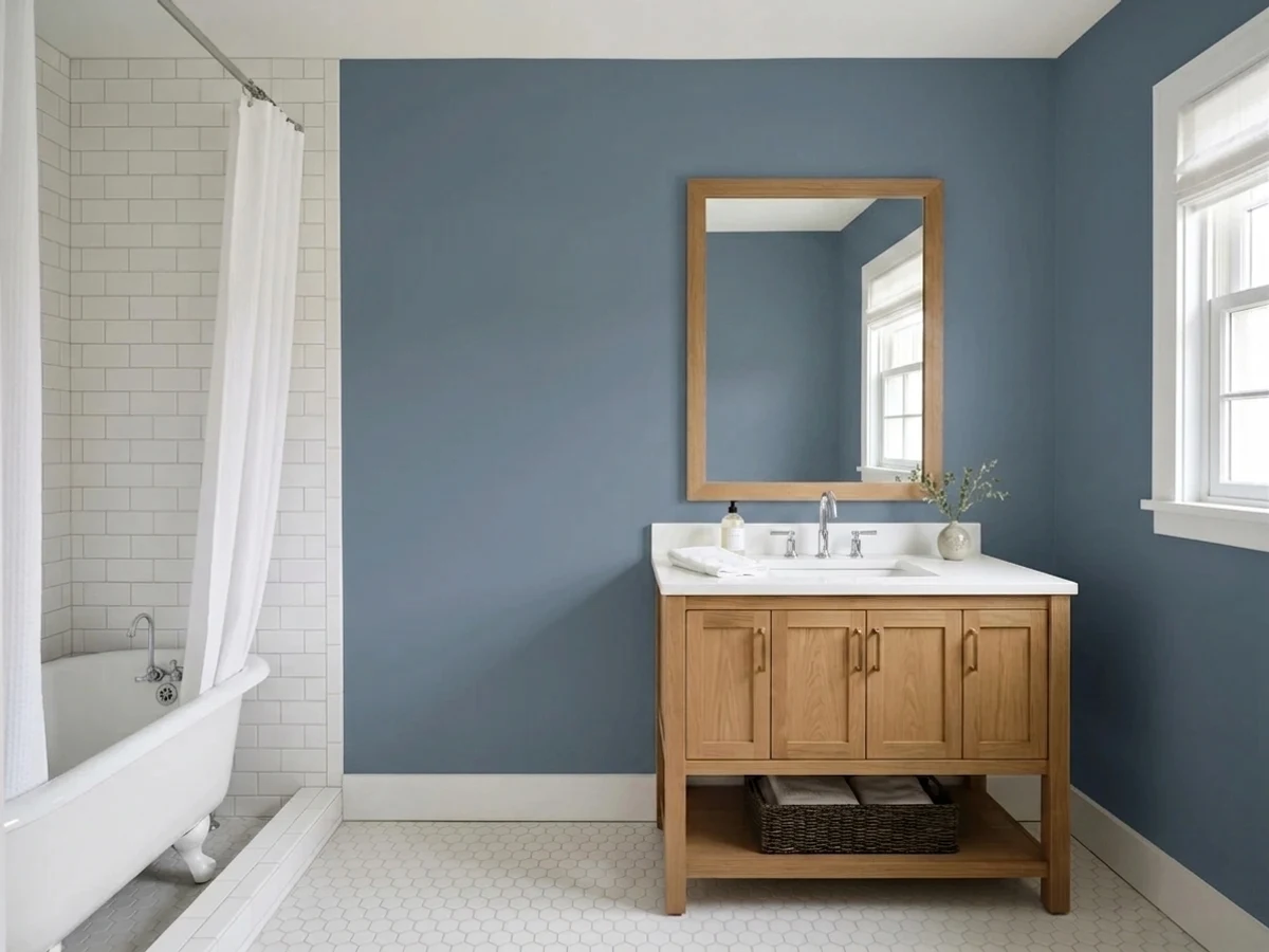
Works well against warm stone, wood-look vanities, and brass. Cool blue-gray tile competes with it rather than complementing it; pick one or the other, not both.
Beautiful in a well-lit, closed room with warm wood furniture. In an open-plan main floor it has to negotiate with every adjacent room's undertone, which is a bigger ask than most buyers expect from a color this quiet-looking.
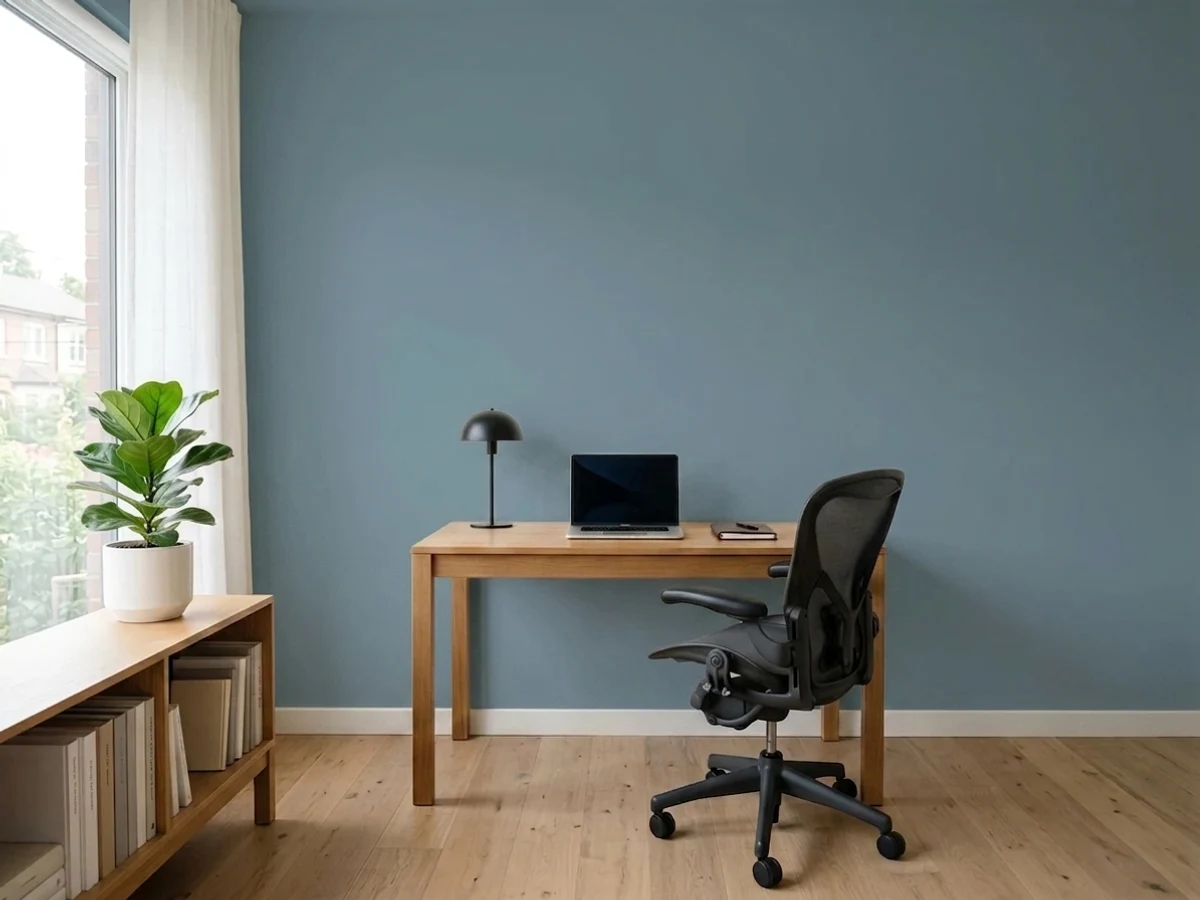
The mid-depth calm suits a focused room, but because so little photographic evidence exists online, this is a room worth sampling on the actual wall, at the actual time of day you will use it, before buying a gallon.
Your Light Is the Risk
South or east exposure with no direct glare reads it as a true, grounded slate blue all day — its most honest and most flattering light.
Weak, cool daylight with no lamps flattens the blue into a heavy, slightly muddy gray. Sample before committing a whole small room.
On a front door, the sun-hit side of the house reads brighter and more clearly blue; the shaded side reads closer to charcoal-gray. Normal, not a defect.
Warm bulbs mute the blue toward a soft charcoal-gray at night — cozy, but the color mostly disappears. Cool LEDs keep the blue honest but can feel a little cold after dark.
Most complaints about Provence are a light mismatch. Upload a photo of your actual room and see it on your walls — then ask for the same wall in north light or evening lamps before you buy a single sample.
Need It From Another Brand?
Any paint counter can custom-tint Behr ICC-74 directly. If you would rather stay in one brand's own deck, these are the closest stock matches, measured as ΔE2000. Under 2 is a difference you will not see on the wall.
| Brand | Closest color | ΔE | LRV | |
|---|---|---|---|---|
| Sherwin-Williams | Searching BlueSW 6536 · Sherwin-Williams | 3.7 | 21 | Color page → |
| Benjamin Moore | Alfresco1672 · Benjamin Moore | 4.1 | 22 | Color page → |
| Valspar | MermanT601 · Valspar | 1.4 | 20.6 | Color page → |
| PPG / Glidden | Silver BlueberryPPG1163-5 · PPG / Glidden | 1.8 | 21 | Color page → |
| Glidden | Benton Harbor90BG 22/141 · Glidden | 0.8 | 22 | Color page → |
| Dutch Boy | Lustrous Blue339-5DB · Dutch Boy | 3.7 | 21 | Color page → |
Similar Behr Colors
The nearest shades to Provence within Behr's own range, ranked by perceptual color distance — useful when you want the same look a touch lighter, darker, or warmer.
WCAG 2.1: AA is 4.5 : 1 for normal text, 3 : 1 for large text, AAA is 7 : 1.
Provence vs the Colors You're Also Considering
Every Provence sample board has the same rivals on it. The numbers show the real lightness gap — then it comes down to which risk you would rather live with.
Pick this for the lighter, slightly more approachable version of the same cool slate mood.
Sherwin-Williams SW 7604 · LRV 15Smoky BluePick this if you want a touch more depth in the same restrained family — still dependable, never loud.
Pick this when you want the blue to be unmistakable, not a maybe.
Benjamin Moore HC-145 · LRV 31Van Courtland BluePick this for a dim or north-facing room — it reads gray until the light says otherwise, which is safer at LRV 31.
Provence Coordinating Colors
The rule for coordinating with Provence: warm whites for trim, near-blacks for outdoor contrast, and its own family for depth. Keep raw honey wood tones out of the room and it behaves. These are the partners that make the most sense with it:
An Honest Legacy Color Nobody's Marketing
The ICC-74 code is the tell. That prefix belongs to an older Behr naming system, distinct from the newer named collections Behr builds seasonal marketing around. Provence has simply been sitting in the deck through all of it — never a Color of the Year, never a trend-collection headliner, never the subject of a design-blog roundup. Search for it and you mostly find Home Depot product listings, not owner stories.
What that search also turns up is more telling: Behr still sells Provence today in Premium Plus, Premium Plus Ultra, Behr Ultra, Dynasty, and Marquee — its everyday interior lines and its two toughest exterior formulas. A color a brand quietly keeps in five product lines without promoting it is a color that keeps getting reordered, which is a better signal than a marketing push. It is the paint-store equivalent of a restaurant's off-menu dish: good enough to stay in rotation, never the thing on the sign out front.
Provence With Wood Tones and Floors
Walnut, espresso, and black-stained wood are the safe, flattering partners — the dark warmth grounds the blue and keeps the pairing from feeling cold. Pale, gray-washed or white oak floors are a safe neutral background that lets the blue do the talking without competing.
Raw honey oak is the one real no. Its yellow-orange sits directly across the color wheel from Provence's blue, and put next to each other, each color pushes the other toward looking dated rather than deliberate — an unpainted honey banister next to a Provence front door reads like a decision made in two different decades. If the honey wood is staying, either paint or stain it darker first, or choose a lighter, grayer comparison color from above instead.
Three Ready Palettes Built on Provence
A color is never alone on the wall. These are complete combinations in the 60-30-10 pattern, with the reason each one holds together. Every one opens in the visualizer.
All three colors share one Behr fan deck, so a painter can match everything off a single card. Ultra Pure White keeps the body crisp, Cracked Pepper's near-black roofline grounds the palette, and Provence carries the one confident color note — bright and clearly blue in full sun, quieter in shade.
Try this palette in your roomWhite Dove's warm white keeps the room from feeling cold under Provence's blue; Van Deusen Blue takes the same hue a full step darker on one wall for tonal depth instead of a mismatched contrast color. Warm lamps do real work here after dark — see the Lights section.
Try this palette in your roomTwo warm Behr whites frame the room so the island can carry all the color without a fight; brass or unlacquered hardware keeps the pairing from feeling cold. One brand, one fan deck, one trip to the paint counter.
Try this palette in your roomProvence FAQ
Is Provence blue or gray?
Blue first — the hue is genuinely blue-dominant, not a neutral wearing a blue name. In low or cool light the gray in it becomes more obvious and it can read closer to a slate-gray, but in any real daylight it reads as blue, not gray.
Is Provence a dark color? What does LRV 21 mean here?
It is a genuine mid-tone, not a pastel — similar in depth to a color like Chelsea Gray (LRV 22). That is deep enough to read as real color on a door or island and hold its own in shade, but it is not a near-black; expect it to lighten noticeably in bright, direct sun.
Does Provence work on a front door?
It is arguably its best use. Behr sells it in Dynasty and Marquee, its stain-blocking, contractor-grade exterior lines — that is where colors go once they have proven they hold up, not where trend colors get parked for a season.
What white goes best with Provence?
A warm white, not a stark cool one. Behr's own Ultra Pure White or Swiss Coffee, or Benjamin Moore White Dove, all keep the blue from feeling cold. A blue-white or gray-white next to it tends to make both colors look flatter.
Does Provence work with honey oak floors or trim?
Not comfortably. Blue and orange sit opposite each other on the color wheel, and raw honey oak next to a genuinely blue wall reads dated rather than deliberate. Walnut, espresso, black-stained or painted trim all avoid the clash.
Why is there so little information about this color online?
Behr has simply never marketed it — no Color of the Year push, no named trend collection, just a color it keeps in stock across several product lines. It is genuinely available and durable; it is just never been the color anyone wrote a blog post about. Order a physical sample before painting a whole room, since you cannot lean on a pile of other people's photos the way you can with a famous color.
Have you painted with Provence?
Rate it — one tap helps the next reader decide.
Ask a Question