Solemn Silence
The quiet cool gray with a whisper of blue, reviewed honestly: the light that turns it pale blue, the rooms that love it, and what to pick instead.

Jessica has spec'd whites and neutrals for more than 300 rooms and keeps a sample wall of painted drawdowns in her studio. Every color review is checked against real reader rooms in the comments and re-tested when a formula changes. About the testing process →
- 1Stardew43
- 2Sea Salt63
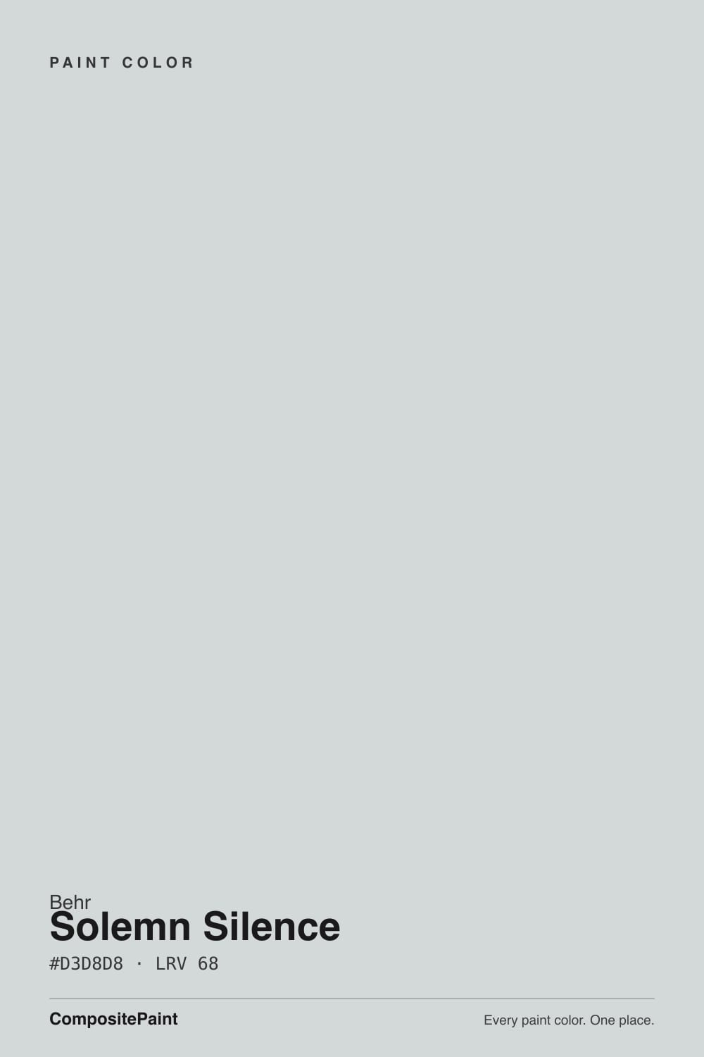
- 3Solemn Silence68
- 4Spring Thaw83
The Fast Verdict
Solemn Silence is not a Color of the Year and nobody paints an accent wall in it to make a statement — it is a plain, cool, very light gray, and it does exactly what that description promises. At LRV 68 it reflects most of the light in the room without ever warming up: no cream, no beige, not a hint of yellow. In strong daylight the whisper of blue-green baked into the mix comes forward, which is either exactly what you wanted or the one thing you didn't ask for.
Bedrooms and bathrooms that want calm, not cream · quiet home offices · cabinets and built-ins that need a true gray, not a greige · anyone who wants zero warmth on the wall
You actually want a warm, cozy neutral · your room already runs cool and dim with little daylight · your hardware, floors and trim are warm brass and honey oak · you want a color with a trend story to tell
- A genuinely cool, low-drama gray — no fighting a hidden beige base
- LRV 68 keeps rooms bright without going stark white
- Flatters nickel, chrome and matte black hardware and fixtures
- Works across bedroom, bath, office and exterior without changing character
- Quiet and low-saturation enough to never feel like a trend piece
- Reads distinctly pale blue in strong daylight if you wanted a true neutral gray
- Goes flat and faintly icy in a dim, north-facing room with no lamps
- Clashes with honey oak floors and brass hardware
- No design-world story or fame — a workhorse color, not a headline
What Color Is Solemn Silence, Really?
A pale, low-saturation gray with the barest trace of blue-green in it — not a green like a sage, not a blue like a slate, just a whisper that keeps the gray from ever reading pure neutral. It comes from Behr's Premium Plus / Marquee catalog, one of hundreds of PPU-code grays, and it has never had a design moment: no magazine spread, no viral bathroom. That is not a knock. It is a workhorse color that does one job — quiet, cool, unbothered gray — and does it consistently.
At LRV 68 it sits in the same bright-but-not-white bracket as a lot of popular light grays, but it reads noticeably cooler than most of them because there is genuinely no warm pigment fighting the blue. RGB 211/216/216 tells the whole story: green and blue sit a few points above red, which is a small gap on paper and a real, visible cast on four walls, especially in bright rooms. Put it next to a warm off-white and the difference is obvious in seconds.
Undertone in one line: cool gray with a whisper of blue-green, never warm. Home Depot's own product Q&A has buyers who wanted "a real silvery gray with no blue" reporting the wall reads distinctly light blue in a lot of light — that is not a bad batch, that is the paint being honest about what's actually in the can.
Where It Shines
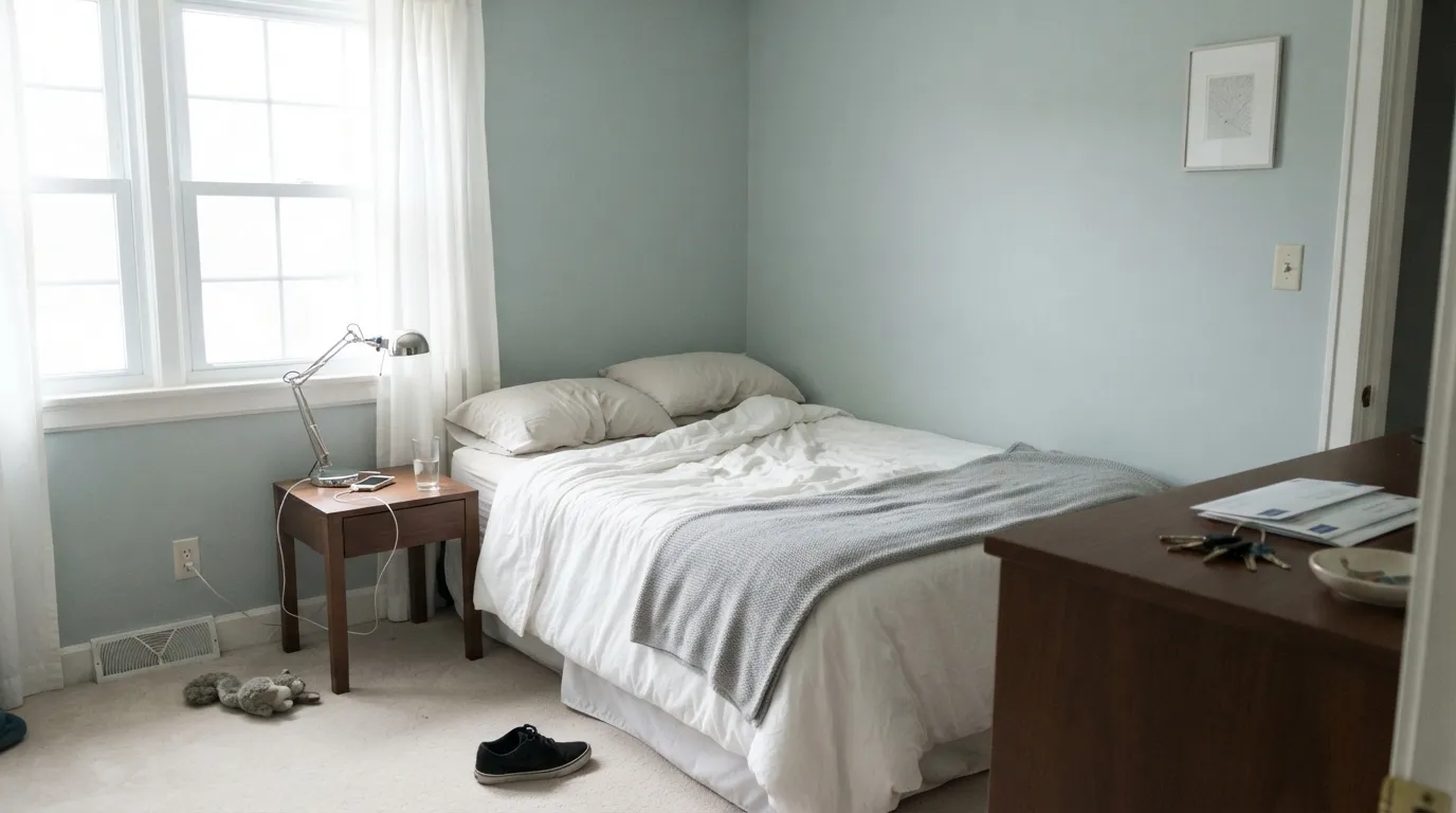
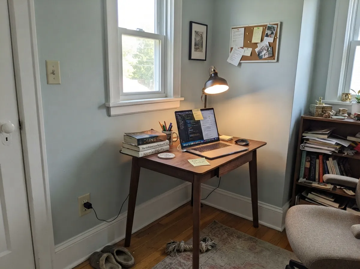
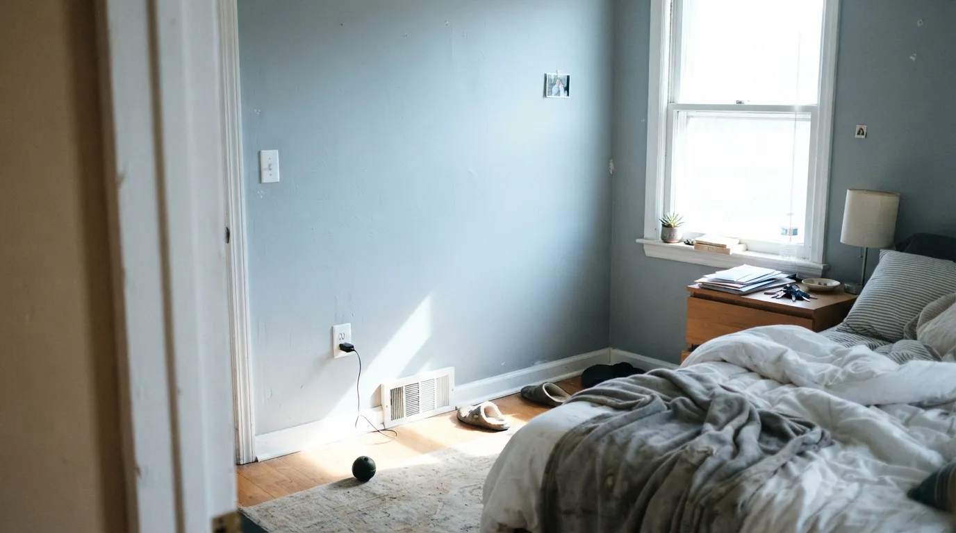
It earns its keep in rooms that want to feel calm and a little cool: bedrooms, bathrooms, a home office that should feel like a library rather than a nursery. Give it bright, even daylight and it settles into a genuinely restful pale gray. On cabinetry and built-ins it reads clean and modern next to nickel, chrome or matte black hardware — metals that share its cool temperature instead of fighting it.
Where It Fails
Almost every disappointed review of Solemn Silence traces back to one of three mismatches, and all three are predictable before the first coat goes up. None of them are the paint failing — they are a cool, low-drama gray being asked to do a warm color's job.
This is the single most common regret: buyers picture a soft, greige-adjacent gray and get a color with real blue in it once the sun hits the wall. If "gray with zero blue" is the actual goal, this is the wrong can — look at a genuinely neutral gray like SW Crushed Ice instead, or a warm greige if you want any color memory at all.
Because there is no warmth to fall back on, a cool overcast day can push Solemn Silence toward flat and faintly icy rather than soft. A warm-neutral or greige forgives a dim room; this color does not — it just goes quieter and colder.
Yellow-orange wood and warm brass sit at the opposite temperature, and the contrast makes both sides look slightly wrong: the floor reads more orange, the wall reads more sterile. Pale or white oak, walnut, or gray-washed floors work; brushed nickel, chrome or matte black hardware works. Save the brass for a warmer wall color.
Room by Room
A genuinely calm, cool backdrop that never tips cozy-cream. Matte finish hides texture; warm 2700K lamps at night keep it from feeling clinical. Skip it if the room already runs cold and dim with no window.
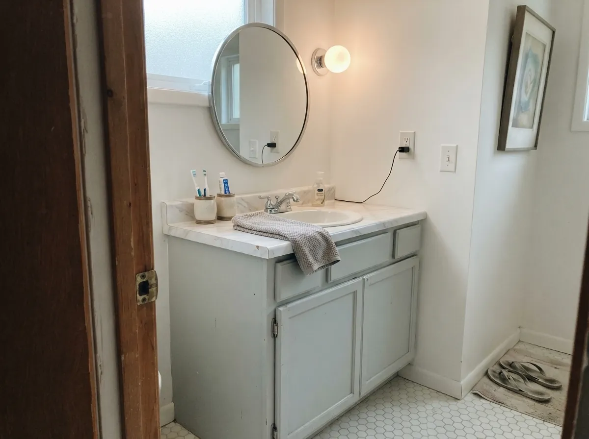
Reads spa-quiet next to white tile, chrome fixtures and a marble-look counter. Satin or eggshell for the humidity, and pair with cool-toned stone rather than warm beige tile.
A serious, library-quiet backdrop rather than a cozy one. Works well behind dark built-ins or a walnut desk, where the wall recedes and the furniture does the talking.
On cabinets it reads clean and modern against white or light gray quartz and nickel hardware. Warm butcher block and brass fight it; if your kitchen leans warm, this is not the cabinet color.
Calm and easy on its own, but in an open floor plan it has to negotiate with every adjacent wood tone and wall color. Fine next to other cool neutrals; awkward next to a warm kitchen greige.
A believable cottage or coastal gray on siding, especially with white trim and black window frames. Walk the house first — the sunny side will show more blue than the shaded side, and that gap is bigger outdoors than in.
Your Light Is the Risk
A bright but not sun-blasted room is the sweet spot: calm, quiet, genuinely cool gray with the blue kept to a whisper.
Strong direct light pulls the blue-green forward and the wall can read distinctly pale blue rather than gray — the exact complaint buyers report.
With no warmth to borrow, it goes flatter and a touch colder through a gray day. Still calm, just quieter than the chip promises.
Warm 2700K bulbs tame the blue into a soft neutral gray at night. Cool white LEDs do the opposite and push it back toward blue-green.
Most complaints about Solemn Silence are a light mismatch. Upload a photo of your actual room and see it on your walls — then ask for the same wall in north light or evening lamps before you buy a single sample.
Need It From Another Brand?
Any paint counter can custom-tint Behr PPU26-12 directly. If you would rather stay in one brand's own deck, these are the closest stock matches, measured as ΔE2000. Under 2 is a difference you will not see on the wall.
| Brand | Closest color | ΔE | LRV | |
|---|---|---|---|---|
| Sherwin-Williams | Olympus WhiteSW 6253 · Sherwin-Williams | 0.6 | 68 | Color page → |
| Benjamin Moore | Blue Lace1625 · Benjamin Moore | 1.3 | 66 | Color page → |
| Valspar | Aerodynamic8006-10A · Valspar | 1.0 | 68 | Color page → |
| PPG / Glidden | PeregrinePPG0993-1 · PPG / Glidden | 1.2 | 68 | Color page → |
| Glidden | PeregrinePPG0993-1 · Glidden | 1.2 | 68 | Color page → |
| Dutch Boy | Frosted Silver435-1DB · Dutch Boy | 1.7 | 69 | Color page → |
Similar Behr Colors
The nearest shades to Solemn Silence within Behr's own range, ranked by perceptual color distance — useful when you want the same look a touch lighter, darker, or warmer.
WCAG 2.1: AA is 4.5 : 1 for normal text, 3 : 1 for large text, AAA is 7 : 1.
Solemn Silence vs the Colors You're Also Considering
Every Solemn Silence sample board has the same rivals on it. The numbers show the real lightness gap — then it comes down to which risk you would rather live with.
Pick this for Behr's price and Home Depot availability — side by side, the two read almost identically on the wall.
Sherwin-Williams SW 7646 · LRV 69First StarPick this if your painter works in Sherwin-Williams — nearly the same quiet, cool gray at nearly the same depth.
Pick this for a color with zero warmth to manage — Silver Drop can shift toward pink or tan depending on the room; Solemn Silence never will.
Behr PPU18-19 · LRV 60Silver DropPick this if the cool blue reads too sterile for you — same brand, same weight, a warmer greige instead of a gray.
Pick this when you want a color you can actually see, not almost-white — Paper White at that LRV can read like bare primer in a dim room.
Benjamin Moore 1590 · LRV 74Paper WhitePick this for a brighter, airier version of the same cool-neutral idea — LRV 74 instead of 68.
Pick this for the specific cool, faintly blue-green quiet that a warm greige simply cannot give you.
Sherwin-Williams SW 9166 · LRV 69Drift of MistPick this if you want a whole-house neutral that leans warm instead of cool — nearly the same LRV, the opposite temperature.
Within the Behr line, Gray Shimmer MQ3-25 at LRV 67 is the most neutral neighbor, hex #D4D6D7, so it drops most of the green and reads as a plain cool gray. Urban Mist PPU12-13 at LRV 70 is slightly lighter and airier, while Sterling 780E-3 at LRV 66 is a hair darker and quieter. Silver Screen 770E-2 at #CFDBDB and LRV 69 is the bluest of the set.
Across brands the matches are unusually tight. Sherwin-Williams Olympus White SW 6253, hex #D4D8D7 at LRV 68, differs by only 0.62, close enough to call a true match. Valspar Aerodynamic 8006-10A at LRV 68 measures 0.97, also effectively the same color. PPG Peregrine PPG0993-1 at 1.23 and Benjamin Moore Blue Lace 1625 at LRV 66 and 1.31 are both visually identical in normal room light, though Blue Lace is very slightly deeper. Farrow and Ball Borrowed Light No. 235 at LRV 69 comes in at 1.73, still visually identical on a wall.
Solemn Silence Coordinating Colors
The rule for coordinating with Solemn Silence is simple: stay cool, stay quiet, and keep brass and honey wood out of the room. It pairs cleanly with crisp whites, near-blacks, deeper blue-grays and other unapologetically cool neutrals — and it argues with anything warm enough to notice. These are the partners that keep it looking deliberate rather than accidental:
Why This Color Has No Story — And Why That's Fine
Solemn Silence has never been a Color of the Year, never had a magazine moment, never gone viral on a renovation account. It is one of hundreds of PPU-numbered entries in Behr's Premium Plus and Marquee lineup — a working color, sold at Home Depot, chosen by people repainting a bedroom or a bathroom rather than chasing a trend. Behr's own coordinated-palette tool pairs it with genuine blues like Adirondack Blue and Chilly Blue, which tells you the brand itself treats it as a cool color, not the grayed-green some early listings suggest.
That lack of a story is the honest review here: this is not a color you'll see a design blog defend or a homeowner regret publicly on a podcast. It is a dependable, unglamorous gray that does its one job — cool, quiet, bright without warmth — and does it the same way in a thousand ordinary rooms. If you came here looking for a trend pedigree, there isn't one. If you came here looking for a true cool gray that won't surprise you with hidden beige, this is a solid, low-risk pick.
Solemn Silence With Wood Tones and Metals
Wood is where this color makes its case or loses it. Pale white oak, gray-washed floors and cool walnut all sit comfortably next to Solemn Silence because neither side is fighting for warmth. Cerused or bleached wood finishes look almost designed for it.
Honey oak and orange-toned trim are the one real no: yellow-orange sits opposite blue-green on the wheel, so the floor reads more orange and the wall reads more sterile, and no amount of extra coats changes that relationship. If the honey floor is staying, either add a warm rug as a buffer or choose a warmer Behr neutral like Silver Drop instead.
Metals follow the same logic. Brushed nickel, chrome and matte black all read clean and intentional against this color. Unlacquered or antiqued brass can work in small doses — a single fixture, not the whole room — but polished bright brass is the metal most likely to look like a mismatch rather than a choice.
Three Ready Palettes Built on Solemn Silence
A color is never alone on the wall. These are complete combinations in the 60-30-10 pattern, with the reason each one holds together. Every one opens in the visualizer.
A same-brand trio, which keeps the paint aisle simple, and Cracked Pepper's near-black gives the pale cool wall the one anchor it needs — without ever tempting the room warm.
Try this palette in your roomVan Deusen Blue takes the whisper of blue already hiding in Solemn Silence and commits to it on the vanity, turning an accidental undertone into a deliberate coastal-spa story. White trim keeps the small room from feeling closed in.
Try this palette in your roomDark built-ins carry the visual weight so the pale, cool wall stays background instead of the main event — a serious, quiet combination that suits a room meant for focus, not comfort.
Try this palette in your roomSolemn Silence FAQ
Is Solemn Silence gray or blue?
Gray on the label, but honestly blue in strong light. It is a genuine low-saturation cool gray, but the small amount of blue-green baked into the mix comes forward in bright daylight, and several buyers report it reading distinctly pale blue on the wall. If you want zero blue, this is not your color.
What's the undertone?
Cool, with a whisper of blue-green and nothing warm anywhere in it. There is no yellow, no pink, no beige lurking underneath — which is exactly why it can look icy in a dim, cool room with no lamps.
Is it too cold for a bedroom?
Not with warm lamps at night — 2700K bulbs settle it into a soft, calm gray after dark. It is too cold if the room already runs dim and north-facing with no lamps at all; that combination is where the complaints come from.
Does it work with brass hardware?
In small doses, yes; as the dominant metal, it fights the color's cool temperature. Nickel, chrome and matte black are the natural partners. If you're committed to brass, warm the wall color up instead.
Can I use it on an exterior?
Yes — it reads as a believable cottage or coastal gray, especially with white trim and black window frames. Walk around the house before committing: the sunny side will show noticeably more blue than the shaded side.
How is it different from a Behr greige like Silver Drop?
Silver Drop carries warmth and can shift toward pink or tan depending on the room. Solemn Silence carries none — it is a true cool gray. Pick Silver Drop if you want a color that softens with your room; pick Solemn Silence if you want one that stays put.
Have you painted with Solemn Silence?
Rate it — one tap helps the next reader decide.
Ask a Question