Silence
Behr's palest whisper of green, reviewed honestly: the light where it disappears into plain white, the light where it turns institutional, and what to pick instead.

Jessica has spec'd whites and neutrals for more than 300 rooms and keeps a sample wall of painted drawdowns in her studio. Every color review is checked against real reader rooms in the comments and re-tested when a formula changes. About the testing process →
- 1First Star69
- 2Classic Gray74
- 3Silence84
- 4Chantilly Lace91
- 5Ultra Pure White97
The Fast Verdict
Silence is what happens when a green gets diluted almost out of existence: at LRV 90 it reads as a soft, quiet off-white in ordinary light, and only a whisper of yellow-green undertone gives it away. It has none of the fame of Behr's bigger names — no Color of the Year moment, no design-blog cult — just a dependable, barely-there calm that suits spa bathrooms and quiet bedrooms, and turns sterile the moment cool light gets involved.
Spa-quiet bathrooms and powder rooms · calm bedrooms and nurseries · kitchen cabinets with brass hardware · anyone who wants a whisper of green without committing to green
Your room runs on cool LEDs or fluorescent light · you want an unmistakably green wall · your floors are golden honey oak · you need a color guests will recognize by name
- Extremely light (LRV 90) — brightens like a true white with one whisper of personality
- Reads as a genuinely undertone-quiet neutral in normal daylight — plays well with almost anything
- Never tips yellow or pink, the two most common off-white complaints
- Flatters brass and pale wood on cabinets and trim without going stark
- An affordable, low-drama base for spa and coastal-minimalist rooms
- Turns sterile and "institutional" under cool LEDs or fluorescent light
- Reads dingy next to a genuinely brighter white trim
- Golden honey oak and heavy brass push it toward a dull olive cast
- So subtle that many buyers can't tell why they didn't just buy a plain white
What Color Is Silence, Really?
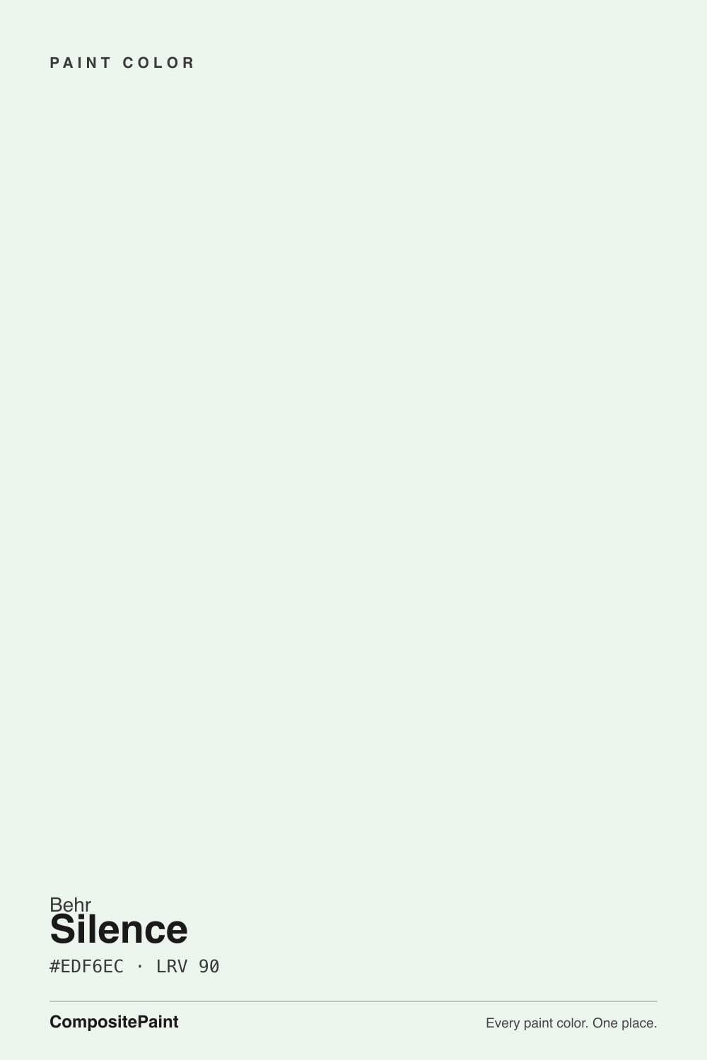
A near-white with a genuinely faint yellow-green undertone — color-matching tools place its hue around 82 degrees, deep in yellow-green territory, but so diluted that in most daylight it simply reads as a soft, quiet white. Behr files it under a plain N4-series number, not a named collection or a trend launch, and there is no Color of the Year moment or design-blog cult attached to it. That is the honest story: Silence is a quiet workhorse color, picked more often off a fan deck or a color-matching app than requested by name.
At LRV 90 it is one of the lightest colors in this review library — genuinely close to a true white. Put it beside an even brighter white like Chantilly Lace (LRV 92) and it holds its own, barely a shade behind; put it beside a warmer or grayer neighbor and Silence's green whisper suddenly reads. That gap is the whole personality of this color: alone, it looks like 'a nice plain white'; in contrast, it looks like it has a temperature. On trim or cabinets it tends to disappear into whatever sits next to it more than it asserts itself — closer to a blank canvas than a statement.
Undertone in one line: pale yellow-green, and only that — never blue, never pink. If your sample reads sterile or faintly clinical, that is cool artificial light doing it, not a flaw in the paint; if it reads like plain white with no color at all, that is strong daylight washing the whisper out. Both are the same pigment being quiet.
Where It Shines
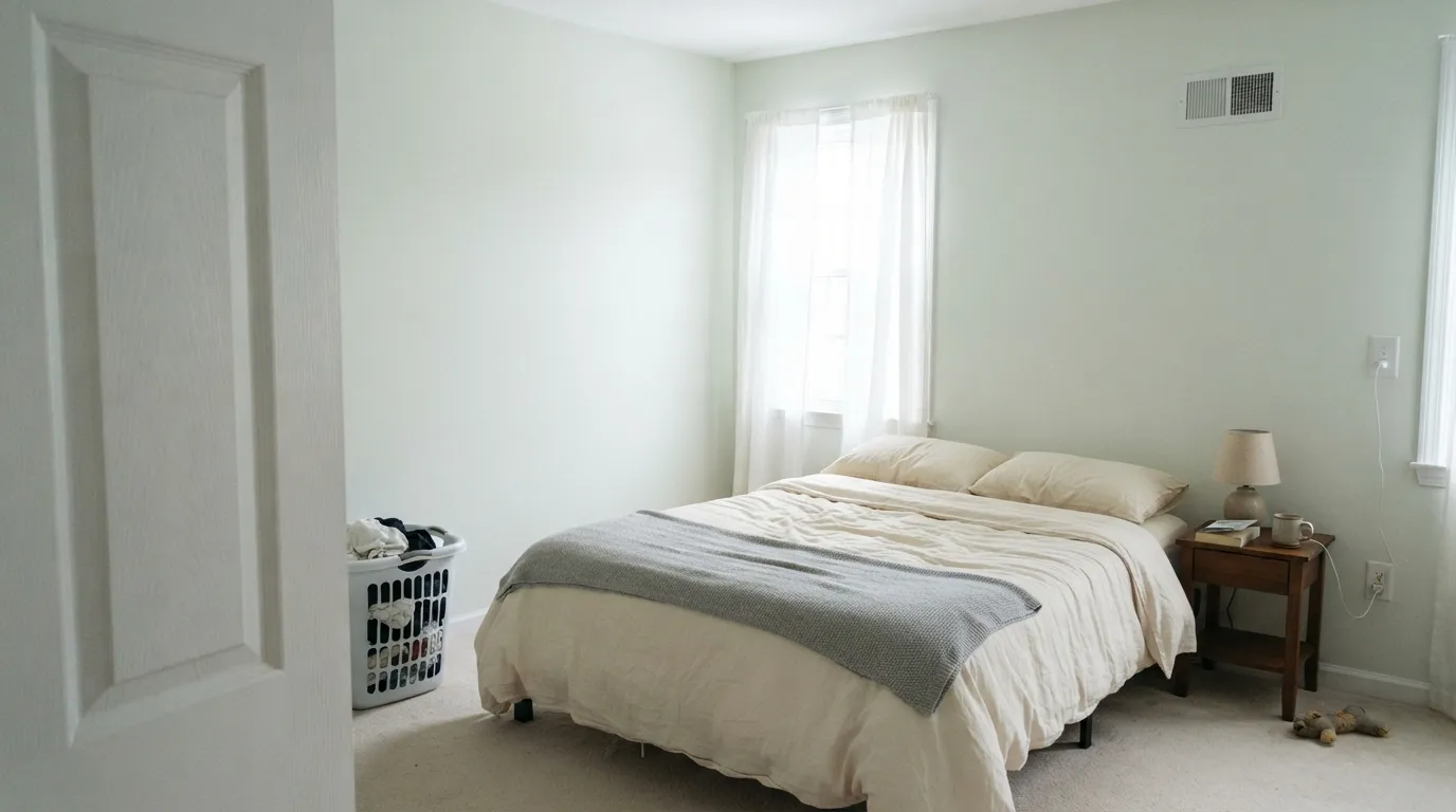
Give it soft, even daylight — morning light through sheers, an east-facing room, indirect bright light — and it becomes exactly what the name promises: a hush, not a color. Its best rooms are the ones that ask for almost nothing: a powder room that should feel like a spa, a nursery that should not compete with the crib bedding, kitchen cabinets that want to look expensive without going stark. Give it brass hardware, cream textiles and pale wood, and it reads like a quiet, deliberate choice instead of the paint that happened to be on sale.
Where It Fails
Almost every regret about Silence comes down to light or contrast, and both are predictable before the first coat. None of them are the paint's fault — but if your room matches one of these, this is not your white, and a bigger sample will only prove it.
Cold artificial light pulls the warmth out of the whisper of green and leaves the green sitting alone — readers describe the result as "institutional" or "like a hospital wall." Swap to warm 2700K bulbs before blaming the paint; the fix costs less than a gallon.
Put Silence walls next to a genuinely brighter trim white — SW Extra White, BM Chantilly Lace — and the brighter white wins; Silence starts to look faintly dingy by comparison. The fix is the same-color rule: walls and trim both in Silence, and let the sheen change do the separating.
Warm honey-gold wood and a lot of yellow-leaning brass push the whisper of green toward a dull, olive-ish cast instead of a clean hush. Pale ash oak, walnut, or a big rug between the two solves it; a whole room trimmed in golden oak will not.
Room by Room
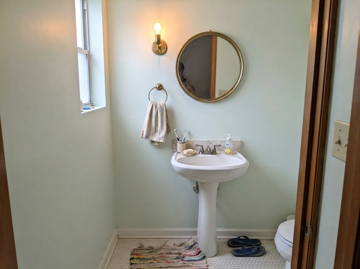
Spa-quiet with white subway tile, brass fixtures and warm stone. Skip cool gray marble, which pulls the whisper of green toward flat and cold instead of calm.
A calm, barely-there backdrop under 2700K lamps. If the room faces north and stays dim, expect it to read closer to plain gray-white than green.
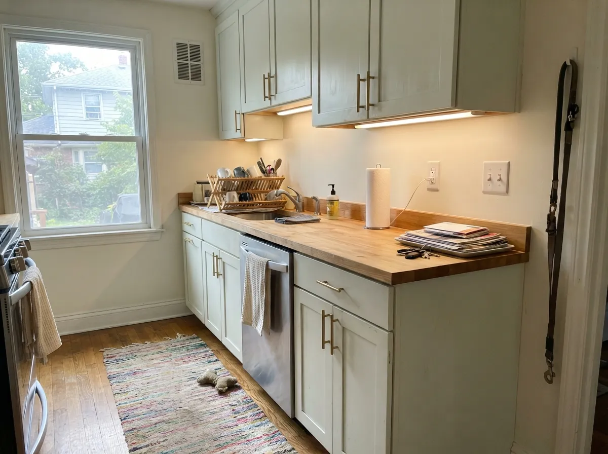
Reads quiet and expensive against butcher block and unlacquered brass. In stainless-heavy, all-cool-metal kitchens it can tip clinical — mix in one warm material.
Calm enough to work behind a crib or a monitor without competing. Use warm task lighting; a cool desk lamp is the one thing most likely to make it look sterile.
A soft alternative to stark white trim under warm wall colors. Avoid pairing it with an even brighter white elsewhere in the house — see the fails section.
Full sun and a street of painted-white houses swallow the whisper of green entirely, and on an overcast day it can read institutional pale-green-gray. It works better as a shutter or door accent than as full siding.
Your Light Is the Risk
Morning light through sheers or an east-facing room keeps the whisper of green visible without tipping cold or washing to plain white.
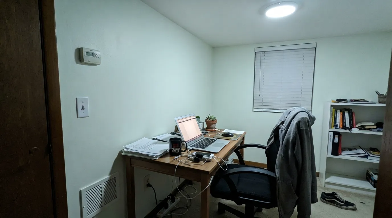
Cold artificial light strips the warmth out and the green alone reads institutional. Test under your actual bulbs before committing.
Fresh and quiet in morning east light; by evening west light it warms slightly and the green softens toward a plain hush.
2700K lamps mute the green into a creamy, barely-there hush. Cool LEDs push it flat and faintly clinical — swap bulbs, not paint.
Most complaints about Silence are a light mismatch. Upload a photo of your actual room and see it on your walls — then ask for the same wall in north light or evening lamps before you buy a single sample.
Need It From Another Brand?
Any paint counter can custom-tint Behr N410-1 directly. If you would rather stay in one brand's own deck, these are the closest stock matches, measured as ΔE2000. Under 2 is a difference you will not see on the wall.
| Brand | Closest color | ΔE | LRV | |
|---|---|---|---|---|
| Sherwin-Williams | SerendipitySW 9671 · Sherwin-Williams | 0.9 | 84 | Color page → |
| Benjamin Moore | Vanilla Milkshake2141-70 · Benjamin Moore | 1.4 | 81 | Color page → |
| Valspar | Cool Gray7006-10 · Valspar | 1.4 | 83.2 | Color page → |
| PPG / Glidden | GypsumPPG1006-1 · PPG / Glidden | 1.4 | 84 | Color page → |
| Glidden | Morning Hush White30GY 83/043 · Glidden | 0.7 | 83 | Color page → |
| Dutch Boy | Glacial Hue128-1DB · Dutch Boy | 1.3 | 83 | Color page → |
Similar Behr Colors
The nearest shades to Silence within Behr's own range, ranked by perceptual color distance — useful when you want the same look a touch lighter, darker, or warmer.
WCAG 2.1: AA is 4.5 : 1 for normal text, 3 : 1 for large text, AAA is 7 : 1.
Silence vs the Colors You're Also Considering
Every Silence sample board has the same rivals on it. The numbers show the real lightness gap — then it comes down to which risk you would rather live with.
Pick this for spa-quiet calm instead of cream — Silence stays cooler and barely-there.
Behr 12 · LRV 80Swiss CoffeePick this if you want Behr's warmest safe off-white instead of a whisper of green — Swiss Coffee leans cream, not cool.
Pick this when you want that undertone — the faint green hush that Benjamin Moore White doesn't have.
Benjamin Moore OC-151 · LRV 84WhitePick this for a true no-opinion white with zero undertone to manage.
Silence Coordinating Colors
The pairing rule for Silence is simple: keep warmth nearby, and keep cool light and cold marble at arm's length. It flatters brass, cream textiles and pale wood, and it disappears into anything genuinely brighter than itself. These are the partners that keep the whisper of green reading as calm rather than clinical:
Silence's Story: An Honest Whisper, Not a Headline
There is no viral moment behind Silence, no Color of the Year plaque, no design-blog essay declaring it the new neutral. It sits in Behr's core deck under a plain N4-series number, the kind of code that signals nothing about fame and everything about function — it exists to be a very light, low-drama option among hundreds of others. Search for it and you find color-matching sites and cross-reference charts before you find a single owner's Instagram post.
That is not a mark against it. At LRV 90, Silence is close enough to a true white that most people who live with it never clock the green at all — they just notice the room feels calm and a little softer than a stark bright white. The personality only shows up in contrast: next to a genuinely brighter white, under cool artificial light, or beside golden wood. Judged as a headline color, it has none; judged as a quiet backdrop, it does its one job well.
Silence With Wood Tones and Floors
Pale, ash-toned or gray-washed oak is the easiest match — both sit in the same cool, low-chroma family, so the room reads as one calm palette rather than two competing tones. Walnut and espresso work well too: the dark contrast sharpens Silence's whisper of green instead of muddying it.
Golden honey oak is the genuine exception. Warm, yellow-orange wood pushes the pale green toward a dull, slightly olive cast, and a room fully trimmed in honey tones will fight the paint on every wall. A large rug between the floor and the walls softens the clash; if the whole floor is honey oak, a warmer off-white like Swiss Coffee will get along with it better than Silence will.
Three Ready Palettes Built on Silence
A color is never alone on the wall. These are complete combinations in the 60-30-10 pattern, with the reason each one holds together. Every one opens in the visualizer.
Silence and Sea Salt share the same whisper-green family, so a tile or vanity in Sea Salt reads as a shade of the wall, not a clash; White Dove trim keeps the room from tipping cold.
Try this palette in your roomOne color at two sheens keeps the whisper of green from fighting itself, and a single near-black door supplies all the contrast the scheme needs — the same trick that makes one-color rooms work in any deck.
Try this palette in your roomEdgecomb Gray's warmth keeps the room from reading cold, Silence cabinets add the faintest green hush instead of stark white, and the Sable island grounds it all in real brown so the green never drifts toward institutional.
Try this palette in your roomSilence FAQ
Is Behr Silence a white or a green?
Technically a green — color-matching tools place its hue in yellow-green territory — but so diluted at LRV 90 that in normal daylight it reads as a soft, quiet white. Only in contrast with a brighter white, or under cool artificial light, does the green become obvious.
Is Silence warm or cool?
Neither strongly — that's the point. It carries a whisper of yellow-green rather than the pink or gray undertones that usually decide warm versus cool. Warm lamps soften it toward a plain hush; cool LEDs push it toward a flat, faintly clinical cast.
Does Silence work with honey oak floors?
It's the one real risk. Golden, honey-toned oak and heavy yellow-brass push the whisper of green toward a dull olive cast instead of a clean hush. Pale ash oak, walnut or espresso floors are much safer partners.
What trim goes with Silence walls?
Silence itself, in semi-gloss, is the safest answer — a genuinely brighter trim white makes the walls look faintly dingy by comparison, the same mismatch that trips up most pale, high-LRV colors. If you want contrast, go warmer or darker, not brighter.
Can I use it on kitchen cabinets?
Yes, and it's one of its better jobs. With unlacquered brass hardware and butcher block or pale wood counters it reads quiet and a little expensive. In an all-stainless, cool-metal kitchen it can tip clinical, so keep one warm material in the room.
Is Silence a popular or trending color?
No — and that's an honest answer, not a knock. It has never been a Color of the Year and has no real design-blog following; it sits quietly in Behr's numbered neutral deck, chosen more often through a fan deck or color-matching software than requested by name. That anonymity doesn't make it a bad paint, just an undersold one.
Have you painted with Silence?
Rate it — one tap helps the next reader decide.
Ask a Question