Chalk
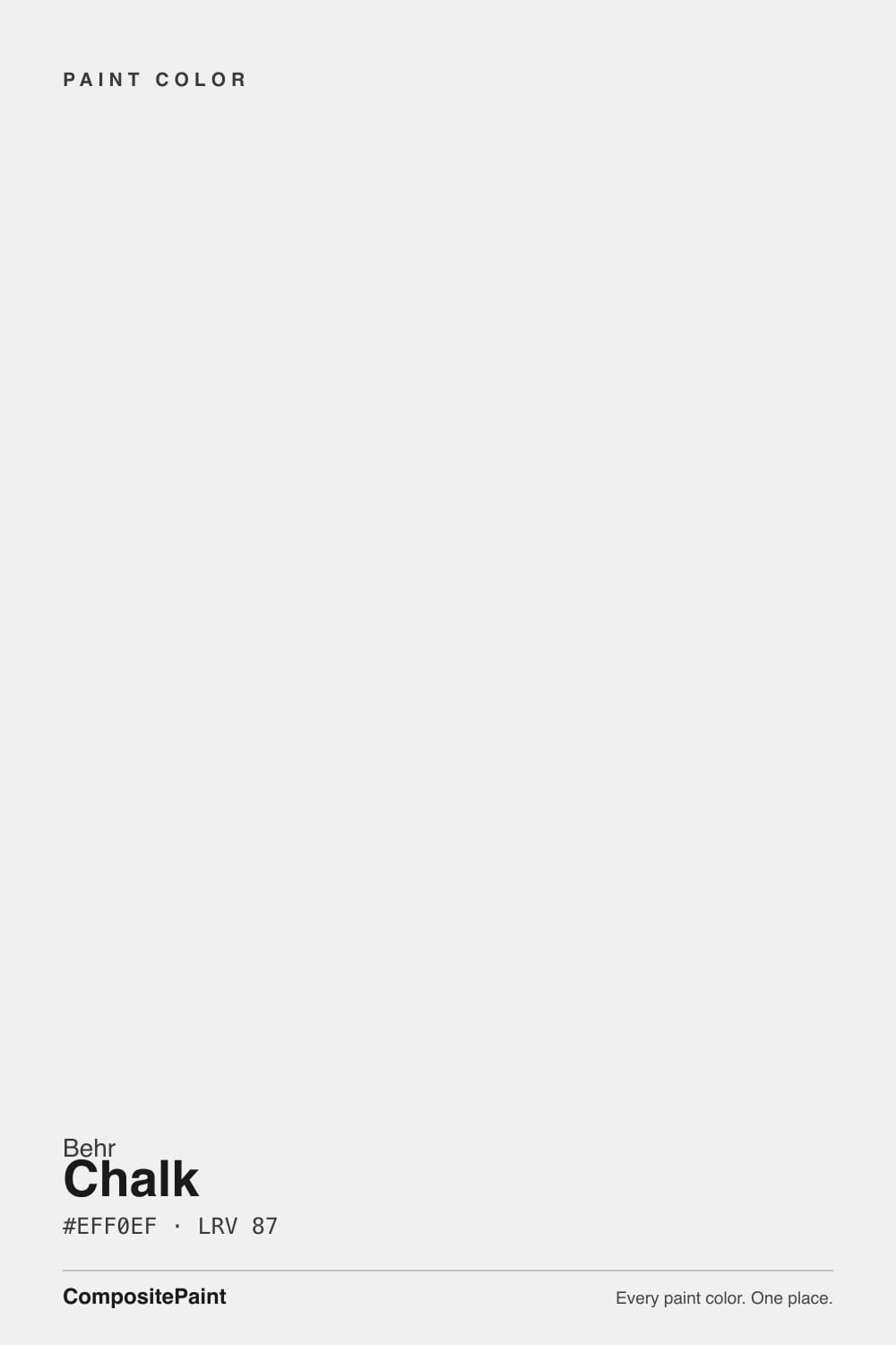
750A-1 · #EFF0EF · LRV 87 — neutral with no strong undertone, very light — near-white, broadens small spaces.
- 1Classic Gray74
- 2Alabaster82
- 3Chalk87
- 4Sleek White92
- 5Ultra Pure White97
What Color Is Chalk, Really?
Chalk 750A-1 is a bright, near-neutral white. Its hex is #EFF0EF and its LRV is 87, which is high in the white range and only a few points off a pure white. At that lightness it throws light back into the room and makes ceilings feel higher and small rooms feel larger. Saturation is about 3 percent, essentially nothing, so there is no real undertone pulling it warm or cool.
That neutrality is the reason people choose it. A white with no strong lean does not fight a countertop, a tile, or a wood floor, and it does not force the rest of the room into a warm or cool camp. It is a straightforward ceiling white, trim white, and gallery-style wall white. Behr sells at The Home Depot, so picking up a sample is easy.
The catch with a neutral this clean is that it takes on whatever is around it. Warm floors and 2700K bulbs will make it look faintly cream. A blue-gray sofa or north light will make it look slightly cool. It also gives you nothing to hide behind: at LRV 87 in a bright room, wall texture, drywall seams, and patch marks show more than they would in a softer white.
There is almost nothing to find here. Saturation sits near 3 percent, so Chalk is about as close to a true neutral as a mixed paint gets. The hue reading of 120 degrees is technically green, but at this saturation it functions as a barely-there coolness rather than a green cast. Most people will read it as plain white.
Because it carries so little of its own color, it borrows from the room. Warm oak floors, brass, and 2700K bulbs will tint it faintly cream. Gray tile, north light, and cool LEDs will tip it slightly cool. Next to a clearly warm white it looks crisp and cool; next to a blue-white it looks softer.
That makes it a safe choice when your fixed materials already have a strong direction and you do not want the paint adding another one. Sample it against your countertop and flooring, not against a white chip.
Best Rooms and Uses for Chalk
The clearest use is ceilings. A neutral white at LRV 87 keeps the ceiling reading as light without adding a color cast that fights the walls, and it works over both warm and cool wall colors. Trim and doors are the next best use, where its brightness gives clean separation from any mid-tone or dark wall.
On walls it suits rooms where you want maximum light and no color story: small bathrooms, hallways, laundry rooms, closets, and modern or gallery-style spaces where the art or the furniture carries the color. It is also a practical choice for rentals and resale, since it commits to nothing.
On cabinets it gives a crisp, contemporary white rather than a soft traditional one. Outdoors it works as a bright trim white against darker siding. Because it is so light, prep matters: at this LRV every seam and dent is visible, so a flatter sheen and careful patching pay off.
How Lighting Changes Chalk
At LRV 87 Chalk stays bright in every room, so lighting affects its temperature rather than its brightness. North-facing rooms get cool, indirect daylight, and Chalk takes that on directly. It will look clean and slightly cool there, sometimes a touch sterile if the room has no warm materials in it.
South and west rooms warm it up. In direct afternoon sun it can look softer and faintly cream, but it never goes yellow the way a warm white does, because there is no yellow in it to amplify. East rooms shift the same way in the morning and settle back by afternoon.
Bulbs are the bigger lever. Warm 2700K lighting is the easiest way to keep Chalk from feeling clinical at night. Bulbs at 4000K and above will push it toward a bright, cool white that suits a laundry, garage, or workshop but can feel harsh in a bedroom. Check a sample under your own fixtures after dark.
Most complaints about Chalk are a light mismatch. Upload a photo of your actual room and see it on your walls — then ask for the same wall in north light or evening lamps before you buy a single sample.
Need It From Another Brand?
Any paint counter can custom-tint Behr 750A-1 directly. If you would rather stay in one brand's own deck, these are the closest stock matches, measured as ΔE2000. Under 2 is a difference you will not see on the wall.
| Brand | Closest color | ΔE | LRV | |
|---|---|---|---|---|
| Sherwin-Williams | SnowbeltSW 9623 · Sherwin-Williams | 2.4 | 87 | Color page → |
| Benjamin Moore | Wedding Veil2125-70 · Benjamin Moore | 0.8 | 87 | Color page → |
| Valspar | Tambourine8007-3B · Valspar | 1.8 | 86 | Color page → |
| PPG / Glidden | Delicate WhitePPG1001-1 · PPG / Glidden | 1.6 | 88 | Color page → |
| Glidden | White On White30GY 88/014 · Glidden | 1.0 | 88 | Color page → |
| Dutch Boy | White003W · Dutch Boy | 2.1 | 86 | Color page → |
Similar Behr Colors
The nearest shades to Chalk within Behr's own range, ranked by perceptual color distance — useful when you want the same look a touch lighter, darker, or warmer.
WCAG 2.1: AA is 4.5 : 1 for normal text, 3 : 1 for large text, AAA is 7 : 1.
Chalk vs Similar Colors
Inside the Behr deck, Sweet Vanilla 780A-1 at #F0F1F0 and LRV 88 is one step brighter and just as neutral. Downy Fluff 740A-1 at #EFEFED and LRV 86 is a shade softer and slightly warmer. Pearl Drops 700C-1 at #F2F0ED is the warmest of the group, and side by side Chalk will look cooler and cleaner against it. Pale Bud W-D-620 at #EFF0F3 goes the other way with a faint blue lean.
Across brands, Dunn-Edwards Snowflake DEW384 at deltaE 0.54 and Benjamin Moore Wedding Veil 2125-70 at deltaE 0.8 are true matches. Glidden White On White at deltaE 1.02 and Farrow and Ball Wevet No. 273 at deltaE 1.41 are visually identical in normal room light, though Wevet at LRV 83 is a few points less bright. Sherwin-Williams Snowbelt SW 9623 at deltaE 2.43 is very close, sample first. Backdrop Tabula Rasa at deltaE 4.65 is close but visibly different side by side.
Colors That Go With Chalk
For a slightly softer companion inside the Behr deck, Pearl Drops 700C-1 at LRV 87 is the same brightness with a gentler feel, and Downy Fluff 740A-1 at LRV 86 sits a hair lower for walls under a Chalk ceiling. Sweet Vanilla 780A-1 at LRV 88 and White 1852 at LRV 88 are marginally brighter if you want the ceiling to read lighter than the trim. Pale Bud W-D-620 at LRV 87 leans cooler and works when you want a faint blue lift in a north room.
Because Chalk is neutral, it does not restrict your wall colors. Mid-tone greiges, deep greens, and near-blacks all frame well against it, and both warm woods and cool stone read honestly next to it.
Across brands, Benjamin Moore Wedding Veil 2125-70 at LRV 87 and Glidden White On White at LRV 88 cover the same neutral ground.
Coordinated palette
Generated by hue-rotating #EFF0EF in HSL space. Pair Chalk with one accent and one neutral — the swatches below are starting points, not final picks.
Chalk FAQ
Is Behr Chalk warm or cool?
Chalk is essentially neutral. Saturation is around 3 percent, which is too little for a real undertone in either direction, so it does not read as a warm cream or a cool blue-white. In practice it picks up the temperature of the room, going slightly cream under warm bulbs and warm floors, and slightly cool in north light.
What LRV is Behr Chalk?
Chalk 750A-1 has an LRV of 87. On the 0 to 100 light reflectance scale that is a bright white, only a little below the brightest whites available. It reflects most of the light in a room, which is why it works well on ceilings and in small or windowless spaces that need every bit of light back.
Does Chalk work in a dark room?
Yes. At LRV 87 it returns more light than almost any other paint choice, so it is a sensible pick for windowless halls, closets, and small baths. The one caution is that a neutral white with no warmth can feel cold in a dark north-facing room. Warm 2700K bulbs and wood or textile warmth in the room solve that.
Is Chalk a good ceiling white?
It is one of its best uses. At LRV 87 and with no meaningful undertone, it keeps the ceiling bright and does not cast warm or cool color down onto the walls. That means it sits comfortably above almost any wall color, which is harder to manage with a white that leans clearly cream or clearly blue.
What trim white goes with Chalk walls?
If you want visible separation, use a brighter neutral such as Sweet Vanilla 780A-1 at LRV 88 on trim, or simply change the sheen and keep Chalk on both. Because Chalk is neutral, a warm white on trim will read clearly warm against it, which can look intentional or accidental depending on the rest of the room.
Is Chalk good for cabinets and exteriors?
It suits both, with one caveat. On cabinets it gives a crisp, contemporary white rather than a soft traditional one, so it fits modern kitchens better than warm farmhouse schemes. Outside it works as a bright trim white against darker siding. At LRV 87 surface prep shows, so patch and sand carefully before painting either one.
Have you painted with Chalk?
Rate it — one tap helps the next reader decide.
Ask a Question