Classic Silver
The medium gray that genuinely doesn't lean warm or cool, reviewed honestly: how it flips with your windows, where it goes flat, and what to pick instead.

Jessica has spec'd whites and neutrals for more than 300 rooms and keeps a sample wall of painted drawdowns in her studio. Every color review is checked against real reader rooms in the comments and re-tested when a formula changes. About the testing process →
The Fast Verdict
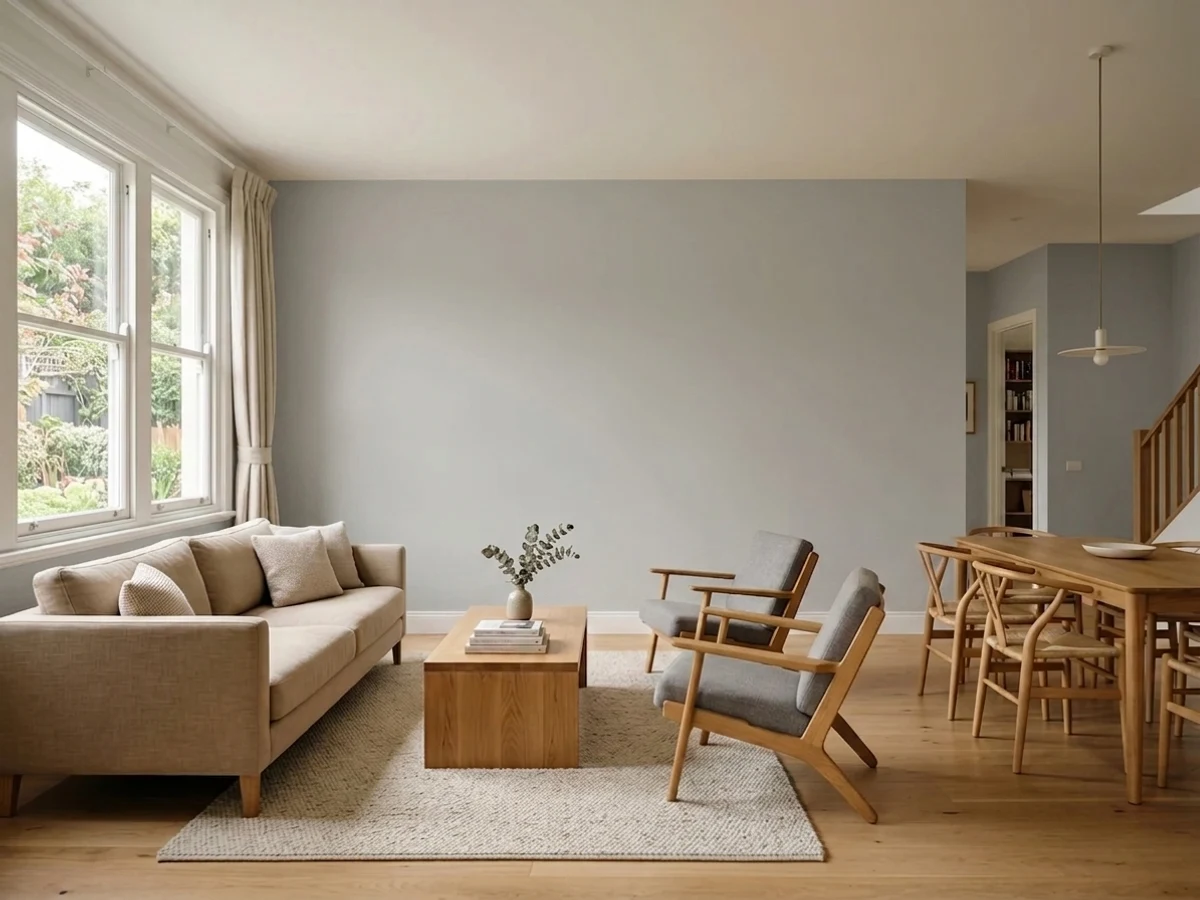
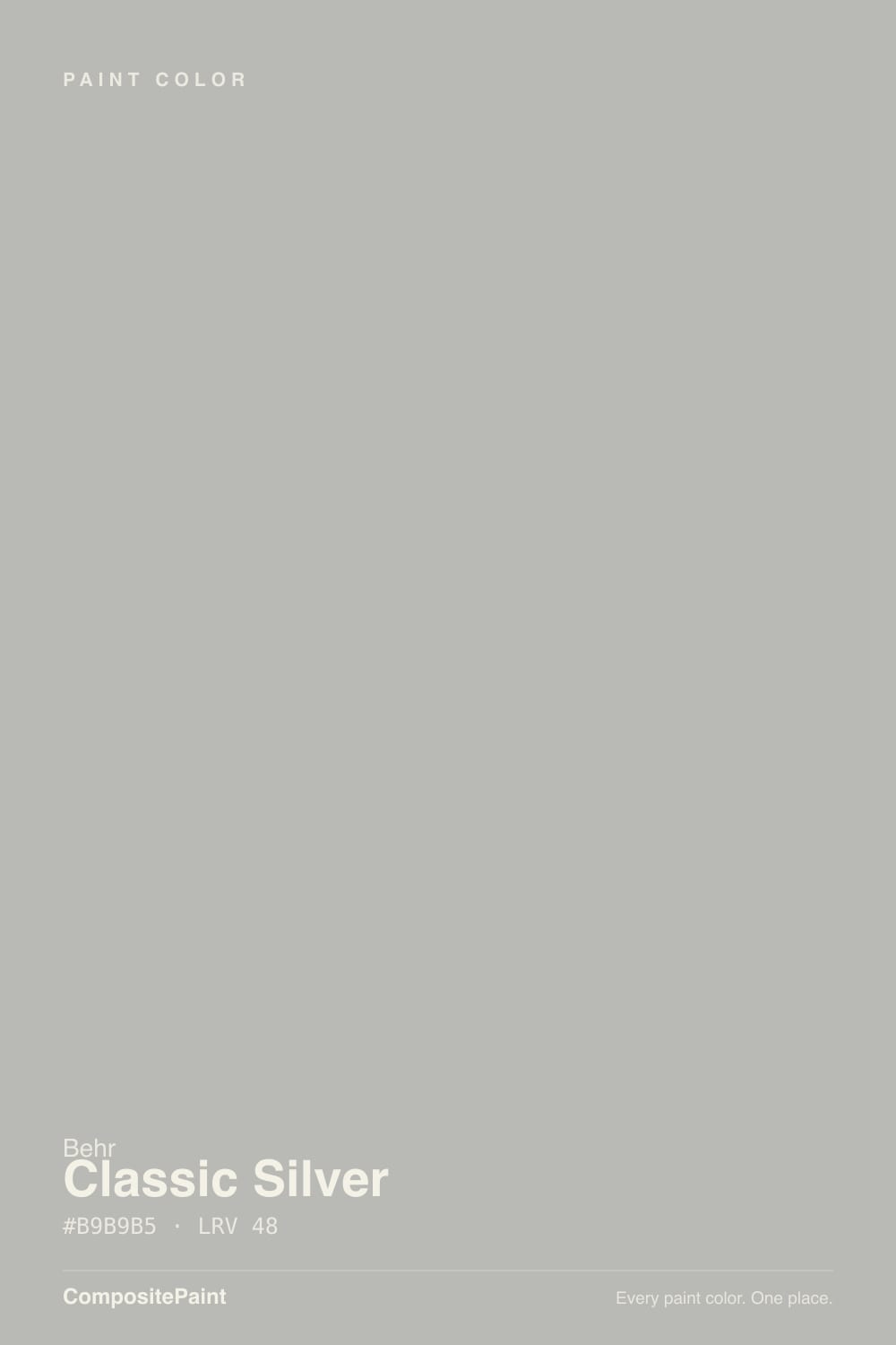
Classic Silver is what a "true" gray actually looks like once you live with it: at LRV 48 it sits almost exactly at middle gray, and it carries both a warm yellow whisper and a cool blue whisper instead of committing to one. That is not indecision — it is the point. North-facing rooms pull the blue forward and it reads crisp and cool; south-facing rooms pull the yellow forward and it reads soft and warm. Same can, two different moods, both honest.
Whole-house neutral walls in a home with mixed light exposures · exterior siding and stucco · a backdrop for a single bold jewel-tone accent · anyone who wants "gray" and not "greige" or "blue-gray"
You want one committed undertone, not a color that shifts room to room · your whole house runs on flat, even artificial light with little daylight · you're chasing a famous, trend-driven color for resale story · you already own Behr Silver Drop and want something meaningfully different
- A genuinely balanced gray — not a secret greige or a secret blue-gray
- LRV 48 medium depth works as a whole-house neutral without going dark or flat-white
- Available in real exterior formulas, including masonry and stucco
- Excellent quiet backdrop for a single bold jewel-tone accent
- Doesn't fight warm or cool hardware, stone, or metals the way a committed neutral can
- Goes flat and uninteresting under even, daylight-free artificial light
- The same gallon reads noticeably different room to room depending on exposure
- No trend or Color of the Year story — a pure workhorse, not a statement
- Buyers expecting one fixed undertone can read the shift as inconsistency
What Color Is Classic Silver, Really?
A true medium gray built to split the difference — our deck lists it warm-cool balanced rather than tipped either way, and that balance is unusually rare. Most "gray" paints are secretly a greige (warm) or a blue-gray (cool) once you get a quart on the wall; Classic Silver is one of the few that actually reads as neutral gray in daylight, because it is carrying equal small amounts of both undertones rather than none.
At LRV 48 it sits almost exactly at the midpoint of the reflectance scale — not light, not dark, genuinely medium. That is why it reads differently depending on which window it is sitting under: in a north-facing room, where daylight itself skews cool and blue, Classic Silver's blue whisper gets amplified and the wall looks crisp and slightly cool. In a south-facing room, where daylight skews warm, the yellow whisper wins instead and the same wall looks soft and neutral-warm. It is not fading or flickering — it is doing what a genuinely balanced color does when the light itself isn't balanced.
Undertone in one line: equal parts warm yellow and cool blue, with neither winning outright — the direction is decided by your light, not the can. If your sample reads clearly blue or clearly yellow on the wall, that is your room's exposure talking, not a defect in the paint.
Where It Shines
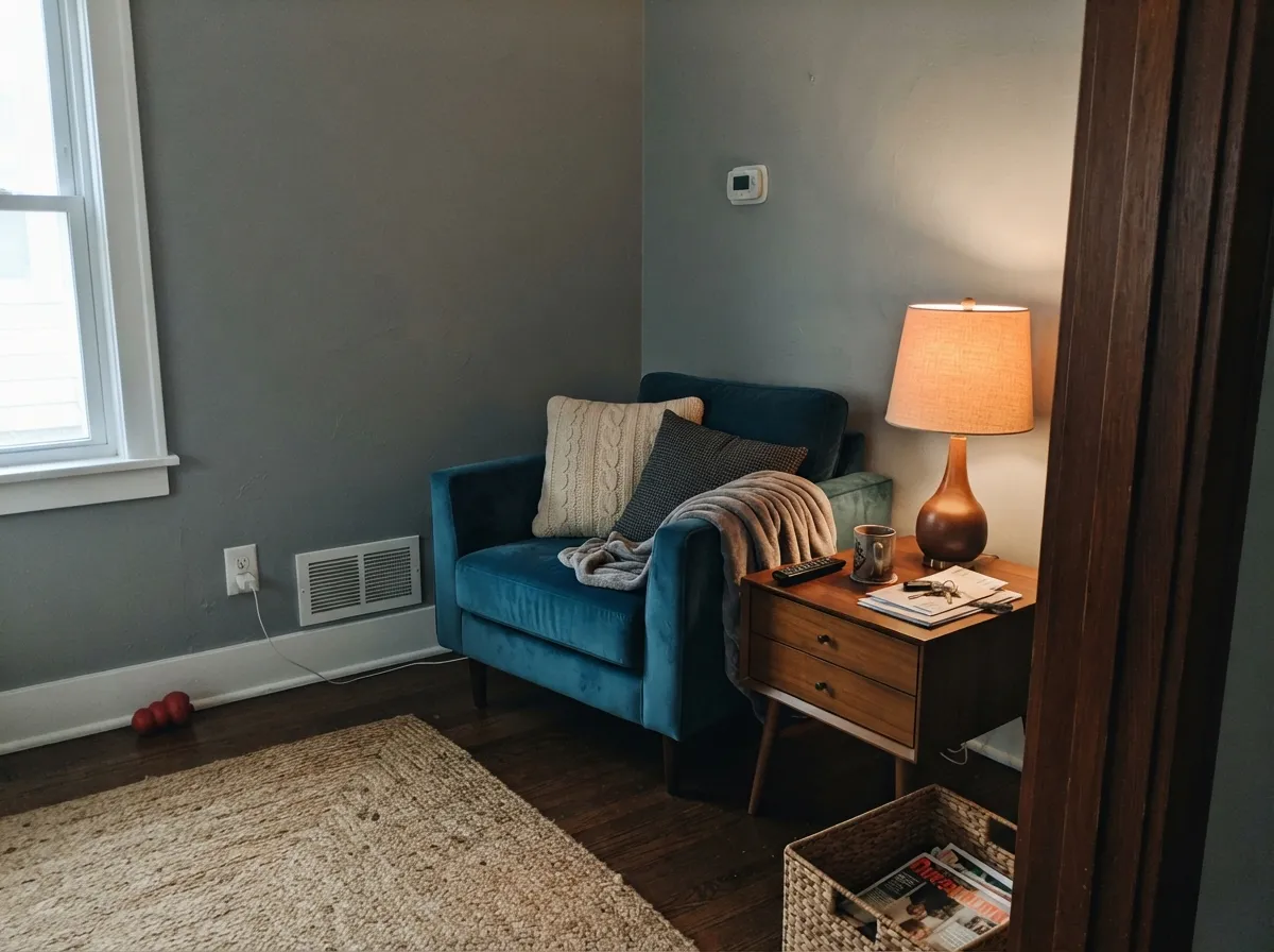
It earns its keep as a background color, not a headline one. On exteriors and whole-house interiors it is dependable in a way flashier grays aren't, because it never fights a room's existing light the way a committed cool-gray or warm-greige can. Its best trick is backdrop duty for one confident accent — a jewel-toned chair, a navy door, a wall of art — because a color with no strong undertone of its own doesn't compete with anything you put in front of it.
Where It Fails
The complaints about Classic Silver aren't about the paint failing — they're about buyers wanting it to behave like a committed color when its whole design is the opposite. All three are predictable once you know the pattern.
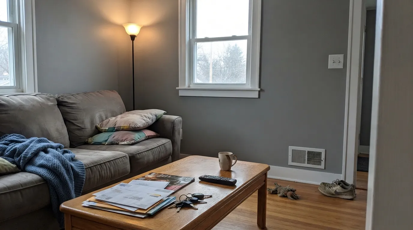
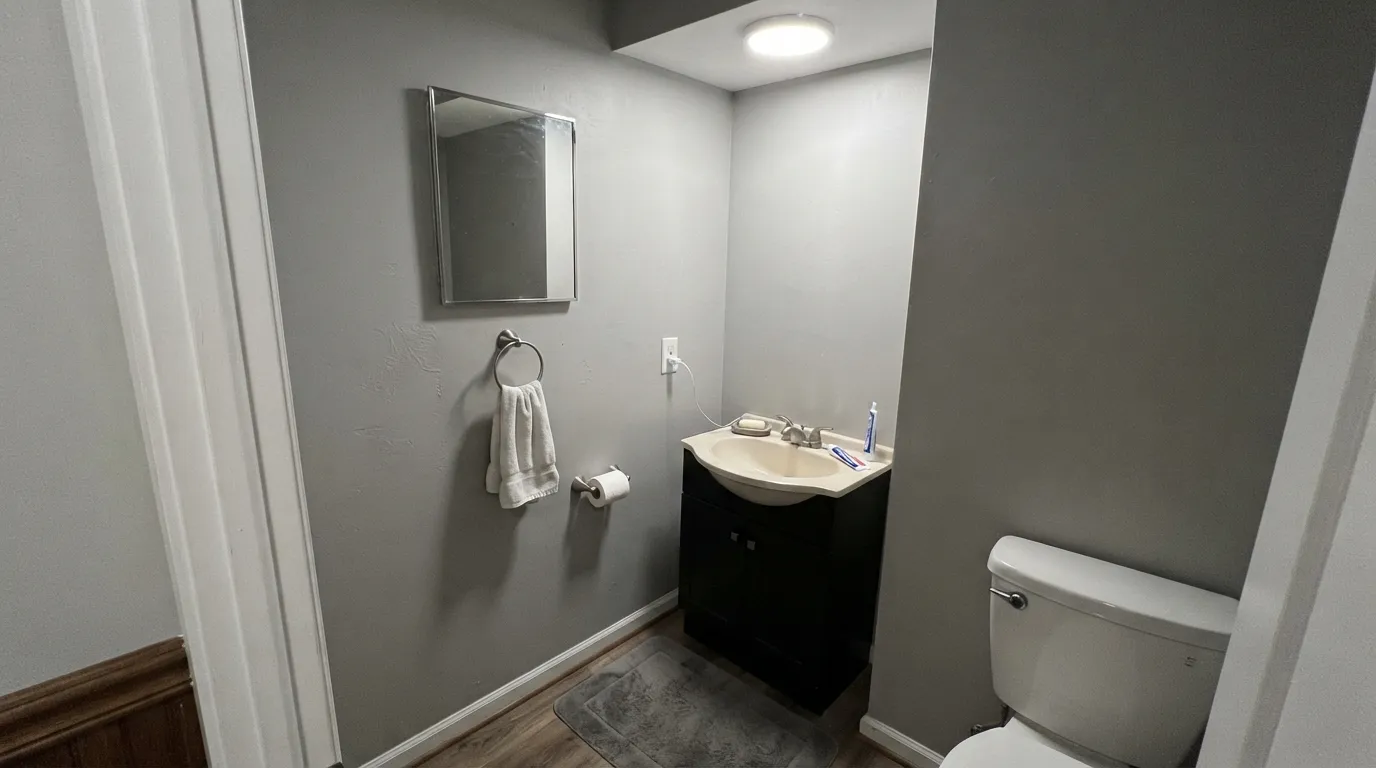
Classic Silver's charm depends on daylight pulling one undertone or the other forward. Under flat, even artificial light — basements, windowless bathrooms, rooms lit only by cool LEDs at night — neither undertone gets a chance to show, and the wall can look plain and a little flat rather than interesting. If the room has almost no daylight, pick a color with one committed personality instead.
Because the undertone follows the exposure, the same gallon can look faintly cool in the north bedroom and faintly warm in the south living room. Most people love this once they understand it; a few feel like the paint is "inconsistent" between rooms. If you need every room to match exactly regardless of exposure, a stronger-committed gray (not a balanced one) is the safer bet.
This is a workhorse neutral, not a trend color — it has no Color of the Year moment or viral room behind it, on purpose. If you're hoping the paint alone reads as a design decision, you'll be disappointed; its job is to disappear politely behind furniture, art, and one bold accent color.
Room by Room
The balanced undertone means it doesn't fight whichever direction the room's light leans, which matters most in open floor plans where one wall faces north and another faces west. Eggshell finish; let a single jewel-tone accent do the talking.
Works with both warm and cool cabinet hardware since it isn't committed either way. The floor decides the mood more than the wall does here — see the wood-tone section below before you paint.
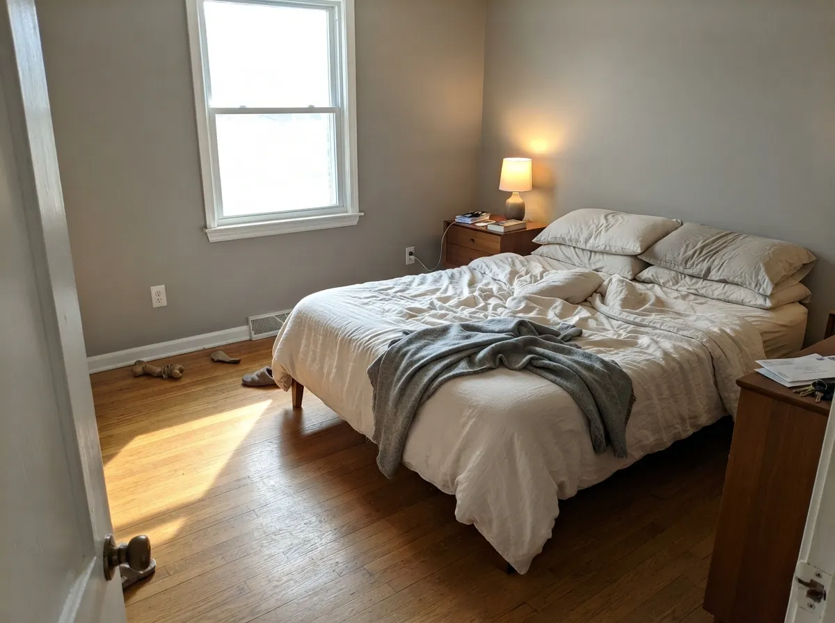
In a south or east bedroom it goes soft and calm under morning light. In a north bedroom, expect a cooler, more businesslike read — fine for some people, not the coziest choice for others. Warm 2700K lamps at night pull it back toward neutral either way.
Because it doesn't lean hard warm or cool, it rarely fights vanity stone the way a committed greige or blue-gray can. Satin or semi-gloss for the moisture; test against your actual countertop before committing to grout and hardware.
A quiet, professional backdrop that reads calm on video calls in almost any light. Not a color anyone will comment on, which is exactly the point in a work room.
Classic Silver comes in Behr's flat, satin, semi-gloss, and even elastomeric masonry/stucco formulas — it is genuinely built for siding, not just walls. Full sun reads it lighter and cleaner than the chip; pair with a crisp white trim and a near-black door for a clean, dependable modern-neutral exterior.
Your Light Is the Risk
This is the color's whole trick: morning warmth and afternoon coolness both read as intentional, not off. A home with several exposures is where it earns its rating.
With no daylight to pull an undertone forward, it can look plain and slightly flat. Test under your actual bulbs before committing a whole room to it.
North light pulls the blue whisper forward for a crisper, cooler read. South light pulls the yellow whisper forward for a softer, warmer read. Same paint, different room.
2700K warm bulbs nudge it gently toward the warm side after dark. Cool white LEDs keep it reading crisp and neutral. Either works — pick bulbs to match the mood you want at night.
Most complaints about Classic Silver are a light mismatch. Upload a photo of your actual room and see it on your walls — then ask for the same wall in north light or evening lamps before you buy a single sample.
Need It From Another Brand?
Any paint counter can custom-tint Behr PPU18-11 directly. If you would rather stay in one brand's own deck, these are the closest stock matches, measured as ΔE2000. Under 2 is a difference you will not see on the wall.
| Brand | Closest color | ΔE | LRV | |
|---|---|---|---|---|
| Sherwin-Williams | March WindSW 7668 · Sherwin-Williams | 0.8 | 49 | Color page → |
| Benjamin Moore | Coventry GrayHC-169 · Benjamin Moore | 1.0 | 48 | Color page → |
| Valspar | Granite Dust5006-1C · Valspar | 1.7 | 48.1 | Color page → |
| PPG / Glidden | Pigeon FeatherPPG0995-4 · PPG / Glidden | 0.5 | 48 | Color page → |
| Glidden | Gray StonePPG1009-4 · Glidden | 1.0 | 48 | Color page → |
| Dutch Boy | Fair-Minded Gray438-3DB · Dutch Boy | 0.6 | 49 | Color page → |
Similar Behr Colors
The nearest shades to Classic Silver within Behr's own range, ranked by perceptual color distance — useful when you want the same look a touch lighter, darker, or warmer.
WCAG 2.1: AA is 4.5 : 1 for normal text, 3 : 1 for large text, AAA is 7 : 1.
Classic Silver vs the Colors You're Also Considering
Every Classic Silver sample board has the same rivals on it. The numbers show the real lightness gap — then it comes down to which risk you would rather live with.
Pick this if you want the color to actually respond to your light instead of staying fixed room to room.
Benjamin Moore HC-170 · LRV 59Stonington GrayPick this for BM's version of a true gray — lighter, and steadier across different rooms since it doesn't swing with exposure the way Classic Silver does.
Pick this for the cooler, more neutral read at that same medium depth.
Sherwin-Williams SW 7016 · LRV 48Mindful GrayPick this at the exact same LRV, if you'd rather have a warm greige than a truly balanced gray.
Pick this for the deeper, more genuinely neutral gray of the two — Silver Drop leans warmer than its name suggests.
Behr PPU18-19 · LRV 60Silver DropPick this from the same Behr line, for a lighter, warmer greige instead of a true balanced gray.
Pick this for Behr's honest, unhyped version of the same true-gray idea, with a warm/cool swing instead of a violet one.
Sherwin-Williams SW 55 · LRV 53Light French GrayPick this if you want SW's take on a true gray — it has its own well-known violet flash in certain light.
Within Behr, Sonic Silver HDC-MD-26 (#B8B7B4, LRV 47) is the closest neighbor and functionally interchangeable on a wall. Lunar Surface N460-3 (#B6B9B9, LRV 48) is the cooler option with a faint blue lean. Pumice MQ6-23 (#BCB9AF, LRV 48) and Warm Ash QE-57 (#BFB8B0, LRV 48) sit at the same lightness but carry visible warmth, so they behave like greige rather than true gray.
Across brands the field is unusually tight. PPG Pigeon Feather PPG0995-4 (#B9B9B6, LRV 48) is deltaE 0.53 and Dutch Boy Fair-Minded Gray 438-3DB (#B9BAB6, LRV 49) is deltaE 0.56, both effectively the same color. Sherwin-Williams March Wind SW 7668 (#BAB9B6, LRV 49) at deltaE 0.84 is also a direct equivalent.
Benjamin Moore Coventry Gray HC-169 (#B8BAB6, LRV 48) is deltaE 1.03, visually identical in normal room light. Clare Greige PNT100-LT-13 (#C2B8B2, LRV 49) is deltaE 4.91, close but visibly warmer side by side.
Classic Silver Coordinating Colors
Because Classic Silver doesn't commit to warm or cool, it pairs cleanly with colors on both sides of the fence — which is unusual for a gray. The partners below either share its balanced neutrality or bring the single confident undertone the wall itself is deliberately withholding:
A Workhorse, Not a Trend Color
There is no Color of the Year story here, no viral room, no designer-blog moment — and that is worth saying plainly, because plenty of paint reviews reach for fame that isn't there. Classic Silver is a numbered color in Behr's professional PPU line, sold alongside colors like Silver Drop and Cracked Pepper as part of a curated, timeless-neutral collection rather than a seasonal trend palette.
That honest positioning is exactly its appeal. It's the color a painter reaches for when a client wants "just a good gray" and doesn't want to think about undertone drama for the next ten years. It won't make a design blog, but it also won't look dated the way a of-the-moment trend gray can.
Classic Silver With Wood Tones and Floors
Wood is the tiebreaker for a color built to be a tie. Mid-tone woods — walnut, a neutral-stained oak, most engineered floors — let Classic Silver stay genuinely balanced, since neither the floor nor the wall is pushing hard in one direction.
Very golden honey oak pulls the wall's warm whisper forward, so expect the room to lean softly greige rather than staying a true gray — not a clash, just a mood shift worth knowing in advance. Cool gray-washed or white-oak floors do the opposite, pulling the blue whisper forward for a crisper, more contemporary read. Either pairing works; neither is the "neutral" one, because the wood is what decides the direction here, not the paint.
Three Ready Palettes Built on Classic Silver
A color is never alone on the wall. These are complete combinations in the 60-30-10 pattern, with the reason each one holds together. Every one opens in the visualizer.
Behr White's high LRV keeps the trim reading genuinely bright against a medium gray wall instead of muddy, and Cracked Pepper's near-black anchors the scheme with one confident dark note — both colors are balanced enough not to fight Classic Silver's own undecided undertone.
Try this palette in your roomA dependable, unhyped modern-neutral exterior: Polar Bear trim doesn't push warm or cool against the balanced siding, and the dark door supplies the contrast the light gray body needs from the curb.
Try this palette in your roomThis is the pairing Classic Silver was made for: a wall with no strong undertone of its own lets a genuine jewel tone read at full richness instead of competing with it. Peacock Blue looks more saturated here than it would against a warmer greige.
Try this palette in your roomClassic Silver FAQ
Is Classic Silver warm or cool?
Neither, on purpose — it carries a small amount of both undertones and lets your room's light decide which one shows. North-facing rooms pull it cooler and bluer; south-facing rooms pull it warmer and softer. That is the color's defining trait, not a flaw.
How bright is Classic Silver? What's its LRV?
LRV 48, which is close to the midpoint of the reflectance scale — genuinely medium, not light and not dark. It reflects roughly half the light that hits it, so it neither brightens a dim room nor absorbs light like a deep color would.
Does it work on exteriors?
Yes — it comes in Behr's flat, satin enamel, semi-gloss, and even elastomeric masonry/stucco formulas, so it's a genuine siding color, not just an interior wall color adapted outdoors. Full sun reads it lighter and cleaner than the paint chip suggests.
What trim color goes with Classic Silver walls?
A bright, balanced white — something around LRV 85+ that isn't strongly warm or cool itself, so it doesn't push the gray's undertone in either direction. A trim white with a heavy warm or cool lean will make the gray look like it's fighting it.
How is it different from Behr Silver Drop?
They're both in Behr's PPU18 line and can look similar in a swatch, but Silver Drop is a warmer greige at LRV 60, while Classic Silver is a genuinely balanced gray at LRV 48 — a full step deeper and without Silver Drop's warm lean. Sample both before choosing; they read differently once you're past a paint chip.
Does it work with wood floors?
With mid-tone wood — walnut, oak with a neutral stain — it stays balanced and calm. With very golden honey oak, the wall's warm whisper gets pulled forward more strongly, landing closer to a soft greige than a true gray. With cool gray-washed floors, expect the blue whisper to lead instead.
Have you painted with Classic Silver?
Rate it — one tap helps the next reader decide.
Ask a Question