Weathered Moss
Behr's muted gray-green reviewed honestly: the light where it turns foresty, the light where it reads plain gray, and why Behr sells it as a wall paint and a fence stain at the same time.

Jessica has spec'd whites and neutrals for more than 300 rooms and keeps a sample wall of painted drawdowns in her studio. Every color review is checked against real reader rooms in the comments and re-tested when a formula changes. About the testing process →
The Fast Verdict
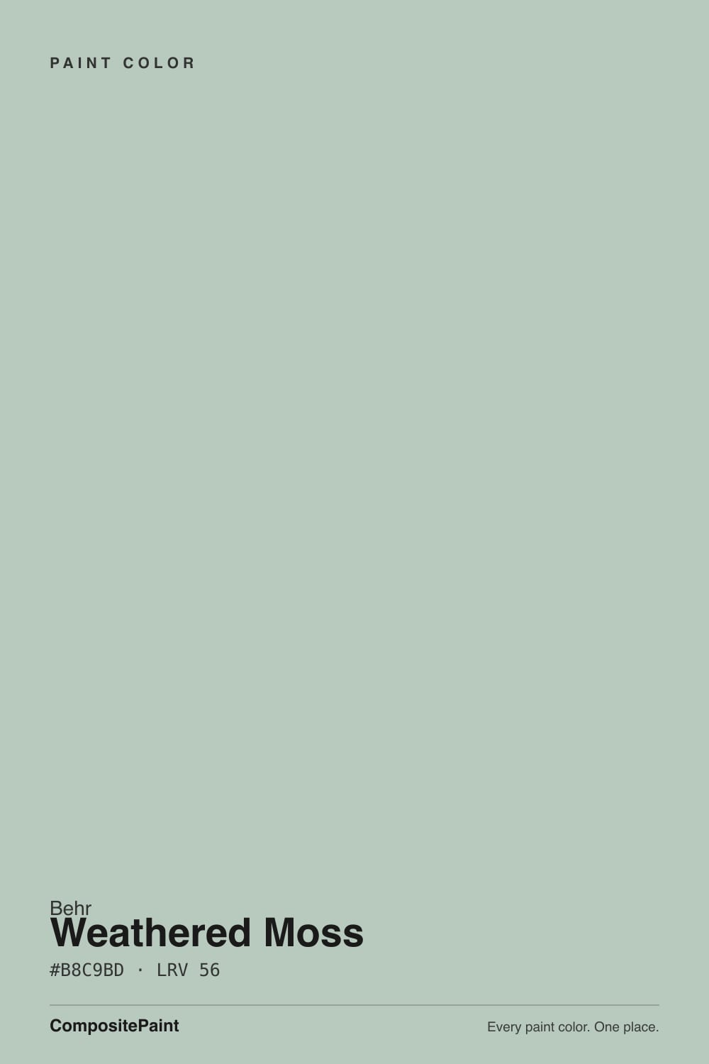
Weathered Moss is a green with the volume turned way down — Behr's own site files it in the Gray family, not Green, and that tells you almost everything. On the chip it reads as a soft, warm, foresty gray-green; on a wall or a fence it needs real daylight to show any color at all. It is less a statement green than a very quiet, earthy neutral that happens to lean green when the light lets it.
Exteriors, siding and fences · home offices and dens with warm afternoon light · kitchen islands and cabinets · anyone who wants a hint of green without committing to green
Your room runs on cool white LEDs with little daylight · you want a color that unmistakably reads green in every light · your trim is icy bright white · you want a bold, saturated statement color
- A warm gray-green that reads as an easy neutral more than a green statement
- One of the rare Behr colors sold as interior paint, exterior paint, and house-and-fence stain — genuinely built for outdoor use
- Flatters brick, stone, walnut and weathered wood
- Mid-depth LRV keeps rooms from feeling cave-dark
- Low enough saturation to pair with almost any other neutral without a color clash
- Chroma is so low it can read as plain gray, not green, to buyers expecting "moss"
- Cool LEDs and north light flatten the green entirely
- Full glaring exterior sun can wash out the subtlety at midday
- Icy bright white trim makes it look muddy instead of foresty — needs a warmer trim partner
What Color Is Weathered Moss, Really?
A warm gray-green so muted it barely registers as green at all — Behr's own official color page files Weathered Moss under "Gray color family," not green, despite the name and the marketing copy calling it "a subtle green with ripples of gray" and a "warm, foresty feel." Both things are true at once: there is genuine green in the mix, but the saturation is so low that most of what you see on a wall is the gray doing the talking. That low-saturation build is exactly why Behr also sells this same formula as a solid-color exterior house-and-fence stain, alongside the Marquee, Premium Plus and Ultra exterior paint lines — this is a color built to sit quietly on a facade for years, not to shout from an accent wall.
At LRV 49 it sits in the mid-light range: not a pale, airy neutral, and not a deep moody one either. That middle depth is part of the appeal — it reads as substance rather than a wash of pale sage, and it holds up outdoors without going cave-dark on a shaded elevation. Indoors, the same mid-depth means it needs a real window, not just ambient room light, to show the green; a dim corner will pull it toward plain warm gray fast.
Undertone in one line: warm gray-green, green only when the light is generous. In strong, warm daylight it reads like moss on old stone — soft, foresty, alive. In flat overcast or cool artificial light it reads like a well-worn gray with no particular personality. If your sample looks like plain gray on the wall, that is not a bad batch — that is the low-chroma formula being honest about the light in your room.
Where It Shines
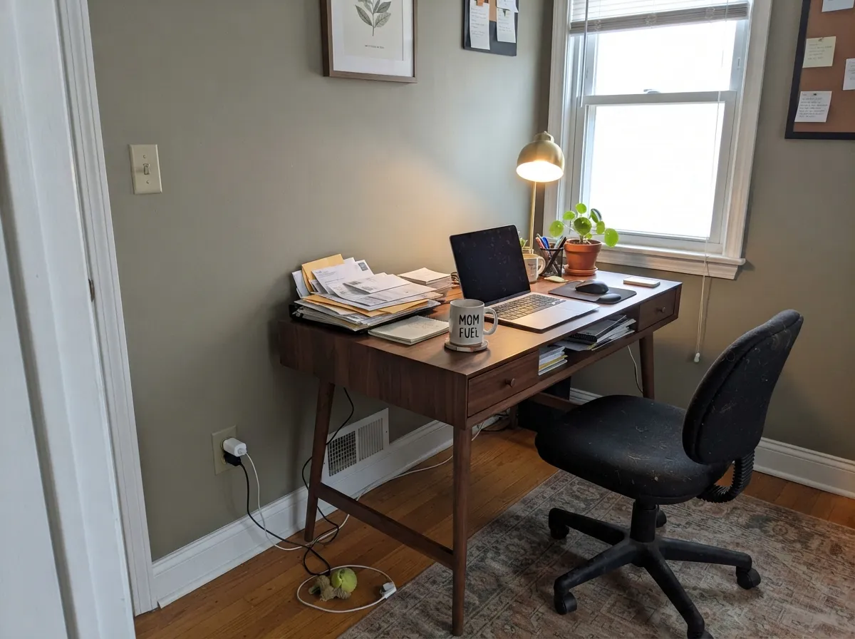
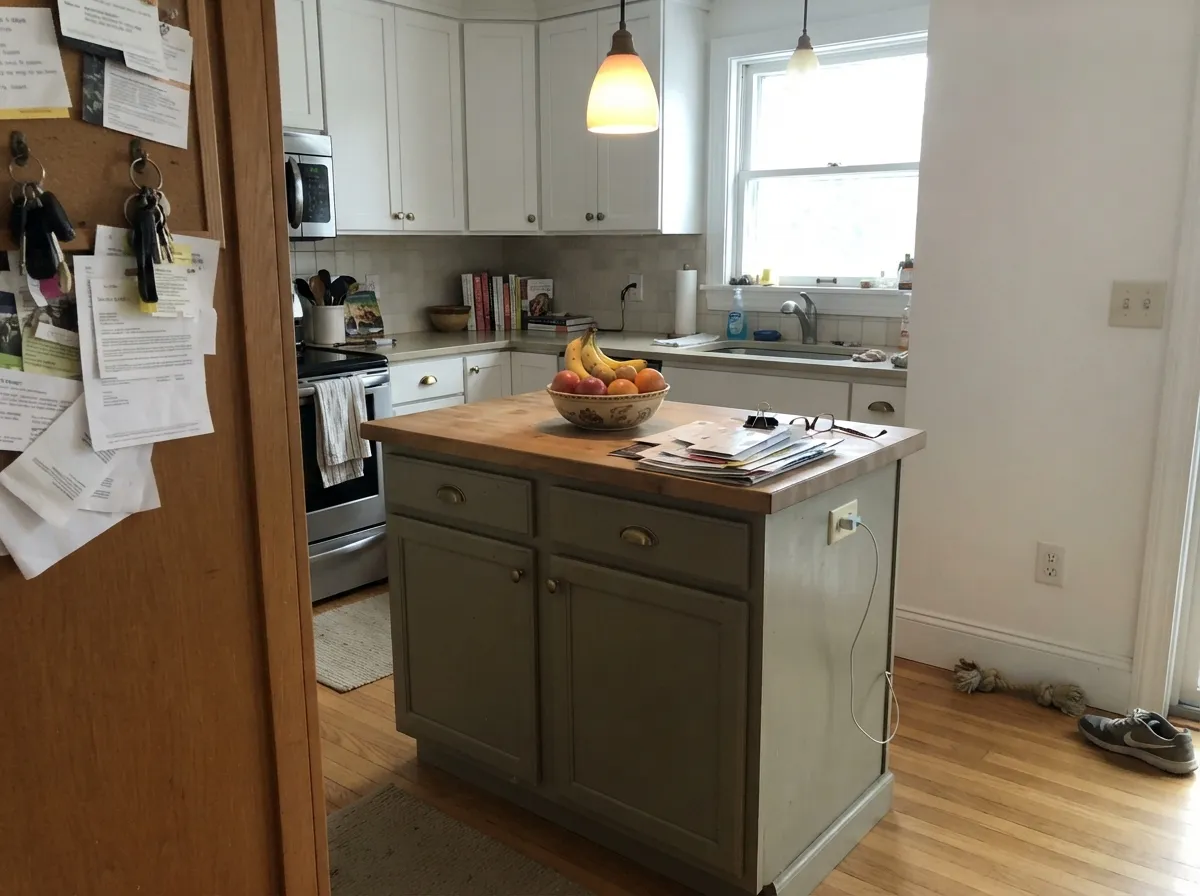
Give it real daylight — morning or late-afternoon warm light especially — and the green comes forward in a way that feels organic instead of decorated. Its clearest home is outdoors: Behr sells the identical color as a wall paint, an exterior body paint, and a fence-and-house stain, which is a real signal about how well it was engineered to read consistently outside, next to brick, stone, and weathered wood. Indoors, it does its best work in rooms that already lean warm — a den with walnut shelves, a home office with brass hardware, a kitchen island under warm pendant light — where the muted green settles in as an easy, earthy neutral rather than a color decision anyone has to defend.
Where It Fails
Almost every disappointed review of Weathered Moss comes down to one of three predictable mismatches, and none of them are really the paint's fault — the color is honest about what it is, the shopper's expectation was the part that was off.
This is the single most common letdown: buyers see "moss" and "foresty" in the name and description and expect a definite sage green on the wall. The chroma is so low that in average room light it can read as plain warm gray with only a faint green whisper. If you want a green that unmistakably reads green, look at a true sage like BM October Mist instead — this color is a neutral first, a green second.
Cool light and no direct sun strip out what little warmth carries the green. Readers describe it going "battleship" or "flat concrete" in these rooms. The fix is warm 2700K bulbs and, ideally, a room that gets some real daylight — this is not a color for a windowless powder room or a cool-lit basement corner.
On siding facing straight west or south, harsh unfiltered midday sun can wash the already-low saturation out almost entirely, leaving the wall reading pale and flat rather than foresty. It comes back warmer and greener in early morning and late-afternoon light. Sample the actual exterior wall at more than one time of day before committing to five gallons.
Room by Room
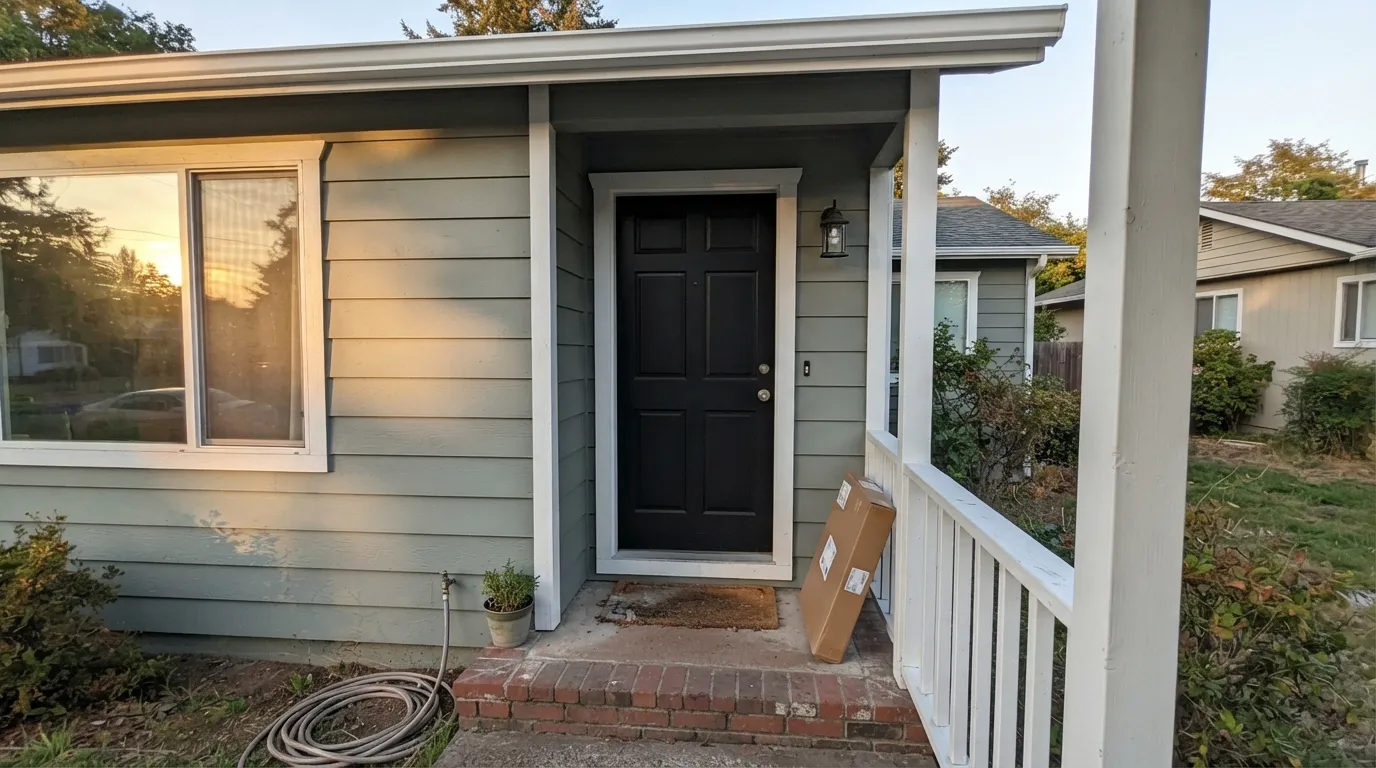
Behr engineers this exact color across its exterior paint lines and as a house-and-fence stain, so it is genuinely built for outdoor durability, not just interior trend appeal. Flat sheen on siding, and it settles beautifully against brick, stone and weathered wood fencing.
A room with a real window and some warm afternoon sun lets the green show up as an easy, grounded backdrop for walnut shelving and brass task lighting. Eggshell for durability where a desk chair scuffs the wall.
As an island or lower-cabinet color under crisp white perimeter cabinets, it reads earthy and current without betting the whole kitchen on green. Satin cabinet enamel; keep the surrounding walls warm, not stark white.
Under 2700K lamplight it turns quietly cozy at night. If the bedroom faces north and stays dim during the day, expect it to read closer to gray than green until the lamps come on.
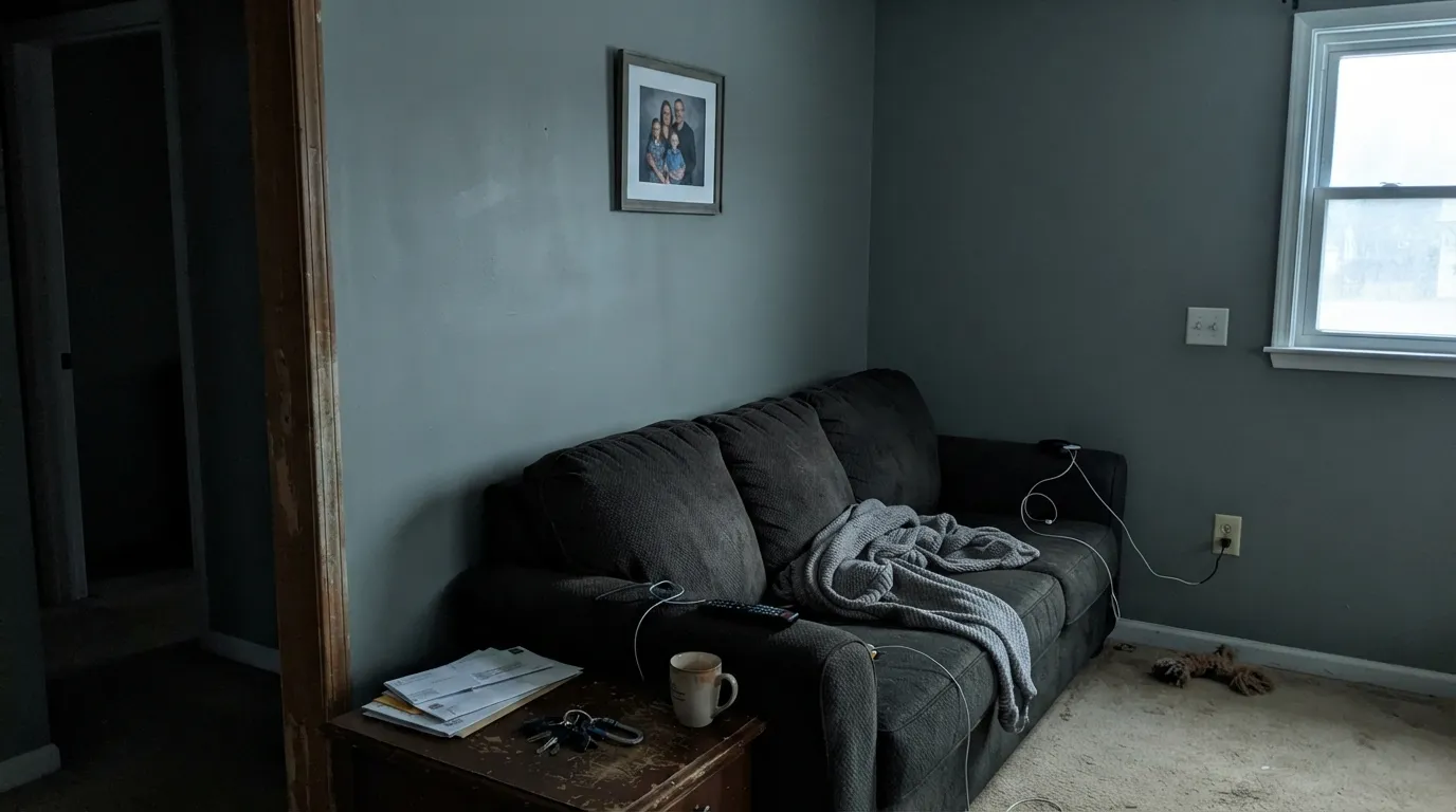
In a bright, south- or west-facing living room it can carry the whole space as a calm, earthy neutral. In a shaded or north-facing living room it tends to disappear into plain gray — sample on the actual wall before committing to a full room.
Most bathrooms are small, artificially lit and short on real daylight — exactly the conditions where this color loses its green. Fine as a vanity color if the room has a window; skip it for a windowless powder room.
Your Light Is the Risk
Direct, warm daylight is what actually pulls the green forward — this is the light the color needs to look like its own name.
Cool, flat daylight strips the color down to a plain warm gray with almost no visible green. Sample before trusting a north room.
On siding, harsh unfiltered noon light can wash it paler and flatter than morning or evening light shows it. It reads deepest and greenest at the edges of the day.
2700K lamps warm it toward a cozy foresty gray-green. Cool white LEDs flatten it back toward plain gray — swap the bulbs before you second-guess the paint.
Most complaints about Weathered Moss are a light mismatch. Upload a photo of your actual room and see it on your walls — then ask for the same wall in north light or evening lamps before you buy a single sample.
Need It From Another Brand?
Any paint counter can custom-tint Behr N380-3 directly. If you would rather stay in one brand's own deck, these are the closest stock matches, measured as ΔE2000. Under 2 is a difference you will not see on the wall.
| Brand | Closest color | ΔE | LRV | |
|---|---|---|---|---|
| Sherwin-Williams | March WindSW 7668 · Sherwin-Williams | 3.0 | 49 | Color page → |
| Benjamin Moore | Gray Horse2140-50 · Benjamin Moore | 1.1 | 49 | Color page → |
| Valspar | Granite Dust5006-1C · Valspar | 0.7 | 48.1 | Color page → |
| PPG / Glidden | SolsticePPG1010-3 · PPG / Glidden | 2.0 | 50 | Color page → |
| Glidden | Fresh GranitePPG0997-3 · Glidden | 2.2 | 49 | Color page → |
| Dutch Boy | Fair-Minded Gray438-3DB · Dutch Boy | 2.0 | 49 | Color page → |
Similar Behr Colors
The nearest shades to Weathered Moss within Behr's own range, ranked by perceptual color distance — useful when you want the same look a touch lighter, darker, or warmer.
WCAG 2.1: AA is 4.5 : 1 for normal text, 3 : 1 for large text, AAA is 7 : 1.
Weathered Moss vs the Colors You're Also Considering
Every Weathered Moss sample board has the same rivals on it. The numbers show the real lightness gap — then it comes down to which risk you would rather live with.
Pick this for the warmer, more grounded, land-not-sea version of a muted green-gray.
Sherwin-Williams SW 6211 · LRV 47RainwashedPick this for a cooler, more watery blue-green with a coastal feel instead of a foresty one.
Pick this for more visible depth and color — Healing Aloe is closer to a tinted white.
Benjamin Moore 1562 · LRV 68Healing AloePick this for a paler, airier green-gray chameleon that still needs real light to show its green.
Inside the Behr deck the gaps are small but readable on a full wall. Tanglewood N320-3 at LRV 57, hex #C2C9B9, is the warmer version, with more yellow and less blue, so it feels closer to sage. Lunar Surface N460-3 at LRV 55, hex #B5C8C3, goes the other way and is more clearly blue-green. Pewter Tray ICC-47 at LRV 55, hex #BDC5C0, is the grayest of the group.
Across brands the matches are unusually tight. Valspar Hearth Frost T635 at LRV 53.8 has a deltaE of 1.1 and Farrow and Ball Teresa's Green No. 236 at LRV 58 a deltaE of 1.47, so both are visually identical in normal room light. Sherwin-Williams Holly Glen SW 9678 at LRV 57 and Benjamin Moore Sylvan Mist CSP-740 at LRV 54 both land near deltaE 2 and behave the same way. Dutch Boy Translucent 231-3DB, at deltaE 3.11, is very close but worth sampling first.
Weathered Moss Coordinating Colors
The rule for coordinating with Weathered Moss: keep everything warm, and let it play a quiet neutral rather than a bold green. It pairs easily with warm whites, warm beiges, near-blacks, and deeper members of its own muted-green family — and it argues with icy, blue-based whites and grays. These are the partners that keep it looking deliberate rather than accidental:
Weathered Moss on Exteriors
This is the color's real home base. Behr doesn't just tint Weathered Moss into its interior lines — it is available across Behr Marquee, Behr Premium Plus and Behr Ultra exterior paints, and separately as a solid-color exterior house-and-fence wood stain. Few colors in any deck get that treatment, and it tells you Behr built this one to hold up outdoors: against brick, natural stone, cedar shakes and weathered fencing, the muted gray-green settles in rather than competing for attention.
The trade-off is the same low chroma that makes it easy to live with indoors: in full, unfiltered midday sun it can wash paler and flatter than the swatch promises, especially on a south- or west-facing wall. It comes back warmer and greener at the edges of the day. Walk the actual house at more than one time before ordering five gallons, and pair it with a warm trim white or a true near-black for shutters and doors rather than an icy bright white, which will make the body color look muddy by comparison.
Weathered Moss With Wood Tones and Floors
Weathered, aged, and reclaimed-feeling wood is this color's best company — walnut, cedar, weathered gray fencing and worn oak all sit comfortably against it because the muted, low-saturation green doesn't fight for attention the way a true sage would. It is a natural pick for a den with walnut shelving or an exterior with cedar shake accents.
The one combination that needs a real sample first is bright, glossy, honey-orange oak flooring or trim — the warm yellow-orange can make the already-quiet green look duller and grayer than it does against a more neutral or darker wood. It is not usually a dealbreaker, but test a large swatch above the actual floor before committing to a full room.
Three Ready Palettes Built on Weathered Moss
A color is never alone on the wall. These are complete combinations in the 60-30-10 pattern, with the reason each one holds together. Every one opens in the visualizer.
This is close to the real Behr sibling-product lineup — Weathered Moss as body, a dependable everyday white for trim, and Behr's most famous near-black for the door. The near-black gives the muted green just enough contrast to read as a deliberate, timeless facade instead of a washed-out gray.
Try this palette in your roomA warm white trim keeps the muted green from tipping cold, and a same-family deep green-blue on built-ins gives the room one real anchor of color instead of asking the walls to carry all of it. Walnut shelving and brass task lighting are its natural company here.
Try this palette in your roomA warm beige wall keeps the kitchen from feeling cold, a crisp-but-not-stark cabinet white stays quiet on the perimeter, and the island carries the one color decision in the room. Brass hardware and butcher block finish it.
Try this palette in your roomWeathered Moss FAQ
Is Weathered Moss a green or a gray?
Officially, Behr files it under its Gray color family, even though the name and marketing describe it as a subtle green. On the wall it behaves like both: a warm gray-green that shows real color in good daylight and reads close to plain gray in flat or cool light. If you want a definite green in every light, this is not that color.
Is it good for exterior siding or a fence?
Yes — this is arguably its best use. Behr sells the same color across its Marquee, Premium Plus and Ultra exterior paint lines and as a solid-color exterior house-and-fence stain, which is a real signal it was built for outdoor durability against brick, stone and weathered wood.
Will it look gray in a north-facing room?
Likely, yes, at least during the day. Cool north light and cool LED bulbs strip out the warmth that carries the green, leaving a flat, plain gray. Warm 2700K lamps at night help, but a genuinely dim north room is not this color's best home.
What trim color goes with Weathered Moss?
A warm white, not a stark icy one — an icy bright white makes the muted green look muddy by comparison. A dependable warm trim white, or a near-black like Behr Cracked Pepper for higher contrast on doors and shutters, both work well.
Is it good for kitchen cabinets or an island?
Yes, especially as an island or lower-cabinet color under a lighter, warmer perimeter. It reads earthy and current in doses without committing the whole kitchen to green. Use a satin cabinet enamel.
Does it change a lot through the day?
More than most muted neutrals. Warm morning and late-afternoon light pulls real green forward; flat midday or overcast light pushes it toward plain gray. On an exterior wall, expect it to look genuinely different at 9am versus noon versus 6pm — worth sampling at more than one time of day.
Have you painted with Weathered Moss?
Rate it — one tap helps the next reader decide.
Ask a Question