Wallflower
SW's palest purple, reviewed honestly: the light that turns it rosy, the light that flattens it to gray-lilac, and where it actually earns its keep.

Jessica has spec'd whites and neutrals for more than 300 rooms and keeps a sample wall of painted drawdowns in her studio. Every color review is checked against real reader rooms in the comments and re-tested when a formula changes. About the testing process →
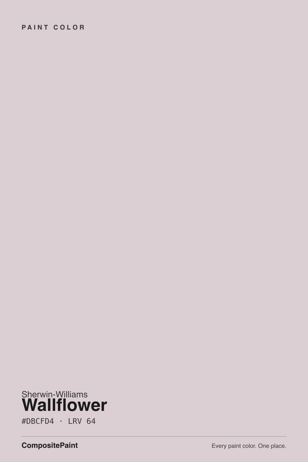
- 1Wisteria48
- 2French Lilac56
- 3Wallflower64
- 4Inspired Lilac71
- 5White Lavender76
The Fast Verdict
Wallflower is a pastel purple that Sherwin-Williams files exactly where it belongs — under Purple Paint Colors, not dressed up as a greige. At LRV 64 it is light enough to feel like an easy neutral from across the room, but stand next to it and the dusty lavender is unmistakable. Warm light pulls it rosy and soft; cool light flattens it toward gray-lilac. Buy it for the color, not as a shortcut to gray.
Nurseries and kids' rooms that want color without going bold · powder rooms · primary bedrooms with real daylight or warm lamps · anyone who wants "a color" that still reads calm
You actually want a warm greige · your room is dim, north-facing, and lit by cool LEDs · your trim and floor are strong honey oak · you're chasing zero purple risk
- A genuine pastel purple that never tips candy or juvenile
- Warms into a soft rosy-mauve under lamp light and warm daylight
- LRV 64 keeps it light enough for nurseries and small rooms
- Reads sophisticated and unisex rather than "little girl's room"
- Sherwin-Williams is upfront about the undertone — no undertone surprise
- Goes flat, cold lilac-gray under cool LEDs or in a dim north room
- Not a greige no matter how neutral the chip looks in a photo
- Fights strong honey-oak or golden-orange trim
- More repaint risk than a true neutral if you tire of the purple
What Color Is Wallflower, Really?
A pastel violet with a soft gray base and a whisper of pink warmth — and unlike most dusty-mauve colors that get marketed as "greige with a twist," Sherwin-Williams puts Wallflower on its own site in the Purple Paint Colors family. That honesty is the useful data point: this is not a neutral wearing a disguise. It sits in the same SW strip as Mauve Finery (one step darker, SW 6282) and Thistle, part of a small run of pastel purples the brand has quietly kept in the deck for softer bedrooms and powder rooms rather than showrooms.
At LRV 64 it reflects a good amount of light, which is why it photographs like an easy neutral in a listing photo. Live with it and the purple shows its body: put it next to a warm white like Ibis White (LRV 84) and Wallflower reads unmistakably lavender by comparison. It is light enough not to close in a small room, but it is not the palest, safest whisper-of-color choice — it commits more than a true greige does.
Undertone in one line: cool violet-gray at rest, with a rosy flicker under warm light. Incandescent bulbs and afternoon south or west sun pull the pink forward; cool daylight or cool-white LEDs push it back toward a flatter gray-lilac. Neither read is wrong — it is the same paint responding honestly to two different lights.
Where It Shines
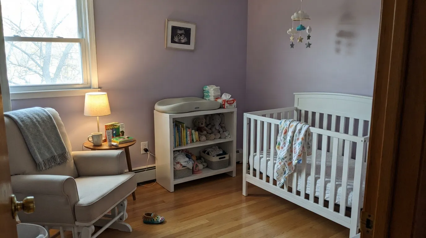
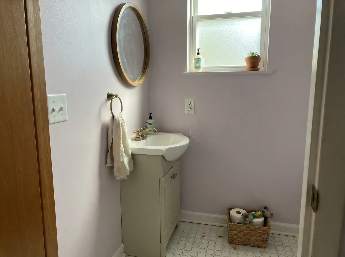
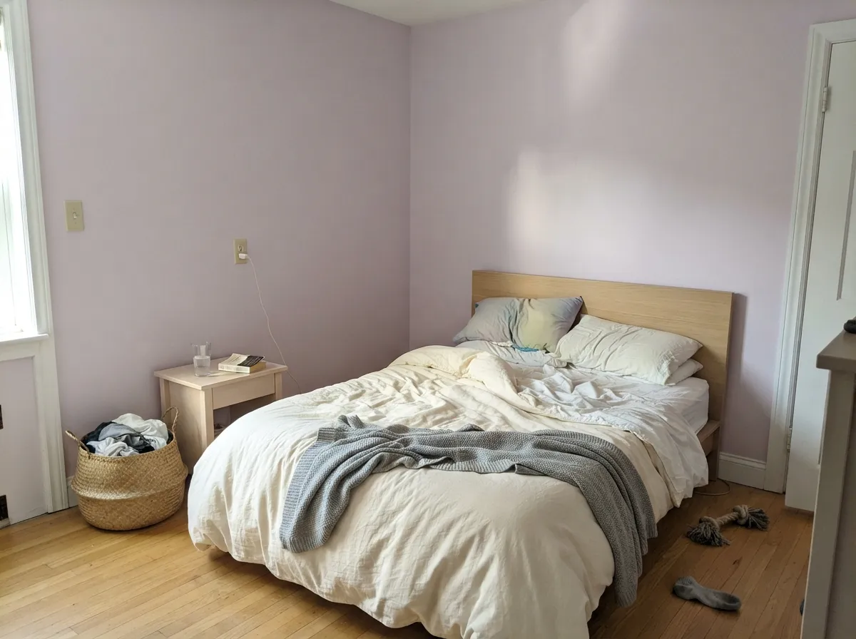
Give it a room with real daylight or warm lamps and Wallflower earns the compliment "is that gray or is that purple?" — the exact ambiguity that makes it work for people who want color but not commitment. It is a natural in nurseries and kids' rooms because it reads soft and unisex rather than candy-pink or lilac-loud, and in a small powder room or vanity nook it turns genuinely pretty without needing a whole-house bet. Pair it with warm whites, brass, pale wood and it looks intentional rather than accidental.
Where It Fails
Almost every disappointed review of Wallflower traces back to one of three situations, and all three are predictable before the first coat goes on. None of them are the paint's fault — but if your room matches one, this is not your color, and a bigger sample will only confirm it.
Wallflower photographs like a soft neutral, but Sherwin-Williams itself classifies it as purple, and on four walls the violet is obvious, especially past sample-chip size. If "neutral with maybe a hint of something" is the goal, this has too much personality — Light French Gray only flashes violet in cool light; Wallflower lives there.
Yellow-orange sits opposite violet on the color wheel, so golden oak floors or builder-orange trim pull against Wallflower's cool base — the wall can read a little chalky and the wood a little more orange. It is milder here than on a deep mauve because Wallflower is so light, but pale white oak, walnut or gray-washed floors are the safer match.
Cold light cancels the pink and leaves a flat, slightly cold lilac-gray that some readers will call "dingy" rather than "soft." The cheap fix is warm 2700K bulbs — this paint job assumes lamp light. If the room is dim and staying that way, pick a color that does not need warmth to look finished.
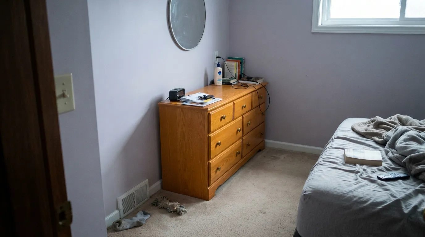
Room by Room
Soft enough to read gender-neutral, calm enough for a nursery, and not so pale it disappears. Eggshell wipes clean; warm 2700K bulbs keep it cozy for late-night feedings instead of clinical.
With daylight or lamps it settles into a quiet dusty-lavender that reads sophisticated rather than themed. White Dove or Ibis White trim keeps the room from feeling closed in; skip it if the room is dim and north-only.
Small rooms take a pastel color well, and Wallflower on all four walls with brass hardware and a marble or white vanity top looks custom without the risk of a full-house commitment.
Lovely in a closed room with warm light and wood furniture. Trickier in an open floor plan, where it has to hold its own against kitchen wood tones and whatever the adjacent rooms wear — Pashmina next door is a safe, purple-free handoff.
With warm-toned tile, wood vanities and brass it is genuinely pretty. Against cool gray or blue-gray tile the two coolnesses stack up and the room can read a little flat — sample big before committing.
Full outdoor sun and weather grey it out fast, and a pastel violet on siding reads more like discoloration than a design choice. This is strictly an interior color.
Your Light Is the Risk
Warm sun pulls the pink forward and the wall reads soft dusty mauve, not gray. This is the light to sample it in.
Cool, flat daylight strips the warmth and leaves a colder, grayer violet. Fine if you half-wanted gray; disappointing if you wanted the rosy version.
East-facing rooms get a bright, coolish morning read; by late afternoon in a west room the same wall looks noticeably warmer and pinker.
2700K warm bulbs bring the dusty rose forward and the room feels intimate. Cool-white LEDs flatten it back toward gray — swap the bulb before you swap the paint.
Most complaints about Wallflower are a light mismatch. Upload a photo of your actual room and see it on your walls — then ask for the same wall in north light or evening lamps before you buy a single sample.
Need It From Another Brand?
Any paint counter can custom-tint Sherwin-Williams SW 6281 directly. If you would rather stay in one brand's own deck, these are the closest stock matches, measured as ΔE2000. Under 2 is a difference you will not see on the wall.
| Brand | Closest color | ΔE | LRV | |
|---|---|---|---|---|
| Behr | Mauve MorningUL250-11 · Behr | 2.5 | 64 | Color page → |
| Benjamin Moore | New Age1444 · Benjamin Moore | 2.1 | 63 | Color page → |
| Valspar | Lilac Lace1003-8C · Valspar | 3.4 | 62.5 | Color page → |
| PPG / Glidden | BalancedPPG1003-2 · PPG / Glidden | 3.9 | 65 | Color page → |
| Glidden | Executive Taupe70RR 64/034 · Glidden | 1.4 | 64 | Color page → |
| Dutch Boy | Milky Quartz346-2DB · Dutch Boy | 0.0 | 64 | Color page → |
Similar Sherwin-Williams Colors
The nearest shades to Wallflower within Sherwin-Williams's own range, ranked by perceptual color distance — useful when you want the same look a touch lighter, darker, or warmer.
WCAG 2.1: AA is 4.5 : 1 for normal text, 3 : 1 for large text, AAA is 7 : 1.
Wallflower vs the Colors You're Also Considering
Every Wallflower sample board has the same rivals on it. The numbers show the real lightness gap — then it comes down to which risk you would rather live with.
Pick this for the lighter, quieter version of the same pastel-purple idea.
Sherwin-Williams SW 6282 · LRV 51Mauve FineryPick this if you want more color and more commitment — it's Wallflower's next-door neighbor in the SW deck, one step darker and more saturated.
Pick this when the violet is the point, not an accident you're trying to avoid.
Sherwin-Williams SW 55 · LRV 53Light French GrayPick this if you actually want gray — it only flashes violet in cool light; Wallflower lives there on purpose.
Wallflower Coordinating Colors
The rule for coordinating with Wallflower: warm whites and warm-leaning neutrals soften the handoff, while a single dark note keeps the room from feeling too pastel. It layers naturally with its own deeper sibling and with cool-adjacent grays that share the same violet lean. These are the partners that keep showing up in rooms that work:
The One Purple That Doesn't Pretend Otherwise
Most pastel violets on the market get sold under softer names — "greige with a twist," "warm gray" — because purple has a harder time selling than gray does. Wallflower is the exception: Sherwin-Williams lists it plainly in its Purple Paint Colors family, alongside Mauve Finery one step darker and Thistle a shade brighter, part of a small run of dusty pastel purples the brand has carried for years rather than chasing a single color-of-the-year moment.
That honesty matters for how you should shop it. Colors that hide their undertone tend to surprise buyers on the wall; Wallflower does not — what the name and the color family promise is what shows up in the room, at least once real light hits it. If you are drawn to it because it looks like a soft neutral in a listing photo, know what you are actually buying before the first gallon goes on the wall.
Wallflower With Wood Tones and Floors
Pale white oak, walnut, and gray-washed floors are the safest company — the cool violet base sits comfortably next to any wood that isn't fighting for warmth. Cerused or whitewashed oak looks especially calm against it, which is part of why it shows up so often in nurseries and light-filled primary bedrooms.
Strong honey-oak floors or orange-toned trim are the one genuine clash. Yellow-orange sits opposite violet on the color wheel, so builder-grade golden oak can look a touch more orange next to Wallflower, and the wall can look a touch chalkier next to the wood. It is a milder version of the problem deeper mauves have, simply because Wallflower carries so much less saturation — but a large sample above the actual floor is still the right move before committing a whole room.
Three Ready Palettes Built on Wallflower
A color is never alone on the wall. These are complete combinations in the 60-30-10 pattern, with the reason each one holds together. Every one opens in the visualizer.
Ibis White already carries a blush undertone of its own, so the trim handoff from Wallflower is seamless instead of stark. One black door keeps the room from feeling too sweet — modern-nursery, not gothic.
Try this palette in your roomTonal purple layering is what keeps this from reading themed: two depths of the same SW strip, separated by a warm ceiling white. Brass hardware and a marble top finish the argument.
Try this palette in your roomPeppercorn gives the room one grounded dark note so Wallflower reads deliberate rather than pastel-by-accident, while Pure White trim keeps the overall room bright enough for daily use.
Try this palette in your roomWallflower FAQ
Is Wallflower purple or gray?
Purple — Sherwin-Williams files it that way on its own site, and in real rooms the violet is visible, especially past a small chip. In cool light it leans grayer and can pass for a muted neutral, but it is not a true greige and buyers expecting one are usually the disappointed reviews.
Is it good for a nursery?
Yes — it's one of its best uses. LRV 64 keeps it light, the undertone reads calm and unisex rather than sweet-pink, and it holds up under both daylight and warm nursery lamp light. Eggshell for easy cleanup.
What trim white goes with Wallflower?
A warm white works better than a stark cool one — Ibis White (which carries its own blush undertone) or Pure White both keep the handoff soft. A very cold, blue-white trim can make Wallflower's gray side look flat by comparison.
Does it work in a north-facing room?
It can, but expect a cooler, flatter read than the chip promises — the pink largely disappears without warm light. If the room is dim and you're not adding lamps, sample big before committing; a slightly warmer, more saturated cousin like Mauve Finery may hold up better.
What's the difference between Wallflower and Mauve Finery?
They're neighbors in the same SW strip — Wallflower (SW 6281) is the lighter, quieter one at LRV 64; Mauve Finery (SW 6282) is one step down in LRV and noticeably more saturated. Pick Wallflower for a background color, Mauve Finery when you want the purple to be the point.
Does it work with oak floors?
Pale white oak, walnut and gray-washed floors are all safe. Strong honey-oak or orange-toned trim is the one real clash — yellow-orange sits opposite violet on the color wheel, so the two exaggerate each other. It's milder here than on a deeper mauve because Wallflower is so light, but still worth a large sample if your floor runs golden.
Have you painted with Wallflower?
Rate it — one tap helps the next reader decide.
Ask a Question