Reflection
SW's light gray-blue, reviewed honestly: the light that keeps it a calm gray, the light that turns it blue, and what to pick instead.

Jessica has spec'd whites and neutrals for more than 300 rooms and keeps a sample wall of painted drawdowns in her studio. Every color review is checked against real reader rooms in the comments and re-tested when a formula changes. About the testing process →
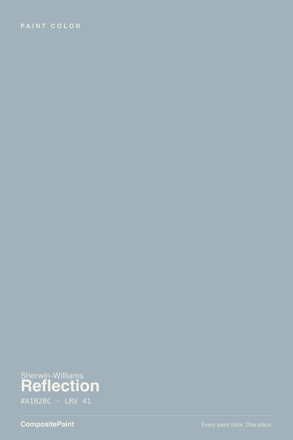
- 1Stardew43
- 2Palladian Blue60
- 3Reflection66
- 4Drizzle71
- 5Spring Thaw83
The Fast Verdict
Reflection is a genuinely light, genuinely cool gray — LRV 66, built on a blue-green undertone instead of the usual warm greige base. In a bright room with crisp white trim it is quiet, calm, almost architectural.
The catch is the same thing that makes it interesting: it does not hold one identity across every light. Give it daylight and it settles into soft gray; give it a north window or cool LEDs and the blue steps forward. Buy it knowing which room you have.
Bright bedrooms and home offices · bathrooms and powder rooms going for a spa-cool look · pairing with crisp white trim and cool metals (chrome, nickel, black iron) · anyone who wants gray with a deliberate cool edge, not another warm greige
You want a warm, camera-ready greige · your room is north-facing and dim · your floors or trim lean honey-orange · you're painting a full-sun exterior and need the color to hold steady
- Genuinely light (LRV 66) without reading stark or clinical
- Calm, cool, spa-like — pairs beautifully with crisp white trim
- Plays well with cool metals: chrome, brushed nickel, matte black
- Warm 2700K bulbs tame the blue and keep it livable at night
- One of the lighter, more consistently cool grays in the SW deck
- The single most common complaint: reads distinctly blue in north light
- Cool LEDs push it further toward blue and cold
- Clashes with honey-orange wood and heavy warm brass
- Not a dependable full-sun exterior color — can wash out
What Color Is Reflection, Really?
Reflection is built on a cool blue-green undertone, not the warm yellow-grey base most "safe gray" colors use. Sherwin-Williams files it in its Neutral family, but in person it reads closer to the gray-blue camp — the paint blogs that cover it almost universally title the piece some version of "gray or blue?" because the honest answer is both, depending on the room. That dependency is the whole story with this color: it is not a color with one fixed personality, it is a color that answers the light it is given.
At LRV 66 it is a genuinely light color — brighter than a mid-tone greige like Agreeable Gray, closer in weight to a pale, airy neutral. Its nearest cousin across brands is Benjamin Moore's Gray Owl, which lands at almost the identical hex and LRV; if you love Reflection but your painter only carries BM, that is the swap. On the wall it opens a room up rather than weighing it down, which is why it shows up so often in bedrooms and bathrooms that want calm without going stark white.
Undertone in one line: cool, blue-green first — never warm, never a true flat neutral. If your sample reads distinctly blue, that is north light or cool LED bulbs doing their job, not a defect in the paint; warm 2700K light and bright daylight both pull it back toward soft gray.
Where It Shines
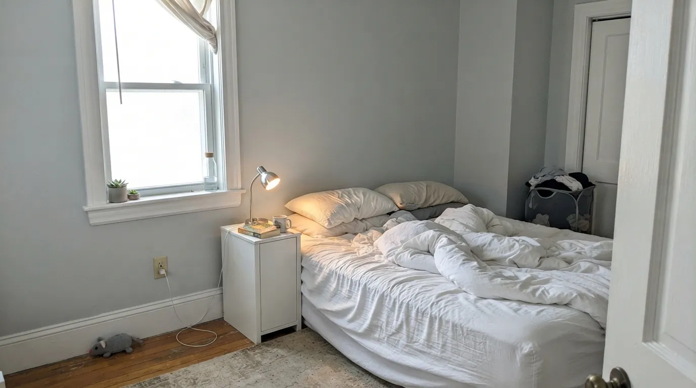
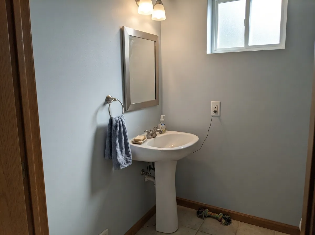
Give it real daylight — south or east, nothing shaded — and a crisp white trim, and Reflection is close to unbeatable: calm, cool, quietly expensive-looking. It is especially good in rooms built around cool metals and cool-toned stone, where a warm greige would fight the room instead of finishing it. Bathrooms and powder rooms are its natural habitat — chrome or brushed-nickel fixtures and white or gray-veined tile read as a single cool, spa-like palette with almost no effort.
Where It Fails
Nearly every mixed review of Reflection comes back to the same question its own reviewers keep asking: gray, or blue? All three of the real failure modes below trace back to that same undertone doing exactly what undertones do — showing up more in the wrong light or the wrong company. None of them are the paint being defective; they are the paint being honest about a cool color in a room that does not support it.
Cool light amplifies a cool undertone — it is the most predictable rule in paint, and Reflection follows it exactly. In a north room or under 4000K+ LEDs the blue-green steps forward and some owners feel like they bought a light blue paint by accident. The color did not shift; the light removed the warmth that was balancing it. Fix it with 2700K bulbs, or pick a room with better daylight.
Sherwin-Williams itself steers this one toward interiors — in strong, direct sun it can wash out and lose the soft undertone that makes it work indoors. If you want the same family of color on a facade, test a large exterior sample in full afternoon sun before committing a whole house to it.
Cool and warm undertones read as contrast, not harmony, when there's a lot of each in one room. Orange-leaning honey oak floors or a room full of warm brass will make Reflection's blue look colder than intended, and the wood will look more orange in return. A little brass is fine as an accent; a room built entirely around warm wood needs a warmer gray, like Repose Gray.
Room by Room
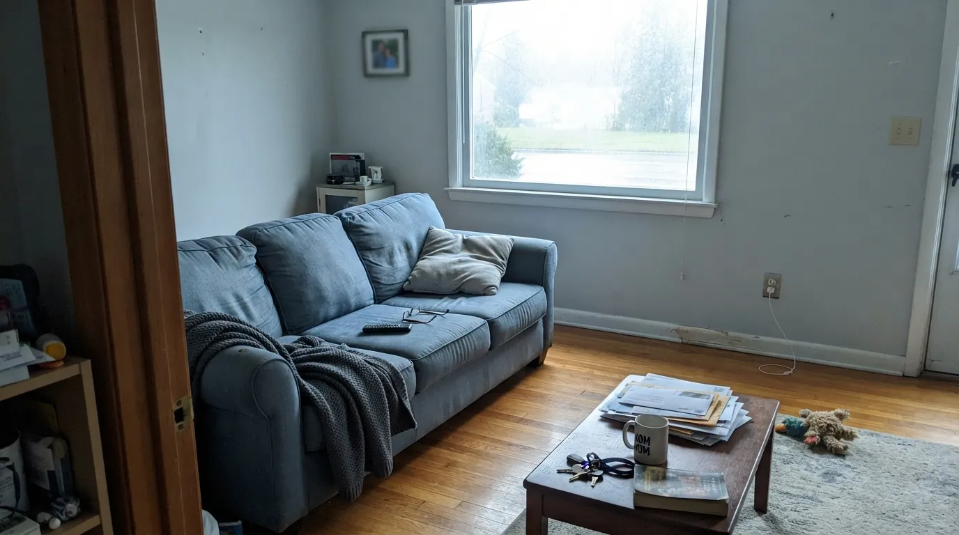
In a bright room it is a calm, current backdrop for linen, cool-toned rugs and black or nickel hardware. Eggshell on the walls; keep the trim a crisp white rather than a warm one.
Calm and quiet by day, and warm 2700K lamps at night keep it from ever reading cold. This is the room Reflection gets recommended for most, and it earns it.
Chrome or brushed-nickel fixtures and white or gray-veined tile share its cool language almost perfectly. Satin or semi-gloss for the moisture; it is one of the deck's better spa-look grays.
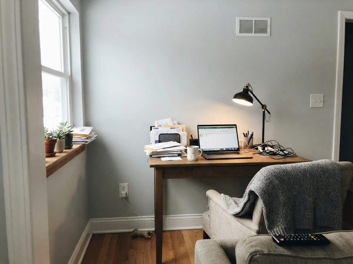
Cool and calm reads focused rather than sleepy. Skip it if the office is the one north-facing room in the house — that is exactly the combination that pushes it blue.
Carried on crisp white trim it flows room to room cleanly. Next to a room full of honey-toned wood the cool-warm handoff can feel slightly at odds; a warmer gray like Repose Gray in the adjoining room smooths that seam.
Sherwin-Williams positions this primarily as an interior color, and full sun can wash it out. If you want a similar cool gray-blue outside, sample big swatches in real afternoon sun before you commit.
Your Light Is the Risk
Real daylight keeps it a soft, calm cool gray without tipping too far blue. The most flattering, most predictable light for this color.
Cool, shadowless daylight has nothing to balance the blue-green undertone, and it steps forward. Sample here first if this is your room.
Softer and grayer at sunrise and sunset, clearer and cooler at midday. The shift is gentle, not a different paint.
2700K warm bulbs mute the blue into a plain soft gray. Cool white LEDs do the opposite — swap the bulbs before you blame the paint.
Most complaints about Reflection are a light mismatch. Upload a photo of your actual room and see it on your walls — then ask for the same wall in north light or evening lamps before you buy a single sample.
Need It From Another Brand?
Any paint counter can custom-tint Sherwin-Williams SW 7661 directly. If you would rather stay in one brand's own deck, these are the closest stock matches, measured as ΔE2000. Under 2 is a difference you will not see on the wall.
| Brand | Closest color | ΔE | LRV | |
|---|---|---|---|---|
| Behr | EvaporationN450-1 · Behr | 1.0 | 66 | Color page → |
| Benjamin Moore | WhisperCSP-500 · Benjamin Moore | 1.6 | 66 | Color page → |
| Valspar | Polar Star4005-1A · Valspar | 0.6 | 67.1 | Color page → |
| PPG / Glidden | Wright Cloud WhiteFLLW961 · PPG / Glidden | 0.6 | 65 | Color page → |
| Glidden | Afraid Of The DarkPPG0994-1 · Glidden | 2.0 | 66 | Color page → |
| Dutch Boy | Pond Ice426-1DB · Dutch Boy | 4.0 | 67 | Color page → |
Similar Sherwin-Williams Colors
The nearest shades to Reflection within Sherwin-Williams's own range, ranked by perceptual color distance — useful when you want the same look a touch lighter, darker, or warmer.
WCAG 2.1: AA is 4.5 : 1 for normal text, 3 : 1 for large text, AAA is 7 : 1.
Reflection vs the Colors You're Also Considering
Every Reflection sample board has the same rivals on it. The numbers show the real lightness gap — then it comes down to which risk you would rather live with.
Pick this for the Sherwin-Williams version if that is the brand your store carries.
Benjamin Moore OC-52 · LRV 65Gray OwlPick this if your painter works in Benjamin Moore — nearly the same hex and LRV, with its own light-dependent streak.
Pick this for the lighter, airier version — Reflection sits closer to a pale neutral.
Sherwin-Williams SW 7064 · LRV 60PassivePick this if you want a truer, slightly deeper cool gray with less blue drift in bad light.
Reflection Coordinating Colors
The rule for coordinating with Reflection is the mirror image of a warm-greige color: stay cool. Crisp whites, other cool grays, and deep blue-leaning darks all sit comfortably next to it; warm creams and orange-leaning wood need a lighter hand. These are the partners that show up again and again:
Reflection on Exteriors
Reflection is one of the SW colors that behaves better indoors than out, and it is worth saying plainly rather than burying it in a footnote. Sherwin-Williams itself frames it as an interior color first, and the reason shows up on a facade: strong, direct sun can wash the soft blue-green undertone out entirely, leaving a flatter, chalkier gray than the swatch promised.
That does not make it unusable outside — it means the homework matters more. Paint a large sample board and check it in full afternoon sun, in shade, and near dusk before committing a whole exterior to it. If the test board disappoints, a deeper or warmer gray will generally hold its identity in full sun more reliably than this particular light, cool one.
Reflection With Wood Tones and Metals
Metals are the easy call: chrome, brushed nickel, and matte black all sit naturally with Reflection's cool undertone, which is a big part of why it does so well in bathrooms. Warm brass works too, in moderation — a single fixture reads as a nice temperature contrast, a whole room of it starts to fight the wall color.
Wood is where the room needs planning. Whitewashed oak, gray-washed floors, and walnut all get along with it fine. Honey oak and other orange-leaning wood are the genuine mismatch — the cool wall makes the warm floor look more orange, and the warm floor makes the wall look more blue, and neither side wins. If the floor is staying and it's golden, a warmer gray like Repose Gray will cause far fewer arguments.
Three Ready Palettes Built on Reflection
A color is never alone on the wall. These are complete combinations in the 60-30-10 pattern, with the reason each one holds together. Every one opens in the visualizer.
Naval and Reflection share the same cool family, so one deep navy wall reads as a deliberate depth note instead of a clash. Pure White trim keeps the whole room bright and current.
Try this palette in your roomGale Force's green-leaning navy is close enough in temperature to Reflection's blue-green undertone that the vanity reads as the same story, one shade darker. Alabaster keeps the small room from feeling closed in.
Try this palette in your roomReflection carries the bright, cool rooms; Repose Gray steps in wherever honey wood or warm light takes over, so the handoff between rooms never feels like a mismatch. One trim white ties the whole house together.
Try this palette in your roomReflection FAQ
Is Reflection gray or blue?
Both, depending on the room — that is the color's defining trait, not a flaw. In bright daylight or under warm 2700K bulbs it settles into a soft cool gray. In a north-facing room or under cool LEDs the blue-green undertone comes forward and it reads as a light blue-gray. Sample it in your actual room before deciding.
What is Reflection's LRV?
66. That makes it a genuinely light color — brighter and airier than a mid-tone greige like Agreeable Gray, closer in weight to a pale neutral. It opens up a room rather than adding visual weight.
What trim white goes with Reflection?
A crisp, cool white — Pure White or Alabaster, both in the SW deck, work well in semi-gloss. Avoid a warm cream trim; the temperature mismatch is more noticeable against a cool wall color than a warm one.
Does it work with honey oak floors?
Not its strongest match. Honey oak leans orange, Reflection leans blue-green, and heavy amounts of both in one room read as contrast rather than harmony. A little warm wood as an accent is fine; a room built entirely around golden oak does better with a warmer gray like Repose Gray.
Is it good for a north-facing room?
Test it first. North light is cool and shadowless, and it has nothing to balance Reflection's blue-green undertone, so the color reads more distinctly blue than it does in a sunnier room. If the room is dim and north-facing, a warmer greige will behave more predictably.
Can I use Reflection outside?
Sherwin-Williams positions it mainly as an interior color, and full, direct sun can wash out the soft undertone that makes it work indoors. If you want this family of color on an exterior, test a large sample in real afternoon sun before committing the whole house.
Have you painted with Reflection?
Rate it — one tap helps the next reader decide.
Ask a Question