Ice Cube
An unglamorous cool white reviewed honestly: the room it's actually built for, the flash of blue owners keep worrying about, and what to pick instead.

Jessica has spec'd whites and neutrals for more than 300 rooms and keeps a sample wall of painted drawdowns in her studio. Every color review is checked against real reader rooms in the comments and re-tested when a formula changes. About the testing process →
- 1Heirloom Shade63
- 2First Star69
- 3Ice Cube77
- 4Alabaster82
- 5Chantilly Lace91
The Fast Verdict
Ice Cube is one of the least-hyped whites in the Sherwin-Williams deck, and that turns out to be the honest read on it: a genuinely cool, near-neutral LRV 77 that reads crisp on the paper chip and then spends its life on a real wall deciding what it actually is — pale gray, a whisper of green, or the flash of blue more than one nervous homeowner has posted about before painting. It has no Color of the Year story and almost no design-blog following. What it has is a quiet, competent job in bathrooms and kitchens with steady daylight and cool materials — and a real habit of disappointing anyone who wanted a fixed, predictable white.
Bathrooms and vanities with chrome or marble · kitchens going for a cool, modern look · minimalist bedrooms with steady daylight · pairing with navy or charcoal for contrast
You want a guaranteed, unwavering white · the room runs on warm 2700K bulbs with little daylight · you have honey oak or amber wood that isn't going anywhere · you need certainty more than character
- About as close to true neutral gray as a "white" gets — pairs easily with true grays and blues
- LRV 77 keeps rooms bright without the glare of a stark white
- Flatters cool materials: marble, chrome, brushed nickel, white oak
- Reads clean and modern with steady daylight, without going sterile
- Quiet enough to run on walls, trim, and ceiling together without feeling cold
- Can flash pale blue or settle into flat gray depending on the light — genuinely unpredictable if you need one fixed color
- Goes dull and slightly greenish under warm-only bulbs with no daylight
- Fights honey oak, amber-stained wood, and warm beige carpet
- Almost no design-blog or Color of the Year track record to check your instincts against
What Color Is Ice Cube, Really?
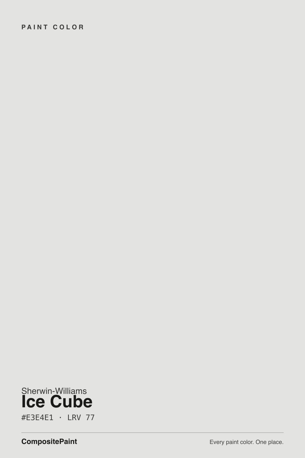
Ice Cube is about as close to true gray as a color still marketed as "white" gets. Its RGB channels sit within three points of each other — 227, 228, 225 — which is a technical way of saying almost no single color dominates. The green channel edges out red and blue by the smallest margin, so the honest math calls it a whisper-green neutral, not the "icy blue" some paint blogs advertise. Most people never consciously clock the green; they just feel the white is cooler and quieter than a cream white, without being able to say exactly why. It sits in Sherwin-Williams' white and cool-neutral family alongside names like Passive, Online, and Snow Leopard — siblings that lean the same direction.
At LRV 77 it reflects most of the light hitting it and reads bright, but it is not a stark white — put it next to Extra White (LRV 86) and Ice Cube visibly steps back. That gap is exactly where its usefulness and its risk both live. On a wall with real daylight it holds a clean, quiet cool tone that flatters marble and chrome without going sterile. Take the daylight away and the same wall can slide toward flat, slightly greenish gray — the color has almost no warm reserve to fall back on.
Undertone in one line: cool and close to neutral, technically green-leaning by the numbers, but visually a real chameleon — in cold light or against cool floors it can flash pale blue, which is precisely the worry a homeowner posted on Houzz before ever picking up a brush. It is never pink, never yellow; the only real question is how far toward gray or blue your specific room pushes it.
Where It Shines
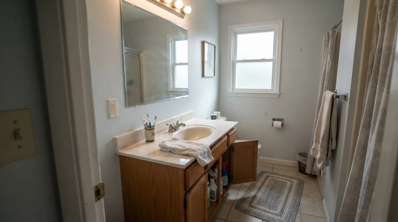
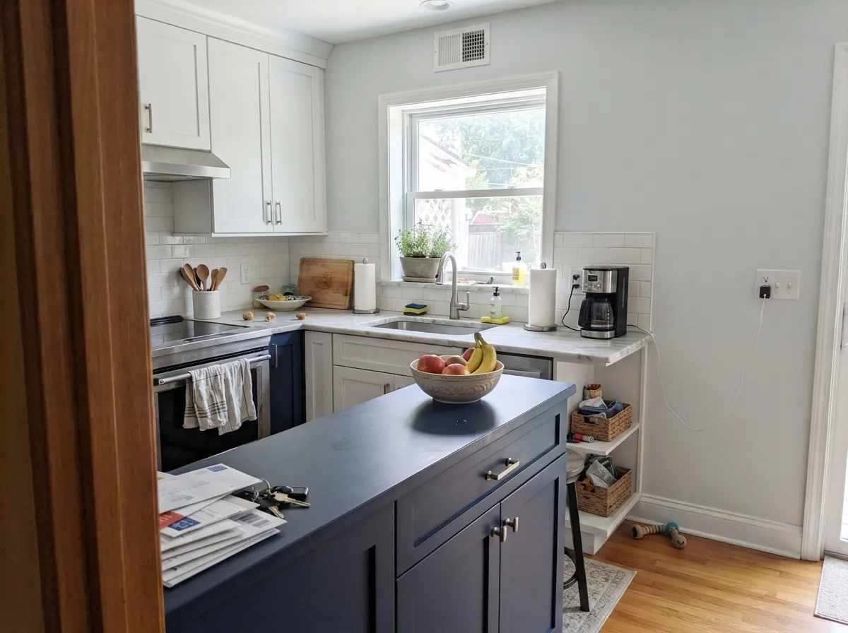
Give it steady daylight and cool company — marble, chrome, brushed nickel, white oak — and Ice Cube earns its name: a clean, quiet, modern cool white that doesn't shout. Bathrooms are its best room by a wide margin; it turns up again and again in vanity and spa-bathroom searches because it reads calm without going cold. Kitchens are its second home, especially against navy or charcoal cabinetry, where the contrast gives the pale wall a job to do instead of just sitting there being pale.
Where It Fails
Almost every regret story about Ice Cube comes down to one of three mismatches, and all three are predictable before the first coat goes on. None of them are a flaw in the paint — but if your room matches one, sampling a bigger swatch will only confirm the problem, not fix it.
On the chip and under bright store lighting it reads crisp and clean. On four walls in ordinary daylight it can shift toward gray, and in colder light it can flash a pale, chalky blue — the exact worry a homeowner posted on Houzz before committing, after swatching it next to Alabaster and seeing "the slightest grey tinge." If you need one fixed, unwavering white, this color will not give you that certainty.
Warm whites get creamier and cozier under warm lamps at night. Ice Cube has no warmth in reserve to fall back on, so the same lamps just mute its cool edge into a flat, slightly greenish gray. A north-facing room with no south or east window and only warm bulbs is close to the worst-case setup for this paint.
Warm orange-leaning wood and a cool near-neutral wall argue with each other: the floor reads more orange next to the cool wall, and the wall reads dingier next to the warm floor. Walnut, espresso, and pale or gray-washed white oak all sit comfortably with Ice Cube; honey oak does not.
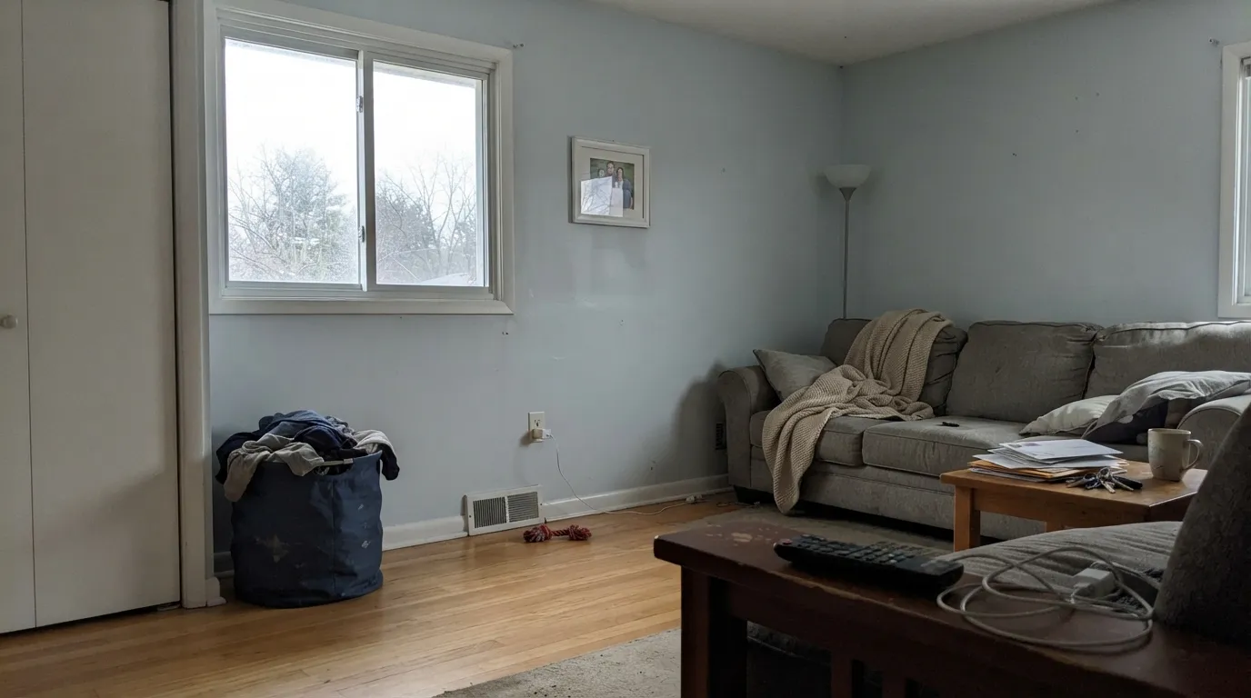
Room by Room
With chrome or brushed-nickel fixtures and any real daylight, this is where Ice Cube stops being ambiguous and starts looking deliberate — clean, spa-like, quietly modern. Satin on vanities wipes clean and resists the water spots a flatter finish would show.
Against navy or charcoal cabinets, or with marble and chrome hardware, it reads as a confident cool backdrop rather than an accident. It is less convincing as the only color in a kitchen with warm wood cabinetry — the cool wall and warm cabinets end up negotiating instead of agreeing.
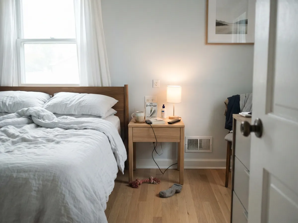
A genuinely calm, minimalist choice with steady daylight and cool bedding. In a dim, north-facing bedroom running on lamps alone, it drifts toward the flat gray this review keeps warning about — step up to a warmer white instead.
Works well with cool stone, glass, black metal accents, and steady light. In a room full of warm wood furniture and beige carpet, it will look like the odd piece out rather than the backdrop.
As a trim white under a mid-tone cool gray or blue wall, it stays quiet and coordinated. Next to a warm cream wall color it can look faintly gray and unfinished — pair it with cool or true-neutral walls, not warm ones.
In full sun it reads bright and crisp, closer to a true white than it ever does indoors. On a shaded, tree-covered elevation it can settle into a flatter, slightly slate-gray read — walk the whole house with a sample before committing to it on all four sides.
Your Light Is the Risk
Consistent daylight is where the ambiguity resolves — a clean, quiet cool white, not a question mark. This is the light the color needs to do its job.
With only 2700K lamps and little or no window light, the cool edge disappears and the wall reads a dull, faintly greenish gray. The light this color handles worst.
Cooler and closer to blue-gray in morning light; it settles into a calmer, truer gray-white by afternoon. The swing is subtle, but real — sample through a full day before deciding.
2700K lamps mute the cool edge into a flat, slightly green gray. Cool LEDs (3500-4000K) keep the icy, quiet read alive after dark — pick the bulb on purpose.
Most complaints about Ice Cube are a light mismatch. Upload a photo of your actual room and see it on your walls — then ask for the same wall in north light or evening lamps before you buy a single sample.
Need It From Another Brand?
Any paint counter can custom-tint Sherwin-Williams SW 6252 directly. If you would rather stay in one brand's own deck, these are the closest stock matches, measured as ΔE2000. Under 2 is a difference you will not see on the wall.
| Brand | Closest color | ΔE | LRV | |
|---|---|---|---|---|
| Behr | Canyon WindBL-W12 · Behr | 1.7 | 78 | Color page → |
| Benjamin Moore | Garlic Bulb2112-70 · Benjamin Moore | 1.0 | 77 | Color page → |
| Valspar | Friendly GhostV161 · Valspar | 0.8 | 77.7 | Color page → |
| PPG / Glidden | AriaPPG1001-2 · PPG / Glidden | 0.5 | 77 | Color page → |
| Glidden | AriaPPG1001-2 · Glidden | 0.5 | 77 | Color page → |
| Dutch Boy | Sarah Rae142-1DB · Dutch Boy | 2.8 | 79 | Color page → |
Similar Sherwin-Williams Colors
The nearest shades to Ice Cube within Sherwin-Williams's own range, ranked by perceptual color distance — useful when you want the same look a touch lighter, darker, or warmer.
WCAG 2.1: AA is 4.5 : 1 for normal text, 3 : 1 for large text, AAA is 7 : 1.
Ice Cube vs the Colors You're Also Considering
Every Ice Cube sample board has the same rivals on it. The numbers show the real lightness gap — then it comes down to which risk you would rather live with.
Pick this if you specifically want the cooler, quieter, more gray-leaning read — Pure White is warmer and far more forgiving, not ambiguous.
Sherwin-Williams SW 7005 · LRV 84Pure WhitePick this if you want Sherwin-Williams' true default white with none of Ice Cube's blue-or-gray guessing game.
Pick this if you want to stay in the Sherwin-Williams deck — Silver Satin means switching painters' books.
Benjamin Moore 856 · LRV 75Silver SatinPick this for the Benjamin Moore version of the same near-white ambiguity, at almost the identical LRV.
Inside the line, Ski Slope SW 6518 at LRV 78 and Glass Bead SW 6805 at LRV 77 are the closest neighbors and both lean a little cooler in the blue-green direction. Spare White SW 6203 at LRV 77 is the warmer alternative at the same lightness, so it is the one to choose if Ice Cube looks too cool on your wall. Cloud Nine SW 6546 at LRV 78 is the most neutral of the group.
Across brands, HGTV Home by Sherwin-Williams Sterling White HGSW 4056 shares the same hex at a deltaE of 0. Aria PPG1001-2 from PPG and Glidden at 0.49, Beryl Pearl 0509 from Kompozit and Hirshfield's at 0.56, and Clare Penthouse PNT100-LT-05 at LRV 79 and 0.95 are also direct matches. Benjamin Moore Garlic Bulb 2112-70 at 1.02 and Behr Quiet On The Set MQ3-04 at 1.62 are visually identical in normal room light. Backdrop Jane BD-JA at LRV 86 and a deltaE of 3.82 is close but visibly different, and clearly brighter.
Ice Cube Coordinating Colors
The rule for coordinating with Ice Cube: stay on the cool side of the fence. It sits easily next to true whites, true grays, and navy or near-black accents, and it argues with anything warm — amber wood, brass-heavy warm palettes, golden beige. These are the partners that keep it looking deliberate instead of accidental:
A Quiet Color With No Fame to Live Up To
Ice Cube has never been a Color of the Year and it does not have the shelf of design-blog features that colors like Agreeable Gray or Alabaster have collected. Most of what exists online about it is either the manufacturer's own listing or newer, thin aggregator pages repeating the same handful of facts. The realest data point available is a small, honest one: a homeowner on Houzz swatched it next to Alabaster, noticed "the slightest grey tinge," and posted asking whether it would read too blue in her own home before she committed to a whole room.
That is a fair summary of the color's actual reputation — not famous, not viral, not backed by a wall of glowing case studies, but a real product that a handful of careful buyers research before they use. Its own name undersells nothing: it promises "icy" and it delivers cool, which is more honest than some warmer-sounding names in the same white family that oversell coziness they don't quite have.
Ice Cube With Wood Tones and Materials
This color is decided by what sits next to it more than most whites. Cool materials are the easy, flattering match: white oak, walnut, espresso stain, brushed nickel, chrome, and honed marble all sit comfortably beside Ice Cube because their temperature agrees with its own.
The one combination that consistently disappoints is warm, orange-leaning wood — honey oak floors, amber-stained trim, golden-beige carpet. Each side makes the other look slightly off: the floor reads more orange next to a cool wall, and the wall reads dingier next to a warm floor. If that wood is staying, a warmer neutral will make both the floor and the wall happier than Ice Cube will.
Three Ready Palettes Built on Ice Cube
A color is never alone on the wall. These are complete combinations in the 60-30-10 pattern, with the reason each one holds together. Every one opens in the visualizer.
Pure White trim gives the room one clean, undebatable white edge so Ice Cube's ambiguity stops being a question, and Boothbay Gray on the vanity leans straight into the blue-gray Ice Cube already hints at — chrome and marble finish the argument instead of fighting it.
Try this palette in your roomNaval gives the room its one saturated, near-black note, so the pale cool walls read as a deliberate backdrop instead of an accident of indecision. Super White cabinets pick up the same neutral cast as Ice Cube rather than arguing with it.
Try this palette in your roomFirst Star in a den or hallway reads like Ice Cube's more confident, more clearly gray older sibling, while Super White trim ties the whole house to one quiet, cool-neutral thread without ever tipping warm.
Try this palette in your roomIce Cube FAQ
Is Ice Cube a white or a gray?
Technically both — its RGB channels sit within three points of each other, which is about as close to true gray as a color still called "white" gets. In bright daylight most people call it white; in duller light, gray. Deck LRV is 77, which is soft-white territory, not stark white.
Does Ice Cube look blue?
It can. Its cool, near-neutral undertone is genuinely close to the blue-gray boundary, and in north light or against cool flooring it can flash pale blue — exactly the worry one homeowner posted about on Houzz before painting. If a flash of blue would bother you, test a large sample in your own room's light before committing.
What trim goes with Ice Cube walls?
A clean, cool white — Sherwin-Williams Pure White or Benjamin Moore Super White both work and keep the room reading crisp. A warm, creamy trim like White Dove will look faintly yellow next to it; stay on the cool side of the fence.
Is it good for a kitchen or bathroom?
Yes — its two best rooms. LRV 77 keeps it bright, and it doesn't fight marble, chrome, or white oak the way a warm white can. Pair it with navy or charcoal cabinetry for contrast, or keep everything cool and quiet for a spa-bathroom feel.
Will it work with honey oak floors?
Not comfortably. Honey oak, amber-stained trim, and warm beige carpet all fight the cool base — the floor tends to look more orange next to the wall, and the wall looks dingier next to the floor. Walnut, espresso, and pale or gray-washed white oak are much better company.
Is Ice Cube a popular color?
Not especially, and that is the honest answer. It has no Color of the Year moment and nothing close to the design-blog following that colors like Agreeable Gray or Alabaster have. It is a quieter, lesser-known member of Sherwin-Williams' white family that homeowners tend to find through side-by-side swatch comparisons rather than magazine features — which is not a knock on it, just an accurate description of where it sits.
Have you painted with Ice Cube?
Rate it — one tap helps the next reader decide.
Ask a Question