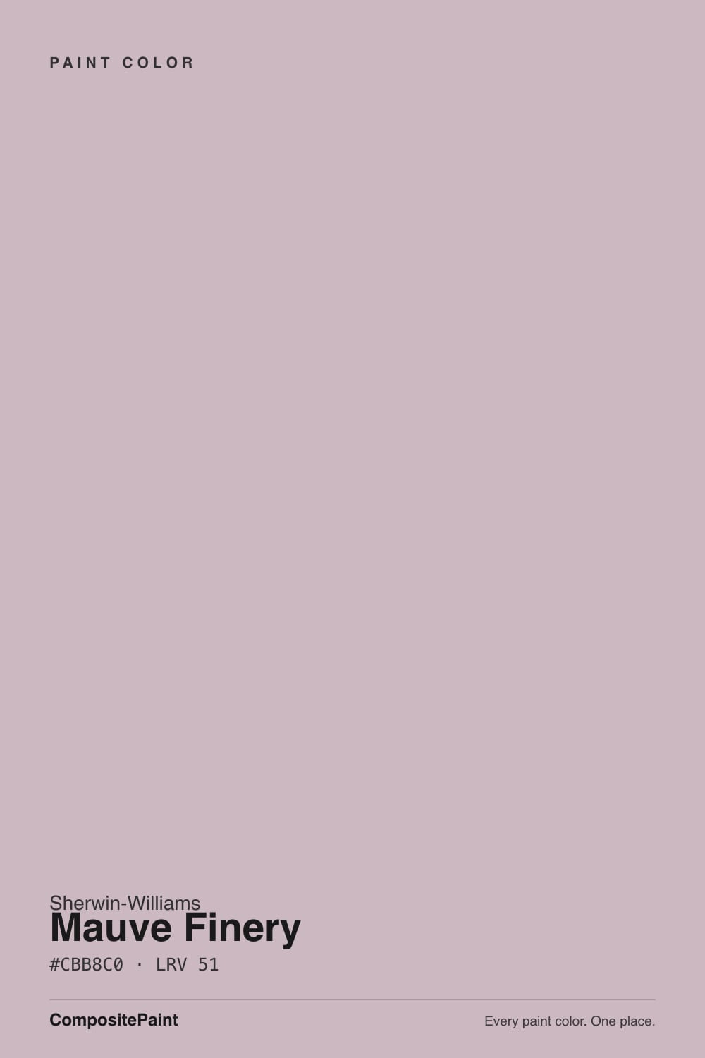
Mauve Finery
Sherwin-Williams' dusty rose-mauve, reviewed honestly: the light where it turns velvety and rose-warm, the light where it goes flat mushroom-gray, and what to buy instead.

Jessica has spec'd whites and neutrals for more than 300 rooms and keeps a sample wall of painted drawdowns in her studio. Every color review is checked against real reader rooms in the comments and re-tested when a formula changes. About the testing process →
- 1Gothic Purple24
- 2Hazy Lilac29
- 3Mauve Finery51
- 4French Lilac56
- 5Lavender Mist63
The Fast Verdict
Mauve Finery is filed in Sherwin-Williams' purple family, but on the wall it behaves like a warm neutral wearing a mauve secret — a grayed dusty rose-pink that reads sophisticated instead of sweet, thanks to LRV 51 and a heavy dose of gray mixed into the violet. Under a warm lamp it turns genuinely rosy and expensive-looking; under cool daylight or LEDs it can flatten into a taupe-mushroom that barely registers as color at all. If you have ever painted a room a "greige" and had it mysteriously flash pink, Mauve Finery is that same color, chosen on purpose.
Bedrooms and dens that get warm evening light · powder rooms and bathroom vanities · dining rooms with walnut and brass · anyone drawn to the dusty-rose trend who wants gray to do most of the talking
You want a true saturated lilac or violet · your room runs on cool white LEDs with no lamps · your floors are honey oak or golden-toned wood · you want zero chance of anyone calling the wall "pink"
- A genuine mauve that reads sophisticated, not saccharine
- Turns velvety and rose-warm under evening lamplight
- Mid-depth LRV 51 holds its color better than a paler blush pink would
- Small doses — a vanity, an island, a dining room — read custom and expensive
- Gray base keeps it from feeling like a dated 1980s mauve
- Cool daylight and cool LEDs flatten it to a dull taupe-gray with the color gone
- Not a true purple — buyers expecting lilac or lavender will be disappointed
- Fights honey oak and any golden-toned wood
- More repaint risk than a plain greige if the mauve trend moves on
What Color Is Mauve Finery, Really?
Mauve Finery sits in Sherwin-Williams' purple color family, but almost nobody who lives with it calls it purple. It is a dusty, grayed mauve-pink — closer in spirit to a rosy taupe than to a true violet — because the gray does more work in the mix than the red-violet does. That is the whole trick: enough color to feel deliberate, enough gray to stop it from reading like a saturated 1980s mauve.
At LRV 51 it sits almost exactly in the middle of the scale — noticeably lighter and less saturated than a true mood color like Sleepy Hollow (LRV 28), and almost the same depth as Shiitake, a warm neutral with the same LRV 51 that gets complained about for randomly flashing pink. Put them side by side and the relationship is obvious: Shiitake is a greige that accidentally turns mauve in the wrong light; Mauve Finery is what you get when you stop fighting that and just buy the mauve.
Undertone in one line: red-violet first, gray second — never a clean blue-purple, never a true saturated pink. If your sample looks like flat taupe with no color left in it at all, that is cool daylight or cool LED bulbs draining the red out; if it looks distinctly rosy-pink, that is a warm lamp or a west-facing window doing exactly what this color is built to do.
Where It Shines
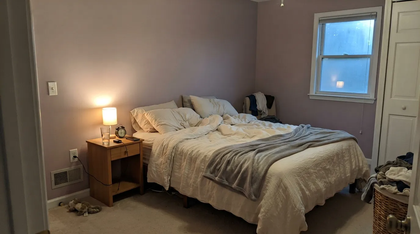
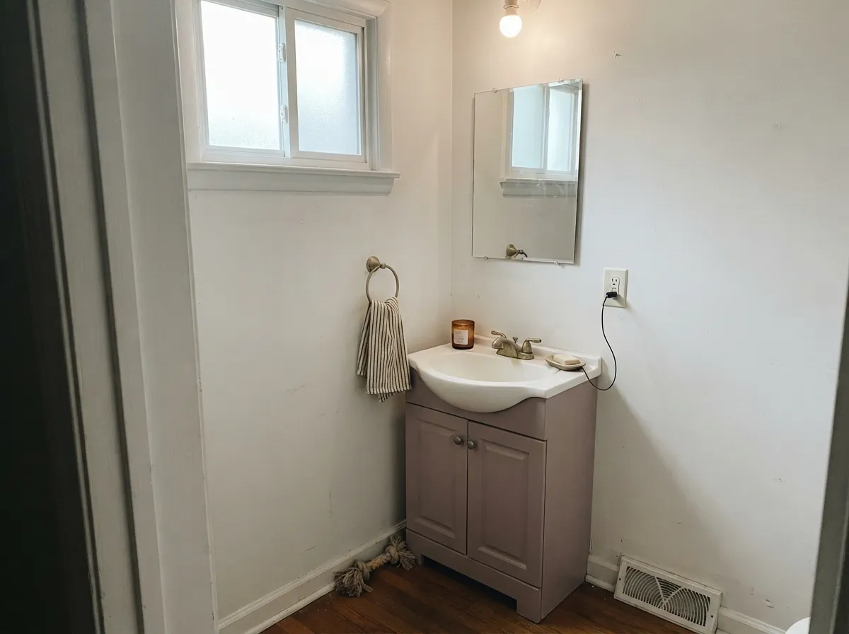
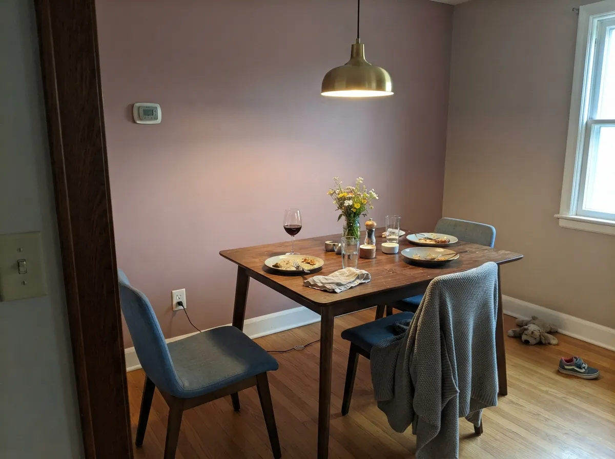
This is a color built for rooms you use with lamps on. Under 2700K light the red-violet comes forward and the walls turn velvety and rose-warm — sophisticated dusty rose rather than candy pink — which makes it a strong pick for bedrooms and any room that earns its keep after dark. Its second home is the small commitment: a powder room, a bathroom vanity, a dining room with walnut furniture and brass fixtures, where the color reads custom without betting the whole house on mauve. Give it cream walls or trim, warm wood, and brass, and it looks intentional rather than trendy.
Where It Fails
Almost every regret story with a color like this follows one of three patterns, and all three are predictable before the first coat goes on. None of them are the paint's fault — but if your room matches one, sample it big before you commit, because a small chip will not warn you.
Mauve Finery is grayed down hard. If you were picturing a clean lilac or lavender like French Lilac, this will look like a muted rosy-taupe instead — barely purple at all in daylight. The name promises more violet than the paint delivers.
Cold daylight and cool-white LEDs strip the red-violet out and leave a flat, slightly muddy taupe-gray that readers of similar colors describe as "just looks dirty." The fix costs less than repainting: warm 2700K bulbs are part of this paint job, not optional.
Yellow-orange sits opposite violet on the color wheel, so honey oak floors and golden-toned trim amplify the mauve while the wall pushes the wood toward orange. Walnut, espresso, and pale white oak are safe; a golden floor is not.
Room by Room
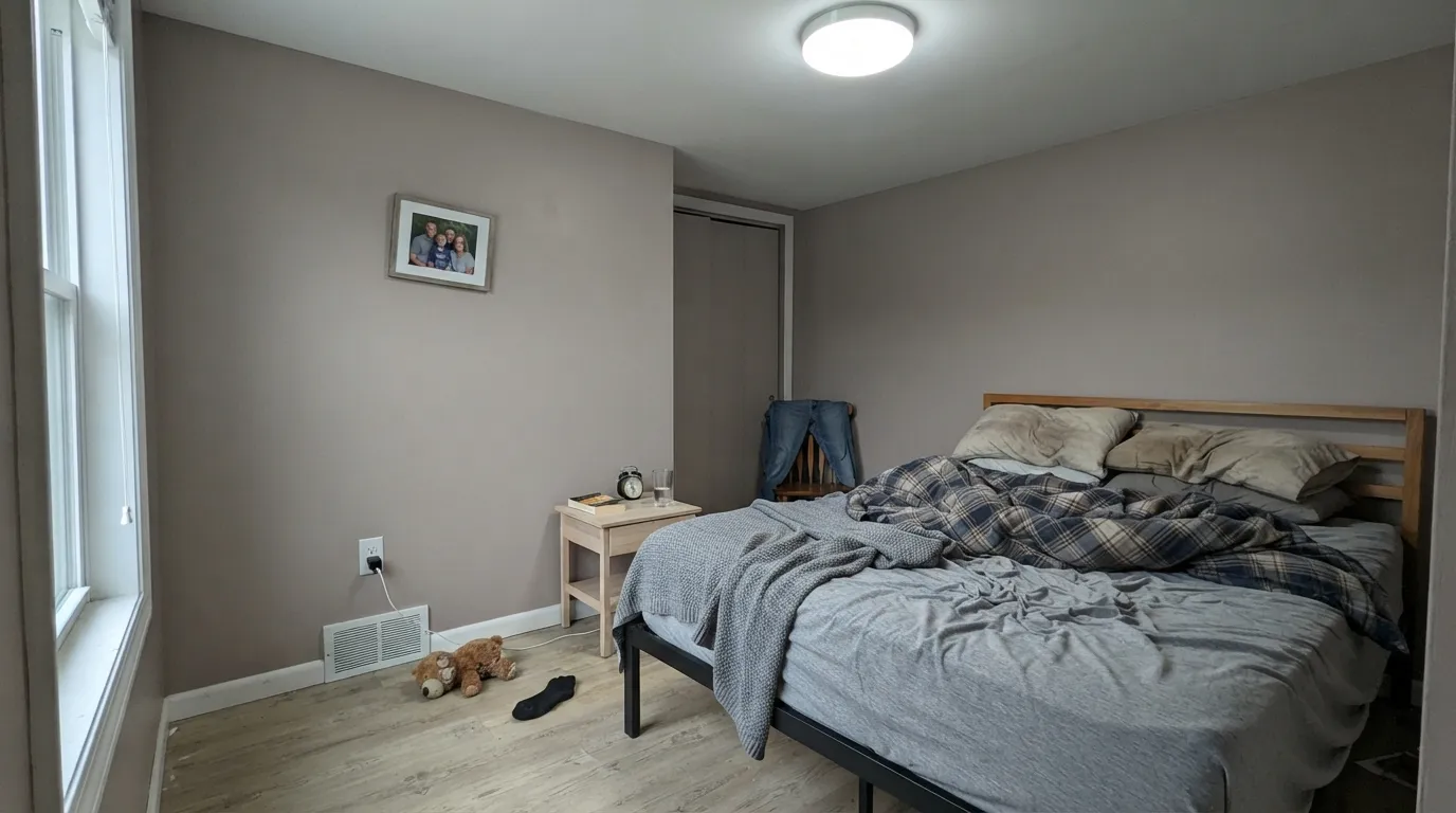
Warm lamp light plus this color is the whole pitch: dusty rose at night, quiet neutral-ish taupe by day. Eggshell on the walls, a warm white like Snowbound on trim, and 2700K bulbs in every fixture.
A Mauve Finery vanity under a white or cream-walled powder room, with brass hardware and a marble or white counter, looks like a weekend project that cost a design fee. Small rooms carry mid-tone color well; satin finish on the vanity.
Walnut table, brass chandelier, cream linen chairs: this is exactly the company Mauve Finery wants. Evening dinners under warm bulbs are where it looks its best — this is not a color that needs to work at 8am.
In a closed room with warm lamps and walnut furniture, it is calm and grown-up. In an open-plan layout it has to negotiate with kitchen cabinets, adjacent hallway colors and whatever daylight is doing at the far end — more variables, more risk of the flat-gray read.
An island or a hutch works; a full kitchen of mauve cabinets over honey-oak floors is a fight this color loses. Satin cabinet enamel, and keep counters and floors on the cool-to-neutral side.
There is no real-world exterior track record for this color, and full outdoor sun tends to wash grayed mauves toward a dull, slightly dirty pink rather than the rich rosy tone it shows indoors under lamps. Treat this as an interior color.
Your Light Is the Risk
2700K bulbs wake the red-violet and the walls turn velvety, rose-warm mauve. This is the light the color is built for.
Cool light drains the red out and leaves a flat, slightly muddy taupe-gray. Test with your actual bulbs before committing.
The most honest read: clearly a dusty mauve at midday, softening toward taupe as the light fades. Sample here first.
2700K lamps: rosy and warm. Cool white LEDs: dull and gray. Same paint, two completely different rooms — swap the bulbs, not the color.
Most complaints about Mauve Finery are a light mismatch. Upload a photo of your actual room and see it on your walls — then ask for the same wall in north light or evening lamps before you buy a single sample.
Need It From Another Brand?
Any paint counter can custom-tint Sherwin-Williams SW 6282 directly. If you would rather stay in one brand's own deck, these are the closest stock matches, measured as ΔE2000. Under 2 is a difference you will not see on the wall.
| Brand | Closest color | ΔE | LRV | |
|---|---|---|---|---|
| Behr | Plymouth Notch180E-3 · Behr | 1.8 | 51 | Color page → |
| Benjamin Moore | Homespun Charm1249 · Benjamin Moore | 2.7 | 51 | Color page → |
| Valspar | MischiefV076-2 · Valspar | 1.3 | 52.2 | Color page → |
| PPG / Glidden | High SocietyPPG1046-4 · PPG / Glidden | 0.7 | 50 | Color page → |
| Glidden | High SocietyPPG1046-4 · Glidden | 0.5 | 50 | Color page → |
| Dutch Boy | Mauv-elous347-3DB · Dutch Boy | 3.1 | 51 | Color page → |
Similar Sherwin-Williams Colors
The nearest shades to Mauve Finery within Sherwin-Williams's own range, ranked by perceptual color distance — useful when you want the same look a touch lighter, darker, or warmer.
WCAG 2.1: AA is 4.5 : 1 for normal text, 3 : 1 for large text, AAA is 7 : 1.
Mauve Finery vs the Colors You're Also Considering
Every Mauve Finery sample board has the same rivals on it. The numbers show the real lightness gap — then it comes down to which risk you would rather live with.
Pick this for the lighter, more neutral-leaning version that still works in daytime rooms.
Benjamin Moore 1454 · LRV 28Sleepy HollowPick this for a deeper, moodier, more clearly violet color built for rooms that stay dim.
Pick this if you want to own the mauve outright instead of hoping it stays gray.
Sherwin-Williams SW 9173 · LRV 51ShiitakePick this if you want the same mid-depth chameleon look but sold as a neutral, not a purple.
Mauve Finery Coordinating Colors
The rule for coordinating with Mauve Finery: warm whites, walnut-toned wood, and one near-black or true dark to ground the room. It pairs comfortably with warm neutrals close to its own depth, and it wants brass or aged metal rather than chrome. These are the partners that keep showing up in rooms that work:
The Greige That Turns Mauve By Accident — And the One You Buy on Purpose
A lot of warm neutrals get a specific complaint online: "my greige turned pink." Colors like Eider White and Balboa Mist are beloved in good light and criticized for exactly the same reason in bad light — they carry a violet undertone that shows up whether the owner wanted it or not. Mauve Finery is what happens when you stop treating that as a flaw and buy it as the feature.
That framing matters for expectations. If you go into this color expecting a neutral that occasionally flashes color, you'll be delighted. If you go in expecting the same soft, dependable behavior as an actual neutral, the swings between rosy-warm and flat-taupe will feel like inconsistency rather than character. It is a genuinely different category of color from the greiges it resembles at a glance — closer to a mood color that happens to be pale enough to almost pass.
Mauve Finery With Wood Tones and Floors
This decision gets made at the floor, not the paint store. Walnut and espresso are the color's best friends — the dark red-brown depth makes the mauve read smoky and deliberate instead of pastel. Pale white oak and gray-washed floors are safe and give the room a softer, more contemporary cast.
The one honest no is golden: honey oak floors, orange-stained trim, yellow-beige carpet. Yellow-orange sits opposite violet on the color wheel, so each side pushes the other further — the floor reads more orange, the wall reads more purple, and no amount of extra coats fixes that geometry. Metals are the easy part: unlacquered brass, antique bronze and matte black all read well against it; polished chrome is the one finish that fights it.
Three Ready Palettes Built on Mauve Finery
A color is never alone on the wall. These are complete combinations in the 60-30-10 pattern, with the reason each one holds together. Every one opens in the visualizer.
Snowbound keeps the trim soft instead of stark, so the mauve doesn't look dirty by contrast, and one near-black accent gives the room the single dark note a mid-tone color needs to feel grounded rather than washed-out.
Try this palette in your roomA warm white keeps the little room bright while the vanity carries the color; the near-black mirror frame and brass hardware give the scheme one deliberate dark note so it reads styled, not accidental.
Try this palette in your roomWorldly Gray and Mauve Finery sit close in depth and share a warm-neutral undercurrent, so a dining room in the mauve reads like the same house turning up the color, not a clash. Greek Villa trim ties both rooms back together.
Try this palette in your roomMauve Finery FAQ
Is Mauve Finery purple or gray?
Officially purple — it lives in Sherwin-Williams' purple family — but on the wall it behaves like a warm neutral with a rosy secret. In cool light it can pass for a plain grayish taupe; under warm lamps it turns distinctly rosy-mauve. It rarely reads as a clean, saturated purple either way.
What trim white goes with Mauve Finery?
A soft warm white like Snowbound or Greek Villa. A stark, bright white makes the walls look dingy by contrast, the same problem warm off-whites have with brighter trim. Semi-gloss trim, eggshell walls.
Is it good for a bedroom?
Yes — arguably its best room. It is calmest and most flattering in low, warm evening light, which is exactly a bedroom's usual operating condition. Keep bulbs at 2700K and pair with cream or white bedding rather than beige, which can read yellow against it.
Does Mauve Finery work with honey oak floors?
No, and this is the most predictable regret with this color. Yellow-orange is violet's complement on the color wheel, so golden oak floors amplify the mauve while the wall pushes the floor toward orange. Walnut, espresso, and pale white oak are the safe pairings.
Will Mauve Finery look dated?
It carries more repaint risk than a plain greige — mauve is a trend color right now, and trends move. But the heavy gray in the mix keeps it closer to a muted neutral than a saturated 1980s mauve, which should age better than a brighter, sweeter pink would.
Can I use it on a powder room vanity or cabinets?
Yes, and it is one of its strongest jobs. A vanity or a kitchen island in Mauve Finery under white or cream walls reads custom without committing a whole room to mauve. Use a satin urethane-fortified cabinet enamel, and avoid this for a full kitchen of cabinets over honey-oak floors.
Have you painted with Mauve Finery?
Rate it — one tap helps the next reader decide.
Ask a Question