Studio Mauve
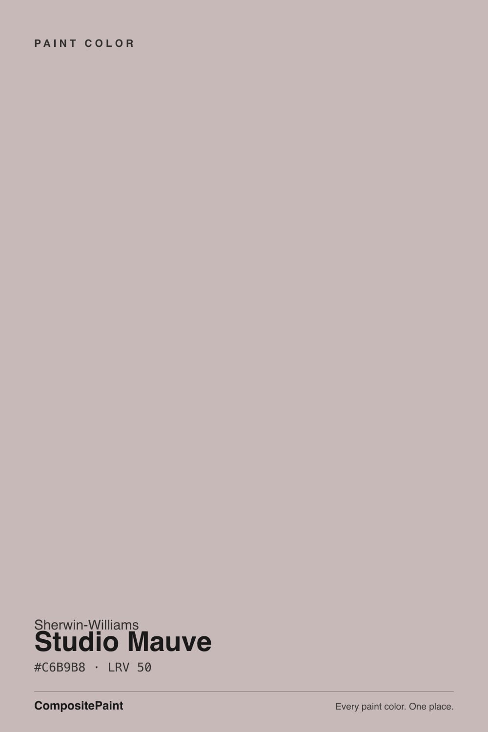
SW 62 · #C6B9B8 · LRV 50 — warm red tone, light — bounces daylight without going clinical.
What Color Is Studio Mauve, Really?
Studio Mauve SW 62 is a light warm gray with a pink lean, the kind of color people call mauve, greige, or dusty rose depending on the room it lands in. Its hex value #C6B9B8 sits at hue 4, right at the red end of the wheel, but with only 11 percent saturation it stays very quiet. An LRV of 50 puts it at the midpoint of the light reflectance scale, so it gives back about as much light as it takes in. On a wall it reads soft and light without ever looking bright white.
People reach for it when a plain gray feels too cold and a real pink feels like too much. The red base gives warm wood, brick, and skin tones something friendly to sit against, and the low saturation keeps it from reading as a color statement. It is a common choice for bedrooms, dressing rooms, and older houses with warm floors that fight cooler grays.
The catch is that the pink hides at chip size. On a small card Studio Mauve looks like an ordinary warm gray, and over a whole wall the mauve becomes obvious. It also needs contrast to look good: at LRV 50 next to a bright white ceiling it can read dingy rather than soft. Sample a large board against your actual trim before committing.
The undertone is warm red, sitting at hue 4 with about 11 percent saturation. That is a small amount of color, so the honest description is a gray that has been tinted rather than a pink that has been grayed. On big surfaces the tint adds up and the mauve becomes easy to see.
What it reads as depends entirely on its neighbors. Next to a true taupe or a warm beige, Studio Mauve looks cooler and more clearly pink. Next to an actual blush or rose, it flattens out and looks like plain gray. Against greens the pink jumps forward, which can be flattering or distracting depending on the room.
The test worth running is against your trim white and your flooring at the same time. Cool gray flooring pulls the mauve toward purple, while warm oak keeps it rosy and settled.
Best Rooms and Uses for Studio Mauve
This is a wall color first. Bedrooms are the natural home, since the soft red keeps the room restful without going cold, and dressing rooms, hallways, and dining rooms work for the same reason. In a bathroom it flatters skin tones under warm bulbs, which is more than most grays manage.
At LRV 50 it will not brighten a dark room much, so treat it as a soft mid-light color rather than a light one. It does well on ceilings in a room where you want the walls and the top surface to blend into one quiet envelope.
On cabinetry it suits a bathroom vanity or a laundry run better than a full kitchen, where the low contrast can look washed out against stainless steel. Outside it works as a gentle body color with white trim, though strong sun will pull the pink forward more than you expect.
How Lighting Changes Studio Mauve
At LRV 50 Studio Mauve sits at the center of the scale, so it reflects a fair amount of light but never bounces the room the way a white does. It will feel light in a sunny space and merely soft in a dim one.
North-facing rooms give it cool, indirect light that mutes the red and can tip the color slightly toward purple-gray. South-facing rooms bring out the warmth and the mauve reads rosier and friendlier. East rooms look pink in the morning and calmer by afternoon; west rooms stay quiet until late day, then flush warm.
Bulbs matter as much as windows here, because the color is so lightly tinted. Warm 2700K lamps push it toward rose and make it feel cozy at night. Cooler 3500K to 4000K bulbs strip the warmth and leave a plain light gray. Check the sample after dark.
Most complaints about Studio Mauve are a light mismatch. Upload a photo of your actual room and see it on your walls — then ask for the same wall in north light or evening lamps before you buy a single sample.
Need It From Another Brand?
Any paint counter can custom-tint Sherwin-Williams SW 62 directly. If you would rather stay in one brand's own deck, these are the closest stock matches, measured as ΔE2000. Under 2 is a difference you will not see on the wall.
| Brand | Closest color | ΔE | LRV | |
|---|---|---|---|---|
| Behr | Georgian PinkHDC-CL-25G · Behr | 1.5 | 50 | Color page → |
| Benjamin Moore | ViolettaAF-615 · Benjamin Moore | 2.5 | 49 | Color page → |
| Valspar | Sun Painter8004-2C · Valspar | 3.0 | 49 | Color page → |
| PPG / Glidden | LuxuriousPPG18-04 · PPG / Glidden | 1.6 | 49 | Color page → |
| Glidden | LuxuriousPPG18-04 · Glidden | 0.9 | 49 | Color page → |
| Dutch Boy | Flutter By403-2DB · Dutch Boy | 0.0 | 50 | Color page → |
Similar Sherwin-Williams Colors
The nearest shades to Studio Mauve within Sherwin-Williams's own range, ranked by perceptual color distance — useful when you want the same look a touch lighter, darker, or warmer.
WCAG 2.1: AA is 4.5 : 1 for normal text, 3 : 1 for large text, AAA is 7 : 1.
Studio Mauve vs Similar Colors
Imagine SW 6009 at LRV 48 and hex #C2B6B6 is the closest in-brand relative, a hair darker and slightly less red. Fashionable Gray SW 6275 at LRV 48 and #BDB8B8 removes most of the pink and behaves like a plain warm gray, which is the pick if the mauve worries you. Mauve Finery SW 6282 at LRV 51 and #CBB8C0 goes the other way and reads clearly more violet.
Across brands, Dutch Boy Flutter By 403-2DB shares the same hex and LRV, a measured difference of 0, so it is the same color. Glidden Luxurious PPG18-04 at LRV 49 measures 0.93 and matches for practical purposes. Behr Georgian Pink HDC-CL-25G at LRV 50 measures 1.53, visually identical in normal room light. Benjamin Moore Violetta AF-615 at LRV 49 measures 2.52, very close but sample first. Farrow and Ball Pink Drab No. 207 at LRV 49 measures 4.09, close but visibly different side by side.
Colors That Go With Studio Mauve
A soft white on trim and ceilings gives the walls definition without turning them gray by comparison. Warm woods, rattan, unlacquered brass, and aged bronze all suit the red base; polished chrome tends to read cold next to it.
For a coordinated scheme, its neighbors do the work. Fashionable Gray SW 6275 at LRV 48 and Essential Gray SW 6002 at LRV 48 are slightly less red, so they act as the calmer neutral partner in an adjoining room. Imagine SW 6009 at LRV 48 sits almost on top of Studio Mauve and gives a nearly seamless transition. Viaduct SW 9567 at LRV 50 matches the lightness but leans yellow-green, which makes a subtle contrast at the same brightness.
If you want the pink to be the point, Mauve Finery SW 6282 at LRV 51 pushes further toward true mauve. For grounding, a deep charcoal or near-black on doors and hardware keeps the whole scheme from floating.
Coordinated palette
Generated by hue-rotating #C6B9B8 in HSL space. Pair Studio Mauve with one accent and one neutral — the swatches below are starting points, not final picks.
Studio Mauve FAQ
Is Studio Mauve pink or gray?
It is a gray with a pink tint rather than a pink. The hue sits at 4 degrees, in the red range, but saturation is only about 11 percent. On a small chip it looks like a warm gray, and across a full wall the mauve becomes clearly visible, especially in warm light.
What LRV is Studio Mauve?
Studio Mauve has an LRV of 50, the exact midpoint of the 0 to 100 scale. It reflects about half the light that hits it, so it reads as a soft mid-light color. It will feel light in a sunny room but will not brighten a dark one the way a white or a high-70s color would.
Does Studio Mauve look purple?
It can, in the wrong light. The base hue is red rather than violet, so on its own it reads rosy. Cool north light and cool bulbs strip the warmth and can tip it toward a gray-purple, and cool gray flooring does the same thing. Warm light and warm wood keep it firmly on the rose side.
What white trim goes with Studio Mauve?
A soft white rather than a stark one works best, because it holds enough warmth to keep the walls from looking dull. Since the wall color sits at LRV 50, you want real separation in brightness so the trim reads as trim. Test the two together on the same board before painting the whole room.
Does Studio Mauve work in a dark room?
It works, but manage expectations. At LRV 50 it reflects a moderate amount of light, so in a room with small windows it will look like a medium soft gray with very little pink showing. Warm 2700K bulbs bring the mauve back at night, which is often the easiest fix.
Is Studio Mauve good for cabinets or exteriors?
It suits a bathroom vanity or laundry cabinets, where softness is welcome, more than a full kitchen, where the low contrast can look washed out. Outside it works as a quiet body color paired with white trim, but expect strong sun to bring the pink forward more than it does indoors.
Have you painted with Studio Mauve?
Rate it — one tap helps the next reader decide.
Ask a Question