Elation
Sherwin-Williams' best-selling pale purple, reviewed honestly: the light where it reads plain gray, the light where the lavender finally shows up, and what to expect on real walls.

Jessica has spec'd whites and neutrals for more than 300 rooms and keeps a sample wall of painted drawdowns in her studio. Every color review is checked against real reader rooms in the comments and re-tested when a formula changes. About the testing process →
- 1French Lilac56
- 2Lavender Mist63
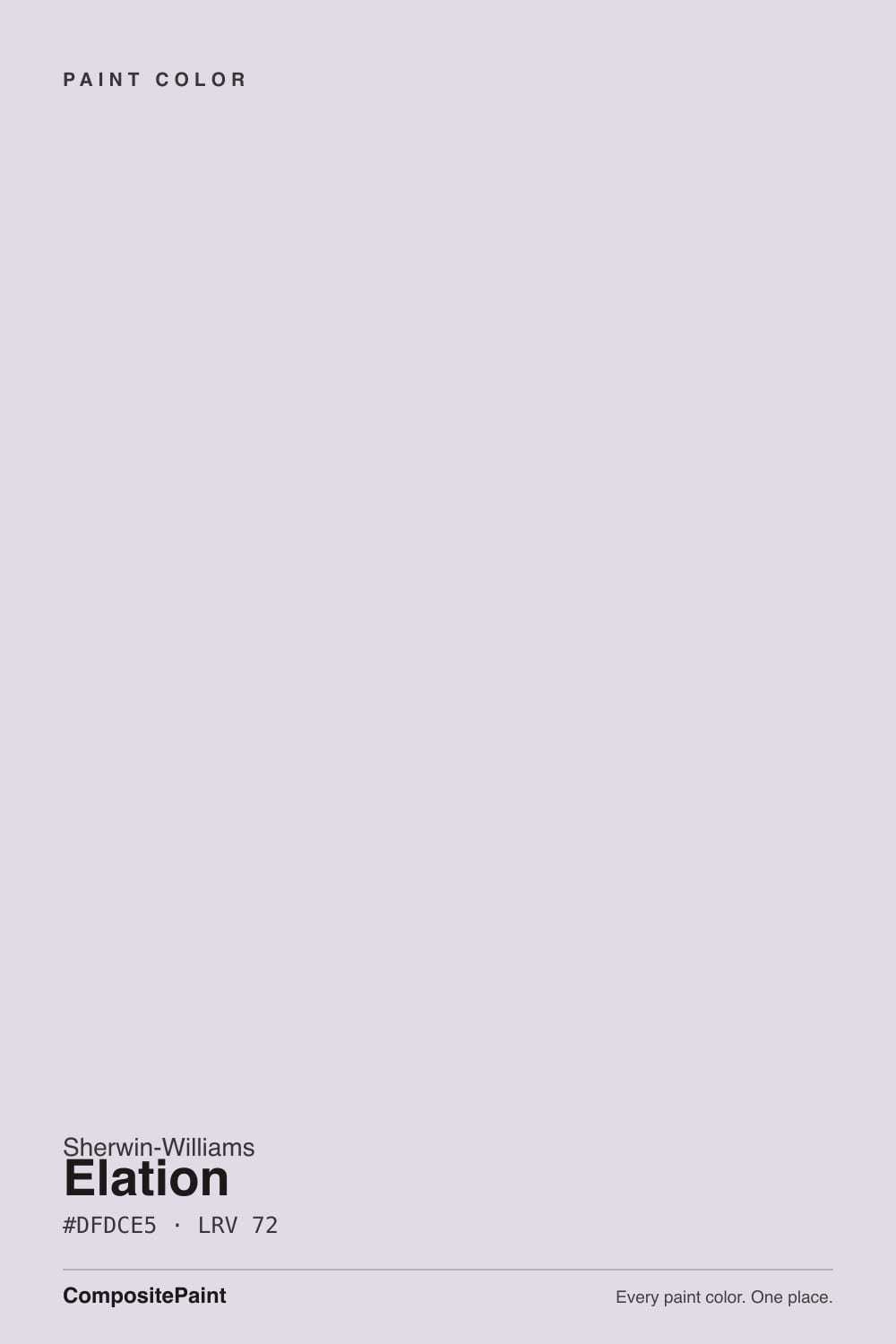
- 3Elation72
- 4Misty Lilac79
- 5Barely Pink87
The Fast Verdict
Elation is Sherwin-Williams' answer to "I want purple, but not really purple" — a low-chroma lavender-gray so pale it reads as a cool neutral most of the day, then quietly admits what it is once warm light hits it. At LRV 72 it behaves like a soft off-white on the wall: it brightens a room, it doesn't shout, and it never turns pink or peach the way a lot of pastel purples do. The trade-off is honesty in reverse of what buyers expect — on a dull day it can look like plain gray, and some people who wanted visible lavender feel shorted.
Nurseries and kids' rooms that want color without a full commitment · bedrooms craving a whisper of lavender at night · anyone who wants a near-white with more personality than beige · a whole-house neutral in a cool-toned home
You want a wall that reads unmistakably purple in daylight · your room runs cold, overcast north light most of the day · you're pairing with warm honey oak and brass · you want zero undertone conversation, ever
- Reads as a soft, usable neutral most of the day — safer than a committed purple
- Turns genuinely lavender under warm light without tipping into candy-pastel
- LRV 72 keeps rooms bright, unlike deeper purples in the same family
- Cool blue-violet undertone — never drifts pink or peach
- Pairs cleanly with crisp white trim and other cool grays
- In cold light it can look like plain gray with no visible purple at all
- Warm honey oak and brass fight its cool undertone
- Too subtle for anyone who wants a wall that unmistakably reads purple
- Shifts visibly through the day in mixed-light rooms — not everyone wants that movement
What Color Is Elation, Really?
Elation is a very light, low-chroma lavender-gray — the kind of purple that spends most of its life pretending to be a neutral. Sherwin-Williams files it in the purple family, and the deck's own RGB breakdown backs that up: the blue channel sits highest, giving it a genuine cool, blue-violet lean rather than the pink or mauve drift you get from most pastel purples. But the chroma is so low, and the LRV so high at 72, that in ordinary daylight it can look like a soft warm-gray or greige to someone who isn't looking for the violet on purpose.
That split personality is the whole story with this color. It has real search demand and shows up on Sherwin-Williams' own popular-purples shortlist — people specifically go looking for a lavender that won't turn a room into a nursery cliché — and Elation delivers exactly that: enough color to register as "not white," not enough to fight the rest of the house. It also carries over into the HGTV Home by Sherwin-Williams line under the same number, which tells you this isn't an obscure fan-deck entry; it's a color the company keeps actively pushing.
Undertone in one line: cool blue-violet, never pink, never tan. If your sample looks flat gray with no hint of lavender at all, that's cold daylight or cool LEDs doing it — the color is still there, it just needs warmer light to show its hand.
Where It Shines
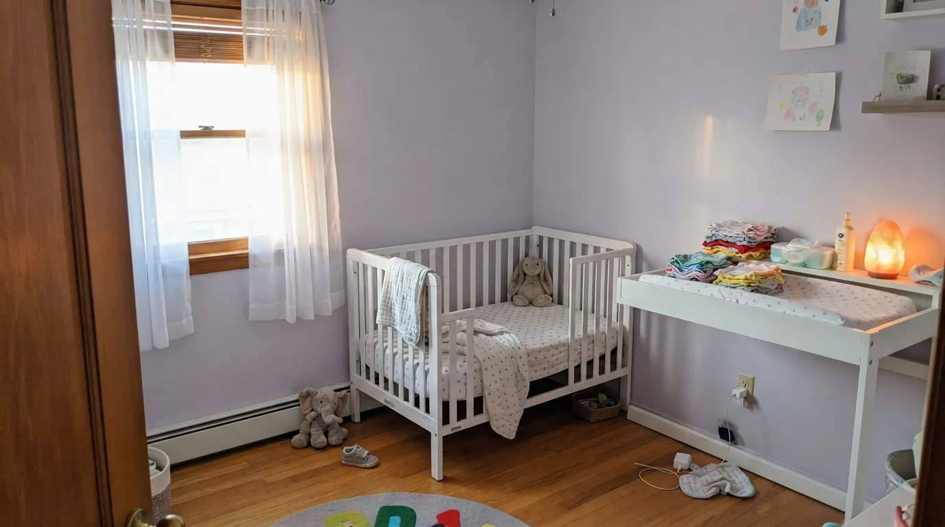
Give it a room with warm light — afternoon sun, a lamp at night, a south or west exposure — and the lavender comes forward without ever tipping into candy-purple. Its home turf is the room that wants a hint of color and nothing louder: nurseries, primary bedrooms, hallways that need to feel calm rather than blank. Next to crisp white trim it reads clean and current instead of dated pastel, and because it never leans pink, it skips the "is this a baby-girl room" problem that sinks a lot of light purples.
Where It Fails
Almost every disappointed review of Elation comes down to one mismatch: the buyer wanted to see purple, and the room's light didn't cooperate. None of these are the paint failing — they're the predictable behavior of a very pale, low-chroma color meeting the wrong conditions.
In flat, overcast, or cool-LED light, Elation can read as plain warm-gray with no visible lavender at all. If the whole reason you picked it was "a hint of purple," and your room stays dim or north-facing, you may end up with a color that just looks like an unremarkable gray — sample it at the actual time of day you'll be in the room before committing.
North-facing rooms and cool 5000K LEDs strip the warmth out of almost any pastel, and Elation's chroma is low enough that it has little color left to lose. The fix is cheap: swap to 2700K bulbs and let a lamp do the work daylight won't.
Elation is a cool, blue-leaning color, and yellow-orange wood is close to its visual opposite. Against honey oak floors or gold-toned trim the two fight — the wood looks more orange, the wall looks flatter and grayer. White oak, painted floors, or cooler wood tones let it actually read lavender.
Room by Room
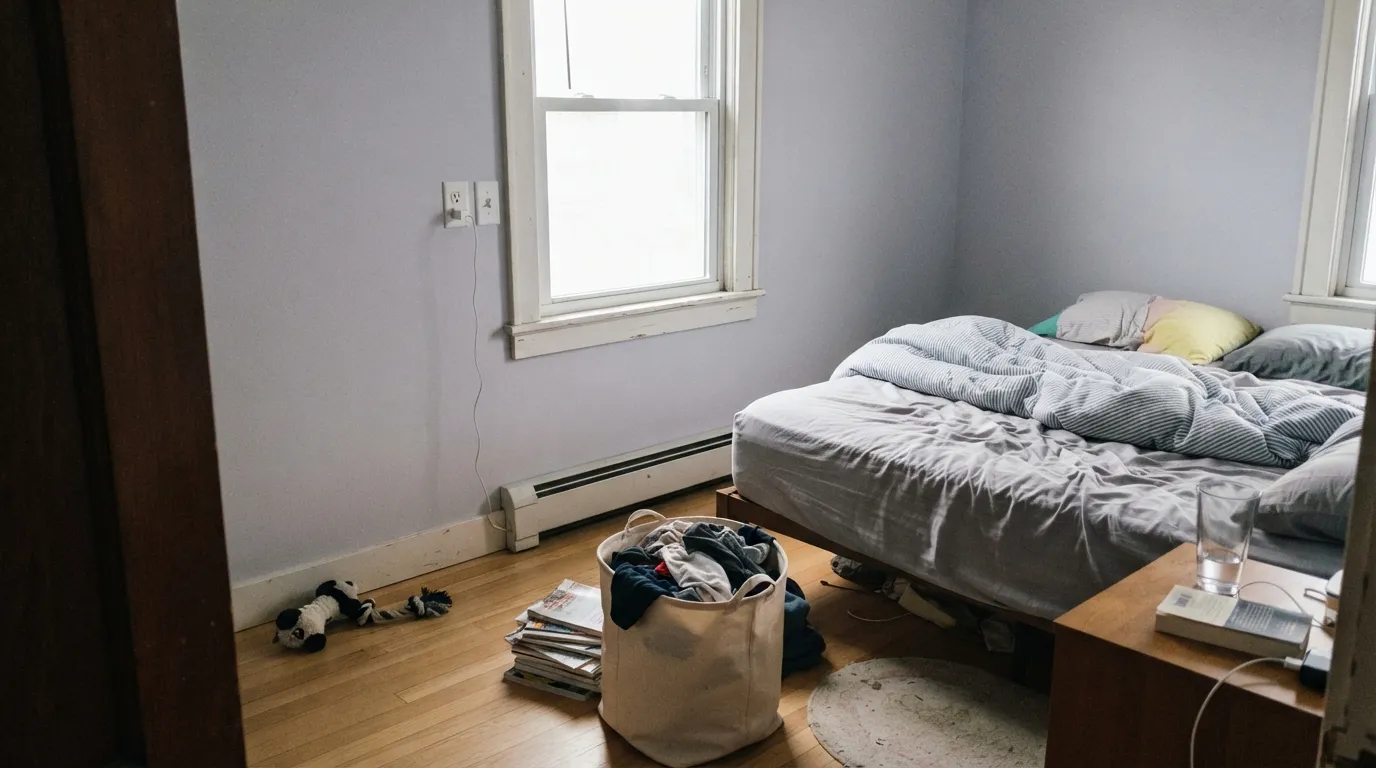
This is the room Elation was picked for, and the reviews back it up: soft enough for sleep, cool enough to skip the pink-nursery cliché, light enough (LRV 72) to keep the room from feeling small. Eggshell on the walls, Pure White trim, warm 2700K bulbs in the lamp.
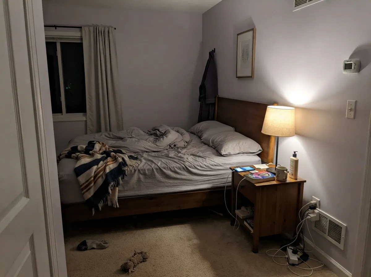
At night under lamp light it turns genuinely lavender and calm — a real "whisper of color" bedroom without the risk of a bolder purple. Skip it if the room is north-facing and you rely entirely on daylight.
With warm-white fixtures and neutral or white tile it stays a quiet cool neutral. Against warm beige or travertine tile it can look muddy; against cool gray or white tile it looks intentional.
Workable, but open-plan rooms mix daylight and lamp light throughout the day, so Elation will visibly shift from gray to lavender and back as the light changes. Some people love that; others find it inconsistent room to room.
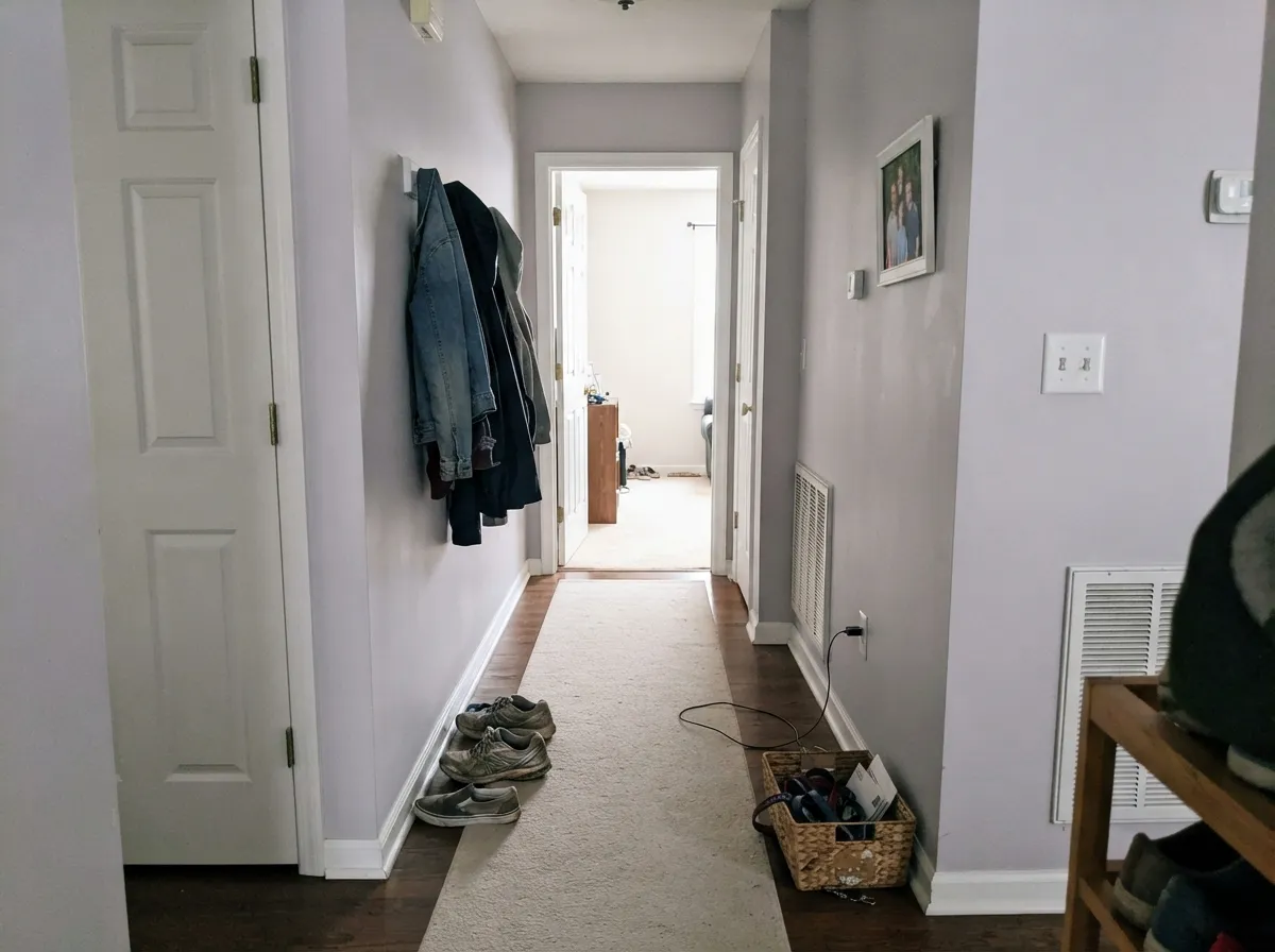
Hallways rarely get flattering light, but that actually suits Elation here — it settles into a soft, quiet gray-lavender that reads as an intentional neutral rather than an indecisive purple.
It's built and marketed as an interior near-white. Full outdoor sun will wash out what little chroma it has, leaving a flat pale gray with none of the lavender payoff — pick a color built for exterior contrast instead.
Your Light Is the Risk
South or west sun and warm lamps pull the lavender forward — this is the light that makes the color's name make sense.
Cool gray daylight has almost nothing to work with here — the walls can read as plain gray, no purple visible.
Gray in flat morning light, more visibly lilac by late afternoon. The shift is real and some readers are surprised by it.
Warm 2700K bulbs bring the lavender base out more, not less — the opposite of what most pale colors do at night. Cool LEDs flatten it back to gray.
Most complaints about Elation are a light mismatch. Upload a photo of your actual room and see it on your walls — then ask for the same wall in north light or evening lamps before you buy a single sample.
Need It From Another Brand?
Any paint counter can custom-tint Sherwin-Williams SW 6827 directly. If you would rather stay in one brand's own deck, these are the closest stock matches, measured as ΔE2000. Under 2 is a difference you will not see on the wall.
| Brand | Closest color | ΔE | LRV | |
|---|---|---|---|---|
| Behr | Mauve Mist100E-2 · Behr | 2.6 | 72 | Color page → |
| Benjamin Moore | Sugarplum1394 · Benjamin Moore | 2.3 | 73 | Color page → |
| Valspar | Purple Mist4002-9A · Valspar | 3.5 | 72 | Color page → |
| PPG / Glidden | Pale OrchidPPG1175-2 · PPG / Glidden | 0.8 | 71 | Color page → |
| Glidden | Pale OrchidPPG1175-2 · Glidden | 0.5 | 72 | Color page → |
| Dutch Boy | Lavender Water142-2DB · Dutch Boy | 1.9 | 73 | Color page → |
Similar Sherwin-Williams Colors
The nearest shades to Elation within Sherwin-Williams's own range, ranked by perceptual color distance — useful when you want the same look a touch lighter, darker, or warmer.
WCAG 2.1: AA is 4.5 : 1 for normal text, 3 : 1 for large text, AAA is 7 : 1.
Elation vs the Colors You're Also Considering
Every Elation sample board has the same rivals on it. The numbers show the real lightness gap — then it comes down to which risk you would rather live with.
Pick this if you want the lighter, quieter version that leans neutral more often than not.
Benjamin Moore 2070-60 · LRV 63Lavender MistPick this if you want the purple to actually show more consistently — Lavender Mist carries more visible color at a lower LRV.
Pick this for the brighter, safer near-white that still nods at lavender.
Benjamin Moore 1403 · LRV 56French LilacPick this for a deeper, more clearly lilac wall that doesn't rely on warm light to read as purple.
Elation Coordinating Colors
The rule for coordinating with Elation is to stay cool: crisp whites, gray-greens, and deeper cool colors all let its lavender read clearly instead of getting fought into plain gray. These are the partners that show up again and again in rooms that work:
The Purple You Don't Have to Commit To
Elation sits on Sherwin-Williams' own list of most-popular purples, which is a strange thing to say about a color most people would describe as gray on first glance. The explanation is search behavior, not marketing: buyers who are scared of a bold violet or a dated pastel lilac go looking for exactly this — a purple that will not embarrass them if it turns out too loud. Elation answers that brief almost too well; the same low chroma that makes it safe is what makes it disappear in the wrong light.
It also shows up under the same number in the HGTV Home by Sherwin-Williams collection, which is worth knowing if you're comparing swatches from different displays — it's the identical formula, not a coincidence in naming.
Elation With Wood Tones and Floors
This color's cool undertone makes the flooring decision matter more than usual. White oak, gray-washed wood, and painted or whitewashed floors all let the lavender read clearly, because nothing in the room is pulling warmth against it. Walnut and darker cool-toned woods work too, adding depth without a fight.
Honey oak and other warm, yellow-leaning floors are the mismatch to watch for. Elation and warm oak sit on opposite temperatures, so each makes the other look slightly off — the floor reads more orange, the wall reads flatter and grayer than it does on the chip. If the warm floor is staying, lean on white trim and cool-toned textiles to referee the two.
Three Ready Palettes Built on Elation
A color is never alone on the wall. These are complete combinations in the 60-30-10 pattern, with the reason each one holds together. Every one opens in the visualizer.
Pure White keeps the lavender from feeling babyish, and one dark navy piece grounds the room instead of letting it float in pastel. Works for a nursery today and a kid's room in five years.
Try this palette in your roomBoth Elation and Silver Strand are chameleon colors that shift with light, and they share the same cool, low-chroma temperament, so a hallway handoff between them reads calm instead of clashing.
Try this palette in your roomSilver Satin trim stays neutral enough not to compete, while a Wallflower accent wall gives the room one spot of committed, visible purple — so the rest of the room can stay as quiet as Elation wants to be.
Try this palette in your roomElation FAQ
Is Elation purple or gray?
Both, depending on the light. It's genuinely filed as a purple — cool, blue-violet, low chroma — but at LRV 72 with that little color saturation, cold daylight or cool LEDs can make it read as plain gray. Warm light and evening lamps are what bring the lavender out.
Is it a good nursery color?
Yes — it's one of the reasons the color has real search demand. It gives a nursery a hint of color without the commitment of a bolder purple, and because it leans cool rather than pink, it works regardless of the baby's gender or the room's theme.
What trim white goes with Elation?
Sherwin-Williams Pure White is the clean, crisp default and keeps the lavender from reading dated. A warmer white like Alabaster will slightly mute the purple by contrast — fine if you want the wall to feel even quieter.
Does it work with warm oak floors?
Not its best pairing. Elation is cool and blue-leaning; honey oak is warm and yellow-leaning, and the two work against each other — the floor looks more orange, the wall looks flatter. White oak, painted floors, or gray-washed wood are a much easier match.
How many coats does it need?
Two coats over an existing light color is standard. Going over a dark or saturated wall, use a tinted primer first — a pale color like this will otherwise need a third coat to fully cover, which costs more than the primer would have.
Does it work on an exterior?
It's built and marketed as an interior color, and full outdoor sun tends to wash out what little chroma it has, leaving a flat pale gray. If you want a lavender-leaning exterior, look for a color with more saturation designed for daylight exposure.
Have you painted with Elation?
Rate it — one tap helps the next reader decide.
Ask a Question