Blackberry Mocha
Behr's mocha-brown with a purple secret, reviewed honestly: where it goes rich and velvety, the light that turns it flat purple-gray, and what to pick instead.

Jessica has spec'd whites and neutrals for more than 300 rooms and keeps a sample wall of painted drawdowns in her studio. Every color review is checked against real reader rooms in the comments and re-tested when a formula changes. About the testing process →
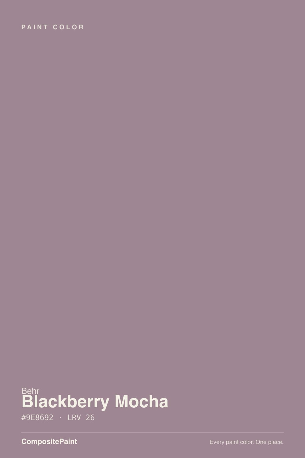
- 1Nocturne Shade5
- 2Blue Nova17
- 3Blackberry Mocha26
- 4Wisteria48
- 5French Lilac56
The Fast Verdict
Blackberry Mocha is Behr's answer to the current mocha moment — a mid-depth color built on a genuine tie between red and purple undertones, so it drifts between coffee-brown and dusty plum depending on the light. Under warm lamps it goes rich and velvety, the color a name like "mocha" promises. Under cool light it drops the brown and shows its purple bones instead. Buy it knowing both colors live in the same can.
Bedrooms and snug dining rooms · powder-room vanities and interior doors · rooms with warm lamps and real daylight · anyone chasing the mocha-brown mood who wants more personality than plain coffee
You want a straightforward brown with zero purple · the room runs on cool LEDs with no lamps · your countertops or tile are cool blue-gray stone · you need a color that reads the same in every light
- Mocha-brown warmth with a purple secret — moody without going flat black
- Turns rich and velvety under evening lamplight
- Mid-depth (LRV 26) holds its color instead of washing out in daylight
- Small-room jewel-box moves: powder rooms, vanities, dining rooms
- Rides the current coffee-brown mood without copying a trend color exactly
- Cool LEDs and dim north light drain the red and expose a flat, dusty mauve-gray
- Buyers expecting a straightforward coffee brown get purple by the second wall
- Cool blue-gray stone and quartz make it read muddy instead of rich
- Whole-kitchen or whole-house use is a bigger commitment than a trim accent
What Color Is Blackberry Mocha, Really?
A mid-depth mauve-brown built on two undertones at once — red and purple — which is the entire personality of this color. Behr's own copy describes it as infused with subtle undertones of purple and red, and that is not marketing softening: the two genuinely trade places depending on the light. Warm daylight and lamplight pull the red forward and the color reads like a rich coffee-brown, the "mocha" the name promises. Cooler light lets the purple win, and the same wall reads more like a dusty plum or eggplant-gray. Our own deck files it in the purple family for exactly that reason — this is not a neutral brown with a footnote, it is a purple color wearing a mocha name.
At LRV 26 it sits in the same mid-depth band as Benjamin Moore's Sleepy Hollow (LRV 28) — deep enough to hold real color in a bright room, but not so dark that it swallows a small one. That depth is why the undertone fight matters: paler mauves wash out to pink before anyone notices the purple, but at LRV 26 the color has enough body to look intentional in either direction. Plan for the wall to read a shade cooler and more purple than the paint chip promises — the same surprise every mid-depth mauve-brown delivers, and the single most common comment in owner photos.
Undertone in one line: red and purple in a genuine tie, decided by the light in the room. If your sample reads warm coffee-brown, that's daylight or a lamp doing its job; if it reads flat dusty plum, that's cool light exposing the purple half of the color — not a bad batch.
Where It Shines
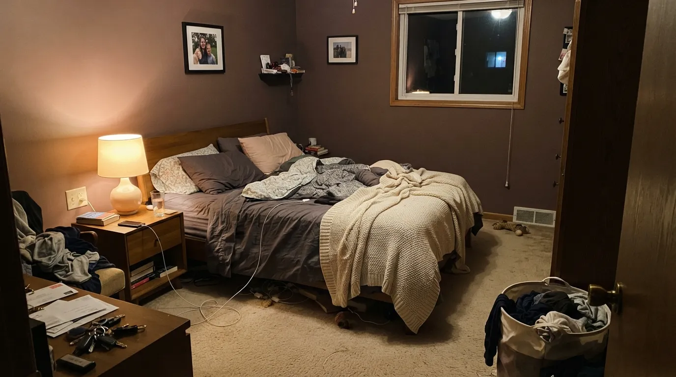
Give it warm lamplight and it earns the "mocha" half of its name: rich, velvety, coffee-brown with just enough plum underneath to feel expensive rather than boring. It is built for small, evening-use rooms — bedrooms, powder rooms, dining rooms — where the goal is cozy over crisp. Pair it with cream trim, walnut or warm oak, and brass or aged-bronze hardware, and the purple half of its personality reads as sophistication instead of surprise.
Where It Fails
Almost every disappointed review of a color like this follows the same three scripts, and Blackberry Mocha is no exception. None of them are the paint's fault — but if your room matches one, sampling bigger will only confirm the mismatch faster.
The name promises coffee. In anything but warm light, the purple half of the undertone takes over and the wall reads more like a dusty eggplant-gray than a mocha. If a straightforward brown is the goal, look at Behr's own Modern Mocha instead — same depth, no purple surprise.
Cool-toned counters and tile fight the color's red, leaving both looking muddy instead of rich — the opposite of the warm, layered look Blackberry Mocha is capable of. Warm quartz, butcher block, or brass fixtures let the red win instead.
Cold light does to this color what it does to every mauve-brown: cancels the red and leaves a flat, slightly dingy plum-gray. The fix is cheaper than repainting — swap to 2700K bulbs — but if the room stays dim and cool by design, this is not the color for it.
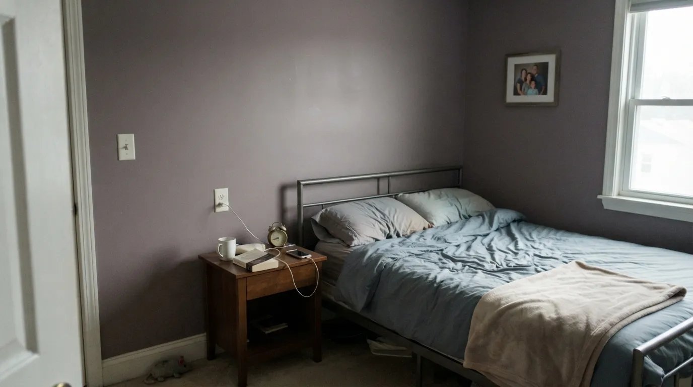
Room by Room
Warm lamps and evening use are exactly the conditions this color wants. Matte or eggshell hides wall texture and deepens the color; keep trim a warm cream, not a stark bright white, or the walls read dusty by comparison.
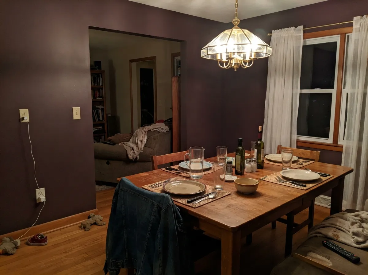
Dining rooms are used mostly after dark, which is Blackberry Mocha's best light. Under a warm chandelier it turns genuinely rich; at lunch under cool daylight it is noticeably more purple, which most diners never notice because the room does its real work at dinner.
Low, warm light flatters it the same way it flatters other mid-depth mood colors. Leather, walnut shelving and a brass desk lamp are natural company; eggshell holds up to chair scuffs better than matte.
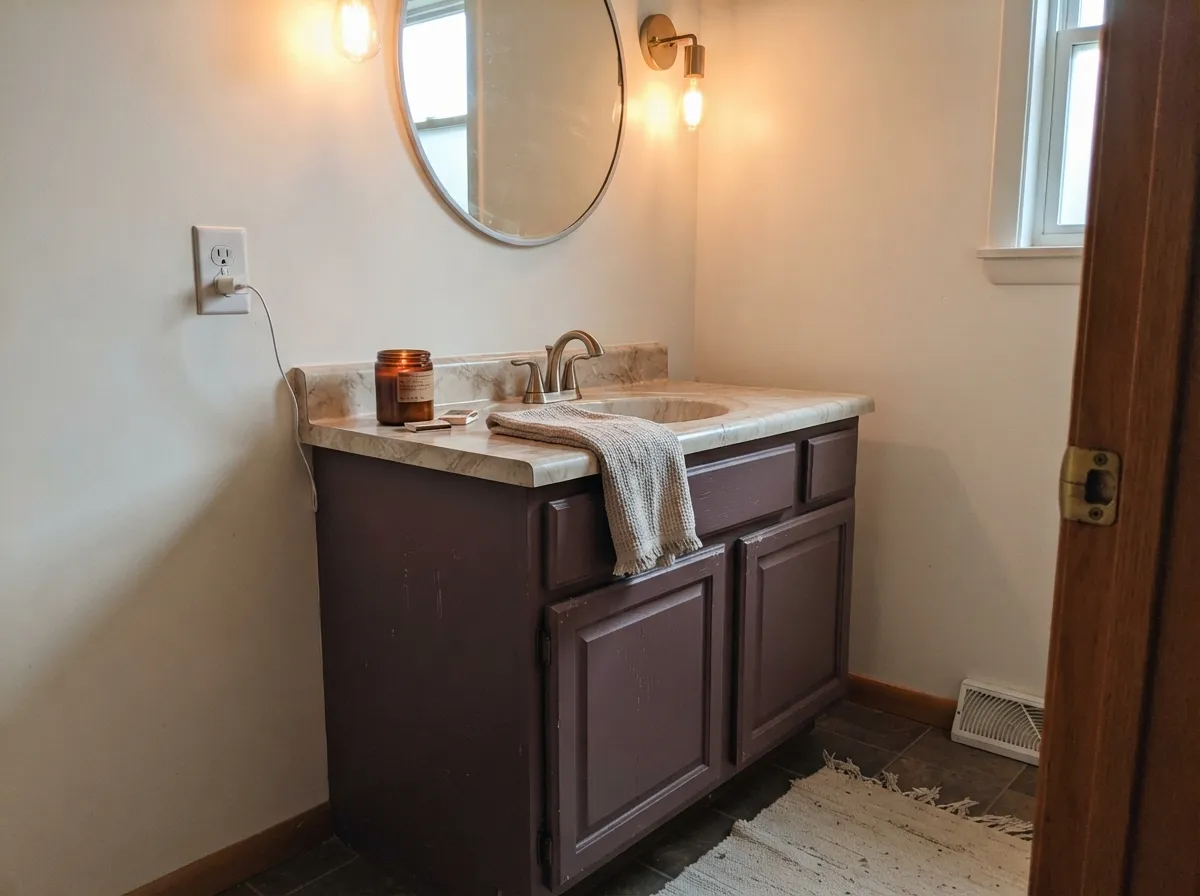
A Blackberry Mocha vanity, or a fully painted small powder room under warm sconce light, reads custom and expensive without betting a whole house on the purple undertone. Satin cabinet enamel, brass hardware, marble or warm-stone top.
Works in a closed, lamplit living room with cream and warm wood. Riskier in an open-plan layout, where it has to negotiate with kitchen cabinets and whatever color the next room wears — the mocha-to-purple shift becomes obvious where daylight and lamplight overlap mid-wall.
Full outdoor sun does the same thing cool daylight does indoors: it grays the color toward a flat purple-brown, and passersby are more likely to read it as dated than deliberate. Save it for interiors; a shaded, north-facing front door is the one exterior spot where the mood still works.
Your Light Is the Risk
2700K bulbs pull the red forward and the walls go rich and velvety — this is the light that earns the "mocha" half of the name.
Cool gray daylight mutes the red, and the purple base takes over as a flat, dusty mauve. Fine if you wanted gray-purple; disappointing if you wanted mocha-brown.
Warmer and browner at the sun hours, cooler and more purple after. The swing is real — sample at both ends of the day.
Cool white LEDs cancel the red the same way north light does, leaving a flat plum-gray. Warm 2700K bulbs are part of this paint job, not optional.
Most complaints about Blackberry Mocha are a light mismatch. Upload a photo of your actual room and see it on your walls — then ask for the same wall in north light or evening lamps before you buy a single sample.
Need It From Another Brand?
Any paint counter can custom-tint Behr 120F-4 directly. If you would rather stay in one brand's own deck, these are the closest stock matches, measured as ΔE2000. Under 2 is a difference you will not see on the wall.
| Brand | Closest color | ΔE | LRV | |
|---|---|---|---|---|
| Benjamin Moore | AmorousAF-600 · Benjamin Moore | 4.1 | 27 | Color page → |
| Valspar | Mellow Mauve1004-7C · Valspar | 2.2 | 27 | Color page → |
| PPG / Glidden | Smoky QuartzPPG18-08 · PPG / Glidden | 4.1 | 28 | Color page → |
| Glidden | Smoky QuartzPPG18-08 · Glidden | 4.1 | 28 | Color page → |
| Dunn-Edwards | PlumvilleDE6012 · Dunn-Edwards | 4.1 | 23 | Color page → |
| Diamond Vogel | Berry Bright1213 · Diamond Vogel | 2.9 | 28 | Color page → |
Similar Behr Colors
The nearest shades to Blackberry Mocha within Behr's own range, ranked by perceptual color distance — useful when you want the same look a touch lighter, darker, or warmer.
WCAG 2.1: AA is 4.5 : 1 for normal text, 3 : 1 for large text, AAA is 7 : 1.
Blackberry Mocha vs the Colors You're Also Considering
Every Blackberry Mocha sample board has the same rivals on it. The numbers show the real lightness gap — then it comes down to which risk you would rather live with.
Pick this for the warmer, more coffee-toned version, where brown gets equal billing with the purple.
Benjamin Moore 1454 · LRV 28Sleepy HollowPick this if you want the cooler, grayer sibling — Sleepy Hollow leans gray-violet with barely any brown.
Pick this when you want the purple to be part of the story, not an occasional surprise.
Behr N150-4 · LRV 25Modern MochaPick this for a straightforward mocha-brown with only a rosy flash, and none of the purple risk.
Inside Behr, the closest options are barely separable. Dream Sunset PPU17-14 at #9B858E and Orchard Plum HDC-CL-05 at #9A858E both sit at LRV 26 and differ from Blackberry Mocha's #9E8692 by a hair. Violet Bouquet PMD-82 and Muse 700B-4, both LRV 25, lean a little more clearly violet. Contessa UL250-6 at LRV 27 and Victorian UL250-18 at LRV 28 are grayer and less berry.
Across brands, Valspar Mellow Mauve 1004-7C at LRV 27 has a deltaE of 2.23, and Diamond Vogel Berry Bright 1213 at LRV 28 is 2.87. Both are very close, so sample before treating either as a swap. Kompozit Berry Bright 1213 at LRV 26 and Hirshfield's Berry Bright 1213 at LRV 27 both sit at 2.92, also very close.
Farther out, PPG Smoky Quartz PPG18-08 at LRV 28 is 4.06, Dunn-Edwards Plumville DE6012 at LRV 23 is 4.09, and Benjamin Moore Amorous AF-600 at LRV 27 is 4.14. All three are close but visibly different side by side.
Blackberry Mocha Coordinating Colors
The rule for coordinating with Blackberry Mocha: warm creams over stark whites, and warm metals over cool ones. It pairs best with the same "mocha" family it shares a name with, plus one true near-black for contrast. These are the partners that keep showing up in rooms that work:
The Mocha Moment: Why Coffee-Browns Are Everywhere Right Now
Blackberry Mocha rides the same wave that put Pantone's Mocha Mousse — its 2025 Color of the Year — on every mood board: warm, coffee-toned browns replacing the gray decade's cool neutrals. Pantone described Mocha Mousse as "thoughtful indulgence" and "harmonious comfort," the exact mood Behr is selling with a name like Blackberry Mocha.
The difference is the purple. Where a straightforward mocha brown like Behr's own Modern Mocha commits fully to coffee, Blackberry Mocha keeps one foot in the mauve trend that came just before it — a hedge that makes it more interesting than a plain brown and more grown-up than a plain mauve, at the cost of being a little less predictable than either.
Blackberry Mocha With Wood Tones and Floors
Warm wood is this color's best friend. Walnut, warm oak, and aged leather deepen the brown side of the undertone and make the purple read as a shadow rather than a surprise. Pale white oak and cream carpet are safe, quieter options that let the color do the talking.
The floor to watch is cool gray — gray-washed hardwood, gray LVP, cool-toned tile. Gray floors pull the same direction as cool light: they mute the red and let the purple dominate, which is fine if that's the look you want, but it is a different room than the mocha-brown one shown on the paint chip. Test a large sample directly over the actual floor before committing a whole room.
Three Ready Palettes Built on Blackberry Mocha
A color is never alone on the wall. These are complete combinations in the 60-30-10 pattern, with the reason each one holds together. Every one opens in the visualizer.
Warm cream trim keeps the purple-brown from reading dusty, and one near-black note — on a headboard wall or a dresser — grounds the room without fighting the mood. All three read warmer, not cooler, together at night.
Try this palette in your roomCream walls keep a small room airy while the vanity carries the color; a near-black door and mirror frame from the same "mocha" family reads deliberate, not accidental. Brass hardware and a warm stone top finish it.
Try this palette in your roomPerfect Taupe carries the rest of the house in a warm, easy neutral so Blackberry Mocha only has to do its job in one room — the dining room or an accent wall — where the purple-brown mood reads intentional instead of overwhelming. Cream trim ties both back together.
Try this palette in your roomBlackberry Mocha FAQ
Is Blackberry Mocha brown or purple?
Both, genuinely — it's built on a tie between red and purple undertones. Warm light and lamps pull it toward coffee-brown; cool daylight and cool LEDs let the purple win and it reads more like dusty plum. If you need it to read as one color in every light, this is the wrong pick.
What trim white goes with Blackberry Mocha?
A warm cream, not a stark white. Behr's own Swiss Coffee or White Mocha keep the walls looking rich; a bright cool white makes the purple undertone more obvious by contrast and the wall can look dusty next to it.
Is it good for a bedroom?
Yes — arguably its best room. It is calmest and most coffee-brown in the low, warm light a bedroom runs on at night. Use matte or eggshell, keep bulbs at 2700K, and it turns genuinely velvety after dark.
Does it work with honey oak or gray floors?
Warm wood — walnut, oak, aged leather — is the safe pairing and pulls the color toward brown. Cool gray floors do the opposite: they mute the red and let the purple take over, turning the room a different, cooler color than the paint chip suggests. Sample over your actual floor first.
Can I use it on cabinets or a vanity?
Yes — Behr lists it for kitchens, bathrooms, trim and cabinets, and a full vanity or kitchen island in Blackberry Mocha is one of its best uses: enough color to feel custom, small enough to repaint if the mood changes. Satin urethane-fortified cabinet enamel is the finish to ask for.
Is this color going to date itself?
Some risk, yes — it's riding the same coffee-brown wave that put mocha-toned neutrals on every mood board recently, and trend colors eventually move on. It's more durable than a pure trend shade because the purple keeps it from reading as a straightforward, of-the-moment brown, but it carries more repaint risk than a plain greige or a true neutral mocha like Behr's own Modern Mocha.
Have you painted with Blackberry Mocha?
Rate it — one tap helps the next reader decide.
Ask a Question