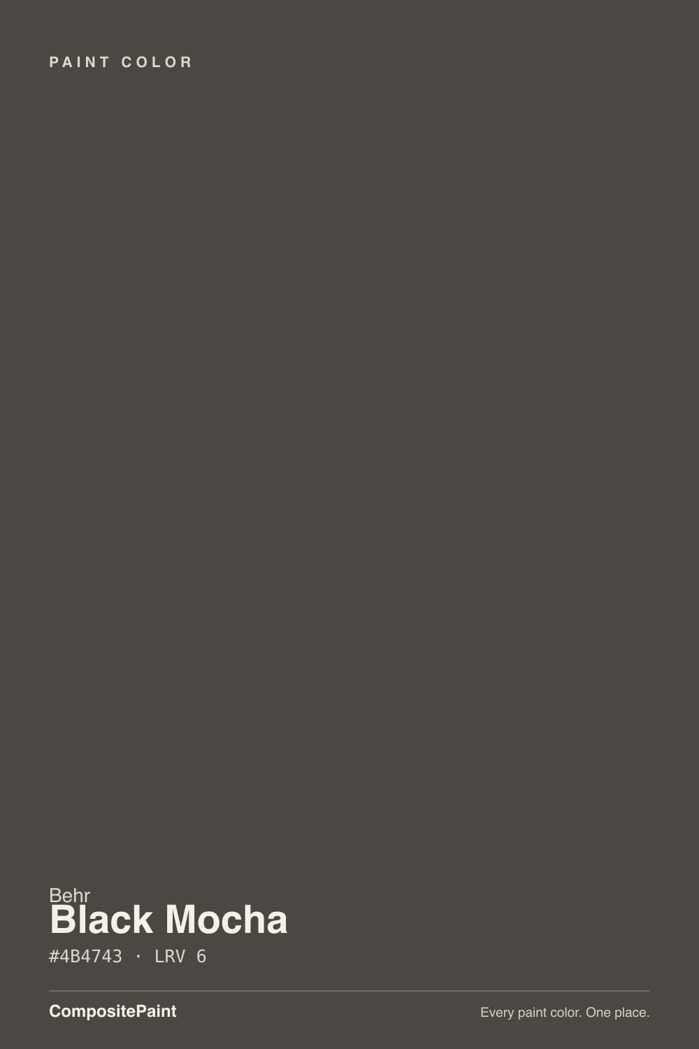
Black Mocha
The warm brown-black that shipped in the same Behr palette as the famous 2024 Color of the Year and never got the spotlight — reviewed honestly: where the mocha shows, where it goes flat, and what to pick instead.

Jessica has spec'd whites and neutrals for more than 300 rooms and keeps a sample wall of painted drawdowns in her studio. Every color review is checked against real reader rooms in the comments and re-tested when a formula changes. About the testing process →
- 1Cordovan Brown0
- 2Black Mocha6
The Fast Verdict
Black Mocha is the Behr near-black that never got its own moment. It shipped in the 2024 Color Trends Palette next to Cracked Pepper, and Cracked Pepper walked off with Color of the Year while Black Mocha waited one shelf over, a shade browner and warmer. That difference is the whole review: point real light at it and warm mocha edges show through the near-black; take the light away and it reads like flat, ordinary black. Buy it for the brown, not as a cheaper stand-in for a true cool black.
Front doors and shutters against a warm-white body · kitchen islands with brass and wood · small drenched rooms — powder baths, dens · anyone who wants black with warmth, not charcoal
You want a true cool black like Tricorn Black · the room gets no direct light or warm lamps · your trim and neighbors are icy cool grays · you specifically want Behr's actual 2024 Color of the Year
- A near-black that reads warm, not stark or clinical
- Front doors and islands both love it against warm-white partners
- Small drenched rooms feel finished with one color decision
- Available across Behr's cabinet, trim and even chalk-paint lines — easy to match across a project
- Deep enough (LRV 6) to hide scuffs and handprints on a door or island
- Reads as plain flat black without real light — the warmth is easy to miss
- Not a substitute for a true cool black; it will always show brown in sun
- Fights cool grays and icy whites instead of complementing them
- Overshadowed by Cracked Pepper, so far fewer real-room photos exist online to sample against
What Color Is Black Mocha, Really?
Behr filed this in the black family, but on the wall it is a brown-black — a near-black with a low-strength warm, slightly orange undertone instead of the blue-black lean most "black" paints carry. It belongs to Behr's 2024 Color Trends Palette, the same release that crowned Cracked Pepper Color of the Year. Cracked Pepper got the campaign and the magazine spreads; Black Mocha shipped alongside it as the quieter, browner option and mostly got discovered by people cross-shopping cabinet and door paint lines, not by anyone chasing a trend headline.
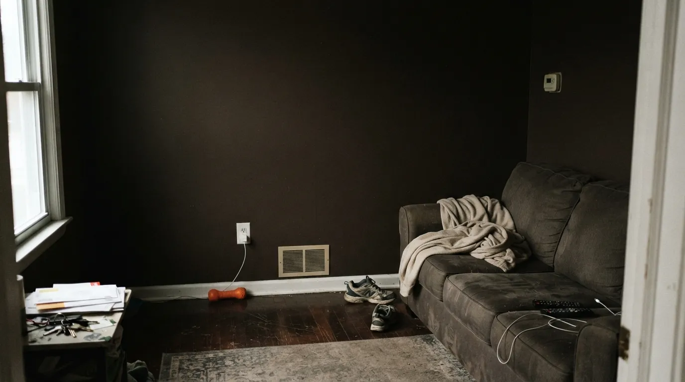
At LRV 6 it reflects almost no light, so in most rooms it reads flatly dark — the mocha note is not something you see across a room, it is something you see at the edges, where the light catches. Put it next to a true cool black like Sherwin-Williams Tricorn Black (LRV 3) and Black Mocha is visibly a step lighter and warmer; put it in a dim corner with no direct light and the two are nearly impossible to tell apart. Strong light is what earns this color its name.
Undertone in one line: warm brown first, with a low-strength orange lean — never blue, never purple. If your sample looks flat charcoal-black with no warmth at all, that is the room's light being cool or dim, not the paint changing; if it looks distinctly brown at the edges in afternoon sun, that is the color doing exactly what it is supposed to do.
Where It Shines
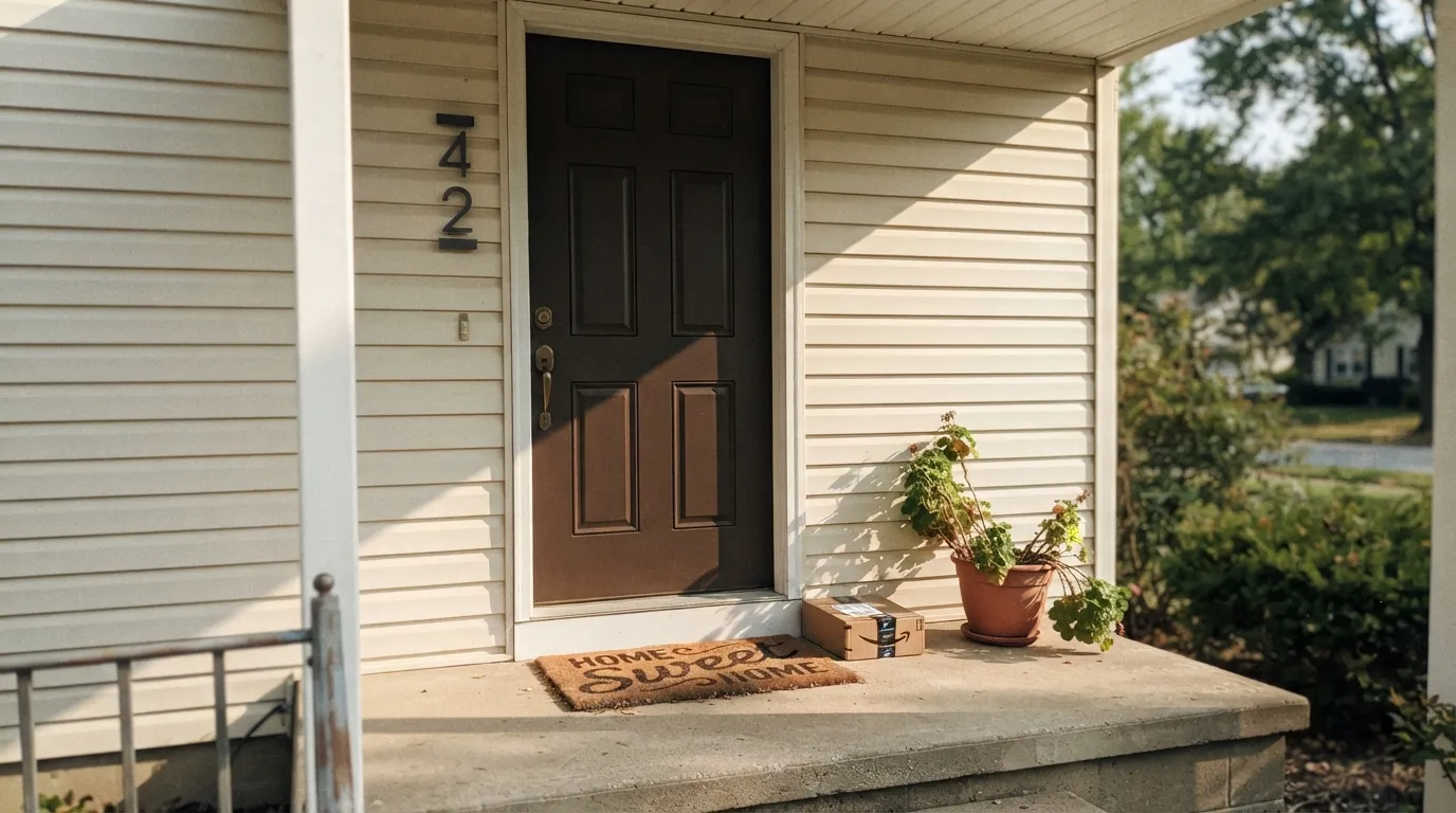
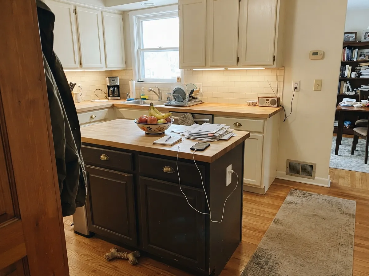
Give it real light and a warm partner and the mocha comes forward without ever losing the drama of a near-black. Front doors are its best public job: full sun rakes across the panel and the brown shows at the raised edges while the recesses stay near-black, which is a more interesting result than a flat cool black gets in the same light. Indoors, a kitchen island with cream perimeter cabinets and brass pulls is its second home — the warmth in the paint meets the warmth in the metal, and neither one fights the other the way a cool black would.
Where It Fails
Almost every disappointed review of Black Mocha comes from one of three mismatches, and all three are predictable before the first coat. None of them are the paint failing — they are a warm brown-black being asked to do a cool black's job, or being asked to perform in light it never gets.
In daylight the brown is visible, especially at edges and highlights — which is a letdown if you were picturing a flat, graphite-cool black like Tricorn Black or Iron Ore. Black Mocha will always read a little warm. If cool and stark is the goal, buy the color built for that instead.
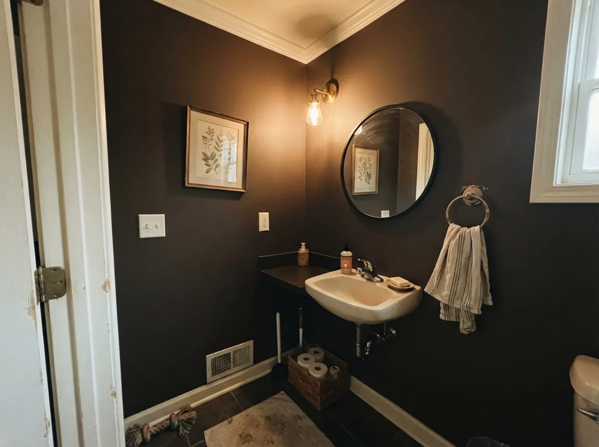
At LRV 6 the color needs light to show its character. In a windowless powder room or a north-facing den with the lights off, it goes flat and featureless — not bad, just anonymous, which defeats the reason most people choose a brown-black over an ordinary black. Add a warm lamp or accept the plainer read.
The undertone is warm, so it wants warm company — creamy trim, brass, wood. Pair it with a cool blue-white or a steel-gray neighbor and the contrast reads muddy instead of sophisticated, because the two undertones are working against each other rather than together.
Room by Room
Semi-gloss on a door under a warm-white or greige body reads confident and current without the starkness of a cool black. Full sun brings the mocha to the surface at panel edges; shade flattens it toward plain black, which is still a fine, safe result on a door.
Satin cabinet enamel on an island against cream or white perimeter cabinets and brass hardware is the classic modern-farmhouse-to-transitional move. Keep the surrounding walls light enough that the room does not go cave-like.
Small rooms take a near-black well. Four walls of Black Mocha with a warm white trim (White Dove, Swiss Coffee) and a real lamp on turns a windowless powder bath into the most interesting room in the house instead of a hole.
Beautiful behind a media console or built-ins with warm lamp light and wood furniture. In a room that runs on daylight alone and stays dim after sunset, it can feel heavy rather than cozy — plan the lighting before the paint.
Works as a headboard wall with warm 2700K sconces; as a whole-room color it needs a bedroom that actually gets afternoon sun, or the warmth never shows and it just reads dark and closed-in at night.
Satin cabinet enamel on a vanity under warm-toned stone or butcher block, with brass or matte-black hardware, is a low-risk way to try the color before committing a whole room to it.
Your Light Is the Risk
Full sun raking across a door or shutter panel is where the mocha shows — warm brown at the raised edges, near-black in the recesses. This is the light the color earns its name in.
No direct light and no lamps flattens it into ordinary, characterless black. Not a failure, just a plainer color than what you paid for.
Bright midday sun shows the most depth and brown detail at edges; by evening shade it settles into a flatter near-black. Expect the color to look like two different paints across one day.
2700K warm bulbs deepen the cozy mocha cast at night. Cool white LEDs push it toward flat gray-black and erase the warmth — swap the bulb before you second-guess the paint.
Most complaints about Black Mocha are a light mismatch. Upload a photo of your actual room and see it on your walls — then ask for the same wall in north light or evening lamps before you buy a single sample.
Need It From Another Brand?
Any paint counter can custom-tint Behr PPU24-01 directly. If you would rather stay in one brand's own deck, these are the closest stock matches, measured as ΔE2000. Under 2 is a difference you will not see on the wall.
| Brand | Closest color | ΔE | LRV | |
|---|---|---|---|---|
| Sherwin-Williams | Black FoxSW 7020 · Sherwin-Williams | 1.9 | 7 | Color page → |
| Benjamin Moore | Cordovan BrownES-62 · Benjamin Moore | 2.2 | 0 | Color page → |
| Valspar | Ebony Keys8006-2G · Valspar | 0.7 | 6 | Color page → |
| PPG / Glidden | Phantom MistPPG1002-7 · PPG / Glidden | 1.3 | 6 | Color page → |
| Glidden | Phantom MistPPG1002-7 · Glidden | 2.2 | 6 | Color page → |
| Dutch Boy | Blackened Kettle439-7DB · Dutch Boy | 1.9 | 7 | Color page → |
Similar Behr Colors
The nearest shades to Black Mocha within Behr's own range, ranked by perceptual color distance — useful when you want the same look a touch lighter, darker, or warmer.
WCAG 2.1: AA is 4.5 : 1 for normal text, 3 : 1 for large text, AAA is 7 : 1.
Black Mocha vs the Colors You're Also Considering
Every Black Mocha sample board has the same rivals on it. The numbers show the real lightness gap — then it comes down to which risk you would rather live with.
Pick this if you want the warmer, browner sibling without the violet surprise.
Behr PPU18-01 · LRV 5Cracked PepperPick this if you want the one Behr actually crowned Color of the Year — cooler, with its own violet flash in strong sun.
Pick this for a near-black that still reads warm and approachable instead of stark.
Sherwin-Williams SW 6258 · LRV 3Tricorn BlackPick this for a true, cool reference black with zero brown lean, even in strong sun.
Rodda Canopy CA212 at #4B4642 and LRV 6 is the closest cross-brand match at a deltaE of 0.67, followed by Valspar Ebony Keys 8006-2G at 0.72 and Diamond Vogel November Storms 0543 at 0.73. All three are matches in practice, not approximations.
Sherwin-Williams Black Fox SW 7020 at #4F4842 and LRV 7 is the best-known near-equivalent, at deltaE 1.88, which means the two are visually identical in normal room light. Clare Blackish PNT100-DP-54 at deltaE 1.94 and PPG Phantom Mist PPG1002-7 at deltaE 1.31 land in the same band.
The differences appear further out. Farrow and Ball Liquorice No. CB10 at #4A4949 and LRV 7, at deltaE 2.78, is very close but should be sampled first, since its channels are even and it reads more neutral. C2 Paint Stout C2-965 at #464646 sits at deltaE 3.08 with the same flat neutrality, while Portola Paints Black Sky at deltaE 4.05 is close but visibly different side by side, leaning cooler.
Black Mocha Coordinating Colors
The rule for coordinating with Black Mocha is the same one that governs every warm near-black: feed it warm partners and it looks deliberate, feed it cool ones and it looks muddy. Creamy whites, warm greiges, and brass all meet its undertone halfway. These are the partners that keep showing up in rooms that work:
The Sibling Behind the 2024 Color of the Year
Black Mocha's whole story is a scheduling accident. Behr's 2024 Color Trends Palette needed a near-black, and it shipped two: Cracked Pepper, which took the Color of the Year title and the campaign budget, and Black Mocha, which quietly rode along in the same release. Cracked Pepper leans cooler with a violet flash in strong sun; Black Mocha leans warmer and browner and never got its own launch moment.
That obscurity has one practical upside for a buyer: it is a genuinely good color that is not chasing a trend cycle. It predates nothing, it will not date the way a viral color can, and because fewer people painted it for a magazine spread, there is less pressure to match a Pinterest photo — you are choosing it for what it actually does in your house, not for what it looked like in someone else's.
Black Mocha With Wood Tones and Metals
Warm woods are the easy call: walnut, white oak, and butcher block all sit comfortably against the brown undertone, and the paint reads like an extension of the wood's depth rather than a hard stop next to it. Cool gray-washed floors are the harder pairing — not wrong, but the near-black reads flatter and more purely black against them, losing some of its warmth.
Metals follow the same logic as every warm undertone: unlacquered brass and warm bronze hardware are its best friends, aged black iron works fine since it disappears into the paint at a glance, and polished chrome is the one finish that reads noticeably cold next to it.
Three Ready Palettes Built on Black Mocha
A color is never alone on the wall. These are complete combinations in the 60-30-10 pattern, with the reason each one holds together. Every one opens in the visualizer.
A warm-white body keeps the near-black door from reading harsh; crisp trim gives the eye an edge to land on. Full sun brings the mocha out on the door in exactly the light this scheme puts it in.
Try this palette in your roomAlabaster keeps the room bright enough that the near-black island reads as a deliberate anchor rather than a hole; Even Better Beige softens the transition to warm wood floors and open shelving.
Try this palette in your roomFour walls of a small room take deep color well; White Dove trim stops it from feeling like a closet instead of a jewel box. Urbane Bronze on the vanity stays in the same warm-dark family without flattening to plain black.
Try this palette in your roomBlack Mocha FAQ
Is Black Mocha the same as Behr's Color of the Year?
No — that was Cracked Pepper, part of the same 2024 Color Trends Palette. Black Mocha shipped alongside it as the warmer, browner sibling and never got the marketing push, which is why it is far less photographed and discussed online.
Is Black Mocha black or brown?
Technically brown-black — a low-strength warm, slightly orange undertone on top of a near-black base. In dim light it reads like plain black; in direct sun the brown shows, especially at edges and raised trim.
Is it good for a kitchen island?
Yes, especially with cream or white perimeter cabinets and brass or matte-black hardware. Keep the rest of the kitchen light enough that the near-black island reads as an intentional anchor, not a cave.
Does it work on a front door?
It is one of its best jobs. Semi-gloss against a warm-white or greige body reads current without the starkness of a cool black, and full sun on the door is exactly the light that shows the mocha undertone.
How many coats does it need?
Plan on two finish coats over any lighter existing color; Behr's Marquee and Premium Plus lines are formulated for strong hide, but a very dark color still shows thin spots in raking light. Going over a bright existing color, a gray-tinted primer saves a coat.
What should I buy instead if I want a true black?
Sherwin-Williams Tricorn Black or Sherwin-Williams Iron Ore give you a cooler, more neutral dark with no brown lean. Black Mocha will always read a step warmer, even in the coolest light.
Have you painted with Black Mocha?
Rate it — one tap helps the next reader decide.
Ask a Question