Kings Court
Behr's deepest jewel-toned purple, reviewed honestly: where it turns rich and regal, the light that flattens it to a black blob, and what to pick instead.

Jessica has spec'd whites and neutrals for more than 300 rooms and keeps a sample wall of painted drawdowns in her studio. Every color review is checked against real reader rooms in the comments and re-tested when a formula changes. About the testing process →
- 1Nocturne Shade5
- 2Kings Court10
- 3Blue Nova17
- 4Gothic Purple24
The Fast Verdict
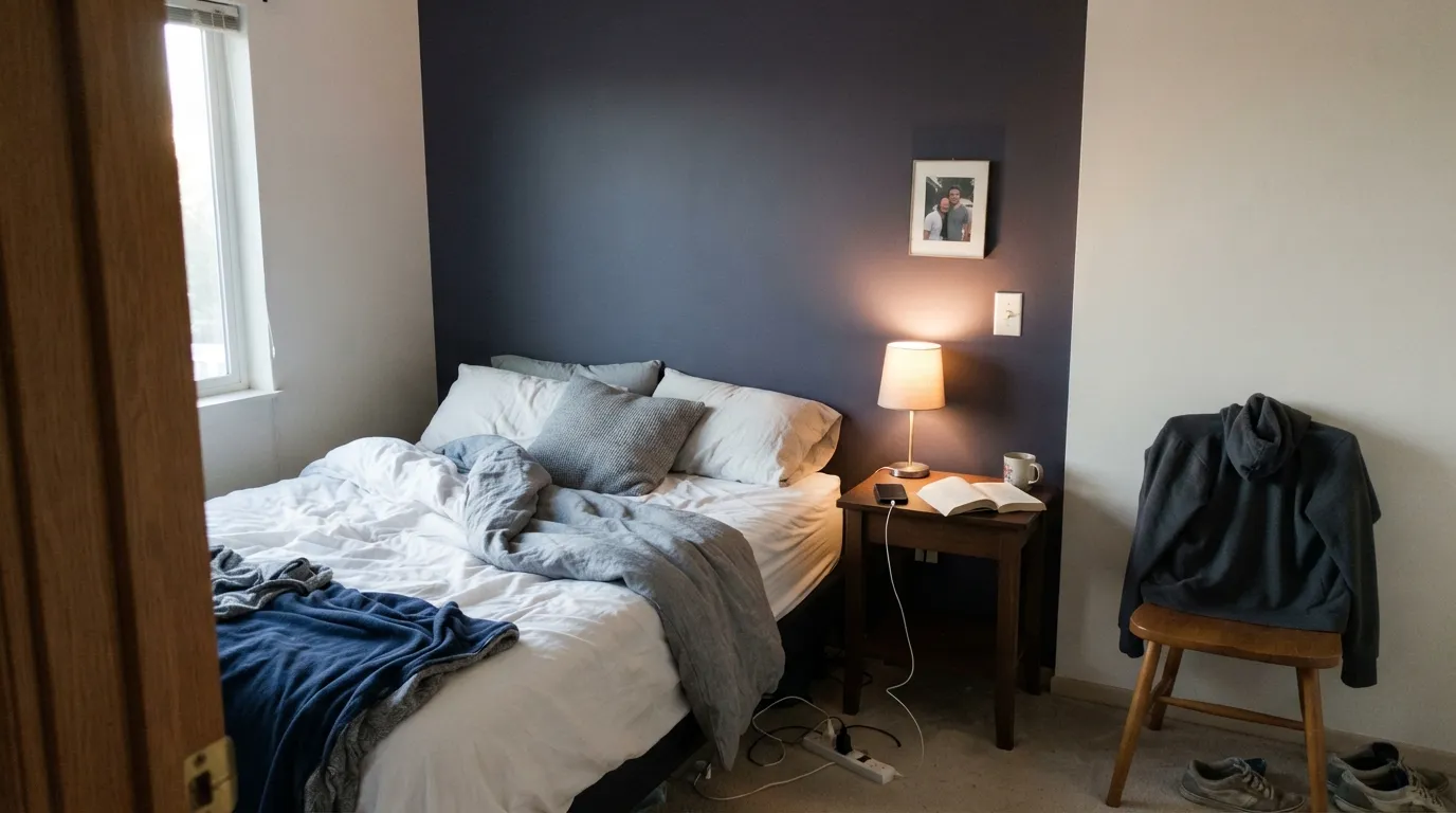
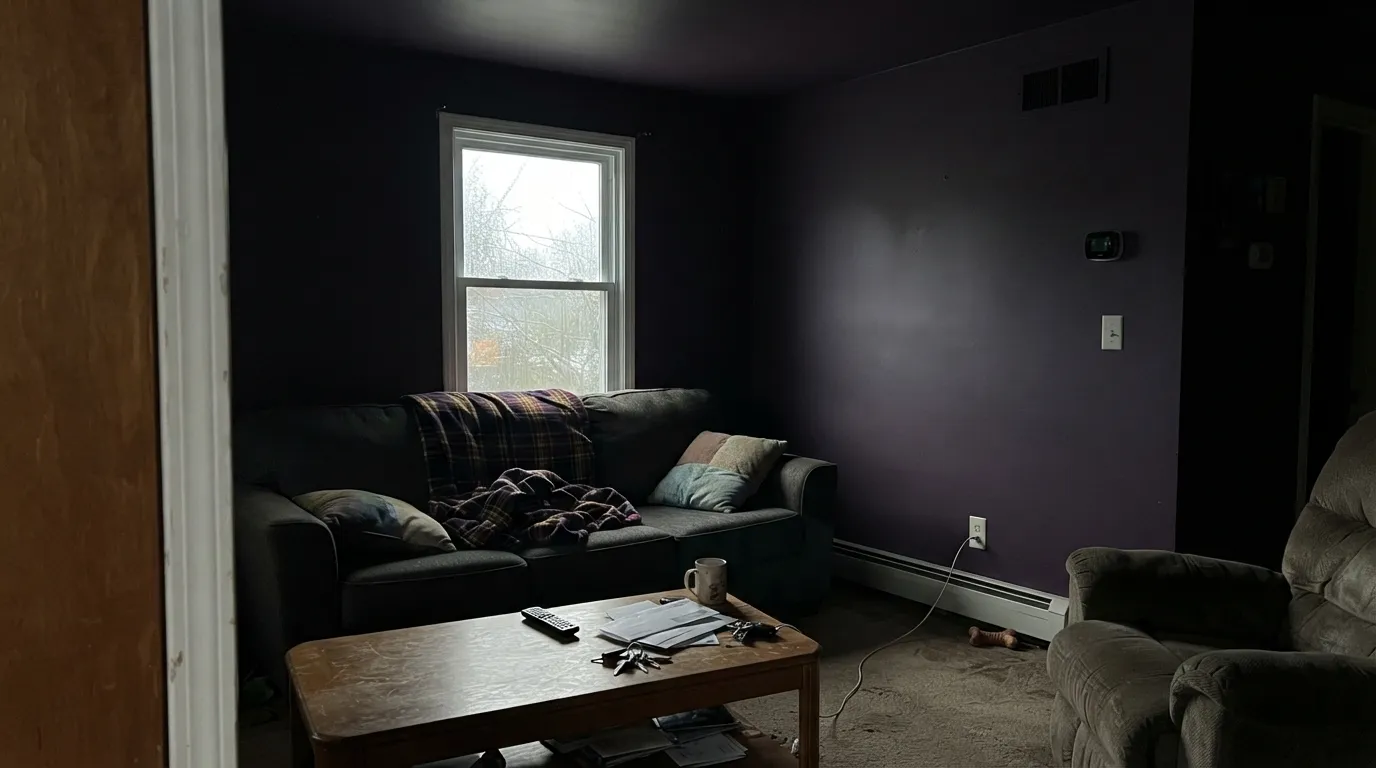
King's Court is Behr's answer to "I want purple, but make it serious." It is not a pastel lilac and not a candy-bright violet — it is a deep blue-violet grayed down with a charcoal cast, dark enough at LRV 10 to sit in near-black territory. Under a warm lamp it turns rich, plum-black, genuinely regal, which is exactly the mood Behr sells it on. Skip real light and it collapses into a flat, featureless dark blob with none of that personality left — which is why this is a one-wall, one-door, one-small-room color, not a whole-house neutral.
One accent wall or a small jewel-box room · a front door that wants real drama · a bedroom built around a dark, cocooning mood · anyone who wants purple with real weight, not a pastel hint
You want to paint an entire room in it without real light · you actually want a plain near-black neutral · your room only gets weak, indirect daylight · you're not prepared to repaint if the mood ever feels like too much
- A genuinely deep, jewel-toned purple with real presence — not a pastel hint of color
- Grayed with a charcoal-blue undertone, so it reads sophisticated instead of candy-bright
- One of Behr's rare expert-picked colors sold across interior, exterior, and even porch-floor lines
- A single accent wall or door delivers real drama without repainting a whole house
- Warm lamplight pulls out a rich plum-magenta flush at night
- At LRV 10 it can flatten into a featureless near-black blob without a nearby light source
- Whole rooms painted in it read as a cave without real white or near-black contrast
- Daylight and camera flash expose the violet hard — it won't pass as a plain neutral
- A color this saturated and this dark carries real repaint risk if the mood ever feels like too much
What Color Is Kings Court, Really?
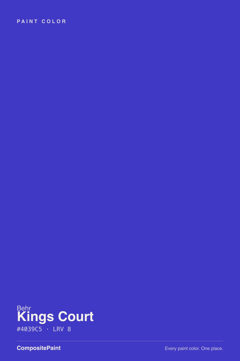
King's Court is Behr's deepest true purple in its expert-picked accent range — a blue-violet grayed down with a charcoal-gray cast, so it reads dark plum more than it reads Barney-purple. Behr has featured it as one of its Colors of the Month, which is a notch of trust the brand doesn't give to every saturated color in the deck; it treats King's Court as a serious pick, not a novelty swatch.
At LRV 10 it sits in the same reflectance band as Behr's own near-black Cracked Pepper and Benjamin Moore's Silhouette — genuinely dark, genuinely capable of reading as near-black in low light. Compare that to a lighter mauve like Sleepy Hollow (LRV 28) and the gap is the whole story: Sleepy Hollow holds its color in a dim room, King's Court needs a light source to prove it's purple at all. That trade is the entire calculation with this color: give it a lamp or a window and it glows; leave it in a shadowed corner and it goes flat.
Undertone in one line: blue-violet first, with a charcoal-gray weight that keeps it from reading candy-bright, and a warm-light flush toward plum-magenta under incandescent or 2700K bulbs. It is also genuinely more flexible across surfaces than most colors this bold — Behr sells it in interior lines with a one-coat hide guarantee, in exterior paint and primer, and even in porch-and-patio floor enamel, which is why it turns up on front doors and painted floors almost as often as bedroom walls.
Where It Shines
Give it a light source — a bedside lamp, a window it can catch, morning sun on a front door — and it turns rich, plum-black and genuinely regal. Its best home is restraint: one wall, one door, or one small room, with enough white or near-black contrast around it that the purple reads as a decision, not an accident that happened in a dim hallway.
Where It Fails
Almost every disappointed review of King's Court comes from one of three scripts, and all three are predictable before the first coat. None of them are the paint's fault — but if your room matches one, this is not your color, and a bigger sample will only confirm it.
Floor-to-ceiling King's Court in a small room without real white or near-black contrast reads like a cave, not a jewel box — there's no relief for the eye to land on. Cap it at one wall, a door, or a powder room with a bright white ceiling and trim; let the depth do the work in a small dose.
On the chip, in weak light, it can pass for a plain charcoal neutral. Get it on a real wall under daylight or camera flash and the blue-violet is unmistakable. If a true near-black neutral is actually what you want, this isn't it — look at Behr Cracked Pepper instead.
At LRV 10, without a light source nearby, King's Court flattens into a featureless dark blob — all the depth and none of the color that made you pick it. This is a color that needs a job to do near a window or a fixture, not a wall it's asked to carry alone in the dark.
Room by Room
Behind the headboard with a warm bedside lamp, it turns deep and cocooning without swallowing the whole room. Keep the other three walls and the ceiling white or a soft warm neutral so the accent stays an accent.
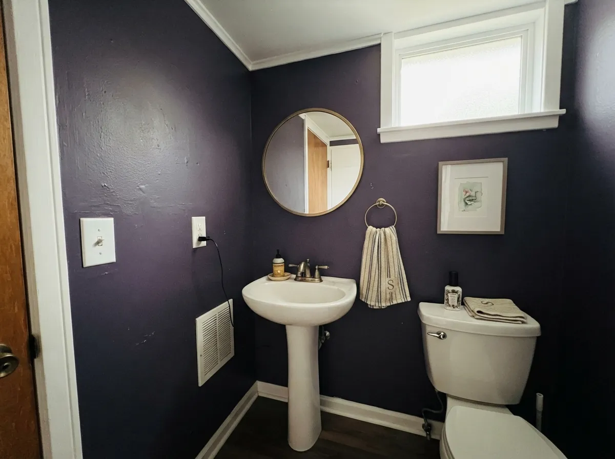
Small rooms take saturated color well, and King's Court on all four walls of a powder room reads custom, not overwhelming, especially with a bright white ceiling and trim to keep it from feeling like a closet.
A moody dining room in warm lamplight is exactly the mood this color is built for. It needs a dimmable warm fixture over the table — under flat overhead light it goes dull instead of dramatic.
Beautiful as the one wall behind a sofa or built-in shelving; a genuine risk as the color for all four walls in a room people use all day in mixed light.
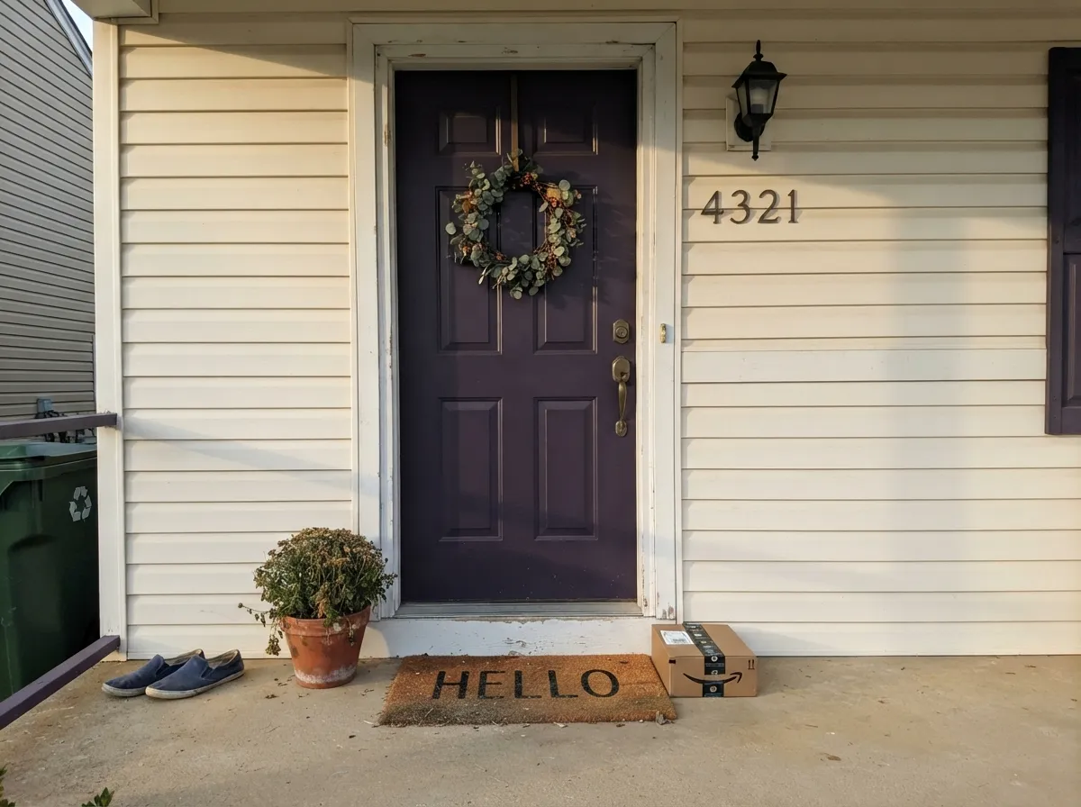
Behr sells King's Court in its exterior paint-and-primer lines specifically. Against a warm white or off-white house and near-black or dark bronze hardware, it reads deliberate and expensive rather than random.
Cabinets or an island in this depth are a serious commitment against everyday kitchen lighting; most kitchens are better served by a lighter jewel tone or a deep neutral that won't fight the room's task lighting.
Your Light Is the Risk
A 2700K bedside or sconce lamp pulls the plum and magenta forward — this is the light the color was picked for, not an accident.
With no light source nearby, LRV 10 collapses into a flat dark blob — all depth, no visible purple. Give it a job near a window or a lamp.
Full sun on an exterior door or a bright window wall reveals the blue-violet in full — more purple, less black, than the dim-room read.
Cool white LEDs push it toward a flat blue-black; warm 2700K bulbs bring the red and plum forward. Swap the bulb before you swap the paint.
Most complaints about Kings Court are a light mismatch. Upload a photo of your actual room and see it on your walls — then ask for the same wall in north light or evening lamps before you buy a single sample.
Need It From Another Brand?
Any paint counter can custom-tint Behr P560-7 directly. If you would rather stay in one brand's own deck, these are the closest stock matches, measured as ΔE2000. Under 2 is a difference you will not see on the wall.
| Brand | Closest color | ΔE | LRV | |
|---|---|---|---|---|
| Sherwin-Williams | African VioletSW 6982 · Sherwin-Williams | 2.1 | 11 | Color page → |
| Benjamin Moore | Mauve Bauhaus1407 · Benjamin Moore | 0.8 | 10 | Color page → |
| Valspar | Rollick4003-10C · Valspar | 2.7 | 10.2 | Color page → |
| PPG / Glidden | EggplantPPG1247-7 · PPG / Glidden | 2.1 | 9 | Color page → |
| Glidden | EggplantPPG1247-7 · Glidden | 2.1 | 9 | Color page → |
| Dutch Boy | Purely Purple144-7DB · Dutch Boy | 2.1 | 11 | Color page → |
Similar Behr Colors
The nearest shades to Kings Court within Behr's own range, ranked by perceptual color distance — useful when you want the same look a touch lighter, darker, or warmer.
WCAG 2.1: AA is 4.5 : 1 for normal text, 3 : 1 for large text, AAA is 7 : 1.
Kings Court vs the Colors You're Also Considering
Every Kings Court sample board has the same rivals on it. The numbers show the real lightness gap — then it comes down to which risk you would rather live with.
Pick this if you specifically want the blue-violet lean and Behr's multi-surface product lines.
Benjamin Moore 2117-30 · LRV 9ShadowPick this if you want the same near-black depth from Benjamin Moore — a smoky amethyst instead of King's Court's blue-violet.
Pick this when you want the color to read unmistakably purple, not just smoky gray.
Sherwin-Williams SW 9689 · LRV 10Ripe BerryPick this for the same depth with a grayer, less violet cast — a quieter smoky plum.
King's Court Coordinating Colors
The rule with King's Court: pair it with a genuinely crisp white to keep its edges sharp, or with another near-black to let it sit quietly as one dark note among several. Warm creams read a little muddy against it; a cooler, cleaner white does the job better. These are the partners that keep showing up in rooms that work:
Why This Color Turns Up on Doors, Floors, and Walls Alike
King's Court is more flexible across surfaces than most colors this saturated. Behr sells it in its Dynasty and Marquee interior lines with a one-coat hide guarantee — a real convenience for a color this deep, since dark saturated paint over a lighter wall usually means extra coats. It's also available in exterior paint-and-primer formulas and, less commonly for a color this bold, in Premium porch-and-patio floor enamel, which is why King's Court shows up under people's feet as often as it shows up on their bedroom walls.
Behr has featured it as a Color of the Month — a notch of promotion the brand reserves for colors it's confident will perform, not just look good in a swatch fan. Treat that as a reasonable vote of confidence in the color's quality, not as proof it will suit every room; the light-dependence described above is real regardless of how the brand markets it.
King's Court With Wood Tones and Metals
Dark, warm woods are this color's best company: walnut, espresso stain, and aged leather all deepen alongside it instead of fighting it. Pale white oak and gray-washed floors are a safer, calmer pairing that lets the purple do the talking without a second warm tone competing for attention.
Golden honey oak is the pairing to test carefully — yellow-orange sits opposite violet on the color wheel, so a warm honey floor can push King's Court further toward a muddy, less regal purple. Metals are more forgiving: brass, aged bronze, and matte black hardware all read well against it, while polished chrome is the one finish that can feel cold and mismatched next to this much warmth.
Three Ready Palettes Built on Kings Court
A color is never alone on the wall. These are complete combinations in the 60-30-10 pattern, with the reason each one holds together. Every one opens in the visualizer.
One wall in King's Court against Polar Bear's soft everyday white keeps the room from turning into a cave; Wrought Iron on a bed frame or door gives the room a single dark anchor so the purple reads as a decision, not an accident.
Try this palette in your roomA warm off-white body lets the door read as the one deliberate splash of color; Cracked Pepper shutters give the facade a second dark note so the purple door doesn't stand alone against all that white.
Try this palette in your roomA powder room takes the full-strength color well when the ceiling and trim stay crisp white to keep the small space from closing in; Shadow on the door adds one deeper tonal note instead of a jarring switch to black.
Try this palette in your roomKings Court FAQ
Is King's Court purple or black?
Purple — a deep blue-violet grayed down with a charcoal cast, dark enough at LRV 10 to read near-black in weak light. Get it under daylight, a lamp, or a camera flash and the violet is unmistakable. If you want a genuine neutral near-black, this isn't it.
What's the undertone?
Blue-violet first, with a charcoal-gray weight that keeps it from reading candy-bright, warming toward plum-magenta under incandescent or warm LED bulbs. Under cool white LEDs it goes flatter and bluer.
Can I paint a whole room in it?
Only a small one, and only with real light-and-white contrast — a powder room with a bright ceiling and trim, for example. A larger room in full King's Court without enough white relief reads like a cave, not a jewel box.
Does it work on a front door?
Yes — Behr sells it specifically in exterior paint-and-primer lines. Against a warm off-white or light siding color and dark hardware, it reads deliberate and expensive rather than out of place.
What trim white goes with it?
A crisp, cool white like Behr White or Polar Bear keeps the deep purple from muddying against a warmer trim. Keep the ceiling white too, especially in a small room.
Will it date?
Like most jewel-tone accent colors, it carries more repaint risk than a neutral. The charcoal-gray undertone gives it more staying power than a fully saturated trend-purple, but it is still a bold, opinionated pick — buy it because you want the drama, not as a safe bet for resale.
Have you painted with Kings Court?
Rate it — one tap helps the next reader decide.
Ask a Question