Color spec
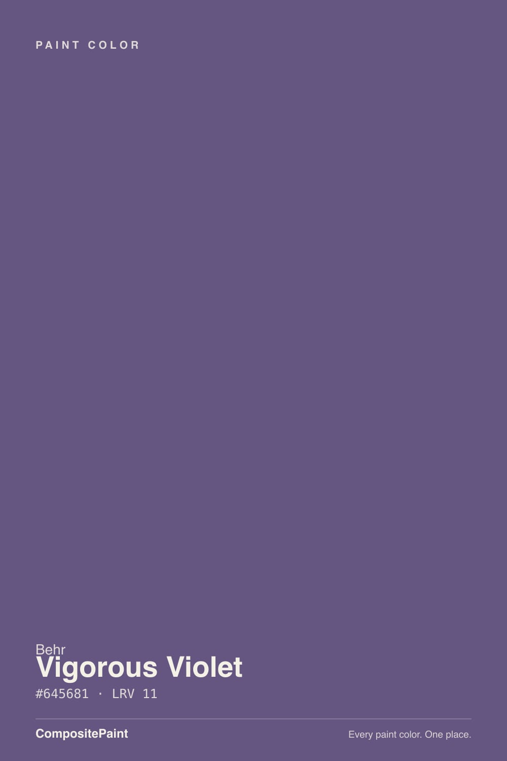
| Brand | Behr |
| Name | Vigorous Violet |
| SKU | PPU16-02 |
| Hex | #645681 |
| RGB | 100, 86, 129 |
| HSL | 260°, 20%, 42% |
| LRV | 11 |
| Undertone | cool blue tone |
| Family | Purple |
About Behr Vigorous Violet
With an LRV of 11, Vigorous Violet is a deep, dramatic shade. It soaks up light in north-facing rooms and looks richest where strong daylight hits it. Its violet undertone is the part to watch: it gets picked up by whatever sits next to it, so test it against your trim, floor and the room's main light before committing. Warm artificial light softens it; cool LED can make it look flat, so match your bulbs to the mood you want.
Vigorous Violet works best as a feature — a single wall, built-ins, a study or dining room — rather than wrapping a whole bright space. Purples range from restful (bedrooms) to dramatic (powder rooms) depending on depth.
Closest matches by brand
9 brands within ΔE 5The closest matches per brand by ΔE2000, computed against each brand's full deck. Only colors within ΔE 5 (close enough to substitute on a wall) are shown — brands with no real match are left off. Tap any swatch for its full single-color spec; tap the brand title to browse all purple from that brand.
Sherwin-Williams
Benjamin Moore
Valspar
PPG / Glidden
Glidden
Dutch Boy
HGTV Home by Sherwin-Williams
Dunn-Edwards
Diamond Vogel
Similar Behr colors
closest in the Behr deckThe nearest shades to Vigorous Violet within Behr's own range, ranked by perceptual color distance — useful when you want the same look a touch lighter, darker, or warmer.
Coordinated palette
Generated by hue-rotating #645681 in HSL space. Pair Vigorous Violet with one accent and one neutral — the swatches below are starting points, not final picks.
Accessibility (WCAG contrast)
WCAG 2.1: AA = 4.5:1 normal text · AA Large = 3:1 large text · AAA = 7:1 normal text.
Behr Vigorous Violet Equivalents at Other Brands
Matching Vigorous Violet from a different paint counter? Below is the single closest color in each major US deck and how close it really is. Remember that any paint store can also custom-tint Behr PPU16-02 directly — these equivalents are for when you'd rather stay inside one brand's own deck.
Sherwin-Williams Equivalent of Vigorous Violet
At Sherwin-Williams, the closest color to Vigorous Violet is African Violet (SW 6982) — very close at ΔE 2.1, though not an exact twin. It sits at the same lightness (LRV 11 vs 11) and carries a cool violet undertone; sample both side by side if the room gets strong natural light. See the full African Violet swatch →
Benjamin Moore Equivalent of Vigorous Violet
At Benjamin Moore, the closest color to Vigorous Violet is Mauve Bauhaus (1407) — very close at ΔE 2.42, though not an exact twin. It sits at the same lightness (LRV 10 vs 11) and carries a cool blue undertone; sample both side by side if the room gets strong natural light. See the full Mauve Bauhaus swatch →
Valspar Equivalent of Vigorous Violet
At Valspar, the closest color to Vigorous Violet is Purple Valley (1001-5A) — very close at ΔE 2.4, though not an exact twin. It sits at the same lightness (LRV 10.8 vs 11) and carries a cool violet undertone; sample both side by side if the room gets strong natural light. See the full Purple Valley swatch →
Glidden Equivalent of Vigorous Violet
Glidden's nearest match is Fresh Grape Juice (10RB 10/219), visually identical in normal room light (ΔE 1.93). It sits at the same lightness (LRV 10 vs 11) and carries a cool blue undertone, so it substitutes for Vigorous Violet without repainting risk. See the full Fresh Grape Juice swatch →
Dutch Boy Equivalent of Vigorous Violet
At Dutch Boy, the closest color to Vigorous Violet is Purely Purple (144-7DB) — very close at ΔE 2.1, though not an exact twin. It sits at the same lightness (LRV 11 vs 11) and carries a cool violet undertone; sample both side by side if the room gets strong natural light. See the full Purely Purple swatch →
Dunn-Edwards Equivalent of Vigorous Violet
Dunn-Edwards's nearest match is Concord Jam (DE5964), visually identical in normal room light (ΔE 1.78). It sits at the same lightness (LRV 11 vs 11) and carries a cool violet undertone, so it substitutes for Vigorous Violet without repainting risk. See the full Concord Jam swatch →
Diamond Vogel Equivalent of Vigorous Violet
At Diamond Vogel, the closest color to Vigorous Violet is When Red Met Blue (1243) — very close at ΔE 2.73, though not an exact twin. It runs slightly darker (LRV 9 vs 11) and carries a cool violet undertone; sample both side by side if the room gets strong natural light. See the full When Red Met Blue swatch →