Shadow
Benjamin Moore's 2017 Color of the Year, reviewed honestly: the direct light where it turns amethyst, the flat light where it goes dull, and the rooms it actually belongs in.

Jessica has spec'd whites and neutrals for more than 300 rooms and keeps a sample wall of painted drawdowns in her studio. Every color review is checked against real reader rooms in the comments and re-tested when a formula changes. About the testing process →
- 1Liberty Blue1
- 2Shadow9
- 3Blue Nova17
- 4Gothic Purple24
The Fast Verdict
Shadow is Benjamin Moore's most famous near-black, and for once the color-of-the-year story holds up on the wall: hit it with real light and the amethyst genuinely appears, a deep cool violet doing its best impression of black until the light proves otherwise. At LRV 9 it is dark enough to feel enveloping in a dining room or a powder room, but it needs a job with contrast — a mirror, brass hardware, real light — or the effect collapses into plain gloom.
Dining rooms and powder rooms that want drama · front doors and interior doors · a kitchen island or a hutch · anyone who wants black's weight with a color secret underneath
You want a true, no-argument black · your room is small, dim, and has no other dark or metallic note · you're lighting it with cool LEDs and no lamps · you need the whole house to feel light and airy
- A genuine amethyst-black, not just marketing — it really does shift in real light
- Famous, proven color: Benjamin Moore's 2017 Color of the Year
- Reads sophisticated and jewel-toned on doors, vanities, and dining rooms
- Deep enough (LRV 9) to hide scuffs and swallow imperfect walls
- Small commitments — a door, a vanity, an island — get the full effect without repainting a house
- Not a true black — buyers expecting flat black see purple show up
- Flat, overcast light drains the personality and leaves plain gloom
- Needs a foil (mirror, brass, pale ceiling) or a small room feels like a cave
- Cool LEDs mute the violet toward dull blue-black
What Color Is Shadow, Really?
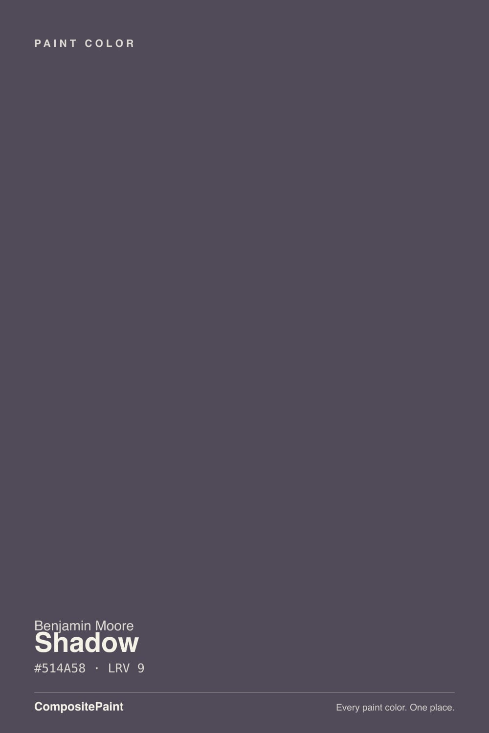
Shadow is Benjamin Moore's 2017 Color of the Year, and the brand's own description — "a rich, royal amethyst that can fade into the soft lilac-gray of distant mountains or morph into lustrous coal" — is doing real work, not just marketing copy. This is a genuine deep violet, built to look black in low light and to reveal its purple only when direct light finds it. That two-faced quality is the entire reason people reach for it over a flat black: it reads as sophisticated color, not just an absence of color.
At LRV 9 it sits in true near-black territory — darker than Kendall Charcoal (LRV 13), close to Silhouette (LRV 10), lighter only than reference blacks like Tricorn Black (LRV 3). That depth means it swallows detail and needs a room willing to give something back: a mirror, brass hardware, a pale ceiling, a doorway to a brighter space. Painted into a small room with nothing to bounce off, the drama collapses into plain gloom.
Undertone in one line: cool violet first, and it is real — not a marketing flourish that vanishes on the wall. If your sample reads flat brownish-black, your light is too dim or too cool; if it reads warm plum at night, that's a 2700K lamp doing its job. Neither is wrong, but if you were hoping for a true, no-argument black, test this one hard before committing — the purple shows up.
Where It Shines
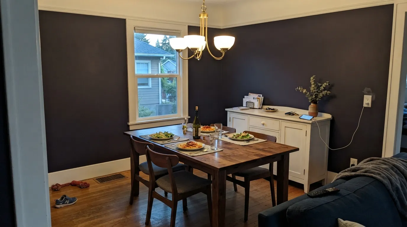
Give it a job with contrast and it earns the hype. Direct daylight or a warm accent lamp is the light this color was made for — the violet comes forward and the wall reads like a jewel box, not a hole in the room. Dining rooms are its natural home: candlelight and evening use are exactly the conditions where Shadow performs best, and because the room sees occasional use, the drama never gets stale. Front doors, interior doors, and a kitchen island are its other reliable jobs — small, contained commitments that get the amethyst effect without repainting a whole house.
Where It Fails
Almost every regret story about Shadow comes from one of three situations, and each one is predictable before the first coat. None of them are the paint's fault — the color is honest about what it needs to perform.
At LRV 9, Shadow is dark enough to read black across a room — until direct or bright light hits it, and the violet comes forward. Buyers expecting a flat, neutral black see purple creeping in and call it a mistake. If zero color argument is the goal, this is not that color — Tricorn Black or Wrought Iron won't budge.
Enveloping a tiny room with nothing to bounce off starts to feel like a closet, not a jewel box. Shadow needs a foil — a mirror, brass hardware, a pale ceiling, a doorway to a brighter room — or the depth reads as gloom instead of drama.
Cold 4000K light flattens the violet into a muddy blue-black and the room loses its warmth entirely. This paint was built for warm lamplight; skip the cool overheads or the color goes cave-dark for the wrong reasons.
Room by Room
Enclosed, evening-use rooms are exactly what Shadow was built for. Candlelight and a warm chandelier pull the violet forward, and because you're rarely in the room at flat midday, the color almost always performs. Eggshell on the walls, White Dove trim in semi-gloss.
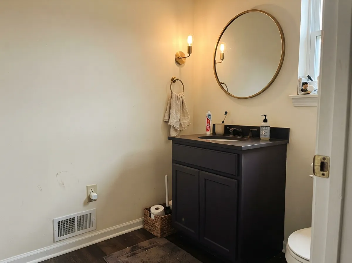
A small room you pass through, not live in, is the safest way to use a near-black. Drenched walls with a brass sconce and a mirror give the violet something to reflect off; a Shadow vanity under a pale wall does the same job with less commitment. Satin on cabinetry.
On an island under white or pale perimeter cabinets it reads moody and expensive, especially with brass or unlacquered hardware. A full kitchen of Shadow cabinets fights daylight kitchens badly and needs a room with real natural light to work at all.
One wall, ideally the one that gets the most direct light during the day or faces a lamp at night. Surround it with a mid-tone neutral like Edgecomb Gray, not another dark color, or the room loses its anchor entirely.
Rooms used mostly after dark are forgiving of a near-black that needs warm light to perform. Walnut shelving, leather, and a brass lamp are its natural company — the same conditions that flatter Sleepy Hollow, one shade lighter and less purple.
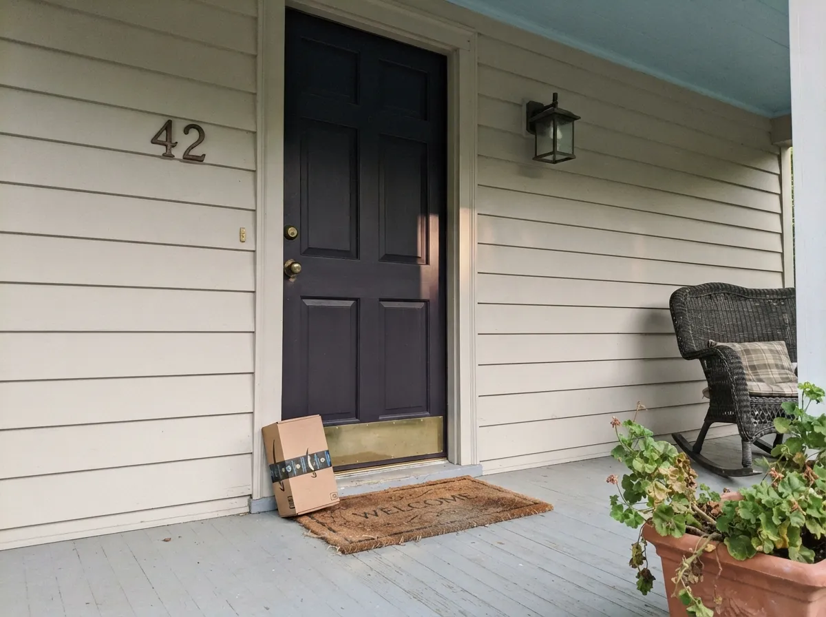
Shadow is built as an interior color, and its violet undertone can gray out in full, unfiltered sun the way many near-blacks do outdoors. Where it shows up well is a front door in a sheltered, shaded entry, paired with a lighter house color — sample the actual door before committing, since direct sun changes the read more than it would indoors.
Your Light Is the Risk
Full sun or a 2700K accent lamp pulls the violet forward — this is the amethyst Benjamin Moore promised, and the reason people pick it over a flat black.
Without direct light hitting it, Shadow just reads plain near-black — the jewel tone disappears and you're left with a dark, moody wall and none of the personality that sold you on it.
In shade it settles into a smoky charcoal-black; step into a shaft of direct sun and the violet flashes clearly for a few minutes before it recedes again.
2700K lamps deepen it into a warm, plummy black. Cool 4000K LEDs flatten it toward blue-black and mute the color entirely — swap the bulbs before you swap the paint.
Most complaints about Shadow are a light mismatch. Upload a photo of your actual room and see it on your walls — then ask for the same wall in north light or evening lamps before you buy a single sample.
Need It From Another Brand?
Any paint counter can custom-tint Benjamin Moore 2117-30 directly. If you would rather stay in one brand's own deck, these are the closest stock matches, measured as ΔE2000. Under 2 is a difference you will not see on the wall.
| Brand | Closest color | ΔE | LRV | |
|---|---|---|---|---|
| Behr | Napa HarvestECC-17-3 · Behr | 2.3 | 7 | Color page → |
| Valspar | Purple Fury4001-4C · Valspar | 2.9 | 6.9 | Color page → |
| Glidden | Black Tulip30RB 07/107 · Glidden | 2.3 | 7 | Color page → |
| Dutch Boy | Sliced Eggplant345-6DB · Dutch Boy | 1.2 | 8 | Color page → |
| HGTV Home by Sherwin-Williams | Oceanic TrenchHGSW 3391 · HGTV Home by Sherwin-Williams | 2.2 | 6 | Color page → |
| Farrow & Ball | PeltNO. 254 · Farrow & Ball | 3.9 | 7 | Color page → |
Similar Benjamin Moore Colors
The nearest shades to Shadow within Benjamin Moore's own range, ranked by perceptual color distance — useful when you want the same look a touch lighter, darker, or warmer.
WCAG 2.1: AA is 4.5 : 1 for normal text, 3 : 1 for large text, AAA is 7 : 1.
Shadow vs the Colors You're Also Considering
Every Shadow sample board has the same rivals on it. The numbers show the real lightness gap — then it comes down to which risk you would rather live with.
Pick this when you want that near-black depth to carry real color — Shadow reveals violet in direct light where Wrought Iron stays flat neutral.
Benjamin Moore 2124-10 · LRV 6Wrought IronPick this if you want the same near-black weight without any purple — Wrought Iron stays a cool charcoal-green in every light.
Pick this for more drama and depth — at LRV 9, Shadow reads almost black where Kendall Charcoal stays a legible charcoal.
Benjamin Moore HC-166 · LRV 13Kendall CharcoalPick this for a lighter, easier dark that behaves in more rooms — Kendall Charcoal reads as gray-brown, never purple.
Shadow Coordinating Colors
The rule for coordinating with Shadow is contrast, not more darkness: pale, warm trim whites and a metallic note — brass or aged bronze — give the violet something to play against. Stacking it next to another near-black just cancels both into a flat dark blob. These are the partners that keep it looking deliberate:
Shadow's Color-of-the-Year Story
Benjamin Moore named Shadow 2117-30 its Color of the Year for 2017, part of a wave of near-black, saturated darks that pushed the industry away from the all-gray decade that came before it. Unlike a lot of Color of the Year picks that fade from memory once the promotional push ends, Shadow kept showing up in real dining rooms and powder rooms years later — designers liked that it carried the same confidence as a flat black but photographed with more depth.
That staying power is the honest case for buying it today: this isn't a trend color riding a single viral moment, it's a nearly decade-old pick that earned repeat use because the amethyst-black effect is real, not just a good product photo.
Shadow With Wood Tones and Metals
Metals decide how expensive this color looks. Unlacquered brass and warm bronze hardware catch just enough light to keep a Shadow door or vanity from reading flat — it's the most common styling move in the rooms that photograph well. Chrome and cool nickel go the other way: they emphasize the cool violet and can push the whole pairing toward cold.
Wood behaves the way it does with most near-blacks: walnut and espresso deepen the mood without a fight, while pale white oak or gray-washed floors keep a room from feeling like one solid shade. Honey oak isn't the disaster it would be with a lighter mauve — at LRV 9 there's almost no wall color left to clash with the wood's undertone — but it does mean the floor, not the paint, becomes the room's warmest note.
Three Ready Palettes Built on Shadow
A color is never alone on the wall. These are complete combinations in the 60-30-10 pattern, with the reason each one holds together. Every one opens in the visualizer.
White Dove keeps the room from feeling closed-in while the crisp semi-gloss trim catches candlelight; the warm cream accent piece gives the violet something soft to sit against instead of another dark tone.
Try this palette in your roomEdgecomb Gray is warm and light enough to keep the room bright, so the single Shadow wall reads as a deliberate anchor rather than a void; White Dove trim outlines the room without competing.
Try this palette in your roomCream walls keep a small room feeling open while the vanity carries all the color; Cloud White trim and a brass-framed mirror give the violet exactly the foil it needs to read as amethyst instead of a hole in the wall.
Try this palette in your roomShadow FAQ
Is Shadow purple or black?
Both, depending on the light. At LRV 9 it reads as near-black most of the time, but it is a genuine deep violet — hit it with direct sun or a warm lamp and the purple comes forward clearly. In flat, overcast light it settles back into plain dark neutral.
Was Shadow really Benjamin Moore's Color of the Year?
Yes — Shadow 2117-30 was Benjamin Moore's Color of the Year for 2017, part of a broader shift toward saturated, near-black darks that also made colors like Wrought Iron and Kendall Charcoal more popular. It has kept showing up in real dining rooms and powder rooms well past that year.
What trim white goes with Shadow?
White Dove or Cloud White in semi-gloss. Both are warm enough not to fight the violet, and the sheen contrast against a matte or eggshell wall reads crisp without needing a stark, cold white.
Can I use Shadow on a front door?
Yes, and it's one of the color's most common jobs — a near-black door with brass hardware is a classic look. Stick to a sheltered, shaded entry if you can; full unfiltered sun tends to wash the violet toward plain gray-black rather than showcase it.
Does Shadow work in a small room?
Only with a foil. A powder room or vanity nook works because there's a mirror and metal hardware to bounce light back at the color. A small room with no reflective surface, no lamp, and no natural light just reads as a dark box — add a mirror or brass fixture before you commit.
How many coats does Shadow need?
Plan on two coats minimum over a lighter existing wall color, and use a gray-tinted or deep-base primer first — going straight from a pale wall to a near-black without priming is the most common reason people end up applying three coats of finish paint instead of two.
Have you painted with Shadow?
Rate it — one tap helps the next reader decide.
Ask a Question