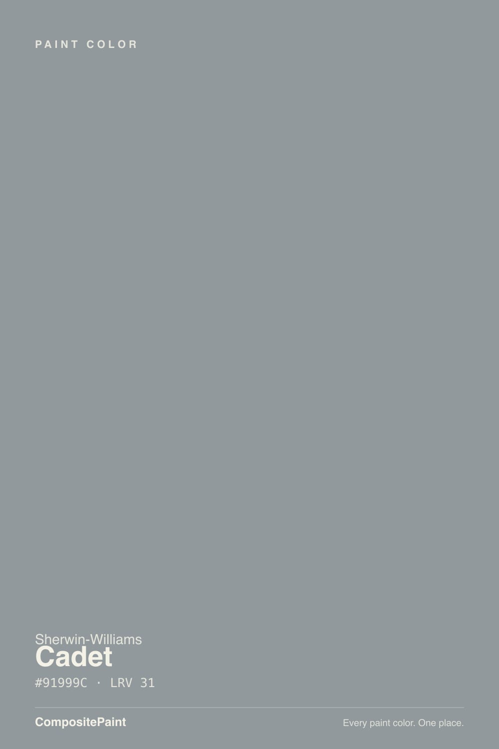
Cadet
A quiet blue-gray that Sherwin-Williams files under Blue but most shoppers buy as gray, reviewed honestly: the light where it turns silvery, the light where it goes flat, and what to pick instead.

Jessica has spec'd whites and neutrals for more than 300 rooms and keeps a sample wall of painted drawdowns in her studio. Every color review is checked against real reader rooms in the comments and re-tested when a formula changes. About the testing process →
- 1Black Fox7
- 2Pewter Green12
- 3Cadet31
- 4Stardew43
- 5Palladian Blue60
The Fast Verdict
Cadet reads like a plain gray on the fan deck and turns out to be a real blue on the wall — cool, weathered, and grayed down just enough that Sherwin-Williams' own site has to remind you it belongs to the Blue family, not Gray. In bright daylight it goes airy and silvery; in low or warm light the blue recedes and a grounded, almost graphite gray takes over. It is a genuinely good cabinet, bath, and exterior color that most people find by accident, not by reputation.
Kitchen and bath cabinetry with white tile and nickel or brass hardware · bedrooms that want calm without going beige · exterior siding, shutters, and front doors · anyone who wants a blue-gray with real depth, not a pale wash
You want a true, name-brand-familiar neutral gray · your room is dim and north-facing with no warm bulbs · your floors are honey oak or yellow-beige · you need a color you can describe to a painter over the phone without confusion
- A genuine blue-gray with real depth — not a beige impersonator, not a pale wash
- LRV 31 holds its color instead of washing out in a big room
- Reads airy and silvery in real daylight, grounded and graphite-gray at night
- Excellent on kitchen and bath cabinetry with white tile and either nickel or brass hardware
- Genuinely good exterior color — siding, shutters, and front doors, not just interior accents
- Buyers expecting a neutral gray get a real blue — the single most common complaint
- Dim, north-facing rooms drain the blue and leave a flat, heavy gray
- Fights honey oak floors and yellow-beige trim
- Less documented than SW's famous greiges — fewer real-room references to check before buying
What Color Is Cadet, Really?
A cool, weathered blue-gray — and the blue is real, not a marketing stretch. Sherwin-Williams' own color-family pages list Cadet under Blue, which surprises almost everyone who has only seen it as a one-inch chip under store lighting, where it reads like an unremarkable gray. Up close it is a grayed-down denim or chambray blue with a trace of green muting it, which keeps it from ever reading as a bold decorator blue — it stays wearable, almost neutral, right up until real daylight hits it.
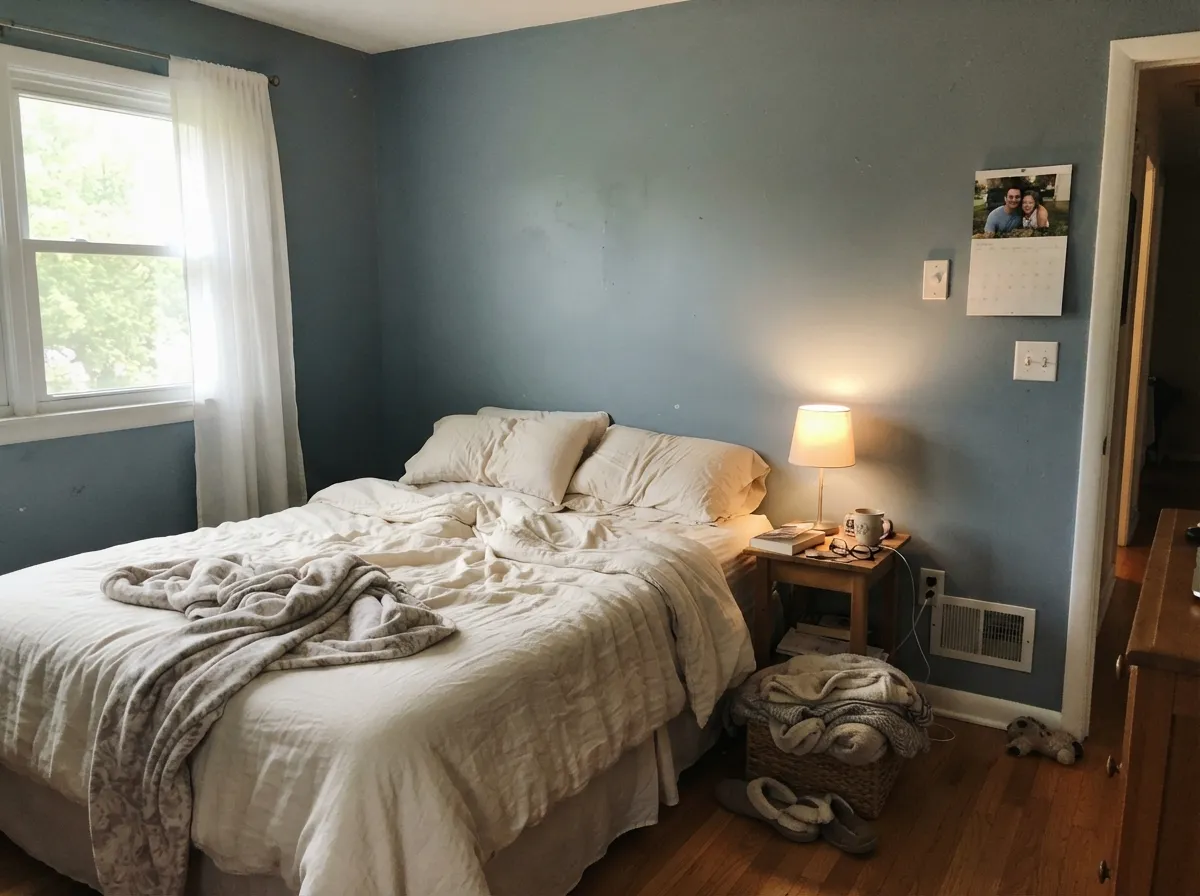
At LRV 31 it is a genuine mid-depth color, not a pale rescue tone, and that depth is exactly why the light behavior matters so much. In bright, direct daylight Cadet goes airy and silvery — the blue steps forward and the color feels lifted. In lower or warmer light — evening lamps, a shaded room, an overcast afternoon — the blue recedes and the color settles into a grounded, almost graphite gray. Same paint, same can, two honestly different moods depending entirely on what light is hitting the wall.
Undertone in one line: blue first, quieted by a whisper of gray-green — never purple, never warm. If your sample looks like plain gray at the store, that is small-chip lighting doing its usual trick; if it looks blue on your actual wall in daylight, that is the color being honest.
Where It Shines
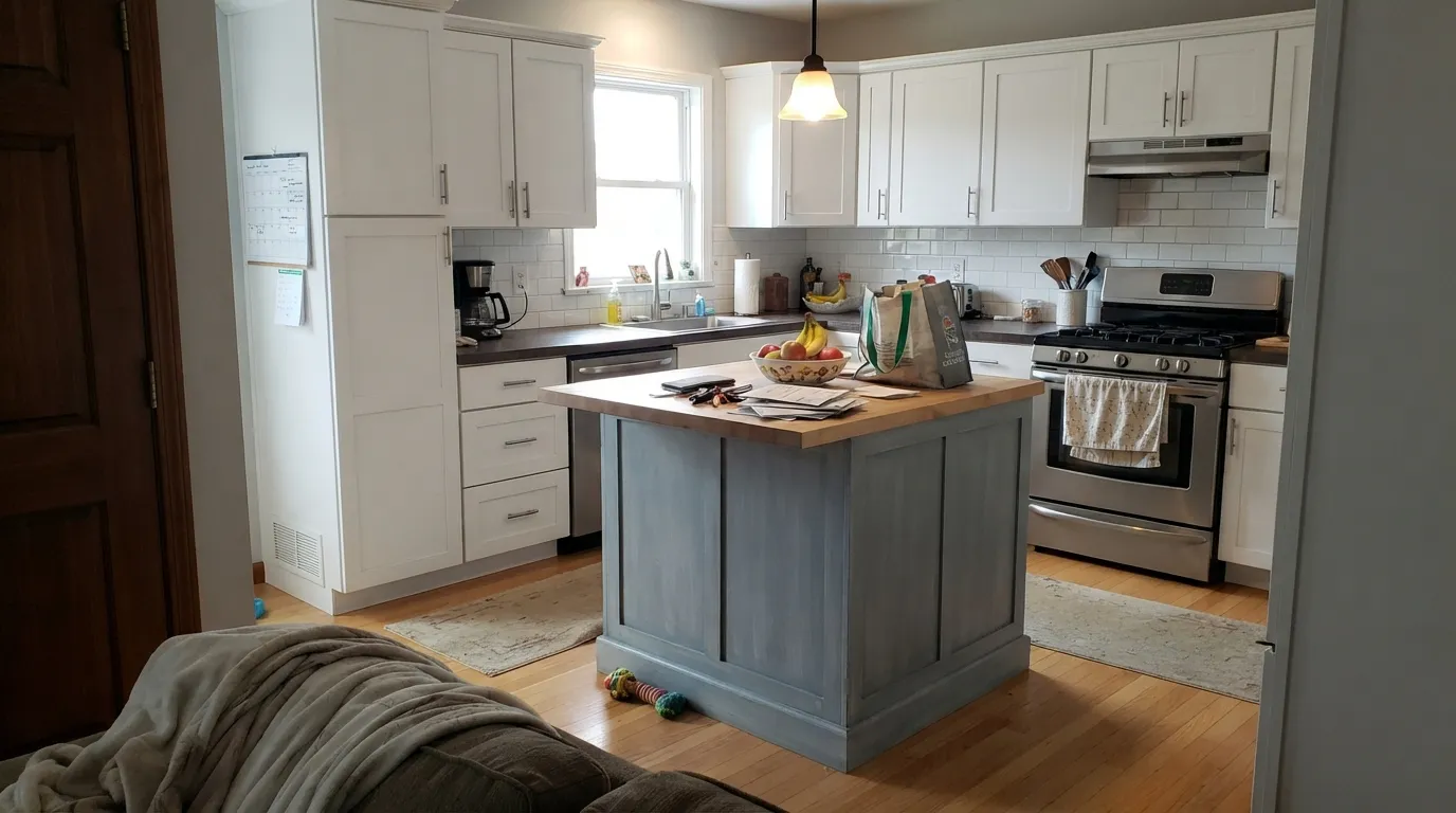
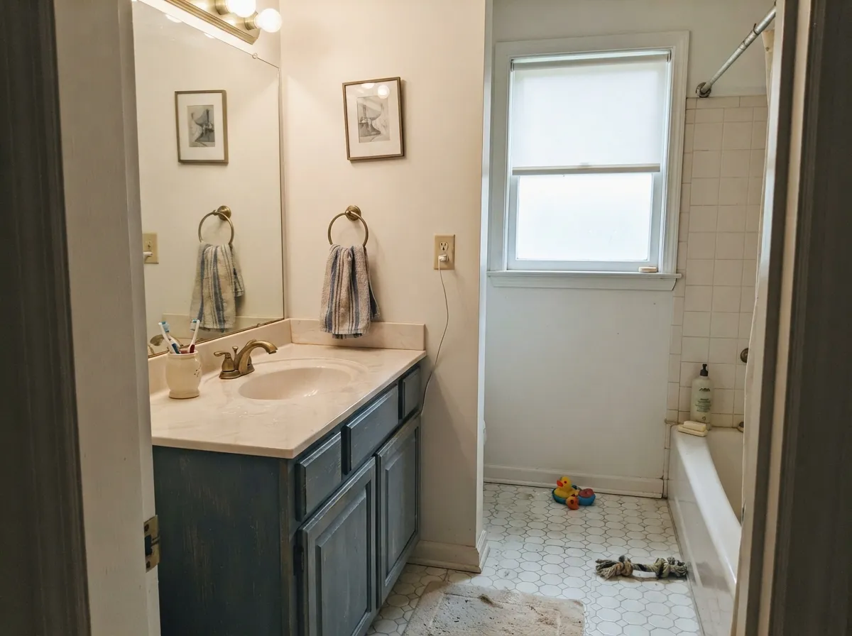
Cadet's best work happens where a cool color has real company: kitchen and bathroom cabinetry next to white tile, pale or white oak, and metal hardware. Brushed nickel and chrome sharpen its cool cast; unlacquered brass warms it up without fighting it. It is also a genuinely capable exterior color — siding, shutters, and front doors in Cadet read as a weathered coastal-cottage or modern-farmhouse blue that photographs better in real sun than the fan deck suggests. Give it daylight and cool-toned partners and it stops looking like "a gray" and starts looking like a deliberate color choice.
Where It Fails
Almost every disappointed review of Cadet comes from one of three mismatches, and all three are predictable before the first coat goes on. None of them are the paint's fault — but if your plan matches one of these, this is not your color, and a bigger sample will only confirm it faster.
This is the single most common regret: buyers pick Cadet off a rack of grays, and Sherwin-Williams itself classifies it as Blue. In real light the blue is unmistakable — it is not a neutral, and it will not read as one on four walls. If a plain gray is genuinely the goal, look at Light French Gray instead and let Cadet stay a blue you chose on purpose.
Cadet's blue needs daylight to show up. In a shaded or north-facing room without lamps, the color loses its lift and settles into a flat, heavy gray that reads darker and duller than the sample suggested — a real risk at LRV 31, which is already a mid-depth color with little margin to spare. Add warm 2700K lamps or reconsider the room.
Blue and yellow-orange sit opposite each other on the wheel, so golden oak floors and warm-beige trim fight Cadet on both ends — the floor looks more orange, the wall looks more washed-out blue-gray, and neither side wins. Cadet wants pale oak, white oak, gray-washed floors, or a large area rug between it and anything golden.
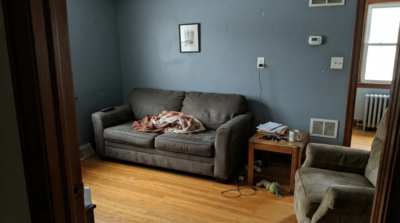
Room by Room
On an island or full cabinet run next to white tile and pale oak, Cadet is a striking, current choice. Brass or gold hardware adds warmth against the cool base; brushed nickel keeps it crisp. Satin urethane-fortified cabinet enamel for durability.
With white or cream tile and brushed nickel or chrome fixtures, Cadet reads clean and a little coastal without tipping into a themed "beach bathroom." Satin finish wipes clean around the sink.
A genuinely restful color for anyone who wants a break from greige without going dramatic. Best with real daylight or a room where you're comfortable adding warm lamps at night; a dim north-facing bedroom will read flatter and grayer than expected.
Siding, shutters, and front doors in Cadet read as a weathered blue-gray that suits coastal cottages and modern farmhouses alike. Full sun brightens it toward the silvery end; pair with white or charcoal trim.
Handsome in a room with a real window, where the cool tone reads focused rather than cold. In a windowless or artificially lit office, test under your actual desk lamp before committing to four walls.
Works best as one wall, a built-in, or trim rather than the whole room for readers who aren't sure they want a full blue commitment — the accent-wall version gets most of the mood with less risk.
Your Light Is the Risk
The blue steps forward and the color turns airy and silvery. South or east-morning rooms show Cadet at its most alive.
Without real daylight or warm lamps, the blue recedes and the color settles into a flat, heavy gray — disappointing if you bought it for the blue.
Cooler and more silvery in morning light, quieter and grayer as the sun moves off the wall. The shift is real but gradual, not jarring.
Warm 2700K bulbs mute the blue toward a soft graphite gray. Cool white LEDs keep the blue visible but can read a little steely — test both before wiring the room.
Most complaints about Cadet are a light mismatch. Upload a photo of your actual room and see it on your walls — then ask for the same wall in north light or evening lamps before you buy a single sample.
Need It From Another Brand?
Any paint counter can custom-tint Sherwin-Williams SW 9143 directly. If you would rather stay in one brand's own deck, these are the closest stock matches, measured as ΔE2000. Under 2 is a difference you will not see on the wall.
| Brand | Closest color | ΔE | LRV | |
|---|---|---|---|---|
| Behr | Teton BlueN490-4 · Behr | 2.6 | 31 | Color page → |
| Benjamin Moore | Sweatshirt Gray2126-40 · Benjamin Moore | 1.3 | 32 | Color page → |
| Valspar | Winter Flannel4007-1C · Valspar | 1.4 | 31.5 | Color page → |
| PPG / Glidden | PachydermPPG1039-4 · PPG / Glidden | 0.6 | 31 | Color page → |
| Glidden | PachydermPPG1039-4 · Glidden | 1.1 | 31 | Color page → |
| Dutch Boy | Over The Moon434-4DB · Dutch Boy | 1.0 | 30 | Color page → |
Similar Sherwin-Williams Colors
The nearest shades to Cadet within Sherwin-Williams's own range, ranked by perceptual color distance — useful when you want the same look a touch lighter, darker, or warmer.
WCAG 2.1: AA is 4.5 : 1 for normal text, 3 : 1 for large text, AAA is 7 : 1.
Cadet vs the Colors You're Also Considering
Every Cadet sample board has the same rivals on it. The numbers show the real lightness gap — then it comes down to which risk you would rather live with.
Pick this when you want that same misread-as-gray blue but deeper and more grounded than Stardew's paler read.
Sherwin-Williams SW 9138 · LRV 43StardewPick this for a lighter, airier version of the same blue-gray family — more silvery, less depth to hold onto.
Pick this for the true Sherwin-Williams match, deeper and bluer than Boothbay's softer read.
Benjamin Moore HC-165 · LRV 36Boothbay GrayPick this if your painter works in Benjamin Moore — a close cousin, a touch lighter and greener-blue.
Inside the Sherwin-Williams line the differences are small. Steely Gray (SW 7664), hex #90979B at LRV 30, is a touch darker and slightly less blue. African Gray (SW 9162), #939899 at LRV 31, drops most of the blue and reads more neutral. Dustblu (SW 9161), #959BA0 at LRV 32, is a shade lighter and keeps the blue. Delft (SW 9134), #8B9FA0 at LRV 33, is the clearest departure, sitting lighter and noticeably greener.
Across brands the matches are unusually tight. HGTV Home by Sherwin-Williams Somerset Grey (HGSW 3334) and Rodda December Sky (R094) share the same hex value with a deltaE of 0, so they are the same color under different names. PPG or Glidden Pachyderm (PPG1039-4) at 0.58 and Dutch Boy Over The Moon (434-4DB) at 1.01 are effectively indistinguishable. Benjamin Moore Sweatshirt Gray (2126-40) at 1.34 and Valspar Winter Flannel (4007-1C) at 1.35 are visually identical in normal room light.
Cadet Coordinating Colors
The rule for coordinating with Cadet: keep everything cool or neutral, and let it be the only blue note in the room. It pairs cleanly with warm-but-not-yellow whites, true grays, and near-blacks, and it layers well with deeper blues when the mood calls for more drama. These are the partners that keep showing up in rooms that work:
Why a Blue Color Is Selling as a Gray
Cadet has no Color of the Year moment, no viral Pinterest board, no HGTV-episode fame — it is a quiet, workmanlike entry in Sherwin-Williams' deck that most people find by scrolling a gray-color search and stopping on a chip that happens to be classified Blue. That naming gap is the real story: shoppers searching for a safe neutral gray keep landing on a color the brand itself calls blue, and the surprise shows up later, on the actual wall, in actual daylight.
That is not a flaw so much as a labeling mismatch worth knowing before you buy. Treated as the blue it is — for cabinets, a bathroom, an exterior, a bedroom you're choosing on purpose — Cadet is a solid, versatile, slightly underused color. Treated as a stand-in for a true gray, it will always disappoint someone, and that mismatch is where nearly all of its complaints come from.
Cadet With Wood Tones and Floors
This decision gets made at the floor, not the paint store. Pale and white oak keep the room light and let Cadet's blue read clean and current. Gray-washed or driftwood floors match its cool temperature and disappear into the same family, for a quiet, unified look. Walnut and espresso tones work too — the depth of a dark wood grounds Cadet rather than competing with it.
The one honest no is anything honey-toned: golden oak floors, orange-stained trim, yellow-beige carpet. Blue sits opposite yellow-orange on the color wheel, so each side pushes the other further from where it wants to be — the floor reads more orange, the wall reads more washed-out. If the golden floor is staying put, a large rug between it and Cadet is the practical fix.
Metals: brushed nickel and chrome are the easy, cool-toned match. Unlacquered brass and warm gold add contrast and keep the room from feeling too cold — the combination the kitchen and bath examples above lean on most.
Three Ready Palettes Built on Cadet
A color is never alone on the wall. These are complete combinations in the 60-30-10 pattern, with the reason each one holds together. Every one opens in the visualizer.
Alabaster keeps the room bright enough that Cadet's blue reads intentional rather than moody, and Iron Ore supplies one near-black note so the palette feels finished, not accidental. White tile and nickel or brass hardware complete the look.
Try this palette in your roomTonal blue layering keeps the room calm instead of themed: Cadet's quieter, grayer blue against Extra White's crisp trim, with Naval as the one deep note on a single wall or door. Real daylight or warm lamps keep the whole scheme feeling lifted, not heavy.
Try this palette in your roomLight French Gray is the truest neutral in the SW deck, so Cadet doors read as a deliberate blue note instead of a clashing undertone — everything in the house shares the same cool family, just at different depths.
Try this palette in your roomCadet FAQ
Is Cadet blue or gray?
Blue — Sherwin-Williams' own site files it under the Blue family, even though it reads like a plain gray on a small chip under store lighting. On real walls in daylight the blue is unmistakable. If you specifically want a neutral gray, this is the wrong color and the source of most of its bad reviews.
What light does Cadet need to look its best?
Real daylight. Bright, direct light — south or morning east exposure — brings out the airy, silvery side of the color. Dim north-facing rooms without warm lamps drain the blue and leave a flat, heavy gray.
Is Cadet good for kitchen cabinets?
Yes — it's one of its best jobs. It pairs well with white tile, pale or white oak, and either brushed nickel or brass hardware. Use a satin urethane-fortified cabinet enamel, not a wall paint, for durability.
What trim white goes with Cadet?
A clean, slightly warm white like Alabaster keeps the room from feeling cold, while a sharper white like Extra White gives a crisper, more coastal contrast. Avoid a yellow-leaning cream trim — it will fight the blue instead of framing it.
Can I use Cadet outside?
Yes, and it's genuinely underused there. Siding, shutters, and front doors in Cadet read as a weathered blue-gray suited to coastal and modern-farmhouse exteriors. It brightens toward the silvery end in full sun; pair with white or charcoal trim.
Does Cadet work with honey oak floors?
Not well. Blue and yellow-orange sit opposite each other on the color wheel, so golden oak floors and Cadet walls amplify each other's worst side. It pairs much better with pale oak, white oak, or gray-washed floors — with honey oak, a large rug or a different color is the safer call.
Have you painted with Cadet?
Rate it — one tap helps the next reader decide.
Ask a Question