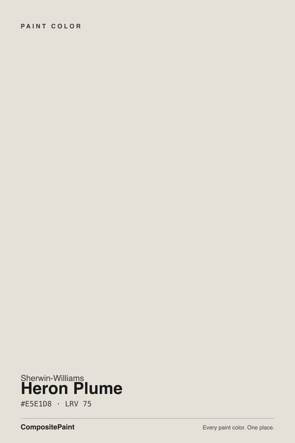
Heron Plume
Sherwin-Williams' quiet Color of the Month, reviewed honestly: the light where it reads a soft warm greige, the light where its violet secret shows, and what to trim it with instead.

Jessica has spec'd whites and neutrals for more than 300 rooms and keeps a sample wall of painted drawdowns in her studio. Every color review is checked against real reader rooms in the comments and re-tested when a formula changes. About the testing process →
- 1Heirloom Shade63
- 2First Star69
- 3Heron Plume75
- 4Alabaster82
- 5Chantilly Lace91
The Fast Verdict
Heron Plume is filed as a white in Sherwin-Williams' own system, but almost nobody who has painted a wall with it calls it that. It reads as a soft, warm greige with a genuine violet-pink whisper underneath — a color even professional color consultants describe differently depending on the room they saw it in. Give it real daylight and it settles into a quiet, confident taupe-greige. Starve it of light and that same violet whisper turns into the color's one honest weakness.
Kitchens and open-concept living rooms with real daylight · homes with mixed warm and cool wood tones · modern or stucco exteriors · anyone who wants a greige that isn't Agreeable Gray or Repose Gray
Your only light source is cool LED bulbs with no daylight · you are sensitive to any hint of pink or purple in a "gray" · your trim is a warm cream, not a bright white · your floors are honey oak with no rug to break it up
- A genuine greige that isn't Agreeable Gray or Repose Gray — its own color, not a copy
- Flatters mixed wood tones and softens reddish cherry without fighting it
- LRV 75 reflects plenty of light without reading stark or clinical
- Earned a real Color of the Month spotlight (July 2024) without needing a viral moment
- Confident on modern and stucco exteriors, especially with a dark door
- Genuine chameleon: taupe in warm light, gray in cool light, pink in poor light
- Cream or yellow-based trim clashes hard — the most common styling mistake with this color
- Cool LED bulbs at night flatten it toward a sterile, uninteresting gray
- Buyers who fear any hint of pink in a "gray" should sample big before committing
What Color Is Heron Plume, Really?
Sherwin-Williams classifies Heron Plume as a white, but it does not read like one on a wall — nearly every independent reviewer calls it a greige or a taupe instead. The base is warm, but underneath it carries a real violet-pink micro-undertone, and that is both the whole appeal and the whole risk: it is honestly ambiguous. Color consultant Kylie M Interiors, who has reviewed it in real client rooms, calls it a genuine "toss-up whether it's a warm gray or taupe" depending on the light — and several independent color databases land in different places on the very same paint. Sherwin-Williams gave it a Color of the Month spotlight in July 2024, a smaller, rotating honor from the brand's own color team rather than a magazine-level Color of the Year moment. It never went viral, but it built a real following among the color-consultant blogs that review paint for a living — an honest, well-liked, not-famous workhorse rather than a manufactured hit.
At LRV 75 it reflects plenty of light without ever reading stark. Put it next to Sherwin-Williams Extra White (LRV 86) and Heron Plume immediately shows its greige body — the gap is the useful part, because it means the color holds enough weight to read as a decision rather than a default. It sits almost exactly at the same reflectance as Benjamin Moore Silver Satin (also LRV 75), and the resemblance goes deeper than the number: both are near-whites that their own reviewers describe as carrying a "confusing undertone." That shared reputation is not a coincidence — colors this close to the white/greige line are the ones most likely to shift with the room around them.
Undertone in one line: a warm greige base with a real violet-pink whisper that surfaces in cool or dim light — never a plain flat gray, never a straightforward beige. If your sample reads sterile gray, that is a cool LED bulb or a north exposure talking, not the paint. If it reads distinctly pink, that is poor daylight or a warm lamp pulling the same undertone the other direction — both readings are the same paint being honest about the light it is standing in.
Where It Shines
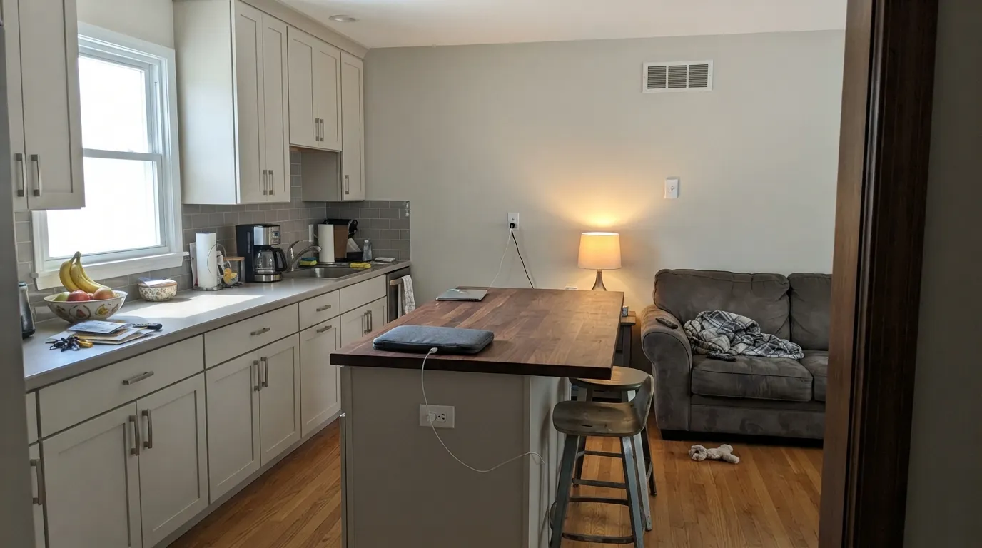
Give it real daylight — south or west exposure is the honest sweet spot — and Heron Plume settles into a confident, warm taupe-greige that photographs beautifully next to both light and dark wood. Kitchens are where it earns the most praise: on cabinets it flatters brushed nickel and saddle-leather tones and softens reddish cherry wood without fighting it. Its second home is the exterior, where designers reach for it on modern and stucco facades because the greige reads considered rather than undecided, especially paired with a dark door.

Where It Fails
Every real complaint about Heron Plume traces back to one of three predictable situations, and all three show up in the reviews written by people who actually tested it. None of them are the paint's fault — but if your room matches one, this is not your color, and a bigger sample will only confirm the mismatch.
One reviewer calls pairing Heron Plume with cream trim "the hardest no I can give," and the color wheel explains why: yellow-cream sits almost opposite violet, so the two fight instead of blending. The walls end up reading muddy and undecided next to trim that should be calming them down. Pair it with a true bright white — Sherwin-Williams Extra White or Pure White — never a warm cream.
The same complementary clash shows up at the floor. Intense yellow-orange wood or amber-toned bulbs agitate the hidden violet undertone, and the room ends up arguing with itself — the floor reads more orange, the walls read more purple. Pale oak, walnut, or a large rug between the two solves it; wall-to-wall honey oak with no buffer does not.
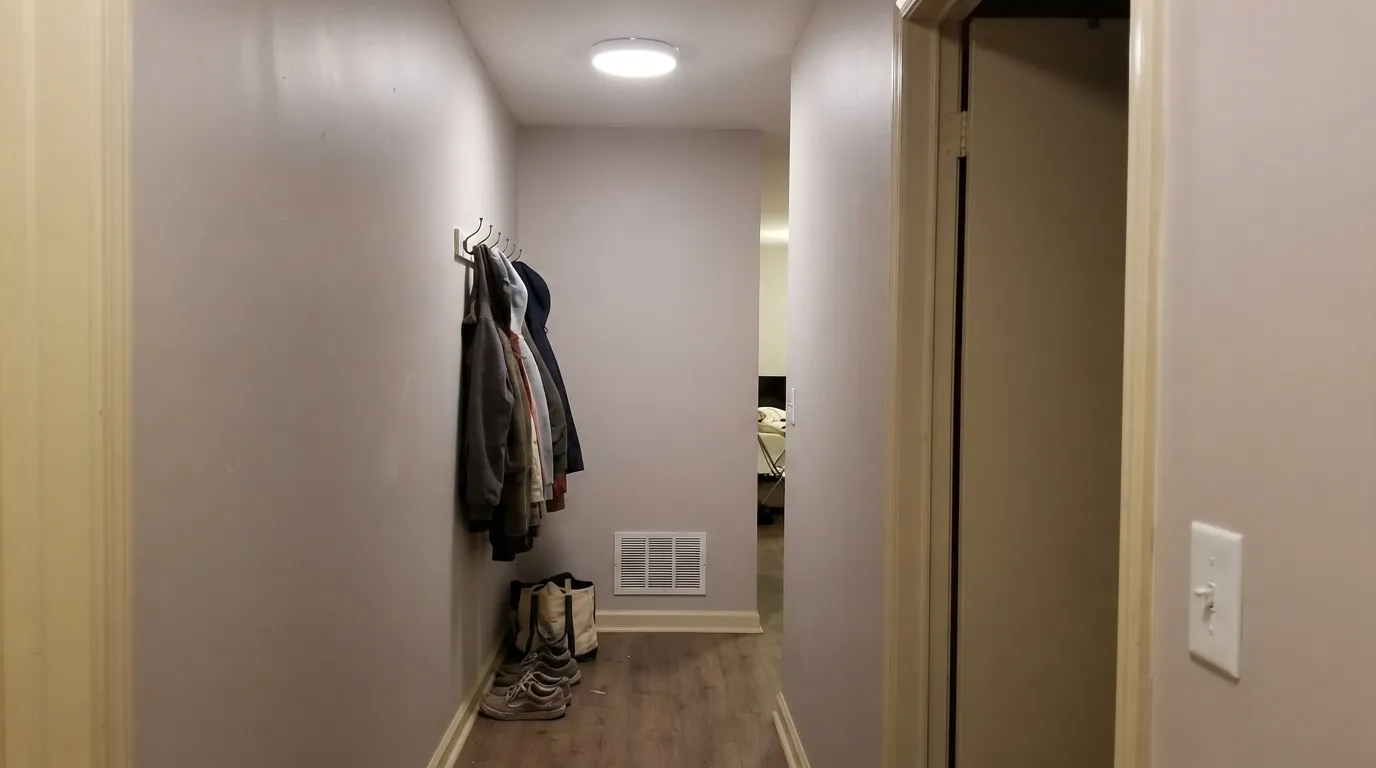
Take away daylight and swap in 4000K-plus LED bulbs, and the greige that was interesting in a sunny kitchen goes flat and sterile — the exact opposite of the warm taupe people bought it for. If your bathroom or hallway runs entirely on cool overhead LEDs, this is not the color to test there first; try the room with a window.
Room by Room
The room this color gets recommended for most. Warm daylight, mixed wood, and brushed nickel or saddle-leather hardware all sit comfortably with it. Satin cabinet enamel wipes clean and hides handle marks.
Reads as a genuine greige rather than a plain gray, which makes it a good answer for anyone tired of Agreeable Gray or Repose Gray showing up in every listing photo. Needs a real window; skip it for a windowless media room.
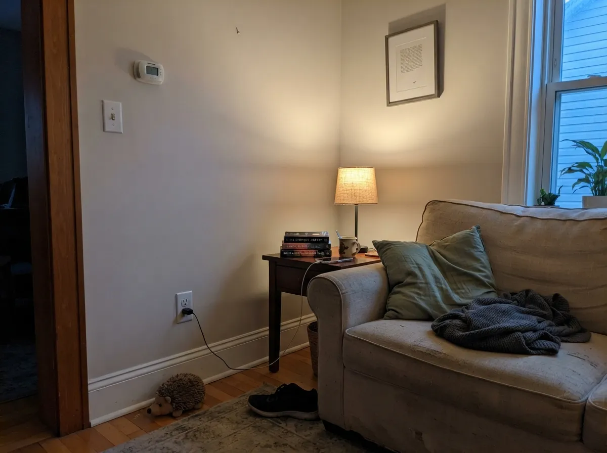
Under 2700K lamps the taupe deepens and turns cozy at night. If the room runs on cool overhead LEDs with little daylight, step up to a warmer, more decided greige instead.
Reads brighter and more settled in full sun than indoors, and works as a full-body color or as the field behind darker trim and a dark door. One of the stronger uses for this particular paint.
With warm stone, brushed brass, and wood vanities it is calm and expensive-looking. With cool blue-gray or true white tile, the violet undertone gets isolated and can read slightly off — sample against your actual tile before committing.
Trim it in a true bright white, never a warm cream — that single pairing decides whether the whole room looks intentional or muddy. Semi-gloss trim under Heron Plume walls is the safest, most-repeated recommendation across every review of this color.
Your Light Is the Risk
Warm daylight pulls it into a confident taupe-greige — the read every reviewer calls its best case, and the one to sample first.
Cool, low daylight is exactly where the violet-pink whisper surfaces most and the color stops reading like a simple gray. Test here before committing to a north-facing room.
Warmer and creamier through the sun hours, quieter and more neutral the rest of the day — most owners read the shift as the color coming alive, not misbehaving.
2700K warm bulbs keep it cozy and taupe after dark. Cool 4000K-plus LEDs flatten it toward sterile gray — swap the bulb before you blame the paint.
Most complaints about Heron Plume are a light mismatch. Upload a photo of your actual room and see it on your walls — then ask for the same wall in north light or evening lamps before you buy a single sample.
Need It From Another Brand?
Any paint counter can custom-tint Sherwin-Williams SW 6070 directly. If you would rather stay in one brand's own deck, these are the closest stock matches, measured as ΔE2000. Under 2 is a difference you will not see on the wall.
| Brand | Closest color | ΔE | LRV | |
|---|---|---|---|---|
| Behr | Light SandstoneECC-15-2 · Behr | 0.9 | 75 | Color page → |
| Benjamin Moore | Silver Satin856 · Benjamin Moore | 1.4 | 75 | Color page → |
| Valspar | Wispy White7006-1 · Valspar | 0.9 | 74.9 | Color page → |
| PPG / Glidden | ParaffinPPG14-31 · PPG / Glidden | 0.8 | 75 | Color page → |
| Glidden | ParaffinPPG14-31 · Glidden | 0.0 | 75 | Color page → |
| Dutch Boy | Moon Pie406-1DB · Dutch Boy | 0.0 | 75 | Color page → |
Similar Sherwin-Williams Colors
The nearest shades to Heron Plume within Sherwin-Williams's own range, ranked by perceptual color distance — useful when you want the same look a touch lighter, darker, or warmer.
WCAG 2.1: AA is 4.5 : 1 for normal text, 3 : 1 for large text, AAA is 7 : 1.
Heron Plume vs the Colors You're Also Considering
Every Heron Plume sample board has the same rivals on it. The numbers show the real lightness gap — then it comes down to which risk you would rather live with.
Pick this for the cooler, more gray-forward read when Egret White feels too pink for your room.
Sherwin-Williams SW 7570 · LRV 73Egret WhitePick this for more beige warmth and less gray — Egret White leans warmer everywhere and carries the same real pink risk in poor light.
Pick this for the specific warm violet-taupe lean, rather than Silver Satin's more unsettled identity.
Benjamin Moore 856 · LRV 75Silver SatinPick this if your painter works in Benjamin Moore — it sits at the exact same LRV, with its own confusing undertone instead of Heron Plume's violet one.
Its Sherwin-Williams neighbors are extremely close. Sunbleached SW 9585, hex #E5E0D7 at LRV 75, is the nearest of all and differs by a single digit. Zurich White SW 7626 at #E6E1D9 and Sanctuary SW 9583 at #E6E2D9, both LRV 76, are a hair brighter and slightly softer. White Heron SW 7627, hex #E7E1D7 at LRV 76, is a touch warmer, Origami White SW 7636 at #E5E2DA is a shade cooler, and Grey Mist SW 9625 at #E4E1D6 leans very slightly grayer.
Across brands the matches are unusually tight. Dutch Boy Moon Pie 406-1DB and Glidden Paraffin PPG14-31 are both deltaE 0. Diamond Vogel Bonaire 0020 at 0.51, HGTV Home by Sherwin-Williams Origami White HGSW 4007 at 0.6, Portola Paints Gem at 0.78, Behr Light Sandstone ECC-15-2 at 0.91, and Valspar Wispy White 7006-1 at 0.91 are effectively the same color. Benjamin Moore Silver Satin 856 at 1.45 and Farrow and Ball Strong White No. 2001 at 1.49 are visually identical in normal room light. C2 Cricket White C2-916 at 2.1 and Magnolia Home Blanched JG-103 at 2.64 are very close, so sample first.
Heron Plume Coordinating Colors
The rule for coordinating with Heron Plume: true whites for trim, never cream, and confident darks or muted greens for contrast. It pairs best with brushed nickel and saddle leather rather than polished brass, and it holds its own next to both navy and sage without either one washing it out. These are the partners that keep showing up in the rooms and exteriors that work:
A Quiet Color of the Month, Not a Color of the Year
Sherwin-Williams gave Heron Plume a Color of the Month spotlight in July 2024 — the brand's own official description called it "a creamy white [that] acts as a breezy backdrop for earthy escapes." That is a smaller, more frequent designation than Color of the Year, closer to a rotating nod from the brand's color team than a magazine moment, and it never generated the viral before-and-after posts that follow an actual Color of the Year winner.
What it did earn is a real following among the people who review paint for a living: independent color-consultant sites — Kylie M Interiors, Brick & Batten, and several color databases — all wrote it up on their own, comparing it to Egret White, Shoji White, and Benjamin Moore Silver Satin. That is the honest shape of this color's fame: not a bestseller, not a household name, but a genuinely well-regarded greige that earns quiet, repeated recommendations from people whose job is telling one greige from another.
Heron Plume With Wood Tones and Floors
This color's biggest strength is how it handles mixed or difficult wood. Reddish cherry, which fights most warm neutrals, gets visibly softened and quieted next to Heron Plume — reviewers specifically call this out as one of its better tricks. Pale oak, white oak, and walnut all sit comfortably with it; none of them push the undertone in an unflattering direction.
The one floor that needs a large sample first is true honey oak or a strongly amber-toned wood. Because yellow-orange sits nearly opposite violet on the color wheel, an intensely golden floor agitates the hidden violet undertone and can make the walls read purple while the floor reads more orange than it actually is. It is rarely a total dealbreaker — a large rug or pale-toned furniture between the two usually settles it — but test big before committing if wall-to-wall honey oak isn't going anywhere.
Three Ready Palettes Built on Heron Plume
A color is never alone on the wall. These are complete combinations in the 60-30-10 pattern, with the reason each one holds together. Every one opens in the visualizer.
Extra White keeps the walls bright and neutral so Heron Plume's warmth stays where it belongs, on the cabinets — the exact trim pairing this color's own reviewers recommend. Urbane Bronze on the island supplies the one dark, warm note the scheme needs without going cold.
Try this palette in your roomPure White trim keeps the facade crisp without the icy edge a starker white would add, and Naval on the door is the dark, confident anchor Heron Plume's reviewers reach for on modern and stucco exteriors — the greige reads considered instead of undecided.
Try this palette in your roomEvergreen Fog is the muted green this greige was built to sit next to — both colors share the same grayed-down, low-saturation logic, so the accent wall reads intentional rather than themed. Silver Satin trim keeps the same quiet-neutral register instead of snapping to a stark white.
Try this palette in your roomHeron Plume FAQ
Is Heron Plume warm or cool?
Warm at its base, but with a real violet-pink whisper that reads cooler in north light or under cool bulbs. In good daylight it settles into a confident warm greige; it never goes fully cool, but it is not a straightforward warm beige either.
What's the actual undertone — gray, taupe, or pink?
All three, depending on the room. Color consultants who have reviewed it in real spaces call it a genuine toss-up between warm gray and taupe, and the same paint can flash pink in poor lighting. That honesty is the point of the color, not a defect — but sample big before committing if you're set on one specific read.
What trim color goes with Heron Plume?
A true bright white — Sherwin-Williams Extra White or Pure White. Warm cream trim is the single most common mistake with this color: the yellow-cream fights the violet undertone and the walls end up reading muddy instead of calm.
Is it a good kitchen cabinet color?
Yes — it is the room most reviewers recommend it for first. It flatters mixed wood tones and brushed nickel or brass hardware, and at LRV 75 it hides fingerprints better than a stark white would. Use a satin, urethane-fortified cabinet enamel.
Does it work on exteriors?
Yes, and it is one of its strongest uses. Full sun reads it brighter and more settled than it looks indoors, and it pairs well as a full-body color with a dark door and true-white trim — Naval or a charcoal like Urbane Bronze both work.
Is Heron Plume the same as Agreeable Gray or Repose Gray?
No, though it gets compared to both because all three are popular Sherwin-Williams greiges. Heron Plume sits lighter (LRV 75 vs. 60 for Agreeable Gray, 58 for Repose Gray) and carries a distinct violet-taupe undertone the other two don't share — it reads as its own color, not a lighter copy.
Have you painted with Heron Plume?
Rate it — one tap helps the next reader decide.
Ask a Question