Cocoa Berry
The mauve-brown Sherwin-Williams quietly files under "red," reviewed honestly: what the undertone actually does, the light that turns it muddy, and what to pick instead.

Jessica has spec'd whites and neutrals for more than 300 rooms and keeps a sample wall of painted drawdowns in her studio. Every color review is checked against real reader rooms in the comments and re-tested when a formula changes. About the testing process →

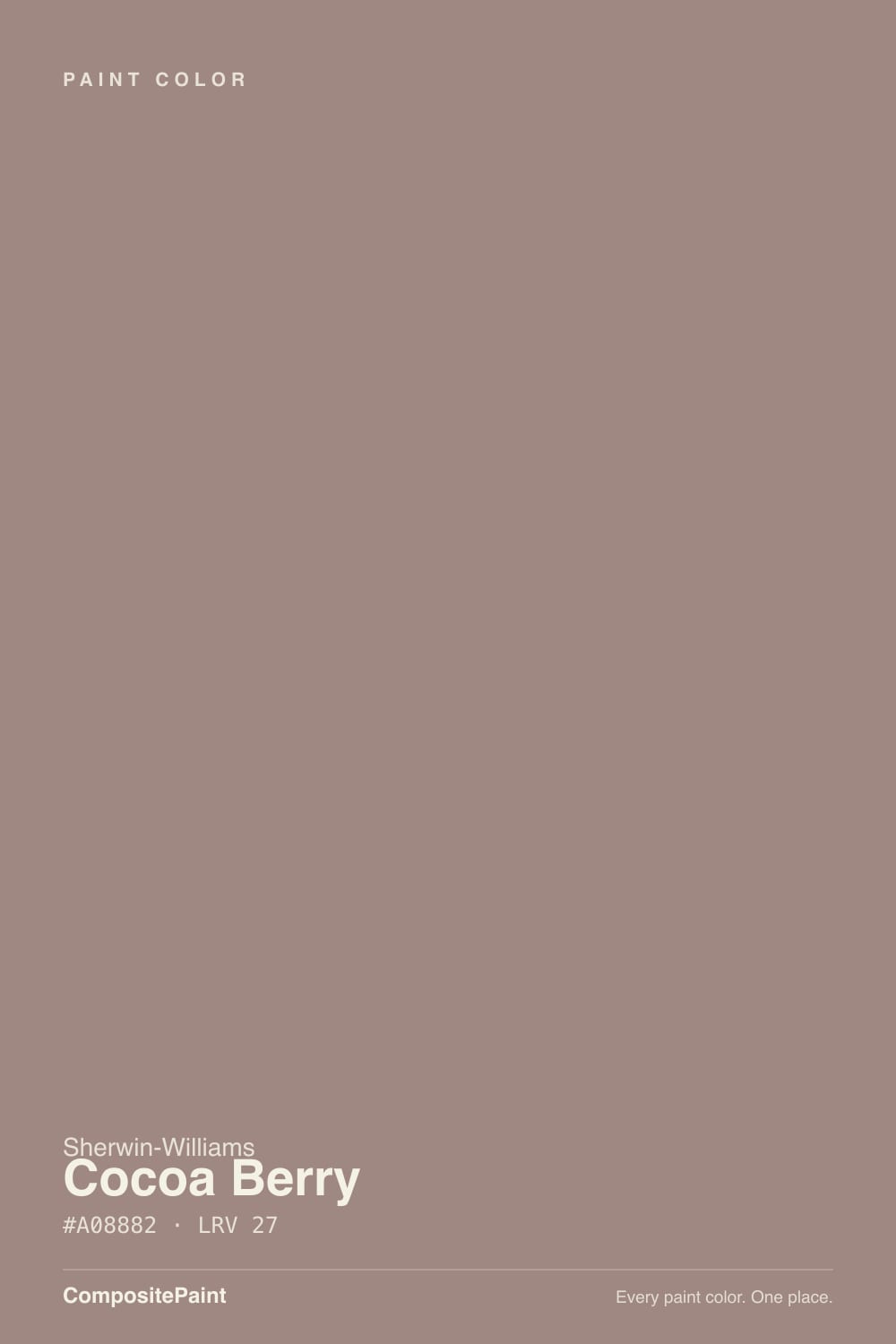
- 1Turkish Coffee5
- 2Porpoise13
- 3Cocoa Berry27
The Fast Verdict
Cocoa Berry is a dusty, warm taupe-brown with a real rose flush running under it — not enough to call it pink, but enough that Sherwin-Williams itself lists it in the Red Paint Colors family on its own site. At LRV 27 it is a genuine mid-depth color, not a whisper-neutral, and it rewards warm light and wood the same way its more famous cousins do. It has never had a Color of the Year moment and probably never will — which makes it a good pick for anyone who wants that dusty clay-rose mood without buying the color half the internet already argued about.
Bedrooms and dens that get afternoon or lamp light · kitchen islands and cabinets under warm wood · entries and hallways that need one warm anchor color · anyone who likes Redend Point or Cinnamon Slate but wants the quieter, less-searched version
You want a flat, no-drama taupe with zero pink · your room is north-facing with no warm bulbs · your stone or tile is cool gray or blue-gray · you are chasing a color everyone will recognize by name
- A genuine mid-depth rose-brown, not another beige-flavored greige
- Flatters warm wood — walnut, cherry, reclaimed wood — without a fight
- Sherwin-Williams lists it for nearly every room, including exteriors
- Deep enough (LRV 27) to hold its color instead of washing pastel
- Quiet and under-searched — a real alternative if you like Redend Point but not the fame
- Not a plain taupe — the red undertone is real and visible in warm light
- Goes muddy and flat in cool, north-facing rooms with no warm bulbs
- Argues with cool gray or blue-gray stone, tile, and quartz
- No brand fame or Color of the Year push, so fewer real-room photos exist to sample against
What Color Is Cocoa Berry, Really?
Cocoa Berry sits in the crowded, confusing middle ground between brown, taupe, and dusty red — and the RGB tells the real story: 160 red, 136 green, 130 blue. That 24-point gap between red and the other two channels is small on paper but visible on a wall, which is exactly why Sherwin-Williams' own color-family filter puts Cocoa Berry under "Red," not under gray, neutral, or brown, despite most shoppers landing on it while searching for a warm greige or a mauve-taupe. It is not a mistake in the listing — it is an honest description of a color that leans redder than it looks in a small chip.
At LRV 27 it is a mid-depth color, close in weight to Redend Point and noticeably deeper than a typical greige like Accessible Beige (LRV 58). That depth is what keeps the rose from turning candy-pink: color gets more saturated and less pastel as it darkens, so Cocoa Berry reads as a grounded, dusty clay-brown on the wall rather than a blush. The trade-off is the same one every mid-depth color makes — it needs real light to earn its keep, and it will look one shade murkier than the chip in a dim room.
Undertone in one line: brown first, a whisper of rose-red second, gray doing the graying — never orange, never true purple. If a sample looks flatly gray, the room's light is cold and killing the red; if it looks distinctly pink, that is warm afternoon sun or a 2700K bulb pulling the red channel forward, and it will settle back down by evening.
Where It Shines
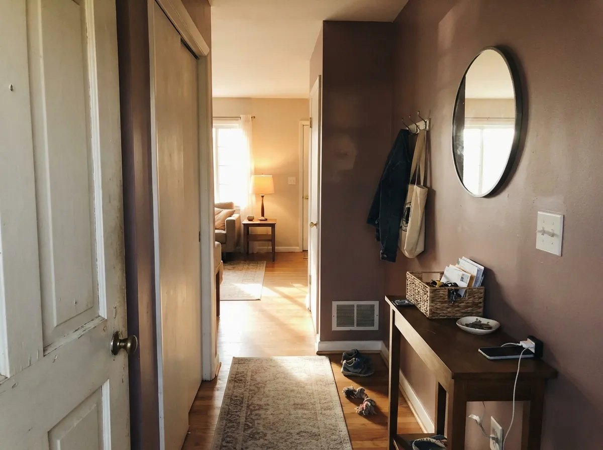
Give it warm afternoon light, lamp light, or a west-facing window and the dusty-rose undertone comes forward without ever tipping into pink paint — the same trick that made Redend Point and Cinnamon Slate famous, minus the internet argument. It is genuinely comfortable next to warm wood: walnut, cherry, and reclaimed barn wood all read richer against it instead of fighting it, and cream trim keeps the whole combination looking deliberate rather than dated. Because Sherwin-Williams lists it for bedrooms, entries, hallways, vanities, cabinets, and exteriors alike, it is one of the more genuinely flexible mid-tones in the deck — quietly, not loudly.

Where It Fails
Cocoa Berry has no famous viral thread and no Color of the Year fame to generate a pile of one-star horror stories — it is an honestly under-discussed color. What follows is not a catalogue of real reader complaints; it is the predictable behavior of a mid-depth, desaturated red-brown under the three conditions that trip up every color in this family, and any of the three will disappoint you the same way they disappoint buyers of its better-known cousins.
The red channel is real, not a rounding error — 24 points above green and blue in the RGB. In strong or warm light that shows as a visible rose-brown flush, not a plain gray-taupe. If your goal was "gray with a hint of warmth and nothing else," test Dovetail or Pashmina instead; Cocoa Berry will always have a little more color in it than a name like "taupe" implies.
Desaturated red-browns lose their warmth fastest of any hue family under cool, blue-heavy daylight — the red channel gets canceled and what is left reads muddy, slightly gray, and flatter than the chip. This is the same failure mode that catches Redend Point and Cinnamon Slate in a north room. The fix is warm 2700K bulbs, not a different can of the same color.
Cool quartz, blue-gray marble, and chrome-heavy cool fixtures sit at the opposite temperature and make the rose in Cocoa Berry look dirty or pink-ish by contrast, the way any warm color argues with a cold material. Pair it with warm stone, brass, or wood instead, or keep the cool stone in a different room.

Room by Room
Afternoon and lamp light bring the dusty-rose warmth forward without it reading pink; eggshell hides texture and deepens the color slightly. Pair with cream bedding and walnut furniture, not beige, which reads flat next to it.
Sherwin-Williams lists it here for a reason: a single warm mid-tone in a transition space reads intentional without committing an entire main floor. Works best with a cream or warm-white trim, not a stark bright white.
A closed, warmly lit living room with wood furniture and a cream sofa is genuinely handsome in Cocoa Berry. Open-plan rooms need to check what the adjacent kitchen and floor tones are doing before committing to all four walls.
Satin Cocoa Berry on a vanity under a warm stone top and brass hardware is a small, reversible way to try the color before trusting it to a whole room. Skip it with cool gray or blue-gray tile.
On an island or lower cabinets against cream perimeter cabinets and warm wood open shelving, it reads custom rather than trendy. A full kitchen of it is a bigger bet — sample it against your actual counter and floor first.
Sherwin-Williams lists it as an exterior option, and full sun reads it a step redder and more saturated than indoors. Pair with warm white or cream trim and avoid pairing with cool gray roofing or stone accents, which will fight the warmth.
Your Light Is the Risk
The rose-brown comes forward and reads rich, not pink — the color at its most flattering, closest to what the paint chip promises.
Cool, blue-heavy daylight cancels the red channel and the color goes flat and slightly muddy. Test a large sample here before trusting the chip.
Brighter and more clearly rose-brown at midday, settling into a quieter grounded tone by late afternoon. A gentle shift most owners like, not a color change.
2700K warm bulbs deepen the rose and make it feel cozy at night; cool white LEDs flatten it toward gray — swap the bulb before repainting.
Most complaints about Cocoa Berry are a light mismatch. Upload a photo of your actual room and see it on your walls — then ask for the same wall in north light or evening lamps before you buy a single sample.
Need It From Another Brand?
Any paint counter can custom-tint Sherwin-Williams SW 9078 directly. If you would rather stay in one brand's own deck, these are the closest stock matches, measured as ΔE2000. Under 2 is a difference you will not see on the wall.
| Brand | Closest color | ΔE | LRV | |
|---|---|---|---|---|
| Behr | Regency RoseUL110-11 · Behr | 2.5 | 27 | Color page → |
| Benjamin Moore | Barberry1244 · Benjamin Moore | 3.2 | 27 | Color page → |
| Valspar | Channel Seal Gray1001-9C · Valspar | 3.7 | 27.4 | Color page → |
| PPG / Glidden | Smoky QuartzPPG18-08 · PPG / Glidden | 4.5 | 28 | Color page → |
| Glidden | Rowhouse Brown70YR 25/106 · Glidden | 2.7 | 25 | Color page → |
| Dutch Boy | Plummet Plum403-4DB · Dutch Boy | 2.0 | 26 | Color page → |
Similar Sherwin-Williams Colors
The nearest shades to Cocoa Berry within Sherwin-Williams's own range, ranked by perceptual color distance — useful when you want the same look a touch lighter, darker, or warmer.
WCAG 2.1: AA is 4.5 : 1 for normal text, 3 : 1 for large text, AAA is 7 : 1.
Cocoa Berry vs the Colors You're Also Considering
Every Cocoa Berry sample board has the same rivals on it. The numbers show the real lightness gap — then it comes down to which risk you would rather live with.
Pick this for the same depth without the viral pink debate; Cocoa Berry keeps its rose whisper-quiet.
Sherwin-Williams SW 9081 · LRV 27Redend PointPick this if you want the internet-famous clay-pink version at the exact same LRV — Redend Point leans pinker and Cocoa Berry leans browner.
Pick this for a lighter mid-tone that still reads warm and grounded without going moody.
Benjamin Moore 2113-40 · LRV 19Cinnamon SlatePick this for the deeper, browner 2025 Color of the Year version of this same mood — moodier and more committed.
Pick this for the warmer, redder-brown cousin without the purple debate that followed Poised Taupe around.
Sherwin-Williams SW 6039 · LRV 22Poised TaupePick this if you want the famous 2021 Color of the Year — it leans a step darker and, by Sherwin-Williams' own admission, purple.
Cocoa Berry Coordinating Colors
The rule for coordinating with Cocoa Berry: stay warm, stay in the brown-rose-taupe family for anything touching it directly, and save true cool grays for a different room. It pairs best with creams, warm wood, brass, and its own deeper or lighter cousins — the partners below keep showing up in rooms that actually work:
The Color Sherwin-Williams Filed Under Red
Cocoa Berry has no Color of the Year story and no viral thread — it is an honestly quiet entry in a deck full of louder mauve-browns. What it does have is a small, telling detail: Sherwin-Williams' own website sorts it into the Red Paint Colors family, not gray, not neutral, not brown. Most shoppers land on Cocoa Berry searching for exactly the opposite — a warm greige or a dusty taupe — and are surprised to see it filed next to true reds.
That classification is honest, not clumsy. At RGB 160/136/130, the red channel really does sit meaningfully above green and blue, and that gap is what gives Cocoa Berry its rose warmth in good light. Compare it to a color like SW Dovetail (RGB 128/122/110), where the channels sit close together and the result reads as a straightforward warm gray with no red argument at all. Cocoa Berry is doing something slightly different — it is a brown built on a red base, wearing a name that sounds like neither.
Cocoa Berry With Wood Tones and Floors
Warm wood is the easy, reliable partner here: walnut, cherry, and reclaimed barn wood all deepen and richen next to Cocoa Berry rather than fighting it, because both sit on the same warm side of the wheel. Honey oak is a milder version of the same story — workable, though it will pull the wall slightly more orange-brown than a walnut floor would.
The floors and stone to sample carefully first are the cool ones: gray-washed wood, cool white oak, and any blue-gray or true gray quartz or marble. Those materials sit at the opposite temperature and will make Cocoa Berry's rose undertone look more pronounced — sometimes pink, sometimes simply out of place — by contrast. A warm rug or a warm-toned countertop closes that gap in most rooms without a full remodel.
Three Ready Palettes Built on Cocoa Berry
A color is never alone on the wall. These are complete combinations in the 60-30-10 pattern, with the reason each one holds together. Every one opens in the visualizer.
Creamy keeps the trim genuinely warm instead of stark, so the handoff from wall to woodwork stays soft; Wenge gives the room one near-black note for depth without introducing a cold gray that would fight the rose undertone.
Try this palette in your roomTwo warm mid-tones — island and hood — bracket a cream perimeter so the kitchen reads layered instead of matchy; Dovetail's grayer warmth keeps the hood from competing with the island's rose.
Try this palette in your roomStaying in the same red-brown-taupe family from entry into living room avoids the muddy clash a true gray or a true beige next door would cause; one cream trim ties the two rooms into a single, deliberate palette.
Try this palette in your roomCocoa Berry FAQ
Is Cocoa Berry pink, brown, or red?
Brown first, with a real whisper of rose-red underneath — not enough to call it pink paint, but enough that Sherwin-Williams' own website lists it under Red Paint Colors rather than under neutrals or grays. On the wall it reads as a dusty, warm taupe-brown; in strong warm light the rose becomes more visible.
Why does Sherwin-Williams file Cocoa Berry as a red?
Its RGB values are 160 red, 136 green, 130 blue — a real gap that pushes the color into SW's red family even though most people search for it while looking for a taupe or greige. It is an honest technical classification, not a marketing choice, and it explains why the color reads warmer than its taupe-sounding cousins.
What trim white goes with Cocoa Berry?
A warm cream, such as SW Creamy, keeps the pairing soft; a stark bright white will make the walls look dingy by contrast, the same mistake that trips up most mid-depth warm colors. Semi-gloss on the trim, eggshell on the walls.
Will Cocoa Berry look too pink in my room?
Only in strong warm afternoon light or under 2700K bulbs, and even then it stays a dusty rose-brown rather than true pink. In cool north light the risk runs the other way — it can look flat and muddy instead. Sample a large board in your actual room before committing either way.
Is Cocoa Berry good for kitchen cabinets?
Yes, especially in doses — an island or lower cabinets under cream perimeter cabinets and warm wood open shelving. A full kitchen of it is a bigger commitment; check it against your counter and floor tones first, since cool gray stone will fight the warmth.
Is Cocoa Berry a popular or trending color?
Honestly, no — it has never had a Color of the Year moment and there is little real-room discussion of it online, unlike its more famous cousins Redend Point and Cinnamon Slate. That is not a mark against it: it is a genuinely usable mid-depth rose-brown that happens to be under-searched, which can be an advantage if you want the mood without the crowd.
Have you painted with Cocoa Berry?
Rate it — one tap helps the next reader decide.
Ask a Question