Poised Taupe
The 2017 Color of the Year that Sherwin-Williams itself files under Purple, reviewed honestly: where it earns the taupe name, where it doesn't, and what to pick instead.

Jessica has spec'd whites and neutrals for more than 300 rooms and keeps a sample wall of painted drawdowns in her studio. Every color review is checked against real reader rooms in the comments and re-tested when a formula changes. About the testing process →
- 1Nocturne8
- 2Mocha Latte17
- 3Poised Taupe22
- 4Dorian Gray39
- 5Mindful Gray48
The Fast Verdict
Poised Taupe is Sherwin-Williams' 2017 Color of the Year, sold with a pitch about gray calm meeting brown warmth. What the launch marketing skipped: Sherwin-Williams' own site today files this color under Purple, not gray or brown. At LRV 22 it is a real mid-depth neutral that holds its color across a full wall — which is exactly why the violet undertone shows up. Give it warm light and warm-toned company and it reads as a genuinely considered choice; get the light or the name's promise wrong and you get the color real buyers complain about: purple, when they wanted plain taupe.
Living rooms, bedrooms and hallways with warm daylight or lamps · dens and home offices with walnut and leather · anyone who wants a genuinely complex neutral, not a safe filler
you typed "taupe" expecting a plain brown or beige · your room runs cool north light with no lamps · your trim and floors already lean cool blue-gray · you want zero chance anyone in the room calls it purple
- A genuinely three-way blend — Sherwin-Williams itself files it as purple, not a flat gray or brown
- Deep enough (LRV 22) to hold real color and personality across full walls
- A real, decade-old Color of the Year that's still a current, purchasable color
- Warms into a grounded, complex neutral under 2700K lamps
- Recommended by Sherwin-Williams itself for living rooms, bedrooms, and hallways
- Sherwin-Williams files it under Purple — the name "taupe" oversells the undertone, and real buyers have been surprised by it
- Cool north daylight strips the warmth and leaves a flatter, more visibly violet wall
- Fights honey oak, golden trim, and other yellow-warm wood
- Not a marketed exterior color — using it outdoors is a real gamble without a big sample first
What Color Is Poised Taupe, Really?
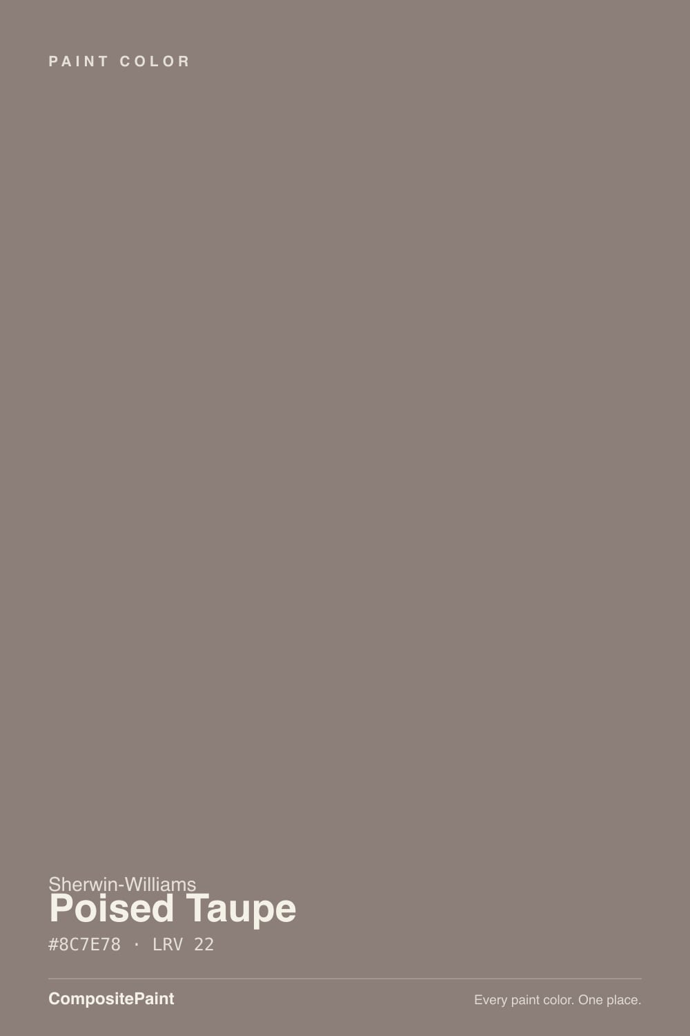
Sherwin-Williams named this one its 2017 Color of the Year, pitching it as a blend that brings the warmth of brown together with the calm of gray. That pitch undersells what is actually in the can. Go to Sherwin-Williams' own website today and Poised Taupe is filed under the Purple color family — not gray, not brown. That is the real story of this color: a genuine three-way blend, brown and gray on the surface with a violet undertone doing more work than the name "taupe" lets on.
At LRV 22 it is a real mid-depth color — the same weight as Benjamin Moore's Chelsea Gray, deeper than most colors people casually call taupe. That depth is exactly why the violet shows up: a paler mauve washes out in daylight and reads as a light accent, but Poised Taupe holds its saturation across a full wall, and depth always makes an undertone harder to hide. A chip in your hand reads like a tasteful brown-gray; the same color across four walls reads with real color in it.
Undertone in one line: gray and brown on the surface, violet always underneath. Sherwin-Williams' own description calls it a balance of purple and brown undertones that shift warm and cool with the light. It never reads pink and it never goes fully cool blue-gray; when it looks flat and gray with the warmth gone, that is cold daylight stripping the brown out and leaving the violet-gray skeleton exposed.
Where It Shines
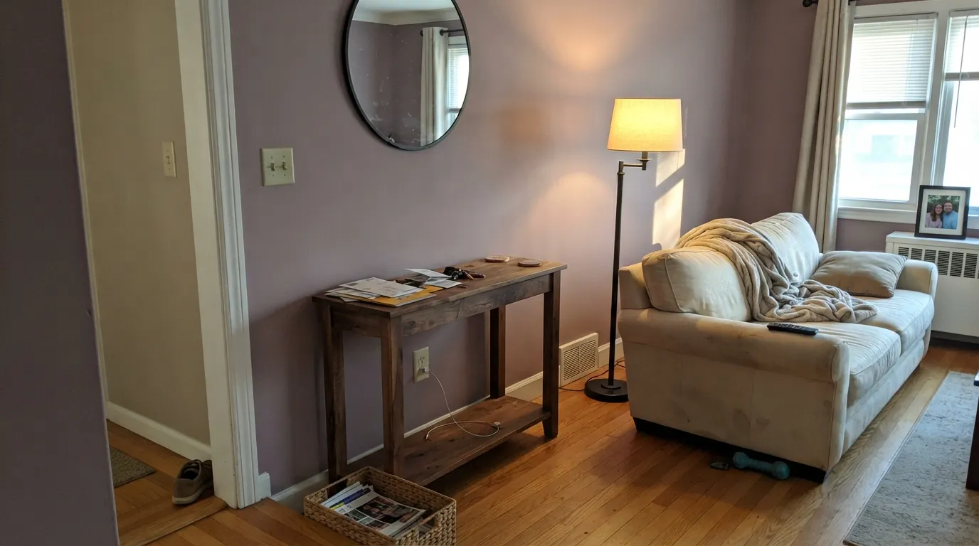
Give it warm light — afternoon sun, or a room that leans on lamps — and warm-toned company like walnut, brass, leather, and black iron, and Poised Taupe earns its Color of the Year title: a genuinely complex neutral that reads as a considered choice, not a safe default. Sherwin-Williams itself recommends it for living rooms, bedrooms, and hallways, and that is exactly where it performs best — carrying a floor plan without repeating a flat gray or a plain beige.
Where It Fails
Almost every complaint about Poised Taupe comes back to one mismatch: someone read "taupe" and expected an unambiguous brown or beige, then ended up with a color Sherwin-Williams itself classifies as purple. The rest of the regrets are ordinary light and pairing mistakes any deep neutral runs into. None of them are the paint failing — they are a name that oversells what the can actually holds.
Sherwin-Williams files this color under its own Purple family, not gray or brown — a fact most buyers never see until the wall is dry. On the Houzz forums, a homeowner shopping for a neutral tried it and reported flatly that "it looks purple"; a design consultant in the same thread backed her up, pointing out that even Sherwin-Williams' own description calls it purple. If you want an unambiguous brown or beige, the name oversold this can.
Yellow-orange sits opposite violet on the color wheel, and Poised Taupe's undertone is real enough that golden oak floors or honey-toned trim amplify the clash — the floor pushes toward orange, the wall pushes toward purple. Walnut, espresso, and pale white oak read calm against it instead.
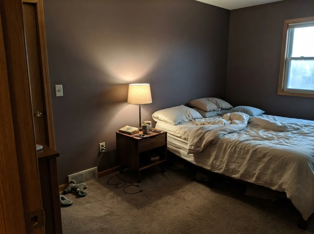
Sherwin-Williams' own note is that the undertones shift warm and cool depending on the light — and cool daylight is where it loses that fight. A dim, north-facing room strips the brown out and leaves a flatter, grayer, more visibly violet wall. Warm 2700K bulbs are part of the paint job here, not an optional upgrade.
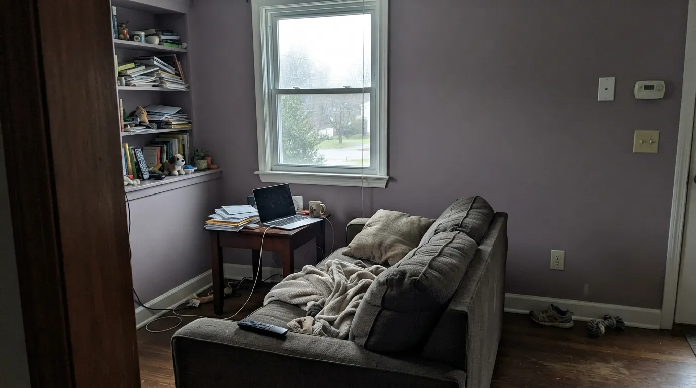
Room by Room
Sherwin-Williams itself lists this among the color's strongest rooms, and it earns the recommendation with real daylight and wood furniture: the depth reads deliberate, not heavy. Eggshell finish, warm-toned neighbors.
Deep enough to feel like a real decision without going as fully violet as Benjamin Moore's Sleepy Hollow. Under 2700K lamps it settles into a warm, grounded neutral; under cool light it edges toward flat purple-gray, so keep the bulbs warm.
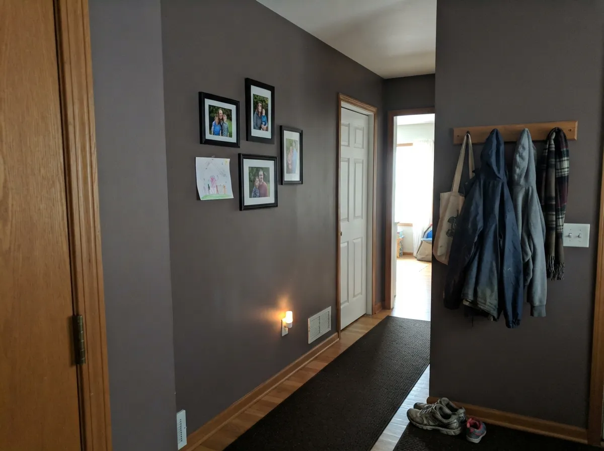
Another room Sherwin-Williams specifically recommends it for, and hallways are forgiving: shorter wall runs and less direct daylight than a sunlit open-plan living room.
Low, warm, lamp-heavy light flatters brown-violet neutrals generally, and this is no exception. Walnut shelving and leather furniture are its natural company.
Not a room Sherwin-Williams calls out specifically for this color, but its depth works the way any LRV-22 neutral works on an island or a run of cabinets — grounded against butcher block and brass. Sample it on the actual cabinet door before committing the whole kitchen.
This isn't one of the deck's marketed exterior specialists, so treat it as an unproven accent outdoors rather than a safe bet. Direct sun shows more of the violet than an indoor lamp ever does, and a shaded portico reads differently than a south-facing door — get a real sample on the actual door before ordering a gallon.
Your Light Is the Risk
West and south sun bring the brown forward and hold the violet as an undertone instead of the headline — the color at its most "taupe."
Sherwin-Williams' own note that the undertones shift warm and cool with the light means north light is where cool wins: flatter, grayer, more visibly violet.
Warmer and browner at midday sun, more visibly violet in shade and toward dusk — a real shift, not a trick of the eye. Sample it at more than one hour.
Warm bulbs pull the brown forward and settle the violet down at night. Cool white LEDs push the opposite way — expect a grayer, slightly purple cast after dark.
Most complaints about Poised Taupe are a light mismatch. Upload a photo of your actual room and see it on your walls — then ask for the same wall in north light or evening lamps before you buy a single sample.
Need It From Another Brand?
Any paint counter can custom-tint Sherwin-Williams SW 6039 directly. If you would rather stay in one brand's own deck, these are the closest stock matches, measured as ΔE2000. Under 2 is a difference you will not see on the wall.
| Brand | Closest color | ΔE | LRV | |
|---|---|---|---|---|
| Behr | Wild TruffleHDC-NT-27B · Behr | 1.4 | 22 | Color page → |
| Benjamin Moore | Smoked Oyster2109-40 · Benjamin Moore | 0.7 | 23 | Color page → |
| Valspar | Dorian GrayT511 · Valspar | 4.1 | 22.2 | Color page → |
| PPG / Glidden | Cinnamon ToastPPG1017-5 · PPG / Glidden | 0.6 | 22 | Color page → |
| Glidden | Cinnamon ToastPPG1017-5 · Glidden | 0.9 | 22 | Color page → |
| Dutch Boy | Lab Gray447-4DB · Dutch Boy | 0.0 | 22 | Color page → |
Similar Sherwin-Williams Colors
The nearest shades to Poised Taupe within Sherwin-Williams's own range, ranked by perceptual color distance — useful when you want the same look a touch lighter, darker, or warmer.
WCAG 2.1: AA is 4.5 : 1 for normal text, 3 : 1 for large text, AAA is 7 : 1.
Poised Taupe vs the Colors You're Also Considering
Every Poised Taupe sample board has the same rivals on it. The numbers show the real lightness gap — then it comes down to which risk you would rather live with.
Pick this for the extra complexity — Chelsea Gray stays a flatter, more purely gray neutral at the same LRV.
Benjamin Moore HC-168 · LRV 22Chelsea GrayPick this for the exact same depth in a true charcoal-greige, with none of Poised Taupe's violet to manage.
Pick this for real weight and drama — Alpaca is Poised Taupe's pale, cautious cousin.
Sherwin-Williams SW 7022 · LRV 57AlpacaPick this for the same violet streak at a much lighter, safer depth for a whole-house neutral.
Pick this for the warmer, brown-leaning version — Storm Cloud stays purely gray-blue where this carries real brown.
Sherwin-Williams SW 6249 · LRV 24Storm CloudPick this if you want a genuine blue-gray with none of the purple debate — best on a single door, not four walls.
Poised Taupe Coordinating Colors
The rule for coordinating with Poised Taupe: stay warm and brown-leaning, and save the true blue-grays for a single door instead of a whole room. It pairs best with black iron, walnut, brass, and warm whites — and it argues with icy trim and blue-gray stone or tile. These are the partners that keep showing up in rooms that work:
The 2017 Color of the Year, Filed Under Purple
Sherwin-Williams named Poised Taupe its Color of the Year for 2017, pitching it as a color that brings the calm of gray together with the warmth of brown. What the original launch coverage didn't dwell on is what Sherwin-Williams' own website says today: Poised Taupe is filed under the site's Purple color family, not gray or brown.
That single fact explains most of the color's reputation. On the Houzz forums, a homeowner shopping for a neutral tried Poised Taupe expecting a taupe-cream and reported it "looks purple" instead — and a design consultant in the same thread agreed, pointing out that even Sherwin-Williams' own description calls it purple. Nearly a decade past its Color of the Year year, it's still a real, purchasable color — just one that rewards buyers who read past the name before they buy the gallon.
Poised Taupe With Wood Tones and Floors
This decision gets made at the floor, not the paint can. Walnut and espresso are the color's best partners — the dark red-brown depth reads the violet as smoky and deliberate instead of loud. Pale white oak and gray-washed floors are calm, safe choices that let the wall carry the color.
The one real no is golden: honey oak floors, orange-stained trim, yellow-beige carpet. Yellow-orange sits directly opposite violet on the color wheel, so each side exaggerates the other — the floor reads more orange, the wall reads more purple, and no number of coats fixes that geometry. If the golden floor is staying, a large rug between it and this paint does more good than another coat.
Three Ready Palettes Built on Poised Taupe
A color is never alone on the wall. These are complete combinations in the 60-30-10 pattern, with the reason each one holds together. Every one opens in the visualizer.
Cloud White is one of the deck's warmest trim whites, so it never fights Poised Taupe's brown side; Wrought Iron adds one true near-black note without introducing any cool blue-gray for the violet to argue with.
Try this palette in your roomTwo depths of the same warm-mood family — brown-violet and brown-red — read as one deliberate palette instead of two competing colors; Cloud White at the trim keeps the room from closing in.
Try this palette in your roomAlpaca carries the same violet streak at a much lighter depth, so the hallway and the den read like the same house getting quieter, not a color change. The shared undertone is what makes the handoff feel deliberate rather than jarring.
Try this palette in your roomPoised Taupe FAQ
is Poised Taupe gray, brown, or purple?
All three, honestly. Sherwin-Williams' own website files Poised Taupe under its Purple color family — not gray, not brown — even though the name and the original 2017 marketing lean on "taupe." Expect a genuine gray-brown-violet blend, with the violet doing more of the work than the name admits.
was Poised Taupe really a Color of the Year?
Yes. Sherwin-Williams named it 2017's Color of the Year, and it's still a current, purchasable color in the deck nearly a decade later — real staying power for a Color of the Year pick, even if the name still trips people up.
why do reviews call it purple when I bought it expecting a taupe?
Because it is, technically. A Houzz forum thread has a homeowner reporting the color "looks purple" after expecting a neutral taupe, and a design consultant in the same thread confirmed it, pointing straight at Sherwin-Williams' own description. It isn't a bad batch or a lighting trick in your photos — it's the actual undertone.
what trim white goes with Poised Taupe?
A warm white, not a stark cool one. Sherwin-Williams itself suggests Alabaster or Greek Villa; Cloud White does the same warm job. A cool, blue-white trim exaggerates the violet instead of calming it.
does it work with oak floors?
Depends on the oak. Walnut, espresso, and pale white oak are calm partners. Golden honey oak is the real risk — yellow-orange sits opposite violet on the color wheel, so the floor reads more orange and the wall reads more purple at the same time.
can I use Poised Taupe outside, on a front door?
Carefully. It isn't one of the deck's marketed exterior specialists, so treat it as an unproven accent outdoors rather than a safe bet. Sample the actual door in its real sun exposure before ordering a gallon, since direct light shows more violet than an indoor lamp does.
Have you painted with Poised Taupe?
Rate it — one tap helps the next reader decide.
Ask a Question