Carnelian
A deep oxblood red-brown that Sherwin-Williams' own website files under purple, reviewed honestly: where the red glows, the light that kills it, and why this stays an accent color, not a whole room.

Jessica has spec'd whites and neutrals for more than 300 rooms and keeps a sample wall of painted drawdowns in her studio. Every color review is checked against real reader rooms in the comments and re-tested when a formula changes. About the testing process →
- 1Redwood0
- 2Carnelian6
- 3Million Dollar Red13
- 4Cinnamon Slate19
The Fast Verdict
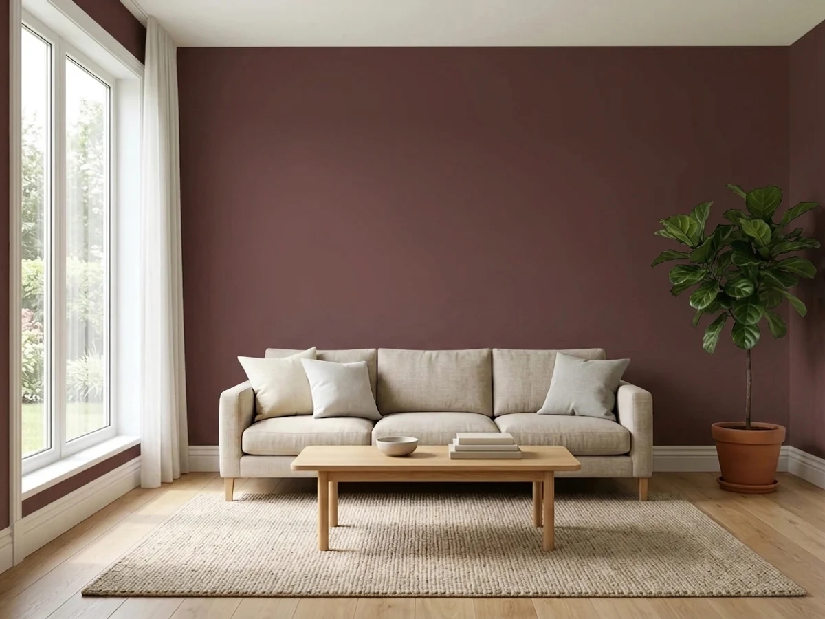
Carnelian is a deep, muted red-brown at LRV 6 — near-black on the reflectance scale, with a warm oxblood glow that only shows up in real light. Sherwin-Williams' own website files it as a purple, but nothing about it reads violet on a wall: it is wine-dark brown, leather and gemstone territory, not lavender. It is built for a door, a cabinet run, or one accent wall — not four walls in a dim room.
Front doors and exterior accents in good light · kitchen or bathroom cabinets with brass or gold hardware · a single accent wall in a den, office, or dining room · anyone who wants oxblood depth without buying an actual red
You searched "purple" and want something violet — this is not it · your room is dim and lamp-free · you are painting all four walls of a small windowless space · you want a safe, easy resale color
- A real oxblood-brown, not another moody navy or black copy
- Glows convincingly against brass and gold hardware
- Grounded in Sherwin-Williams' Timeless Color line, not a one-season trend
- Hides door and cabinet wear at LRV 6
- Reads genuinely different from every greige or sage crowding the deck
- Sherwin-Williams' own site files it as purple, which misleads searches and comparisons
- LRV 6 makes four full walls a real commitment, not a casual accent
- Needs warm light or lamps — cool LEDs kill the red and leave flat brown
- Uncommon enough that real-room photos and reviews are thin online
What Color Is Carnelian, Really?
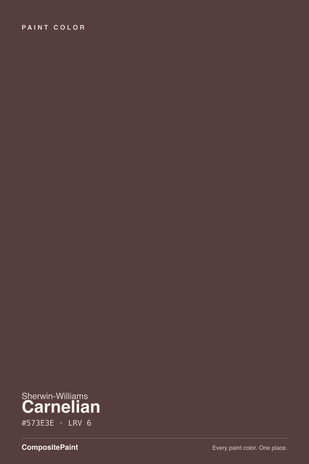
Carnelian is Sherwin-Williams' own description in one line: "a very dark red with a saturated brown undertone." Named for the reddish-orange gemstone, it lives in the brand's Timeless Color collection and had its moment as Sherwin-Williams' Color of the Month in April 2021 — modest recognition, not a Color of the Year run, which is the honest read on how well-known this color actually is. Search for it on Sherwin-Williams' own site, though, and it turns up filed under "Purple Paint Colors." That is a genuine quirk worth flagging: at hex #573E3E there is no violet in this color on the wall — it is oxblood and wine, the same family as a leather armchair or a dried rose, not lavender. If you found this page searching for a purple, this is the wrong color; trust the swatch, not the category tag.
At LRV 6 it sits in near-black territory — the same reflectance band as Benjamin Moore Wrought Iron and Sherwin-Williams Iron Ore, both filed as true near-blacks. That number is the whole story for how to use it: on four walls of an average room it behaves like a very dark, saturated wall, not a color you casually "try." On a door, a cabinet run, or one wall in a room with other light sources, that same depth reads rich and specific instead of cave-like. This is an accent color wearing a whole-house LRV.
Undertone in one line: warm red-brown, front to back — no blue, no true violet, ever. Strong daylight or gallery lighting pulls the red forward into a glowing oxblood; shade, dusk, or a phone photo flattens it into a near-black brown with barely a hint of red left. If a listing photo or a screen render looks maroon-purple, that is compression and monitor color profiles doing what apparently even Sherwin-Williams' own sorting system does — get an actual chip in the room before you commit.
Where It Shines
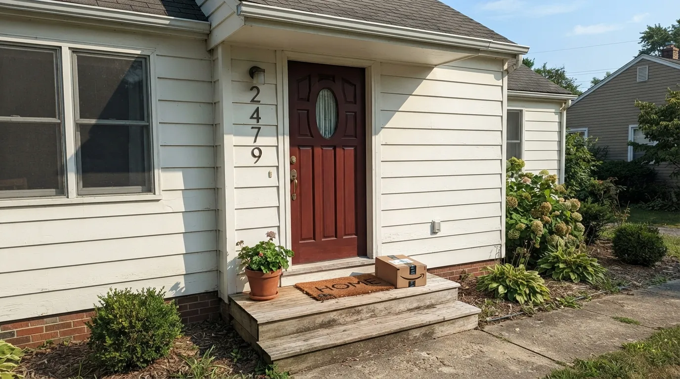
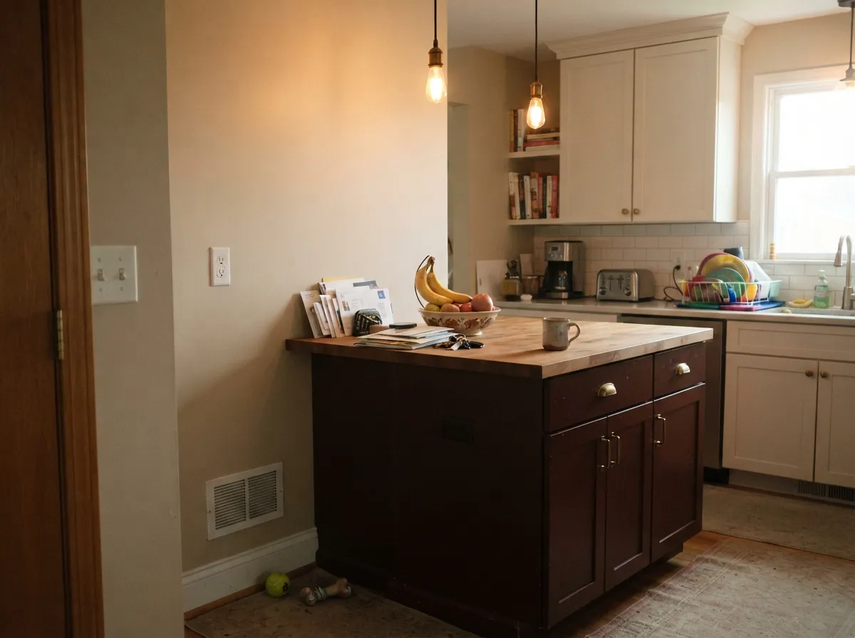
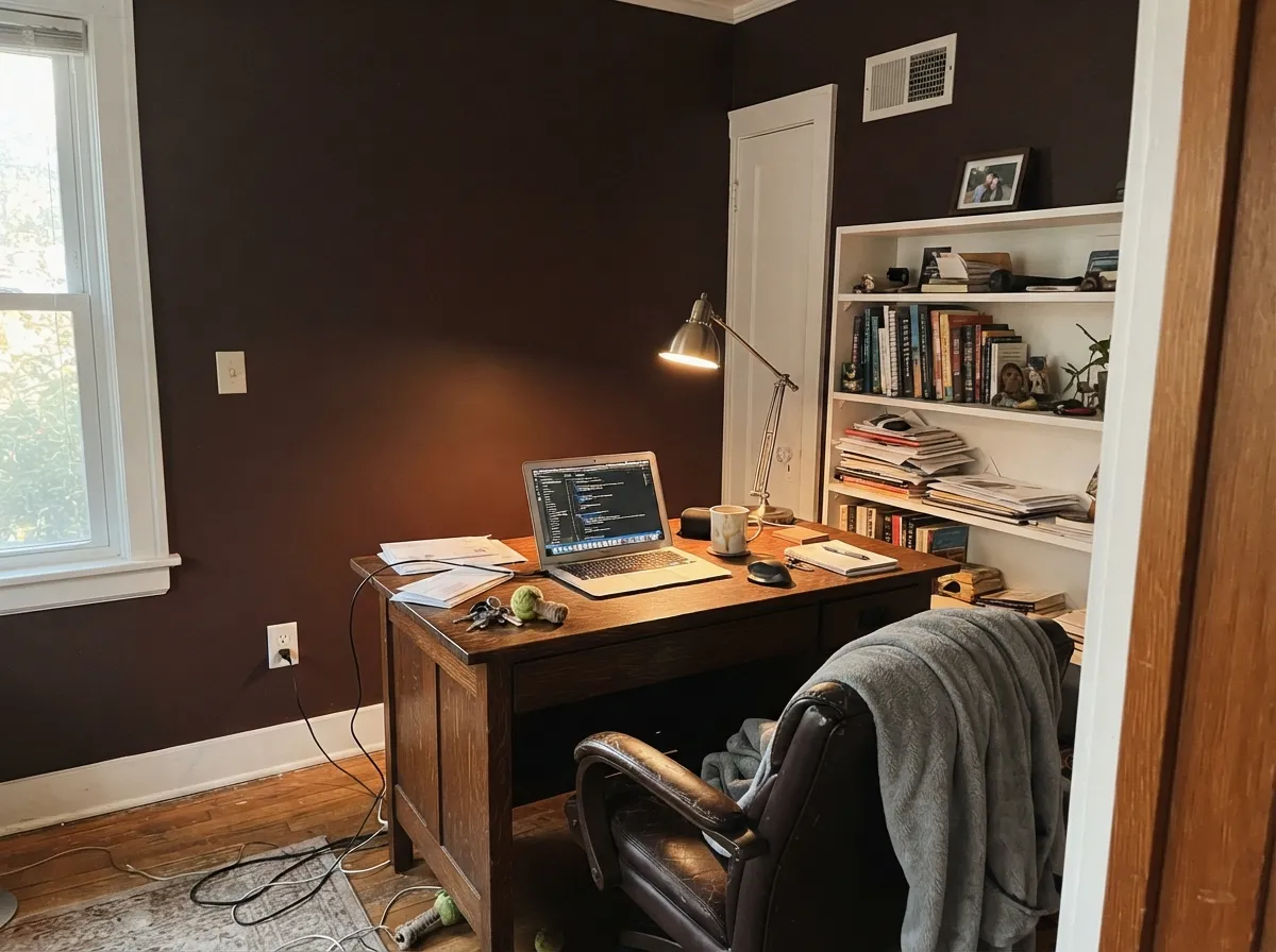
Give it a surface with real light and metal to reflect off, and Carnelian earns the gemstone name. Sherwin-Williams' own styling for the color pairs it with gold and brass hardware on cabinetry for a "vintage modern" look, and that is exactly where it performs best — a front door in full sun, an island or lower-cabinet run under warm pendant light, one office or dining wall a lamp can reach. The color needs light and metal as company; give it both and it reads expensive.
Where It Fails
Almost every regret story with a color this dark and this niche follows one of three scripts, and all three are predictable before the first coat. None of them are the paint's fault — but if your plan matches one, this is not your color, and a bigger sample will only confirm it.
Sherwin-Williams' own website files SW 7580 under "Purple Paint Colors," and plenty of buyers land here expecting violet. On the wall it is a dark red-brown with zero blue in it — oxblood, not lavender. If you actually want a purple, this color will just confuse you; look at a true violet swatch instead, not this one under a mislabeled category.
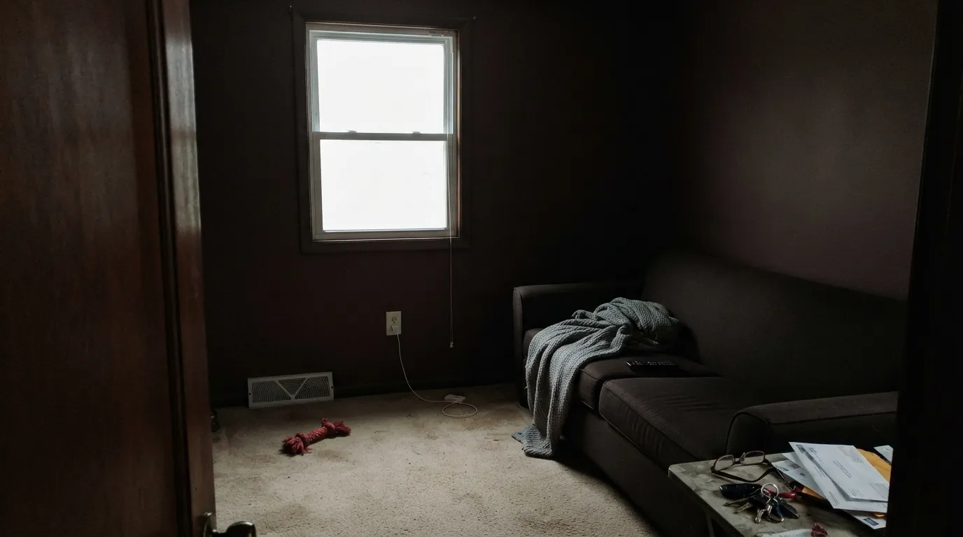
LRV 6 is near-black. In a small room with one window and no lamps, Carnelian does not read as "rich wine" — it reads as a dark, flat brown box, and the red never shows up to rescue it. This is a one-wall or one-surface color for most rooms; whole-room commitment needs real daylight or serious lamp coverage.
The red-brown undertone depends on warm light to show itself. Under cold white LEDs or a north window with no lamps on, the color drops the red entirely and settles into a muddy, near-black brown with none of the oxblood glow the gemstone name promises. Swap to 2700K bulbs before blaming the paint.
Room by Room
Full sun on an exterior door pulls the reddish oxblood forward, and it holds up against white, gray, or brick siding without looking dated. This is the single most reliable use for the color.
Sherwin-Williams itself styles this on lower cabinets or an island with brass or gold pulls — a genuinely good pairing. Matte or flat gets the moody showroom look; satin or semi-gloss wipes clean better for daily kitchen use.
A single accent wall behind a desk or shelving, with a warm lamp and leather or walnut furniture, is where the color feels intentional rather than heavy. Skip it on the other three walls.
Evening entertaining light — warm bulbs, candles — is this color's best audience. Daytime, keep the other walls a light neutral so the room does not go cave-like at lunch.
It can work as a headboard-wall color with serious lamp light, but LRV 6 on four bedroom walls with only a ceiling fixture reads oppressive fast. Not the color for someone chasing a soft, restful room.
A powder room vanity or a half-bath accent wall with brass fixtures can look genuinely custom. A full shower-to-ceiling bathroom in Carnelian needs real daylight or it will just look dark and dated.
Your Light Is the Risk
Direct sun or bright warm-white gallery lighting pulls the red forward into a true oxblood glow — the color at its most convincing.
Without a real light source the red drops out and Carnelian settles into a flat, muddy near-black brown. This is the situation behind most disappointed reviews.
Cooler and browner at midday, warmer and more visibly red as the light lowers toward evening — the shift is gentle, not dramatic, since the color starts this dark.
2700K warm bulbs keep the oxblood alive after dark. Cool white or daylight LEDs strip the red and leave a flat brown-black — swap the bulb before you swap the paint.
Most complaints about Carnelian are a light mismatch. Upload a photo of your actual room and see it on your walls — then ask for the same wall in north light or evening lamps before you buy a single sample.
Need It From Another Brand?
Any paint counter can custom-tint Sherwin-Williams SW 7580 directly. If you would rather stay in one brand's own deck, these are the closest stock matches, measured as ΔE2000. Under 2 is a difference you will not see on the wall.
| Brand | Closest color | ΔE | LRV | |
|---|---|---|---|---|
| Behr | Divine WinePPU1-02 · Behr | 0.7 | 6 | Color page → |
| Valspar | Piano Brown1004-9A · Valspar | 3.3 | 6.3 | Color page → |
| Glidden | Ranch House Brown85RR 05/082 · Glidden | 1.5 | 5 | Color page → |
| Dutch Boy | Old Chaparral402-7DB · Dutch Boy | 0.9 | 6 | Color page → |
| HGTV Home by Sherwin-Williams | Blackberry BrambleHGSW 3011 · HGTV Home by Sherwin-Williams | 3.4 | 6 | Color page → |
| Magnolia Home | Moody FigJG-155 · Magnolia Home | 2.7 | 7 | Color page → |
Similar Sherwin-Williams Colors
The nearest shades to Carnelian within Sherwin-Williams's own range, ranked by perceptual color distance — useful when you want the same look a touch lighter, darker, or warmer.
WCAG 2.1: AA is 4.5 : 1 for normal text, 3 : 1 for large text, AAA is 7 : 1.
Carnelian vs the Colors You're Also Considering
Every Carnelian sample board has the same rivals on it. The numbers show the real lightness gap — then it comes down to which risk you would rather live with.
Pick this when you actually want that red-brown wine color to show — Cracked Pepper reads more neutral, less gemstone.
Sherwin-Williams SW 9580 · LRV 5Cracked PepperPick this if you want the near-black without any visible red — it is a warm neutral-brown, not an oxblood.
Pick this for the deeper, more saturated oxblood — Sable is lighter and browner, with none of Carnelian's red glow.
Sherwin-Williams SW 6083 · LRV 8SablePick this for a genuine mid-depth brown you can use on more than an accent — Sherwin-Williams filed this one under "orange," the same kind of mislabeling.
Carnelian Coordinating Colors
The rule for coordinating with Carnelian: warm neutrals and brass metals, never cool grays or chrome. It wants company that lets the red-brown do the talking — a light warm wall, a warm white trim, maybe one other near-black elsewhere in the house for repetition. These are the partners that keep showing up in the pairings Sherwin-Williams itself recommends:
Why Sherwin-Williams Files Its Own Red Under "Purple"
Search Carnelian on Sherwin-Williams' own website and it comes up filed under "Purple Paint Colors" — despite the hex value (#573E3E), the RGB numbers, and Sherwin-Williams' own written description all agreeing it is a dark red with a brown undertone. It is not the only one: Sable, a genuine mid-brown a few pages over in the SW deck, is filed under "Orange." Whatever sorts these categories on the brand's site leans on something other than what your eye will see on the wall.
The practical upshot: do not shop by the category tag. If you landed here searching for purple, this is not your color — it is oxblood and wine, not lavender. And if you are comparing swatches on a screen, know that a JPEG or a poorly lit photo can push a color this dark and this saturated toward looking maroon-violet even when the physical chip reads clearly red-brown in your hand. Get the actual chip.
Carnelian's Quiet History
Carnelian is not a Color of the Year and never chased that spotlight — it sits in Sherwin-Williams' Timeless Color collection and had a single turn as the brand's Color of the Month in April 2021, styled on kitchen cabinets with brass hardware for a "vintage modern" look. That is a modest résumé, and it is the honest one: this is a niche accent color with real depth, not a bestseller, and there simply are not many real-room photos or forum threads about it online yet.
That obscurity cuts both ways. You will not find a wall of Houzz horror stories to sort through, but you also will not find much reassurance beyond a paint chip and your own test swatch. Sample it big, on an actual wall, in your actual light, before committing a door or a full cabinet run to it.
Three Ready Palettes Built on Carnelian
A color is never alone on the wall. These are complete combinations in the 60-30-10 pattern, with the reason each one holds together. Every one opens in the visualizer.
White Dove keeps the exterior warm instead of stark, so the oxblood door reads intentional rather than jarring; Urbane Bronze on shutters and trim pulls the same warm-dark family together without repeating the red.
Try this palette in your roomThis is close to Sherwin-Williams' own styling for the color: a warm neutral wall keeps the room from feeling heavy, Alabaster uppers give the eye a light landing spot, and brass or gold pulls on the Carnelian lowers do the rest of the work.
Try this palette in your roomEdgecomb Gray is warm enough not to fight the red-brown accent wall, and White Dove trim keeps the room from reading as one dark box — the one-wall rule that makes an LRV 6 color livable in a normal room.
Try this palette in your roomCarnelian FAQ
Is Carnelian purple or red-brown?
Red-brown, unmistakably — Sherwin-Williams' own hex value (#573E3E) and its own written description ("a very dark red with a saturated brown undertone") both say so. Confusingly, the brand's website also files SW 7580 under "Purple Paint Colors." That is a category-tag quirk, not a description of the paint — nothing about it reads violet on a wall.
Is Carnelian too dark for a whole room?
For most rooms, yes, unless you have strong daylight or serious lamp coverage. At LRV 6 it sits in near-black territory — the same reflectance band as Benjamin Moore Wrought Iron. Treat it as an accent-wall, door, or cabinet color first; a full four-wall room needs real light to keep it from going flat.
What's the best light for Carnelian?
Direct daylight or warm gallery lighting, full stop. That is when the red comes forward into a true oxblood glow. Dim rooms and cool LED bulbs strip the red and leave a muddy near-black brown — the paint is not misbehaving, the light is just wrong for it.
Does Carnelian work on kitchen cabinets?
Yes — it is Sherwin-Williams' own styling example, usually on an island or lower cabinets with brass or gold hardware, paired with a lighter neutral wall. Matte or flat gives the showroom look in photos; satin or semi-gloss holds up better to daily kitchen wiping.
What wall or trim color pairs well with Carnelian?
Warm neutrals do the heavy lifting: Accessible Beige or Edgecomb Gray on the walls, White Dove or Alabaster on trim. Avoid cool grays and blue-based whites — they fight the warmth instead of framing it.
Is Carnelian a good front door color?
It is the color's single most reliable use. Full sun pulls the reddish oxblood forward, and it reads as a confident, slightly vintage door against white, gray, or brick siding without looking like a trend purchase.
Have you painted with Carnelian?
Rate it — one tap helps the next reader decide.
Ask a Question