Winter Gray
The lavender-gray everyone searches for by name, reviewed honestly: the light that sharpens the violet, the rooms it's built for, and what to pick instead.

Jessica has spec'd whites and neutrals for more than 300 rooms and keeps a sample wall of painted drawdowns in her studio. Every color review is checked against real reader rooms in the comments and re-tested when a formula changes. About the testing process →
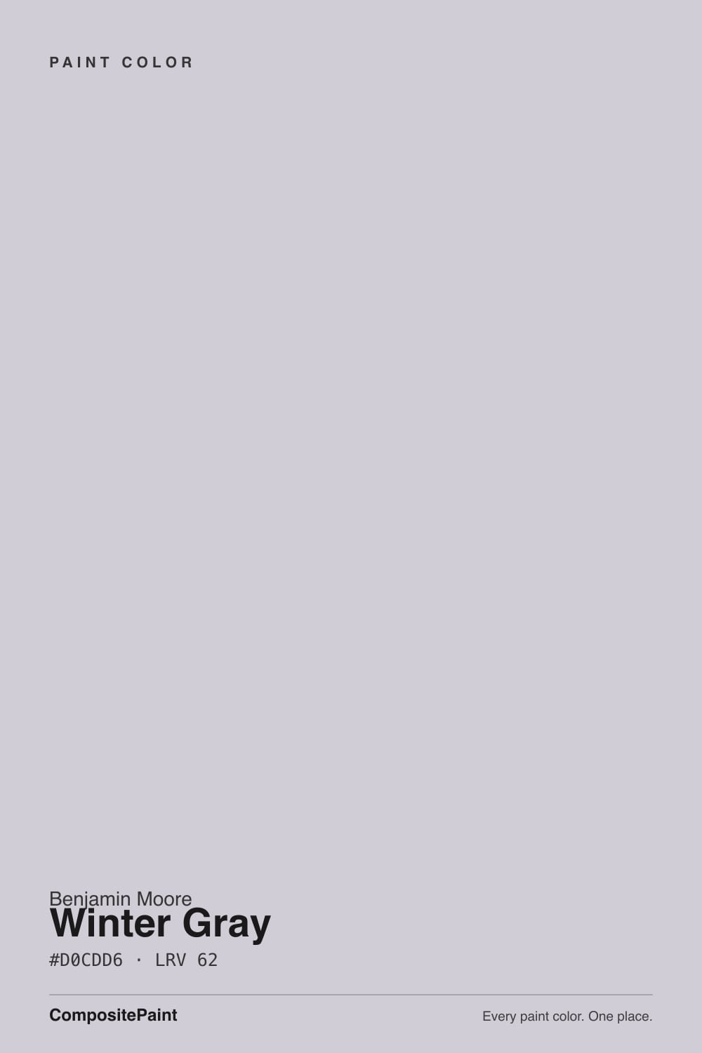
- 1Wisteria48
- 2French Lilac56
- 3Winter Gray62
- 4Silver Peony68
- 5White Lavender76
The Fast Verdict
Winter Gray is proof Benjamin Moore's violet-grays don't stop at Sleepy Hollow — this one just does it three shades lighter and much quieter. At LRV 62 it reads first as a soft, cool gray, and only on a second look does the lavender show up: "equal amounts of gray and violet," by BM's own description, and on the wall that's literally true. It's the exact color people land on when they search for a "muted purple gray" and want something sophisticated, not sweet.
Bedrooms and studies wanting quiet color without going full lavender · north-facing rooms with real daylight · anyone who typed "muted purple gray" into a search bar · powder rooms and baths with cool stone
You want a true, colorless gray in every light · your room has no real window and stays dim · your floors are honey oak or golden builder beige · you're handing the color off across an open floor plan
- A genuine violet-gray that reads sophisticated, not sweet or purple-themed
- Actually improves in cool north light — most colors this cool go muddy there instead
- Light enough (LRV 62) to work as a background, not just an accent
- Reads as a true neutral next to pattern, art, and brass
- Real, specific search demand — the exact color people mean when they ask for "muted purple gray"
- Not a true gray — the violet is visible in almost any daylight
- Reads noticeably darker and flatter in a room without real windows
- Fights honey oak, golden trim, and warm yellow-beige the same way Sleepy Hollow does
- Needs a light-behavior conversation before painting a whole open floor plan
What Color Is Winter Gray, Really?
Equal amounts of gray and violet, in Benjamin Moore's own description — and for once the marketing line holds up on the wall. Winter Gray sits in the same violet-gray family as Sleepy Hollow, just diluted several times over: instead of a deep, moody bedroom color, this is a light, quiet neutral that only reveals its purple heart once you go looking for it. It shows up again and again in the same design-forum threads, searched by name from people typing some version of "muted purple gray paint" and hoping for exactly this — enough personality to not be boring, not enough to read as a themed purple room.
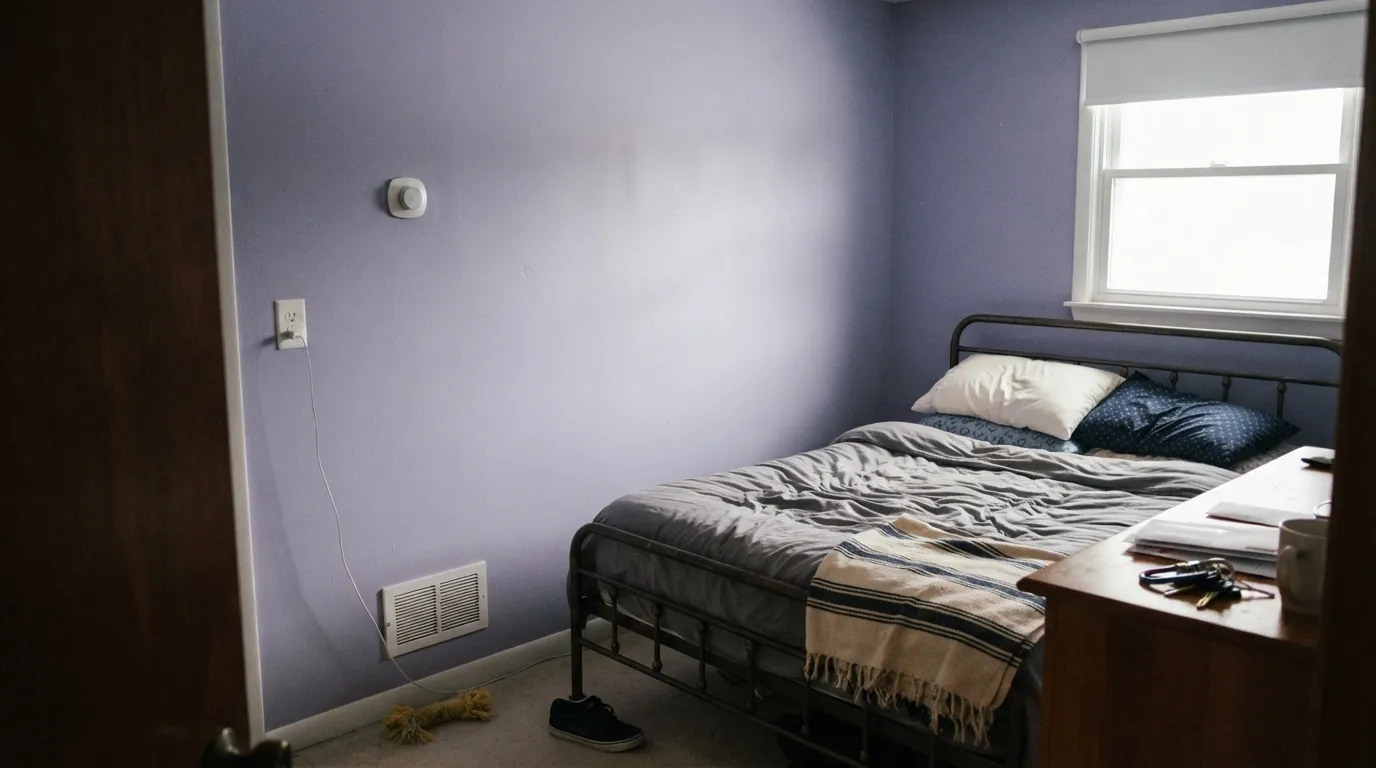
At LRV 62 it sits almost exactly between two of Benjamin Moore's other light grays: cooler and a touch deeper than Gray Owl (LRV 65), a shade lighter than Stonington Gray (LRV 59). What separates it from both is undertone — Gray Owl leans green, Stonington stays a true blue-gray, and Winter Gray is the one that unmistakably leans violet the moment real daylight hits it. It also breaks the usual rule: most cool-undertone colors go muddy in cool north light, but Winter Gray does the opposite — north light sharpens the lavender into a crisp, elegant read, while a dim interior room with no real window just makes it read flat and dark.
Undertone in one line: violet first, gray second, and it holds that ratio in nearly every light — it never drifts pink or green. If your sample reads plain gray on the wall, that's usually warm afternoon light or warm bulbs muting it; if it reads full-on lilac, that's cool daylight doing exactly what the color is built to do.
Where It Shines
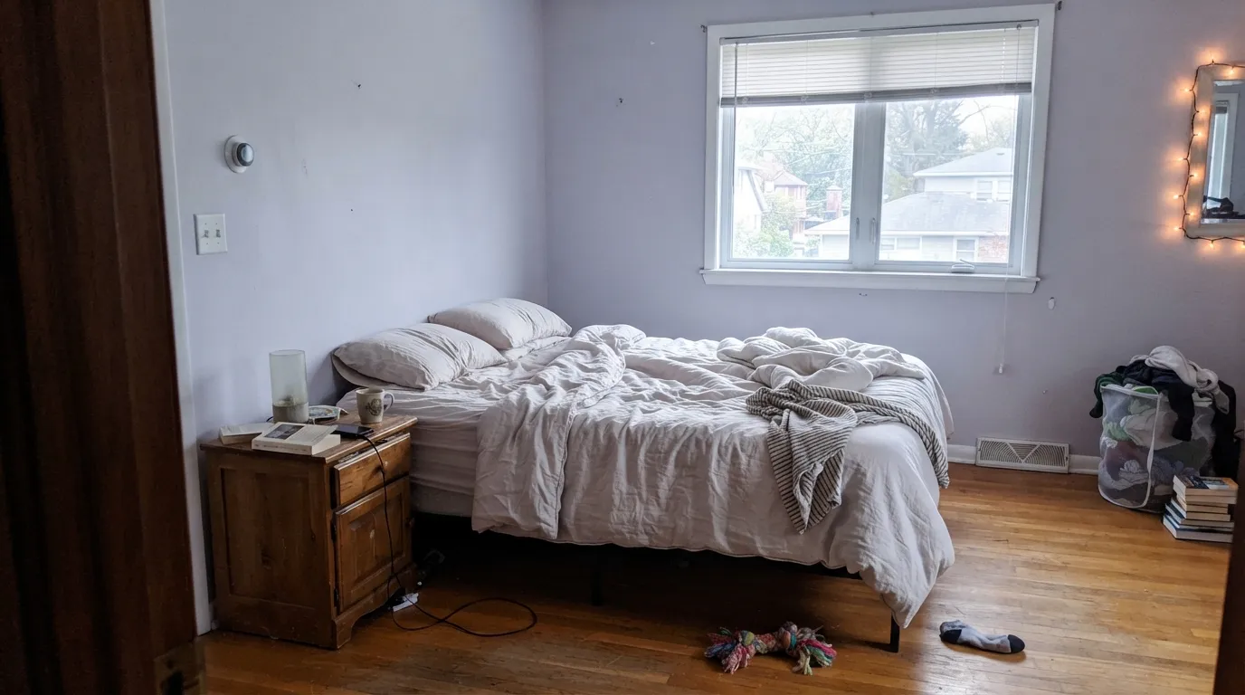
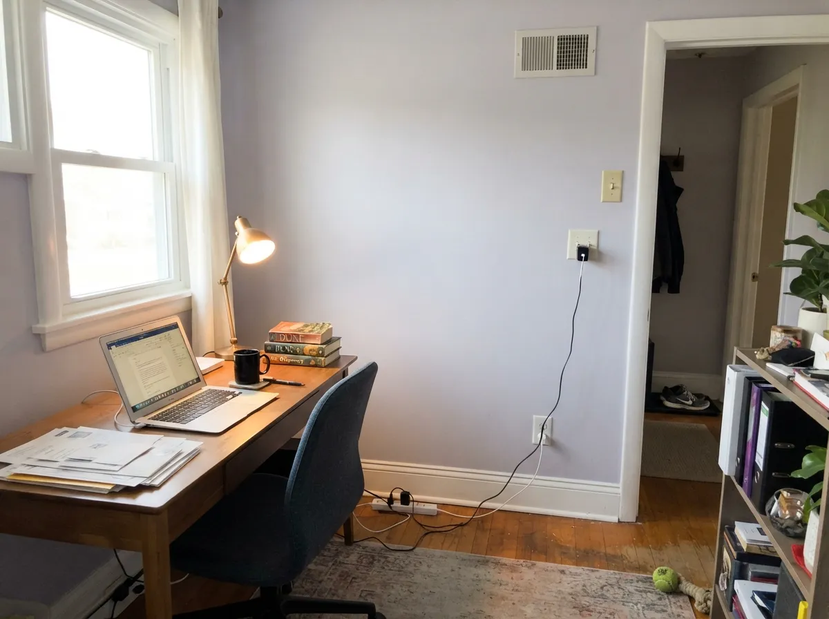
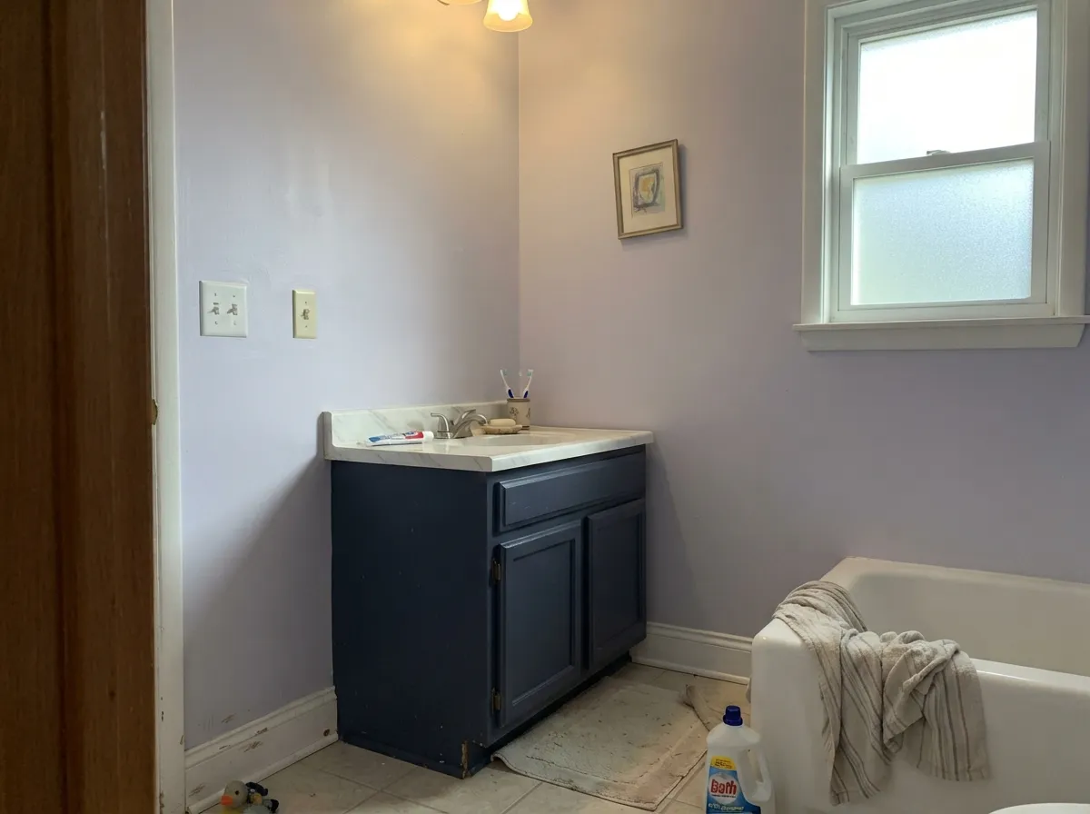
Give it a room with real daylight — north or east both work in its favor — and cool-toned trim, and Winter Gray earns the search traffic it gets. Bedrooms and studies are its home turf: Benjamin Moore itself lists it there, and the reason is obvious once you've seen it under a north window — quiet, cool, and sophisticated instead of sweet. It also does well as the small commitment: a powder room, an accent wall, somewhere the lavender reads as a considered choice rather than the whole personality of the house.
Where It Fails
Almost every disappointed review of Winter Gray comes from one of three situations, and all three are predictable before the first coat goes on. None of them are the paint's fault — but if your room matches one, sampling bigger will only confirm the mismatch, not fix it.
Benjamin Moore is upfront that this is "equal amounts of gray and violet," and on four walls in real daylight the violet is not subtle. If a flat, personality-free gray is the actual goal, this is the wrong can — look at Stonington Gray instead, which stays gray in nearly any light.
Violet and yellow-orange sit across the color wheel from each other, so golden oak floors and warm builder-beige carpet fight this color the same way they fight Sleepy Hollow: the floor reads more orange, the wall reads more purple, and neither side wins. Walnut, white oak, or a cooler-toned floor is the fix.
Without abundant natural light, Winter Gray reads noticeably darker and duller than the chip promises — a room lit only by a ceiling fixture flattens it into a dull gray with none of the elegance a real window gives it. This is a color that needs an actual window, not just a light switch.
Room by Room
Cool and quiet under daylight, softer and grayer under a warm bedside lamp at night. Eggshell on the walls, White Dove or Chantilly Lace trim depending on how much contrast you want.
Listed by BM itself for exactly this use, and it earns the recommendation: a north-facing office gets the crisp, elegant version of this color for free, no lamp required.
With white or gray-veined stone, chrome or matte black fixtures, and a bright window, it reads spa-cool and expensive. Skip it next to warm beige tile or a brass-and-honey-oak vanity.
Beautiful in a closed, well-lit room with true grays and cool woods around it. Riskier in an open floor plan, where it has to negotiate with whatever warm wood or beige the kitchen is wearing.
Works on an accent wall or a breakfast nook with white or gray quartz and matte black hardware; a full kitchen of Winter Gray cabinets over honey-oak floors repeats the same clash as the living room, just at closer range.
As a single accent wall under white trim, or a soft frame around a bolder color, it does quiet, sophisticated work without asking a whole room to commit to lavender.
Your Light Is the Risk
Cool daylight sharpens the lavender into a crisp, elegant read instead of muddying it — the opposite of what most cool colors do here.
Without real daylight it goes flat and noticeably darker than the chip promises. A ceiling fixture alone is not enough.
Warmer light softens the violet toward a plain, quiet gray at midday, then lets a little lavender back in as the light cools toward evening.
Warm 2700K lamps mute the violet into a soft warm gray; cool LEDs keep the lavender obvious after dark.
Most complaints about Winter Gray are a light mismatch. Upload a photo of your actual room and see it on your walls — then ask for the same wall in north light or evening lamps before you buy a single sample.
Need It From Another Brand?
Any paint counter can custom-tint Benjamin Moore 2117-60 directly. If you would rather stay in one brand's own deck, these are the closest stock matches, measured as ΔE2000. Under 2 is a difference you will not see on the wall.
| Brand | Closest color | ΔE | LRV | |
|---|---|---|---|---|
| Behr | Moonlit SnowMQ3-61 · Behr | 3.4 | 62 | Color page → |
| Valspar | El NiñoM210 · Valspar | 2.7 | 61.4 | Color page → |
| PPG / Glidden | Jam SessionPPG1172-3 · PPG / Glidden | 1.6 | 63 | Color page → |
| Glidden | Jam SessionPPG1172-3 · Glidden | 1.3 | 63 | Color page → |
| Dutch Boy | Subtle Purple344-1DB · Dutch Boy | 1.5 | 62 | Color page → |
| Dunn-Edwards | Pale ShaleDE5918 · Dunn-Edwards | 3.9 | 58 | Color page → |
Similar Benjamin Moore Colors
The nearest shades to Winter Gray within Benjamin Moore's own range, ranked by perceptual color distance — useful when you want the same look a touch lighter, darker, or warmer.
WCAG 2.1: AA is 4.5 : 1 for normal text, 3 : 1 for large text, AAA is 7 : 1.
Winter Gray vs the Colors You're Also Considering
Every Winter Gray sample board has the same rivals on it. The numbers show the real lightness gap — then it comes down to which risk you would rather live with.
Pick this for the lighter, quieter version that still reads mostly gray in daylight.
Benjamin Moore 1454 · LRV 28Sleepy HollowPick this for the same violet-gray family taken three shades deeper — a bedroom that reads dusk instead of daylight.
Pick this when you want the extra note of color Stonington deliberately avoids.
Benjamin Moore HC-170 · LRV 59Stonington GrayPick this if you want a true gray with zero violet risk — Stonington never flashes lavender.
Pick this for the more consistent, less mood-swingy read — Gray Owl shifts more than most buyers expect.
Benjamin Moore OC-52 · LRV 65Gray OwlPick this for a lighter gray that leans green instead of violet, and changes more with the room.
Pick this for the Benjamin Moore original that leans into the violet instead of trying to hide it.
Sherwin-Williams SW 55 · LRV 53Light French GrayPick this if your painter works in Sherwin-Williams — it's the same idea, a true gray with its own famous violet flash in cool light.
Winter Gray Coordinating Colors
The rule for coordinating with Winter Gray: cool whites and true grays sharpen the violet on purpose, warm whites and earthy neutrals soften it back toward plain gray — pick the mood you want instead of fighting the undertone. These are the partners that keep showing up in rooms that work:
Winter Gray and Benjamin Moore's Violet-Gray Family
Benjamin Moore has quietly carried violet-leaning grays for decades — Winter Gray and Sleepy Hollow both predate the recent mauve-and-muted-purple trend by a long way. That history is exactly why Winter Gray keeps showing up in the same design-forum threads: it isn't a trend color chasing a moment, it's a Classics-collection neutral that happens to be having one.
It also works as the gateway color for buyers who love gray but find true grays boring: light enough and quiet enough to live with as a background, with just enough violet to make people ask what color it is. That combination — real search demand plus real staying power — is the whole case for it.
Winter Gray With Wood Tones and Floors
This decision gets made at the floor, not the paint store. Walnut, espresso, white oak and gray-washed floors are safe and let the violet read intentional rather than accidental. Cream or gray carpet is fine.
The one honest no is golden: honey oak floors, orange-stained trim, yellow-beige carpet. Yellow-orange sits directly opposite violet on the color wheel, so each side exaggerates the other — the floor reads more orange, the walls read more purple, and no amount of coats fixes geometry. If the golden floor isn't going anywhere, a large rug helps, or pick Stonington Gray and skip the fight entirely.
Metals are the easy part: matte black, chrome and unlacquered brass in small doses all work; keep brass minimal if the room already leans warm.
Three Ready Palettes Built on Winter Gray
A color is never alone on the wall. These are complete combinations in the 60-30-10 pattern, with the reason each one holds together. Every one opens in the visualizer.
Two depths of the same violet-gray family plus a warm white trim keep the room tonal instead of themed — the deeper Sleepy Hollow wall reads like the room simply got quieter at the far end, not like a different color decision.
Try this palette in your roomChantilly Lace's cold-blooded whiteness amplifies Winter Gray's violet on purpose, and Hale Navy gives the room one dark, cool note so the palette reads deliberate instead of pastel.
Try this palette in your roomStonington Gray is close enough in depth to hand off cleanly at a doorway, but true enough in undertone that the hallway won't inherit Winter Gray's violet — a practical way to use the color in one room without committing the whole floor plan to it.
Try this palette in your roomWinter Gray FAQ
Is Winter Gray gray or purple?
Both, by design — Benjamin Moore describes it as equal parts gray and violet, and that's the honest read on the wall too. In warm light or under warm bulbs it leans toward plain quiet gray; in real daylight, especially north light, the violet is unmistakable. If you need it to read as flat gray in every light, it isn't that color.
What's the difference between Winter Gray and Sleepy Hollow?
Depth, mostly. Both are Benjamin Moore violet-grays, but Winter Gray sits at LRV 62 — a light background color for a whole room — while Sleepy Hollow is LRV 28, a deep, moody color built for lamplight and evening. Think of Winter Gray as the daytime version and Sleepy Hollow as the after-dark one.
Does Winter Gray work in a north-facing room?
Better than most cool colors do. North light usually mutes a cool undertone, but here it sharpens the violet into a crisp, elegant look instead. The room to worry about is a dim interior room with no real window at all — that's where the color goes flat and dark, not a north-facing room with a normal amount of daylight.
What trim goes with Winter Gray?
Chantilly Lace if you want a crisp, cold-blooded contrast that leans into the violet on purpose. White Dove or another warm white softens the whole look and pulls the color toward plain gray. Semi-gloss on the trim either way.
Does Winter Gray work with honey oak floors?
No — this is its one real trap. Violet and yellow-orange sit opposite each other on the color wheel, so golden oak makes the walls read more purple and the floor read more orange. Walnut, white oak, or a cooler-toned floor is the fix; a large rug helps if the honey oak floor isn't going anywhere.
Is Winter Gray good for a whole house?
Better as a considered room than a whole-house color. Use it where you want a hint of lavender-gray — a bedroom, a study, a bath — and hand off to a true gray like Stonington Gray in the hallway or open areas, so the rest of the house doesn't inherit a violet cast it didn't ask for.
Have you painted with Winter Gray?
Rate it — one tap helps the next reader decide.
Ask a Question