Potentially Purple
The palest purple in Sherwin-Williams' own Popular Purples lineup, reviewed honestly: the light that turns it a soft plum, the light that flattens it to gray, and where a color whose own name hedges actually earns the hedge.

Jessica has spec'd whites and neutrals for more than 300 rooms and keeps a sample wall of painted drawdowns in her studio. Every color review is checked against real reader rooms in the comments and re-tested when a formula changes. About the testing process →
- 1Wisteria48
- 2French Lilac56
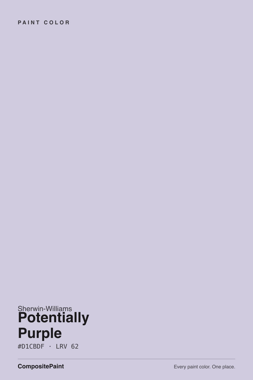
- 3Potentially Purple62
- 4Silver Peony68
- 5White Lavender76
The Fast Verdict
Potentially Purple is what a paint company names a color when it wants credit for purple without asking you to commit to it. At LRV 62 it sits closer to a tinted white than to a wall of violet — a balanced blue-and-red undertone that reads as a cool, quiet lavender in daylight and quietly deepens toward a soft plum once a warm lamp hits it at night. It is the low-risk way to try purple: a nursery or bedroom gets a real mood shift, and nobody mistakes it for a bold statement wall.
Nurseries and kids' rooms that want color without commitment · primary bedrooms that want calm, not drama · powder rooms and walk-in closets · anyone who wants purple's mood at a whisper, not a declaration
You want a color that unmistakably reads purple all day, not just at night · your room runs cool north daylight with no lamps · you actually want a true neutral gray · your trim is anything but a soft, un-stark white
- Genuinely gentle purple — reads as mood, not as a bold statement wall
- Balanced undertone: never icy-cool, never candy-pink
- Deepens into a flattering soft plum under warm evening lamps
- Pale enough (LRV 62) to work in small, light-starved rooms like closets
- Named honestly — buyers who read the name know exactly what they're getting
- Can read as barely-there off-white in ordinary daylight
- Cool north light with no warm bulbs flattens it to chalky gray
- Golden oak floors and warm brass push it mildly toward pink
- Not the color for anyone who wants purple to be unmistakable
What Color Is Potentially Purple, Really?
Sherwin-Williams' own name is the honest review: this is a purple that is only "potentially" one. The undertone is a genuine, roughly even split of blue and red — not a cool violet leaning icy, not a warm mauve leaning pink, but a balanced lavender sitting right in the middle of the purple family. That balance is what keeps it from ever reading as loud or saturated; it just quietly tints the white it's built on.
LRV 62 is the number that explains everything else. That puts it a hair below Lavender Mist (LRV 63) and Wallflower (LRV 64) — its closest neighbors in the pale end of SW's purple family — and worlds above Wisteria (LRV 38), the mid-depth lilac in the same Popular Purples lineup that actually reads as visible purple across a room. Potentially Purple is a wash of color, not a wall of it. That is the whole appeal for a nursery, and the whole disappointment for anyone who wanted more.
Undertone in one line: it shifts with the bulb, not the paint. In ordinary daylight it settles into a soft, cool lavender-gray; under warm 2700K light it pulls noticeably toward a dustier, richer plum. Neither version is the paint being inconsistent — it is a genuinely balanced undertone letting the light source decide which half of it shows.
Where It Shines
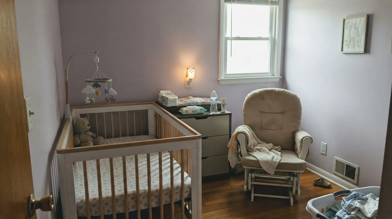
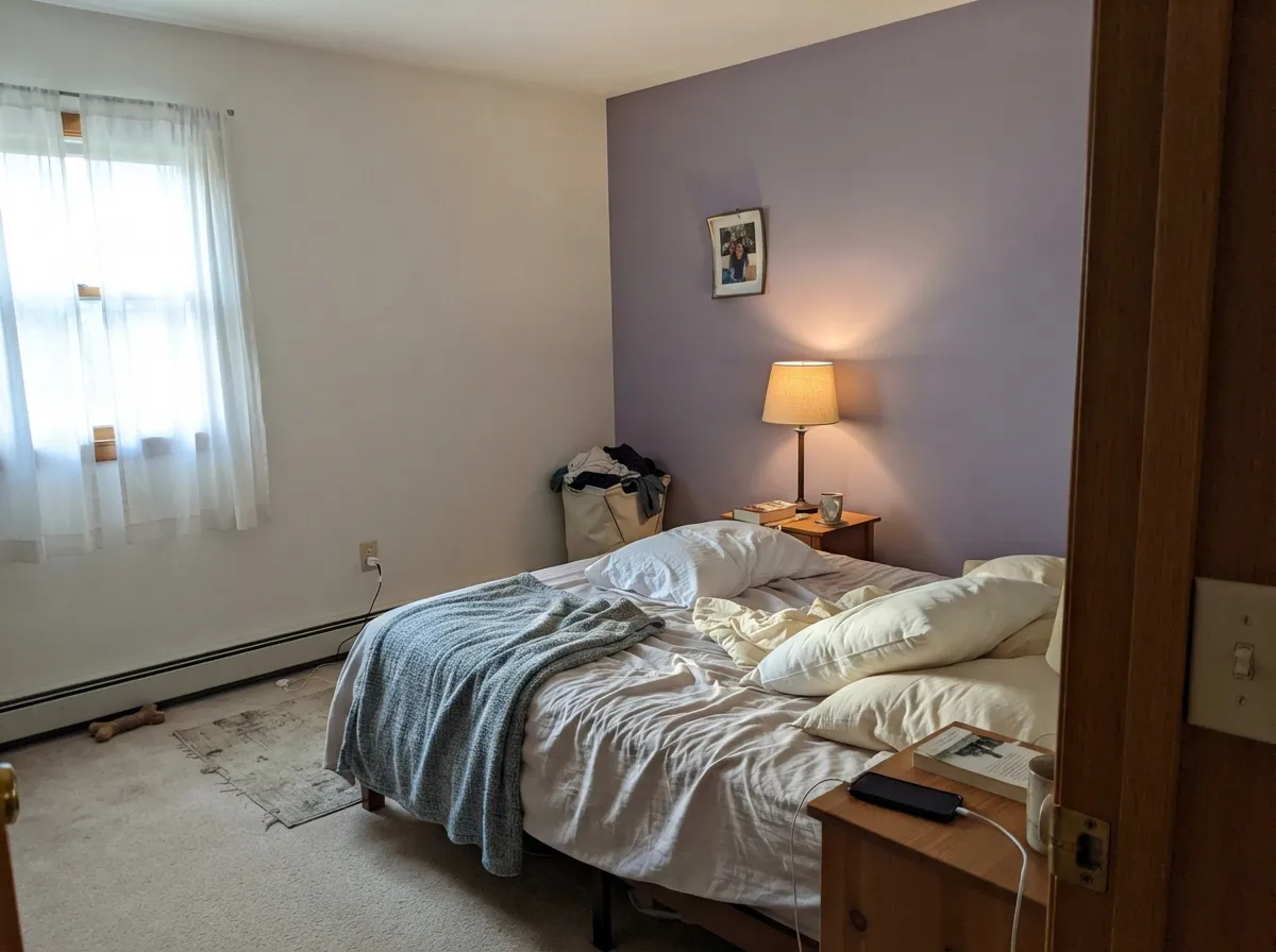
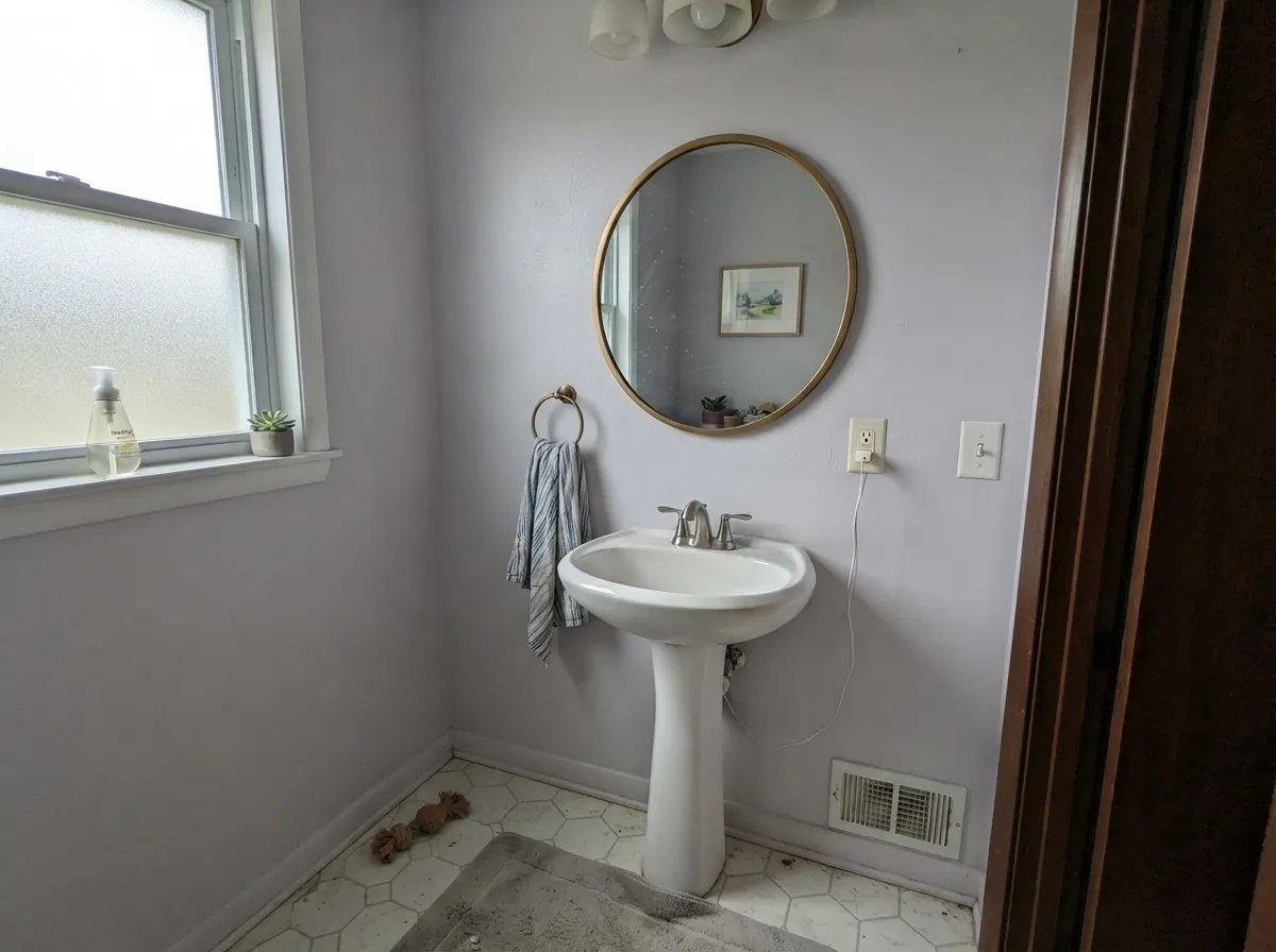
This color earns its keep in small, quiet rooms lived in at close range — a nursery you rock a baby in at 2 a.m., a primary bedroom you want to feel calm rather than curated, a closet or powder room where a hint of purple reads as a deliberate design choice instead of a phase. Give it a warm lamp after dark and the plum comes forward; give it soft daylight and it settles back into a barely-there lavender that most guests will call "a really pretty gray."
Where It Fails
The regret stories about Potentially Purple all trace back to one mismatch: expecting more color than LRV 62 was ever going to deliver, or putting it in a room with light that cancels the little color it has. Neither is a paint defect — but if your room matches one of these, sample it big before you commit a whole nursery to it.
At LRV 62 this is one of the palest colors in the SW purple family. On the chip it looks like a real lavender; on four walls in ordinary light it can read as little more than a cool off-white. If you want purple that reads as purple from across the room, this is the wrong shade — look at Wisteria instead, which sits at LRV 38 and actually commits.
North daylight is already blue-gray, and it strips the red half of this color's balanced undertone right out. What's left is a flat, slightly chalky blue-gray that readers of similarly pale lavenders describe as "just looks gray." Warm 2700K bulbs are not optional here — they are the only thing that brings the plum back.
Yellow-orange is violet's complement, so golden oak floors and warm-gold trim push this color toward pink while the wood pushes toward orange. It's a milder version of the clash a deep purple would cause — LRV 62 softens it — but it's still visible, and a large area rug or a switch to Pure White trim usually settles the fight.
Room by Room
Gentle enough for a newborn's room, real enough to still read as a color choice rather than a blank wall. Matte or eggshell hides roller texture; Pure White trim and ceiling keep it fresh instead of dated. Warm nursery lamps will pull it toward a soft plum at bedtime — exactly the mood most parents are after.
Whole-room or a single headboard wall both work; the headboard-wall version is the safer bet if you're not sure how much lavender you actually want to live with. Pairs cleanly with Alabaster on the remaining walls and a near-black bedframe or nightstand for grounding.
Small, enclosed rooms are where this color earns its "expensive-looking" reputation — enough purple to feel intentional, small enough that the commitment is a weekend project. Satin on millwork, semi-gloss on trim.
Calming without being sleepy, as long as the room has a lamp on the desk. Under cold overhead LEDs alone it drifts toward the flat, gray version of itself — swap the bulbs before you blame the paint.
The paleness that flatters a bedroom reads indecisive on cabinets and open-plan walls, where it has to hold its own against warm wood, stainless, and daylight all at once. A small breakfast-nook accent is fine; a full kitchen is a stretch.
Full outdoor sun and weather wash a color this pale toward a chalky, indeterminate gray-lilac, and the balanced undertone that reads as "soft" indoors just reads as "faded" on a facade. Keep this one inside.
Your Light Is the Risk
Warm 2700K bulbs pull the red half of the undertone forward and the walls deepen into a soft, dusty plum. This is the color at its most "purple."
Cool, blue daylight cancels the red side of the balance and leaves a flat, slightly chalky gray-lavender. Fine if you half-wanted gray; disappointing if you wanted purple.
Cool and quiet in the morning east light, it warms gradually through the day and picks up a soft pink-lilac cast as west sun gets low. Sample on a west wall to see both extremes.
2700K warm bulbs: dustier, richer, more clearly purple. Cool white LEDs: flatten it toward a pale blue-gray that can lose the lavender almost entirely. Same paint, two different rooms.
Most complaints about Potentially Purple are a light mismatch. Upload a photo of your actual room and see it on your walls — then ask for the same wall in north light or evening lamps before you buy a single sample.
Need It From Another Brand?
Any paint counter can custom-tint Sherwin-Williams SW 6821 directly. If you would rather stay in one brand's own deck, these are the closest stock matches, measured as ΔE2000. Under 2 is a difference you will not see on the wall.
| Brand | Closest color | ΔE | LRV | |
|---|---|---|---|---|
| Behr | On LocationM570-3 · Behr | 3.3 | 60 | Color page → |
| Benjamin Moore | Lavender Mist2070-60 · Benjamin Moore | 3.1 | 63 | Color page → |
| Valspar | Purpling Dawn1001-6B · Valspar | 1.9 | 62.8 | Color page → |
| PPG / Glidden | Dusky LilacPPG1176-3 · PPG / Glidden | 2.4 | 62 | Color page → |
| Glidden | Hint Of Heather90BB 60/109 · Glidden | 1.4 | 60 | Color page → |
| Dutch Boy | Sleepy Purple144-3DB · Dutch Boy | 3.1 | 62 | Color page → |
Similar Sherwin-Williams Colors
The nearest shades to Potentially Purple within Sherwin-Williams's own range, ranked by perceptual color distance — useful when you want the same look a touch lighter, darker, or warmer.
WCAG 2.1: AA is 4.5 : 1 for normal text, 3 : 1 for large text, AAA is 7 : 1.
Potentially Purple vs the Colors You're Also Considering
Every Potentially Purple sample board has the same rivals on it. The numbers show the real lightness gap — then it comes down to which risk you would rather live with.
Pick this if you're staying in the Sherwin-Williams system, or want the pale lavender that holds onto a touch more of its color.
Benjamin Moore 2070-60 · LRV 63Lavender MistPick this if you want the palest possible option — Lavender Mist washes out even faster than Potentially Purple; cross the BM/SW divide and the two are nearly a wash.
Pick this for the cooler, more classically "lavender" read — bluer, calmer, and easier next to grays than pinks.
Sherwin-Williams SW 6281 · LRV 64WallflowerPick this if you want the warmer, pinker mauve-lilac side of pale purple — Wallflower leans rose where Potentially Purple leans blue.
Pick this for the palest, safest version of the same family — mood without the commitment.
Sherwin-Williams SW 6822 · LRV 48WisteriaPick this if you actually want purple to read as purple from across the room — at LRV 38, Wisteria is real, visible color, not a wash of it.
Pick this if a whisper of lavender sounds better than a whisper of nothing — it gives a room a mood a plain greige can't.
Sherwin-Williams SW 7015 · LRV 58Repose GrayPick this if you actually want a true neutral gray with zero purple risk — Repose Gray is the safe, no-surprises default.
Potentially Purple Coordinating Colors
The rule for coordinating with Potentially Purple: keep whites clean rather than stark, let true grays do the neutral heavy lifting, and use its own family — a warmer mauve like Wallflower or a deeper lilac like Wisteria — instead of reaching outside it. A single near-black note keeps the palette from drifting too pastel. These are the partners that keep showing up in rooms that work:
A Name That Doubles as a Warning Label
Sherwin-Williams groups this color into its Popular Purples collection alongside pale lilacs like Wisteria, Elation, and Silver Peony — the family the brand reaches for when a client wants purple's calm without purple's drama. Potentially Purple sits toward the palest end of that group, close in depth to Lavender Mist and Wallflower and nowhere near the visible saturation of Wisteria.
The name itself is unusually candid for a paint company. Most brands name a pale lavender something evocative and let you discover on the wall how little color it actually holds; Sherwin-Williams just told you up front. That honesty is the whole review in miniature: buy this expecting a soft, mood-setting wash of color, and it delivers exactly that. Buy it expecting a statement wall, and the name already warned you.
Potentially Purple With Wood Tones and Floors
Because this color sits so close to white, the floor decision matters less than it would for a deeper purple — but the same underlying physics still apply. Walnut, white oak, and gray-washed floors are effortless: the cooler or neutral wood tone doesn't fight the lavender at all, and the room reads calm and considered.
Golden honey oak is the one pairing worth testing first. Yellow-orange sits opposite violet on the color wheel, so there's a gentle push in both directions — the walls read a shade pinker, the floor a shade more orange. At LRV 62 it's a mild effect, not the dealbreaker it would be with a saturated purple, but it's visible enough that a large rug or a switch to a warmer trim white can smooth it out if the clash bothers you.
Metals are easy: brushed nickel, matte black, and unlacquered brass all sit comfortably against it; only very yellow polished brass pulls it slightly toward pink.
Three Ready Palettes Built on Potentially Purple
A color is never alone on the wall. These are complete combinations in the 60-30-10 pattern, with the reason each one holds together. Every one opens in the visualizer.
Tonal purple layering keeps this from feeling like a theme nursery: the pale wash on the walls, a deeper Wisteria piece of furniture, and crisp Pure White trim to keep the whole room feeling fresh rather than dusty.
Try this palette in your roomA single accent wall lets you test how much lavender you actually want to live with; Alabaster keeps the rest of the room bright and warm, and Iron Ore supplies one grounding dark note so the palette doesn't drift too pastel.
Try this palette in your roomTwo pale purples from the same family, one cooler and one warmer, layered instead of matched — the ceiling or vanity in Wallflower's warmer mauve keeps Potentially Purple's cooler lavender from feeling flat in a small, enclosed room.
Try this palette in your roomPotentially Purple FAQ
is potentially purple actually purple, or does it read gray?
Both, depending on the light. In ordinary daylight it's a genuinely pale, cool lavender that many people will call a soft gray at first glance. Under a warm lamp at night it clearly deepens toward plum. The name is honest — it's a color that only "potentially" commits to being purple, and the light decides which version you get.
what trim white goes with potentially purple?
Pure White is the clean, crisp default and what Sherwin-Williams itself pairs it with. Alabaster works if you want the trim a touch warmer and softer. Avoid a stark, blue-white trim in a north-facing room — it will make the already-cool walls read even colder.
is it good for a nursery?
Yes — it's one of the gentler entries in SW's Popular Purples collection specifically because it's this pale. It gives a nursery real color and mood without the intensity of a deeper lilac, and it will still work as the child gets older since it never reads as overtly juvenile.
does it work with honey oak floors?
Mildly, not badly. Yellow-orange floors sit opposite violet on the color wheel, so there's a soft push-pull — the walls read a touch pinker, the floor a touch more orange. At LRV 62 the effect is subtle, not a clash like a deeper purple would cause. Walnut, white oak, or gray-washed floors are the more effortless pairing.
will it look too pink or too blue?
It's built to sit in the middle — a genuinely balanced blue-and-red undertone. Push it with warm 2700K light or golden-hour sun and you'll see more pink; push it with cool LEDs or north daylight and you'll see more blue-gray. Neither is a flaw; it's the same balanced paint responding honestly to the room.
is purple a resale risk?
Less than most people assume at this LRV. Because it reads so close to a tinted white, it doesn't carry the same repaint burden as a saturated violet — most buyers will register it as "a soft, pretty neutral" rather than "purple." It still carries more personality risk than a true greige, so a nursery or accent wall is the lower-stakes place to use it than a whole open-plan main floor.
Have you painted with Potentially Purple?
Rate it — one tap helps the next reader decide.
Ask a Question