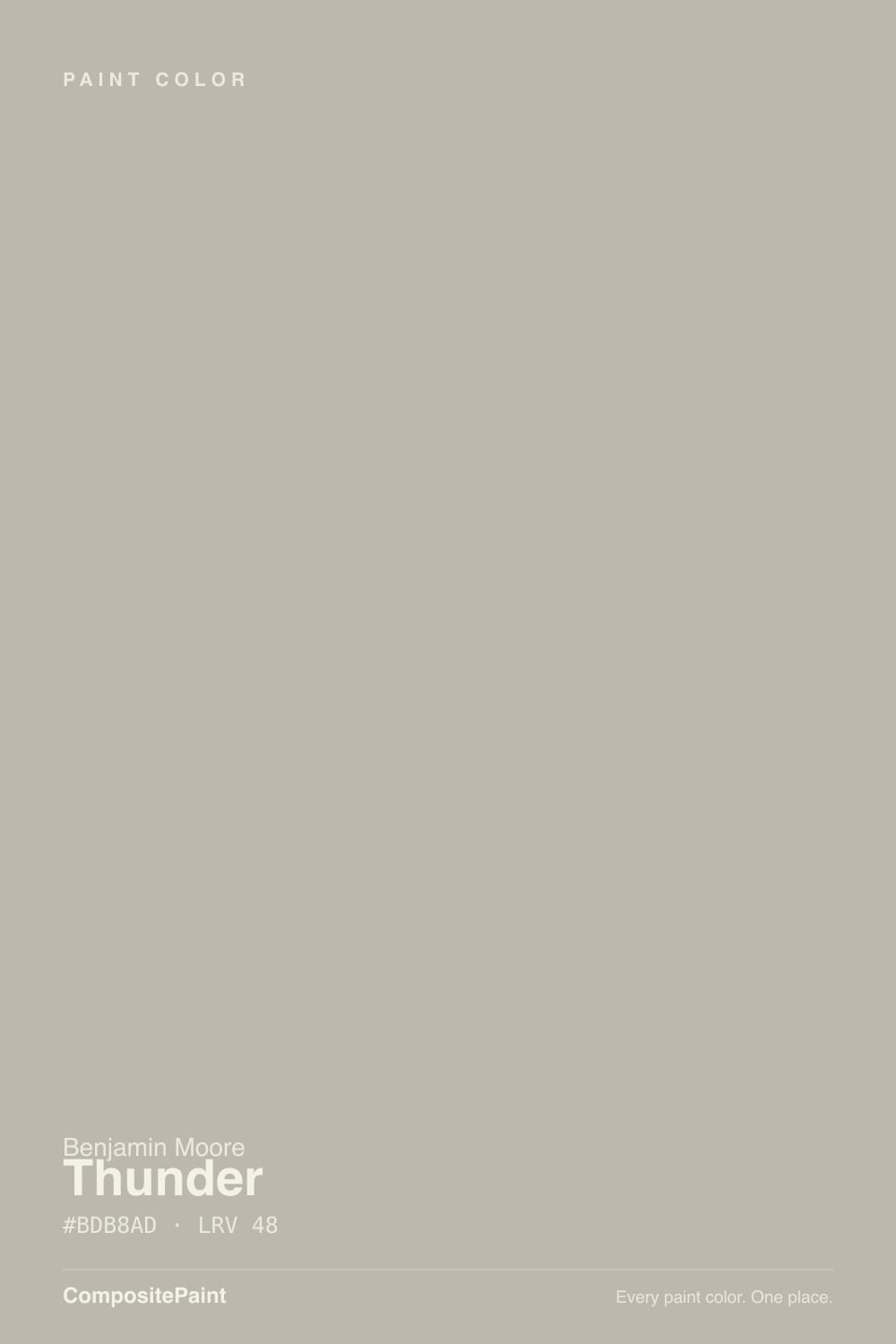
Thunder
The greige Benjamin Moore never turned into a bestseller, reviewed honestly: the light where it's a dependable neutral, the light that turns it purple, and what to buy instead.

Jessica has spec'd whites and neutrals for more than 300 rooms and keeps a sample wall of painted drawdowns in her studio. Every color review is checked against real reader rooms in the comments and re-tested when a formula changes. About the testing process →
- 1Anonymous20
- 2Dorian Gray39
- 3Thunder48
- 4Agreeable Gray60
- 5Pale Oak69
The Fast Verdict
Thunder is a mid-tone greige that Benjamin Moore filed into its Affinity Color Collection back in 2020 and then let quietly disappear. It deserves better than that. In real daylight it is a genuinely balanced warm-cool gray — not too brown, not too blue — but its low-chroma base sits right on the yellow-to-purple hinge, so the same wall can read as a plain, agreeable gray in one room and a soft lavender-gray in another. Both readers are right. Test it before you trust either camp.
South-facing rooms with steady daylight · kitchen cabinets and islands · exteriors under black or navy trim · anyone who wants a greige the neighbors haven't already picked
Your room is north-facing and stays dim · you want a guaranteed zero-undertone gray · your bulbs are cool white LEDs and you won't swap them · you want a color your painter recognizes on sight
- A genuinely balanced warm-cool greige — flatters both wood tones and cooler stone
- Dependable on cabinets and exteriors without reading as a trend color
- Pairs naturally with chocolate browns, navy, and black trim
- LRV 48 holds real color without tipping into a moody dark
- Underrated: an easy-to-live-with greige your neighbors probably haven't used
- Splits opinion hard — some rooms read plain gray, others read purple, same paint
- Dim, north-facing rooms push it toward a flat lavender-gray
- Cool LED bulbs mute the warmth at night the same way cool daylight does
- Not a famous color — little design-blog validation if you want reassurance before you commit
What Color Is Thunder, Really?
A mid-tone greige built on a low-chroma base that Benjamin Moore's own color science places right at the boundary between yellow and yellow-red — which is a technical way of saying it can't fully commit to warm or cool, and neither can the light around it. It launched as part of BM's 2020 Affinity Color Collection, a trend palette built for exactly this kind of quiet, adaptable neutral, and it has stayed a working color rather than a famous one. One reviewer put it bluntly: Thunder "does not get the love it deserves."
At LRV 48 it sits squarely in the mid-tone range — not a pale wash, not a moody dark — and depth is exactly what makes its undertone argument possible. A near-neutral this close to the middle of the scale shows whatever whisper of hue it has more clearly than a pale tint would, and Thunder's whisper happens to sit exactly between beige-brown and violet. That single fact explains the split reviews better than any single homeowner's opinion does: some rooms genuinely read as a plain, agreeable warm gray, and others genuinely read lavender. The paint did not change; the light did.
Undertone in one line: warm beige-brown first, a whisper of purple second, never blue, never green. If your sample reads flat and neutral, you are seeing it in balanced or warm light; if it reads faintly lavender, that is cool daylight or a cool bulb finding the hue the color has always had.
Where It Shines
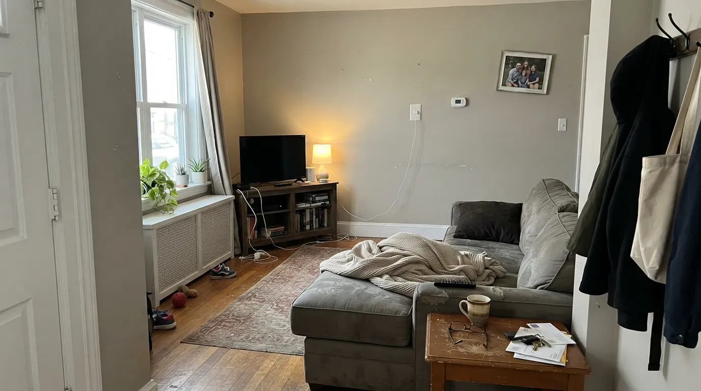
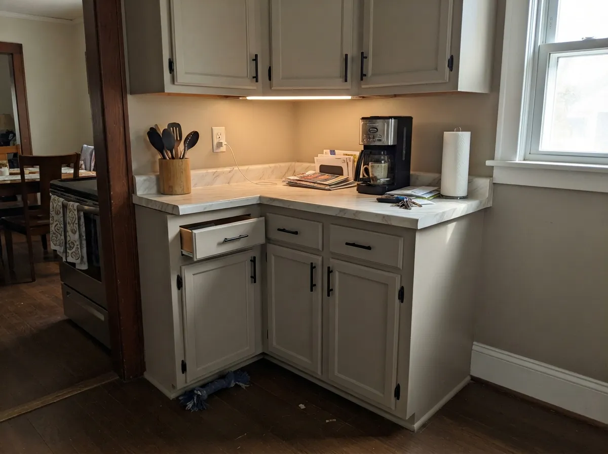
Give it real, consistent daylight and Thunder does exactly what a good greige should: it stays out of the way while still looking considered. South-facing rooms are its best case — the beige-brown side holds steady through the day instead of drifting. Its second home is cabinetry: at LRV 48 it reads as a genuine color choice rather than off-white, flatters both brass and black hardware, and does not fight white or light marble counters. Outdoors, full sun reads it lighter and warmer than it does indoors, which makes it a dependable, slightly unusual alternative to the same handful of exterior grays everyone else's street already has.
Where It Fails
Almost every complaint about Thunder traces back to one of three predictable situations, and none of them are the paint acting unpredictably — they are the paint being exactly as light-dependent as its low-chroma undertone always was.
Cool daylight strips out the beige-brown warmth and pushes the color toward the violet side of its hinge — this is the single biggest reason reviewers split into "it's just gray" and "it's secretly purple" camps. Warm 2700K lamps pull it back toward neutral; if you refuse lamps, sample first.
The same shift happens indoors after dark under cool-temperature LEDs: the warmth drains and a flat, slightly lavender-gray is left behind. Swap to warm bulbs before you blame the paint.
Thunder is a greige, not a pure neutral, and it will always show a lean somewhere in the day — warm in good light, violet in cool light. If you want a gray that reads gray in every room of the house, this is the wrong color; look at a truer neutral like Stonington Gray instead.
Room by Room
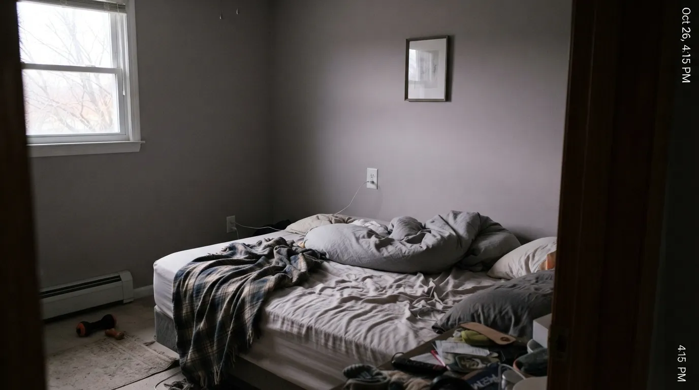
South-facing rooms with steady daylight are where Thunder is most itself: a calm, balanced greige that doesn't drift toward either camp. In a north-facing living room, expect a cooler, slightly lavender-leaning read and plan for warm lamps.
On cabinets it reads as a deliberate mid-tone color rather than an off-white, and it holds up next to both brass and black hardware. Owners commonly pair it with a soft white trim like Simply White rather than a stark white, which keeps the transition gentle instead of exposing the greige as dull.
Under 2700K lamps it settles into a quiet, warm-toned backdrop. A north-facing bedroom with cool overhead lighting is the one setup to test carefully before committing.
Full sun reads it lighter and warmer than it does indoors, and it pairs cleanly with black or navy trim for a modern-classic look that doesn't default to the same two or three exterior grays every other house on the block is wearing.
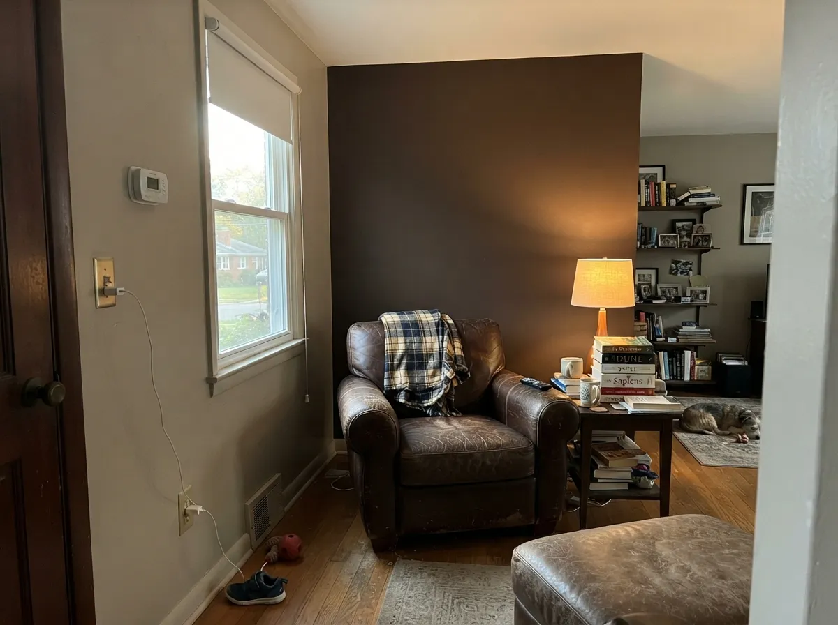
Homeowners who paint their main living space Thunder consistently reach for a darker chocolate-brown accent wall rather than another gray — the warm-cool balance in Thunder makes deep brown its natural, grounding partner.
Thunder is almost always the wall or cabinet color, paired with a soft white trim rather than used as the trim. A stark, cool-white trim will make the greige look flatter than a warm white will.
Your Light Is the Risk
Steady daylight keeps the beige-brown side in charge all day — the most honest, most flattering read of the color.
Cool, flat daylight strips the warmth and exposes the violet edge. This is the exact light behind the "it's purple" reviews.
Warmer in the morning and again in late afternoon sun; quieter and more neutral through the middle of the day.
2700K lamps keep it warm and settled. Cool white LEDs push it toward the same lavender-gray that north light does — change the bulb, not the paint.
Most complaints about Thunder are a light mismatch. Upload a photo of your actual room and see it on your walls — then ask for the same wall in north light or evening lamps before you buy a single sample.
Need It From Another Brand?
Any paint counter can custom-tint Benjamin Moore AF-685 directly. If you would rather stay in one brand's own deck, these are the closest stock matches, measured as ΔE2000. Under 2 is a difference you will not see on the wall.
| Brand | Closest color | ΔE | LRV | |
|---|---|---|---|---|
| Sherwin-Williams | Mindful GraySW 7016 · Sherwin-Williams | 0.5 | 48 | Color page → |
| Behr | Glasgow FogHDC-NT-06G · Behr | 0.5 | 48 | Color page → |
| Valspar | Frappe6003-1B · Valspar | 1.1 | 47.1 | Color page → |
| PPG / Glidden | Ghost WriterPPG1007-3 · PPG / Glidden | 1.3 | 47 | Color page → |
| Glidden | Ghost WriterPPG1007-3 · Glidden | 0.5 | 48 | Color page → |
| Dutch Boy | Comfortable Gray443-2DB · Dutch Boy | 2.0 | 47 | Color page → |
Similar Benjamin Moore Colors
The nearest shades to Thunder within Benjamin Moore's own range, ranked by perceptual color distance — useful when you want the same look a touch lighter, darker, or warmer.
WCAG 2.1: AA is 4.5 : 1 for normal text, 3 : 1 for large text, AAA is 7 : 1.
Thunder vs the Colors You're Also Considering
Every Thunder sample board has the same rivals on it. The numbers show the real lightness gap — then it comes down to which risk you would rather live with.
Pick this for more depth and a truer gray-to-purple lean instead of Revere's warmer, more olive-adjacent greige.
Benjamin Moore HC-172 · LRV 56Revere PewterPick this for BM's more famous, lighter, warmer greige — the color most painters already know by heart.
Pick this for Benjamin Moore's version, with more beige-brown warmth to counter the gray.
Sherwin-Williams SW 7016 · LRV 48Mindful GrayPick this if your painter works in Sherwin-Williams — the same mid-tone depth, a touch ashier.
Across brands Thunder has an unusually crowded field. Sherwin-Williams Mindful Gray SW 7016, hex #BCB7AD at LRV 48, comes in at a delta E of 0.53, and Behr Glasgow Fog HDC-NT-06G, hex #BDB8AE at LRV 48, at 0.47. Both are close enough that on a painted wall you would not tell them apart. Glidden Ghost Writer PPG1007-3 at 0.53 and Magnolia Home Sunday Stroll JG-19 at 0.56 land in the same bracket.
A step out, Valspar Frappe 6003-1B at 1.08, Dunn-Edwards Stoneware Clay DEGR16 at 1.05, and Farrow and Ball Purbeck Stone No. 275, hex #C0BCB3 at LRV 50, at 1.39, are all visually identical in normal room light.
Clare Greige PNT100-LT-13, hex #C2B8B2 at LRV 49, is the outlier at 4.21. It carries more pink in the mix and is close but visibly different side by side, so do not treat it as a substitute.
Thunder Coordinating Colors
The rule with Thunder is to lean into its warm-cool balance rather than fight it: soft whites keep it looking intentional, deep browns and near-blacks ground it, and navy gives it the one confident dark note it pairs with easily. These are the partners that keep showing up together:
A Quietly Underrated Color, Not a Famous One
Thunder has never had a Color of the Year moment. Benjamin Moore placed it in the 2020 Affinity Color Collection — a trend palette built around exactly this kind of adaptable, working neutral — and it has stayed there, used steadily but never marketed hard. That is not a knock; it is an honest description. If you want validation from a decade of design-blog posts and viral before-and-afters, this is not that color. If you want a genuinely useful mid-tone greige that most of your neighbors haven't already painted their kitchen island, Thunder's obscurity is the actual selling point.
The tradeoff is real: because it has less of a public track record than colors like Revere Pewter or Agreeable Gray, you are relying more on your own sample test and less on a decade of other people's rooms. Sample it generously, and in more than one light, before committing to a whole space.
Thunder With Wood Tones and Floors
Because Thunder balances warm and cool rather than committing hard to either, it is genuinely flexible with wood. Walnut, white oak, and other mid-to-dark woods sit comfortably against it — the wood's warmth meets the greige's beige-brown lean without a fight. Very cool, gray-washed floors are the safer bet if you want the color to stay closer to neutral gray rather than drift warm.
The floor to test carefully is bright, orange-leaning honey oak: the contrast can push Thunder's beige-brown side forward and make the wood look more orange by comparison, the same dynamic that trips up most warm-leaning greiges. A large sample taped up over the actual floor, viewed at different times of day, is worth the ten minutes before you buy the gallon.
Three Ready Palettes Built on Thunder
A color is never alone on the wall. These are complete combinations in the 60-30-10 pattern, with the reason each one holds together. Every one opens in the visualizer.
A soft white trim keeps the transition gentle instead of exposing the greige as dull, and one navy door supplies the single dark note the scheme needs — exactly the kind of quiet, considered palette Thunder is built for.
Try this palette in your roomA crisp, cool white wall lets the greige cabinets read as a real color choice rather than an off-white, and the near-black island grounds the kitchen so the middle-depth cabinets don't feel like the only statement in the room.
Try this palette in your roomThis is the pairing homeowners reach for on their own: a deep chocolate-brown accent grounds Thunder's warm-cool balance instead of fighting it, and a warm white trim keeps the room from tipping cold.
Try this palette in your roomThunder FAQ
Is Thunder warm or cool?
Both, in a way that depends on your light. Its beige-brown base is genuinely warm, but it sits at a low-chroma point right between yellow and violet, so cool daylight or cool bulbs can pull it toward a faint lavender-gray. Neither reading is wrong — test it in your own room before deciding.
Does Thunder actually look purple?
In some light, yes — a soft, subtle lavender-gray rather than an obvious purple. This is the single most common surprise with the color and the reason reviews split so sharply between "it's just a plain gray" and "it's purple." Both groups are describing the same paint in different light.
What trim goes with Thunder?
A soft white like Simply White is the easy, forgiving choice — it lets the greige read as intentional instead of dull. A stark, cool white trim will flatten the wall by comparison, the same mistake that trips up most greiges.
Is it good for kitchen cabinets?
Yes — it's one of Thunder's strongest jobs. The mid-tone depth reads as a real color decision rather than an off-white, it holds up next to both brass and black hardware, and it doesn't fight white or light marble counters.
Does it work on exteriors?
Yes. Full sun reads it noticeably lighter and warmer than it looks indoors, and it pairs well with black or navy trim for a look that stands apart from the handful of exterior grays every other house already uses.
How does Thunder compare to Revere Pewter?
Revere Pewter is Benjamin Moore's far more famous greige — lighter (LRV 56 versus Thunder's 48), warmer, and leaning slightly olive. Thunder is darker, more balanced between gray and its beige-brown base, and carries the purple risk Revere doesn't have. If you want the color your painter already knows, pick Revere; if you want something less common, Thunder is the move.
Have you painted with Thunder?
Rate it — one tap helps the next reader decide.
Ask a Question