Twilight Mist
The Lowe's periwinkle that passes for blue-gray on the chip, reviewed honestly: the bedrooms where it stays misty, the light that turns it lavender, and what to pick instead.

Jessica has spec'd whites and neutrals for more than 300 rooms and keeps a sample wall of painted drawdowns in her studio. Every color review is checked against real reader rooms in the comments and re-tested when a formula changes. About the testing process →
- 1Resolute Blue40
- 2Lost in the 80s51
- 3Twilight Mist61.5
- 4After Rain68
- 5Bashful Blue74
The Fast Verdict
Twilight Mist is a light periwinkle that Valspar files as purple and shoppers buy as a blue-gray. On the chip it looks like mist; on four walls the violet is the story. Cool north light keeps it blue-gray and restful — the bedroom color people think they sampled. Warm sun and 2700K bulbs flush it toward lavender. If you want Wedgewood Gray, this is not a dupe. If you want a quiet periwinkle nursery or a misty bedroom, it is one of the cheapest good answers at Lowe's.
Bedrooms and nurseries · powder rooms · painted dressers and vanities · north-facing rooms that should feel restful, not gray
You actually want gray or a true blue-gray · honey oak or golden beige floors · a bright south room on warm bulbs · even a hint of lavender is a dealbreaker
- Light periwinkle that can pass as a restful blue-gray in cool light
- LRV 61.5 keeps bedrooms and nurseries airy instead of cave-like
- Cheap and easy to sample at Lowe's — a real alternative to a designer blue-gray
- Painted furniture and vanities look custom, not craft-project
- Soft enough to live with if you actually want the violet
- Not gray — buyers expecting Wedgewood Gray see lavender by the second wall
- Fights honey oak, golden beige and every yellow-warm floor
- Warm sun and 2700K bulbs pull it into lilac
- A 2019 palette leftover: more trend-risk than a true gray, less staying power than a Historic
What Color Is Twilight Mist, Really?
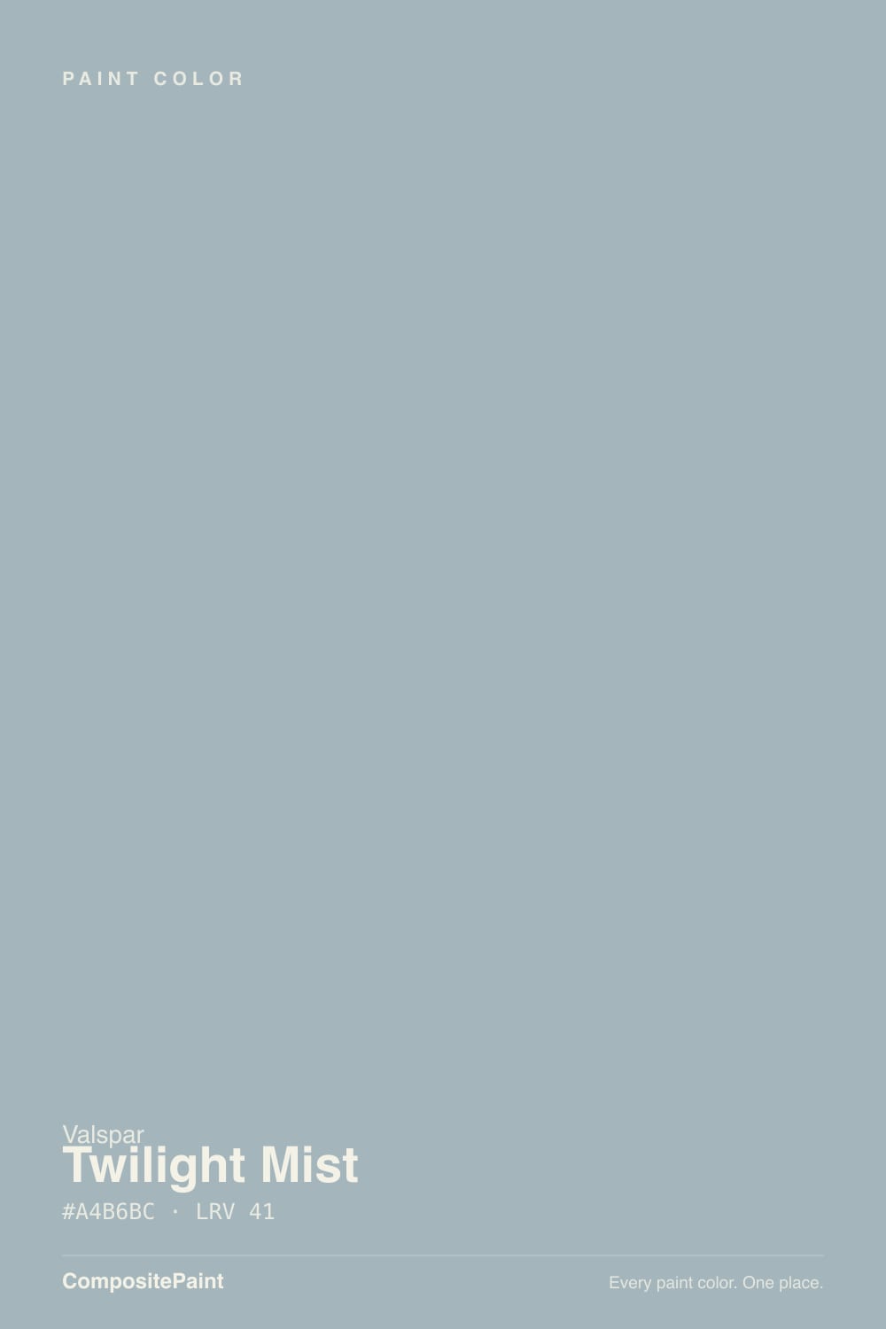
A soft periwinkle pastel — Valspar's own line is Purple, Cool undertone — not the blue-gray the name and the chip suggest. MyPerfectColor calls it a light cool blue with a gray cast and a faint violet; Lowe's lists it as periwinkle; furniture painters on Facebook describe a delicate lavender once it is on a piece. All three are the same paint being honest in different light. It sat in Valspar's 2019 Colors of the Year palette (one of twelve, not a single hero color) and showed up in a Kristen Poissant entryway for PureWow. It never became a household name. It is still on the Lowe's chip rack, which is how most people find it.
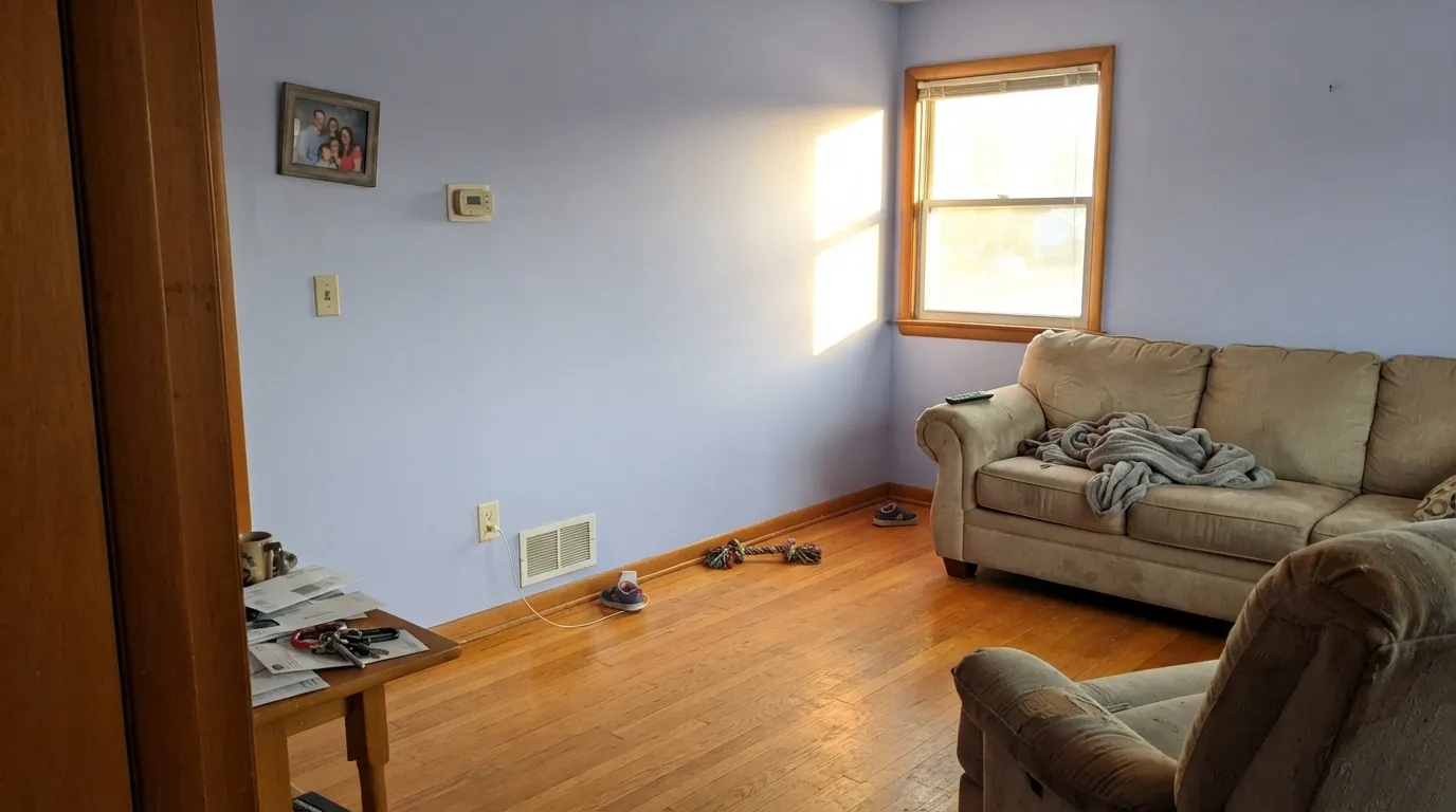
At LRV 61.5 it is a genuine light color: it keeps a room airy and will not cave in on you after dark the way a mid-tone blue-gray does. That lightness is also the trap. Pale violets wash toward gray-lilac in strong sun and bloom more purple once they wrap a room, because depth and adjacent surfaces multiply undertone. Plan for the wall to read a half-step more periwinkle than the strip in the store — that is the number-one surprise, not poor coverage.
Undertone in one line: cool periwinkle first, violet second, gray only on the chip. If your sample reads baby-blue, the light is cool; if it reads lilac, that is west sun or warm bulbs doing it. Neither version is a different paint.
Where It Shines
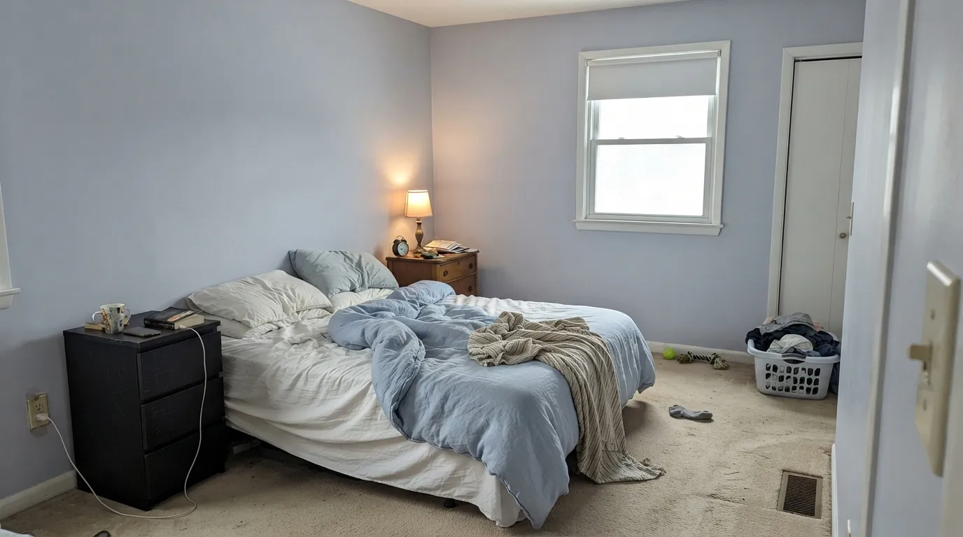
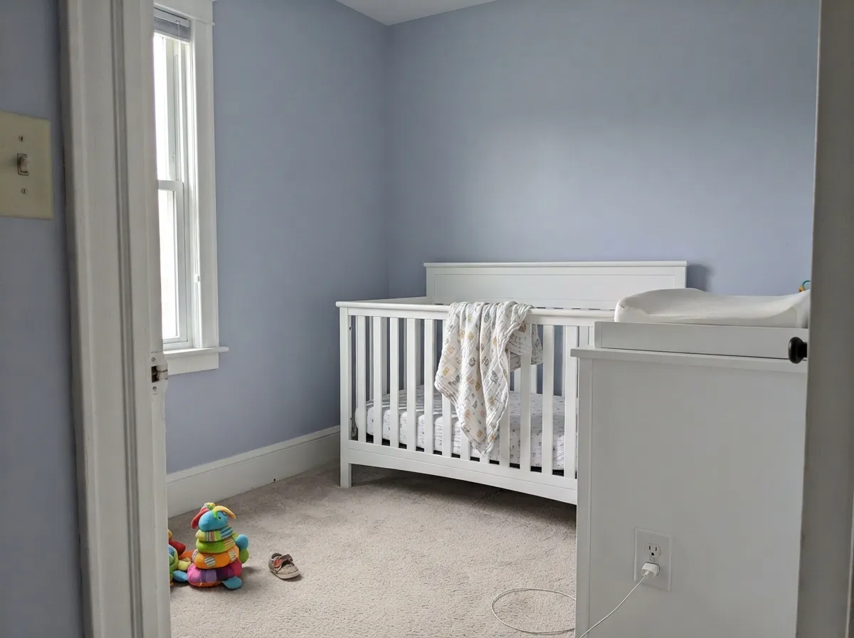
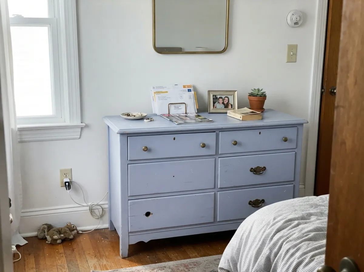
Give it a bedroom, a nursery, or a small room with cool daylight and it is quietly excellent. North and east light hold the blue-gray mist the name promises; matte finish hides wall texture and keeps the pastel from looking chalky. Its second home is the low-commitment object: a dresser, a vanity, an interior door, where the periwinkle reads custom instead of themed. Pair it with a crisp cool white, pale wood or painted furniture, and nickel or chrome — not cream, not honey oak, not a yellow-beige carpet.
Where It Fails
Almost every regret story about Twilight Mist follows one of three scripts, and all three are visible on the sample wall if you look. None of them are a bad batch — but if your room matches one, this is not your color, and a bigger sample will only confirm it.
On the chip it passes for a soft blue-gray, which is why it gets shopped as a Wedgewood Gray stand-in. On four walls the violet is unmistakable. If your goal is gray with a little personality, this is too much personality; look at Boothbay Gray or Wedgewood Gray and let them merely flash blue.
Yellow-orange is violet's complement, so golden oak floors, honey trim and builder-beige carpet all push Twilight Mist toward lavender while the walls make the floor look more orange. Both sides lose. It wants pale white oak, painted floors, cool gray LVP, or a large rug between it and anything golden.
Heat in the light pulls the violet forward. A bright south room at 4pm, or a bedroom lit only with warm lamps, is how a misty blue-gray becomes lilac. Cool daylight or 3000–3500K bulbs keep the blue; if you will not change the bulbs, pick a color that does not depend on them.
Room by Room
The misty, restful version of this color lives here. Matte finish, cool-white or north light, cream-free bedding. Decorator's White trim keeps the edges crisp without warming the walls into lilac. This is the room the 2019 palette was aiming at.
Light enough to stay airy, colored enough to feel chosen. It is a calmer periwinkle than a true baby-blue and less candy than a named lavender. Eggshell for wipe-downs; keep the oak changing table off the wall or the violet will bloom.
A satin dresser or vanity in Twilight Mist is the project that keeps showing up in DIY photos: periwinkle on wood reads custom, not pastel-themed. Drenching a small powder room works too — four walls of a light color still feel like a jewel box without going dark.
North-facing desks and morning rooms get a calm blue-gray that photographs well on video calls. West offices with one window will watch it go lavender every afternoon; sample the actual wall before you commit the Zoom background.
Beautiful in a closed, cool-lit living room with white oak and chrome. Risky in an open plan next to a warm kitchen, where the periwinkle has to negotiate honey cabinets and beige. Adjacent Quiet Moments or a crisp white is the safe handoff — not a greige.
A full kitchen of periwinkle walls fights wood tones and makes food lighting look odd; a hutch or island in satin is the dose that works. Outside, full sun washes a pastel violet toward chalky lilac that reads as faded from the street. Leave it indoors.
Your Light Is the Risk
Cool morning light holds the blue-gray mist. This is the version on the chip, and the reason to buy it for a bedroom.
Warm daylight flushes the violet. By mid-afternoon a south wall can read clearly lavender — fine if you wanted that, a shock if you wanted gray.
Blue-gray in the morning, periwinkle at noon, a lilac cast as the sun drops. Sample the same wall at 9am and 5pm before you order gallons.
2700K bulbs pull lilac; 3000–3500K keep it closer to blue-gray. Cool white LEDs hold the mist but can go slightly chalky. The bulbs are part of this paint job.
Most complaints about Twilight Mist are a light mismatch. Upload a photo of your actual room and see it on your walls — then ask for the same wall in north light or evening lamps before you buy a single sample.
Need It From Another Brand?
Any paint counter can custom-tint Valspar 4004-9B directly. If you would rather stay in one brand's own deck, these are the closest stock matches, measured as ΔE2000. Under 2 is a difference you will not see on the wall.
| Brand | Closest color | ΔE | LRV | |
|---|---|---|---|---|
| Sherwin-Williams | Hyacinth TintSW 6968 · Sherwin-Williams | 1.6 | 60 | Color page → |
| Behr | Grape Lavender630E-3 · Behr | 1.8 | 63 | Color page → |
| Benjamin Moore | English Hyacinth1417 · Benjamin Moore | 2.2 | 63 | Color page → |
| PPG / Glidden | Globe ThistlePPG1246-3 · PPG / Glidden | 1.0 | 64 | Color page → |
| Glidden | Pearl Violet44BB 62/134 · Glidden | 0.7 | 62 | Color page → |
| Dunn-Edwards | MaritimeDET588 · Dunn-Edwards | 3.0 | 63 | Color page → |
Similar Valspar Colors
The nearest shades to Twilight Mist within Valspar's own range, ranked by perceptual color distance — useful when you want the same look a touch lighter, darker, or warmer.
WCAG 2.1: AA is 4.5 : 1 for normal text, 3 : 1 for large text, AAA is 7 : 1.
Twilight Mist vs the Colors You're Also Considering
Every Twilight Mist sample board has the same rivals on it. The numbers show the real lightness gap — then it comes down to which risk you would rather live with.
Pick this for the lighter, cheaper, more clearly violet bedroom version of a soft blue mood.
Benjamin Moore HC-146 · LRV 50Wedgewood GrayPick this if you want the real coastal blue-gray — deeper, more teal, no periwinkle, and it needs actual daylight or it goes flat.
Pick this when you want the same lightness with a better chance of passing as blue-gray during the day.
Benjamin Moore 2070-60 · LRV 63Lavender MistPick this if you want the named purple — it is the gentlest one in the BM deck, and it is easier to lose on a bright wall.
The closest Valspar neighbors are a step lighter. Artisan Blue (M228) shares almost the same blue-gray but sits at LRV 45, so it reads a little airier on the wall. If you want the same character in a brighter, more open room, Artisan Blue is the safer pick; Twilight Mist at LRV 41 gives you more presence and looks better where you want the color to feel grounded.
Blue Goblin (T683), at LRV 45, is both lighter and noticeably bluer, so it tips further from neutral and looks more like a soft blue than a blue-gray. Cold Snap (T621), also around LRV 45, carries a slightly more violet-blue cast and stays cooler.
Choose Twilight Mist when you want a deeper, grayer, more even-tempered blue-gray. Choose the lighter neighbors when the room is dim or you want the wall to recede.
Twilight Mist Coordinating Colors
The rule for coordinating with Twilight Mist: stay cool. Crisp whites, one deep navy or charcoal, and maybe a blush if you are in a nursery — and keep cream, greige and yellow-beige at arm's length. Warm whites make the periwinkle look dirtier and more purple. These are the partners that keep the color misty instead of lilac:
A 2019 Palette Color, Not a Blue-Gray Dupe
Valspar put Twilight Mist in its 2019 Colors of the Year palette — a twelve-color story, not a single coronation — and PureWow filmed stylist Kristen Poissant using it in an entryway. That is the closest thing this color has to a famous moment. It did not go viral, it is not a Historic, and it is not Valspar's answer to Wedgewood Gray no matter how many chip-rack shoppers treat it that way.
The useful comparison is still Wedgewood Gray, because that is the color people think they are buying. Wedgewood is deeper, teal-leaning, and daylight-hungry. Twilight Mist is lighter, more violet, and cheaper to try. If you sample both on the same wall for two days, you will know in an afternoon which undertone you can live with — and you should, because the names will not tell you.
Twilight Mist With Wood Tones and Floors
This decision gets made at the floor. Pale white oak, ash, painted wood and cool gray LVP let the periwinkle stay misty. Gray-washed floors are the easy yes. Chrome, brushed nickel and matte black metals all sit comfortably; unlacquered brass is the metal that warms the walls toward lilac.
The honest no is golden: honey oak floors, orange-stained trim, yellow-beige carpet. Yellow-orange sits opposite violet on the wheel, so each side exaggerates the other — the floor reads more orange, the walls read more purple, and another coat will not fix geometry. If the golden floor is staying, put a large rug down or choose Quiet Moments and keep the calm without the fight.
Three Ready Palettes Built on Twilight Mist
A color is never alone on the wall. These are complete combinations in the 60-30-10 pattern, with the reason each one holds together. Every one opens in the visualizer.
A crisp cool white is the trim that keeps Twilight Mist blue-gray instead of lilac — Decorator's White is the least forgiving of warm company, which is exactly what a periwinkle wall needs. Hale Navy is the one dark note so the room does not float away.
Try this palette in your roomUltra White is Valspar's own coordinating trim for this chip — a workhorse bright white that belongs on trim, not four walls. Kendall Charcoal gives the little room one near-dark edge so the periwinkle reads deliberate. Chrome or brushed nickel, not unlacquered brass.
Try this palette in your roomChantilly Lace is the cleanest white BM makes, so the periwinkle stays cool instead of creamy. First Light is a pale pink that behaves like a warm off-white — one blush note in a periwinkle room, not a second color fighting for attention.
Try this palette in your roomTwilight Mist FAQ
Is Twilight Mist blue, gray, or purple?
Purple that can pass as blue-gray. Valspar files it in the purple family as a cool periwinkle pastel. In north light it looks like a misty blue-gray; in warm light it is lavender. On four walls nobody who wanted gray will call it gray.
What trim white goes with Twilight Mist?
A crisp cool white — Decorator's White or Chantilly Lace, or Valspar Ultra White if you are staying in the Lowe's aisle. A warm white such as White Dove makes the walls look more lilac by contrast. Semi-gloss on the trim, matte or eggshell on the walls.
Is it good for a bedroom?
It is the best room for it, with a caveat: cool or north light, and bulbs that are not deep-warm 2700K. Matte finish, pale bedding, no honey oak. If the bedroom faces south and runs on table lamps, sample at night before you commit.
Is Twilight Mist a Wedgewood Gray match?
No. Wedgewood Gray is a deeper coastal blue-gray (LRV 50) with a teal lean that goes flat without real daylight. Twilight Mist is lighter (LRV 61.5) and more violet. Shoppers treat them as cousins because both are soft blue-grays on a chip; they are not interchangeable on a wall.
Does it work with oak floors?
Pale white oak and gray-washed wood are fine. Golden honey oak is the clash: yellow-orange sits opposite violet, so the floor goes more orange and the walls go more purple. A large rug helps; wall-to-wall honey tones mean pick Quiet Moments or a true gray instead.
Can I use it on furniture?
Yes — satin Twilight Mist on a dresser, nightstand or vanity is the use that keeps showing up in real photos, and it is a smarter dose than four walls if you are unsure about the violet. Prime raw wood, use a cabinet-grade enamel, and keep warm wood floors from sitting against it unprotected.
Have you painted with Twilight Mist?
Rate it — one tap helps the next reader decide.
Ask a Question