Mountain Peak White
The bright warm white with no gray in it, reviewed honestly: the dim rooms where it beats White Dove, the sun that turns it cream, and what to pick instead.

Jessica has spec'd whites and neutrals for more than 300 rooms and keeps a sample wall of painted drawdowns in her studio. Every color review is checked against real reader rooms in the comments and re-tested when a formula changes. About the testing process →
- 1Classic Gray74
- 2Alabaster82
- 3Mountain Peak White91
- 4Ultra Pure White97
The Fast Verdict
Mountain Peak White is what people are actually looking for when they say "warm, but not creamy, and please not dingy." It carries a soft yellow warmth with almost no gray mixed in, which is the whole story: nothing mutes it in dim light, so it keeps glowing in the windowless hall where the famous grayed whites go flat — and nothing mutes it in blasting sun either, which is where it can tip toward cream. Pick it for the dark half of the house, sample it hard on the sunny half.
Windowless entries, halls and stairwells · north-facing rooms that need warmth without going dingy · ceilings and trim over warm walls · anyone who found White Dove too gray and Swiss Coffee too creamy
Big south- or west-facing walls in direct afternoon sun · your counters are cool gray marble or blue-gray quartz · the ceiling is staying builder-white · you want a crisp modern gallery white
- Stays bright and warm in dim, windowless rooms
- LRV 91 — a real bright white, not a cream
- No gray base, so nothing goes dull when the light turns cool
- Works as walls, trim and ceiling in the same room
- Flatters brass, butcher block and warm quartz on cabinets
- Direct south or west sun pushes it to cream
- Reads yellow next to cool gray marble and blue-gray tile
- Looks dirty under a stock blue-white builder ceiling
- Scuffs and handprints show more than on a softer white
What Color Is Mountain Peak White, Really?
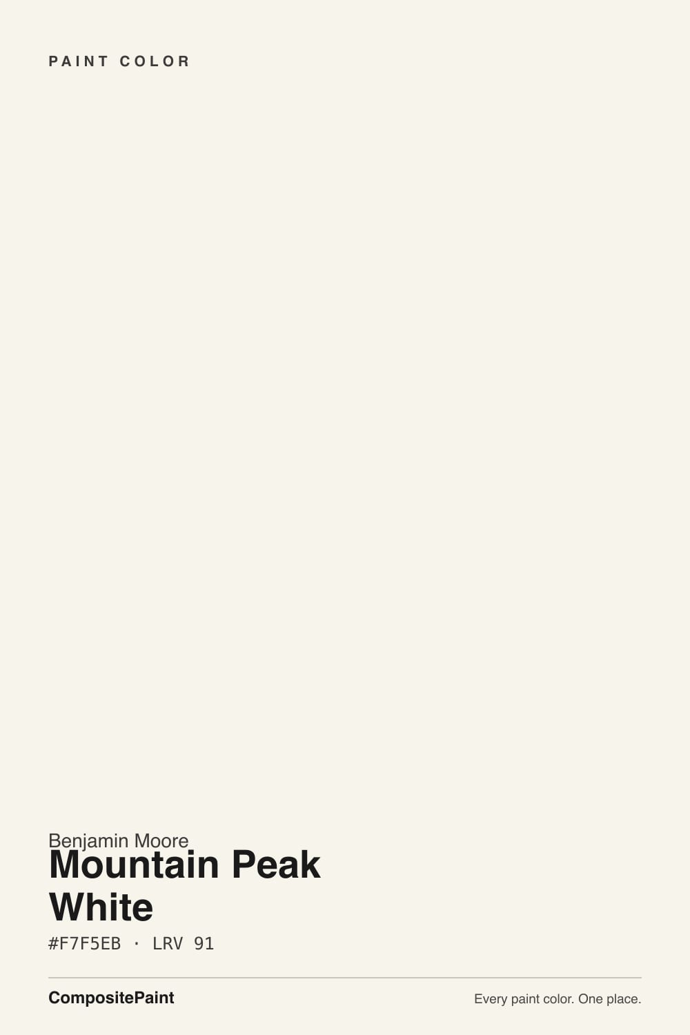
A very light white with a soft yellow warmth and, unusually, almost no gray in it. That last part is what separates it from the whites everyone knows. The color strategists who sort these off-whites by hue family put Mountain Peak White squarely in the yellow family, sitting between Simply White and White Dove — and call it the cleanest of the three, because it has the least gray. White Dove takes the same warmth and grays it down; Mountain Peak White leaves it alone and simply keeps the amount small.
At LRV 91 it is genuinely bright — the same reading as Simply White, six points above White Dove (85), one point under Chantilly Lace (92). So it is not a cream, whatever the swatch photos on Pinterest suggest. Stand it next to a true white and you see a faint warm cast, not a butter wall. That combination — high LRV, low gray, small warmth — is rare, and it is exactly why it does well in rooms with bad light: there is no gray base to expose when the daylight turns cool.
Undertone in one line: soft yellow, and nothing else — no gray, no pink, no green. If your sample reads distinctly cream, that is direct sun; if it reads flat and plain white, that is a cool LED bulb overhead.
Where It Shines
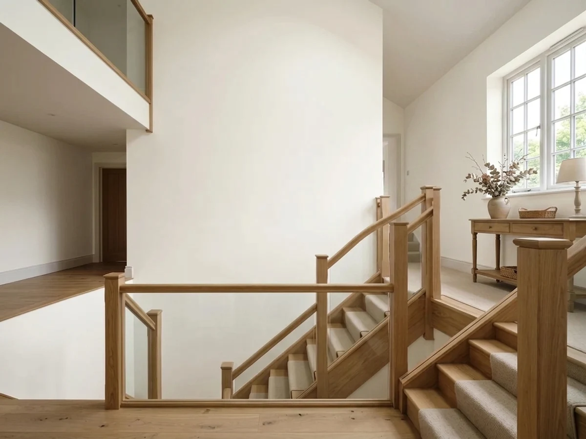
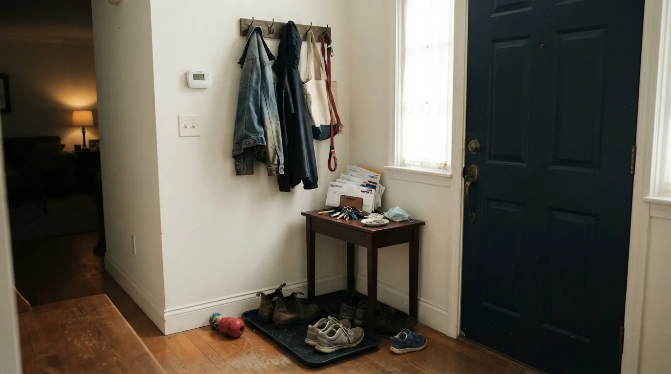
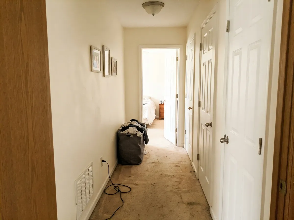
This color earns its keep in the parts of the house nobody photographs: the entry with one sidelight, the stair landing, the hall with three doors and no window. Those rooms punish grayed whites — White Dove and its cousins go dull the moment the borrowed daylight runs out — and Mountain Peak White does not, because there is no gray in it to expose. The same logic makes it a strong north-room white in cold climates, and a genuinely good ceiling and trim white over warm walls, where its brightness reads as light and its warmth keeps the plane from going clinical.
Where It Fails
The complaints about this color are consistent and every one of them is predictable before you open the can. Two are about sun and one is about neighbors. If your room matches, no number of coats will argue you out of it.
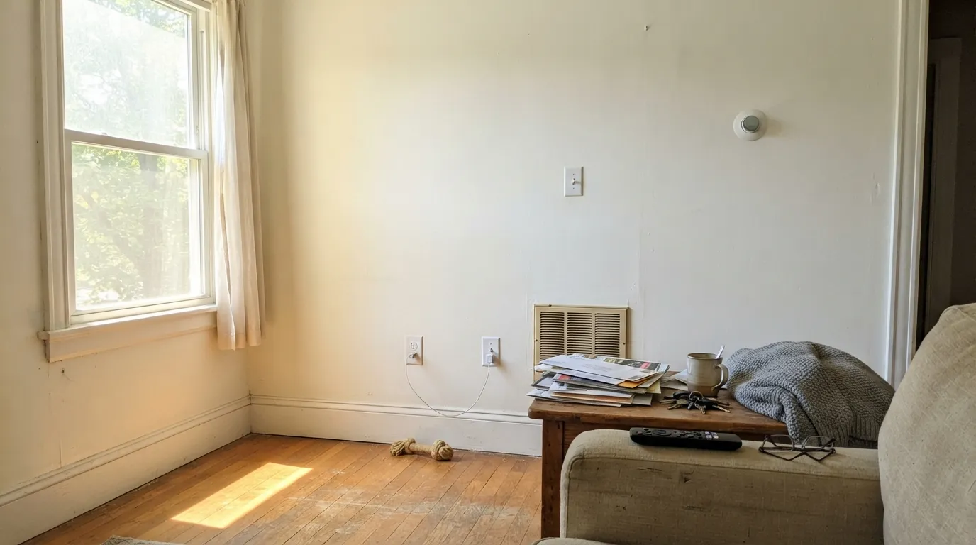
There is no gray in this white to absorb strong light, so full afternoon sun sits right on the yellow and the wall reads cream — sometimes noticeably. On a small bright wall it is pretty. On a two-story sunny great room it is the number-one regret. Go to White Dove, where the gray does the muting for you.
Stock contractor ceiling white is bright and slightly blue. Under it, warm walls look yellowed and slightly dirty from below, and everyone blames the wall color. Paint the ceiling too — this color itself in flat, or another warm white. Worth knowing: a crisp trim white at nearly the same LRV, like Chantilly Lace (92), does not cause this, because there is no lightness gap; you read the temperature difference as deliberate rather than as a stain.
Carrara-type marble, blue-gray quartz and gray-washed LVP sit at the opposite temperature and pull the yellow forward hard. Add 4000K bulbs and the wall reads sallow while the stone reads blue. This is a temperature mismatch, not a paint defect — with cool stone, pick a neutral or cool white and stop fighting it.
Room by Room
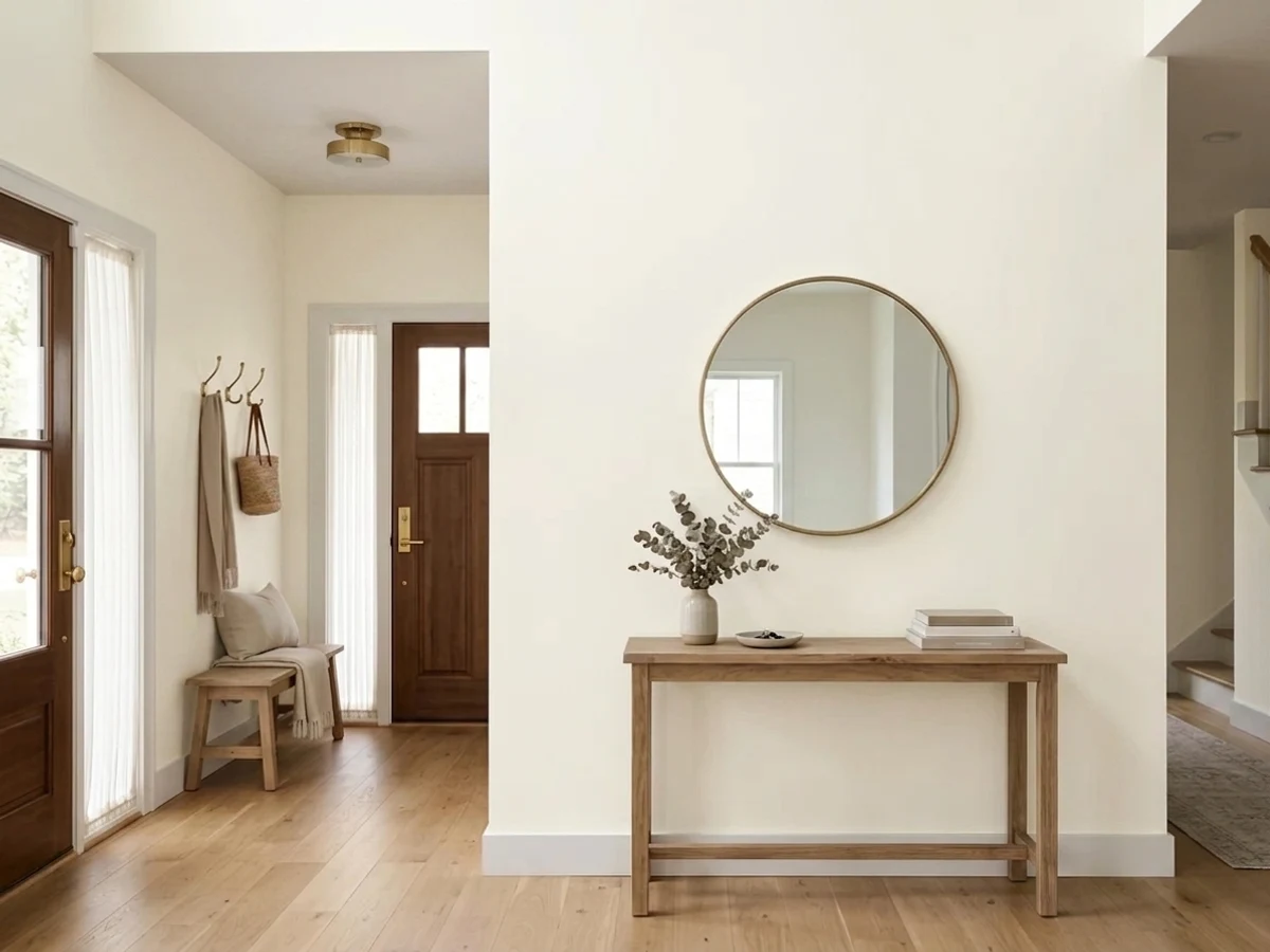
The classic entry problem is that there is almost no daylight, so a grayed white reads gloomy the second you open the door. This one does not: LRV 91 bounces what little light there is, and the warmth makes the first room of the house feel welcoming rather than institutional. Denver designers Kristi Dinner and Susan Schwab of Company KD name it exactly for this — fresh and bright while still feeling warm. Eggshell on the walls, same color semi-gloss on the trim, one dark front door.
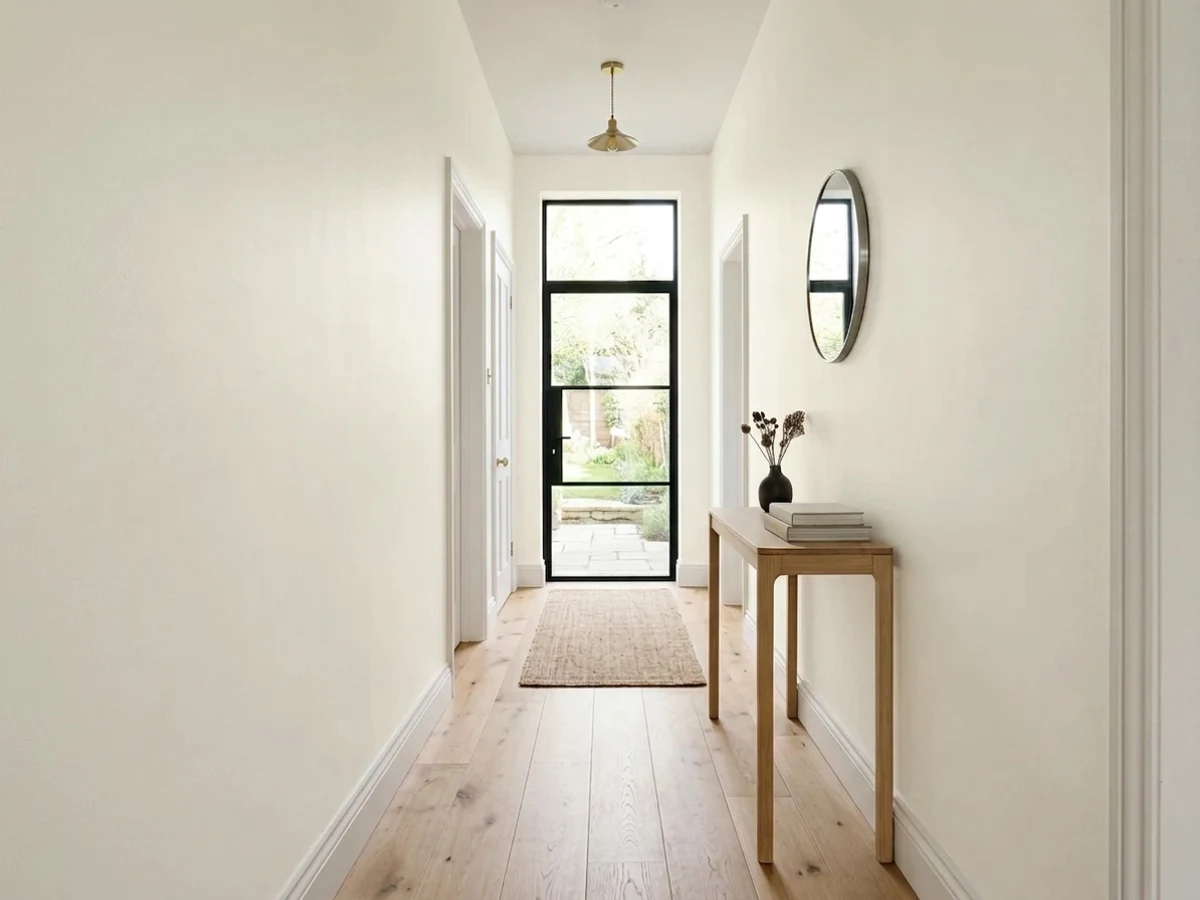
Same argument as the entry, and halls are where warm-white choices usually go wrong. Because it holds its brightness in borrowed light, a long hall in Mountain Peak White does not develop the dull stretch in the middle. Use eggshell for washability; scuffs on a high-LRV white show, so keep a labeled quart for touch-ups.
North- or east-facing: excellent, one of the better choices in the BM deck. South- or west-facing with big glass: sample a large board on the sunniest wall and look at it at 4pm before you commit, because that is where it turns cream. Eggshell either way.
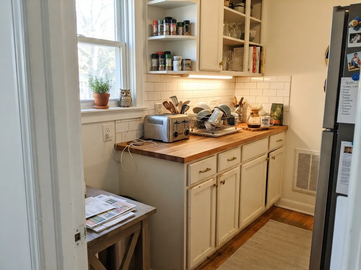
It is on a lot of designers' short lists for cabinet whites, and it deserves the spot: bright enough to read as a white kitchen, warm enough to flatter brass, butcher block and warm-toned quartz. It works next to white subway tile without the tile looking blue. The one hard no is cool gray marble. Satin, in a urethane-fortified cabinet enamel.
Under 2700K lamps it turns quietly cozy without going cream, and in a north bedroom it stays bright where grayed whites go gloomy. Pair it with cream or oatmeal bedding rather than stark white, which will make the walls look tinted.
Benjamin Moore sells its waterborne ceiling paint tinted to this color, and over warm walls it is a better ceiling than stock white — the plane reads light without the cold blue edge. On trim it is bright enough to hold its own against mid-tone walls while staying on the warm team. Flat overhead, semi-gloss on the woodwork.
Your Light Is the Risk
The reason to buy it. Cool gray daylight has no gray base to expose, so it stays bright and gently warm where the famous whites go flat.
Strong midday light sits on the yellow with nothing to mute it. Big sunny walls read cream. Sample large here or skip it.
Clean and bright at the shaded end of the day, distinctly creamier for the hour the sun is in the window. The swing is real but short.
2700K lamps deepen the warmth into something cozy. Cool 4000K LEDs flatten it to a plain white and can make it look slightly sallow — change bulbs before you change paint.
Most complaints about Mountain Peak White are a light mismatch. Upload a photo of your actual room and see it on your walls — then ask for the same wall in north light or evening lamps before you buy a single sample.
Need It From Another Brand?
Any paint counter can custom-tint Benjamin Moore 2148-70 directly. If you would rather stay in one brand's own deck, these are the closest stock matches, measured as ΔE2000. Under 2 is a difference you will not see on the wall.
| Brand | Closest color | ΔE | LRV | |
|---|---|---|---|---|
| Sherwin-Williams | White SnowSW 9541 · Sherwin-Williams | 1.8 | 90 | Color page → |
| Behr | Icy TundraECC-38-2 · Behr | 0.5 | 91 | Color page → |
| Valspar | Gauzy WhiteV152 · Valspar | 0.0 | 91 | Color page → |
| PPG / Glidden | Delicate WhitePPG1001-1 · PPG / Glidden | 3.0 | 88 | Color page → |
| Glidden | Crisp Linen White61YY 89/040 · Glidden | 2.1 | 89 | Color page → |
| Dutch Boy | Ultra White002W · Dutch Boy | 1.8 | 91 | Color page → |
Similar Benjamin Moore Colors
The nearest shades to Mountain Peak White within Benjamin Moore's own range, ranked by perceptual color distance — useful when you want the same look a touch lighter, darker, or warmer.
WCAG 2.1: AA is 4.5 : 1 for normal text, 3 : 1 for large text, AAA is 7 : 1.
Mountain Peak White vs the Colors You're Also Considering
Every Mountain Peak White sample board has the same rivals on it. The numbers show the real lightness gap — then it comes down to which risk you would rather live with.
Pick this when the room is dim and you want the warmth to survive the bad light. On a chip they are near twins; on a dark wall they are not.
Benjamin Moore OC-117 · LRV 91Simply WhitePick this for the household name — Benjamin Moore's 2016 Color of the Year, the same brightness with a sharper, less openly warm read.
Pick this for dim rooms and when White Dove came back from the wall looking flat. Also six LRV points brighter.
Benjamin Moore OC-17 · LRV 85White DovePick this for sunny rooms and anything you cannot afford to get wrong — the gray in it mutes strong light and keeps the cream away.
Pick this when you want the same brightness with a soft edge instead of a cold one. They also pair well: Mountain Peak White walls under Chantilly Lace trim is a real, working combination, because the values match.
Benjamin Moore OC-65 · LRV 92Chantilly LacePick this for the crisp modern gallery look and next to cool marble, where warmth is the enemy.
Pick this when the room is dark and Cloud White would drop the brightness you cannot spare — six points of LRV is visible on a hall wall.
Benjamin Moore OC-130 · LRV 85Cloud WhitePick this on trim and cabinets in an already warm room, where a softer, creamier white reads richer.
Mountain Peak White Coordinating Colors
The rule with this white is to stay on the warm side and give it something with body to sit against — its brightness makes flat, same-value schemes look washed out. Warm greiges are the natural wall partners, and it takes dark accents unusually well because there is no gray in it to muddy the contrast. Benjamin Moore's own suggested partner for it is Kendall Charcoal, and that instinct is right: charcoals and warm-leaning darks flatter it, while cool blue-grays fight it.
Where It Sits Among Benjamin Moore's Whites
Benjamin Moore has more warm whites than any sane person needs, and Mountain Peak White is one of the least marketed of them — no Color of the Year, no viral kitchen, barely a search volume. That is worth knowing when you compare reviews online: the silence is not a verdict on the color, it is a verdict on its publicity. Designers who work in the deck all day reach for it often; the internet has mostly never heard of it.
Its position is easy to pin down. It is the top of the 2148 strip, with Timid White (LRV 82) one step deeper in the same hue — useful if you want the same color with more presence on the walls. Snowfall White (88) was built for the same gap between Simply White and White Dove and lands a touch softer. Cotton Balls (90) is its closest twin by brightness but wears its yellow more openly, and Mayonnaise (88) is the frankly creamy version of the idea. If you have narrowed to this shelf of the deck, get big samples of two or three — at these LRVs the differences are small on paper and obvious on a wall.
Mountain Peak White With Wood Tones and Floors
Warm wood is the easy case. White oak, honey oak, walnut, butcher block and cedar all sit comfortably against it, because the yellow in the paint meets the yellow in the wood instead of arguing with it. Orange-leaning builder oak is the interesting one: this white does not neutralize the orange the way a grayed white does, so the floor stays as orange as it is. If you like your floors, that is fine — even flattering. If you were hoping the paint would tone them down, it will not, and White Dove is the better tool.
Gray-washed floors and cool gray LVP are the pairing to sample first. Against a cool gray plank, the warmth in the wall is thrown into relief and the room can read slightly yellow. It is usually fixable — a warm rug, warm bulbs, wood furniture — but tape a large sample above the actual floor before you commit to the whole level.
Metals are simple: brass, bronze and matte black all work. Polished chrome and brushed nickel are neutral enough to be fine, but a room full of cool chrome plus cool stone plus this white is the one combination that will have you calling it yellow.
Three Ready Palettes Built on Mountain Peak White
A color is never alone on the wall. These are complete combinations in the 60-30-10 pattern, with the reason each one holds together. Every one opens in the visualizer.
Entries have no light to waste, so the walls and trim stay one bright color at two sheens and the only dark note goes on the door, where it reads as a deliberate frame. Edgecomb Gray in the next room gives the eye somewhere to go without a temperature change at the doorway.
Try this palette in your roomBright warm cabinets against a soft neutral wall keeps a white kitchen from going flat-on-flat, and Kendall Charcoal is the one dark that never reads blue next to a yellow-based white. Brass or unlacquered hardware; keep the counters warm.
Try this palette in your roomThe brightness gap does the work here: at LRV 91 against walls at 63, the trim reads crisp without needing to be cold, and the same white overhead keeps the ceiling from turning blue-white on you. October Mist gives one closed room a quiet color note that stays on the warm side of the fence.
Try this palette in your roomMountain Peak White FAQ
Is Mountain Peak White warm or cool?
Warm — a soft yellow warmth, with no gray mixed in to mute it. That makes it warmer in character than a chip suggests but brighter than a cream. It never reads pink, green or icy.
Is 2148-70 the same color as OC-121?
Yes. Benjamin Moore lists Mountain Peak White twice — as 2148-70 in the Color Preview deck and as OC-121 in the Off-White collection. Same paint, two catalog numbers. Either code gets you the right can; use whichever your store's fan deck shows.
Will it look yellow?
In direct south or west sun on a big wall, it can look distinctly cream. Everywhere else it just reads as a warm white. The two things that make it look yellow when it should not are a stock blue-white ceiling above it and cool gray stone beside it — fix those before you blame the paint.
What trim white goes with Mountain Peak White walls?
Itself, in semi-gloss, is the safest answer and the one most rooms want. If you want contrast, Chantilly Lace (LRV 92) genuinely works here — the values are close enough that you read a clean temperature shift rather than dirty-looking walls, which is the trap with softer whites like White Dove (85). What you must not do is leave a builder-white ceiling.
Is it good for a dark entry or hallway?
It is one of the best whites in the deck for that job. Rooms with borrowed light expose the gray in grayed whites, and there is no gray here to expose — at LRV 91 it keeps bouncing light while staying warm. Eggshell for scrubbability, and keep a touch-up quart, because a bright white in a hallway will collect scuffs.
How does it compare to Simply White and White Dove?
All three sit in the yellow family. White Dove (LRV 85) is the softest and grayest, Simply White (91) the brightest and sharpest, and Mountain Peak White (91) matches Simply White for brightness while keeping the least gray of the three. In practice: sunny room, take White Dove; dim room, take Mountain Peak White; either way, sample both.
Have you painted with Mountain Peak White?
Rate it — one tap helps the next reader decide.
Ask a Question