White Snow
The near-white Sherwin-Williams keeps inside its Designer Edition line, reviewed honestly: where the warmth shows, the light where it goes flat, and what to buy instead if you can't get the paint.

Jessica has spec'd whites and neutrals for more than 300 rooms and keeps a sample wall of painted drawdowns in her studio. Every color review is checked against real reader rooms in the comments and re-tested when a formula changes. About the testing process →
- 1Classic Gray74
- 2Alabaster82
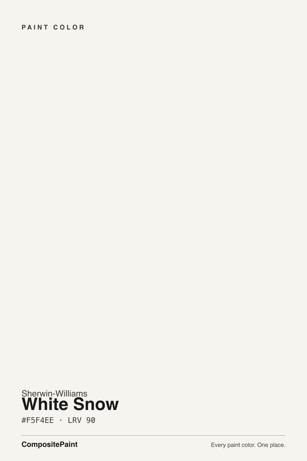
- 3White Snow90
- 4Ultra Pure White97
The Fast Verdict
White Snow is what happens when Sherwin-Williams' colorists build a white for a curated designer palette instead of the paint-counter shelf: bright, LRV 90, with only the faintest undercurrent of cream so it never reads stark or clinical. It sits in the gap between soft near-whites and true stark whites, and it holds that middle ground well in real daylight.
The catch is not the color — it is that you can only buy it in the Emerald Designer Edition line, at Designer Edition prices, which is why almost nobody has heard of it.
Walls or trim that want bright and barely-warm, not stark or creamy · pairing with light greiges, taupes, soft blues, and muted greens · kitchens going for a minimal-modern look · anyone already committed to Emerald Designer Edition for the whole job
You are not already buying Emerald Designer Edition — the color is not sold in standard Emerald or ProClassic lines · you need a matching exterior siding paint, not just trim · your room is dim and north-facing and you have not tested a sample · you just want Sherwin-Williams' everyday, easy-to-find white (get Pure White or Extra White instead)
- Bright near-white (LRV 90) with just enough warmth to avoid feeling clinical
- Sits cleanly between soft off-whites and the coldest stark whites in most decks
- Strong on cabinets and trim — reads crisp without going icy
- Pairs well with light greiges, taupes, soft blues, and muted greens
- Part of a genuinely curated designer palette, not a random deck filler
- Sold only in Emerald Designer Edition — not the standard Emerald line, at a premium price
- No matching exterior siding product, only trim and doors
- Goes flat and slightly dingy in dim, north-facing rooms with no lamps
- Little name recognition, so almost no real-world room photos exist to sample against
What Color Is White Snow, Really?
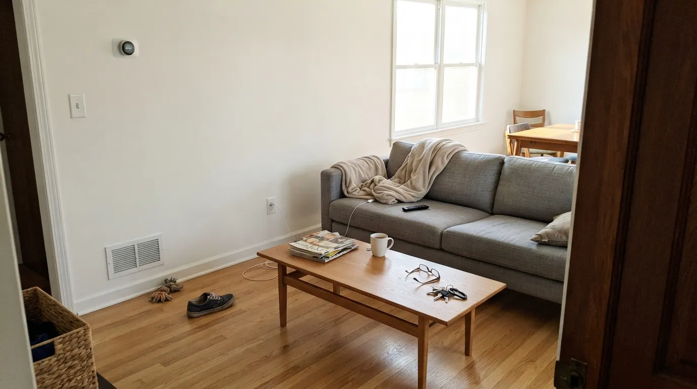
A near-white with, in the words of the designers who reviewed it, "the most vague creamy warmth" — an undercurrent, not a commitment. There is no obvious yellow, pink, or gray pulling at it the way a lot of off-whites do; White Snow reads simply bright and clean, then softens by a degree once you put it next to a true stark white. At LRV 90 it sits in a specific, useful gap: brighter than the soft near-whites most brands sell as their safe default, but a step short of the coldest, most reflective whites in any deck.
The part that actually defines this color is not the pigment — it is where Sherwin-Williams sells it. White Snow is exclusive to the Emerald Designer Edition line, part of the brand's curated Designer Color Collection, specifically the Minimal + Modern palette. It is not in the regular Emerald lineup, and it is priced like the premium product it is. That means most painters have never mixed it and most homeowners have never seen the chip, even though the color itself is easy to defend on the wall.
Undertone in one line: a whisper of warm cream, nothing more — never yellow enough to read as ivory, never cool enough to flash blue or violet. If your sample looks flat and gray, that is the light in the room, not a hidden undertone in the paint.
Where It Shines
Give it real daylight — south or west exposure, afternoon sun — and the faint warmth comes forward just enough to keep the white from feeling sterile, which is exactly the effect the Minimal + Modern palette was built around. It is a genuinely strong trim and cabinet color: bright enough to read crisp against light greiges and taupes, soft enough not to fight warm wood or brass. Because it sits closer to true white than most "soft white" defaults, it also reads clean and current next to blues and muted greens, which is where reviewers keep pairing it.
Where It Fails
White Snow's problems are not about the color misbehaving — they are about what it takes to actually get it on your wall, plus the one lighting condition every near-white this bright shares. All three are predictable before you order a sample.
This is the real catch. White Snow does not exist in the standard Emerald line, in ProClassic, or in Sherwin-Williams' everyday product tiers — only in Emerald Designer Edition, at a noticeably higher price point. If your painter or store does not already stock that line, getting this exact color means a special order and a premium bill for what is, on the wall, a very good but unremarkable white.
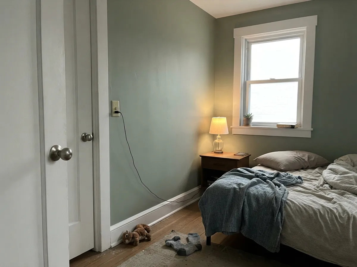
The undertone is faint by design, so it has little warmth in reserve to fight cool north daylight. Owner reports describe it going flat and "dirty" or "dingy" in exactly this situation — not a defect, just a bright near-white with no cushion against cold light. Test a real sample on the actual wall before committing a whole room.
White Snow's Emerald Designer Edition formulation is interior. Sherwin-Williams sells a separate exterior product for trim and doors in the same number, but there is no siding-rated version — if you were hoping to carry one white from the living room straight onto the house, this color will not do the whole job.
Room by Room
In south or west light it holds a bright, barely-warm neutral backdrop that suits a minimal, modern furniture plan without going cold. Eggshell on walls, same color in semi-gloss on trim if you want the one-color look.
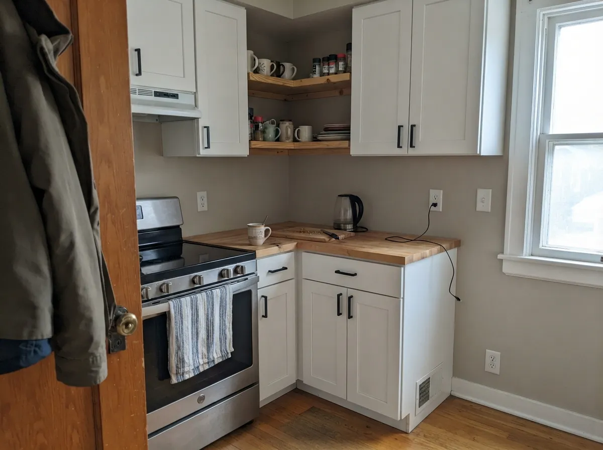
This is arguably its best job. At LRV 90 it brightens a kitchen more than a soft off-white would, without the slightly clinical edge of the truest stark whites, and it holds up against black hardware and quartz. Satin or semi-gloss cabinet enamel.
Under warm 2700K lamps at night it stays gentle rather than glary, which is not guaranteed at this LRV. Skip it if the room is north-facing and dim; step down to a warmer soft white instead.
With warm or neutral tile and brass or matte-black fixtures it reads clean and current. Against very cool blue-gray tile the faint warmth can get lost and the wall will lean toward flat white — sample first.
Semi-gloss White Snow trim against light greige, taupe, or muted green walls is exactly the pairing the Minimal + Modern palette was designed for. It reads brighter and crisper than most soft-white trims without the coldness of a true stark white.
A separate exterior product exists for trim, shutters, and doors in the same number, but there is no siding-rated Emerald Designer Edition exterior paint. Plan on a different white (or a color-matched equivalent from another line) for the body of the house.
Your Light Is the Risk
The faint warmth comes forward and the white glows without tipping cream. This is the light the Minimal + Modern palette assumes you have.
Cool daylight leaves the near-white with no warmth to lean on; readers describe it going flat and dingy. Sample on the actual wall first.
Crisp and fresh in morning light, quietly warmer by late afternoon. The shift is gentle — the same color, not a new one.
2700K lamps keep it soft and comfortable at night. Cool white LEDs push it toward a flatter, slightly clinical white — swap the bulbs before repainting.
Most complaints about White Snow are a light mismatch. Upload a photo of your actual room and see it on your walls — then ask for the same wall in north light or evening lamps before you buy a single sample.
Need It From Another Brand?
Any paint counter can custom-tint Sherwin-Williams SW 9541 directly. If you would rather stay in one brand's own deck, these are the closest stock matches, measured as ΔE2000. Under 2 is a difference you will not see on the wall.
| Brand | Closest color | ΔE | LRV | |
|---|---|---|---|---|
| Behr | Whisper WhiteHDC-MD-08 · Behr | 0.5 | 90 | Color page → |
| Benjamin Moore | Opulence879 · Benjamin Moore | 1.3 | 89 | Color page → |
| Valspar | Cuddle Down8007-6F · Valspar | 0.5 | 91 | Color page → |
| PPG / Glidden | Delicate WhitePPG1001-1 · PPG / Glidden | 1.4 | 88 | Color page → |
| Glidden | Delicate WhitePPG1001-1 · Glidden | 1.3 | 88 | Color page → |
| Dutch Boy | Ultra White002W · Dutch Boy | 0.5 | 91 | Color page → |
Similar Sherwin-Williams Colors
The nearest shades to White Snow within Sherwin-Williams's own range, ranked by perceptual color distance — useful when you want the same look a touch lighter, darker, or warmer.
WCAG 2.1: AA is 4.5 : 1 for normal text, 3 : 1 for large text, AAA is 7 : 1.
White Snow vs the Colors You're Also Considering
Every White Snow sample board has the same rivals on it. The numbers show the real lightness gap — then it comes down to which risk you would rather live with.
Pick this when you want a step brighter and crisper than Pure White's soft, slightly warmer read.
Sherwin-Williams SW 7005 · LRV 84Pure WhitePick this for Sherwin-Williams' everyday, easy-to-find default — same brand, no Designer Edition premium or special order.
Pick this for nearly the same brightness with a softer, less stark edge that works better on four walls.
Sherwin-Williams SW 7006 · LRV 86Extra WhitePick this if you want the sharpest, coldest true white SW sells at retail — great trim, riskier on walls.
UltraWhite SW 9500 at LRV 94 is the brighter, cleaner option. Its hex #F6F7F2 holds more green and blue, so next to the #F5F4EE of White Snow it looks whiter and cooler. High Reflective White SW 7757 at LRV 93 behaves the same way. Choose either when you want maximum brightness, or use one as trim over White Snow walls.
Cheviot SW 9503 at LRV 89 goes the other direction with a clearer cream cast, and Frost Bite SW 9505 at LRV 88 goes further. Snowbelt SW 9623 at LRV 87 is the cool one, slightly green and gray.
Across brands, Behr Whisper White HDC-MD-08 and Valspar Cuddle Down 8007-6F both land at deltaE 0.52, effectively the same color in use. Farrow and Ball All White No. 2005 at LRV 92 and Benjamin Moore Opulence 879 at LRV 89 are visually identical in normal room light. Rust-Oleum Linen White 285140 at LRV 93 is close but visibly different side by side, cooler and bluer.
White Snow: A Designer-Collection Exclusive
Most Sherwin-Williams whites live in the standard Emerald or ProClassic lines, sold at any store, mixed by any painter. White Snow does not — it belongs to Emerald Designer Edition, the premium tier tied to Sherwin-Williams' curated Designer Color Collection, and specifically to a palette the brand calls Minimal + Modern. That is a real, deliberate positioning: this white was chosen to sit alongside light greiges, taupes, soft blues, and muted greens in a specific aesthetic, not picked to be everyone's default wall color.
The trade-off is availability and price. Because it only exists in Designer Edition, you cannot walk into most stores and get it mixed on the spot the way you can with Pure White or Extra White, and the paint itself costs more per gallon. If you are already committed to Emerald Designer Edition for a project, White Snow is a genuinely strong choice. If you are not, the honest advice is to compare it against Pure White or Extra White first and decide whether the difference is worth chasing down the line that carries it.
White Snow Coordinating Colors
The Minimal + Modern palette it was built for tells you exactly what to pair it with: light greiges and taupes for a soft, current neutral scheme, and soft blues or muted greens when the room wants one quiet color note. Near-black anchors work well precisely because White Snow is bright enough to hold its own against a strong dark, rather than washing out the way a softer cream white can.
White Snow With Wood Tones and Floors
Because the warmth in White Snow is so faint, it behaves more like a neutral bright white than a cream when it meets wood. Mid-tone oak and walnut floors read clean and current against it rather than fighting for warmth the way they sometimes do against a truer stark white. It does not have enough cream in reserve to soften a very orange, heavily golden-oak floor the way a warmer off-white would — in that specific situation, a color with more cream (Alabaster or a similar soft white) will do a better job of calming the floor down.
On trim and cabinets, White Snow is genuinely easy to live with next to most wood tones because it reads bright without reading cold, which is the balance a lot of true whites miss.
Three Ready Palettes Built on White Snow
A color is never alone on the wall. These are complete combinations in the 60-30-10 pattern, with the reason each one holds together. Every one opens in the visualizer.
One bright near-white at two sheens keeps the room feeling open without going stark, and Naval supplies the single dark note the Minimal + Modern look wants — a real navy, not a washed-out one.
Try this palette in your roomAgreeable Gray's warm-neutral base hands off cleanly to White Snow's faint warmth, so cabinets and walls read as one family; Iron Ore on the island gives the room its single dark anchor.
Try this palette in your roomMuted green is one of the pairings White Snow was actually built for, and because it is brighter than a soft off-white the trim stays crisp against Evergreen Fog instead of blending into it. Wrought Iron on the door adds the near-black note without going full jet-black.
Try this palette in your roomWhite Snow FAQ
Is White Snow warm or cool?
Neither, strongly — that is the point. It carries the faintest warm cream undercurrent, not enough to read as ivory or fight a cool room, and not enough cool cast to flash blue. In real daylight it reads as a clean, bright near-white with a whisper of friendliness.
Can I buy White Snow in Sherwin-Williams' regular Emerald paint?
No. It is exclusive to Emerald Designer Edition, part of the Designer Color Collection's Minimal + Modern palette, and priced at a premium over standard Emerald. Confirm your store or painter carries that specific line before you fall in love with the chip.
How does it compare to Pure White or Extra White?
Brighter than Pure White (LRV 90 vs. 84) with a touch more warmth, and close in brightness to Extra White but softer-edged — Extra White reads as a truer, colder white and is riskier on walls. White Snow sits between the two.
Is it better as a wall color or a trim color?
It does both well, which is unusual at this LRV. Trim and cabinets are its strongest job — bright and crisp against greige, taupe, blue, or green walls. On walls it needs real daylight; it is not the safest choice for a dim north room.
Can I use White Snow outside?
For trim and doors, yes — Sherwin-Williams sells a matching exterior product. There is no siding-rated exterior version, so it cannot carry the whole exterior on its own.
Will it look gray or dingy in a north-facing room?
It can. The undertone is faint by design, so there is little warmth in reserve when the light is cool and flat. Owners with dim north rooms have reported exactly this — sample a real board on the wall before committing.
Have you painted with White Snow?
Rate it — one tap helps the next reader decide.
Ask a Question