
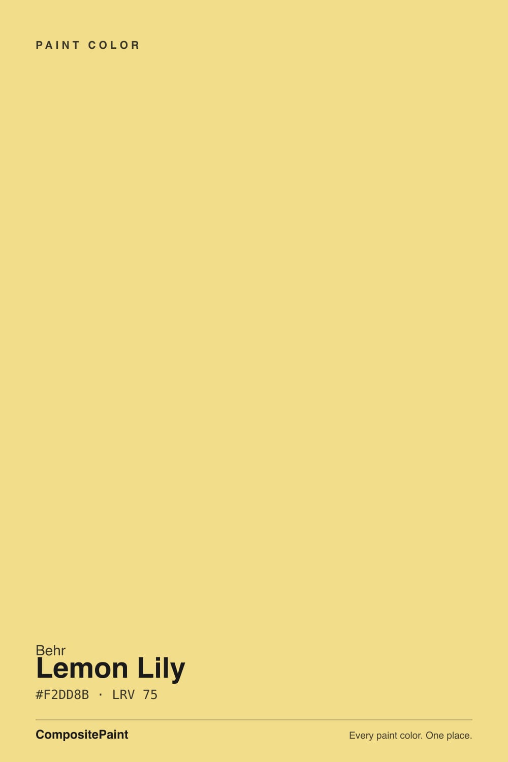
Color spec
| Brand | Behr |
| Name | Lemon Lily |
| SKU | MQ6-46 |
| Hex | #F2DD8B |
| RGB | 242, 221, 139 |
| HSL | 48°, 80%, 75% |
| LRV | 75 |
| Undertone | warm yellow tone |
| Sheens | walls eggshell · trim semi-gloss · front door semi-gloss |
| Family | Yellow |
Lemon Lily is a buttery, high-LRV pastel yellow — warm and citrusy without tipping into neon or baby-food orange. At LRV 75 it behaves almost like a tinted white: it brightens a room the way a pale color does, but it never lets you forget it is yellow. Good light makes it read sunny and happy; bad light — especially cool fluorescent or LED — can pull it toward a flat, faintly sickly green-yellow. It is a doses color, not a whole-house color.
What Color Is Lemon Lily, Really?
A soft, warm pastel yellow — the RGB breakdown (242, 221, 139) shows a color that is genuinely yellow, not yellow-green or yellow-orange: red and green sit close together while blue drops off, which is the classic recipe for a clean, buttery lemon rather than a citrus-orange or a chartreuse. It reads closer to lemon icing or fresh butter than to a school-bus or highlighter yellow.
At LRV 75 it is a very light color — almost as reflective as an off-white — which is the main reason it does not feel loud on a wall the way a saturated gold like Behr's own Thai Curry (LRV 20) does. That high LRV is also why it behaves differently than most "accent" yellows: it can genuinely work as a full-room wall color in good light, not just a front door or an island, because it is closer in brightness to a warm white than to a bold statement color.
Undertone in one line: warm and clean, no green cast and no orange push, in daylight or under a warm 2700K bulb. Under cool fluorescent tubes or a cool-white LED, the same paint can flatten toward a duller, slightly greenish yellow — not a defect in the paint, just what cool light does to any warm pastel.
Where It Shines
Give it real daylight and a job with a clear personality — a kitchen, a mudroom, a front door, a kid's room — and it earns its keep. Because the LRV is so high, it never gets heavy or cave-like the way a deeper gold can; it just adds warmth and a little joy without demanding the whole room bend around it. It is at its best in small, defined doses: cabinets, an island, lockers, a door, a nook — spaces where "happy" is exactly the assignment.
Where It Fails — the Honest Part
Nearly every regret story with a pastel yellow like this one follows the same three scripts, and none of them are really about the paint. If your room matches one of these, sample a big board before you commit — this color is unusually sensitive to the specifics of your space.
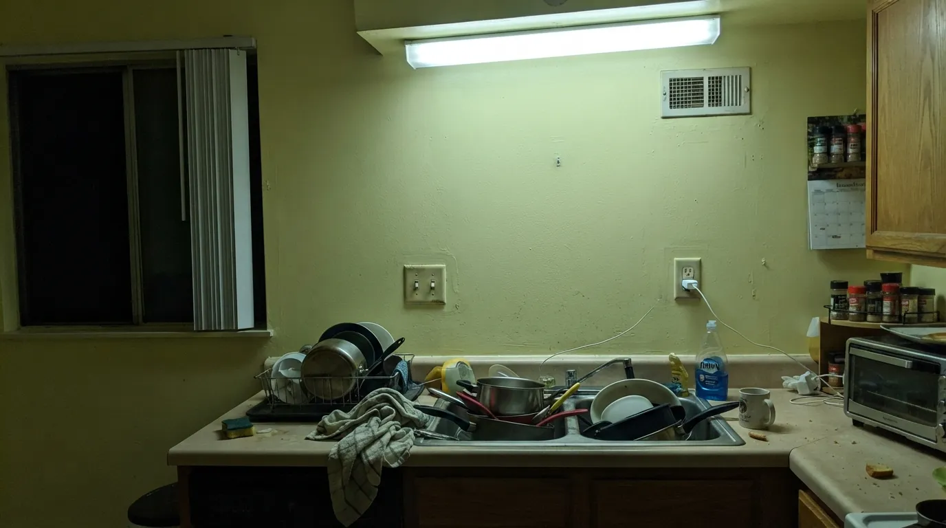
Cool fluorescent tubes or cool-white LED. This is the single most common complaint about pastel yellows in general: under a cool 4000K–5000K bulb, the warmth drains out and the paint reads flat and faintly greenish — the classic "sickly" yellow readers describe in kitchens and laundry rooms lit by old fluorescent tubes. Swap to a warm 2700K–3000K bulb before you blame the can.
Golden honey-oak floors and cabinets. Two warm yellows in the same room stop reading as a palette and start reading as one undifferentiated yellow wash — walls, floor and cabinets all blur together with no contrast to anchor the eye. Lemon Lily needs a break from the floor: a painted white cabinet, a darker island, or a rug does the job a matching honey-oak tone cannot.
A whole house of it, edge to edge. Pale, warm yellows are famously hard to live with wall-to-wall for years — even happy colors get tiring at full-house scale, and touch-ups show more on a saturated hue like this than on a neutral, because any slight sheen or batch mismatch reads as a visible patch. Keep it to a room or two with a clear job, not the whole floor plan.
Room by Room
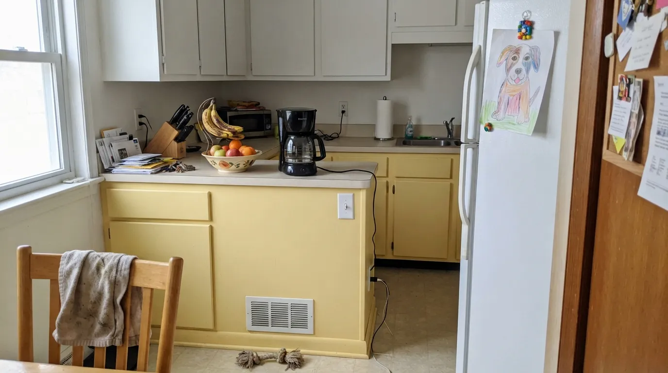
Kitchen — its best room
On an island, a wall of lower cabinets, or a breakfast nook it is genuinely cheerful without tipping into a theme kitchen. Pair with white uppers or white walls so the yellow reads as an accent, not the whole story. Satin or semi-gloss for cabinets.
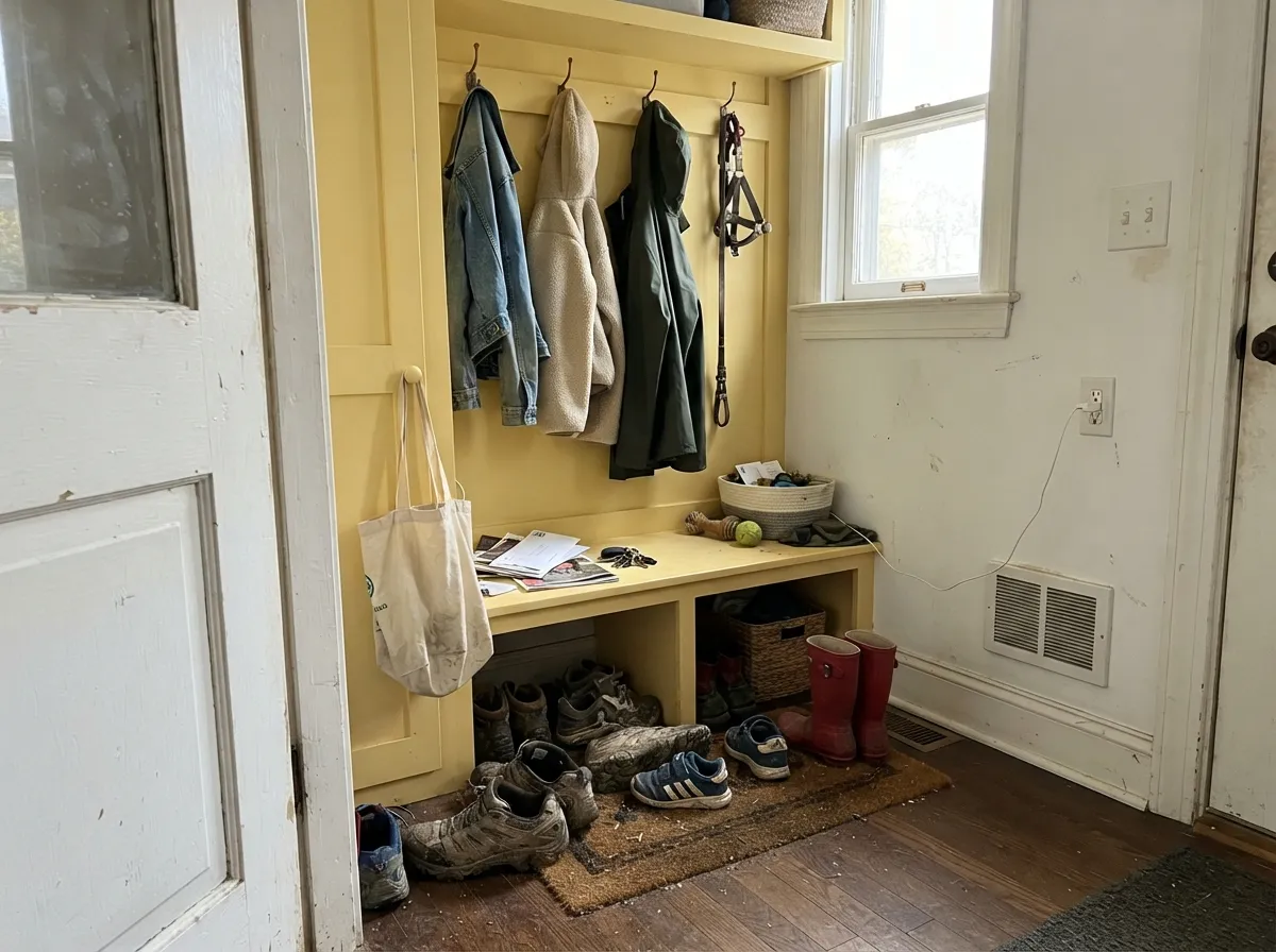
Mudroom, laundry room, pantry — yes
Small, hardworking rooms are exactly where a happy color like this earns its space, and the high LRV keeps a windowless mudroom from feeling dim. Check the actual bulb in the room before you commit — this is where old fluorescent fixtures live.
Nursery and kids' rooms — yes
Warm, bright, gender-neutral, and light enough not to feel babyish in a few years. Eggshell for scuff resistance; pair with white trim so the room does not read as one flat yellow box.
Powder room — yes, with commitment
A small room takes a saturated wall color well precisely because there is so little wall — Lemon Lily on all four walls of a powder room reads intentional and cheerful rather than overwhelming, the way the same color would on an open living room.
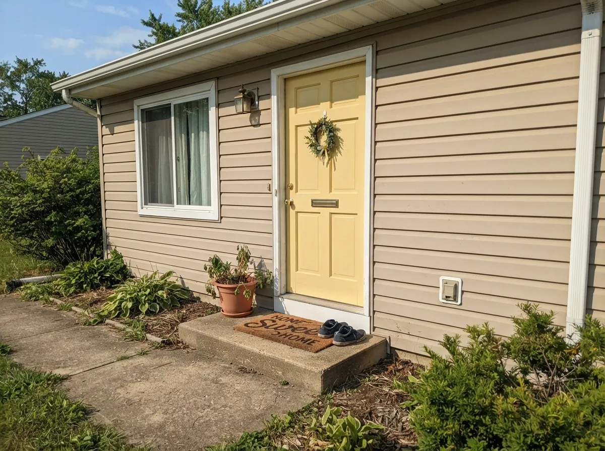
Front door and exterior accents — yes
Full sun reads it bright and clean rather than washed-out, and against a warm greige or white body it makes a genuinely cheerful, low-drama front door. Semi-gloss, and prime over any darker existing door color first.
Adult bedroom — usually no
It is a wide-awake color, not a restful one — it works against the calm, low-arousal palette most adult bedrooms are chasing. Save it for a kid's room or a hallway instead, and let the bedroom go quieter.
The Scorecard
What it gets right
- +Genuinely warm, clean lemon-yellow — no green or orange muddiness
- +High LRV (75) keeps it light and livable, not heavy like a deep gold
- +Reads cheerful without tipping neon or baby-food orange
- +Excellent in small doses: cabinets, doors, nooks, mudrooms
- +Pairs easily with white trim, navy, and warm woods
Where it struggles
- −Cool fluorescent or LED light turns it flat and faintly sickly
- −Clashes with matching honey-oak floors and cabinets — no contrast left
- −Too energetic for most whole-house or formal-bedroom uses
- −Touch-ups and lap marks show more than on a neutral
Light by Light
Most complaints about Lemon Lily are a light mismatch. Upload a photo of your actual room and see it on your walls — then ask for the same wall in north light or evening lamps before you buy a single sample.
TEST IT IN YOUR LIGHT →Lemon Lily vs the Colors You're Also Considering
Every Lemon Lily sample board has the same rivals on it. The numbers show the real lightness gap — then it comes down to which risk you would rather live with.
Need It From Another Brand?
Any paint counter can custom-tint Behr MQ6-46 directly — but if you would rather stay in one brand's own deck, these are the closest stock matches:
Similar Behr colors
closest in the Behr deckThe nearest shades to Lemon Lily within Behr's own range, ranked by perceptual color distance — useful when you want the same look a touch lighter, darker, or warmer.
Lemon Lily Coordinating Colors
The rule for coordinating with Lemon Lily is simple: keep it in doses, give it a warm white to sit next to, and let one deeper, grounded color anchor the room so the yellow doesn't have to do all the work. It pairs easily with warm whites, navy, sage green and near-black accents — and struggles when the only other color in the room is another warm yellow. These are the partners that keep it working:
Lemon Lily Outdoors and On a Front Door
Because it is a high-LRV pastel rather than a saturated gold, Lemon Lily tends to behave better outdoors than most yellows: full sun reads it bright and clean instead of washing it out or turning it garish, which is the usual complaint with deeper yellows on a facade. A warm neutral or white body keeps the door reading as a deliberate pop of color rather than a mismatch.
The one real prep issue outside is coverage: yellow paints are notoriously poor at hiding a dark existing color, so a door that is currently navy, black or barn-red needs a stain-blocking primer before the first coat of Lemon Lily goes on, or the finish coat will look patchy and gray no matter how many coats follow.
Lemon Lily With Wood Tones and Floors
This decision comes down to how warm your existing wood already is. Pale white oak, birch and gray-washed floors give Lemon Lily real contrast, so the yellow reads as a deliberate accent against a quieter floor. Walnut and other deep, cool-brown woods work well too — the contrast in depth keeps both elements distinct.
The one combination to sample carefully is deep honey-gold oak, the classic builder floor. Two warm yellows in the same room can blur together with no visual break between wall and floor, and the room can start to feel like one undifferentiated wash of warmth rather than a considered palette. A painted white cabinet run, or simply keeping the yellow to a smaller surface like an island or a door, solves it without a full floor replacement.
Three Ready Palettes Built on Lemon Lily
A color is never alone on the wall — these are complete combinations in the 60-30-10 pattern, with the reason each one holds together.
A warm white keeps the yellow from feeling like a themed room, and one near-black note on the stools and light fixture gives the eye somewhere to land. All three are Behr, so a painter can match everything off one deck.
TRY THIS PALETTE →A dependable white wall lets Lemon Lily do the work on the built-ins instead of fighting for the whole room, and Bitter Sage adds one grounded, grown-up note so the mudroom doesn't tip into a kid's playroom look.
TRY THIS PALETTE →A warm neutral body and crisp white trim give the door somewhere quiet to pop from — full sun reads Lemon Lily bright and clean here, without the risk a saturated gold door would carry.
TRY THIS PALETTE →Accessibility (WCAG contrast)
WCAG 2.1: AA = 4.5:1 normal text · AA Large = 3:1 large text · AAA = 7:1 normal text.
The Questions Everyone Asks
Is Lemon Lily too bright for a whole room?
It is bright but not neon — LRV 75 puts it closer to a tinted white than to a saturated statement color. Most people find it works on four walls in a well-lit kitchen, nursery or mudroom; it gets harder to live with at whole-house scale, where any warm pastel starts to feel like a lot.
Will it look sickly under my kitchen lights?
Only if those lights are cool fluorescent tubes or cool-white LEDs — that combination flattens almost any warm pastel yellow toward a dull, faintly greenish cast. Swap to a warm 2700K–3000K bulb and the buttery warmth comes back.
What trim white goes with Lemon Lily?
A warm white keeps the pairing soft — Behr Swiss Coffee or Polar Bear both work. A stark cool white will make the yellow look slightly dingy by contrast; if you want real crispness, go with a warm white rather than the coolest white on the shelf.
Does it clash with oak floors?
It depends on the oak. Pale or gray-washed oak gives it useful contrast. Deep honey-gold oak is the real risk — two warm yellows next to each other stop reading as a palette and start reading as one undifferentiated warm wash. A painted white cabinet or a rug helps break the two apart.
Is it a good front door color?
Yes — at this brightness it reads cheerful rather than garish in full sun, and it pairs easily with a warm neutral or white body. Use semi-gloss, and prime over any darker existing door color first; yellow is notoriously poor at hiding a dark base coat.
How many coats will it need?
Plan on two coats minimum over a similar light color, and prime first if you're covering anything dark or saturated — pale, warm yellows are among the harder colors to get solid, even coverage from in a single pass.
Will It Work in YOUR Room?
No page can promise how Lemon Lily behaves in your light. Upload a photo and see it on your own walls in seconds — before you spend a cent on samples.
TRY LEMON LILY ON YOUR ROOM →
Ask a Question