Encore
Valspar's 2025 Color of the Year, reviewed honestly: the entry it was built for, the violet it turns after dark, and the rooms where LRV 6 just reads black.

Jessica has spec'd whites and neutrals for more than 300 rooms and keeps a sample wall of painted drawdowns in her studio. Every color review is checked against real reader rooms in the comments and re-tested when a formula changes. About the testing process →
- 1Encore6
- 2Waterloo13
- 3Charcoal Blue19
The Fast Verdict
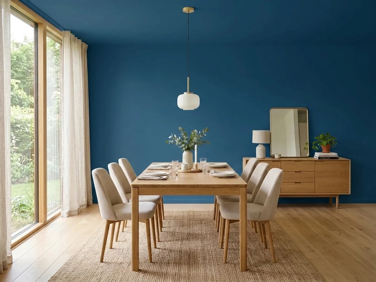
Encore is a saturated, cool navy at near-black depth — LRV 6 — with more pure blue in it than the famous navies it competes with. In real daylight it is unmistakably blue, almost inky-cobalt in the brightest corner of the room. In dim light it collapses toward black, and under warm 2700K bulbs it picks up a violet cast that some owners love and some did not sign up for. Buy it for an entry, a door, a set of cabinets or a small room you want to feel wrapped. Do not buy it for a dim room and expect to see blue.
Entryways and small transitional spaces · teen rooms that need to stop looking like kid rooms · kitchen islands, base cabinets and vanities · front doors · dining rooms and offices you mostly use at night · anyone who wants navy that still reads blue
The room has one small north window and no lamps · you want a soft, grayed navy rather than a saturated one · warm lamplight turning it plum is a dealbreaker · you hate touch-ups showing · you need one-coat coverage on a budget line
- Actually reads blue in daylight — most navies this deep go gray
- Small rooms, entries and stairwells feel wrapped instead of cramped
- Outstanding on cabinets, islands, vanities and front doors
- Brand-backed as a 2025 Color of the Year, so pairing guidance is everywhere
- Sold at Lowe's and tintable across most Valspar lines, indoors and out
- LRV 6 — in a dim room it is simply a black wall
- Turns violet under warm 2700K bulbs after dark
- Deep base means two to three coats and visible touch-ups
- The Color of the Year spotlight has already moved on to a green
What Color Is Encore, Really?
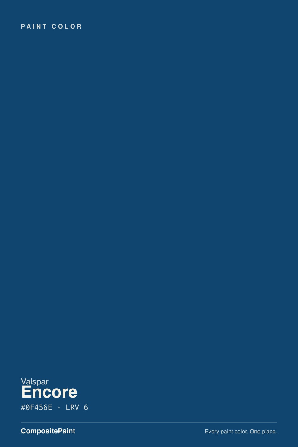
A deep, cool blue with real chroma left in it. That is the whole difference between Encore and the navy shelf it sits on: most famous navies are grayed down until they behave like dark neutrals, while Encore keeps enough pigment to read as an actual blue when light hits it. Valspar named it 2025 Color of the Year and pushed it as an anchoring, everyday blue rather than a dramatic one, but the chip undersells how much color is in there.
At LRV 6 it is near-black depth. That number is the single most useful fact about this paint. It absorbs almost all the light that lands on it, which is why the same gallon can look like glowing cobalt beside a big window and like a black hole in a windowless hall. Depth is also what makes it good in small rooms: an entry, a powder room or a stairwell has enough bounced light from one direction to keep the blue alive, and the walls come in close in a way that reads deliberate.
Undertone in one line: cool blue with a faint teal lean in daylight, and a violet tinge that shows up in low light and under warm bulbs. Reviews split on this — some describe it as gray-blue, others as violet-navy — and both camps are describing the same paint in different light. If your sample looks flat and gray, the room is dim; if it looks plum at 9pm, that is the 2700K bulb doing it.
Where It Shines
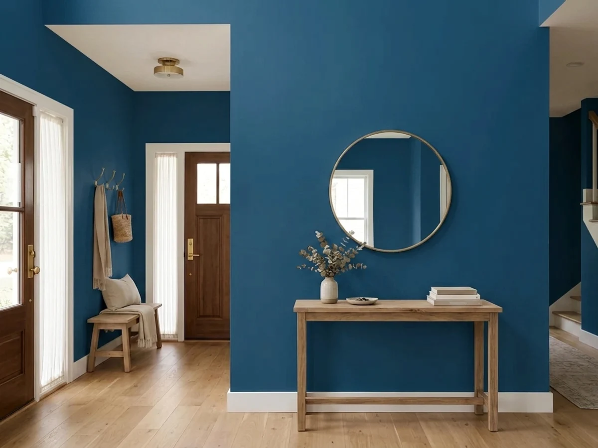
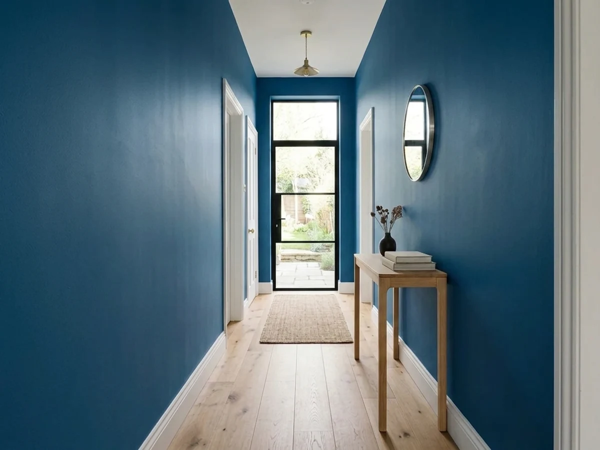
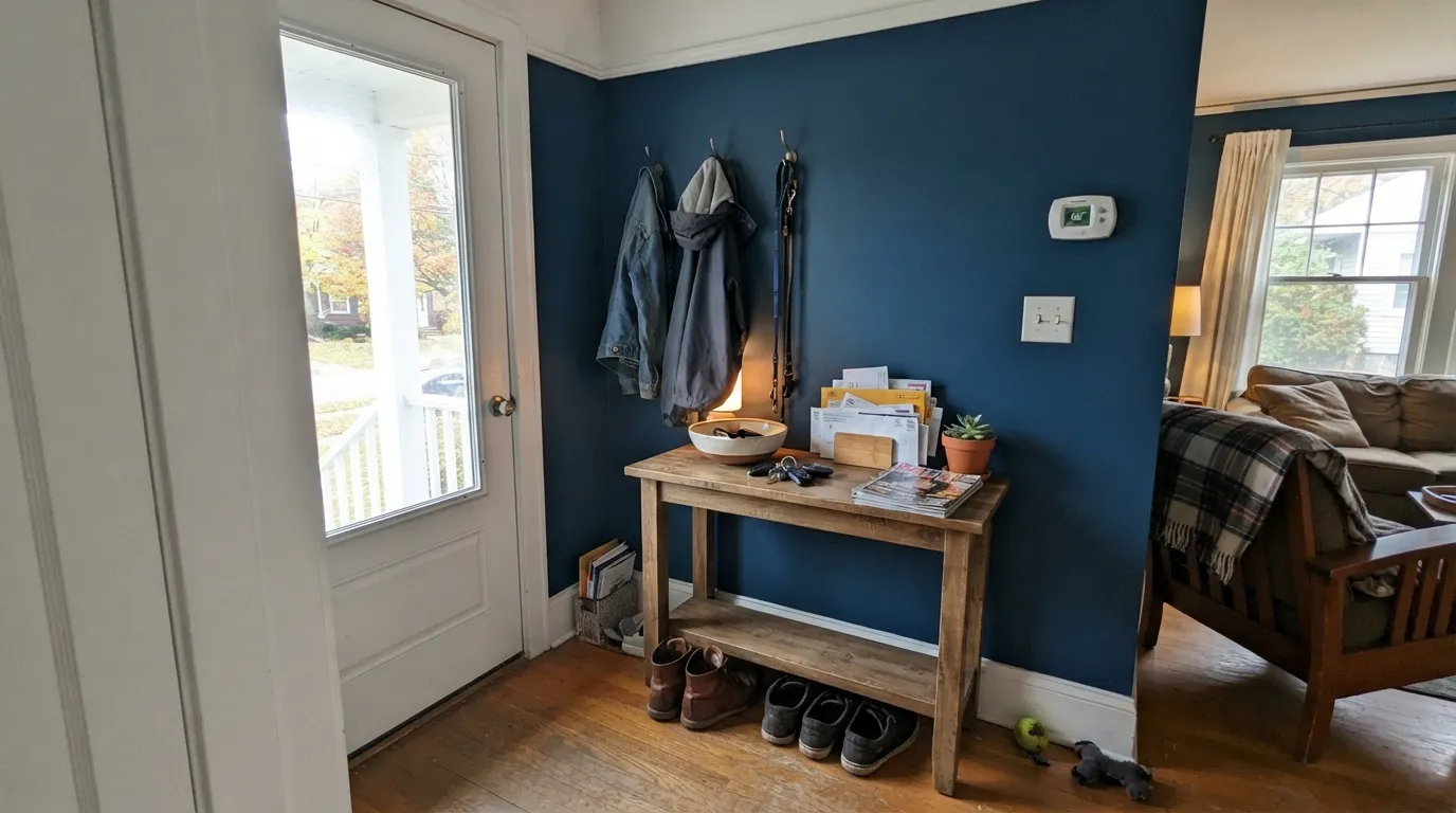
This color is at its best when it only has to cover a small amount of wall in a space you pass through rather than sit in. An entryway is the obvious one, and it is the use Valspar itself put front and center: deep blue on entry walls with crisp white trim reads expensive, and because you are never in there for long the darkness never becomes oppressive. Its other home is a hard surface — base cabinets, an island, a vanity, a front door — where a satin finish gives the blue something to reflect and the color turns jewel-like. Give it warm white trim, brass or unlacquered hardware, cream or oatmeal textiles and a rust accent, and it looks like a decision somebody paid for.
Where It Fails
Encore's bad reviews are not really about the color; they are about LRV 6 meeting a room that cannot feed it. Three scripts cover almost all of them, and every one is predictable from the doorway before you open a can.
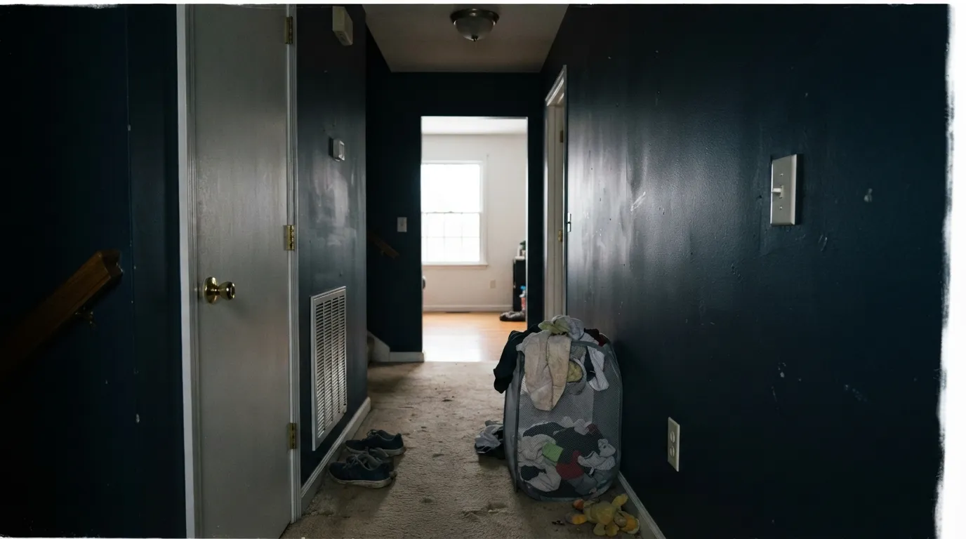
This is the number-one regret. At LRV 6 the paint has to borrow light to show its hue, so a dim north room, a windowless hall or a basement turns it into a dark gray-black wall with no blue in it at all. People who paint a bright entry rave; people who paint a dim den ask why they spent a weekend painting a room black. Sample the actual wall, look at it at 4pm with the lights off, and believe what you see.
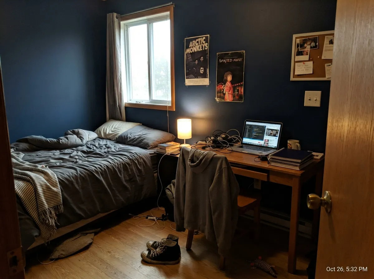
Warm 2700K bulbs add red to a blue this saturated, and the walls tip toward plum or indigo at night. Valspar's own launch coverage flagged the violet tinge and said low light amplifies it. If you wanted a crisp military navy, that shift will bother you every evening. Cooler 3000K to 3500K bulbs pull it back to blue — this is a bulb decision as much as a paint decision.
Deep colors are mixed into a clear or deep base with very little white in it, so hide is poor by nature: plan on two coats over a gray-tinted primer, and three if you are going over anything light or patched. Valspar's cheaper lines are where the angry coverage reviews come from — buy the better tier for a color this dark. And on a near-black wall every roller lap and every dab of touch-up shows, so keep a wet edge, roll wall-height in one pass, and use flat or matte if you want the least flashing.
Room by Room
The use Valspar promoted, and the one that actually works. An entry usually borrows daylight from a door sidelight or the room beyond, which is enough to keep the blue reading blue, and you are never standing in it long enough for the depth to feel heavy. Crisp white trim and a white ceiling do the heavy lifting; skip both and it becomes a tunnel. Eggshell holds up better than matte against shoes, bags and dog leashes.
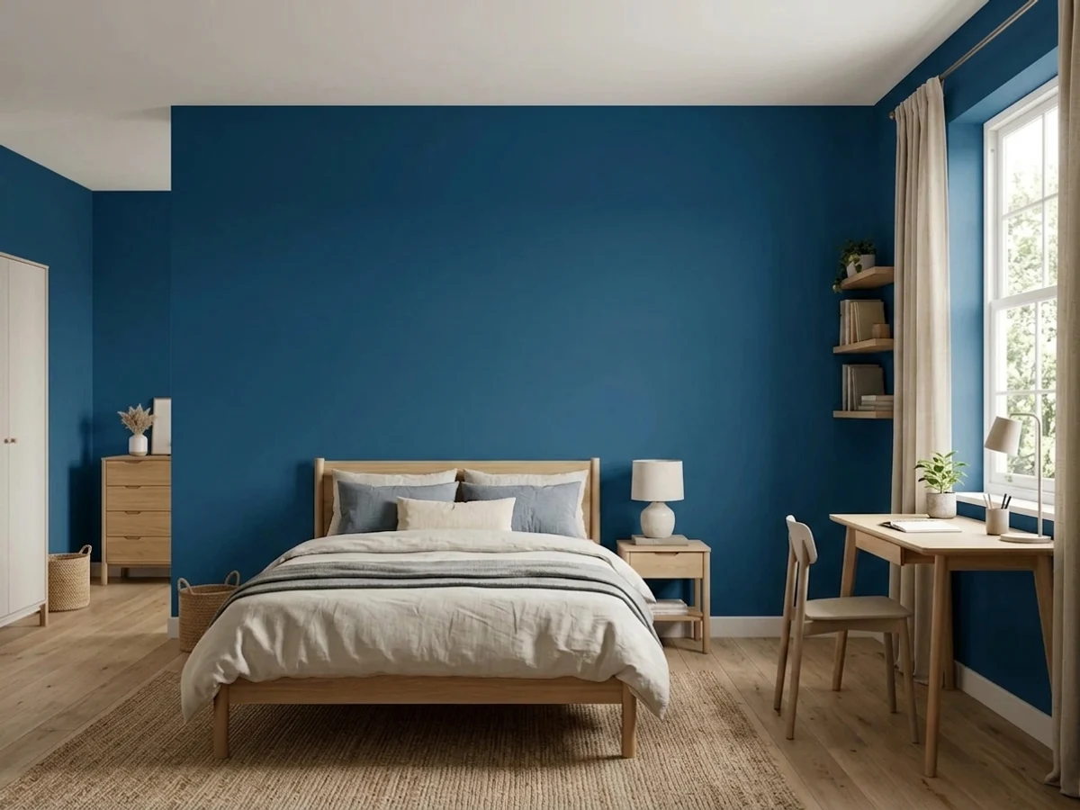
This is the honest answer to a kid who wants a dark room and a parent who does not want to repaint in two years. Encore is saturated enough to feel like a real choice, and adult enough that it survives the teen leaving for college. Two rules: keep the trim and ceiling white so the room does not close in, and put the desk lamp and bedside lamp on warm-neutral bulbs so homework light does not turn the walls purple. If the room has one small window, do a feature wall instead of all four.
Rooms used mostly after dark are where a deep blue pays. Bookshelves, a lamp or two and walnut furniture against Encore reads library, not cave, and video-call backgrounds look genuinely good against it. A dining room drenched in it — walls, trim and ceiling — is one of the safest big swings in this color, because candles and a pendant are the only light that matters. Just accept that the daytime version of the room will be dim.
It can be excellent, but half-measures fail here. Painting only the walls in a bedroom with white trim, white ceiling and cool LEDs gives you a room that feels like a box with dark sides. Color-drenching — walls, ceiling and trim in the same blue, matte finish, warm lamps, cream bedding — is the version people love, and it is genuinely cocooning. If you are not ready for that commitment, use it on the headboard wall only.
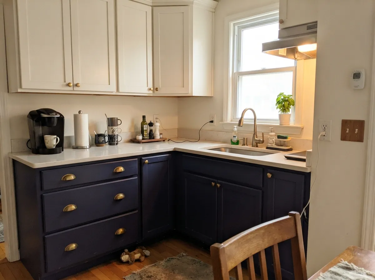
The lowest-risk way to own this color. Navy base cabinets under a light counter, with white or warm-white uppers and brass pulls, is a proven look and Encore's saturation keeps it from going flat gray the way some navies do. Same for a powder-room vanity, where one square metre of deep blue under a mirror does more than a whole wall. Use a real cabinet enamel in satin, and expect two coats plus a bonding primer.
A saturated navy door on a white, gray or brick house is close to foolproof, and full sun is the one place this color is never too dark. Shutters work on the same logic. What I would not do is a whole dark-blue house body without accepting the trade: near-black exteriors run hot, show chalking and fade sooner on south and west walls, and they need the top-tier exterior line rather than the cheapest one.
Your Light Is the Risk
Direct or generously bounced daylight is the only light that shows what you actually bought: saturated, slightly cobalt blue with real depth. South-facing rooms and rooms with a glass door are where owners post the photos that sell this color.
With one small north window, or in a windowless hall or basement, the hue disappears and the wall reads flat black-gray. Nothing is wrong with the paint — LRV 6 has no light to give back. This is the single most common complaint.
An east room shows the truest blue in the morning and sinks toward near-black by mid-afternoon. A west room does the reverse and gets a striking hour at sunset when low gold light hits it and the blue glows before going dark for the night.
2700K bulbs push it toward violet-indigo — cozy if you want it, wrong if you wanted crisp navy. 3000K to 3500K keeps it blue and is the safer default here. Cool 4000K LEDs hold the blue but flatten it into something inky and slightly clinical, which is worth testing before you commit.
Most complaints about Encore are a light mismatch. Upload a photo of your actual room and see it on your walls — then ask for the same wall in north light or evening lamps before you buy a single sample.
Need It From Another Brand?
Any paint counter can custom-tint Valspar 8002-45G directly. If you would rather stay in one brand's own deck, these are the closest stock matches, measured as ΔE2000. Under 2 is a difference you will not see on the wall.
| Brand | Closest color | ΔE | LRV | |
|---|---|---|---|---|
| Sherwin-Williams | Honorable BlueSW 6811 · Sherwin-Williams | 2.2 | 6 | Color page → |
| Behr | Planetarium560D-7 · Behr | 0.7 | 5 | Color page → |
| Benjamin Moore | Downpour Blue2063-20 · Benjamin Moore | 2.6 | 7 | Color page → |
| PPG / Glidden | Blue TangPPG1160-7 · PPG / Glidden | 3.3 | 7 | Color page → |
| Glidden | Blue TangPPG1160-7 · Glidden | 3.3 | 7 | Color page → |
| HGTV Home by Sherwin-Williams | Delft PotteryHGSW 1391 · HGTV Home by Sherwin-Williams | 2.2 | 6 | Color page → |
Similar Valspar Colors
The nearest shades to Encore within Valspar's own range, ranked by perceptual color distance — useful when you want the same look a touch lighter, darker, or warmer.
WCAG 2.1: AA is 4.5 : 1 for normal text, 3 : 1 for large text, AAA is 7 : 1.
Encore vs the Colors You're Also Considering
Every Encore sample board has the same rivals on it. The numbers show the real lightness gap — then it comes down to which risk you would rather live with.
Pick this when you want people to see blue, not a dark gray with a hint of navy. Identical LRV 6, very different amount of color.
Benjamin Moore HC-154 · LRV 6Hale NavyPick this for the same depth with the blue turned down — Hale Navy is grayer and behaves more like a dark neutral, which makes it the easier whole-house navy.
Pick this for a touch more light and noticeably more chroma; Encore is the brighter, more modern blue of the two.
Sherwin-Williams SW 6244 · LRV 4NavalPick this if you want the deepest, most classic navy on the shelf — at LRV 4 it is darker and slightly softer in hue.
Pick this for the slightly lighter, cleaner blue and Valspar's own coordinating palette to work from.
Behr M500-7 · LRV 4Very NavyPick this if you shop at the other big box — this is the closest everyday equivalent on Behr's shelf, at LRV 4 and with much less marketing behind it.
Encore Coordinating Colors
The rule with a saturated navy is simple: give it one clean white for edges, one warm neutral so the scheme does not go cold, and one warm accent as the counterweight. Beige-leaning off-whites are the thing to avoid — beside this much blue they read dingy. These are the partners that keep working in real rooms:
Encore's Year in the Spotlight, and What Happens Next
Valspar named Encore its 2025 Color of the Year and framed it as an anchoring, dependable blue rather than a dramatic one — the pitch was constancy, with a bold entryway as the headline use. That matters practically: the launch came with a full coordinating palette and a year of retail signage, so there is more pairing guidance available for this color than for almost anything else on Valspar's shelf, and a lot of it points the same direction — soft earthy neutrals, muted greens and grays as partners.
Valspar has since moved on to Warm Eucalyptus, a warm green, as its 2026 Color of the Year. That is worth knowing for two reasons. First, the in-store display space and sample-card prominence follow the current year, so Encore is now a regular deck color rather than a promoted one — you may need to ask for the chip rather than find it on the endcap. Second, it means nothing at all about how the color will look in your house. Navy predates the award by a century and outlives it easily.
One more thing the Color of the Year status buys you: breadth. Valspar tints Encore across essentially its whole product line, so the same color is available for interior walls, cabinet enamel, exterior body and trim, and porch or floor coatings — which is why it is realistic to run it from the front door through to the entry walls without hunting for a match.
Encore With Wood Tones, Floors and Metals
Blue is the friendliest deep color for wood, and Encore proves it. Warm mid-brown oak, walnut and even orange-leaning honey oak all work — orange is blue's complement, so the pairing is a contrast rather than a clash, which is exactly the opposite of what happens when you put a violet or a green next to golden floors. Pale white oak and gray-washed floors are equally safe and give a cooler, more Scandinavian result.
The one combination to think about is dark floors. Espresso or near-black wood under LRV 6 walls means the room has no light anchor at all, and it goes heavy fast. A large light rug fixes it; so does keeping the ceiling white. In a kitchen, a light counter under navy base cabinets is doing the same job.
Metals: brass and unlacquered brass are the obvious winners and the reason half the navy kitchens on the internet look the way they do. Matte black works and reads more modern. Polished chrome and brushed nickel are fine but neutral — they add nothing. Aged bronze is the sleeper choice on a front door.
Three Ready Palettes Built on Encore
A color is never alone on the wall. These are complete combinations in the 60-30-10 pattern, with the reason each one holds together. Every one opens in the visualizer.
Deep blue needs a hard white edge or it turns into a tunnel — Ultra White at LRV 92 gives the entry crisp casings and a ceiling that still bounces light, and it is the trim white sitting on the same Valspar shelf. Natural Linen next door is the handoff that keeps the house from going cold: warm beige beside saturated blue reads intentional, where another gray would read like the paint ran out.
Try this palette in your roomRust against navy is the pairing that keeps a dark teen room from looking like a gaming cave: the warm terracotta reads adult, and it is the complement to blue, so both colors look stronger. Swiss Coffee rather than a stark white keeps the ceiling from cutting the room in half, and the whole scheme survives the kid outgrowing it — repaint the accent, keep the blue.
Try this palette in your roomThe two-tone kitchen that has not gotten tired yet: dark below, soft white above, warm neutral on the walls so the room does not read blue-and-white-cold. Alabaster at LRV 82 is warm enough that the navy looks rich rather than harsh beside it, and Accessible Beige gives brass or unlacquered hardware something to sit against. Wood floors of any tone work with this one.
Try this palette in your roomEncore FAQ
Is Encore navy or is it basically black?
It is genuinely navy — a saturated one — but at LRV 6 it needs light to prove it. In a room with a decent window you will see blue all day. In a dim hall, a basement or a north room with no lamps, it reads as a very dark blue-black and most people would just call it black. The color is not the variable here; your light is.
What white trim goes with Valspar Encore?
A clean, bright white gives the sharpest and most classic result — Valspar's own Ultra White at LRV 92 is the obvious same-shelf choice. If the room runs warm or you want it softer, a creamy white like Swiss Coffee keeps the contrast from feeling severe. What does not work is a beige-leaning off-white: next to this much blue it reads dirty.
How many coats will I need?
Two over a gray-tinted primer in most cases, three if you are covering a light color, patched drywall or a sheen change. Deep colors sit in a base with almost no white pigment, so hide is poor by design, and Valspar's budget lines are where the one-star coverage reviews come from. Buy the better tier for a color this dark — it is cheaper than the third coat.
Will it make a small entryway feel smaller?
Smaller, yes — but that is usually the point. A dark entry makes the room you step into next feel bigger and brighter by contrast, which is why designers keep using deep colors in small transitional spaces. Keep the ceiling and trim white, make sure there is a light fixture worth having, and it works. If the entry is also your only path to a dim hallway, that is when it starts to feel like a tunnel.
Can I use Encore on kitchen cabinets?
Yes, and it is the use I would recommend first. Valspar promotes it for cabinetry and it earns it: satin navy base cabinets under a light counter, warm-white uppers, brass pulls. Use a proper cabinet enamel with a bonding primer, expect two coats, and let it cure properly before the doors go back on.
Now that Valspar has moved on to a green, will Encore look dated?
Not really. Valspar's 2026 Color of the Year is Warm Eucalyptus, a warm green, so the marketing spotlight has moved — but deep navy has been in continuous use for decades and is closer to a dark neutral than a trend color. The Color of the Year label got Encore attention; it is not what keeps it usable. The bigger dating risk is the finish and hardware you pair it with, not the blue.
Have you painted with Encore?
Rate it — one tap helps the next reader decide.
Ask a Question