Navy Blue
Behr's plainest-named navy, reviewed honestly: where the blue actually stays blue, the rooms where LRV 4 turns it into black, and the Behr-specific application trap.

Jessica has spec'd whites and neutrals for more than 300 rooms and keeps a sample wall of painted drawdowns in her studio. Every color review is checked against real reader rooms in the comments and re-tested when a formula changes. About the testing process →
- 1Navy Blue4
- 2Waterloo13
- 3Charcoal Blue19
The Fast Verdict
Navy Blue is the navy you get when nobody in marketing touched it. No poetic name, no color-card story — just a deep, genuinely blue navy that Behr keeps tintable in nearly every product it sells, from wall enamel to masonry paint to porch-floor gloss. On a front door or a drenched entry with daylight it is excellent. At LRV 4 in a dim, windowless room it stops being blue and becomes black, and that is the review in one sentence.
Entryways and stair halls with real daylight · front doors · a drenched office, study or dining room · islands, lower cabinets and built-ins · anyone who wants navy to actually look blue
The room is small, windowless and stays dim · you wanted the soft gray-navy look of Hale Navy · your floors and trim are orange honey oak · you are rolling big flat walls yourself and hate seeing every touch-up
- Stays clearly blue where the popular gray-navies go charcoal
- One of the best front-door colors there is, on almost any siding
- Available in nearly every Behr product — interior, exterior, masonry, porch floor
- Small rooms drenched in it read jewel box, not closet
- Home Depot tinting means you can get more of it any day of the week
- LRV 4 gives back almost no light — a dim room gets dimmer
- Not the soft, grayed navy most people picture when they say navy
- Behr's deep base dries fast: lap marks and flashing are a real risk on big walls
- Touch-ups, nail pops and sanding scratches all show more than in any mid-tone
What Color Is Navy Blue, Really?
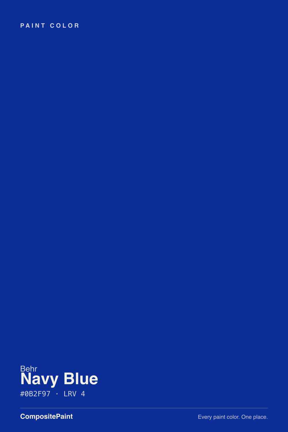
A deep navy with real blue left in it. Most of the navies people fall in love with online — Hale Navy, Naval, half the Behr deck — are navies with the chroma dialed down, so they behave like a dark neutral and only whisper blue. This one keeps the blue. Look at the company it keeps in Behr's catalog and you can see what it is for: S-H-580 is a legacy core color, stocked across Behr's interior enamels, exterior paint, masonry-stucco-brick paint and porch-and-patio floor gloss. Designer navies live in wall paint only. This one gets tinted into anything, which is the tell — it is a workhorse color, not a curated one.
At LRV 4 it sits at the bottom of the scale, in the same territory as Sherwin-Williams Naval (LRV 4) and Behr's own Very Navy (LRV 4), a step deeper than Hale Navy (LRV 6). What LRV 4 means on a wall is simple and unforgiving: the paint gives back almost nothing. Whatever light the room already has is all the light you will ever have. In a room with a real window that trade is worth it — the color goes rich and inky and the blue is unmistakable. In a hall with one ceiling fixture, the same paint reads as flat black.
Undertone in one line: blue first, with a violet lean at the cool end — never green, never teal. If your sample looks black, that is your light, not the paint. If it flashes faintly purple under bright LEDs, that is the violet side showing, and it is the same thing that makes it look so good next to brass.
Where It Shines
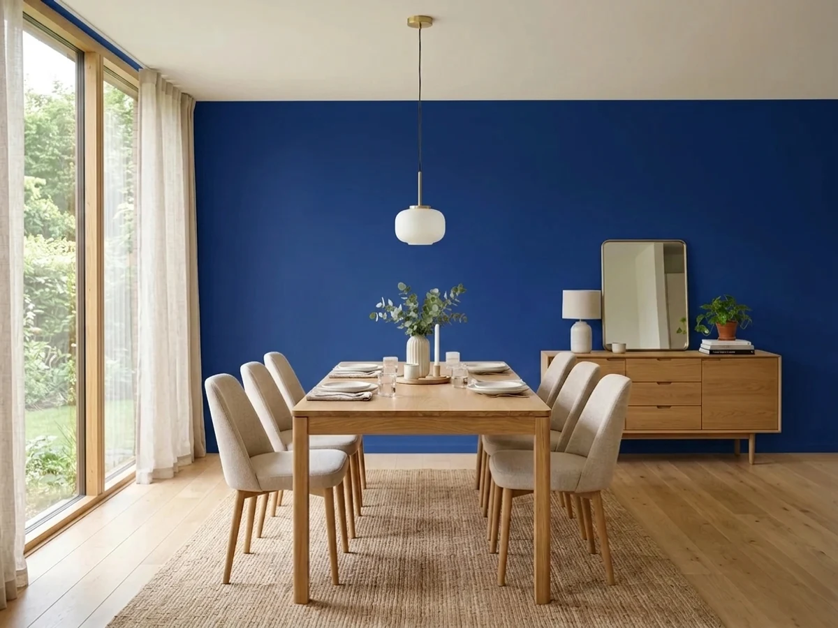
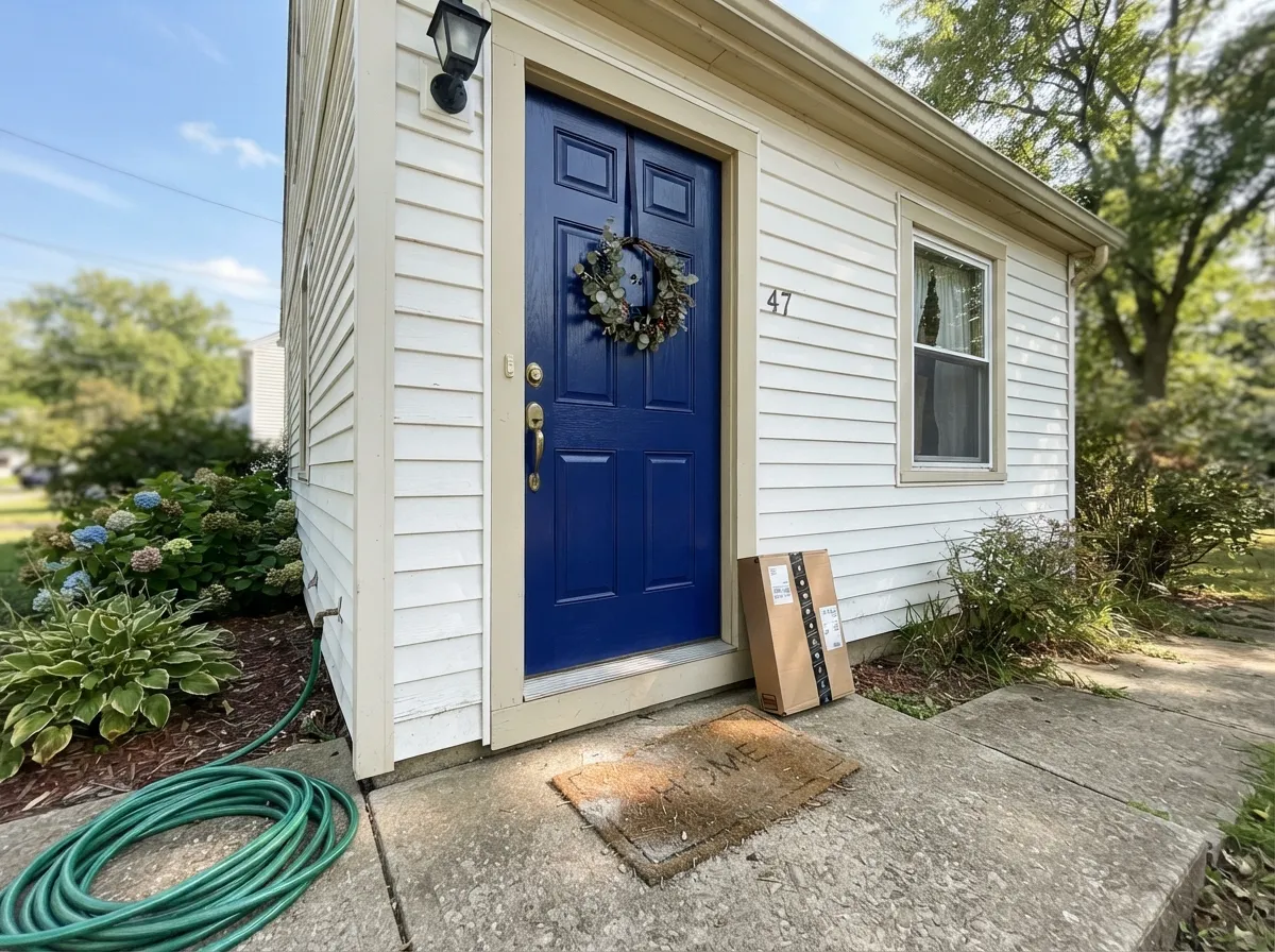
Its best job is the one people actually buy it for: the front door. Deep saturated blue against white or pale siding is one of the few exterior moves that reads classic and current at the same time, and satin holds the color without the plastic glare of full gloss. Indoors it wants a room you can commit to — an entry with a window, a small study, a dining room used at night. Drench it: walls, trim, doors, all in Navy Blue, and let white ceiling and brass or matte-black hardware do the contrast. Half-navy rooms with three other walls in beige are where this color goes wrong.
Where It Fails
The bad reviews for a color like this almost never say the paint was defective. They say it was darker than expected, bluer than expected, or harder to roll than expected — and all three are predictable before you open the can. If your room matches one of these, sampling bigger will only confirm it.
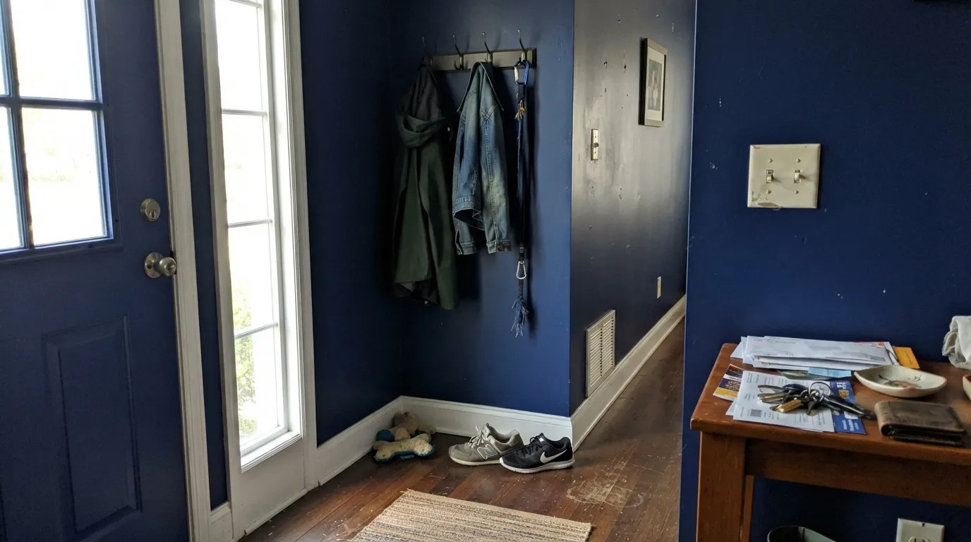
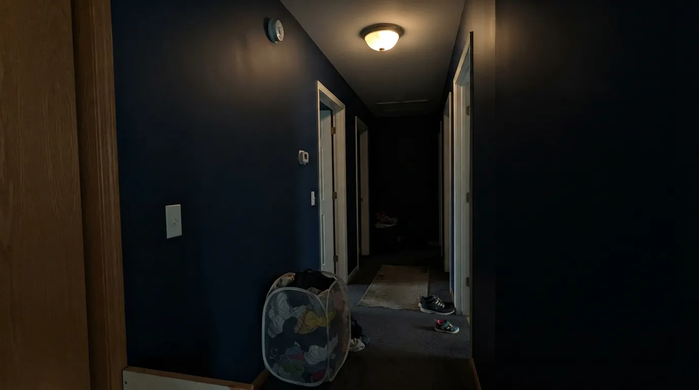
LRV 4 is near the floor of the scale. In a windowless entry, an interior hall, or a north room on an overcast day, there is not enough light for the blue to show and the walls simply go black. Owners describe it as "I painted my hallway black by accident." The only real fixes are light — a window, a wall washer, more lamps — or a shallower navy like Van Deusen Blue.
When most people say navy they picture Hale Navy: grayed down, tailored, quiet. This is not that color. The blue here has real chroma, so on four walls it announces itself as blue rather than settling in as a dark neutral. If your Pinterest board is full of gray-blue rooms, buy Very Navy or Hale Navy and skip this one.
This is the complaint pattern specific to buying a very dark color at Home Depot. Behr's deep-tinted bases carry a lot of colorant, cover unevenly on the first coat, and set up quickly — so lap marks, flashing and picture-framed edges around trim show up far more than they would in a mid-tone. Prime with gray-tinted primer, keep a wet edge, plan on two full coats plus touch-ups, and expect every nail pop and sanding scratch in the wall to be visible afterward.
Room by Room
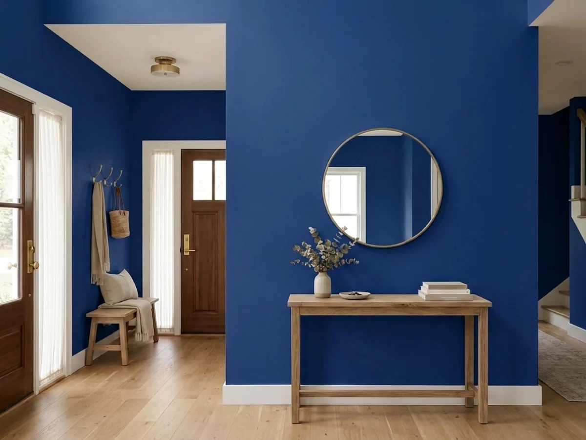
A navy entry is a genuinely great first impression: it makes the rooms beyond feel brighter by contrast and it hides the scuffs that entries collect. The condition is light. With a sidelight, a transom or a landing window, drench it — walls and trim both — and keep the ceiling white. With no daylight at all it is a black box, and no bulb count fixes that.
Full sun is the only light that shows this color completely, and outdoors it gets it every day. Navy is one of the few door colors that works on white, gray, brick and stone alike. Use the urethane alkyd enamel in satin, prime bare wood or metal, and give a south- or west-facing door a fresh coat sooner than you would a pale one — saturated blues fade first.
Small rooms take deep color better than large ones, and a study is a room you mostly use with the lamps on anyway. Walls, trim, shelves and the door in Navy Blue, white ceiling, warm bulbs, brass picture lights. It reads library, not cave, as long as one real window is in the room.
Dining rooms live at night, which suits a color that goes inky under lamplight. Navy walls with white trim, a warm wood table and brass or amber glass fixtures is an easy win. Eggshell, not matte — chairs hit dining-room walls constantly and matte will burnish where they touch.
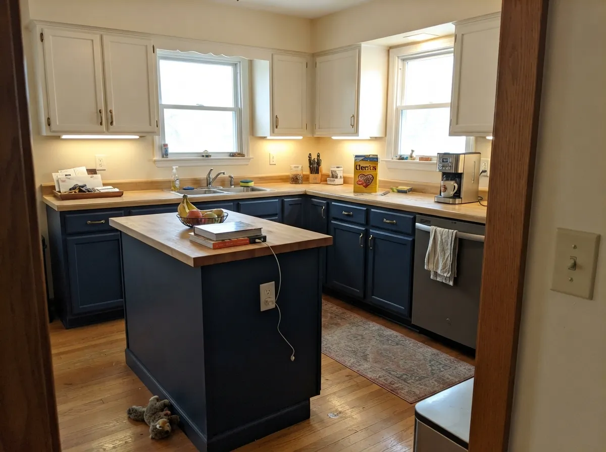
Navy lowers under a warm white upper run is the safest way to use this color in a kitchen, and Behr sells it in a urethane alkyd enamel that levels properly on doors. It also solves the awkward built-in bookcase: paint the case navy, leave the walls light, and the shelves look intentional instead of forgotten.
It can make a beautiful bedroom in a room with two windows, but most bedrooms are used at dusk and dawn, when LRV 4 gives you nothing back. Interior hallways are worse: no windows, no reason. If you want the mood without the blackout, Van Deusen Blue or Smoky Blue does that job at a depth you can live with.
Your Light Is the Risk
Strong sun is the only light that shows the whole color: deep, saturated, unmistakably blue rather than black. Sample on the sunniest wall first.
With no direct sun the blue drops out and the wall reads flat black. This is the single most common complaint about the color, and it is a light problem, not a paint problem.
Cool morning east light shows the blue at its cleanest and brightest. Low west sun and golden hour push it toward indigo and warm the surface slightly — the same wall looks like two different navies at 9am and 6pm.
2700K bulbs mute the blue toward warm ink, which is the flattering version and what you want in a study or dining room. Cool 4000K LEDs do the opposite: they bring the violet forward and can make the walls look faintly purple. Warm bulbs are part of this paint job.
Most complaints about Navy Blue are a light mismatch. Upload a photo of your actual room and see it on your walls — then ask for the same wall in north light or evening lamps before you buy a single sample.
Need It From Another Brand?
Any paint counter can custom-tint Behr S-H-580 directly. If you would rather stay in one brand's own deck, these are the closest stock matches, measured as ΔE2000. Under 2 is a difference you will not see on the wall.
| Brand | Closest color | ΔE | LRV | |
|---|---|---|---|---|
| Dunn-Edwards | Kinetic EnergyDEFD49 · Dunn-Edwards | 4.8 | 8 | Color page → |
Similar Behr Colors
The nearest shades to Navy Blue within Behr's own range, ranked by perceptual color distance — useful when you want the same look a touch lighter, darker, or warmer.
WCAG 2.1: AA is 4.5 : 1 for normal text, 3 : 1 for large text, AAA is 7 : 1.
Navy Blue vs the Colors You're Also Considering
Every Navy Blue sample board has the same rivals on it. The numbers show the real lightness gap — then it comes down to which risk you would rather live with.
Pick this when Very Navy sampled like dark slate and you wanted real blue on the wall.
Behr M500-7 · LRV 4Very NavyPick this for the same depth from the same store with the blue turned down — the classic muted navy most people actually mean.
Pick this when Hale Navy sampled too gray for you and you wanted the blue to read as blue.
Benjamin Moore HC-154 · LRV 6Hale NavyPick this for the safe, grayed designer navy that behaves in almost any light and never surprises anyone.
Sailboat S-H-590 at LRV 5 and hex #0A35A1 is the closest relative and it is slightly brighter and a touch more vivid. The difference is small on a chip and larger on a wall, where Sailboat holds its blue a little longer as the light drops.
Mountain Blueberry S-H-610 at LRV 4 and hex #193386 is the quieter option. It carries a bit more gray, so it reads more like a traditional navy and less like ink. Midnight Sky S-H-620 at LRV 4 and hex #1C2F80 goes further in that direction again, softer and less saturated. Sailor S-H-600 at LRV 6 and Tanzanite P530-7 at LRV 6 both lift the lightness slightly, which matters in a dark room.
Across brands, Dunn-Edwards Kinetic Energy DEFD49 sits at LRV 8 with hex #2A39B0 and a deltaE of 4.83 against Navy Blue. That is close but visibly different side by side, lighter and more violet-leaning. Treat it as a relative, not a substitute.
Behr Navy Blue Coordinating Colors
The rule with a saturated navy is to give it warmth to lean on and one honest white to break against. Cool grays beside it look like a second, weaker version of the same idea; warm neutrals and real whites make the blue look deliberate. These are the Behr partners that keep working in real rooms:
Why This Navy Turns Up in Every Behr Product Line
Most famous paint colors live in exactly one place: interior wall paint, on a designer color card, with a story attached. Behr Navy Blue is the opposite kind of color. It carries a legacy S-H code rather than a modern collection code, and Home Depot stocks it tinted into the interior enamels, the exterior lines, the masonry-stucco-and-brick paint, and the porch-and-patio floor gloss. That is the profile of a utility color — the navy a store keeps because painters, landlords and contractors ask for a navy and do not care what it is called.
For a homeowner that has two practical consequences. First, you can run one color across surfaces most paint decks cannot follow: door, shutters, painted brick, porch floor. Second, this color was never tuned to photograph well on a color card next to greiges — it was tuned to be a navy. That is exactly why it holds more blue than the designer navies, and exactly why some people open the can and find it bluer than the chip in their hand suggested.
Behr Navy Blue With Wood Tones, Metals and Floors
Wood decides how expensive this color looks. Walnut, white oak and natural rift oak are its best company — the blue reads deep and tailored against them. Orange-toned honey oak floors and 1990s oak trim are the hard case: orange sits opposite blue on the wheel, so each side pushes the other louder, and the room lands in high-school-locker territory. A large light rug between the two helps; refinished or replaced floors help more.
Metals are easy and the reason navy has stayed popular: unlacquered and satin brass is the classic pairing and warms the blue instantly, matte black is the modern one, and polished nickel is the safe middle. Polished chrome is the only one that reads cold beside it.
Floors and counters: warm quartz, butcher block and cream limestone all sit comfortably with navy cabinets. Cool gray-veined marble works too, but it makes the whole kitchen read cool — add brass or wood somewhere to keep it from feeling clinical. Gray LVP is the combination to sample before committing; two cool surfaces with nothing warm between them is how a navy kitchen ends up feeling like an office.
Three Ready Palettes Built on Navy Blue
A color is never alone on the wall. These are complete combinations in the 60-30-10 pattern, with the reason each one holds together. Every one opens in the visualizer.
Drenching the entry — walls and trim the same navy, separated only by sheen — avoids the chopped-up look that ruins most dark entries. A plain white ceiling keeps the ceiling plane lifted, and Smoked Tan next door is a khaki-greige with enough weight to hand off to a near-black color without looking washed out beside it.
Try this palette in your roomThe white keeps the facade bright enough that the door reads as blue and not as a dark rectangle. Cracked Pepper is the useful third note: it is warm enough not to compete with the navy, and its faint violet flash in strong sun happens to run in the same direction as this blue, so the two darks look related instead of accidental. Brass or matte-black door hardware, either works.
Try this palette in your roomWarm walls, cleaner white uppers, navy on the bottom half: the light stays at eye level and the dark stays where it takes the abuse. Blank Canvas brings the warmth that keeps a saturated blue from feeling cold, and its peach tell is far enough from the blue that the two never argue. Brass pulls; butcher block or warm quartz on the island.
Try this palette in your roomNavy Blue FAQ
Is Behr Navy Blue too dark for a small entryway?
It depends entirely on whether the entry has daylight. With a sidelight, a transom, or an open sightline to a window, a small entry is one of the best places for it — small dark rooms read as jewel boxes rather than closets. With no natural light at all, LRV 4 means the walls will read black, and adding lamps only lights the objects in the room, not the paint.
What white goes with Behr Navy Blue?
Almost any of them will contrast, so pick by temperature. A plain everyday white like Behr Polar Bear keeps the scheme crisp and is the easy default for ceilings and trim. Behr Whisper White is the warmer choice and is the better cabinet white beside navy. Avoid a very warm cream next to it — the cream reads yellow against this much blue.
Is Behr Navy Blue the same as Hale Navy?
No, and this is the mismatch behind most disappointment. Hale Navy is a grayed navy — it behaves like a dark neutral. Behr Navy Blue keeps much more blue chroma and is deeper as well (LRV 4 against Hale Navy's 6). If you want a true Behr stand-in for the Hale Navy look, Very Navy is closer than this one.
How many coats does it take?
Plan on two over gray-tinted primer, and be honest that a third is common over a light or patchy wall. Deep-tinted bases hide unevenly on the first pass. The bigger risk is not coverage but lap marks: Behr sets up fast, so cut and roll in sections, keep a wet edge, and do not go back over a section that has started to dry.
Can I use it on a front door or outside?
Yes — it is the color's strongest use. Behr keeps this shade tintable in exterior paint, urethane alkyd enamel, masonry and stucco paint, and porch-and-patio floor gloss, so you can carry it from the door to a porch floor if you want. Satin on a door, prime bare wood or metal first, and expect a sun-facing door to need refreshing sooner than a pale one.
Does it work on kitchen cabinets?
It does, in the usual navy arrangement: island and lower cabinets navy, uppers a warm white, walls light. All-navy kitchens with this much blue are a big commitment and read cold without warm wood and brass to balance them. Use the urethane alkyd satin enamel — it levels far better on doors than wall paint and stands up to being wiped.
Have you painted with Navy Blue?
Rate it — one tap helps the next reader decide.
Ask a Question