Hocus Pocus
A DTC blue-black reviewed honestly: the light that turns it navy, the small rooms it was built for, and why it belongs on one wall or one door — not four.

Jessica has spec'd whites and neutrals for more than 300 rooms and keeps a sample wall of painted drawdowns in her studio. Every color review is checked against real reader rooms in the comments and re-tested when a formula changes. About the testing process →
- 1Hocus Pocus3
- 2Graphite8
The Fast Verdict
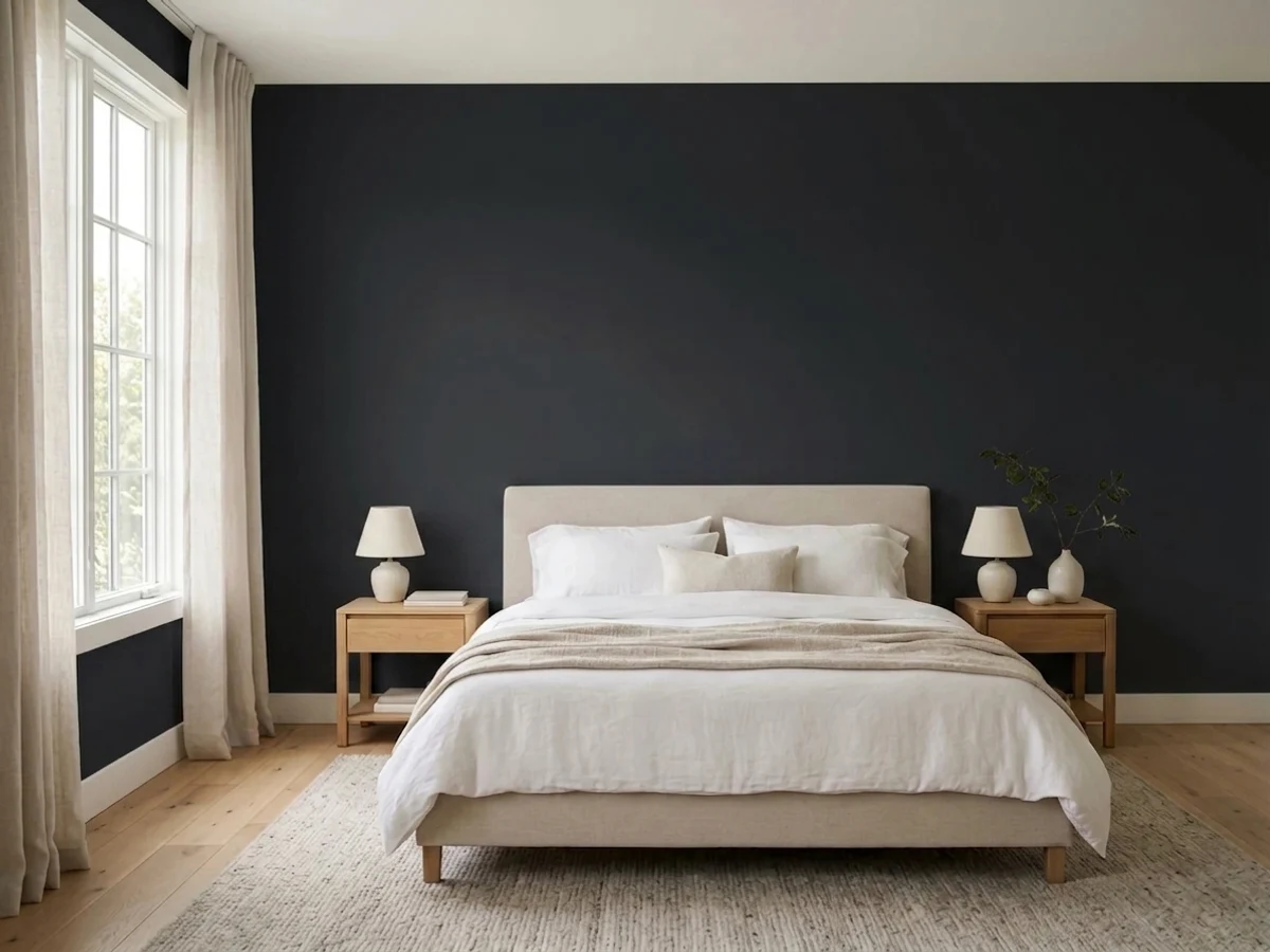
Hocus Pocus is Backdrop's take on the near-black that seems to live in every paint brand's deck now: a blue-leaning charcoal-black so dark it reads as pure black in most rooms and only confesses its undertone in strong afternoon light. At LRV 3 it sits in the same tight cluster as Sherwin-Williams Black Magic and Inkwell — this is genuinely one of the darkest, most saturated colors you can put on a wall. Buy it for a single accent wall, a powder room, an island, or a front door, and it looks expensive and deliberate. Buy it for four walls in a dim room with no plan for lamps, and you bought a cave.
One accent wall or a built-in · powder rooms and other small jewel-box spaces · kitchen islands and cabinetry · front doors and interior trim in confident light · shoppers fine with ordering online and waiting on shipping instead of grabbing a can same-day
You want black across all four walls of a room that gets real daily use · your only light source is a dim north window and you won't add lamps · you need paint today from a local store, not a shipped order · your drywall has visible texture or repairs you don't want a flat dark color to spotlight
- A genuinely dark, saturated near-black — LRV 3, no compromise
- Cool blue undertone reads clean and modern, not brown or green
- Small rooms and single accent walls look expensive and deliberate
- Backdrop's Standard finish is low-VOC and wipeable at a soft 6 percent sheen
- One name, one card, curated deck — no scrolling a 3,000-color fan deck to find it
- Whole rooms with weak light go cave-like fast — this is an accent color first
- DTC-only: no local store to grab a quart or match a chip in person
- Two coats minimum over any light color, often a tinted primer first, despite the self-priming label
- Shows roller stipple and drywall texture under side light more than any mid-tone would
What Color Is Hocus Pocus, Really?
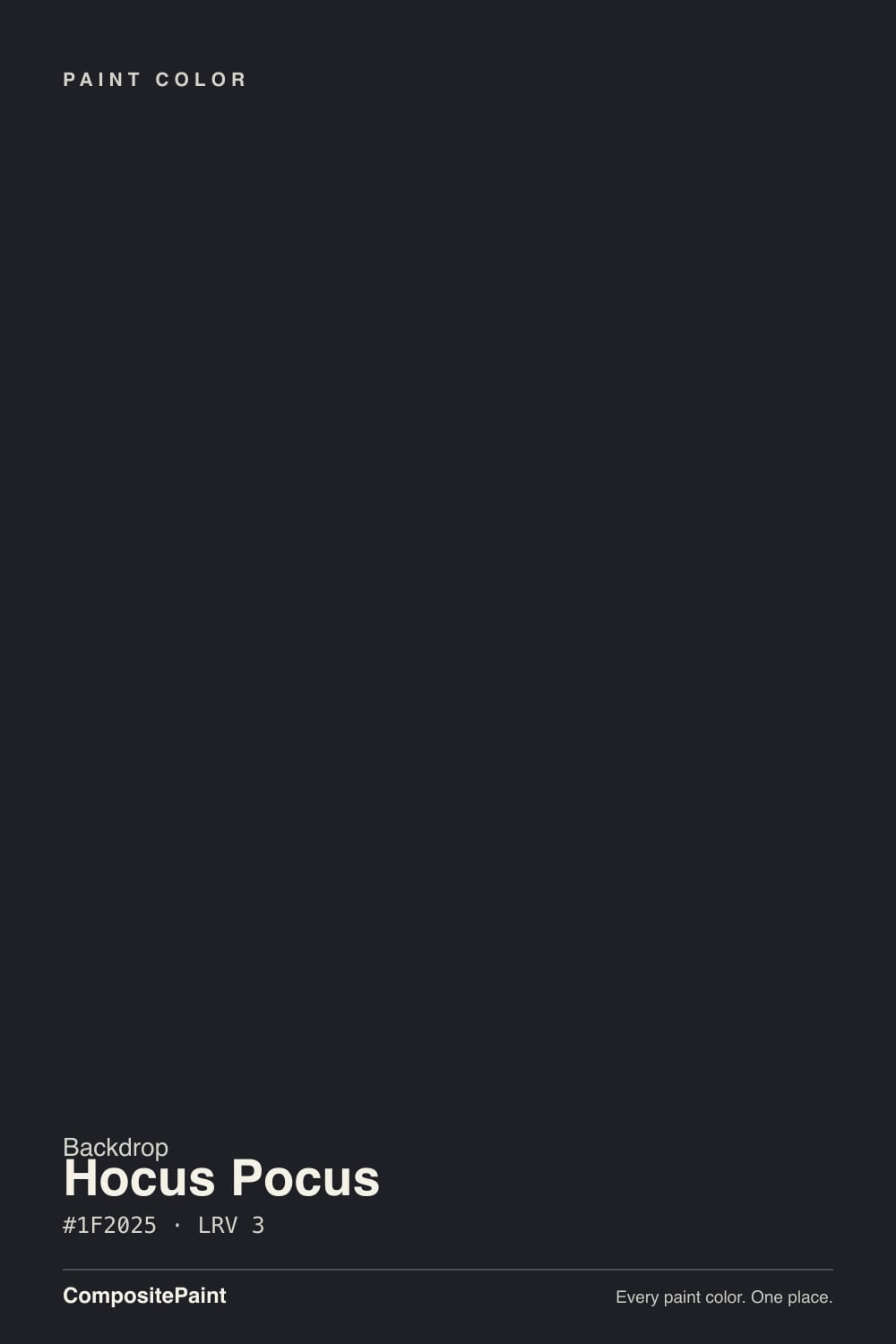
Run the numbers on Hocus Pocus's hex (#1F2025) and the undertone shows up immediately: the blue channel sits highest, red and green are within a point of each other, which puts the color's hue right around blue rather than true neutral or green-black. In practice that means Hocus Pocus reads as a clean, cool black in most light and only shows its hand — a faint navy-violet cast — in strong, direct sun or right at dusk. It sits in the same family as Sherwin-Williams Black Magic and Inkwell, two near-identical blue-blacks at the same LRV 3 depth; if you've seen either of those on a wall, you've seen roughly what Hocus Pocus does.
Backdrop is a direct-to-consumer paint company — you order online, not off a shelf, and the color deck is built around playful, nostalgia-driven names (Barbie Dreamhouse Pink, Troop Beverly Hills, Porsche Ruby Star) rather than the numbered chip system big brands use. Hocus Pocus fits that house style: a witchy, slightly campy name for the darkest color a decorator reaches for on a Halloween mood board and keeps using in April. The paint itself is Backdrop's Standard interior finish — a low-VOC, self-priming acrylic at roughly 6 percent sheen, which reads as a soft matte with just enough glow to wipe clean, plus a separate semi-gloss line for trim and doors.
LRV 3 means the paint reflects almost nothing — about as dark as paint gets before you're technically buying a chalkboard finish. That has real, physical consequences: any texture, roller stipple, or drywall patch shows up under raking light the way it never would on a mid-tone wall, and 'self-priming' claims aside, going from a light wall to this color still wants two full coats and often a gray-tinted primer first. None of this is unique to Backdrop — it's true of every true black on the market — but it matters more here because you can't walk into a store and grab a quart to test coverage before committing to the order.
Where It Shines
Give it a single wall, a door, or a small room with a real light source, and Hocus Pocus does exactly what a good near-black should: it disappears into a flat, confident dark that makes everything in front of it — brass hardware, white trim, warm wood — look sharper by contrast. It's at its best doing one job in a room, not four.
Where It Fails
Almost every regret story about a paint this dark follows one of three scripts, and none of them are unique to Backdrop — they're true of any true black at LRV 3. If your room or your plan matches one of these, sample big before you order a gallon.
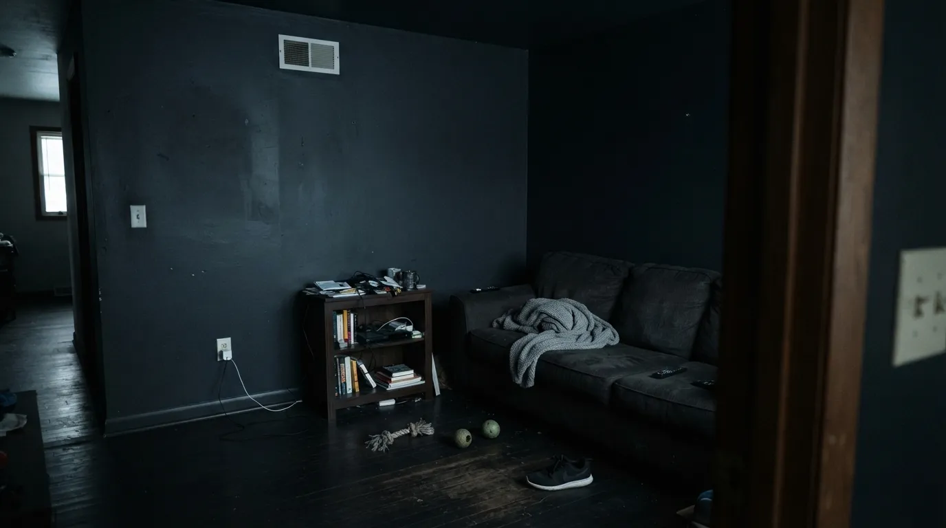
At LRV 3 the walls absorb almost all the light that hits them, so a windowless or north-facing room painted floor to ceiling in Hocus Pocus goes from moody to genuinely cave-like fast. This is the single most common complaint about any true black — the paint isn't the problem, the room's light budget is. Keep it to one wall, or add real lamps before committing to four.
Backdrop's Standard finish is billed as self-priming, but going from a pale wall to LRV 3 still means two full coats minimum, and most painters use a gray-tinted primer first anyway to avoid a third coat and visible roller flashing. Skip the prep and you'll see patchy, streaky coverage in side light — a paint problem, but an avoidable one.
Backdrop doesn't sell through a local store, so there's no walking in with a chip to hold against your trim. Order the sample swatch first and look at it in your own room's light at different times of day — a screen or a printed chip can't show you whether the blue undertone reads as black or as navy-charcoal on your specific walls.
Room by Room
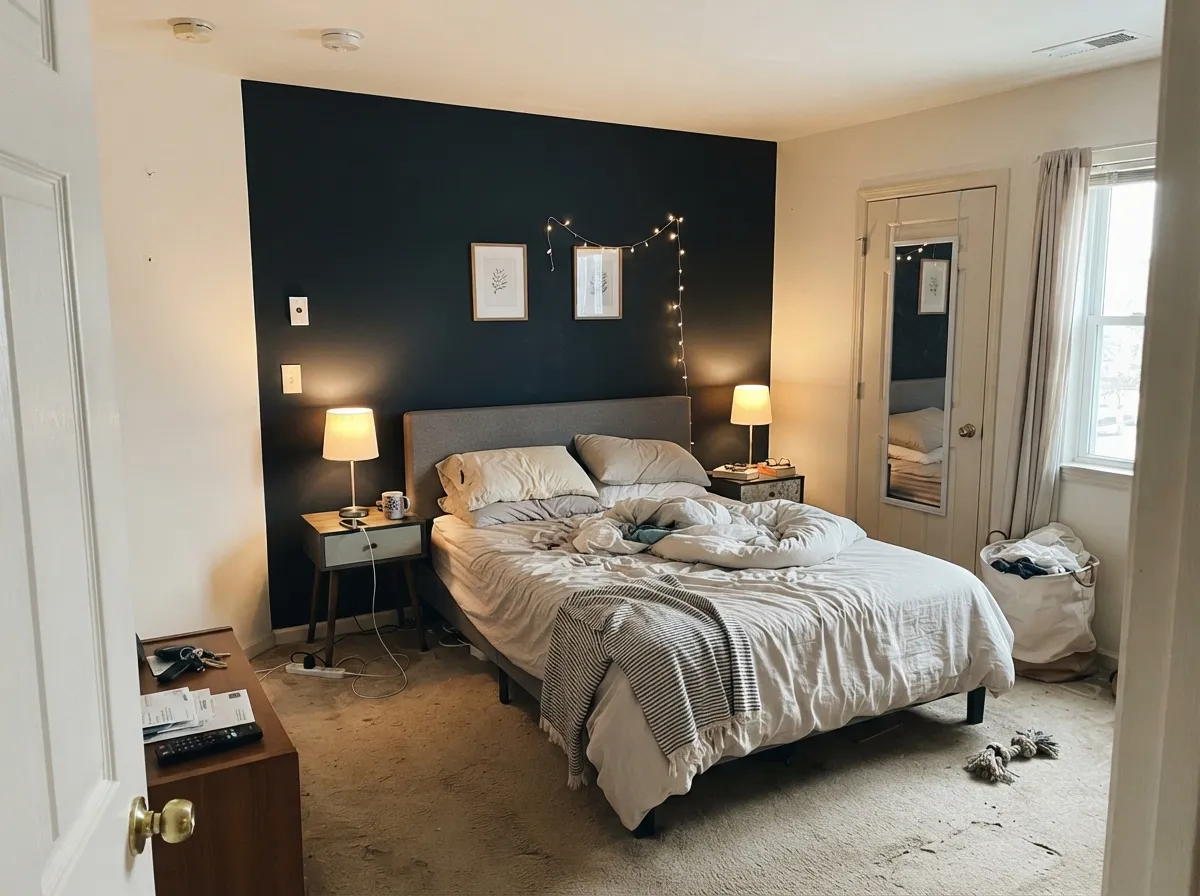
One wall behind the headboard, in matte, with warm 2700K lamps on either side, is the classic near-black bedroom move — cocoon-like without eating the whole room's light. Four walls of Hocus Pocus in a bedroom with a single window is a much bigger commitment; sample it at night before deciding.
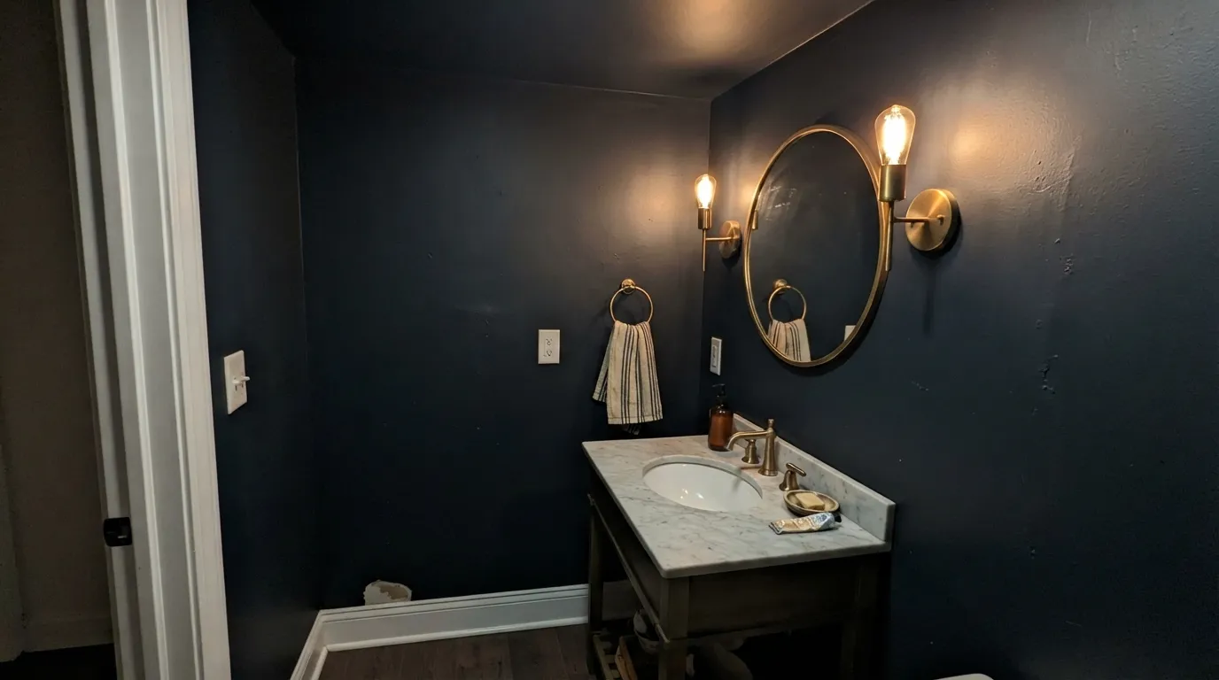
Small rooms take deep color exceptionally well, and a powder room gives Hocus Pocus a job it's built for: drench all four walls, add a brass or unlacquered mirror frame and a marble or wood vanity top, and the room reads like a jewel box rather than a closet. This is where a true black earns its reputation.
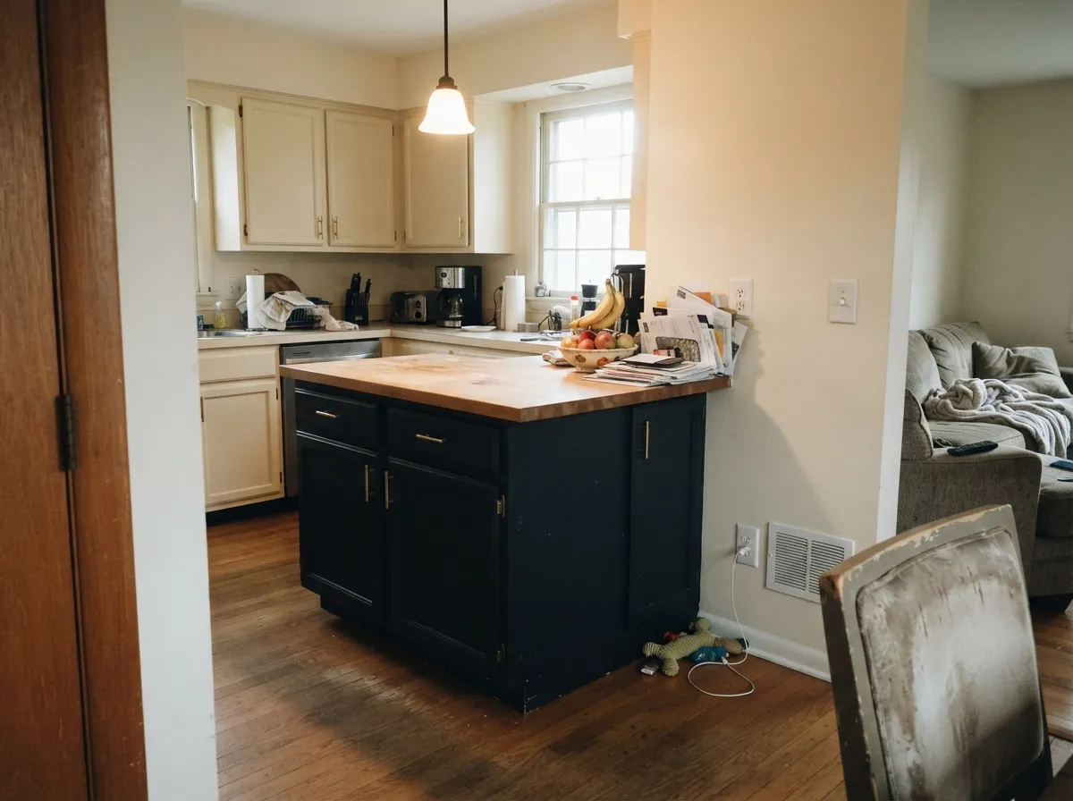
On an island or a run of lower cabinets under paler perimeter walls, Hocus Pocus is a genuine design move — grounding, sharp against brass or matte-black hardware. A full kitchen of near-black cabinetry is a colder, harder look and needs real daylight to avoid feeling heavy. Satin cabinet enamel, not the wall Standard finish.
Rooms used mostly in the evening flatter a color built to disappear in shadow. Bookshelves, leather, and warm task lighting make the blue undertone read as a rich, quiet black rather than a void. Skip it if the room is your only bright daytime workspace.
Dining rooms get candlelight and evening use more than all-day sun, which plays to Hocus Pocus's strengths. Pair it with a warm wood table and a bright ceiling or trim color so the room doesn't read as one unbroken dark box.
Near-black front doors are one of the most reliable exterior moves in paint, and Hocus Pocus's blue lean reads as a clean, modern black rather than brown-black or green-black outdoors. Confirm Backdrop's exterior-rated finish before ordering for outdoor use, and expect full sun to show the undertone more than an interior wall ever would.
Your Light Is the Risk
2700K light keeps Hocus Pocus reading as a clean, confident black with just a whisper of blue in the shadows — the light it was built for.
Flat gray daylight with nothing to bounce off gives the color nowhere to go but flat and heavy — this is the light behind every 'the room felt like a cave' complaint.
Strong, direct light is the one place the blue undertone shows itself plainly — walls can read faintly navy-charcoal for an hour or two rather than pure black.
Cool white bulbs flatten the color into a slightly harsher, bluer black; warm bulbs are worth the swap if you want the softer, richer version.
Most complaints about Hocus Pocus are a light mismatch. Upload a photo of your actual room and see it on your walls — then ask for the same wall in north light or evening lamps before you buy a single sample.
Need It From Another Brand?
Any paint counter can custom-tint Backdrop BD-HP directly. If you would rather stay in one brand's own deck, these are the closest stock matches, measured as ΔE2000. Under 2 is a difference you will not see on the wall.
| Brand | Closest color | ΔE | LRV | |
|---|---|---|---|---|
| Valspar | Tuxedo8006-8G · Valspar | 2.6 | 2 | Color page → |
| Hirshfield's | Silent Sea0515 · Hirshfield's | 4.5 | 5 | Color page → |
| Portola Paints | Factory BlackFACTORY BLACK · Portola Paints | 4.6 | 2 | Color page → |
| Kompozit | Silent Sea0515 · Kompozit | 4.5 | 2 | Color page → |
Similar Backdrop Colors
The nearest shades to Hocus Pocus within Backdrop's own range, ranked by perceptual color distance — useful when you want the same look a touch lighter, darker, or warmer.
WCAG 2.1: AA is 4.5 : 1 for normal text, 3 : 1 for large text, AAA is 7 : 1.
Hocus Pocus vs the Colors You're Also Considering
Every Hocus Pocus sample board has the same rivals on it. The numbers show the real lightness gap — then it comes down to which risk you would rather live with.
Pick this if you're already ordering from Backdrop's curated deck and want the color that started the comparison.
Sherwin-Williams SW 6991 · LRV 3Black MagicPick this for the near-identical blue-black off a store shelf today, instead of waiting on a shipped DTC order.
Pick this for the more distinctive name and the Backdrop buying experience; the paint underneath the two is nearly identical.
Sherwin-Williams SW 6992 · LRV 3InkwellPick this for the same cool blue-black at a lower profile — Inkwell is the same depth, quietly.
Within Backdrop's dark range, the practical differences come down to how much color survives on the wall.
After Hours (BD-AH), at LRV 6, is twice as reflective and carries a green-gray cast; in daylight it reads as a very deep charcoal-green, not black. Choose After Hours when you want a dark room that still feels organic and soft; choose Hocus Pocus when you want unambiguous black, like doors and window frames that must match black steel or hardware.
Last Call (BD-LC), also LRV 6, leans blue and reads as a blackened navy in good light. It is the better pick for a bedroom or library where a hint of color keeps the walls from feeling flat; Hocus Pocus is better where the surrounding palette is already colorful and the black should stay quiet.
We Three Kings (BD-WK), at LRV 8, is clearly a dark blue rather than a black. If you keep second-guessing whether you want black at all, sample it alongside Hocus Pocus; the comparison usually settles the question fast.
Hocus Pocus Coordinating Colors
The rule for coordinating with Hocus Pocus is simple: warm neutrals soften the handoff, cool bright whites sharpen it, and there's an easy same-brand pairing if you want the whole scheme shipped from one order. These are the partners that keep the color from reading like a hole in the wall:
What Backdrop Is, and Why That Matters for This Color
Backdrop sells paint online only — you pick a color from a curated deck of roughly 80 names, order a sample or a can, and it ships to your door instead of sitting on a shelf at a big-box store. The names lean nostalgic and pop-culture (Barbie Dreamhouse Pink, Troop Beverly Hills, Porsche Ruby Star), which is the same house style Hocus Pocus fits into: a witchy, campy name for the darkest color in the deck. The paint is a Green Wise-certified, low-VOC acrylic, and Backdrop markets itself as a Climate Neutral Certified company — details that matter if sustainability is part of your buying decision, less so once the can is open.
The trade-off of buying this way is real: no walking into a store to hold a chip against your trim, no grabbing a quart today to test coverage, and a Standard finish billed as self-priming that, like every self-priming claim, still benefits from a real primer coat when you're painting a light wall this dark. Order the sample swatch first, and build shipping time into your schedule before you commit a painting weekend to it.
Hocus Pocus With Wood Tones, Metals and Neighbor Colors
A blue-leaning near-black is one of the easier darks to pair because it doesn't fight warm wood the way a true green-black or brown-black can. Walnut, white oak, and even honey oak all sit comfortably against it — the cool undertone in the paint and the warm undertone in the wood balance rather than compete. Unlacquered brass and warm brushed gold are its best hardware partners; polished chrome and cool stainless read slightly harsher next to it but are far from a clash.
Where it needs more care is next to other paint colors: a true warm-neutral like Swiss Coffee or Revere Pewter keeps the transition soft, while a stark, cool white like Chantilly Lace right beside it creates the sharpest, most modern-reading contrast in the deck. Save that pairing for a room where crisp contrast is the goal — a powder room or an entry — rather than a whole-house trim scheme, where the softer warm whites wear better over time.
Three Ready Palettes Built on Hocus Pocus
A color is never alone on the wall. These are complete combinations in the 60-30-10 pattern, with the reason each one holds together. Every one opens in the visualizer.
White Dove's warmth keeps the black from reading like a void instead of a wall, and Revere Pewter in the next room steps the depth down gradually instead of slamming from black to bright white at the doorway.
Try this palette in your roomAlabaster keeps the kitchen bright enough to work in daily, the near-black island becomes the one thing every eye lands on, and Pale Oak on a secondary piece ties the warm-neutral perimeter together without adding a fourth competing tone.
Try this palette in your roomSmall rooms take deep color best, and drenching the walls and ceiling in Hocus Pocus removes any awkward transition line. The muted Evergreen Fog vanity keeps the room from reading pure black-and-white, and Chantilly Lace's cool, bright trim gives the near-black a sharp, gallery-clean edge instead of a soft one.
Try this palette in your roomHocus Pocus FAQ
Is Hocus Pocus a true black or does it have an undertone?
It's a cool near-black with a blue undertone — the hex works out to a hue right around blue, not true neutral. In most rooms it reads as plain black; only in strong direct sun or right at dusk does the blue show up as a faint navy-charcoal cast. If you want zero undertone to think about, Benjamin Moore Black is the more neutral option at the same LRV 3 depth.
Can I paint a whole room in Hocus Pocus?
You can, but think hard about the light first. At LRV 3 it reflects almost nothing, so a small, dim, or window-light room goes cave-like fast. It's genuinely excellent for a small, well-lit powder room drenched floor to ceiling — the situation is different for a bigger everyday room with weak natural light.
How many coats does Hocus Pocus need over a light wall?
Plan on two full coats minimum, and use a gray-tinted primer first if you're going over anything pale — Backdrop's Standard finish is billed as self-priming, but that claim is about adhesion, not about covering a light color in one pass. Skipping the primer is the most common cause of streaky, patchy coverage at this depth of color.
What white or trim color goes with Hocus Pocus?
A warm white like White Dove or Swiss Coffee keeps the pairing soft; a cool, bright white like Chantilly Lace creates a sharper, more modern-reading contrast. Avoid a mid-tone trim color — it tends to disappear next to a color this dark instead of framing it.
Does it work on kitchen cabinets or an island?
Yes, and it's one of the color's best jobs — an island or a run of lower cabinets under paler perimeter walls reads as a deliberate design statement rather than an overwhelming one. Use a satin cabinet-grade enamel, not the flatter wall finish, since cabinets take far more handling.
Where do I buy Backdrop paint, and how does that change the process?
Backdrop sells direct online only — there's no local store to walk into and grab a can or hold a chip against your trim in person. Order the sample swatch first, look at it in your own room at different times of day, and build shipping time into your painting schedule before committing to a full order.
Have you painted with Hocus Pocus?
Rate it — one tap helps the next reader decide.
Ask a Question