We Three Kings
Backdrop's boutique deep navy, reviewed honestly: the light it needs to read blue instead of black, and the mainstream color it turns out to match to the hex.

Jessica has spec'd whites and neutrals for more than 300 rooms and keeps a sample wall of painted drawdowns in her studio. Every color review is checked against real reader rooms in the comments and re-tested when a formula changes. About the testing process →
- 1Anchors Aweigh3
- 2We Three Kings8
- 3Waterloo13
- 4Charcoal Blue19
The Fast Verdict
We Three Kings is a proper deep navy — grayed and slate-leaning rather than primary-blue, with an LRV of 8 that puts it near the black end of the paint deck. It comes from Backdrop, a small direct-to-consumer brand that ships peel-and-stick swatches instead of fan decks, and by the numbers it lands in exactly the same place as Sherwin-Williams' Indigo Batik. It is not a whole-house color. On a front door, a kitchen island, or a small lamplit room, it is the classic navy move done well.
Front doors and exterior trim · kitchen islands, cabinets and built-ins · dens, home offices and libraries · powder rooms and dining rooms · anyone who wants a serious navy without a big-box paint aisle
Your room is dim, north-facing and has no lamp doing real work · you want this color running across a whole open floor plan · you're relying on decades of owner reviews before you buy · you need to color-match in a physical store
- A genuinely deep, grayed navy — sophisticated rather than primary-blue
- Classic, dependable role on front doors, islands, built-ins and small rooms
- Backdrop's Standard finish self-primes, which cuts a step over lighter walls
- Peel-and-stick swatch sampling is a real advantage for a color this dark
- Lands on the same hex and LRV as a proven mainstream navy, so the recipe isn't a gamble
- LRV 8 means it reads near-black without real light hitting the wall
- Not built for open floor plans or daylight-starved rooms
- Small DTC brand — far less public owner-review history than a BM or SW navy
- No physical store to color-match or compare against other brands' cans in person
What Color Is We Three Kings, Really?
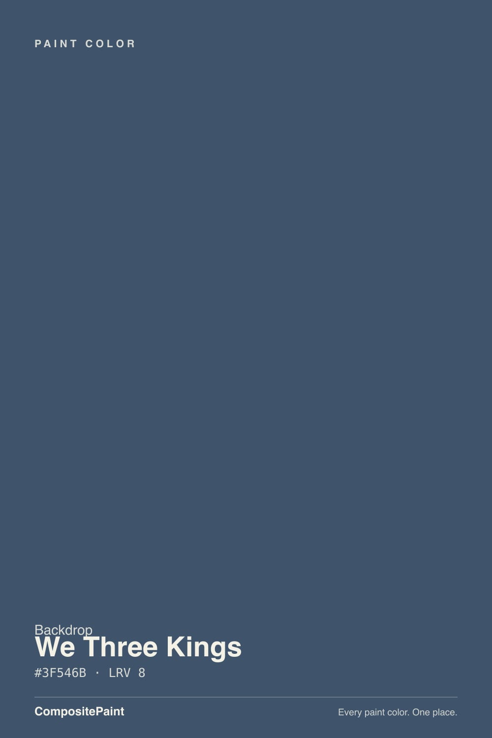
A deep, grayed-down navy — RGB(63, 84, 107) puts it closer to slate-blue than to a crisp primary navy. The gray keeps it from reading nautical or preppy; it leans toward the moody, denim-adjacent navies that read as sophisticated rather than crayon-blue. At LRV 8, though, color is the second thing you notice. The first is depth: this is a genuinely dark paint, closer in weight to a near-black than to a mid-tone blue.
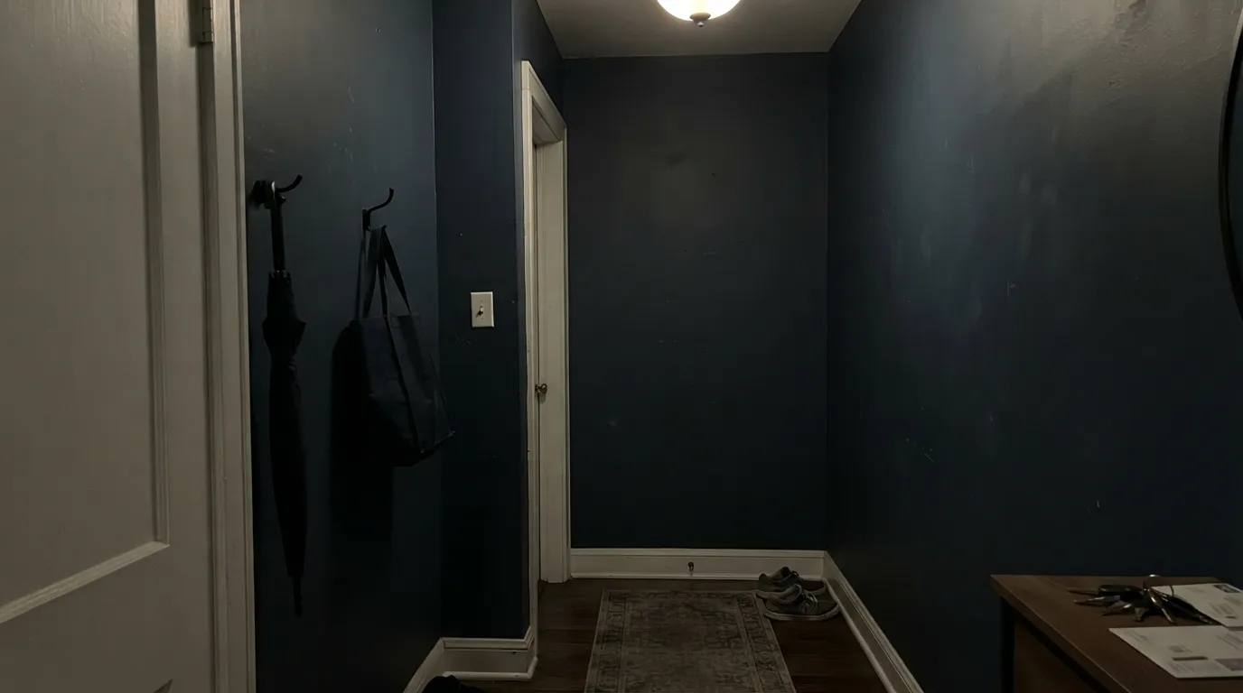
That LRV number is the whole story with a color this dark. Below roughly LRV 10, a paint needs real light hitting it — daylight, a strong accent lamp, or both — to show its hue at all; in shadow or dim ambient light it collapses toward plain black. That is not a defect specific to We Three Kings, it is what LRV 8 means on any wall, and it is worth knowing before you commit a whole room to it rather than a door or an island.
One fact worth knowing if you're brand-shopping: our own color data shows We Three Kings landing at the exact same hex and LRV as Sherwin-Williams' Indigo Batik. Paint brands don't coordinate on this — it's what happens when two formulators independently converge on the same well-tested navy recipe. It doesn't mean the two paints will behave identically on your wall (base, resin and pigment load still differ), but it does mean you are not chasing a rare unicorn; this is a known, workable navy under a boutique label.
Where It Shines
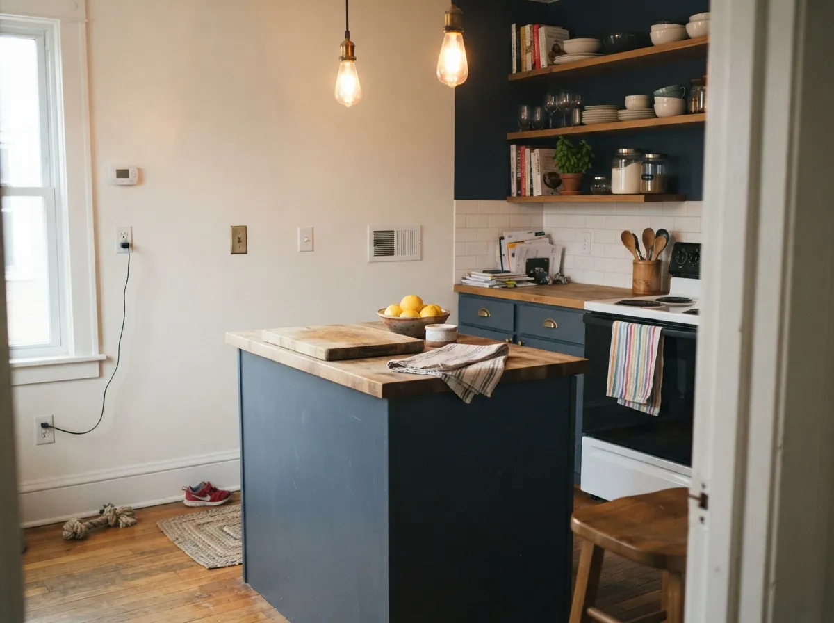
This is a color built for a defined surface, not an open floor plan. A front door under a porch light, a kitchen island next to butcher block or marble, a den with one good lamp, a powder room with a sconce — small, contained, well-lit surfaces are where a deep navy like this earns its reputation. Give it brass or black hardware, warm wood, and one deliberate light source, and it reads expensive and intentional rather than simply dark.
Where It Fails
The complaints that come with any navy this deep are predictable, and Backdrop's small size adds one more: there is no decades-long trail of owner reviews to check against the way there is for a Benjamin Moore or Sherwin-Williams navy. None of that makes it a bad paint — it makes sampling before you commit non-negotiable.
At LRV 8, without daylight or a lamp actively hitting the wall, this reads as flat near-black, not navy. That is true of every color this dark — the fix is a window, a strong accent lamp, or accepting the near-black look on purpose. It is not a flaw you can paint your way out of.
A deep navy running unbroken across a large connected space gets heavy and cave-like fast, and it drags every adjacent room's color down with it through sightlines. Keep it to a door, an island, a den, or a single defined room with its own light and its own trim break.
Navy in general is a safe bet; this specific mix, from this specific small brand, is not one you should assume from a screen swatch. Order the 12-inch peel-and-stick sample and look at it in your own room's light before you buy a gallon — there is no long public review history to lean on instead.
Room by Room
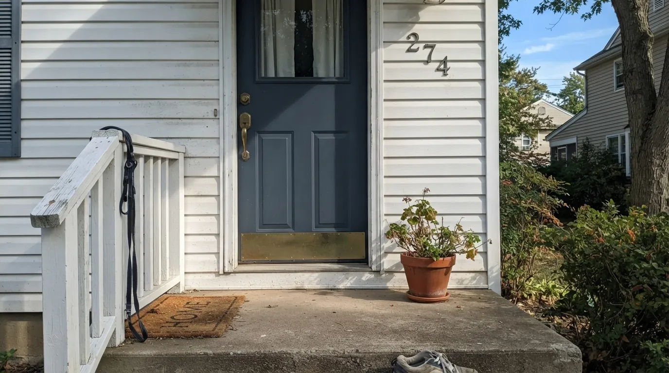
A navy door on a lighter-sided house is the single most dependable use for a color this deep: full daylight most of the day, brass or black hardware for contrast, and the color reads rich rather than black. Use an exterior-rated enamel, not the interior Standard finish.
On an island or a run of lower cabinets under lighter counters and warm wood open shelving, it is a genuine design move. A full kitchen of this navy on every cabinet face works only with strong, consistent light — sample the darkest corner first.
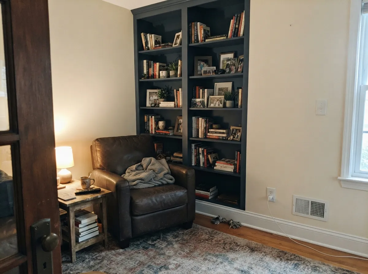
Low, warm light is this color's friend rather than its enemy here. Leather, walnut, brass reading-lamp light: the room is meant to feel enclosed and a little serious, and We Three Kings does that without turning gloomy — as long as the lamp is doing its job.
A small, four-wall room takes deep color well, and a powder room rarely needs to double as a daylight-flooded space. Add a sconce rather than relying on an overhead fixture alone.
Evening entertaining is this color's best hour: warm bulbs, brass or black fixtures, and a navy that reads formal rather than dark. Daytime dining in a dim room is the weaker case.
This is the room type in the skip list for a reason. Without a defined edge and a real light source, a deep navy this size of a commitment tends to make the whole main floor feel smaller and darker than the homeowner expected.
Your Light Is the Risk
This is where the slate-blue actually shows. A sunlit front door or a lamp aimed at a den wall pulls real navy out of what otherwise reads as near-black.
Below its LRV 8, ambient light alone isn't enough. The color collapses into flat, featureless black — sample in your actual room's worst light before deciding.
Morning and evening low-angle light catch more of the blue in the mix; midday overhead light flattens it toward its darkest, most neutral state.
Warm bulbs bring the slate-blue forward and keep it from reading cold. Cool white LEDs push it further toward plain black — pick warm bulbs for any room wearing this color.
Most complaints about We Three Kings are a light mismatch. Upload a photo of your actual room and see it on your walls — then ask for the same wall in north light or evening lamps before you buy a single sample.
Need It From Another Brand?
Any paint counter can custom-tint Backdrop BD-WK directly. If you would rather stay in one brand's own deck, these are the closest stock matches, measured as ΔE2000. Under 2 is a difference you will not see on the wall.
| Brand | Closest color | ΔE | LRV | |
|---|---|---|---|---|
| Sherwin-Williams | Indigo BatikSW 7602 · Sherwin-Williams | 2.0 | 8 | Color page → |
| Behr | Midnight MosaicHDC-SM14-7 · Behr | 0.8 | 8 | Color page → |
| Benjamin Moore | Hudson Bay1680 · Benjamin Moore | 1.3 | 8 | Color page → |
| Valspar | Mountain River4005-6C · Valspar | 2.8 | 9 | Color page → |
| PPG / Glidden | AdmiraltyPPG1042-7 · PPG / Glidden | 2.9 | 7 | Color page → |
| Glidden | AdmiraltyPPG1042-7 · Glidden | 2.9 | 7 | Color page → |
Similar Backdrop Colors
The nearest shades to We Three Kings within Backdrop's own range, ranked by perceptual color distance — useful when you want the same look a touch lighter, darker, or warmer.
WCAG 2.1: AA is 4.5 : 1 for normal text, 3 : 1 for large text, AAA is 7 : 1.
We Three Kings vs the Colors You're Also Considering
Every We Three Kings sample board has the same rivals on it. The numbers show the real lightness gap — then it comes down to which risk you would rather live with.
Pick this for a boutique brand experience — peel-and-stick sampling, self-priming convenience, and no big-box aisle.
Sherwin-Williams SW 7602 · LRV 8Indigo BatikPick this if you want the exact same hex and LRV mixed at any Sherwin-Williams store, with none of the DTC ordering wait.
Pick this for a slightly less famous, more slate-leaning navy without the 'everyone's front door' reputation.
Benjamin Moore HC-154 · LRV 6Hale NavyPick this for the industry-standard navy with decades of owner reviews to check against before you buy.
Within Backdrop, the closest cousin is Last Call (BD-LC), LRV 6. Last Call is darker and leans indigo, with a violet edge that reads more nocturnal and less classic. Choose Last Call for a moodier bedroom or den; choose We Three Kings when you want a navy that people recognize as navy, especially on cabinets and exteriors.
Mom Jeans (BD-MJ), LRV 18, is the lighter, more casual relative. It is a washed slate blue that works on all four walls of a normal room, where We Three Kings would close the space in. If you love the hue but the room is small or dim, Mom Jeans gets you the same family at a livable depth. North End (BD-NE), LRV 7, matches this color for darkness but is a deep green, not a blue; sample them side by side if you are torn between a dark green and a dark navy, because in dim light the two can look surprisingly alike until daylight separates them.
We Three Kings Coordinating Colors
The rule with a navy this deep: keep trim and ceiling warm and light, and let one near-black or brass accent do the contrast work. It pairs naturally with its own Backdrop sibling, and with the warm creams and greiges that show up again and again next to deep navies:
We Three Kings and the Backdrop Deck
Backdrop is a small direct-to-consumer paint company, not a big-box brand — no physical color wall, no in-store matching. Its Standard interior finish runs about $45 a gallon, is self-priming at a 6% sheen the brand calls semi-matte, and is Green Wise certified, low-VOC and formaldehyde-free. Instead of a fan deck, Backdrop ships 12-inch peel-and-stick swatches, which is genuinely the better sampling method for a color this dark — a printed chip swatch this size of a thumbnail tells you almost nothing about how LRV 8 behaves on an actual wall.
That small-brand footprint cuts both ways. There isn't the decades-deep public review history behind We Three Kings that exists for a Benjamin Moore or Sherwin-Williams navy — we could not find independent owner reviews specific to this color in our research, only Backdrop's own marketing and secondary swatch listings. What we can verify is the color itself: it lands at the same hex and LRV as Sherwin-Williams' well-established Indigo Batik, which is a reasonable stand-in data point for how a navy this dark tends to behave, even without a long Backdrop-specific track record to cite directly.
We Three Kings With Wood Tones and Metals
Walnut, espresso and other dark, red-brown woods sit comfortably against a navy this deep — the two darks don't fight, they read as one deliberate tonal family. Lighter woods like white oak give more contrast and let the navy stand out as the clear focal point rather than blending into a dark room.
Metals do more of the work than usual with a color this dark. Brass or unlacquered hardware warms the whole look and keeps it from feeling cold; matte black nearly disappears into the paint and reads as texture rather than contrast. Polished chrome or nickel is the one metal that fights it, throwing a cool glare against a warm-leaning navy.
Three Ready Palettes Built on We Three Kings
A color is never alone on the wall. These are complete combinations in the 60-30-10 pattern, with the reason each one holds together. Every one opens in the visualizer.
A warm white siding keeps the house bright and low-maintenance while the door carries the one deliberate color move; near-black hardware and a lantern in Wrought Iron tie the metals together without adding a second wall color to manage.
Try this palette in your roomBackdrop pairs its own dusty light blue with this navy for a two-tone wall split, and it works because both colors share the same grayed-blue undertone — the split reads deliberate rather than like two unrelated blues thrown together. A warm white ceiling keeps the room from closing in overhead.
Try this palette in your roomCream trim keeps a wall this deep from reading like a cave in daylight; near-black built-ins nearly disappear into the navy at night and reappear as texture once a lamp is on. This is the room type where LRV 8 stops being a warning and becomes the point.
Try this palette in your roomWe Three Kings FAQ
Is We Three Kings a true navy, or does it read black?
Both, depending on light. It's a genuine grayed slate-navy, but at LRV 8 it needs real daylight or a lamp hitting the wall to show that blue. In shadow or dim ambient light, it reads close to black — that's true of nearly every paint this dark, not a flaw unique to this one.
What sheen should I use?
Backdrop's interior Standard finish is a self-priming 6% sheen — a soft, low-glare look, fine for a wall or wainscoting. For a front door, cabinets or heavily touched trim, use a dedicated exterior or cabinet enamel in satin or semi-gloss instead; a wall-grade finish won't hold up to that kind of daily contact.
Do I need to prime first?
Backdrop's Standard finish is formulated to self-prime over most existing painted walls. Going over a much darker or more saturated color, or bare drywall, a dedicated primer still shortens the job and gives you a more even final color — especially important with a deep color like this where blotchy coverage shows.
What trim white goes with it?
A warm white — White Dove or Swiss Coffee — softens the transition better than a stark, cool white, which can make the navy look flat and blue-black by contrast. Keep the trim warm-leaning, the same rule that applies to most deep navies.
Is it really the same as SW Indigo Batik?
By the numbers in our own color data, yes — identical hex and identical LRV. The underlying resin and pigment load can still differ between brands, so we wouldn't promise an identical finish off the roller, but you are not choosing between two unrelated colors; you're choosing between two brands selling essentially the same navy.
Does it work on a front door or exterior?
Yes — it's the color's most dependable job. Full daylight most of the day keeps it reading rich navy rather than black, and it pairs cleanly with a lighter-sided house and brass or black hardware. Use an exterior-rated enamel, since Backdrop's Standard interior finish isn't built for outdoor exposure.
Have you painted with We Three Kings?
Rate it — one tap helps the next reader decide.
Ask a Question